Hi Everyone!! It’s Jenn (jk703) here to bring you today’s post and offer some tips with your digital shadows! Chelle offers a wonderful style set of shadows called Me & My Shadows by Chelle’s Creations. Here is the description (I can’t describe it any better, lol!) right from the product page:
“A digital scrapbook product by Chelle’s Creations. Take your shadowing up a notch with Me & My Shadow Styles by Chelle’s Creations. Speed up your scrapping with these layer styles. Quickly add shadows to multiple layers. Me & My Shadow Styles works with PSE & PS and progams that use .asl style files. Includes common shadow directions: Shadow to the LowerRight = 120 (photoshop standard), Shadow to the LowerLeft = 45 , Shadow to the UpperLeft = -43.”
You can complete your layout, add all of your shadows with simple click, click, click. But, if you are like me, you can’t leave well enough alone! Sometimes, I just have to adjust my shadows by moving them a smidge, changing the depth, or even the color. Here are a few tips when working on shadows. Just remember, you have to like your shadows, and everyone has their own taste. While I might offer some tips, I am no expert.  These are just tips and tricks to using shadows, and how to make them your own, and to change them up to make them your own! Most of these tips will work with PS and PSE, some may not work with PSE.
All of the close up examples use Chelle’s Creations Zoo Crew (Arctic).
1. Lighting
First things first. Light is a big thing. Look where the light is coming from on elements when you place them. You will want to shadow and match the lighting on the element with a twist, turn, or flip. Here are two buttons, both use the Thin Button Brad setting. Can you see how the one on the left is twisted so the light part is to the upper right? That is because I usually shadow to the lower left. The button on the right is shadowed the same direction, but the lighting on the button is on the bottom left. It looks funny. So, try to match your lighting to your elements.
2. Not ALL Items Must Be Shadowed
So, what happens if you add a shadow to text. Well… it looks funny. LOL! Text usually doesn’t have a shadow that I’ve ever seen when I write on a piece of paper, so I don’t add shadows to my digital scrapbook pages. Other items that may not need shadowing are paint and splatters. Here’s an example:
3. Global Light & Blend Modes
This is a personal choice, but one that I think is important when you start to play with individual shadows. Leave the Global Light Unchecked. Why? When I start fiddling with shadows, and if the Global Light is checked, some of my other shadows may change to match the Global Light. Global Light’s purpose is to have all your effects agree and work together. I don’t want my shadows to all work together. If I am fiddling with them, I want them to stay how I left them, not change in between or after I’ve made changes to other elements.
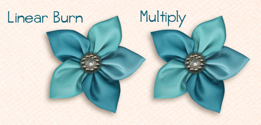
Blend Modes are important for the way the shadow looks and how it interacts with the layer below the shadow. Most times Multiply is the Default Blend Mode for shadows. I happen to use Linear Burn for my shadowing. I also look at the background paper to determine if my shadow color needs tweaking. I’ll make this super simple. Multiply is a bit more “solid” when casting a shadow. Linear Burn takes the color information of the embellishment that getting the shadow, and transfers that to the shadow coloring, If there is a lighter spot in the embellishment, the shadow will be lighter also in that spot. It is a very slight difference, but over time, I preferred the Linear Burn. Here is an example:
4. Shadow the OPPOSITE Edge
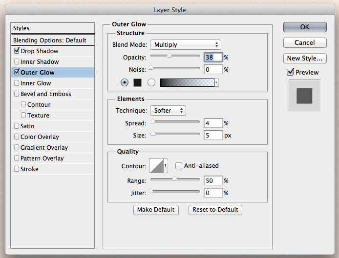
Nothing has a shadow on one side, and sits perfectly flat with no shadow on the opposite side. This can be done a few different ways, but the way that I do this uses the Outer Glow. Here are two pieces of paper, and the setting that I added to the opposite edge. To get to the shadow settings, click on the little “fx” on the layer you want to adjust the shadows. I feel this just adds a little something to certain elements and papers. I use this a lot for stacked papers, and stacked elements. You can use the Multiply or the Linear Burn for this option, as I think it is not as noticeable as regular shadows. Here are my examples.

5. Tweaking
Tweaking shadows are something that I don’t do often – I’m just too lazy. While I wanted to learn and was so excited to learn, I found that I didn’t want to give that extra time to all my shadows. If I do tweak shadows, its for a flower here or there, a crumpled paper or frame, but mostly I use this for ribbons and string. When I tweak, I use either the Warp Tool or the Smudge Tool. The Smudge Tool feels a bit more controlled than the Warp Tool.
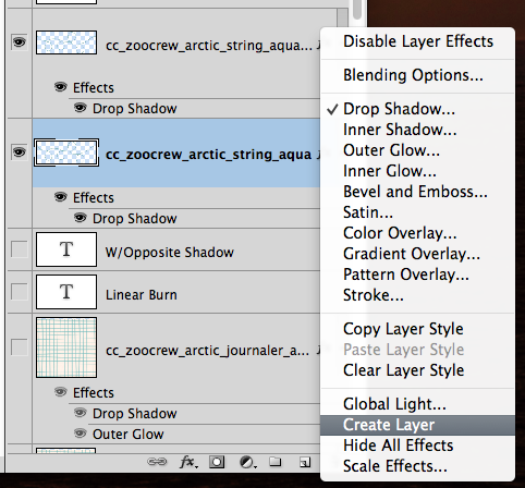
In the Layers Palette, select the layer that you want to Smudge the Shadow. Right click on the “fx” symbol, and choose Create Layer. This puts your shadow on it’s own layer, and allows you greater control of tweaking.
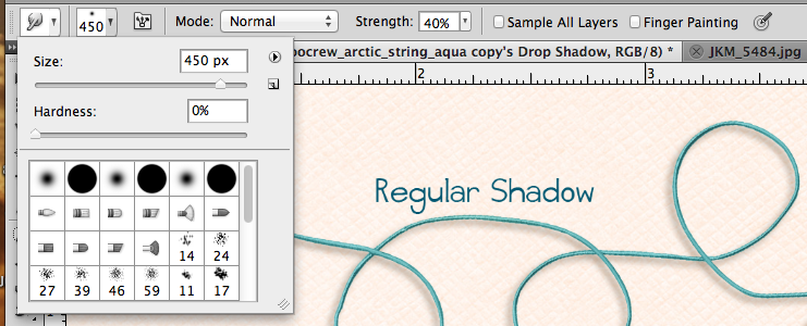
Once you have your layers separated, select the shadow layer, and then choose the Smudge Tool. Here are my Smudge Tool Settings too. I use a larger brush to start with, and then change the size smaller when I need to get into corners or smaller areas. Usually around 450 to start, and then 100 when I end. I also leave the strength at about 40%, and have a hardness of 0%. Even with Control Z, it’s easier to add then to remove. 
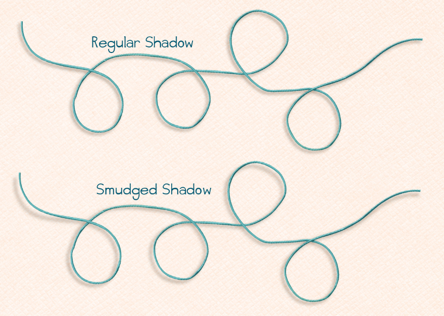
Here are my strings and how they appear after smudging. Look at the end pieces, and then near where any of the curved circles of the string is. Can you see the difference?
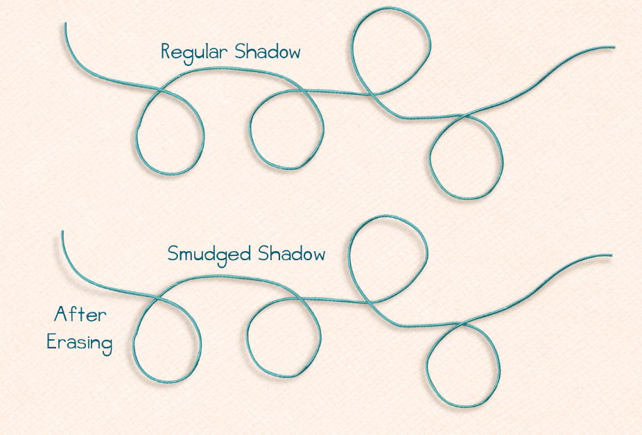
I have one more tidbit to make them look a little more realistic. Especially, since string and other embellishments do not all sit at the same exact depth. Once you smudge a section and it looks as if it is farther away from the background, you might want to change the darkness of the shadow. Further shadows will have less definition and a lighter color than those closer to the background. Erasing part of the shadow will do the trick! Choose the Eraser Tool, and make the settings around 150 pixels in size, 40% opacity, and 40% flow. On the shadow layer, click to erase the sections away that are “lifted.” Click and remove, over and over again. Here is how mine turns out. What do you think?
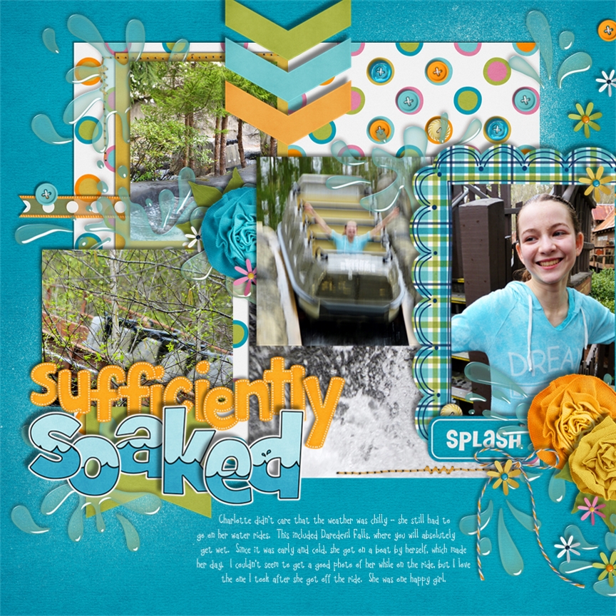
Jan (Quiltymom) also shared some information for the SBC+ users out there. Her layouts uses In the Pool and Splash Alpha, and a Cluster Queen Creations Template. She shared the following info to help with your shadowing.
What I love about using SBC+ (StoryBook Creator Plus/Panistorian Aritsan) is how user friendly it is. Since most of the work has been already done for you, all you need to do is use a preset, or modify it if you choose. Shadow work is so simple and fun to customize. The closest to what Chelle uses is what I call the upper left preset. I always start my pages using the presets, but I’ll come back to customize certain elements to make them pop a bit more. I always make sure to use a variety of shadows to keep the page looking more realistic without being either flat or having everything float off the page. Also, for the most part I’ll leave the shadow color at black, only changing it to make the shadow less harsh.
It is also difficult to get a good shadow on transparent elements, such as the water splashes, so I cheat and use Chelle’s pre-shadowed elements from her kit! Yay for them!
I use the upper left presets for my pages for both the heavy and light shadows (Direction -135, Expansion 0). Here are the changes the settings I made for this page:
“soaked”: Depth 3, Softness 2
Large flowers: Depth 3, Softness 3
Buttons: Depth: 1.2, Softness 0.09
For the stitching I used the preset choice in the middle: Direction 0, Depth 0, Softness .07, Expansion 0. I want it to have some definition so it is not flat on the page without having it float.
There you go! Hoping you learned something today with our Digital Shadow Tips and Tricks post! Have a great week!
Thanks for stopping by!







 Hi! I'm Chelle: a 40 something mom of 7. My husband & I live in a rural community in the rocky mountains with our 4 children still at home. In the winters we enjoy sledding & snuggling by the fire. I the cool fall evenings we love relaxing around the campfire & meeting friends at the county fair. Admiring the stars
