


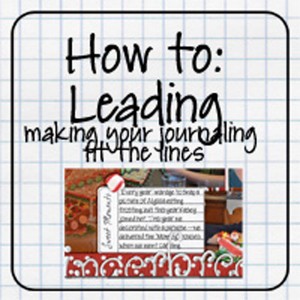
Hello Friends! Have you ever wanted your journaling to sit on a line in your digital scrapbooking layouts? Chelle has you covered with a tutorial about it. It’s called “Leading, Making Your Journaling Fit On The Lines.” I hooked you up with a link, just click the image below. The TUT has gorgeous pictures and is done in Photo Shop Elements (PSE). Plus a couple of freebies for you practice on. Check ’em out below.
Some of our ladies have given an example for you to look at.
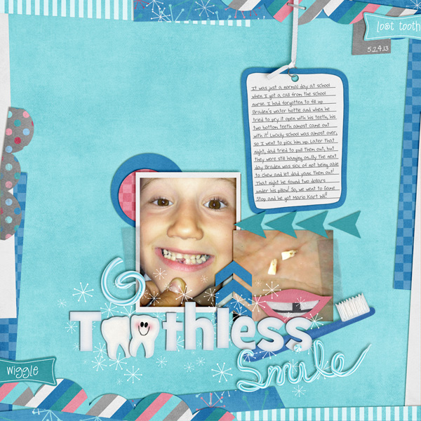
Kassie (kass_23) used Pearly Whites to create her layout. I like the wacky shape she used for her journaling. She definitely needing to adjust the lines to make that text line up.


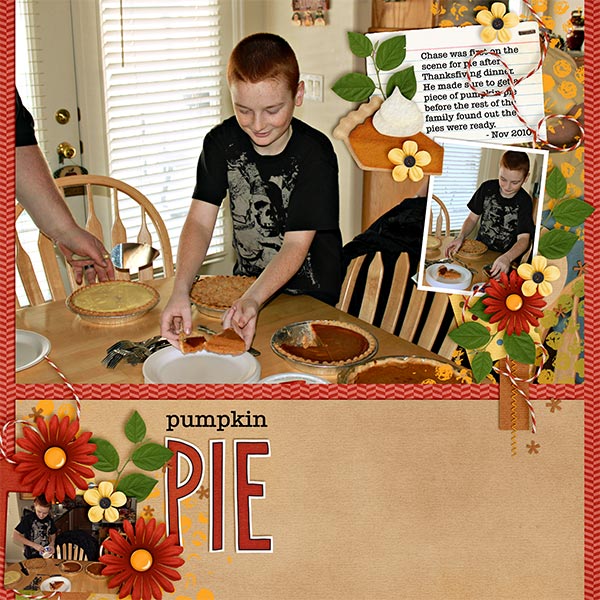
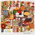
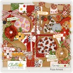
Next, Kayla (keepscrappin) used an index card for her journaling. I used the font – typewriter serial medium and set it to 12 pt with the leading set to 15 pt. This made it so the journaling would go between the lines on the recipe card. I also noted that I had rotated the recipe card -4 degrees when I placed it on my layout, so I could also rotate the text box -4 degrees and have the journaling text line up correctly. She used Taste of Home and Pasta & Pizza.

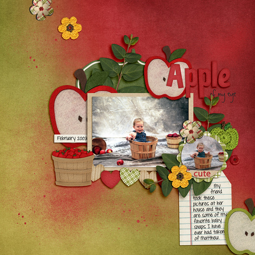
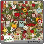
Finally, Leslie (lab130) shares her layout using Apple Of My Eye. Her instructions, Font: DJB Britany Print, size 12, leading 19.5 (you can drub the leading to get it just where you want it to be by manipulating the mouse right and left over the word “leading”)
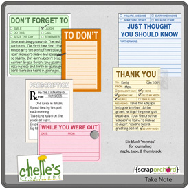
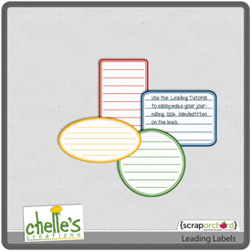
Want to try it out? Along with the tutorial, Chelle provides a couple of FREE items for you to use. Take Note & Leading Labels. Head on over to her blog and at the bottom of the tutorial you find these two images. They are already linked to the free downloads. Go for it.
Hugs!


 Hi! I'm Chelle: a 40 something mom of 7. My husband & I live in a rural community in the rocky mountains with our 4 children still at home. In the winters we enjoy sledding & snuggling by the fire. I the cool fall evenings we love relaxing around the campfire & meeting friends at the county fair. Admiring the stars


