Hello, digital scrapbooking fans and friends of Chelle’s Creations. Today the Creative Team has a few pages to share with you in which they have used 2 different alphas on a page. It’s fun to do, if you’ve never tried it, and the more contrast the better, it seems with some pages. Don’t be afraid to pull two totally different alphas onto your desktop to use on a page. You can pull from the colors in your photos, the textures on the page, or even the shapes of the theme of your page. Let’s take a look at some very inspirational pages.
First, Kimberly used the ever handy curled frames to make a custom layout without the need of a template. She chose different sizes, resized some, and even rotated them to give her page the snapshot-on-a-page look. She used alphas from Liberty and Play the Game for her title. For the word “Your” she used Janda Elegant Handwriting font and applied Chelle’s CU metal styles to make it look like an alpha or piece of word art. 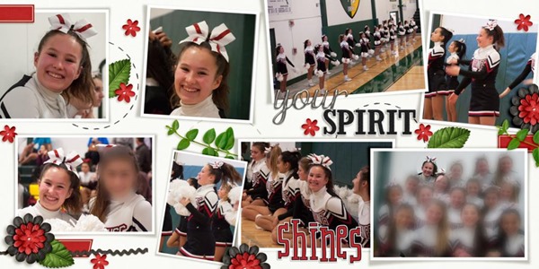
Next, Leslie used Hippity Hop Hop and the matching alpha for the majority of her page. It was a perfect kit choice since her pictures were from an Easter egg dyeing party. (The words “Dye Job” were made from a retired kit called Spic and Span). I love the blocked look, and the title made from evenly spaced alphas works perfectly in this style. Look how proud her little guy is of his egg! So cute. 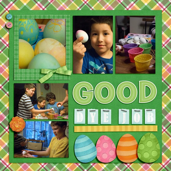
Next, Donna has used Hard Hat Required, one of Chelle’s newest kits for her page. Both of the alphas in her title came from the matching alpha set for the kit so they work marvelously together, of course. I love how she used the little construction worker in her title work. I often think Donna is the Queen of using a large photo for a background. Look how well that traffic line flows up through the page. I’m sure it was a frustrating experience, but she’s made a great page from it to record her memory.
Finally, Carol has used the Liberty kit and matching alphas on her page. Look how well her retro photo works with this kit! I love the way she sized one of the title words significantly smaller than the other, and the date tag hanging off the side of one of the letters is perfect. Carol, are you one of the cute young ladies in this picture? Adorable! ![]()
I hope you are inspired to mix and match your alphas. It adds texture and dimension to your page and just might be the emphasis you need.






 Hi! I'm Chelle: a 40 something mom of 7. My husband & I live in a rural community in the rocky mountains with our 4 children still at home. In the winters we enjoy sledding & snuggling by the fire. I the cool fall evenings we love relaxing around the campfire & meeting friends at the county fair. Admiring the stars