Hi Gals! Fonts make me giddy with excitement. They make me want to jump up and down. I don’t know exactly why, but I love ’em. I’m that person at Staples who buys the CD’s of fonts. I download them whenever I run across any new fonts. It’s hopeless I know! I’m a font-a-holic! If there were a 12-stop program, I would never get past step 1. LOL My personal favorite font is Janie HMK and a new one I found this year, St. Nicholas.
- Katie at The Daily Digi offered this list of great fonts for scrapbooking. She also had a posting for great fonts from the previous year, you can check them out here.
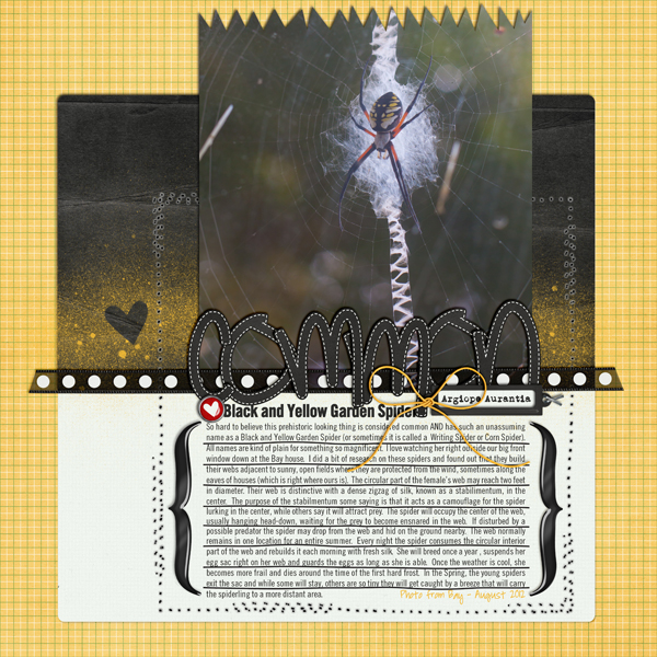
Our CT Ladies not only gave us inspiration LOs, they also gave us information about their fonts. Let me share them with you now.JennV (jennv): I have several favorite fonts to journal….I’ll admit I like a good somewhat plain font that is easy to read as I usually write LOTS of journaling. The font is I use the most often is SlimSans Serif (what I used here for the journaling). I also love the bold version of it that I used here as my subtitle. Two other fonts I use often are Pea Alisha…use this especially for journaling my dates, locations, etc. And I always love a good typewriter font and my current fave is L.C. Smith 5 Typewriter that I used here on the label. Here are the links for them if you need them.
- Slim Sans Serif, http://www.ffonts.net/SlimSansSerif.font
- Slim Sans Serif Bold, http://www.fontsner.com/font/SlimSan…old-32186.html
- L.C. Smith 5 Typewriter,http://www.dafont.com/l-c-smith-5-typewriter.font
- Pea Alisha, http://kevinandamanda.com/fonts/font…as/pea-alisha/
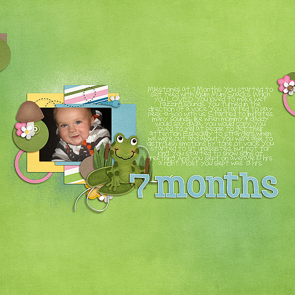
Moving on to Mel B (prettypeaches) and her favorites. I absolutely LOVE the font sf Natalie.. It was a freebie font that I found a few years ago.. Sadly its no longer available to download anymore, as the blog that I downloaded on, is no longer around  I used Toadally Bundle and Toadally Add-On for this LO.
- Lovely Little Snippets had a list of fonts including Pea Natalie that I think is very similar to ps Natalie. Check it out.
Mary (plumdumpling) blogged
- I love Slim Sans Serif like jennv. It’s such a great font to fit in a lot of journaling without looking too crowded.
- Some of my go to fonts are default fonts that come with many programs. I love Century Gothic for a simple, uncluttered look. For layouts that require a serif font, I usually go to Perpetua or Georgia.
- My favorite typewriter font is Rough Typewriter. http://www.dafont.com/rough-typewriter.font. It has an uneven baseline and if you double up on a letter, it has two options of the letter. Does that make sense? Like if I write look. The second o is filled in and looks different from the first one. Very fun.
- For kid layouts where my journaling is written from the child’s perspective, I like to use a childlike font. One favorite is WM2_NowWeAreSix. Link here: http://scraporchard.com/market/wm2-n…scrapbook.html
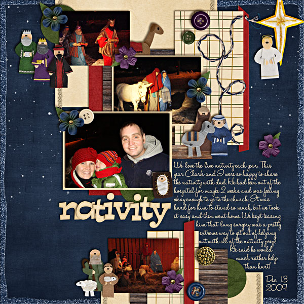
- Some favorite script fonts are Halo Handletter: http://www.dafont.com/halohandletter.font This LO uses Chelle’s O Come Let Us Adore Him Felties & the Kit.
Hope you all enjoyed the LO’s and the fonts.
Until next time, Hugs!




 Hi! I'm Chelle: a 40 something mom of 7. My husband & I live in a rural community in the rocky mountains with our 4 children still at home. In the winters we enjoy sledding & snuggling by the fire. I the cool fall evenings we love relaxing around the campfire & meeting friends at the county fair. Admiring the stars
