


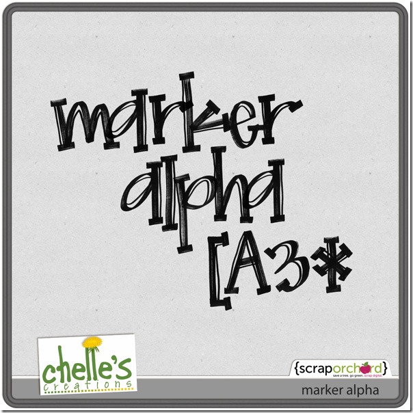
Hi all! It’s Cheryl again with another Scrap Skills post for you. Today, we are going to look at using paints or spritzes on our digital scrapbooking pages. Paint splatters can add a significant amount of texture to a page, and they certainly add interest and depth. But, a paint splatter added poorly can ruin a page, just like a paint splatter in real life, right? Once again, Chelle’s video tutorials can save the day. She has a tutorial here entitled Tweaking the Marker Alpha, and it is certainly perfect for her Marker Alpha. She describes how to achieve the effect of the marker “skipping” over the edge of a paper slightly as it would if you were to write with marker on your page. But watch it again, and this time keep in mind how you could apply the same techniques to a paint splatter because the same things happen to both in real life.
Here are some examples of pages created by members of Chelle’s Creative Team to highlight the use of paints and spritzes on a page. Melissa’s page has the paint spritzed behind the photo, so she didn’t need to worry about the effect of the paint crossing a paper boundary. She used the paint to add depth and color to the solid background and to highlight the blue colors on the page. It gives her page much more texture than it would have without the paint. 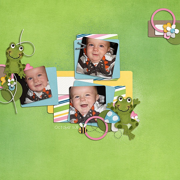 Next, Roxana used the paint similarly to Melissa, but in this case, she recolored some of the paints and she used them on a patterned paper background. This keeps the area adjacent to the photo from being too busy and distracting for the photos. She also adjusted the blending mode to allow some of the paper pattern to peek through the paint.
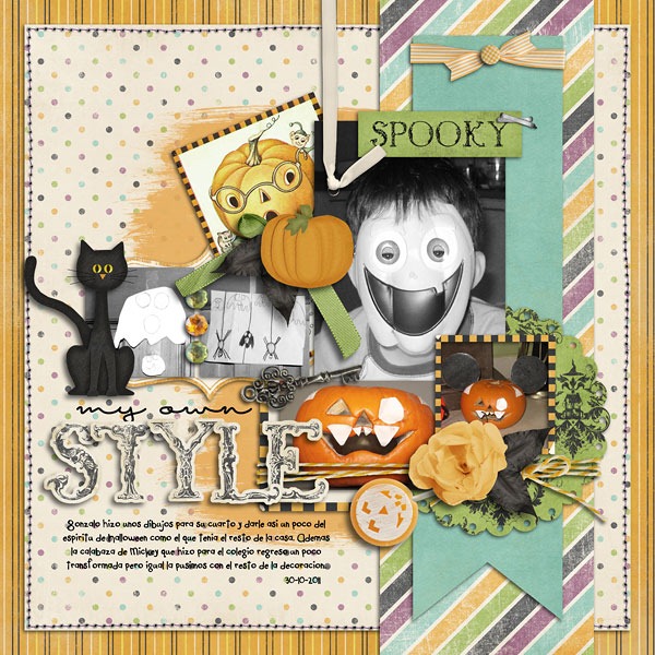 Finally, Shanell made a page for us, and she really went crazy with the paints. She used both the techniques shown above and the technique in the video tutorial. See if you can find all the paints on her page! But, notice how the green paint smear behind the title has a slight gap in it at the place where it crosses the brown paper edge. Notice also that she erased a thin stripe through the “Y” in the stamped word “You” where it was stamped on the edge of a digital paper. It is this attention to detail that makes her page seem like you could reach through your computer screen and feel its many textures.
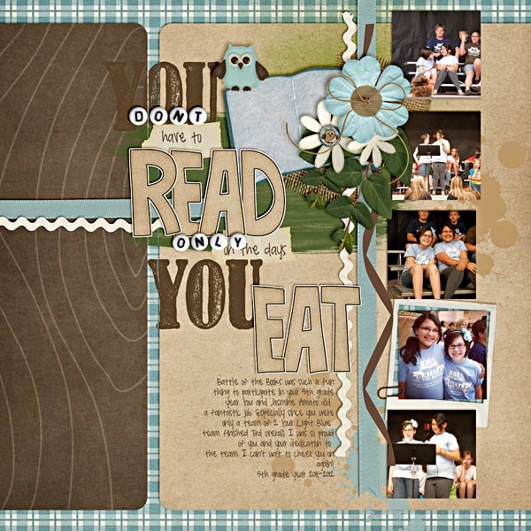
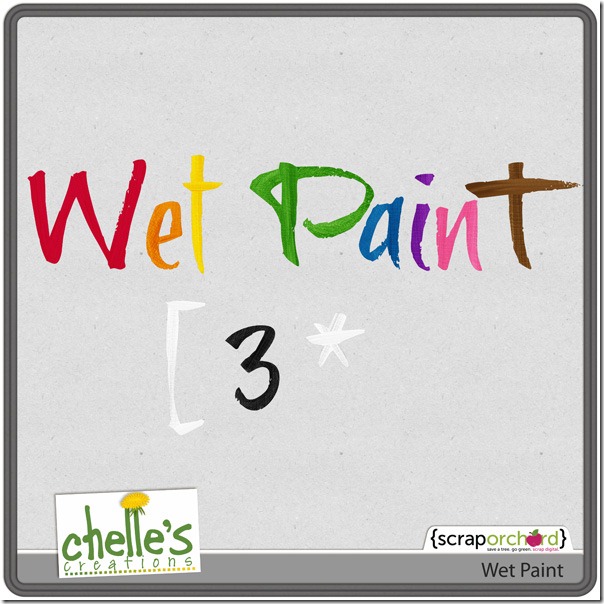
I hope you’ve been inspired to try to add this touch of realism to your layouts. Here’s a closer look at some of the items in the market so you can give this technique a try on your own pages. 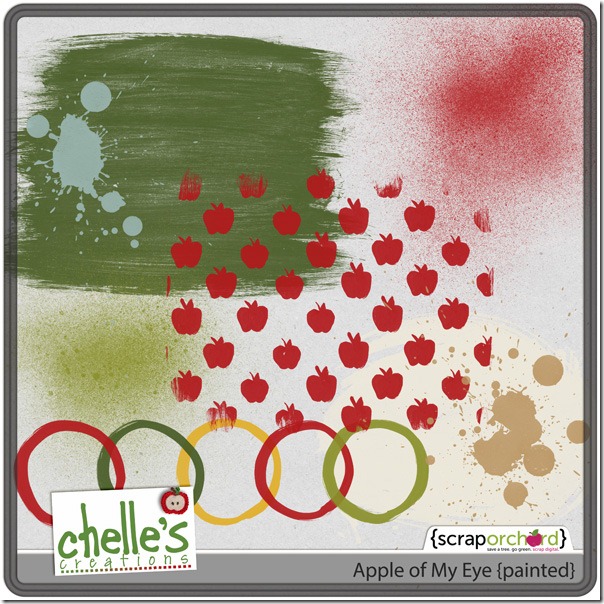


 Hi! I'm Chelle: a 40 something mom of 7. My husband & I live in a rural community in the rocky mountains with our 4 children still at home. In the winters we enjoy sledding & snuggling by the fire. I the cool fall evenings we love relaxing around the campfire & meeting friends at the county fair. Admiring the stars


