


Hey All, What is your goto font? Do you have a favorite for journaling?
Chelle has used the same font in her scrapbooking for many years. Recently she started using a new font for her journaling. When Chelle started scraping her font of choice was JH Kari. This font hasn’t been available for many years.
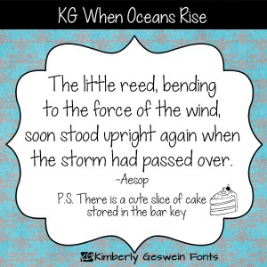
Earlier this year, she started transitioning her journaling font to When Ocean’s Rise by Kimberly Gershin. Click on the image if you want to learn more.
I asked Chelle what other fonts were some of her favorites? Here’s what she said.
For journaling: I love fonts with “character” lots of swirls and neat decorative elements, but the reality is, in blocks of text the most important feature is readability. I had a font of my handwriting made, but it’s hard to read. So a few years back I picked a font I loved: Pea Jay (from Fonts for Peas) But after I printed my first book I realized it wasn’t so easy to read in text blocks. So I adopted another “simpler font” JH Kari (no longer available). And I still use that font on layouts from 2013 and before. But beginning with 2014 I’m changing to KG When Oceans Rise. It’s even a little MORE simple = readable in text blocks.
Hugs!


 Hi! I'm Chelle: a 40 something mom of 7. My husband & I live in a rural community in the rocky mountains with our 4 children still at home. In the winters we enjoy sledding & snuggling by the fire. I the cool fall evenings we love relaxing around the campfire & meeting friends at the county fair. Admiring the stars


Thanks for the font names … love the fonts that Chelle uses!