


Hi Everyone! i’m Jenn, aka jk703 here this great Thursday! Hey… it beats Monday in my book!  Hope you are all having a great week and getting some scrapping in! There is so much you can do with your layouts, and so many new techniques that are out there to try! We often use alphas, and font on our layouts, as well as part of our journaling. Alphas help up spice up the titles and add a little more to the page than just a plain font. Fonts can be decorative, handwriting or even themed. So, let’s see what we can come up with today!
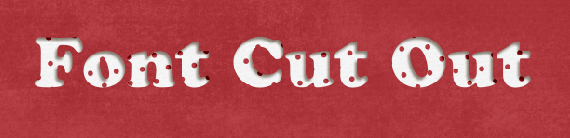
One that I like is the “Swiss Cheese” Technique. Today’s tutorial is a spin on that technique, by using the font as the “swiss cheese holes.” For my example, I used Chelle’s Happy Papers. This is just one great part of the Happy Collection of goodies – Papers, Brackets & Frames, Elements and a Alpha! Fun, and can be used for a perfect or magical day!
Step #1: Open some papers, and make sure to have at least 2 papers open in your workspace.

Step #2: Select the Text Tool from your Tool Menu. Then choose your font. Mine is Cooper Std. type in the words that you will cut out. Before the next step, make sure to put your words where you want them to be on your layout. You will not be able to move them easily later on. Here is what your layers will look like as of now.
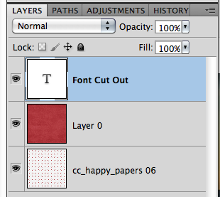
Step #3: Command (Control) + Click on the Font Thumbnail, and you will see marching ants all around the outside of your font.
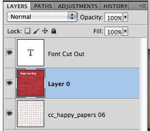
Step #4: With the marching ants still marching, select the topmost paper in the Layers Palette. This should be the paper that is your background, the one that will have the cut out. Press Command (Control) + Delete. This will delete the font’s shape from that paper.
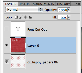
Step #5: Turn off the visibility of the Font Layer – Click on the Eye on the left side of the layer.
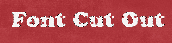
Step #6: Lastly, Command (Control) + D to stop the marching ants from marching. Add a shadow Style to the top paper layer. There you go – Swiss Cheesed Fonts.
Here are other fun techniques that you can do with fonts and Alphas.
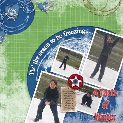
Ronnie (ronnie_texas) used a font for the main title “A Taste of Winter.” She then simplified the layer, clipped paper and merged layers. Lastly, she added a white stroke. The subtitle was also created using a font, adding an adjustment layer of white and once again, she added the white border using stroke to give it more impact.
Heather (snowdrop) also created a sticker look with the word Fairmount – it almost looks like it is a thick sticker and it might be raised with pop dots! Cool!

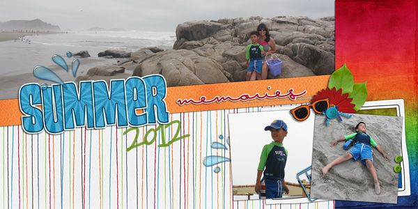
Roxana (roxanamdm) created this layout with such pop – and added some cool effects to her subtitle word. See the word memories – it looks almost like a puffy sticker to me! That is awesome!
This layout by Cara (colson) made a bright a fun layout with an awesome blend to boot! Check out that cool font that she stickerized (yes, my own term, lol) and then outlined! It really stands out!
Well…. lots to see and try on your layouts! Thanks for coming by and visiting – hope to see you again soon!


 Hi! I'm Chelle: a 40 something mom of 7. My husband & I live in a rural community in the rocky mountains with our 4 children still at home. In the winters we enjoy sledding & snuggling by the fire. I the cool fall evenings we love relaxing around the campfire & meeting friends at the county fair. Admiring the stars


