Tips: One Photo Layouts

Hi Everyone! Hope you are all enjoying this week! This is Jenn, jk703, and I’m loving how the week is flying by! I don’t want to wish my days away, but I always get excited for the weekend! A taste of freedom from the everyday!

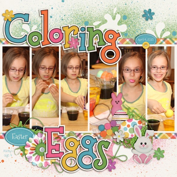
Today, I’m going to focus on Tips: One Photo Layouts, and how you can incorporate them into your layouts.

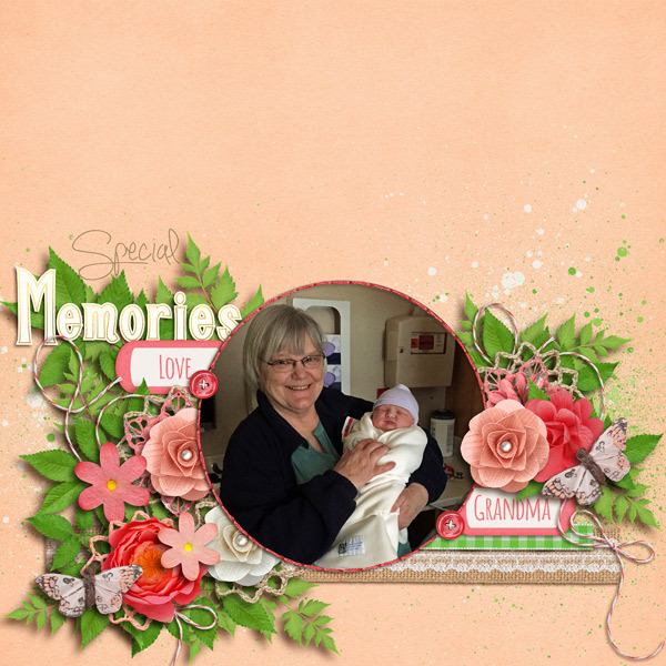
1. Use different shapes. Add a little fun to your layout by using different shapes for your photos. Using a shape brings more focus to your photo and really can make it pop on the page.

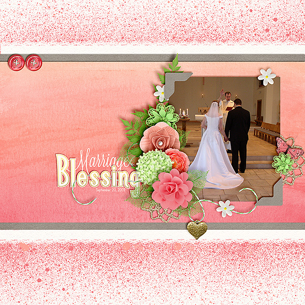
Jenny created this wonderful page using Creme de la Peche and a Fiddle Dee Dee Template. Jenny’s photo really stands out to me because of the white space on top, the colors and because it is the only photo. My mind wants to focus and see what is going on in the image. What a special moment captured.

GranVAubffMasquerade2_web


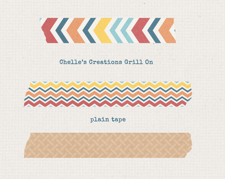
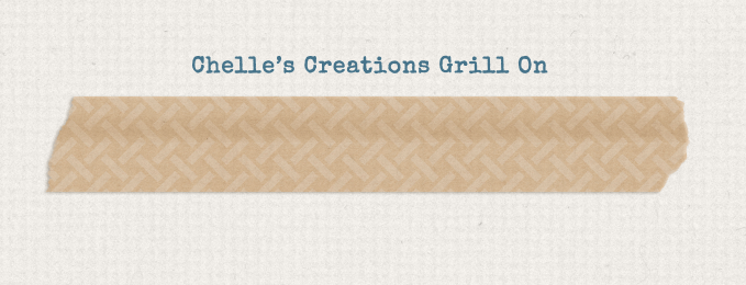
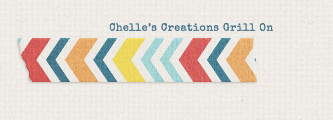
Here is a layout I created some time ago, but the shape of the picture draws me to the image. It’s irregularity. I used Chelle’s Get Your Grill On and a Scrapping with Liz template.

soswlrecyclechellegrillonjellybeansandsummertimeweb-1405911650kn48g


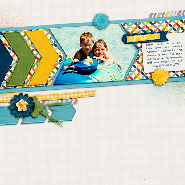
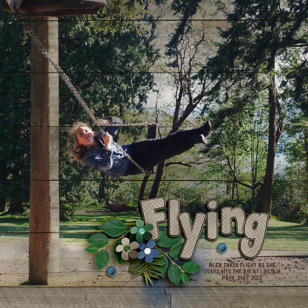
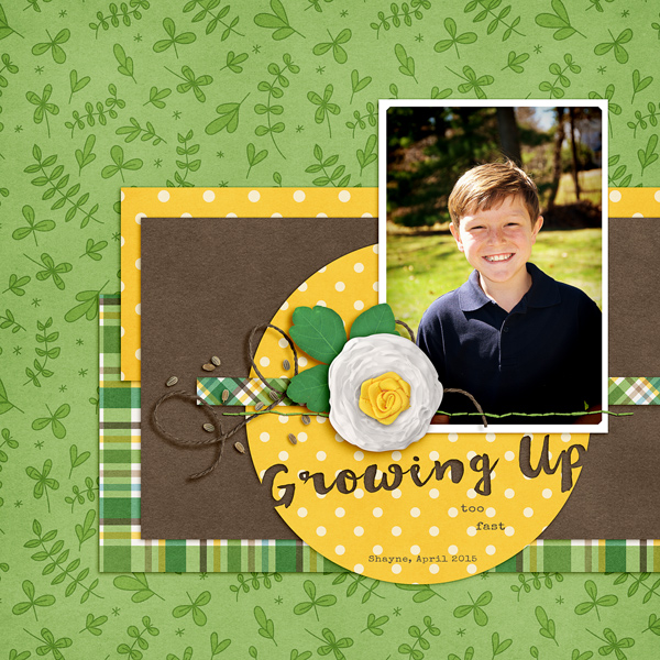
2. Make the Photo Bigger.  Keeping your photo on the larger side lets us see details we might not have noticed the first time around. A big photo can also really emphasize your subject, and reason for the layout. Sometimes covering the whole page or half of the page is a great technique for a one page layout!

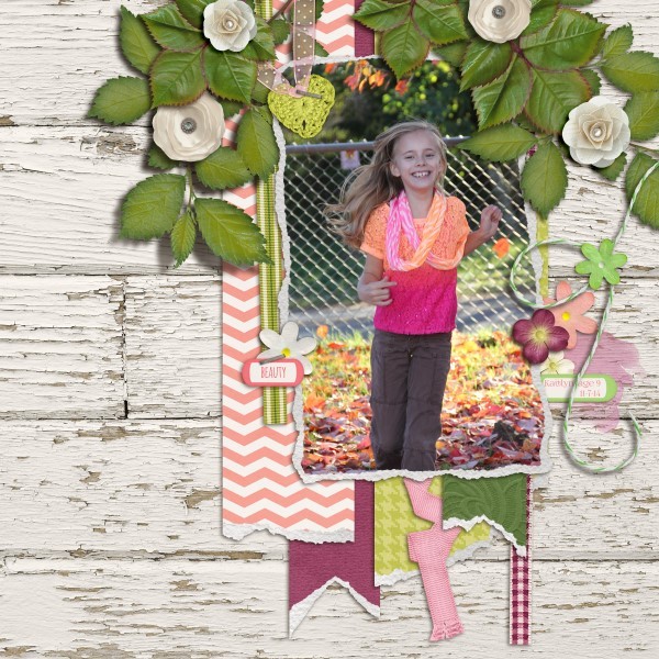
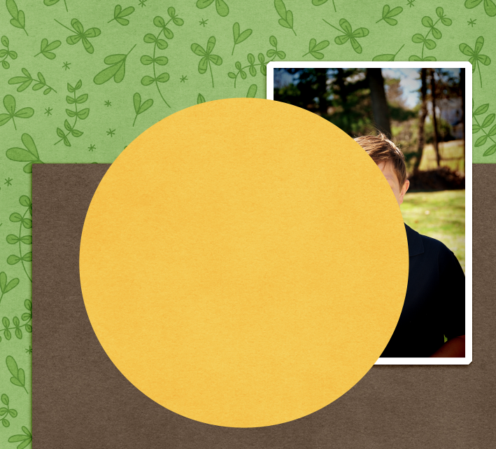
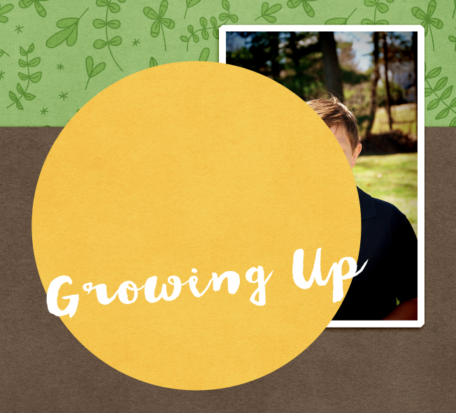
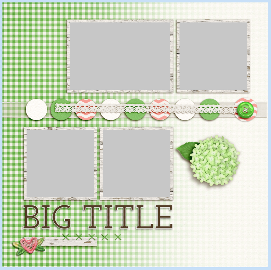
Helen created this perfectly spring page with a larger photo, and a tad off center. She used Green Thumb for her layout. Many times when I scrap with a larger photo, my picture is more of an action rather than a portrait like image. I think this works well for larger one photo layouts.

green-thumb

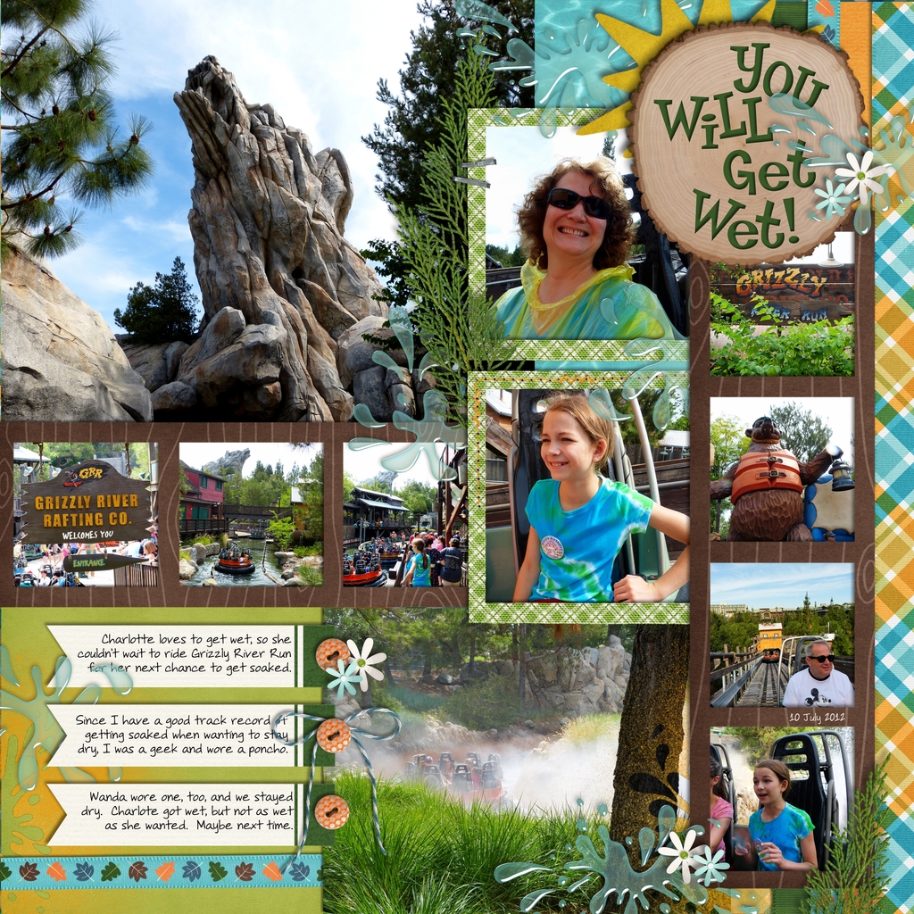
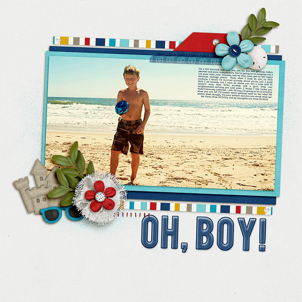
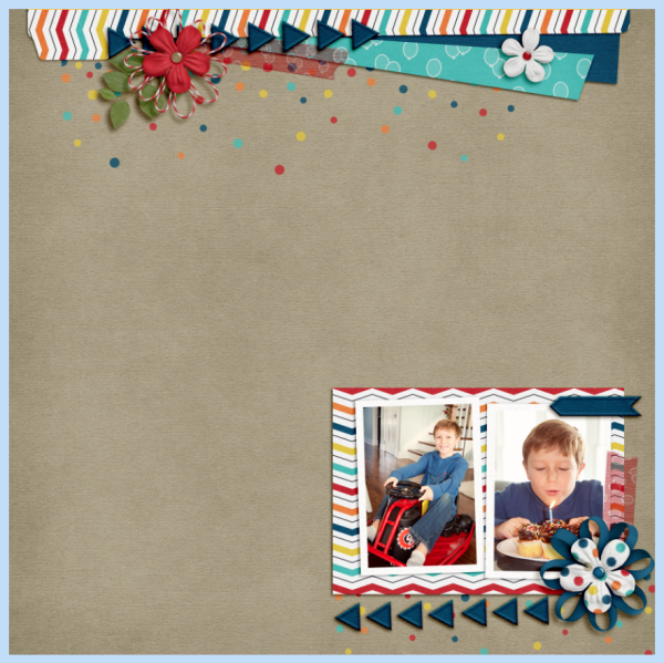
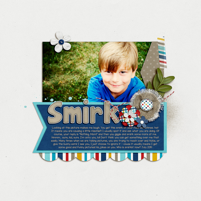
Here is one that I created of my son. He is trained well, and stopped really fast to smile for me. It wasn’t my intent. I was looking for an action shot of him on the beach playing football. The larger photo really shows the location, the weather, my son, and allows me to journal on it too! I used At The Beach and a template by Scrapping with Liz.


soswlfebcalendarccatbeachbebasspeceliteshayneweb-14233711878gk4n


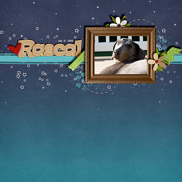
2A. Make the photo smaller. Yes, this tip works both ways. I think the combination of white space and openness are also great ways to keep you focused on the photo. A lot of space sometimes means that my eye will focus on the picture first. Keeping it clean and simple, really allows my eye to focus right to the photo.

Karen used Goodnight Teddy and Home for the Holidays (heart) to create this lovely page of her pup, Rascal! He looks so content basking in the sun! By leaving a lot of space and minimal elements, I focus on the photo.

rascalgoodnightteddy_600_zpstdd13nea.jpg~original


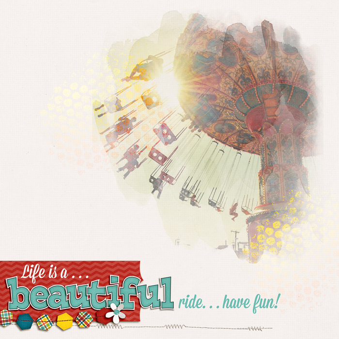
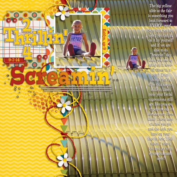
3. Blending. Sometimes a bit of a blend is a great way to use a photo on a page, without any other pictures. The technique as well as the photo, color, and subject can all bring the focus onto the image. Here is a layout I created by blending and painting my image onto the background. I used Roller Coasters and Cotton Candy for this layout.

soccrollercoastermissionscptpaintedridefunsingleweb-1411613010ngk84

4. Color.  Sometimes color can really change up a layout and change the focus. It depends on the papers you use, and what photo you are scrapping, but using color photos and black and white photos can totally change the tone of the page. Sometimes, emotion is felt based on the color or non-color of the photo.

Lisa created this wonderful page and left her photo full of color. I find this is perfect and adds to the layout – this layout also exudes happy from every layer! Just check out that smile! She used Creme de la Peche and Fleur de Violette.

5 Fleur amp Creme 600 x 600

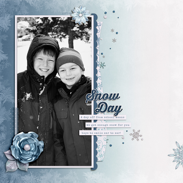
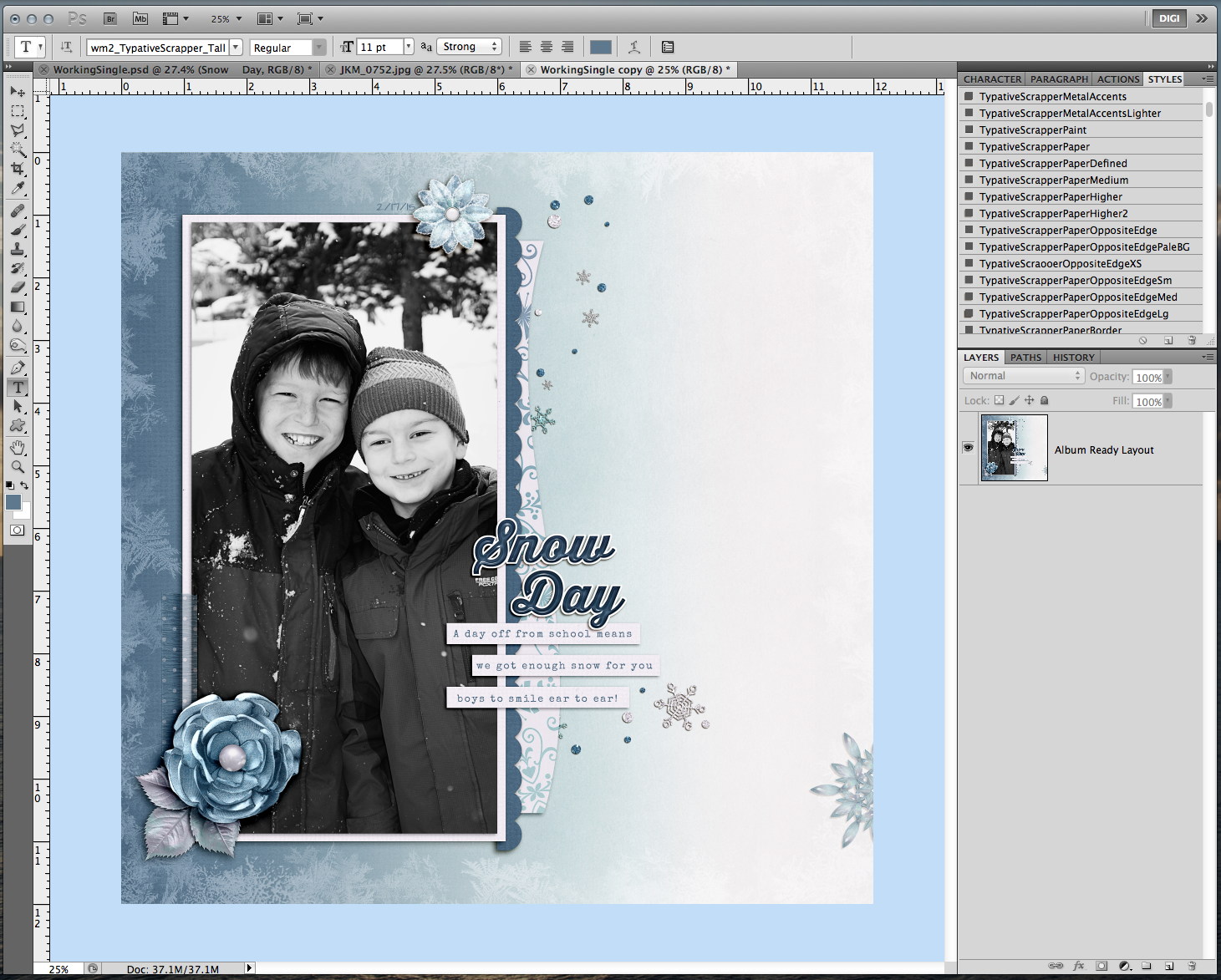
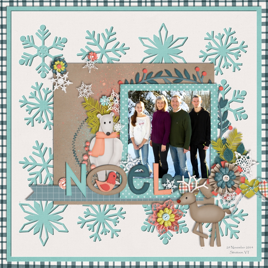
Now, opposite on the color spectrum is black and white. While I wanted to have a picture of my boys smiling, I wanted to convey the coldness of winter, how different it is from other parts of the year around here. Here is my page using Snowlandia and a Scrapping with Liz template.

socczigsnowlandiaswlssbthirstyboldsnwdyfeb-1425862886g48nk

5. Comfort. This one might explain why you scrap the way you do. Depending on what you are scrapping, who you are scrapping, and the particular event may cause you to scrap with one (or many) photo(s). If you are uncomfortable scrapping with one photo, then don’t force it. You many end up not liking the page, wasting that time, and become frustrated. Scrapping is a very personal experience. We all scrap differently, and we all have our own ways. No one way is better than the other.

A lot of scrappers are already one photo layout scrappers. Then there are a bunch of scrappers that have a need to have multiple photos. This was me. I was originally a paper scrapper, and that was how I made my layouts way back when. I now have a mix of layouts and double layouts that have one photo on a 12 x 12 layout. So, it’s ok to scrap how you like, but give yourself a chance to change things up every so often. You might like to break your stride, and mix up the action on your pages. :)

Remember, there is no wrong way to scrap!

Thanks for stopping by!

by_Jenn

Tutorial: Alphabet Fill In

Tutorial: Alphabet Fill In

Hi everyone! Can you believe it’s May?! Holy moly this year is flying by! This is Jenn, aka jk703, here today to share the Tutorial: Alphabet Fill Ins. This is a fun one that can really bring your layouts together! Plus, Chelle has awesome alphabets to fill in! 😛

First, for my example images, I’m using the newest kit – Green Thumb and the Green Thumb {Alpha}. Many of Chelle’s Alphabets will work for this tutorial, as long as they have a lined border. Let’s get to it!

First… Here is the alpha, in it’s original form. I spelled “alpha.” So original, right, lol! It works. :)

1

I have my alphabet letters lined up in my Layers Palette, and I added a shadow. Next, I will use the Magic Wand Tool. Here is what it looks like within the Tools.

2


Once you have the tool selected, you will want to choose the first letter of your alphabet in the Layers Palette. I have chosen my “a.” Now, click on the yellow part of the “a” within your workspace. You will get marching ants around the border of the yellow next to the black. Like this:


3

4


Once you have the marching ants, you will want to create a new layer ABOVE your alphabet. Do this by clicking on the square with a corner folded over. This will add a new, transparent layer above your letter. Here is mine…

5

Now, the marching ants are still marching, and your new layer selected in the Layers Palette. Press Command (Alt on PC) + Delete. This will fill in the alphas marching ants with the background color that you have chosen. Here is mine – white, and what my layer looks like after being filled in. You’ve created a mask. :)

6


7


Now, bring in any of your patterned papers, or a paper that really would work with your page. make sure it is above the new filled in alphabet layer. In my case, that is the white “a” layer. Then right click on the paper, and choose Create Clipping Mask. Here is mine:


8

Neat, right?! Now, you have to go back and do that for each letter. I know it seems tedious, but once you do it a couple times, it goes really fast. AND… the outcome is really cute. Here is a copy of my Layers Palette as I was working on this tutorial, and deciding on papers. I loved them all! You can layer paper after paper, but only the top one will show on the letter, unless you turn the layers “eye” off, so it is hidden.

9


Playing with the different patterns, I came up with these mixes and matches.  Super versatile for any layout, and using the same patterns that are in your kit. You can play with the size of the pattern by making the paper smaller, too!

9a 9b 9c


One more tidbit. With all these layers and papers in there, I might want to switch up the papers later. With that in mind, I leave all my layers unmarked and will group them for easy finding later. Highlight all your layers that have to do with the alphabet, masks, and patterns in the Layers Palette. Then click on the super tiny triangle on the top right corner of the Layers Palette. A menu will appear. Choose New Group from Layers.

9d


After you choose the New Group, you will then see all your layers put into a folder. Super neat, and easy to navigate. 9e


Super easy, fun, and very versatile to your page and favorite patterns. I think this Tutorial: Alphabet Fill In is really a great technique. Give it a try – I’d love to see your layouts. (Link me up – pretty please!!)

Carol helped me out and created this absolutely stunning layout using this technique. She used Chelle’s At the Park and Gone Fishin’ kits for this layout – just check out that big picture blend into the wood paper. It looks so perfect! Her alpha has a pattern clipped in, and uses a little bit of embossing to the layer also. I think it is a beautiful page!

Flying-Alex at Lincoln park 2015_zpsrsefgqvp

Thanks for visiting, and I hope you learned another technique to personalize your pages, give you some versatility, as well as stretch your stash just a smidge!

by_Jenn


Tutorial: DIY Circle Elements

Tutorial: DIY Circle Elements

Hi Everyone! Are you ready for iNSD weekend?! It’s so exciting… so much to see, do, and join in on! I (Jenn/jk703) won’t take up too much of your time here, but this Tutorial: DIY Circle Elements is a fun way to add a little fun to your layouts. Here is my final layout, and I’m going to show you how to make that circle with the writing. I’ve used some of Chelle’s Farmer Market releases – Green Thumb – WOOT! Check out her STORE to see what is available for $1 – Farmer’s Market!

SO_CCGreenThumb_WanderlustSpecElite_ShayneApr2015Growing_WEB


First, I used the shape tool to make my circle. Before we start, be sure to Rasterize your shape, if needed. You might get stick at some point. If you do, and your shape isn’t rasterized, do it them. :)

Right now, I have chosen to leave it above my photo, but I will move it below later. It’s yellow… for now. :)

1

Here is my Layers Palette.
2

Next, I’ve chosen the Type Tool. I’ve used a font called Wanderlust. Any scripty, thicker font will look nice with this method. You can try Pacifico or Thirsty Script. I believe both have free versions. I’ve typed it and the layer is above my circle.

3

After my type was good, I used the move tool to tilt my letters a little. I also made sure that my letters overlapped the edge of the circle a little bit. This way, when I cut them out, I will cut a part of the edge off.

4

For the next step, you will have the text selected in the Layers Palette, and double click on the thumbnail. You will get marching ants around the letters on your layout.

5

After you have the marching ants, turn off your Type Layer. This is what your type should look like on your layout.

6

Now, you will choose the shape, and press delete. You will see where the marching ants was, the paper/shape inside will be deleted. Here is what mine looks like. Press D to remove the marching ants. Add a shadow style, and you are done.

Note – when you move the shape, paper and type, be sure to lock the layers together, so that they move together. In case you need to make changes for later on edits.

8

Now, I’ve tried out a couple of other paper layers and ended up with the yellow polka dot. Here is my final layout. Easy DIY Circle Elements. You can even add styles to them to make them look letterpresses, or acrylic!

SO_CCGreenThumb_WanderlustSpecElite_ShayneApr2015Growing_WEB

Hope you enjoyed this tutorial. Have fun during iNSD! Get all you can for the $1 Farmer’s Market!

by_Jenn

Tutorial: Stenciling

Tutorial: Stenciling

Hi Everyone! It’s Jenn, aka jk703, here to bring you another tutorial! A lot of times I try to recreate what I can create on a paper layout! One thing that I always liked was paint and splatter…. but then I also liked the opposite. What is the opposite? Today’s post – Tutorial: Stenciling! :)

For my layout, I’ve used Chelle’s newest delight – Creme de la Peche! It is a gorgeous kit… but make sure you give it a chance, it is very versatile. I’ve used it today on a spring layout of my boys! My layout also uses a template by Scrapping with Liz, and the fonts – Special Elite and Wanderlust. Here is my final image: SO_Swl_Rcyclb36_CC_CremePeche_Wanderlust_SpecElite_FinSpring_Apr2015_WEB

Start out with your blank page (by blank – I mean paint-less, lol!):
Screen Shot 2015-04-06 at 8.37.54 PM

Add your paint – I have 3 layers here.
Screen Shot 2015-04-06 at 8.40.17 PM
Next, you will place your shape above the paint. I’ve chosen leaves. Here are my two leaves layers, and my 3 paint layers:
Screen Shot 2015-04-06 at 8.42.45 PM


Next, you will choose one of your leaves. Double click on the thumbnail image, and you will get marching ants around the shape. Now, On EACH paint layer, click on the layer and delete. The paint within the shape will be taken out. Do this for each shape you have, as I had to do it for each leaf, on each layer of paint.

Screen Shot 2015-04-06 at 8.42.30 PM


Once you are done deleting paint, turn off your shape layers. And my page after deleted paint, and turned off leave layers:
Screen Shot 2015-04-06 at 8.43.16 PM

That’s it!! :)

Really. That’s all that you have to do to mimic a stencil. You can do this with flowers, doily, and so much more. Here are some layouts the CT came up with for stenciling.

Karen made this lovely creation! Just look at the lacy edgers – perfect stenciling. :) Plus, I really like the mixed font and alpha title work. She used Creme de la Peche and SWL template Recyclables 29.

cremedelapeche_600


Lisa used Bunny Hop. She used the splashes and eggs to make her stenciling! Look at that line of pictures. My favorite is the candid silly one!

4 Assign1 Bunny Hop Stencil 600 x 600

Jan made this super fun page from the Grizzly River Rafting Co. Ride – perfect for the water splash out of the spray – put on top of the bottom photo and behind the journaling tags. She used In the Forest and In The Pool, plus a retired Little Green Frog Designs template.

grr2

This Tutorial: Stenciling doesn’t have to be messy, and you will love the results! Give it a try.

Thanks for visiting and hoping to see layouts using this technique.

by_Jenn


Busy Background Journaling

Busy Background Journaling

Hi Everyone! This is Jenn, jk703, here with a fun and easy tutorial for your journaling! I’m here today to share Busy Background Journaling… or Not So Busy Background Journaling! :) Don’t groan yet! I get it, journaling is hard for some, easy for others, but if you put the effort in, you want to be able to use the papers you like, AND read your journaling! Right?!

For my layout, I’ve used Chelle’s Doctor’s Orders, Chelle’s CU Watercolor Brushes, a Scrapping with Liz March In Review template, and the font Special Elite. I’m super addicted to this font, and have used it since January on almost every layout. I’ve never done that before.

Method #1

I’m working on this page. You can see my grey spots over on the right. That will be where my journaling will go. I’ve used the water color brushes (two of them), and lined them up how I like.

Brush1

And my Layer’s Palette:

Brush2

Next, I merged them together. This way, they become one watercolor shape/spot.

Brush3

Next, I brought in a solid paper, that matched my background paper with the swirled circles. (Say that 10 times fast!) This paper is above the watercolor shape.

Brush4

Next, I will clip my paper to the Watercolor paint. Just have the paper selected in the Layers Palette, right click and choose Create Clipping Mask. Like this:

Brush5

Once you clip the mask, it may or may not show up a lot if you’ve used the same color as the pattern paper. That’s ok and normal. Just like mine, right now. :)

Brush6

So, here is a quick fix. First, select the watercolor brushes layer, and go through each of the Blend Modes to see if any will work for your journaling needs. They did not for me. That’s ok. Select the watercolor layer, and the paper layer, and DUPLICATE them. That’s right. Duplicate – once selected, right click and choose Duplicate. Then your Layers Palette will look like mine below. The watercolor part has darkened the white swirls, just a bit more.

Brush7

And my duplicated watercolor spots.

Brush8

Here is what my final layout looks like. Even with the small size, you can see more journaling than paper where I’ve used the watercolor brush, and paper.

Brush9

Method #2

I’ve got one more trick up my sleeve. This one is super easy, especially if you don’t have a solid paper in a specific color! Again, I’m working on my layout. I’ve used the Marquee Tool, and drawn a box where I’d like my journaling to be. You should see marching ants.

Feather1

Next, you will change your Background Color to the color you want to be prominent for your layout. In my case, I want a darker color to cover the light white swirls. So, I choose the solid teal. Here is my background Colors.

Feather2

Your marching ants are still marching at this point. Next, you will create a new layer on top of the background paper (or right where you want your journaling to be. This layer can be moved later if you need. With that new layer selected, and your marching ants marching, you will choose Select > Modify > Feather. Feathering is expanding the edges of the selection, but more of a blend will occur as the edge moves away from the center.

Feather3

A pop up will appear. I chose to feather by 30 pixels.

Feather4

After you click ok, you will then press Command + Delete (Alt plus Delete on PC) and you will fill in the selection with the Background Color. See below. A filled in area that does not have distinct edges or really a total square-ness.

Feather5

To make this seem less solid, all you have to do is play with the Blend Mode, and the Fill or Opacity. For my example, I chose Darken and a 68% Fill.

Feather7

Feather6

That’s it. Not too hard, and a super fun way to use all those wonderful backgrounds on your pages, but still allows room for readable journaling. :) Here is my final layout:

SO_SwlMarchReview_CCDocOrders_SpecElite_SmuggsStart_Jul2014_WEBDbl

SO_SwlMarchReview_CCDocOrders_SpecElite_SmuggsStart_Jul2014_WEBLeft

SO_SwlMarchReview_CCDocOrders_SpecElite_SmuggsStart_Jul2014_WEBRght

There are loads of ways you can journal on busy backgrounds. Journal cards, words strips, paper pieces, tags, or even darken and make your font bold.

Karen (zippyoh) used Doctor’s Orders too, and the Artsy Journal Templates by Scrapping with Liz. She used the word strips to journal for her layout.

doctorsorders2014_600

Thanks for visiting! Hope these techniques will get you using a bit more of those fun patterns that Chelle makes!

by_Jenn

Save For Web

Save For Web

Hi Everyone! This is Jenn, jk703, here back for another blog post today! I’m here to share how I easily share my layouts after they are completed by using photoshop to Save for Web. Photoshop makes it pretty easy, and I’ve been doing this version for a few years now.

For my example and layout, I’ve used the collab, Snowlandia by Chelle’s Creations and Ziggle Designs. My font is Special Elite, and my title was a free version of Thirsty Script. I’m also using a template that has been modified from Scrapping with Liz.

I’ve finished my layout, and I’ve saved the layout for my Album. Now, I’m going to save for web version. Here is what my working space looks like in Photoshop.

Save1

Next, under the File menu, you will choose the Save for Web and Devices option.

Save2

When I complete a layout and save it for my Albums, it is full size. I leave it as is, and after I choose the Save for Web and Devices option, I get a warning pop up. The warning does advise that it may run slow, and have errors. BUT, this error has only ever occurred 1 time when I completed this step, and since I have the album copy saved, I never worried about it. I’m also a bit lazy, and just go for the save for web and save myself a few steps. Here is what the error looks like:

Save3

ALTERNATE WAY: If that warning scares you, then before you choose the Save for Web option, you can resize your layout by choosing Image > Image Size. Then when the pop up appears, change your layout to 6 inches by 6 inches or 1800 pixels x 1800 pixels. Then the warning will not occur. All other steps remain the same.

So, once you have chosen Save for Web, a large pop up screen will appear. It will look like this.

Save4

On the right side, about halfway down, there is a Image Size option box. You will enter the size to be whatever size you require. Most galleries are 600 x 600, some are 700 x 700, 800 x 800 and even 900 x 900. Enter in that size, and keep the constraints locked. Once you hit enter, your image will shrink down.

Save5

Save6Next, on the image, in the top you have choices for how you want to save. For the web, mine is set to JPEG, and it is also set to Very High, and Optimized. Save7b

After you have JPEG selected, you will click on that SUPER SMALL itty bitty arrow that is to the right of “Unnamed.” A menu will appear, and you will choose Optimize to File Size.

Save7a

Once, you click on that, you will then enter the number that you want the file to be – size wise. 😛 I’ve put mine to 249, just so it doesn’t cause issues if a gallery has a 250kb limit.

Save8

Click OK, and then click Save on the bottom of the Save for Web screen. Save your layout, and then you’re ready to upload to most galleries. Here is the layout that I was working on – perfectly sized, and ready to go for the Web:

SO_CCZig_Snowlandia_Swl_S&SB_ThirstyBold_SnwDyFeb2015

Thanks for visiting today! Have a great week!

by_Jenn

Washi Tape Shadowing Techniques

Washi Tape Shadowing Techniques

Washi tape is super fun, and a great little embellishment to have in your stash! This is Jenn, aka jk703, here to bring you Washi Tape Shadowing Techniques today. There are a lot of way to shadow, and we all have our little quirks, so hopefully one of these might work for you and your layouts!

Shadowing washi tape is a little tricky, but it doesn’t have to be. Washi tape is a fun element, to tack items down, use as a journaling/date location, and even as a border with multiple pieces across a whole edge on a layout. Once you use it, you will be “stuck” wanting to use it over and over again! :) Here are a few ways we can shadow washi tapes.

Here are the tapes that I have used for my examples. They are a part of Grill On. Plain Tape

Tape1

Tape with Shadows – layered for you to see how they might look stacked.
Tape2

#1 Easy Peasy

Tap3

You start out with a piece of washi tape. First, you will want to make another (duplicate) copy of the original tape – right click, and choose duplicate. For this shadowing technique, I’ve added a shadow (mine are 45* – down and to the left) to the lower of the two copies. I have a distance of 4 and a size of 5. I lowered the opacity to 74, and used the Linear Burn Blend Mode. Tape3a

The bottom layer tape has a blend mode of Overlay, and a Fill of 34%.

Tape3b

The top layer of tape has a Normal Blend Mode, and is at 51% opacity.
Tape3c

See, that wasn’t so hard! Next up, we will try something else – adding a little depth over paper. Oooooohhhhh…. 😛


#2 A Little Burn Won’t Hurt
Here is what my finished tape looks like stand alone. I’ve made it appear as if part of the tape has a higher lift on the top portion. This will be layered onto another piece of paper. If you look above, you will see this on top of another tape layer too. It will appear as if the edge of the underlying paper has put an edge into the tape.
Tape4

For this shadowing process, you will want to have two duplicate copies of the tape layer. With the bottom one selected, I’ve set my shadows to Linear Burn, 40% opacity, Distance of 4 and a size of 5.
Tape4a

My bottom layer has a Normal Blend Mode, and a Fill of 70%
Tape4b

The top layer of tape has a Soft Light Blend Mode, with a fill of 50%.
Tape4c

Next, with the bottom layer of the tape selected in the Layers Pallette, you will choose the Polygonal Lasso Tool. You will use this tool around to make a box around the tape portion that is OVERLAPPING something – a piece of paper, or a photo, whatever the tape is overlapping. Once your box is made, you will get marching ants.
Tape4d

Now, click on the Burn Tool. It’s the one that sort of looks like the fingers/hand are making a circle.

Tape4e

Now, my settings are at 65 size, Exposure 30%, and Protect Tones is checked.
Tape4f

At this point you should still have marching ants on the bottom layer of tape. With the Burn tool, brush over the bottom edge of the marching ants – where your tape overlaps another paper/photo, etc. You should get a slight darkness added to this layer of tape. Almost like a crease.

No too bad, and looks especially good when using on top of paper layers. Makes it just a little more realistic with a darker bump where the overlap occurs.

#3 Textured Tape
This is a fun shadowing technique for washi tape. It adds a little dimension where you might not have realized you wanted it, lol!
Tape5

Make 3 copies of the tape for this shadowing technique. My piece of tape above has a Drop Shadow using Linear Burn, 34% opacity, Distance of 5 and a Size of 10.
Tape5a

THEN, it also has a Inner Shadow using a Multiply Blend Mode at 41%, and a Distance of 9.
Tape5b

THEN on top of that, I have a Bevel and Emboss – Texture added! My Scale is 101%, and my Depth is 100%.
Tape5c

See that little triangle pointing down on the right of the pattern box? Click that, and choose a pattern that you like. I’ve chose Wax Crayon on Sketch Pad.
Tape5d

Bottom layer of tape is set to Linear Burn, with 50% opacity.
Tape5e

Middle layer of tape is set to Overlay, and 49% opacity.
Tape5f

Top layer of tape is also set to Overlay, and has a 51% opacity.Tape5gThere you go – a textured, fun, washi tape.

Jenn (jennschultz) created this fun page using tape from See Clearly Now. She tacks down her picture and the eye chart with it. :)

new glasses

Hope you learned something new with Washi Tape Shadowing Techniques. There are so many ways to shadow things in PS/PSE. Make sure you like what you have, and play with the blend modes. They can make or break the coloring. Have fun! Thanks for stopping by today! See you next time.

by_Jenn

Stop The Crop!

Hi Everyone! It’s Jenn, jk703, here. Did I get your attention!? By me telling you to Stop the Crop isn’t referring to actually stopping your scrapping, but toward the cropping of your photos! :) We all scrap and the reason could be for many reasons – photos, creative outlet, recording our memories and sharing the stories. Sometimes, you can use the photo to give more information, or just as a backdrop for your journaling. Maybe you don’t have any space to journal, as you filled up your page with all photos!There may be times the story could also be in the surroundings in your photo.

Journaling on photos isn’t hard, but there are a few tips that might help you.

  • Make sure the font is legible on the photo. My thought is that you wouldn’t want to use a fancy script that will be hard to read on busy background photo.
  • Check the color, and change it to see what reads easier over the photo. Try changing the Blend Modes on the Type Layer.
  • Work with the space and shape of your photos. If your program allows, try using the Type Tool, and the Shape Tool to create Text Paths for your journaling.
  • When journaling on the photo, try to determine the best spot to journal. Sometimes you can journal on one spot, but then another it gets to hard to read. Choose wisely.
  • Lastly, to keep the surroundings visible, but to allow for journaling on a busy background, add a paper piece of vellum. You can then still see the image slightly, but your journaling will be easier to read.

Here are some examples that the CT created. Jenn created this YUMMY layout – using Pizza and Pasta Journal Cards, Pizza Amore and the alpha from Pasta La Feasta.  She added some journaling to the photo, used a typewriter font, and used a lighter font on her picture.

pizza

Lisa created this fun layout. She used Roller Coasters and Cotton Candy. Lisa also said that she made two layers of the text, one in white and one in black underneath, and she offset by 1 pixel down and 1 pixel to the left to give a shadowed appearance to make it easier to read.

2-5Assign1TextonPhoto600x600


Jan made a great layout about her trip to California! She used Get Your Grill On, with Gimmie Doubles Vol. 1 by Cluster Queen Creations. She added her journaling right on to her photos, and tried to place it in a location to make it easier to read.

loulous

Here is my page – I used Chelle’s At The Beach, and Scrapping with Liz’s 2016 Calendar Templates 2. I had originally had my journaling as a long column, but since there was a lot of dark and light pockets on the sand, I moved it only to the water and sky. Much more legible.

i-WcfWX9J-L

There you go. Stop the Crop and journal on your photos! Have a great week, and thanks for stopping by!

by_Jenn

Backwards Photo Blend

Backwards Photo Blend

Hi Everyone! This is Jenn (jk703) here, hoping you are all doing well on this wintry (for me) Thursday! We’ve got a smidge of snow on the ground, and it is so cold out! I’m home with a sick child, and it is nice not having to go out and about today! Today I’m going to show you how to make a blend, but backwards, lol! It’s super easy, and looks great!

For the Backwards Photo Blend tutorial, I’ve used Chelle’s One Year Older Kit, and some new products from Scrapping with Liz. They were a perfect match and I love how my layout turned out! Here is my layout so far… a little bit of fun, and a lot of open space. I love open space layouts, but I’m not always the best at them. Sometimes, I feel like I spend more time trying to work on a clean layout versus a bit of clustering. So, let’s fill that BIG open space with a picture.

Erase1

Next, I’ve pulled in a picture and for this image, it is above the paper. Just so I can see where I want the image, I’ve changed the blend mode for the time being. This way I can move the photo and see how it might look for the blend. This step is just for placement. After doing your photo moving, you will then put the image behind the background paper layer. (Remember, to change your image back to the Normal Blend Mode.)

Erase2

Here is my Layer’s Palette. Photo on the borrow, background paper and then all the papers and embellishments. These are not the originals, just “copies” of the kit pulled into Photoshop. You also want to have a duplicate image of your photo. Not the original. The reason for this is that this method of blending/masking could damage your original photo or papers.

Erase3

Next, I’ve selected the Eraser Tool.

Erase4

For my selections on the Eraser Tool, here is the sub menu. I’ve selected a large soft brush eraser, and a flow of 25%. I usually start low, and if I need more erased, I go over again, or adjust the flow higher.

Erase5

With my kraft background paper selected in the Layers Palette, I slowly click on where my son’s head is, to erase the paper. I click in a couple more spots, and after erasing, here is what my Backwards Photo Blend looks like. It is intended for him to look excited at the pictures of him, lol!

Erase6

Next, I add a title and my journaling and I’m good to go. Space filled, a bit a cluster, title and journaling. All done!

SO_CC_1YrOldr_SWLRcyc36&EdgrTmps_SpecialElite_ShayneCloud9Dec2014_WEB

Jenn (jennschultz) created a page using Chelle’s Rock the Vote and the Summertime mini kit! Perfect combination! She made a layout for a visit with Chip & Dale, and the backwards photo blend was done on the family picture!

chipanddaleleft

A super easy way to try out the Backwards Photo Blend – I hope you liked it! Can’t wait to see your creations using the technique! Have fun, and thanks for visiting!

by_Jenn

Flower Layering and Tips

Flower Layering and Tips

Hi everyone! Happy New Year! I’m excited to show you my post today. This is Jenn, jk703, here today to share some fun ideas and some awesome pages using Chelle’s Creations supplies. This is so easy, and I had so much fun. And I’m sure you can relate – I made my layout for the post, and it became my newest most favorite layout. Actually, many of my favorite layouts are using Chelle’s supplies. They make me and my pages happy!

Today, we are going to play with flowers – specifically Flower Layering and Tips. For my example images, I’ve used Chelle’s At the Beach kit, and the At the Park Kit. So versatile, and they work well together!

Let’s get to it! Flowers are *usually* included in kits, and there are always so many and in so many colors. I want to use them all sometimes, but that doesn’t always look right for me or my style. So, this is an alternative. Layer them up, change, twist and flip them to make them work for you.

Here is the start of my flower. A pretty bright red, with a shadow style and it looks nice!

Flowers1


Next, I’ve added the same flower but one that has a pattern on it, right on top. Then I used my Move Tool and twisted it a little bit. Still looks a bit unfinished, right?

Flowers2


Next, I added one of Chelle’s super awesome little paper flowers to the middle, and your shadow styles – and you get this little gem. Viola! A perfectly pretty layered flower. Isn’t it pretty? I just love it! (Yes, I’m a bit dorky, lol – sorry!).


Flowers3


What about other kinds of flowers that you see in her kits? They all work with this method. Here is a burlap flower with a buttoning the center. It looks nice, and that blue looks great on the white. How can we add to it? We layer it up!


Flowers4


Adding that same plaid flower layer from above, just squeeze it in between the white burlap and the button. Just give it a little oomph, more than just a button.

Flowers5


You could even layer up burlap flowers of different colors, and change out the button to a decorated bottle cap. Just remember to make the 2nd flower a bit smaller than the one in back, and add a shadow style.


Flowers6


Or, mix it up by adding the 2 burlap flower layers, the fabric flower layer and the button. Making layered flowers like this has infinite possibilities. You can stretch your stash another 100 flowers.

Flowers7


After I was done layering up and trying out all kinds of flowers, the ones above were my favorite mix. I made a layout and I LOVE it! For this layout, I also used one of Scrapping with Liz’s templates – New Year’s Templates. – which I modified a lot. Here’s my page:

SO_CC_AtBeachPark_SwlNewYrsTemps_MissKinder_SmirkJul2014_WEB


Flower Layering and Tips: 

Play and try out flowers you don’t think will work together. It might surprise you. I didn’t think the two burlap flowers above would look good, but with a little shrinkage and a twist, it came out pretty sharp looking.

Try bold patterns or shapes with classic colors. You might like the combination.

Give each layer a shadow style so that each layer of flower has some depth and definition. Shadow Styles make it look a bit more realistic. If you had flowers on your table and put them on top of one another, you would not have flat flowers. Neither should your layouts. :)

Try clustering your layered flowers. My layout above combines the flowers I made and then adds another little paper flower. It’s a boy page, but the colors and types of flowers means that it doesn’t come off as a girly page. The burlap flowers give a sturdy solid feeling.

For flowers, I work in groups of odd numbers – 1, 3, 5. Above, my layout uses 3 in a cluster, and then 1 above the photo. With you eye, you may go from the white top flower, down over the photo to the flower cluster, and then over to read the title. (At least, that is how my “eye” flows over the page, lol!)

The layered flowers adds visual interest to the layout, as well as depth and different texture. You that toward your advantage and allow those flowers to convey feelings. My page above is bright, fun, on the boyish side, and solid. I think my flowers convey that – they aren’t soft, dainty or pastel.

Try different centers for your flowers – Brads, Buttons, Beads, Coins, or any other embellishments that might fit. Even a metal asterisk from an alpha might work.


I had some lovely layouts submitted for Flower Layering and Tips post from my co-CT members. Here are their pages. What is funny is that they both picked Cozy Christmas for their pages! It must be because it’s so cold out, and everyone would love to be cozy and warm.

Jenn (jennshultz) created this  layout. She mixes up her flower layers with different types of flowers and lots of great colors – as well as adding shadow styles to give each flower it’s own depth. She also used the Cozy Christmas alpha that matches the kit. brrr-1


Jan (QuiltyMom) made the next chilly layouts with lots of snowflakes and flowers. Jan worked with the template by Down This Road Designs and worked the ideas into her flowers. She layered some flowers on snowflakes, and then layered more flowers on top – very clever. She alternated colors and added shadow styles. She also used CU Snowflakes for her layout. noel

There you go. Flower Layering and Tips to start off your layouts. Give it a try and I’d totally love to see what you create! Thanks for stopping by today and have fun scrapping!

by_Jenn