10.13 Tutorial: Mixed Edges

Hi Everyone!  It’s Jenn, aka jk703 here for today’s post.  It’s Thursday here, and almost Friday!  That just makes me one day closer to the weekend and a much happier person!  Today, I thought I would share a fun and new to me technique that I just recently learned.  We all love our digital scrapbooking papers, and Chelle sure has some awesome ones!  Here is a way to mix up the papers and get a cool effect for your backgrounds.

For today’s tutorial, I’ve used papers from Chelle’s All Hallow’s Eve kit.

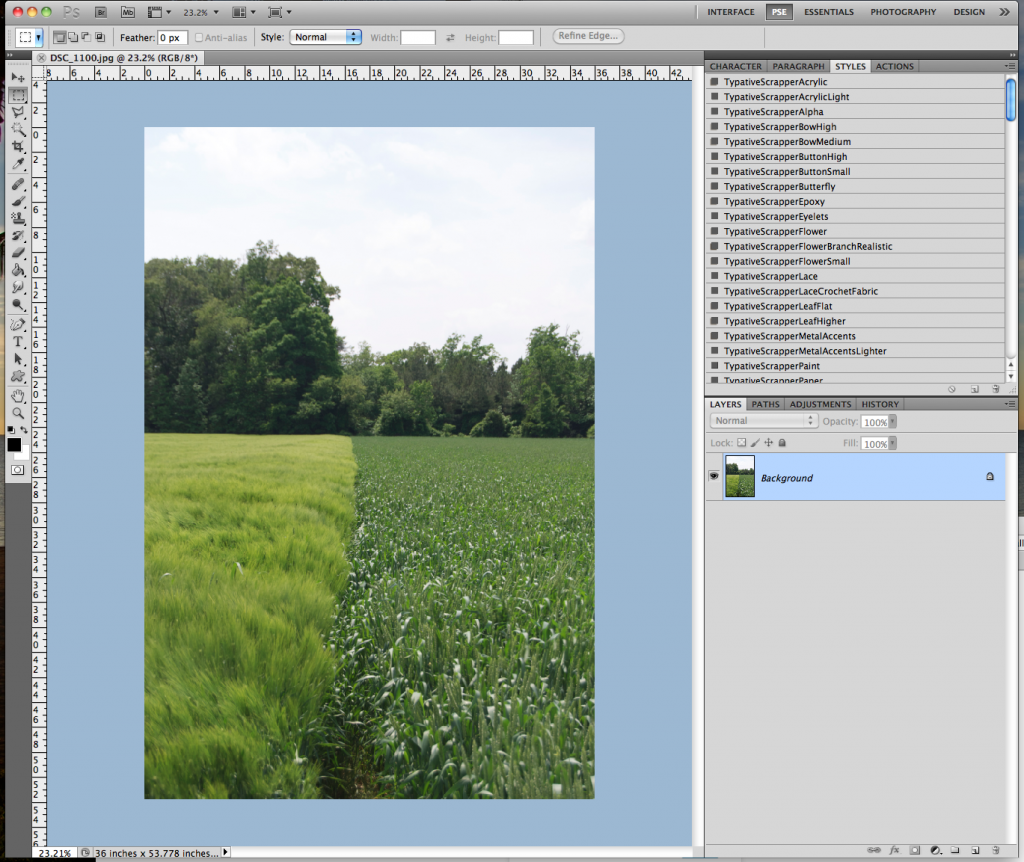
Step 1:  Open up a new document and then one of the background papers.

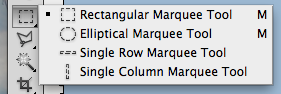
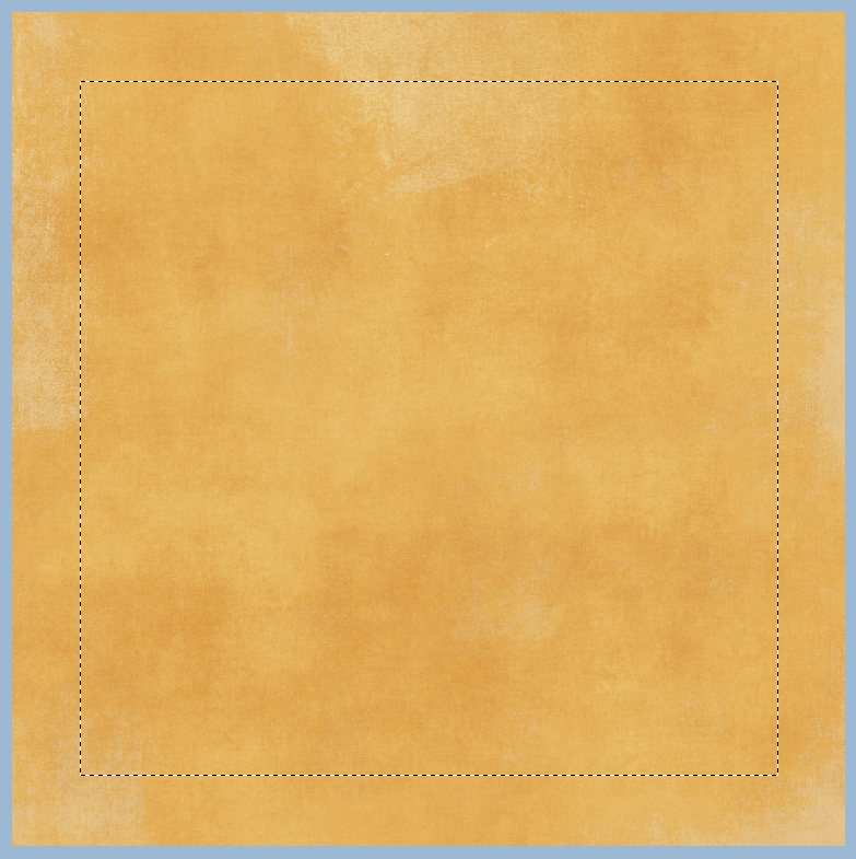
Step 2:  Using the Rectangular Marquee tool, select the area that you would like to have show a different background paper. This should leave a border on your paper with marching ants.  Here is the tool and my chosen selection.

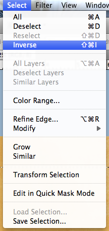
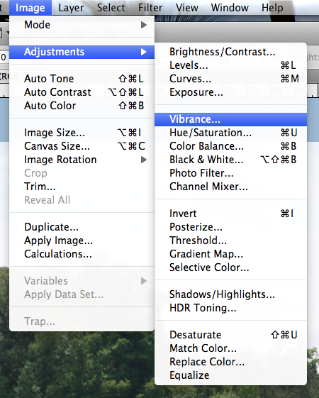
Step 3:  Click on Select > Inverse from the Menu Bar.  This will inverse the marching ants to the edge instead of the inner part of the background paper.

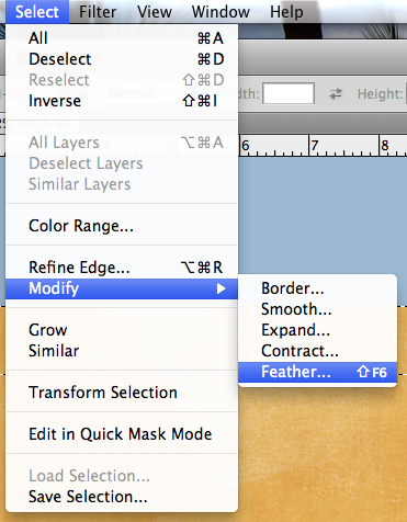
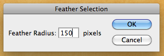
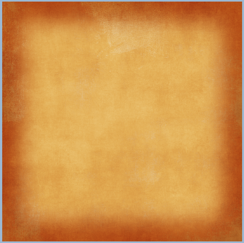
Step 4:  Next choose Select > Modify > Feather.  We are going to soften the edges on the selection.  A menu will pop up, and you can choose any value you like, but I found that it works nicely when between 100 and 250.  For my example, I chose 150.

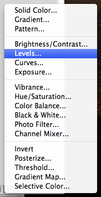
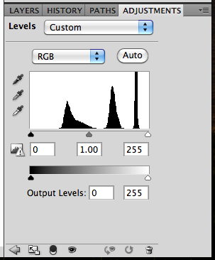
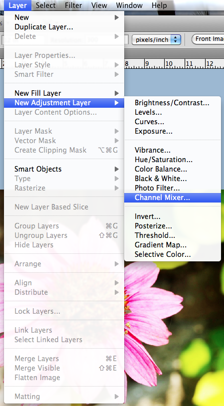
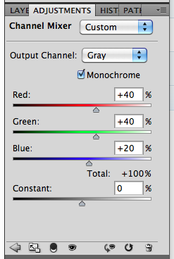
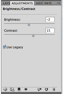
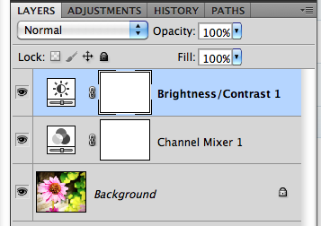
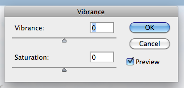
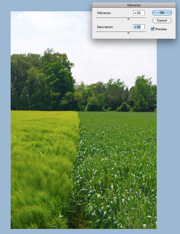
Step 5:  Next, you will clicl on the half black/white circle on the bottom of the Layers Palette. Choose Levels (or from the Menu Bar you can choose Image > Adjustments > Levels.)  When the adjustments menu appears, you will slide the middle GREY triangle toward the right.  You will see the paper change all on the selection.

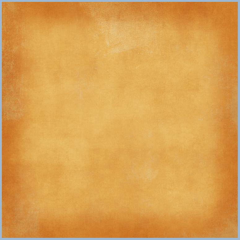
Here is what my plain background paper looks like after playing with the adjustment level.

Here is another version with the slider closer to the right (towards the white triangle).

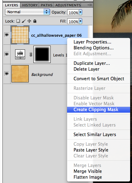
Step 7:  Now, to incorporate more background papers, you can layer them and clip them to the adjustment layer. After you have opened another background paper, make sure the layer is above the adjustment layer.  Next, right click and choose Create Clipping Mask.

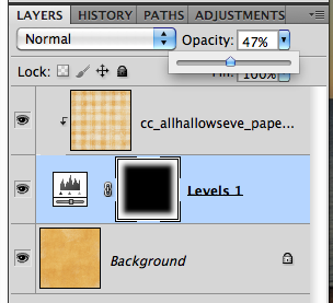
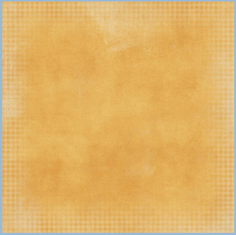
Step 8: Clip the paper, and then you can play with the opacity of the top background paper.  Here I’ve lowered mine to about 47%. And the final background.

Looks cool, right!  I can’t wait to incorporate this in my next layout! I was so excited to share this, that I didn’t get to scrap it, lol! Thanks for visiting today!  I hope this was a fun and interesting new technique. We hope you come back soon!


9.16 Tutoriial: EZ Black and White Photos

Hey Everyone!  It’s Friday!  Yay!  It’s Jenn, aka jk703, here to bring you today’s post.  I hope that you are ready for the weekend!  Today, I decided to make my post about a quick How-To for Black and White Photos.  The weekend will be a perfect time to try out this technique. It’s not too difficult and can really make your otherwise dull black and white photos pop!

Black and White, otherwise B&W, can be a way to create a striking photo and bring a lot of contrast to your digital scrapbooking layouts.  Here is my starting photo – a pretty flower I snapped while on vacation this summer. It is a very bright photo and I love the perspective.

Let’s say that I am making a layout also with bright colors in the papers and elements, but I really want to use this photo.  Instead of a too busy or too colorful page, I want to create a focal point on my layout.  To make the photo pop, I am going to make the photo B&W.

First, remember to save your image before completing your edits so you will always have the original photo if you ever needed it. Next, with the photo selected,  in the Menu Bar, click on Layer. Scroll down to New Layer Adjustment, and choose Channel Mixer.

The Adjustment Palette will pop up (mine is within my Layers Palette, just another tab).  You will see a few slidebars, and a small box that is for  Monochrome.  Click this box and make sure there is a check mark ticked.

Your photo will turn to an instant Black and White.  But wait… there’s more… Again, in the Menu Bar, click on Layer > New Adjustment Layer . Brighness/Contrast.  Here are the options available to you in this particular adjustment.

When you look at the Layers Palette, you will now see another new adjustment layer. By tweaking the contrast, your photo can become a little more sharper and really jump off the page.  Here is my after picture below.  See how the center of the flower is a little more focused and the edges of the shadows are just a tad deeper.

Here is my final Black and White Photo.

There you have it – an easy way to make a photo black and white!  Plus, the know-how to tweak the brightness and contrast to your own liking!  Enjoy your pictures and make them pop off the page!

Have a great weekend, and thank you for stopping by.  Come back soon!


Gallery Standouts | Digtal Scrapbooking Inspiration

Gallery Standouts | Digtal Scrapbooking Inspiration

Hey Everyone!  It’s Jenn, aka jk703 here to bring you this edition of Chelle’s Gallery Standouts!  There are tons of layouts in Chelle’s gallery but i get to peruse them, and choose a couple that rock her designs!  Let’s go!

Catching the Big One by jmljensen

A double page layout is one of my favorite ways to scrap!  I try to do this as much as possible – so to see someone else doing it too, makes me happy!  Look at those pictures and fantastic title work!  Great mix of papers and patterns too!

Next up is Dental Assisting by Britaneejean.

First, it is a photless layout!  Then, it is so fun with the toothpaste and painted title!  They look perfect together!  All the little ellies and scatters look perfectly placed!  Plus, reading about her and what she does is interesting – we all need to scrap about ourselves more often!

Here we have Hay by lab130… look at those photos!  Those are so interesting… and tall hay too!  :)  
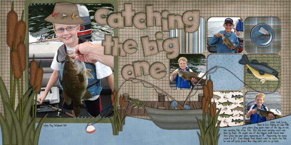
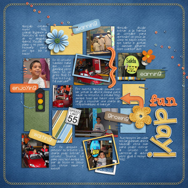
I love the mix of papers, design of the page and it looks like everyone had a great time!

Don’t forget to upload your layouts to Chelle’s Gallery over at Scrap Orchard, you never know – we might have to show off your page right here!

Thanks for visiting and be sure to come back!


8.26 Tutoriall: Vibrance

Hi Everyone!  Hope you are all having a great start to your weekend!  I’m Jenn (jk703) and I’m from NJ… right now, I have lots of grey skies, and rain on the way – including Hurricane Irene!  So, for my tip today, I’m going to share a little secret to adding a little vibrance to your photos QUICKLY.  We are always trying to do things faster, and that works with our scrapping too!  Here we go…
Here is my original picture opened in Photoshop. (I use CS 5)

Now, in the Menu Bar, I choose Image > Adjustments > Vibrance.

Next, a small pop up menu will appear.  It will have sliders marked Vibrance and Saturation.  Slowly move the sliders to the left and right. If you have the Preview box is checked off, you will be able to see the changes in your image as you are sliding the cursor.

I moved my sliders to the right, and increased the vibrance and saturation.  Play with them at different settings, and see what you like!  A quick and easy way to add a little pop to your photo.

Thanks for stopping by and checking out a quick tip!  Hope it added a little vibrance to your day!

Jenn (jk703/The Typative Scrapper)

Gallery Standouts | Digital Scrapbooking Inspiration

Hey Everyone!  It is Monday…. yes, another Monday… but it’s that fun time here on Chelle’s Creations Blog!  The time to show off some awesome layouts and Gallery Standouts!  WOOT!

OK… let’s get going.  I really love perusing the gallery and checking out pages that show-off kits in fun way.  Many times, I use a themed kit, but not in the themed way as it was intended for… so my first choice is Fun Day by Roxanamdm! A great, and perfectly titled fun layout that showcases a fun day, but also steps away from the kits themes that were used!  Love that!

Next up, I’ve chosen IKEA Cat by Hey Jude.  This was so cute to me, especially because the family pet wanted in on the action!  My grandmother’s cat *had* to be involved with unpacking every time something new arrived to the house!  It brought back some funny memories! Plus, check out the fun mix of patterns on the page.  Looks fantastic!

One last layout… especially since school is starting!  I love to take the first day of school pictures and this layout, First Day of School by Kirstiegai is a great layout showing the excitement of going back to school!  But the cute computer and fun journaling and an awesome picture make a wonderful layout! 

There you go… so wonderful layouts chosen from Chelle’s gallery over as Scrap Orchard.  Remember, to upload your laouts there – you might find your layout chosen for the GSO post!  Just upload them HERE!

Enjoy your day – and Thanks for visiting!

Jenn (jk703/The Typative Scrapper)