Tutorial: Adding Warmth to Photos

Tutorial: Adding Warmth to Photos

Happy 4th of July to all those who celebrate! Hi Everyone – it’s Jenn, aka jk703 here with a quick tutorial!  So much is going on, so I won’t keep you for long. Adding warmth to photos are super easy to do… and can really make a cooler photo look nice and warm with a sunny feel. Sometimes shadows, clouds, and skin tone will look a bit blue… so this will help you change it a little. This little tutorial can also be done for many other color changes for photos.

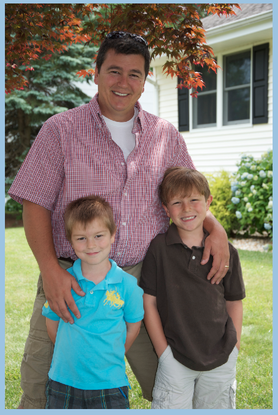
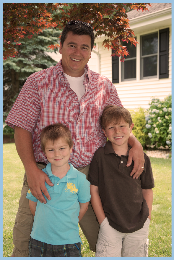
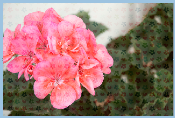
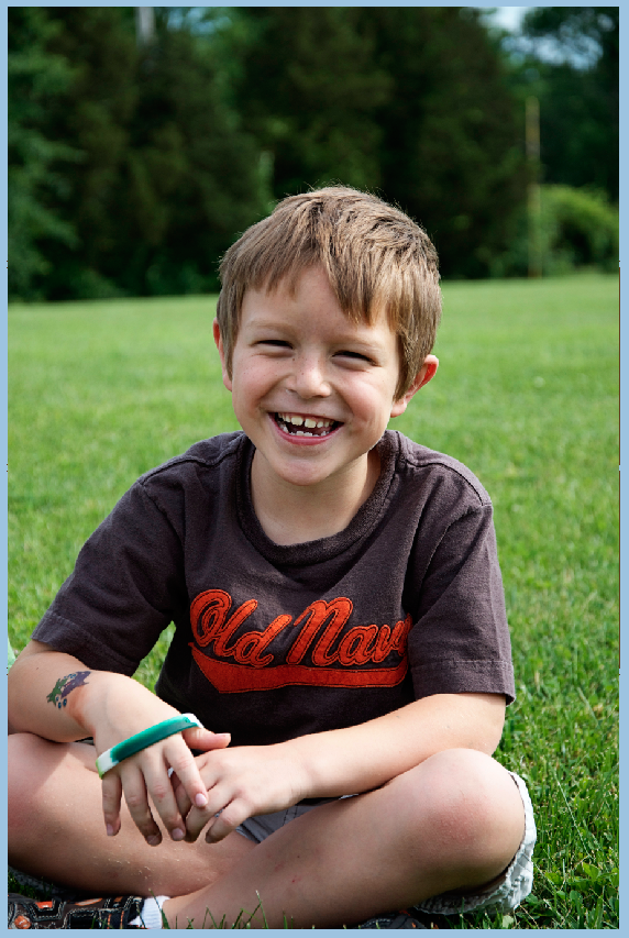
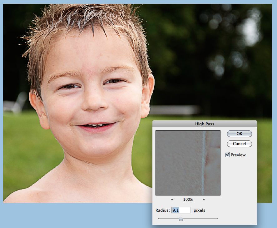
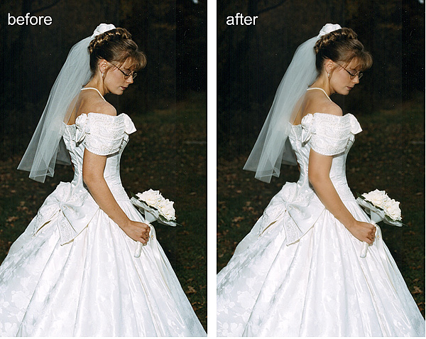
Open your image and re-save it. This was you will have your original available if you need it later. Here is mine of my boys on Father’s Day this year. Not a bad picture, but I like my images a little warmer most of the time.

Warm 1
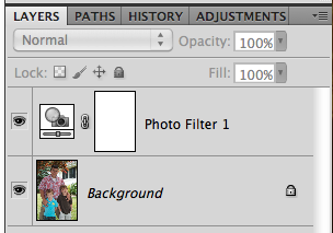
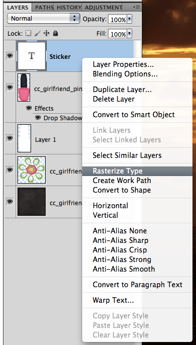
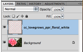
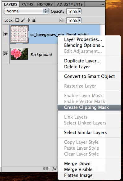
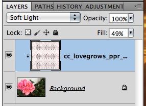
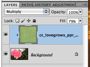
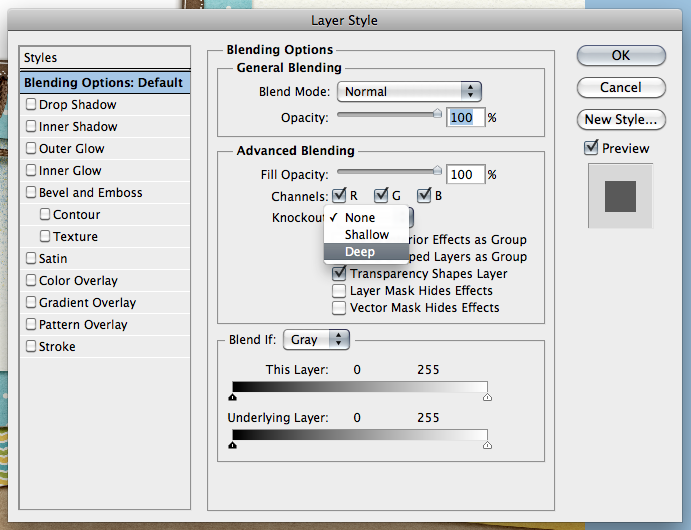
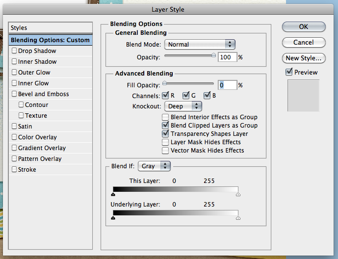
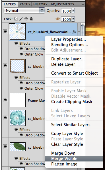
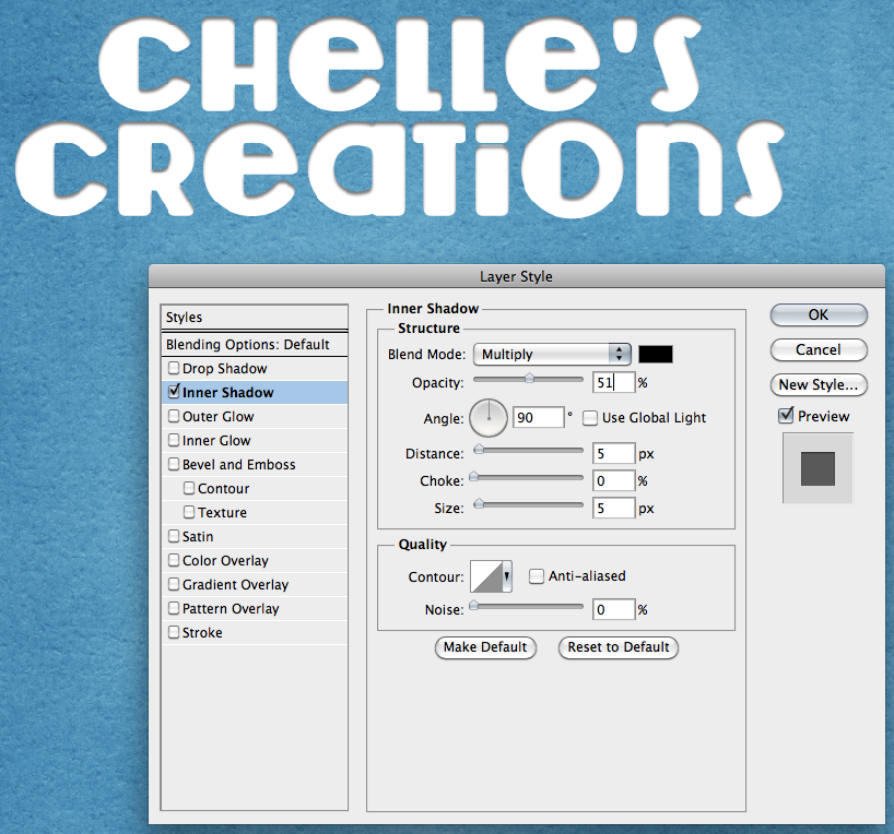
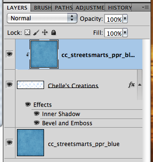
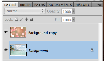
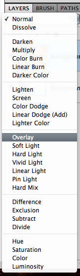
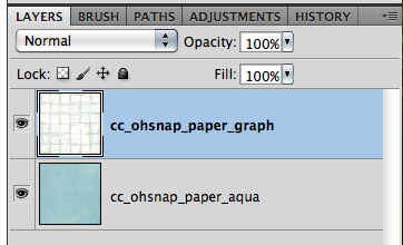
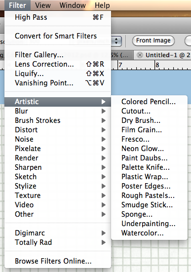
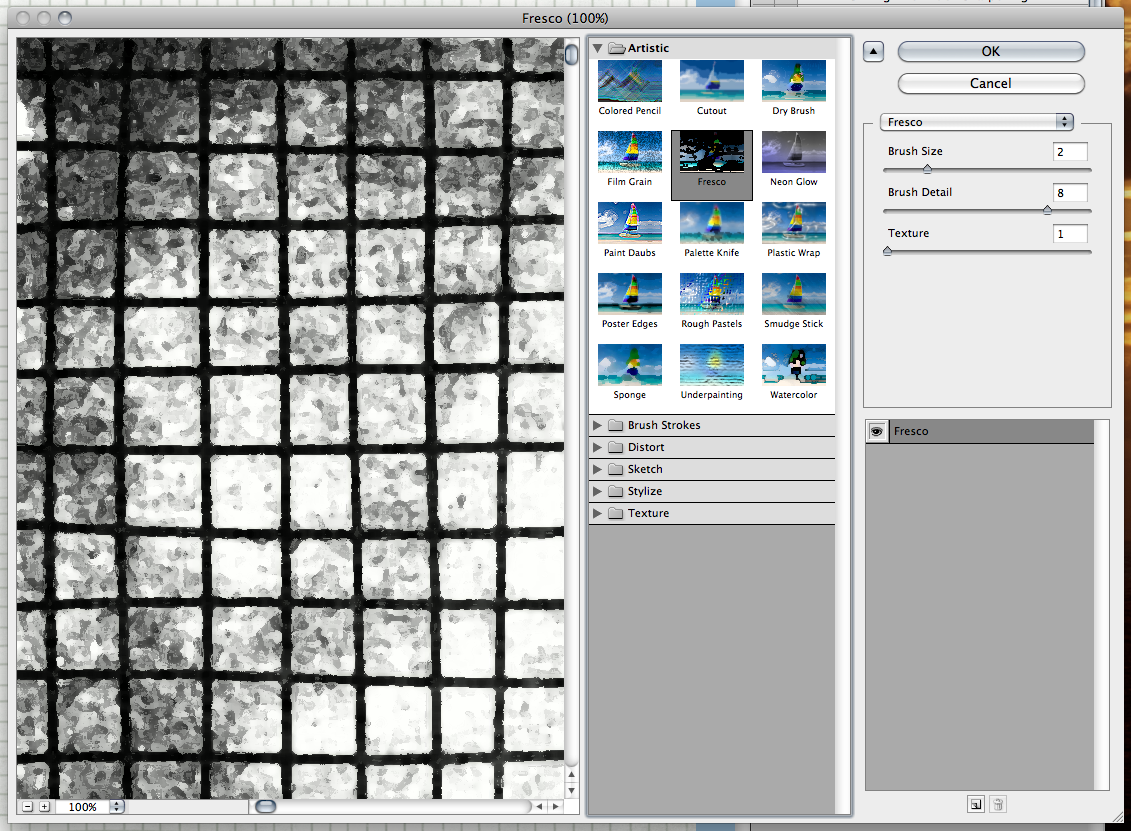
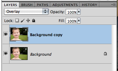
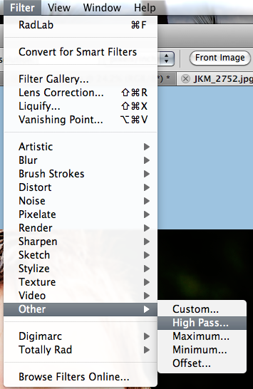
Next, on the bottom of your Layers Palette, there is a black and white filled circle. Click on that and the Adjustment Layer options will pop up. Choose Photo Filers.

Warm 2
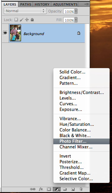
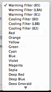
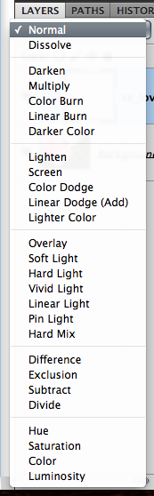
You will automatically be looking at the Adjustment Palette. you can click drop down menu next to “Filter.” There are so many options available to you to enhance your photo. You can also use a specific color by clicking on Color. You will then get an option to change the color by double clicking on the color box.

Warm 3
Warm 4

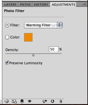
I’ve chosen the first warming filter, and have moved the opacity to 50%. Then you are done!
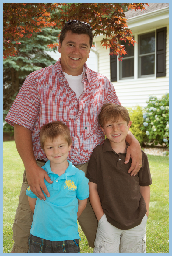
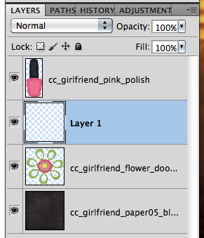
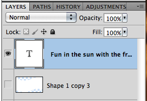
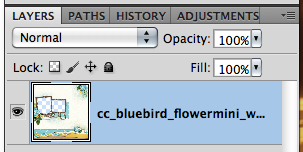
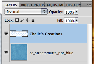
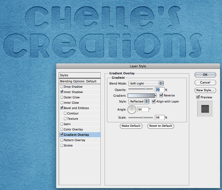
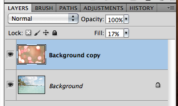
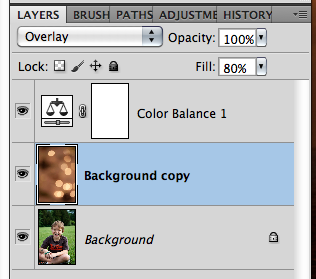
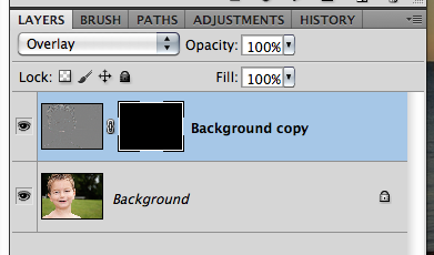
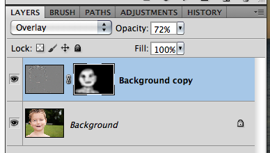
Here is my image… and my Layer’s Palette so you can see what yours should resemble.

Warm 6

Warm 5
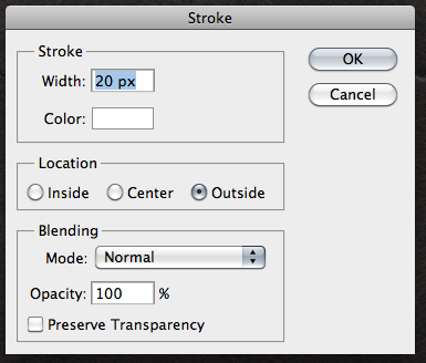
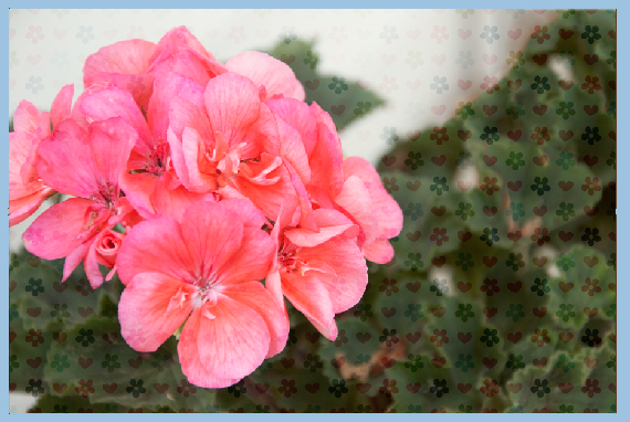
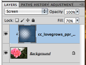
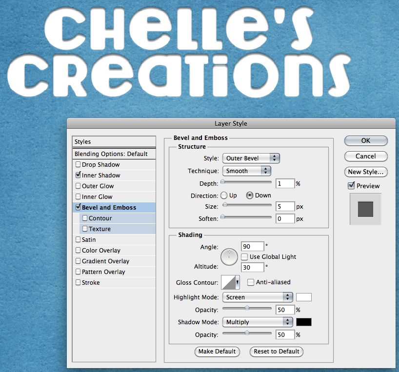
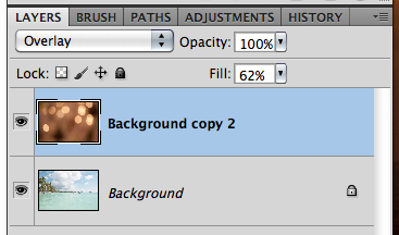
Another easy way to add warmth (or any color) to your photo is to add a layer above your photo. Click on your background color in the Tools Menu. Use the color picker to get a color that you want to add to your photo. I used an orangey color for mine – similar to the one available in the previous adjustment layer. Press Command + Delete to fill the layer with the background color.

Warm 7

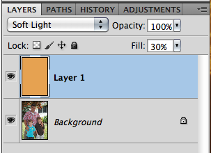
Next, change the blend mode to Soft Light, and play with the opacity of the color layer. You can use any blend mode and opacity combination that you like for your photo. Here is mine – Soft Light and an opacity of 30%.

Warm 8

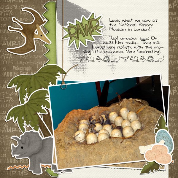
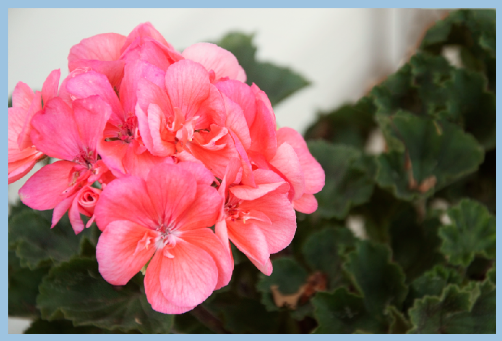
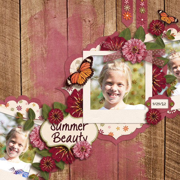
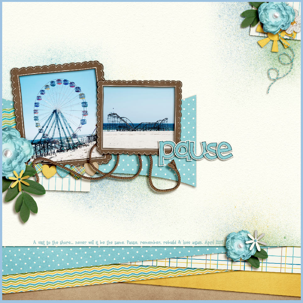
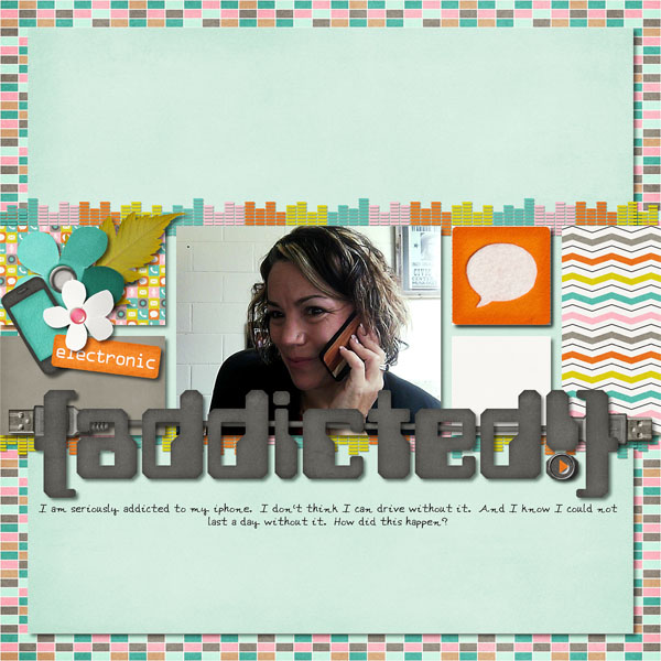
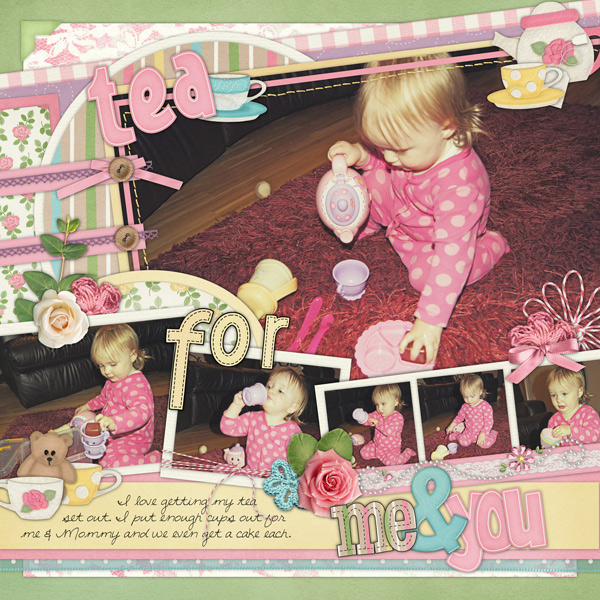
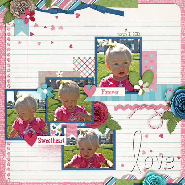
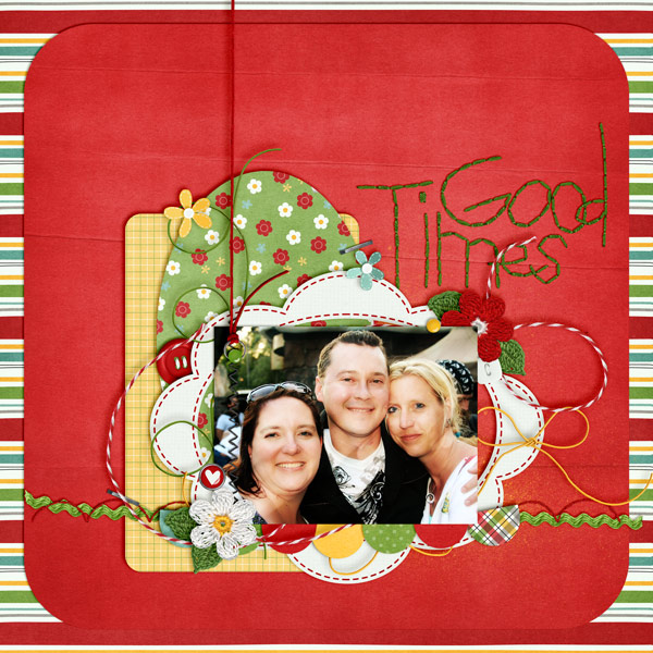
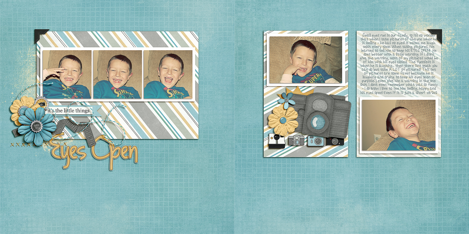
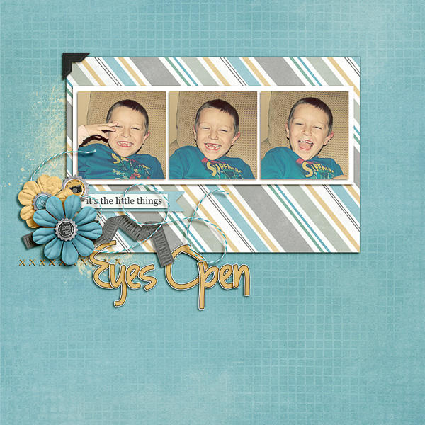
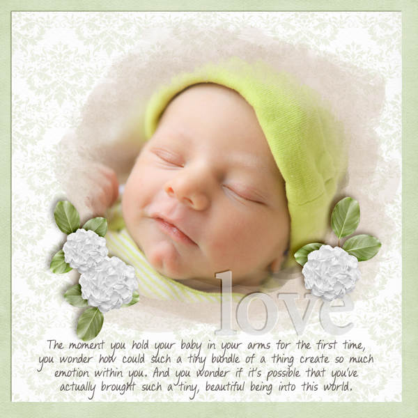
Here are layouts using these techniques from the CT. Here, Jenn (jennschultz) created this layout using First Foods.

yummy-2

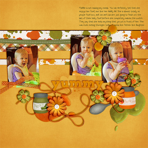
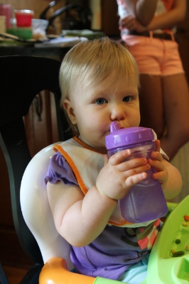
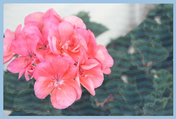
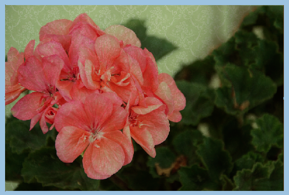
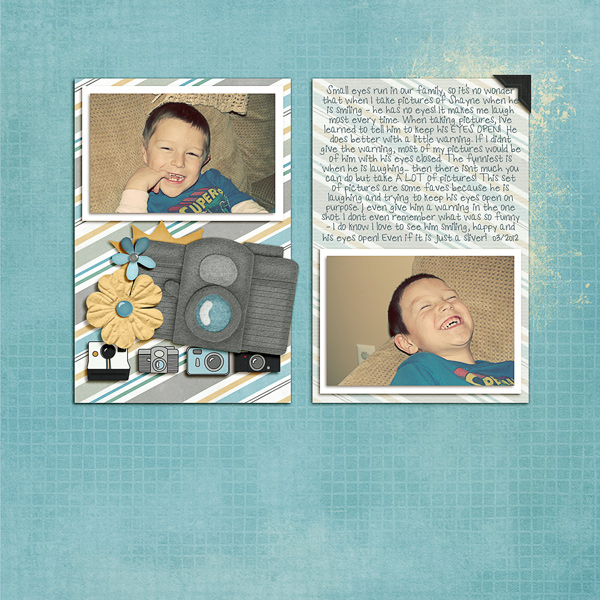
Here is her original picture:

IMG_0176

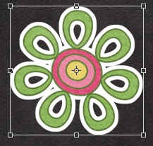
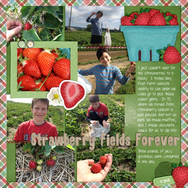
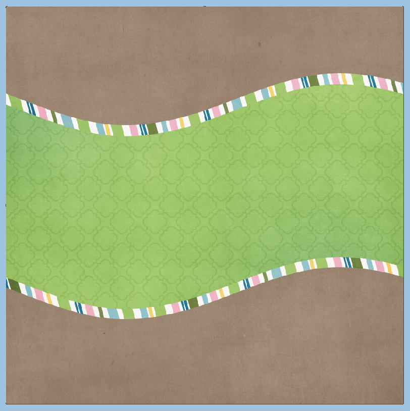
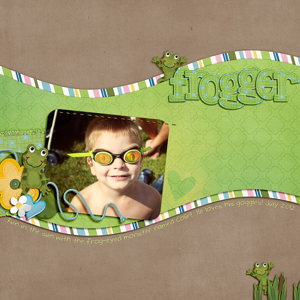
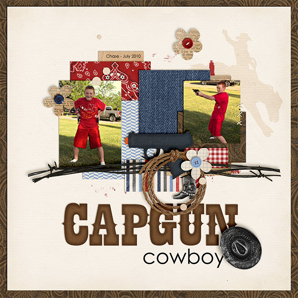
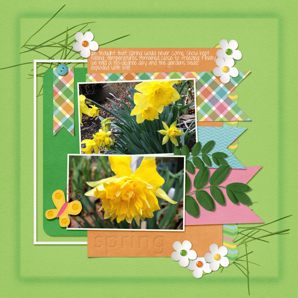
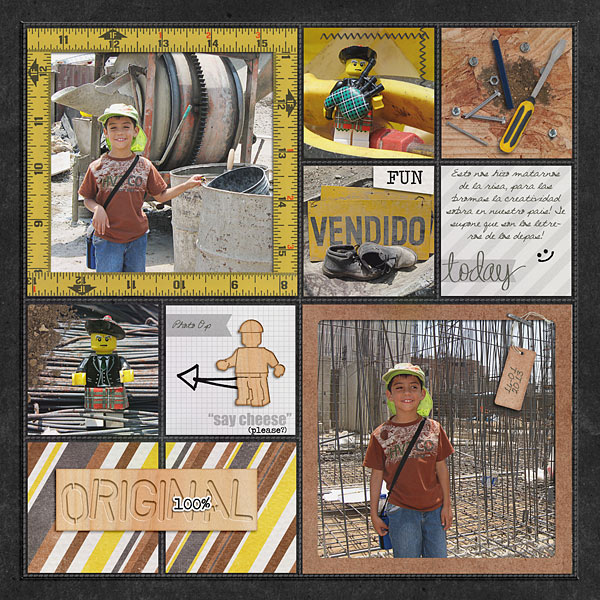
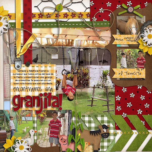
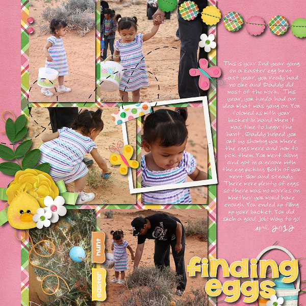
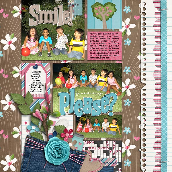
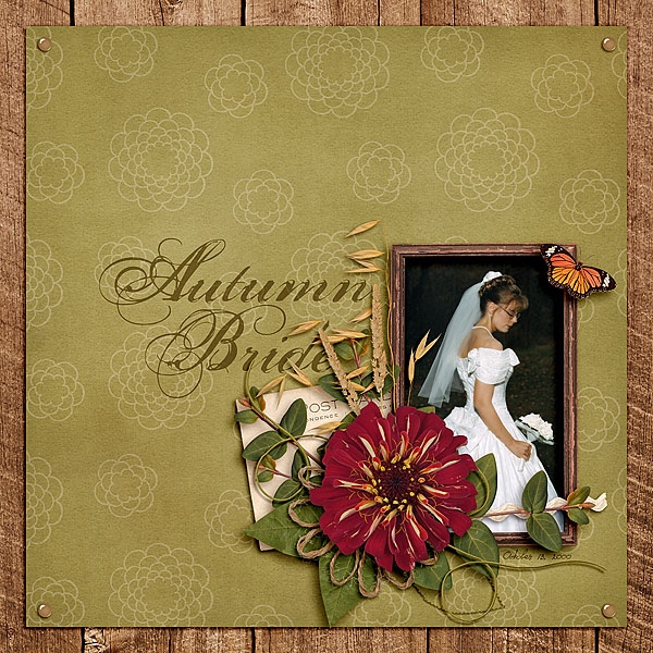
Next, Kayla (keepscrappin) made this layout using Girlfriend, Toadally, and Toadally Add-On (and a Little Green Frog Template too!)

BarbieNme_Mar12_web_zps3ec1b8ab

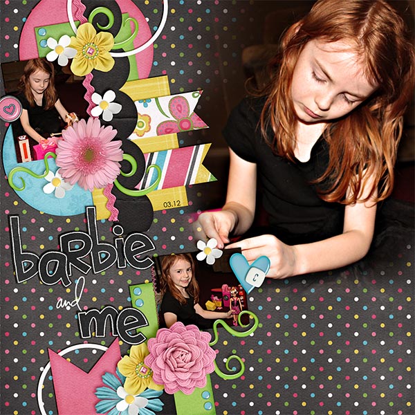
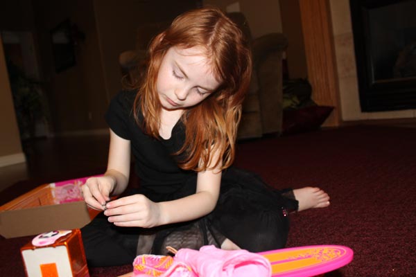
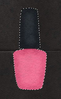
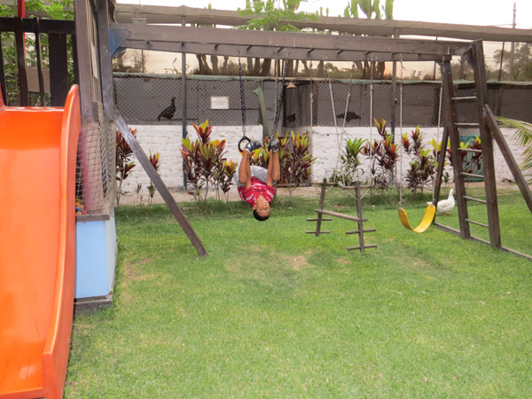
And Kayla’s original image:

IMG_3609_before_zps9837b5a1

There you go!  Simple and super fast too! Thanks for stopping by today, be sure to keep checking everyday for Chelle’s freebies for the month of July! Have a great week!

by_Jenn

Tutorial: Stickerizing!

Tutorial: Stickerizing!

Hi Everyone!  It’s Jenn, aka jk703, here to get to to Stickerize!!! Stickers were a part of my scrapping when I was a paper scrapper. Even lifting them with pop dots or adding them behind photos – they seemed to always be on my pages! BUT, once they were down, you couldn’t move them around! Well, that isn’t the case in digital scrapping! Yay! Here are a few ways to stickerize your layouts! For my layouts, I’ve used Chelle’s Girlfriend kit.

Adding a stroke to a font, or doodle is easy and makes it look stickerized. First up, doodles.

Stick01

1. With the doodle selected in the Layer’s Palette, choose Edit > Stroke.
Stick02

2. A new menu will pop up, and you will want to choose white as the border for your doodle. Once white is chosen, you can also choose where the stroke’s location will be from – center, inside or outside. You can also indicate how thick of a stroke you want by noting the number of pixels. Keep the blend mode normal, and the opacity 100%.

Stick03

Here is my doodle with the location set to center and it is 10 pixels:

Stick04

Here is my doodle with an outer location, and 20 pixels. These options are totally customizable for the look that you want to create.


Stick04a


So simple and pretty easy to add a sticker to you page. Right?! Next up, adding a sticker look to felt. Sometimes when I was paper scrapping, many stickers were “realistic” or appeared to be on stickers, but they were flat. Here is how:

1. With your felt ellie selected in the Layer’s Palette, double click on the image’s thumbnail. You will see marching ants around the object.

Stick05

2. Press D on your keyboard to set your default foreground and background colors.
3. Insert a new layer under your felt ellie. You can do this by pressing Command + the New Layer icon (Control for Windows) and it will be under your selected layer.

Stick06

4. With your new layer selected, and your marching ants still marching, choose Select > Expand from the menu. You can enter eny number… I have 10 pixels.

Stick07
Stick08

5. You will see the marching ants expand from the original selection by 10 pixels. Press Command + Delete to fill the marching ants on your new layer. Here is what the before and after looks like, and then another with a 20 pixels expansion and a shadow on the felt layer.

Stick09

tick011Stick010


That was another easy way to add stickers to felt!

One last way to stickerize…. fonts.

1. With the type tool selected and you’ve chosen your font, size and color — type what you would like stickerized. I’ve written the word sticker, and my font is Futura.

Stick012pre

2. With your Type selected in the Layer’s Palette, right click and choose > Rasterize Layer.

Sticker012

3. With the type layer still selected, choose Edit > Stroke. For this part of the tutorial, I have 20 pixels, outside location, 100% , and Normal. Here is my Type with the stroke added.

Stick013

Sticker014

Layer them up and you can cluster with the best stickers. You can be creative with what you make stickers out of, and you can always use that undo feature! Stickers can be fun because you can layer and layer…. so, get to stickerizing!

Sticker015


Here is what a couple of my fellow CT members came up with the Tutorial: Stickerizing!

By Samantha, using Prehistoric:

Dino

By Leslie, using Berry Berry Sweet, and DJB Britanny Print.

2013-06-Strawberry-Picking

Have a great day! Thanks for visiting!

by_Jenn


Tutorial: Adding A Paper Overlay to a Photo

Tutorial: Adding A Paper Overlay to a Photo

Hi Everyone!  Happy Thursday!  It’s Jenn, aka jk703 here to share a super fun technique with you today! Ninety percent of the time, I have photos on my layouts. I’m sure you like to include them from time to time, no?! lol!  Well, what if we add a paper overlay to your photo, and gave it a little pattern or texture. Here’s how:

Open a copy of an image up in Photoshop. Then open up a couple of papers and fun patters to try out! Make sure your are using copies of the images and papers so that you don’t ruin the original versions.

Here is my image and then a picture of my paper layer on top. I am using Chelle’s Love Grows papers.
pattern1

Pattern2

Next, you will clip the paper to the photo. Right click and choose Create Clipping Mask. Pattern3

After you’ve clipped your paper, you will play with the Blend Modes. Make sure you have the paper layer highlighted. Instead of clicking each time to see a new blend, just use a shortcut. To scroll through the blend modes, press Command (Control) and the + symbol. To go the opposite scroll, use the – symbol.

Pattern4

Once you have found the blend mode that you like, you will want to play with the opacity of the paper layer. You can also use numbers as shortcuts to opacity percentages. 9 would be 90%, 6 would be 60% etc. Give it a try. Here is my layers palette and my image at this point. I used the Soft Light blend mode and an opacity of 49%.

Pattern5

Pattern6

Next, you will choose the brush tool from the Tools. With your paper layer selected, change the brush settings to a round soft brush, with a low opacity for strength. Here is what my eraser tool menu looks like.

Pattern7

Now, slowly go over the part of the image that you want to highlight, to remove the pattern overlay. Since I am using a flower pattern paper, I am going to erase the flowers on the flower. (lol) Here is what I have… some flowers are visible on the edges, but not so many in the center. This paper was white with a colored pattern.

Pattern8

We will see what we get when using other colors and patters now. First up, A dark blue pattern. I used a Screen blend mode, and changed the opacity to 70%  What’s interesting about this pattern, is that it gave my photo a cooler appearance. So, you can always use a colored paper to get a closer color to the kit you are working with. Pattern9

Pattern9a

After the blue, I decided on a green paper. Check out this change – I love it. It sort of gave my image a little bit of an antique, grungy feel. I think the pattern looks cool on the flower, so I didn’t even erase it. It adds a dramatic tone without much effort.

Pattern9b

Pattern9c

I shared this technique with the CT, and Karen (karen32) came up with such a pretty page… She used Chelle’s Indian Summer and it just looks wonderful. Can you see the flowers on the pictures? So subtle, yet it adds a little fun to the page.

Indian_zps7c05dbb8
Adding a paper overlay to a photo is really easy, creative and lots of fun. I know I would love to see some pages in Chelle’s gallery with this technique!  I hope this was a lot of fun, and super easy. Thanks for visiting!
by_Jenn
Jenn/jk703

Tutorial: Text On/In a Shape

Hi Everyone!  Happy Thursday… I’m so glad it’s almost Friday!  It’s starting to get warmer here, though we’ve seemed to skip Spring a little – we jumped from 60’s to 80’s in days… and I’m already tempted to turn on my air conditioning! That’s early for me in the Northeast!

Ok… onto the tutorial! Text On/In a Shape is fun! I love being able to write within a shape or around a shape in Photoshop. It’s one of my favorite features. I’m going to show you how to do this… easily. Here goes… For my layout , I used Chelle’s Toadally Add On kit – it is a fun one, and much more versatile than you might think! Here is what I’m starting with. I’ve used the shape tool to make  my paper layers.

Text1

Now, I’m going to duplicate one of my shape layers and use that as a basis for making a path for text. You can duplicate a layer by right clicking on it, and choosing Duplicate Layer. Here is what my Layer’s Palette looks like.

Text2

Once I have my shape in my Layers Palette, I chose that layer and double click on it. You should get the marching ants around your shape.

Text3

At this point, you will want to pull up your Paths. You can find this in the menu bar under Window > Paths. Mine is set to be open with my Layers Palette, like this:

Text4

Click on the small lines and triangle in the top right corner, and choose “Make Work Path.”

Next pop up with be about Tolerance. A lower tolerance number will create a path with many fixed points, and the path will be very precise to the shape that is sele.cted (your marching ants). The bad side of a lower tolerance can cause too many problems with your text fitting into the shape evenly, and may look a bit garbled. A higher tolerance number will create a path with fewer fixed points, and the path will be smoother.
Text5
Text6
Choose the Type Tool.  Text7

If you click within the shape a cursor will appear, and look as if two parenthesis are surrounding it. This just means that the text will be INSIDE the shape. Depending on your shape, this might take a little playtime figuring the size and spacing of your text.

Text8
Text8b
Text8a

If you click on the shapes edges, you will see a cursor with almost a tilda going through it. One tip when working on the edges with text. Take a peek at your setting in the Paragraph Tab, so that you know if you are typing centered, left edge or right edge. Click at the point where you want to start typing, and the text will go around the whole outside of the shape.

Text9
Text9a
Once you have entered your text, and clicked the checkmark, you will want to find the shape in your Layers Palette. Click on the little eye and turn off that layer’s visibility. Now your text is stand alone.

Text11

You can use the move shape to move it around a bit, or to even make it larger or smaller a little. Here is my final layout:

SO_CC_ToadallyAO_WMTypativeTall_Frogger_ColJuly2012_WEB
I hope that was super easy, and simple to follow!  Have a great weekend!
by Jenn
Tutorial: Making a Quick Page

Tutorial: Making a Quick Page

Hi everyone…it’s Jenn, aka jk703 here for today’s tutorial! I’ve made many layouts and I’ve printed and framed some. They get attention from my family, friends and other visitors to my home. One closes friend of mine really loved a layout of my boys, and wanted make one with the different kids in her family. Since she had her pictures, and was able to use Photoshop, I decided to send her a Quick Page.  She could then insert the kids for her sister’s family, save, and make another copy for her brother’s family. It worked perfectly. Anytime you create something for another person, be sure you read the designer’s TOU to see if acceptable. If you are not allowed to send a Quick Page, then you can finish for yourself. Then ask for your friends pictures, add to your saved Quick Page, and send the flattened jpg file for printing and framing. So, today I thought you might like to learn the steps for making a quick page!

Once you’ve completed your layout, save it in it’s layered form. Here is mine, using Bluebirds by Chelle, that was recently available at The Daily Digi.

Screen shot 2013-05-08 at 10.04.40 PM

When you are working on making a Quick Page, you want to remove all personal details – such as any text, the photos, and the title. Here is mine a bit more bare.

Screen shot 2013-05-08 at 10.05.35 PM

We need to make the filled frame masks transparent so that other people’s images would be able to be seen. Find one of the photo’s clipping masks and double click on it in the layers. The Style Menu will pop up. Once it does, there are two things that need to be changed. On the first screen, click on the Knockout. Choose Deep. Next, on the Fill Opacity, slide that arrow to 0%. If you have Preview clicked, you will see that the clipping mask will instantly become transparent. Here are the screens up close:

Screen shot 2013-05-08 at 10.06.25 PM

Screen shot 2013-05-08 at 10.06.37 PM

And what my layout looks like, open in Photoshop.

Screen shot 2013-05-08 at 10.07.05 PM

Next, you will go to the topmost layer in your Layers Palette. Right click on the layer, and choose, Merge Visible. Here is that menu:

Screen shot 2013-05-08 at 10.07.32 PM

 Once you have merged the visible layers, here is what my Layers Palette looks like:

Screen shot 2013-05-08 at 10.07.49 PM

After you have completed this, you can then save your new Quick Page. Be sure to save it as a PNG image so the picture boxes will remain transparent. That’s it! Here are some layouts the CT made just to inspire you today!  :)

Lynette made this page using Chelle’s Technogeek Mini   and the Collage Templates (Long).

addicted_zps97e2ab96

Kayla used Yee Haw Bundle, Ready Aim, Fire Felties, and Letters from Home for her creative layout.

CapgunCowboy_July10_web_zps597f57e2

Lastly, Helen made this precious layout – she used  Tea for Two, Boing Boing Alpha Doodles (CU), & Dots and Dashes Alpha Doodles (CU).

Helen-tea-for-two

There you have it… a quick way to make Quick Pages… and some lovely layout inspiration!  Be sure to come back later in the month to see what else you can do with Quick Pages!

Thanks for visiting!

by Jenn

Tips: Letterpress and Embossed Look

Hi Everyone!  Hope this week is treating you well!  I’m Jenn, aka jk703, here to share an interesting way to add a new technique to your pages. Last year, right before Hurricane Sandy, I found a few new way to add the Embossing technique to your papers and you could even use the patterns that came in the kits!  That was a fun tutorial for me. I was always stumped about how to actually make my text look a bit like it was in a Letterpress style. While I am still a bit stumped, I’d love to share what I, and my co-CT members have found so far!

Letterpress is basically an old style print, that pushed the letters into the paper – using a printing press. While this is not the norm in today’s world, it is a fun way to add to your page. For me, when creating this blog post, I noticed that sometimes when looking at an example, it could look either embossed or letterpressed – depending on my view. Some images may appear as if they are pressing into the paper, yet a minute later, appear as if they are dry embossed. Either way, I hope you learn a new trick today!

This will be a photo heavy tutorial, so you might want to let the page fully load.

Ok – here is my layers. For my examples, I used Chelle’s Street Smarts kit. Start by using the Type Tool, type in the words you would like to use, and pick a fun font. What font you choose will also determine how the end result will look. For this post, I used Lemondrop. Once I’ve typed up what I’d like to work with, I’ve right clicked and “Rasterized Layer.”

LP1

Next, you will double click on the type layer, and the style menu will pop up. There will be multiple screens that you will be working with here, so take your time when entering the info. At the same time, you can play around with the settings – change it to what you like or how you want your words to appear for your page.

Adding Inner Shadow:

LP2

Adding Bevel and Emboss:LP3

 Here is what my layers look like at this point – and then if I add a paper clipped to my type layer.

LP4 LP5

Here is another version, where I changed the Inner Shadow to Linear Burn, and lowered the opacity. I also played a bit with the Contour to change it up. You can see the Contour is rounded a bit in the little thumbnail. I used the same setting for the Bevel and Emboss as above.

LP6

The result… a bit less embossed looking.

LP8

Next, I added a fun style, Gradient Overlay. Check out the setting below. This was actually my favorite of the outcomes!

LP9

Leslie (lab130) offered some great advice when trying to do this from a PSE standpoint. Here is what she said. “Using PSE. What I did is apply a low inner shadow. Then I went to Layer > Layer Style > Scale Effects and reduced the scale of the inner shadow until it was something I liked (~50%). Then I did an emboss (this one is pressed INTO the paper, since my shadows are to the lower right). I did an bevel of 1px and Direction > Down. I also scaled that effect down by Layer > Layer Style > Scale Effects. Then I clipped the same paper to the text as was on the background.” She also mentioned that it’s just so much easier to skip the inner shadow and just put a bevel in. Here is what her page looked like using the Bevel, using Chelle’s Hippity Hop Hop kit:

LPLS1

LPLS2

Roxana (roxnamdm) xreated this awesome page, and really made the Wood Veneer Toolkit Title really looks fantastic! Here are her pages and settings. She used the Wood Veneer Tool Kit, Under Construction, Mark My Words and Square Pockets.

Inner Shadow:

RXLP3

Bevel and Emboss:

RXLP4

Contour:

RXLP5

Outcome:

RXLP2

Awesome layout – check out how perfect the title looks!

RXLP1

Kassie (kass_23) used Love Grows for her page and completed a Bevel Down in PSE for her look:

KSLP2

KSLP!

There you have it – embossed or letterpressed – depending on what your eye tells you!  :)  Give it a try, and experiment with the style settings. You will find something that you particularly love and will be drawn to use it again!

Have a great day!

Jenn (jk703)

Adding a Bokeh Texture

Adding a Bokeh Texture

Hi everyone…. It’s Thursday and that makes me happy! This is Jenn (aka jk703) and I get to bring you a fun and super easy tutorial today. We are going to add a little oomph to your photos, by adding a bokeh texture. Bokeh what?!? I know… sounds odd and even when it’s typed it looks odd – but I promise it is fun.

In the past, bokeh was always known as the blur that is in your photos, mostly around the things that are in focus. You take a picture of a child, and the area all around the child is in a blurry state, while the child remains in focus. The blurry areas, aka areas out of the depth of field, are referred to as bokeh. Bokeh usually, though not always, has reflective out of focus points of light. Nowadays, with improvements with cameras and equipment, bokeh is used to refer to those specific out of focus lights or shapes in your photo.

Bokeh is easy to add to your photo, but it takes time, patience and a little effort. You will need to play with different bokeh textures to find the ones that fits with your photo. That is the biggest hurdle to this tutorial – trying out many bokeh textures. Good thing there is only about 5 steps to add the texture! :) ok… let’s get to it.

So… where can you get bokeh textures?  Try out this awesome site – Lost and Taken – specifically this post about 94 Free Colorful Bokeh Textures  – http://lostandtaken.com/blog/2012/1/25/94-free-colorful-bokeh-textures.html. Here is their About Page to learn more about this wonderful site. Once you have downloaded the textures, take a peek at them to see what you like, and what may work with your photo. Also, pick a couple that you think would look bad with your photo too. lol!

First up, open up both your photo and the bokeh texture that you want to use. Here is my photo of La Romana, DR:

Screen shot 2013-04-02 at 10.12.47 PM

Next, click over to the bokeh texture, and Copy it into your photo’s file.  Make sure to have your Bokeh on top of your image in the Layers Palette. Screen shot 2013-04-02 at 10.13.41 PM

With the Bokeh layer selected in the Layers Palette, change the blend mode to Overlay. Screen shot 2013-04-02 at 10.14.17 PM

Once you have overlay selected, you will then play with the opacity of the bokeh layer.

Screen shot 2013-04-02 at 10.14.44 PM

Here is what my image looks like with the Bokeh overlay and opacity played with. Simple, subtle and pretty. Screen shot 2013-04-02 at 10.14.35 PM

Here is another boken and it’s effect. Screen shot 2013-04-02 at 10.19.11 PM

Screen shot 2013-04-02 at 10.18.51 PM

One last one with my son and a bokeh effect. If you find that your image takes on too much of one color, you can always make an Adjustment Layer to remove that cast of color. For these images, I created an Adjustment Layer to remove some of the orange coloring. Screen shot 2013-04-02 at 10.52.38 PMScreen shot 2013-04-02 at 10.54.22 PM

Screen shot 2013-04-02 at 10.52.51 PM

 Here is what the CT came up with….

Roxana (Roxanamdm) said it took her some time to choose the bokehs and then the correct color and opacity. It wasn’t easy to find the right bokeh for her photo. I used Bookeh #21 and #12. EIEIO was used.

41-granja-web
Her original image…. img_0110
Here is Mel’s (KSCroppyChick) layout…
Good-Times-MKA
Original
Lastly, Ophelia created this page. She didn’t use the bokeh texture that is linked above – she made an overlay with a star bokeh that she made herself. It’s on the photo in the lower left corner. Cool, right?!
2012-04-08-findingeggs_sm-1
I hope you give it a chance, and play with the bokeh’s… they can be a lot of fun!  Happy scrapping!
Jenn (aka jk703)
by Jenn
Tutorial: Artistic Filter Blends

Tutorial: Artistic Filter Blends

Hi Everyone!  It’s Jenn, aka jk703, here to share a fun and super simple technique for you!  This technique is pretty subtle, but really allows you to stretch your stash!  We are going to use Filters in Photoshop to change our patterns and background papers. Artisitc Filter Blends really are easy, and fun to use. For my layouts, I used one of my favorite kits of Chelle’s, called Oh Snap! Let’s get to it!

Layer at least two papers in the layers palette.

Screen shot 2013-03-20 at 10.01.00 PM

With the top layer chosen, click on Filter > Artistic > Colored Pencil. (Don’t worry, you can pick any once the menus pop up).  Screen shot 2013-03-20 at 10.01.18 PM

Once the Filters Menu pops up, you can click on each filter to see how each will interact with the paper that you chose. Screen shot 2013-03-20 at 10.13.30 PM

Play with each filters sliders to change any aspects – such as lighting, brush size and detail, stroke size and detail, and even definition.
When a filter is decided on, click ok.

Your paper will then change in your layers palette to the filterized version. :)

Go through the blend modes to blend it with the paper below. Play with the sliders for Opacity and Fill. Presto!  You have a new artisitc paper that you can use for your backgrounds, paper pieces, and strips. Here are some examples.

Colored Pencils:

CP1

Paper using Colored Pencils and a Multiply Blend Mode:

CP3

Sponge Filter:

Spg1

Paper using Sponge Filter and a Color Burn Blend Mode:

Spg3

Fresco Filter:

FRE1

Fresco Filter with a Color Burn Blend Mode:

Fres4

Really easy, right!?  Here is a layout that Roxana (aka Roxanamdm) created. She said she used the Rough Pastels Filter on the brown flowered paper, but first deleted the brown color and then applied the filter, to keep just the flowers as the background is actually the wood grain paper. Now, the flowers kinda match the rub ons. Blended mode Normal and enlarged to 250% so the details are clearly seen when printed.

42-cousins-web

Here are the layouts that I created.

SO_CC_OSnp_Swl_SimpPhtCdTem1_WMWndyMsy_Hsg_GB3_EyesOpenMar2012_WEBDbl

SO_CC_OSnp_Swl_SimpPhtCdTem1_WMWndyMsy_Hsg_GB3_EyesOpenMar2012_WEBLft

SO_CC_OSnp_Swl_SimpPhtCdTem1_WMWndyMsy_Hsg_GB3_EyesOpenMar2012_WEBRght

CloseUp_WEB2

Fun, simple and super cute. Give it a try!  Thanks for visiting today!

by Jenn

Tip: ScrapPin Basics


Hi Everyone!  It’s Jenn, aka jk703 here to give you a little explanation and some references for the new Scrap Orchard Gallery: ScrapPin. It is the new way to see so many more layouts, comment and love layouts as well as share the love of digital scrapbooking with other scrappers! Once you get the hang of it, the change will be ok. I know… it looks totally new, overwhelming and you are so confused, right!?  Don’t worry – let’s get some info to you and then the links to some of the tutorials and you will be good to go.

First, ScrapPin is similar to an old “cork board” – an easy way to share our digital scrapbook pages by pinning them up for others to see. It is the new gallery at Scrap Orchard, and allows you to upload a layout or by re-pinning a layout to one of your “cork boards.” Any pin that you see in the ScrapPin gallery can be pinned and re-pinned. Note that all re-pins and pins will include a path to the original source of the image and it’s creator.

You will have to join the ScrapPin gallery, either by signing up or through Facebook, Twitter, or directly at the site. Please note that you do NOT need Facebook or Twitter to sign up. After you have registered, you will want to begin pinning your layouts. When uploading a pin to the ScrapPin gallery, you will want to create a board. Boards are created by you, can be edited or deleted, and how you create them is entirely up to you. You can have boards sorted by person, season, designer, hybrid, or whatever you like. Each time you upload, you will have a choice as to what board you would like to add your new pin to. At this point, you will also have the ability to choose a category. The ScrapPin categories are Digital Scrapbooking, Hybrid Scrapbooking, Miscellaneous, and Photography.

Once you have  uploaded a pin to the gallery, your image is available to everyone to admire. They may like your layout, re-pin your layout and even comment on your layout. Liking a layout is simply saying that you like it. Re-pinning a layout could be compared to the old gallery’s Favorites. Comments are wonderful when received and many like to leave feedback for each other. In the old gallery, once you saved a layout to your favorites, you could go back and check them out whoever you wanted. Now, it is the same idea, you can go back and look at all the layouts that you re-pinned for inspiration. You can pin layouts, hybrid projects and photography. Posting in the ScrapPin gallery also allows other users to follow you and your layouts, selectively by board or all of your boards.

When uploading your pin, and you’ve created your board, you will want to enter the credits in for the items that you used to create your layout. Scrap Orchard required you to have some products that are currently in the store, so be sure this is the case (you wouldn’t want your layout accidentally deleted). As for your credits, all you need to list are the items that you used for your layout or project. Credits should include the product name and designer, for each item that you have used for your layout. The next important item are the ScrapPin Hash Tags. Hash tags are when there is a # symbol plus text/words, (example #chelle). When hash tags are used, they can tell you the designers, challenge, and even a description of the kind or type of layout with a quick glance. These are important for the ScrapPin Gallery search feature, and especially important for challenges. After the products and hash tags, you can include a link to the product if you wish. Just as a note, Chelle’s hash tags are #cc and #Chelle. We’d love for you to use them so we can find your layouts and leave you some love!

Here is a run down of all the tutorials that Kami and Mel have made available to help you use the new ScrapPin Gallery:

When I asked the CT what there favorite parts of the ScrapPin Gallery was… here are the answers that I received:

Kassie (kass_23) said that she loves the search box. You can find anything from a kit name to a designer. I also really love the “like” option :)

Brandy (superscrappinmom) mentioned that in the old gallery you had to go through about 10 different steps to upload a layout (including finding the file on my computer, typing in a title and credits, selecting which galleries it needs to go in, clicking through all the different screens, etc). Now I just have the pinning link on my toolbar so I just click it, click my layout, type credits, and click submit. Super easy! AND if I make a mistake and need to edit, I can just click the little edit button and do it once, whereas in the old gallery it had to be edited for each gallery you posted it to.

Hope that is some helpful information and explanations. We love to see your layouts in the gallery, so get on over and register today!

Thanks for coming by!

by_Jenn


Tutorial: High Pass Sharpening for Softening

Tutorial: High Pass Sharpening for Softening


Hello Hello on this last day of February!  I can’t believe it’s almost over already (yes, I repeat this in December too!) The time flies, and most times I wish for a pause button, and there are a few that I wish for a fast forward option!  It’s Jenn here, aka jk703, to bring you a quick and easy tutorial to soften things up!  I know when I have some pictures, I feel a bit exposed and stark. Well, when I feel this about the way a picture looks, I like to soften it up. For this tutorial, we are using the High Pass Filter to soften skin… Here we go…

1. Open an copy of your image, and create a duplicate layer. Here is my son, Colin.

soft1

2. Change the Blend Mode to Overlay. Your image may become super saturated and bright.

Soft2


Soft3

3. On the Menu Bar, Choose Filter > Other > High Pass.

Soft4
4. Move the slider to about 9-10 pixels. Your image will get really really sharp.

Soft5

5. Press Command + I (I like Igloo) or Control on a PC. This will Inverse the sharpness and make it super soft. So, your image will get a changed color appearance, and softening.

Soft6

6. Press and hold the Option Key (Alt on a PC). Click on the Add a Mask on the bottom of the Layers Palette (the square with a circle button). You should get a black mask box next to the overlay layer.

Soft7

7. Click on the black mask in the layer – you will see slight edgers around the corners to know you chose that box. (See above image, check out the corners of the black mask box).

8. Click on the Brush Tool. Use a white, soft, round brush, and change the opacity to around 40-50%.

brush

9. Brush on the masked layer and you will soften the skin.

Soft9

My after picture is just a tad softer than my original. It’s softens his skin just a little, while giving a little more sharpness to his hair and features.

Soft10

ok… Here goes. This is awesome for up close and personal face shots. Many people take “selfies,” which are pictures of themselves… and depending on the camera, this can be a super sharp picture of you. I wanted to show an up close and personal pic that I took of me… so… gulp, here is my before and after. The skin is the biggest change, and really makes me feel as if my bumpy skin, blemishes and wrinkles are a little less obvious.

Before:

BeforeSoft1

After:

BeforeSoft2

Here is what my co-CT members came up with for my tutorial!  They are pretty awesome!

Jennifer (jmljensen) used this before and after shot for her layout!  Isn’t it gorgeous?!

Jennifer Before After

She used Chelle’s Indian Summer to create this beautiful layout!  I love the title work and big cluster!

Jennifer

Leslie (lab130) used her nephew as her adorable subject. Here is the before….

original

and the after…

softening

Here is her page… Leslie used Chelle’s Blessings Kit and the wonderful Watercolor Brushes for this masterpiece!

Graham-2

That’s today’s tutorial!  Thanks for stopping by, and we hope you come back again!

by_Jenn