


Hi Everyone! Hope this week is treating you well! I’m Jenn, aka jk703, here to share an interesting way to add a new technique to your pages. Last year, right before Hurricane Sandy, I found a few new way to add the Embossing technique to your papers and you could even use the patterns that came in the kits! That was a fun tutorial for me. I was always stumped about how to actually make my text look a bit like it was in a Letterpress style. While I am still a bit stumped, I’d love to share what I, and my co-CT members have found so far!
Letterpress is basically an old style print, that pushed the letters into the paper – using a printing press. While this is not the norm in today’s world, it is a fun way to add to your page. For me, when creating this blog post, I noticed that sometimes when looking at an example, it could look either embossed or letterpressed – depending on my view. Some images may appear as if they are pressing into the paper, yet a minute later, appear as if they are dry embossed. Either way, I hope you learn a new trick today!
This will be a photo heavy tutorial, so you might want to let the page fully load.
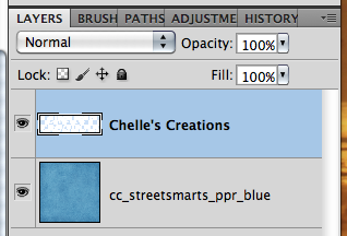
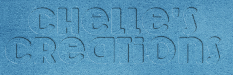
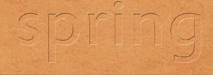
Ok – here is my layers. For my examples, I used Chelle’s Street Smarts kit. Start by using the Type Tool, type in the words you would like to use, and pick a fun font. What font you choose will also determine how the end result will look. For this post, I used Lemondrop. Once I’ve typed up what I’d like to work with, I’ve right clicked and “Rasterized Layer.”
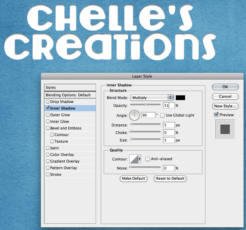
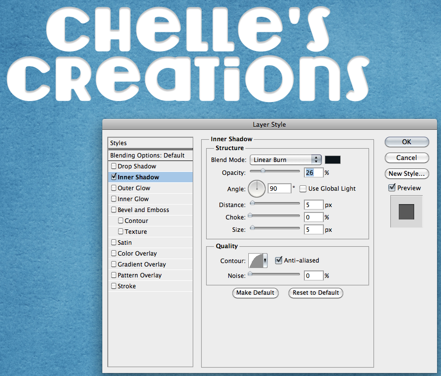
Next, you will double click on the type layer, and the style menu will pop up. There will be multiple screens that you will be working with here, so take your time when entering the info. At the same time, you can play around with the settings – change it to what you like or how you want your words to appear for your page.
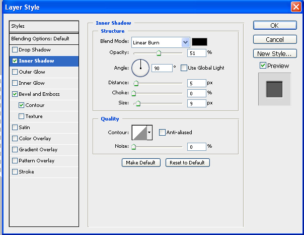
Adding Inner Shadow:
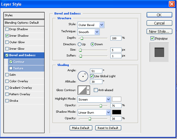
Adding Bevel and Emboss: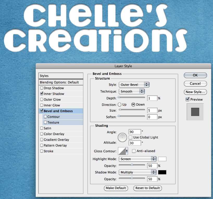
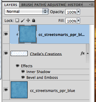
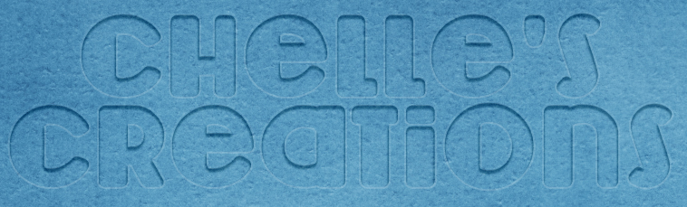
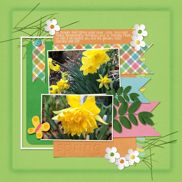
Here is what my layers look like at this point – and then if I add a paper clipped to my type layer.
Here is another version, where I changed the Inner Shadow to Linear Burn, and lowered the opacity. I also played a bit with the Contour to change it up. You can see the Contour is rounded a bit in the little thumbnail. I used the same setting for the Bevel and Emboss as above.
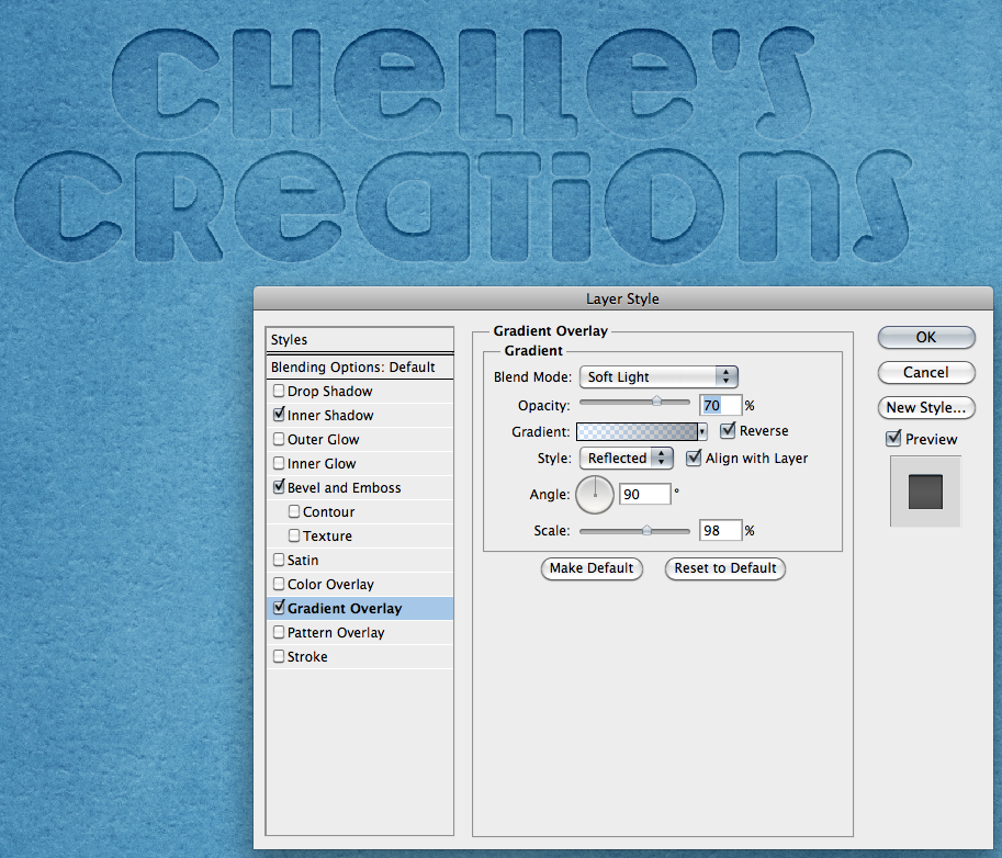
Next, I added a fun style, Gradient Overlay. Check out the setting below. This was actually my favorite of the outcomes!
Leslie (lab130) offered some great advice when trying to do this from a PSE standpoint. Here is what she said. “Using PSE. What I did is apply a low inner shadow. Then I went to Layer > Layer Style > Scale Effects and reduced the scale of the inner shadow until it was something I liked (~50%). Then I did an emboss (this one is pressed INTO the paper, since my shadows are to the lower right). I did an bevel of 1px and Direction > Down. I also scaled that effect down by Layer > Layer Style > Scale Effects. Then I clipped the same paper to the text as was on the background.” She also mentioned that it’s just so much easier to skip the inner shadow and just put a bevel in. Here is what her page looked like using the Bevel, using Chelle’s Hippity Hop Hop kit:
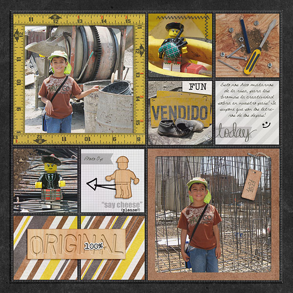
Roxana (roxnamdm) xreated this awesome page, and really made the Wood Veneer Toolkit Title really looks fantastic! Here are her pages and settings. She used the Wood Veneer Tool Kit, Under Construction, Mark My Words and Square Pockets.
Inner Shadow:
Bevel and Emboss:
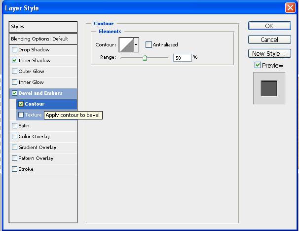
Contour:
Outcome:
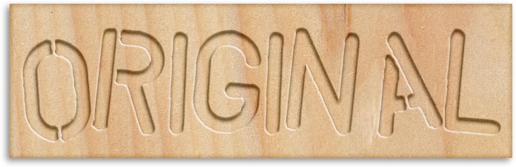
Awesome layout – check out how perfect the title looks!
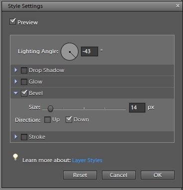
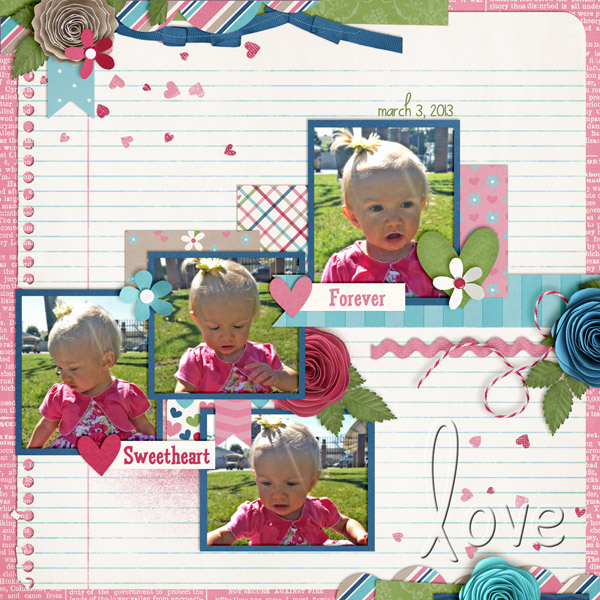
Kassie (kass_23) used Love Grows for her page and completed a Bevel Down in PSE for her look:
There you have it – embossed or letterpressed – depending on what your eye tells you!  Give it a try, and experiment with the style settings. You will find something that you particularly love and will be drawn to use it again!
Have a great day!
Jenn (jk703)


 Hi! I'm Chelle: a 40 something mom of 7. My husband & I live in a rural community in the rocky mountains with our 4 children still at home. In the winters we enjoy sledding & snuggling by the fire. I the cool fall evenings we love relaxing around the campfire & meeting friends at the county fair. Admiring the stars


