Lifted Strings | Digital Scrapbooking Tutorials

Lifted Strings | Digital Scrapbooking Tutorials


Hi Everyone!  It’s Jenn here, otherwise known as jk703 around digiland!  Hope you are enjoying your summer!  Today, I am going to show you how to play with the shadows on strings. They will look as if they are lifted off the page, and this can be applied to papers, and other embellishments too!

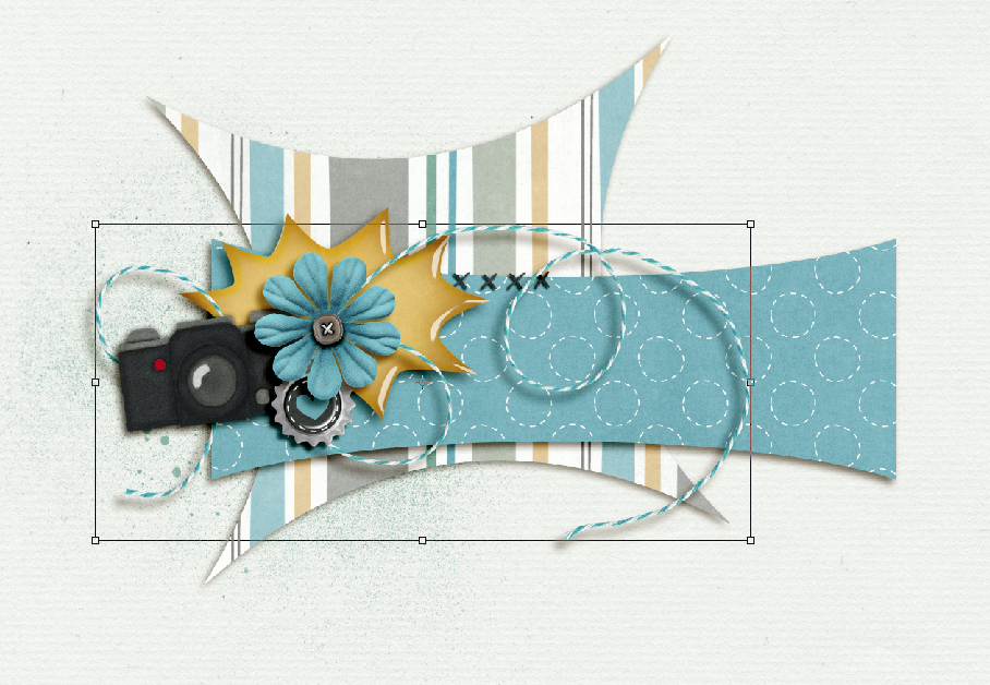
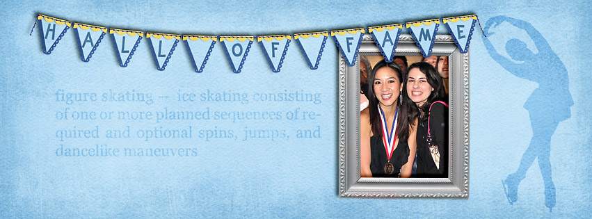
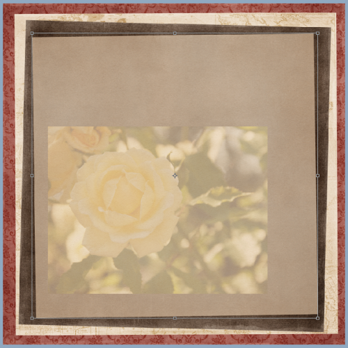
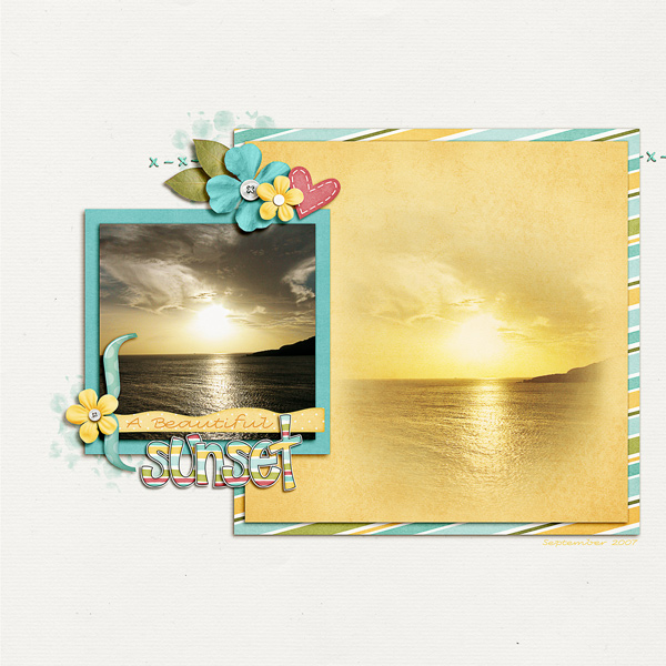
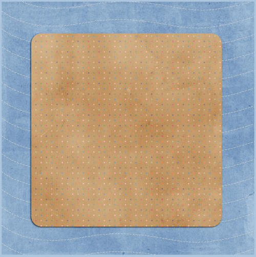
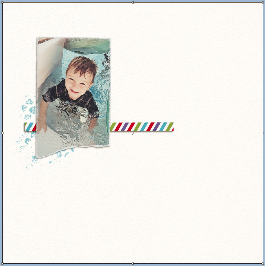
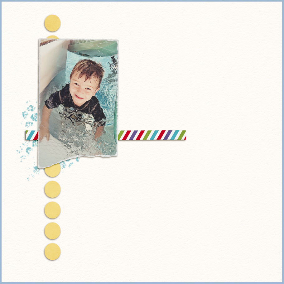
Scrap as you normally would scrap. After you have finished your page, we will tweak your string shadows to make them appear just a little lifted off the page. I’m using Photoshop CS5 and you will need to be able to split your Shadow and element by “Creating Layers” in the Layers Palette. For my example today, I’ve used Oh Snap! and I decided to make a siggy! For this tutorial, I have inserted a white paper for the background so it would be easier to see the shadows and how they move. Here is what it looks like now:

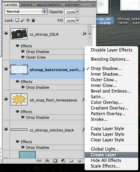
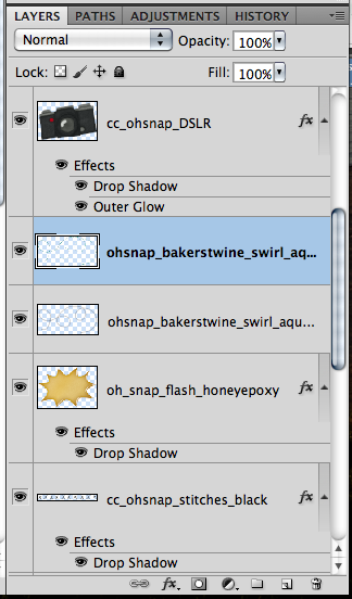
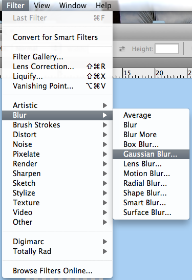
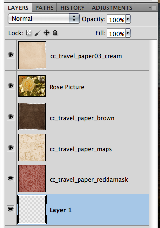
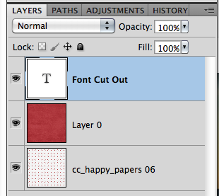
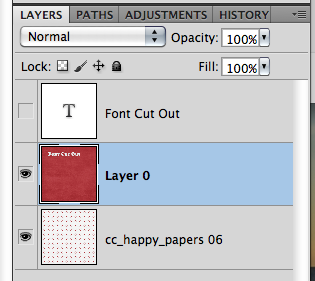
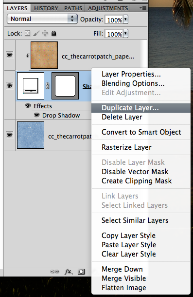
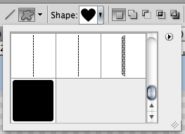
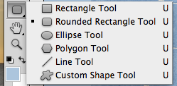
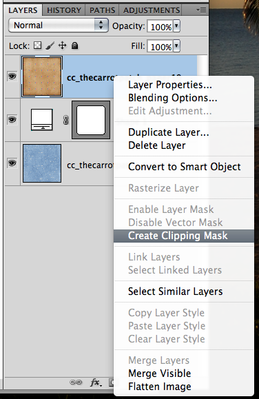
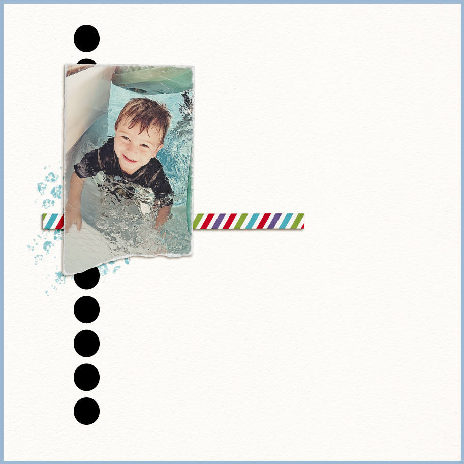
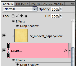
Now, you will right click on the string layer in your layers palette. Choose Create Layer.

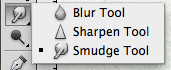
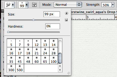
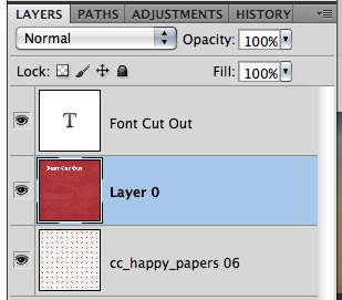
Next, you will have the string’s shadow selected from the layers palette. Click on the Smudge Tool.

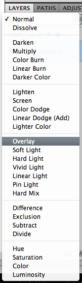
After you have chosen the smudge tool, you will want to change your brush to around 100 or so and with an opacity of 50%. This is all personal to what you like, so you can change this as you see fit.

Look at the shadow of the string, and see where you would like it to lift a little from your page. Click on the shadow of the string, slightly move it in the direction that you want. I moved three different spots on my string. The problem now, is that my string looks too dark where it was lifted.

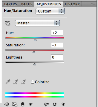
Choosing the Eraser Tool, and changing the size to about 135 with an opacity of 20%, I slowly erased some of the shadows darkness where the string is lifting.
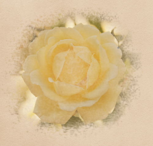
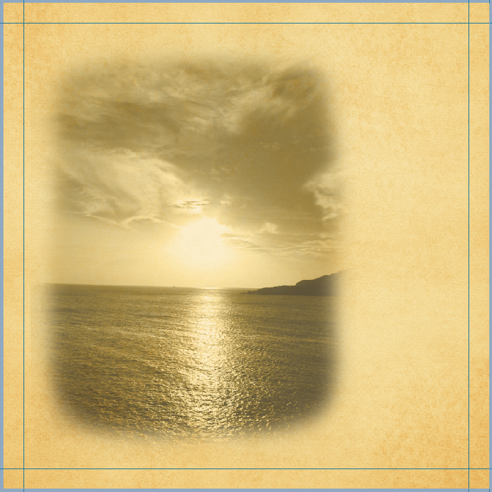
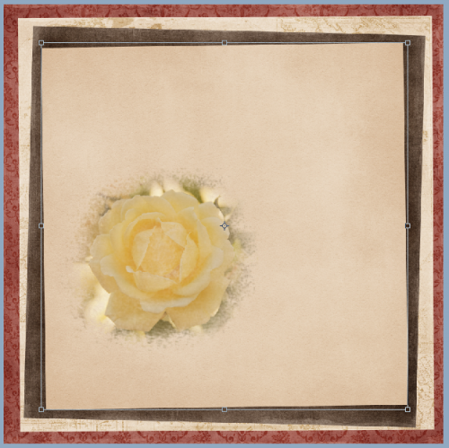
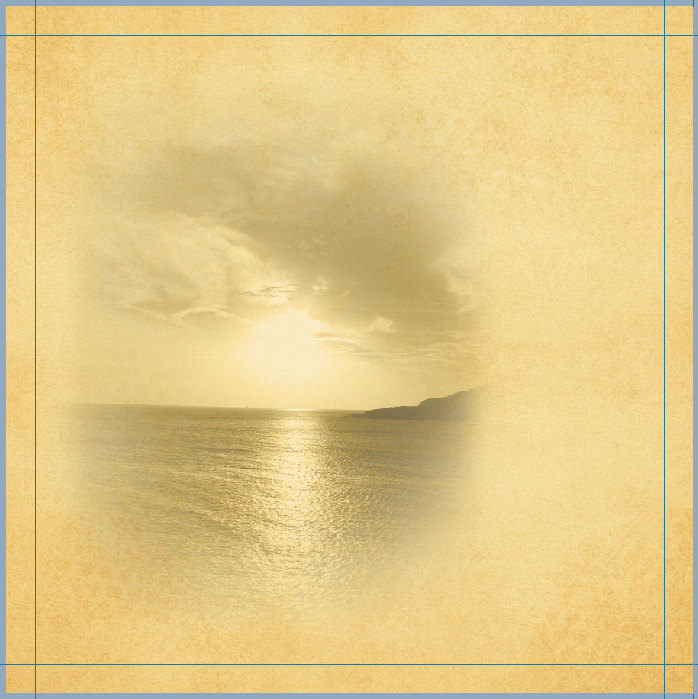
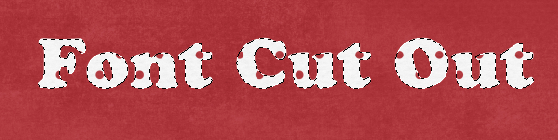
Next, I went back and used the smudge tool on areas to make the string appear closer to certain layers, such as the topmost paper. It takes practice, and it is a personal preference as to how much your strings are lifted off the page. You can also go back and create layers for papers and other elements, such as flowers and bows. Smudge them up, and give a little lift to your pages. Here is what mine looks like after I played with the strings and paper corners.

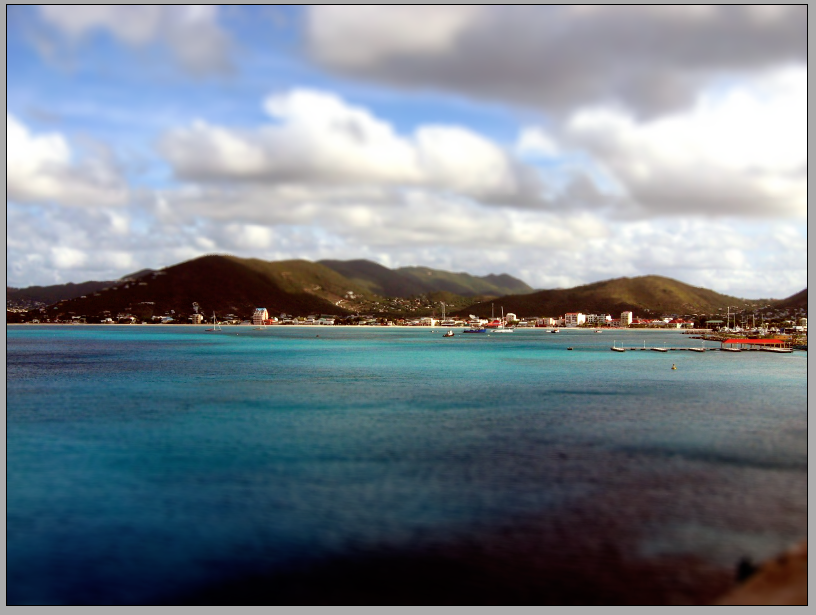
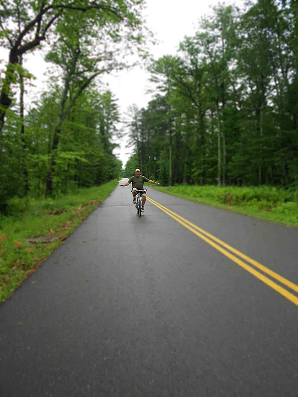
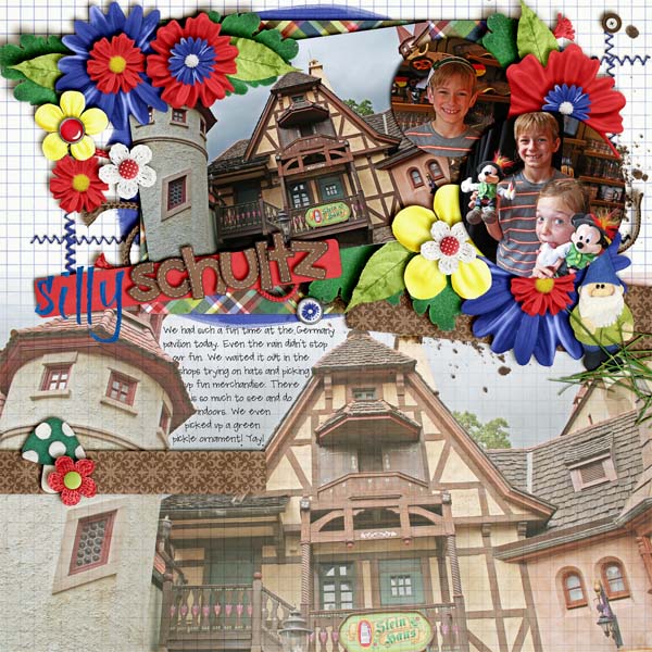
Here is my final Siggy…

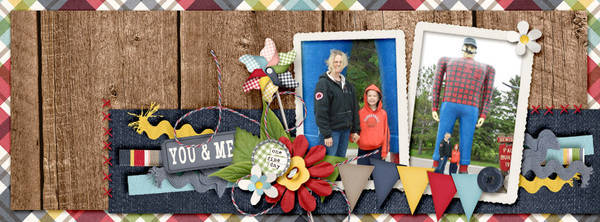
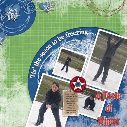
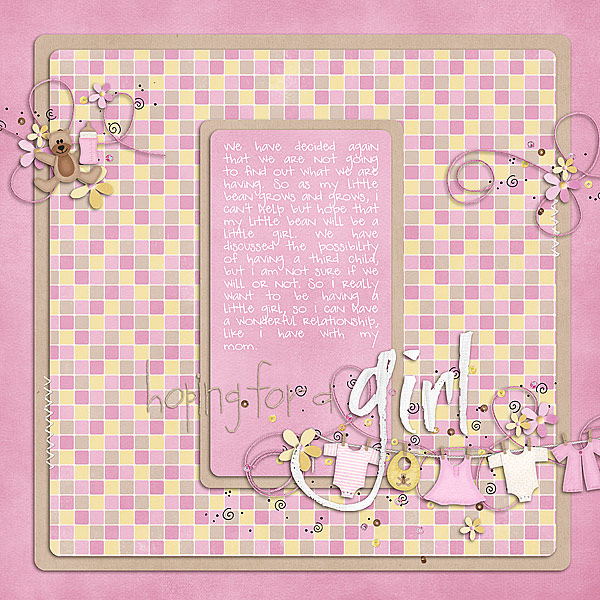
Here are some layouts that they team did using strings. Here is Karen’s before layout and then her after layout. She worked her layout in PSE, and used her own workaround to lifting the string! She used Chelle’s Oh Snap! also. Before:
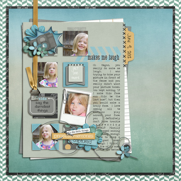
After:

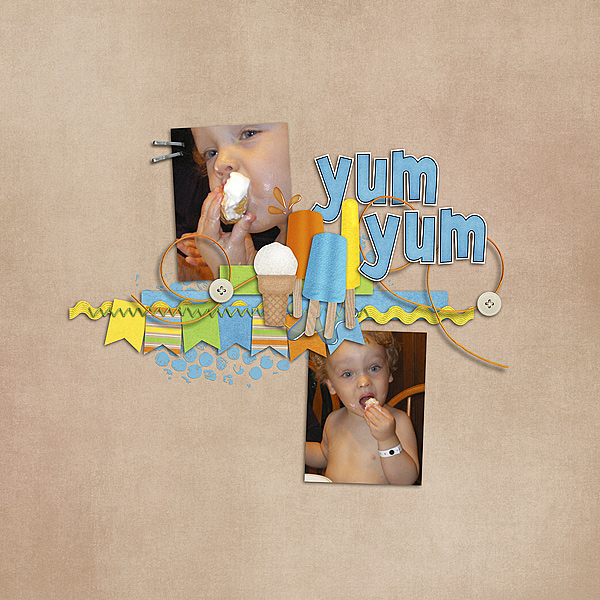
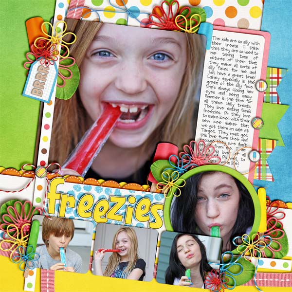
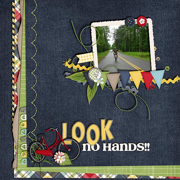
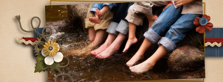
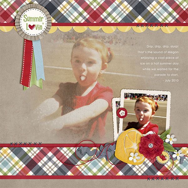
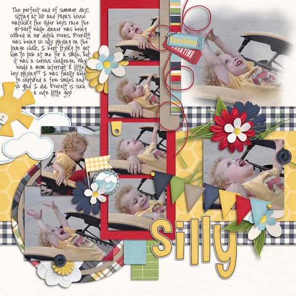
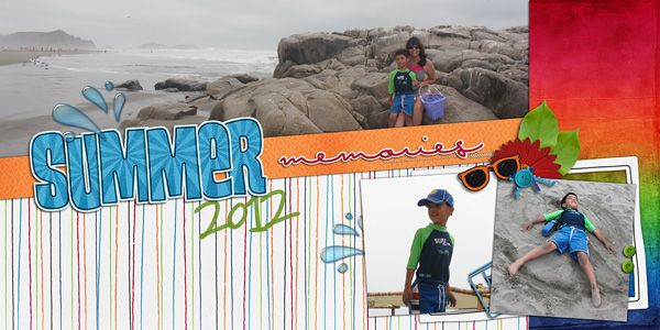
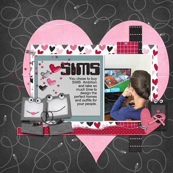
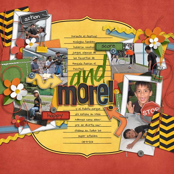
From Melissa, using Beat The Heat:

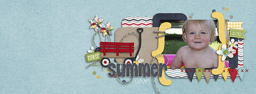
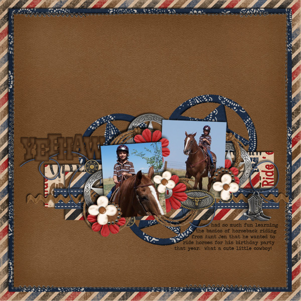
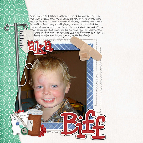
and one from Jenn, also using Beat The Heat:

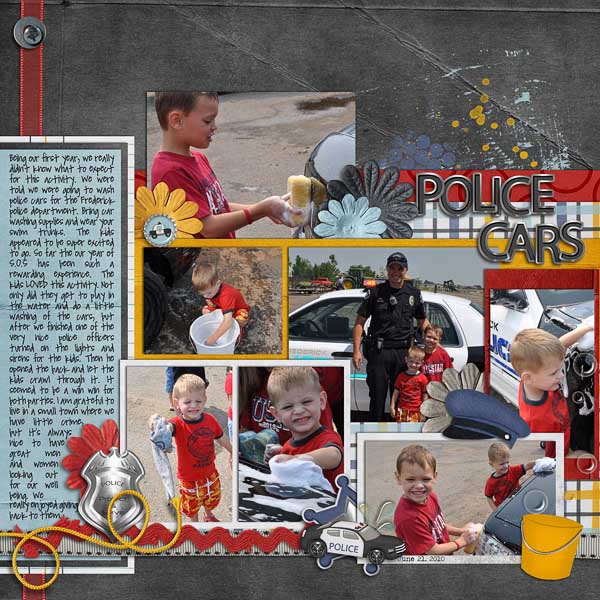
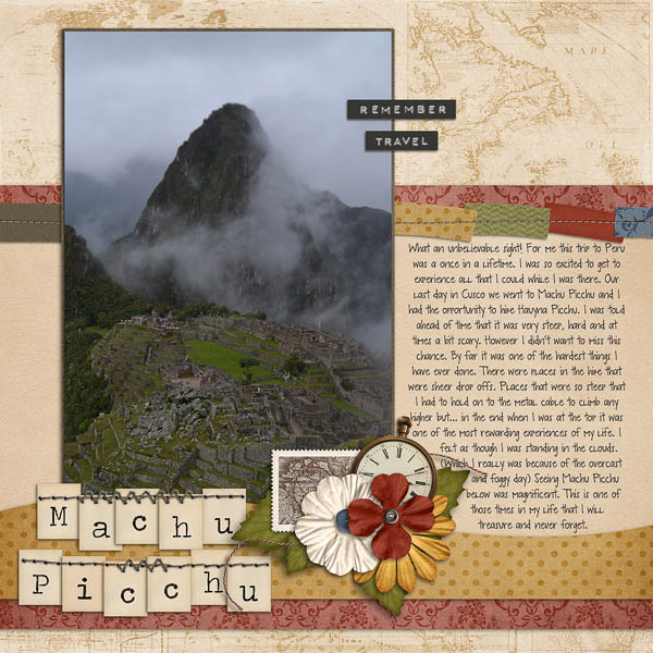
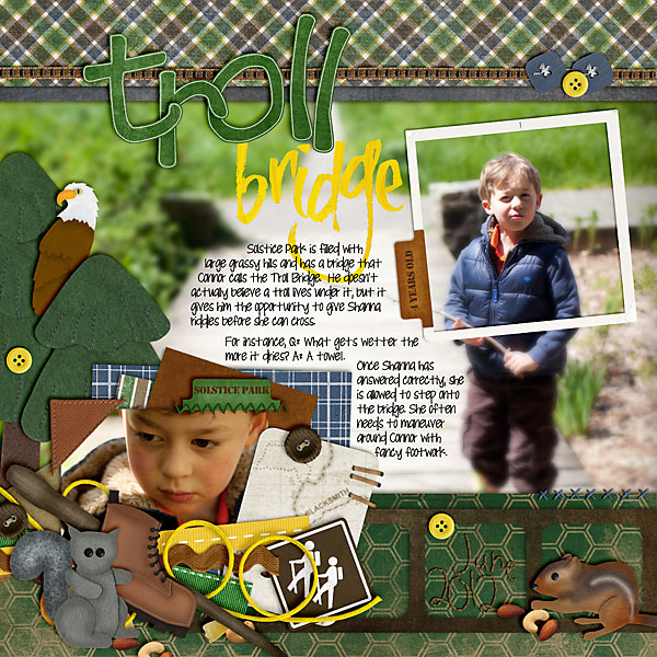
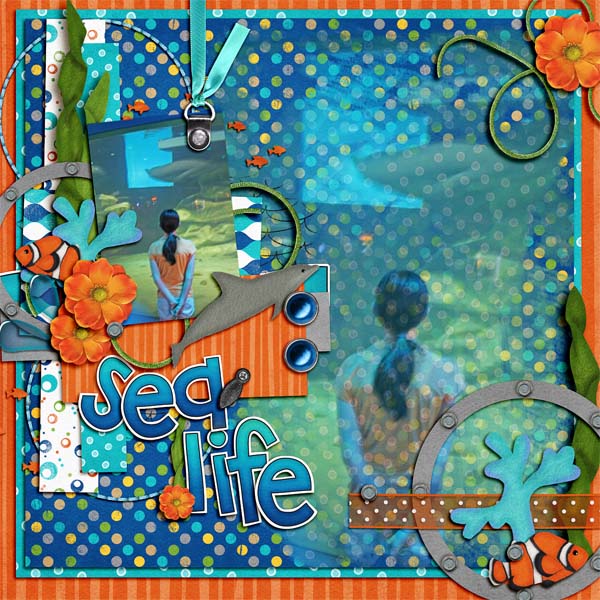
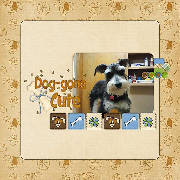
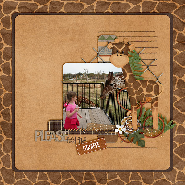
Erica made this awesome page using Heroes {Police} and the bucket is from Spic -n-Span:

 There you have it. Hopefully, you can give it a try!  We would love to see your layouts in the gallery trying out any of the tutorials you can find on Chelle’s blog!  Thanks for visiting and we hope you come back soon!


Miniaturizing Photos | Digital Scrapbooking Tutorials

Hi everyone… this is a photo tutorial. :) It’s Jenn, aka jk703 here to share a fun and maybe new to you technique!  Hope you like it!

Step 1:  Open your photo in Photoshop or Photoshop Elements. Save as a new file. This way the original will be available if you need it.

Step 2: Choose the Quick Mask Mode. It is the little box with a circle under the Foreground and Background Color boxes.

Step 3: Choose the Gradient Tool. On the sub menu, click on the reflective gradient (3rd box), and also make sure that Reverse is checked. You can use any of these that fit your picture though.

Step 4:  Select the part of the photo that will be the miniaturized portion. To do this, click, and drag up. Let go when you feel you have a good space that will be mini. After I let go, my image gets the red gradient mask. The portion that doesn’t have as much red will not be blurred as much.

Step 5:  Click the Quick Mask Mode to turn off the red, and you will see marching ants marching on your photo.

Step 6:  Click on Filter > Blur > Lens Blur. A large screen will pop up, showing all the options that you can play with. When doing this type of photo, I used the Invert and Radius (below). Play with them, and see what you like for your photo.

Here is what my photo looks like now:

Looks pretty cool, yet still shows off that wonderful island!  Here is some more layouts and photo examples by Jennifer/jmljensen and  Erica/Stanworth:

Jennifer’s Before:

Jennifer’s After:

And here is Jennifer’s Layout, and she used the Summer Lovin’ Kit:


Eric’s Before:

Erica’s After:

Erica’s Layout, and she used the Traveler Collection:

Well, a quick tutorial to add a “little” miniaturizing to your photos!  Hope you learned something new!

Have a great day, and thanks for stopping by!


FaceBook Cover | Digital Scrapbooking Tutorials


Hi Everyone!  It’s Jenn, aka jk703, here to bring a tutorial your way. Most everyone that I know, besides my mom and dad have a FaceBook account. Recently, they changed your main page to allow for a photo spot. We can dress up this space with a digital scrapbooking help to make it pop from everyone else’s cover pages!  Here’s how:

For my example, I used Chelle’s Summer Lovin kit to make a great summery cover photo.

Step 1:
Open a new PS file, and set up the canvas to 851 x 315.


Step 2:
Scrap on your canvas as you would a layout. Some items may need to be changed for sizing purposes.

Tip: 
– Make sure to leave space in the lower left corner where your Profile Picture will be. Your Profile Picture will be 125 x 125 pixels. The total image and border is 135 x 135, as FaceBook adds a 4-pixel white border and 1-pixel dark outline. The Profile Picture must be a minimum of 180 x 180 pixels when uploading. The Profile Picture is 23 pixels from the left, 210 pixels from the top

Here is what mine looks like when I am finished.

Step 3:
Save image as a jpg or png. Save for Web, and you are ready to upload to FaceBook.

Step 4:
Uploading your Cover Photo and Profile Picture to your Facebook Page is not difficult. You’ve probably done this before, but just in case you haven’t:
– If this is the first Cover Photo you’ve created for your Page, just click on “Add a Cover,” locate it on your computer and then upload it.
– If you’re replacing an existing Cover Photo, just hover over the Cover Photo and click “Change Cover.”
– Repeat for the Profile Picture, hovering over it and selecting: Edit Profile Picture > Upload Photo.

Tip:
– If you upload an image smaller than 851 x 315, it will be stretched to fit. This will make your image quality appear slightly grainy or distorted.
– Have fun with your Cover Photo. Express yourself, and play with your images!


Here is what the CT did – boy, I love the ideas and such great inspiration!

Jennifer/jmljensen:  She also used Summer Lovin!

Erica/stanworth made this beauty – with an awesome photo! Kit was Traveler.

Melissa/prettypeaches used Summer Lovin also for her handsome man!  That smile is contagious!

Lastly, Heather/snowdrop used Toe Pics & Figure 8’s to create this timeless cover.


Hope these help when you go to try a new cover photo!  Have fun and thanks for visiting!


6.28 Tutorial: Dreamy Photo Look in 5 Minutes

Hi Everyone! It’s Jenn, aka jk703 here…. bringing you a fun and really fast tutorial today!  Love the dreamy look to some older photos that you see?  Well, you can quickly add them in five minutes!  Ready?

Here is my original photo of my son, Colin.

Step 1: Open your image and re-save it. This way the original will remain intact for future use.

Step 2: Duplicate the image. (Cmd+J or Ctrl+J or by Dragging the Background Layer to the “New Layer” button on the bottom of the Layer’s Palette.) This is what the New Layer button looks like:  

Step 3: With the Duplicate layer (or Top Layer) selected in the Layers Palette, Click Filter > Blur > Gaussian Blur. A pop up will “pop” (lol). Enter 10-30px. Look at the preview to see the changes that are made. Play with the amount of blur that you like, and just make sure that the outlines of the face are evident. Click OK.

Step 4: With the Duplicate Layer selected, change the blending mode to Overlay. Your photo will take on a softer, dreamier look. This is within the Layers Palette, and near the top left corner.

Step 5: If your image is too RED, click on the little black and white circle on the bottom of the layers palette – the Adjustment Layer. Choose Hue/Saturation and set the Hue to around a positive 2 or 3 and the Saturation around a negative 2 or 3. Make sure Lightness is set to zero. Click ok. The way the photo appears can be played with in the Adjustment Layer – some photos may need more of an adjustment, so play with the numbers so the images is to your liking.

TIP: To get a specific color for the dreaminess, you can add an additional adjustment layer. With the Duplicate layer selected, choose the icon for the Adjustment layer again. Choose Photo Filter. Pick a color from the drop down menu, and choose the Density. You can add a pink, yellow, or blue dreaminess for the photo. Whatever color you are looking for!

Here is Colin… Dreamified! :)

Now, for some CT Inspiration for your enjoyment!  From Melissa, and she said “When I did this, it made my background really dark, so I turned down the opacity by 10% and it made it have a softer look!”

From Kayla. She had to work with the adjustment layer and advised that her photo was really red so she had to adjust the hue to +7 and saturation down to around -15 to get it to look right.

From Carol, who mentioned that she followed a different technique, but inspired by the Dreamy look. She said that she followed the following steps: Duplicate image, Filter > Blur > Gaussian blur, and then she added mask layer, gradient (circle setting) with a stroke from face to edge.

There you have it – Dreamy Looks in 5 Minutes!  Thanks for stopping by to visit,

6.14 Tutorial: Using the Eraser to Make a Mask

Hi Everyone!  I’m Jenn, aka jk703, here to bring you a quick and easy tutorial for blended masks.  For this tutorial, you will use the Eraser Tool. Something a little different – but so easy!  Let’s get started!

For my Example, I used Chelle’s Traveler Kit. This is a kit that can be very versatile for Men, Traveling, and Everyday Memories. Lot’s to work with and works with all types of pictures.

Step 1:  Open the image and save it to a new file, allowing the original image available if needed. You don’t want to ruin your only copy of a picture. This is a good habit for anything that you open and plan on changing.

Step 2:  Import the paper that you want to have the Brushed Mask on, and make sure it is the layer above the photo. Change the opacity to 70% or so. Save your file, so that this is a working copy of your layout. This way the original paper is still available to use for later.

Here is what the papers look like with the photo and Opacity lowered to 70%:

Step 3:  Choose the Eraser tool, and click on the small arrow next tot he number in the brush tool menu. Choose a brush you like, and make the size somewhere around 100 to 500. For my Example I used a Watercolor Wet Flat Brush, with an Opacity of 20%, and I actually turned the flow down to 60%.  My brush was on the larger side at 432 pixels. Remember, you can use multiple brushes to change the end result.

I decided to use another brush on top of this one. A splatter brush, 55% opacity, 422 pixels, and 55% flow.

Step 4:  Make sure you have the paper layer chosen in the layers palette. Brush on the layer and slowly show the image through the paper. Continue to brush the layer until your photo appears to your liking. Try out different types of brushes, sizes and opacities.

Step 5:  After your have completed the brushwork, change the opacity of the paper layer back to 100%. Your image now looks painted on that layer.

Close Up of the rose:

Super Easy technique there, and each brush will give you a different look on your paper and photo. Play with them and try it out!  Some of the girls on the CT give it a try!  Check out their layouts:

From Jenn:


From Jennifer:

From Erica:


We would love to see what you create!  Please let me know if there are any questions.

Thanks for visiting and I hope you come back soon!


5.30 Tutorial: Easy Blend


Hey Everyone!  It’s Jenn, aka jk703 here for a tutorial for you!  Yay!  I love learning new things about my software, as well as showing people a couple of new techniques!  Today, I’m going to do a quick but easy blending technique.

First, open a blank document, a plainish background paper to practice on and a copy of a photo.  When I am working on something, I save it with the title Working Copy, this way I know what I am working on, and can title it will all my used products at a final save.  Plus, by using a copy of a photo, I know the original is always available to me as a backup!

I’ve used Chelle’s Spic n’ Span, along with some added items from the Rainbow Collection for my example, and a template from Scrapping with Liz. The picture from a cruise vacation my family went on in 2007. It is a favorite sunset – and I love taking pictures of nature and landscapes. Here is my photo on top of a paper.

Remember, place your background paper, and then the photo on top.  When placing your photo, place it where you would like the main part of the image to remain.

Next, within the Layers Palette, and the photo selected, you can scroll through the different Blend Modes that are available to you in PS or PSE.

To “see” what all the blend modes look like with your picture is to do this:  Choose the layer that will be blended in the Layers palette.  Now, press the Shift key, and use your + and – keys to “scroll” through the different blend modes. How easy and cool is that?!

Next, there are two ways to go about blending. Either erasing first or erasing second. For this example, I am erasing first – but you can choose to flip flop the next few steps.

Choosing the Eraser Tool from the Tool Menus, you will choose a large  soft brush. You can change your opacity and flow to dictate how much you will erase, and how drastic it will be with each brush stroke. I lower mine to about 25% when first erasing.  But, with digital scrapbooking, there is always the Undo button, so I am usually not too worried about mistake brush strokes.

Erase away at the edges. Remove the blunt corners, and slowly make the shape that you want to show off from your photo. This may take multiple steps and different opacities while erasing.

Here is what I have so far:

I still think the erasing needs work, and the opacity seems harsh to me. So, I will keep erasing and working on my blend at this point.  After some more brush work, and playing with the blend modes, here is my photo blend.

I really liked the Luminosity blend mode and I also liked the Linear Burn, and Multiply.  Look at them all though – each picture will have a different effect determined by the background paper you choose as well as the picture itself.  Here is the Luminosity blend mode:

At this point, I will duplicate my photo and background paper onto my layout. To do that, all you have to do is highlight both layers in the Layers Palette, and right click. Choose Duplicate Layers, and copy them to the layout that you are working on!

Another fun idea is to combine the blends. Try duplicating the blended photo, and change each layer’s blend mode. You might be surprised what your blended photos look like when mixed with different blend modes!

I ended up layering it, and showing off the original with the blend. I also switched my blend mode. I love this photo and love how the blend really pops with the original photo next to it!

Hoping that was an easy blend tutorial for you!  Thanks for visiting and we hope to see you here again!

5.15 Tutorial: Swiss Cheese Font Edition

Hi Everyone!  i’m Jenn, aka jk703 here this great Thursday!  Hey… it beats Monday in my book!  :) Hope you are all having a great week and getting some scrapping in!  There is so much you can do with your layouts, and so many new techniques that are out there to try!  We often use alphas, and font on our layouts, as well as part of our journaling.  Alphas help up spice up the titles and add a little more to the page than just a plain font. Fonts can be decorative, handwriting or even themed. So, let’s see what we can come up with today!

One that I like is the “Swiss Cheese” Technique. Today’s tutorial is a spin on that technique, by using the font as the “swiss cheese holes.”  For my example, I used Chelle’s Happy Papers.  This is just one great part of the Happy Collection of goodies – Papers, Brackets & Frames, Elements and a Alpha!  Fun, and can be used for a perfect or magical day!  :)

Step #1: Open some papers, and  make sure to have at least 2 papers open in your workspace.

Step #2:  Select the Text Tool from your Tool Menu.  Then choose your font.  Mine is Cooper Std. type in the words that you will cut out.  Before the next step, make sure to put your words where you want them to be on your layout. You will not be able to move them easily later on. Here is what your layers will look like as of now.

Step #3:  Command (Control) + Click on the Font Thumbnail, and you will see marching ants all around the outside of your font.

Step #4: With the marching ants still marching, select the topmost paper in the Layers Palette. This should be the paper that is your background, the one that will have the cut out. Press Command (Control) + Delete. This will delete the font’s shape from that paper.

Step #5:  Turn off the visibility of the Font Layer  – Click on the Eye on the left side of the layer.

Step #6: Lastly, Command (Control) + D to stop the marching ants from marching.  Add a shadow Style to the top paper layer. There you go – Swiss Cheesed Fonts. :)

Here are other fun techniques that you can do with fonts and Alphas.

Ronnie (ronnie_texas) used a font for the main title “A Taste of Winter.” She then simplified the layer, clipped paper and merged layers. Lastly, she added a white stroke. The subtitle was also created using a font, adding an adjustment layer of white and once again, she added the white border using stroke to give it more impact.

Heather (snowdrop) also created a sticker look with the word Fairmount – it almost looks like it is a thick sticker and it might be  raised with pop dots! Cool!

Roxana (roxanamdm) created this layout with such pop – and added some cool effects to her subtitle word. See the word memories – it looks almost like a puffy sticker to me!  That is awesome!

This layout by Cara (colson) made a bright a fun layout with an awesome blend to boot!  Check out that cool font that she stickerized (yes, my own term, lol) and then outlined!  It really stands out!

Well…. lots to see and try on your layouts!  Thanks for coming by and visiting – hope to see you again soon!

4.26 Tutorial: Saving A Custom Shape

Hi Everyone!  It’s time for a tutorial!  Yay!  I’m Jenn, aka jk703 – happy to be here to share a easy but useful workflow process to save you time! A couple of my recent tutorials focused on the Shape Tool for using it to make a Custom Shape, and another for Rounded Edges. This tutorial will show you how to save your custom shape to your shape library. There are many ways to do things in Photoshop and Photoshop Elements – I’m just sharing one of the ways. To me, this is a very easy way.

Now, I understand that this is not as amusing or fun as creating your own custom shapes, but it is definitely helpful to learn. If you save your custom shapes as you create them, you can reuse that shape over and over again. When I made my rounded edges square, I saved it – so I could use it for background mats or photo mats later on. I’ve done this with irregular star shapes, fun wavy shapes, and flowers too!

For this tutorial, I’m going to use the Rounded Edges Example from the previous tutorial. It is HERE if you would like to look at it again. That tutorial ended with us clipping a background paper to our new square shape with rounded edges, as seen below.
Let’s save that shape!

Step #1:  In your layers palette, you will want the shape layer active.  Right click on it and click on Duplicate Layer. A Duplicate Layer pop up will appear. Click on the Destination Document and choose New. I duplicate to a new document so that I don’t ruin anything in the layout I am working on, and so I don’t save the wrong item as my shape.

Step #2: Next, you will be in the New Document, and the only layer will be your shape. Right click on it, and choose, Clear Layer Style.  This clears your shape of any styles, such as shadows.

After removing the style, this is what your layer should look like.

Step #3:  In the Layers Palette, click on the actual shape once. In the above picture, there is a slight double line on the corners of the Shape Box. That is important for the next step.

Step #4:  Then on the Top Menubar, click on Edit > Define Custom Shape. A pop up will show, and ask you to name your shape. Enter the name.

Step #5:  Choose the Shape Tool. In the Shape Tool Options bar, click on the small arrow next to the shape and you can scroll through the shapes until the end.  Your shape should be the last one there. Tadaa!

Tip:  To organize or delete shapes after creation, just click on that arrow next to the shape listing on the right. It’s really small!  Then choose Preset Manager. In this pop up box, you can move shapes, rename them, and delete them. You can also save your favorites as a set!

There you go… creating a shape, creating rounded edges, and now saving your shapes. I think we have shapes covered!

Here is some awesome inspiration that the CT came up with!  Check these layouts out!
From Jenn (jennshultz). She made strips for her title and for a little pattern breaks here and there! Look at that blended photo – it pops!

From Stefanie (eyeore). She used the heart, and clipped a background paper, adding an overlay too!  Awesome twist to this kit!

From Jennifer (jmljensen). She used the rounded edges to make her edges rounded like the little epoxie element!  Great idea!

From Melissa (prettypeaches). Love the way the rounded edges look – but the focus on the layout is her journaling!  Beautiful!

Lastly, from Karen (karen32). Look at the shapes below her layers and cluster work – see what it is?  It is the silver circle with the star in the center!  How awesome is that shape – and once saved – it can be used over and over again!  Even for journaling! Love the shapes and how they are cut out of the brown paper!  Really cool!

Well, there you go…. shapes and saving them!  Hope that was helpful! Thanks for visiting!

3.15 Tutorial: Rounded Edge

3.15 Tutorial: Rounded Edge


Hi Everyone! Hope you are all doing great!  It’s Jenn, aka jk703, here for an easy tutorial – but something you might not know how to do!  Hope this is easy for you to follow, and maybe something new for you!

Many of my layouts are square… right angles, and lots of them!  What about softening the edges, and making some of your layers rounded?!  I love this little idea, and use it all the time, especially because it is sooo easy!  So, start your layout, and let’s go!

Step 1:  When you are ready to make your rounded edge layer, choose the Rounded Rectangle Tool from the Tools Palette. My tools pop out to the right when I click and hold, which allows me to choose one of the other sub tools in the menu.

Step 2:  Next, you will see your cursor change to a symbol similar to a plus sign. On the tools menu options, there is a section for the Radius.  You can have anything up to 13 inches. I’ve used .50 inches for this example.

Step 3:  Now, you will click on your layout, and hold the mouse button down.  Drag the button, and you will see your shape forming with a dashed line.  Make the shape the size that you would like. When you let go of the mouse button, the shape will be filled in with the foreground color.

Step 4: After the color is filled, you can then clip your paper to the shape!
Step 5:  Add your shadows and you’ve made rounded edges!
But what happens if you use a different radius?  The amount of roundness will change, making it a larger number will cause the shape to be rounder.  Having a lower radius, will cause the shape to be less round on the corners.
Here is a different example, rounder with a radius of 2 inches:
A really simple way to add something different to your layouts!  Here is my final page, and I used Chelle’s Carrot Patch and Stamped Alpha:
One from Mel.
From Jan:
From Melissa:
Thanks for stopping by and visiting!
Jenn (jk703)

2.16 Tutorial: Custom Shape Tool


Hi Everyone!  It’s Jenn, aka jk703 here to share a fun tutorial that I use all the time.  Custom shapes are a fun tool in Photoshop.  They can help make fun layers, photo mats, and even custom text paths. I tend to use them mostly for all of those reasons, lol! You can apply special effects and cool styles to create even more shapes and fun things for your scrapbook layouts! The pre-drawn images that you will find already loaded in the software have lots of stars, circles, arrows, and decorative shapes. But, the best part is the fact that you can actually create your own shapes and save them too!  Today, I’m going to focus on actually making a shaped paper mat (or photo mat).

Here is a quick tutorial to add a custom shape layer to your layout.  For my example, I’ve used the newest kit from Chelle’s Creations, The Mane Event Bundle, as well as a splatter from Chelle’s Spic n Span kit and my picture uses Worn Pieces by Happy Scrap Girl.  My fonts are The Chuck Wearer by Heather Hess and LDJ Thankful.
Here is my layout with my son, Colin. I’ve started the layers, but I want to add a couple of shapes to clip my papers to behind the photo.
Choose the Custom Shape Tool in the Tool Menu, by clicking on it or by pressing the “U.”  Tip – to rotate between the different shape tools, press the “U” again along with the Shift key.
From the top menu bar, click on the small arrow next to the star, and a whole menu will appear with shapes that you can choose from.  Pick your shape.
In your Layers Palette, we are going to add a blank layer. Note that the new layer inserts above the layer you have selected in the Layers Palette. Now, look towards the bottom there is a small square with a corned folded over. Click that once.
Now, with that new layer selected and your custom shape tool active, click on your layout and drag your shape to the size that you want.  When you let go of the mouse button, the shape will fill with the foreground color.
Next, I clipped my paper to the shape, and added my shadow to the shape layer. Here is my Layers Palette and how it looks on my layout.
After that circle shape, I decided to add one more star-ish shape mat. To finish off my layout, I also decided to use a shape to make a text path for my journaling – so it would fit exactly under my star shape.  Here is my final layout.
Here is some more inspiration when using the shape tool:
By Shannell
She used shapes to make the paper mats on her page.  She also mentioned that if she didn’t start with a template, she turns to the shape tool – which helps her get started on her layout.
By Roxana
Roxana used her shape tool to highlight her title and journaling. The yellow bracket shape really pops off the red.
By Jennifer
She used the custom shape tool (sign #4) which looks like a highway road sign to create the border. I made it extra large and clipped a paper to it. Awesome curve add so much to the design of the layout!
Hope that you enjoyed this tutorial!
Thanks for visiting and come again soon!