Tutorial Stroked Overlays for Paper and Photos

Tutorial Stroked Overlays for Paper and Photos

Hey everyone!  Happy Valentine’s Day if you are in the US!  This is Jenn, aka jk703, here for today’s tutorial for Stroked Overlays. This is to add a little edging around your paper or photo. A simple technique, yet it can add a little pop to the page. Let’s get started.

Here is my layout that I am working on. I’ve used Chelle’s Family Tree for my example.

Using the Shape Tool… Create a Shape… any shape you like. I chose a rectangle (and later I changed it to a rounded rectangle). Then click on the Shape’s thumbnail in the Layer’s Palette. This will bring the ants marching around your shape.

2

Create a new layer by clicking on the square with the folded edge that is on the bottom of the Layers Palette. If this is a paper, then you can hide the shape layer. If this is a picture, please leave the shape unhidden. 3
My example is for a paper, so I have hidden my shape layer. With this new layer selected, click on Edit > Stroke. A pop up will appear… you can make your choices for color, size and blend mode.

5

6

Once you click ok, press Command + D (Control + D for PC). You will have a stroke of your shape, super easy! (I will refer to this as the stroked layer) You can change it up to have rounded edges, blend modes, and colors.

7
Rounded Rectangle version:
8
To go a step further, I’m going to add a title to my stroke. With the Type Tool, I’ve typed Brothers, and placed it above my stroked line.
9
Next, in the Layers Palette, I’ve chosen the stroked layer I just created. Then I selected the Rectangular Marquee Tool. I’ve clicked and dragged a rectangle over the word I typed in – “Brothers.” Once I have my rectangular Marquee in the right spot; I let go of the mouse. I pressed the delete button and the part of the line within the rectangular marquee was deleted. Switching to the Move Tool, I was able to scoot my Type Layer down to fall within the line.
10
11
12Here is a paper overlay stroke… with a title mixed in, blend mode changed to Soft light. My font is TXT Longhand.
13
For Photo Overlays…
If you are working on a layer that is for a photo or something else that you want to outline don’t hide the shape layer. That will become your photo mask. Click on the shape’s thumbnail in the Layer’s Palette to get the marching ants. Create a new layer, and then click on Select > Modify > Contract. A pop up menu will appear. I chose a contraction of 50 pixels, and click ok. Add the stroke as stated above. You will have a stroke on the inside of your photo mat. You can follow the same steps to remove part of the stroke to add words, or maybe a date.
14
15
Here are some pages that the CT did using this tutorial!
Leslie (lab130) said she used the smudge tool to make the lines imperfect. Blend mode is Overlay. She used the Back 2 School Bundle by Chelle for her layout.
LABeahm_stroke-tutorial
Roxana (roxanamdm) used Leafy Treetops and Scribbles 2. She put strokes on the pictures, used blend mode of Normal and 100%.
22-bosqueleft-web
Jenn (jennshultz) tried out the tutorial and made this page using Apple of My Eye from Chelle. She made a stroke on the smaller picture, and added the word Apple.
foolinattheorchard
And here is my final layout. I went back and forth with the rounded edges and couldn’t decide. For now, I left the straight edges and think it looks nice with the angles of papers on the bottom of the layout!
SO_CC_FamilyTree_BrothersFriends_Sum2012_txtLonghand_WEB
I hope you’ll give it a try! It’s fun and once you give a try, it will be easy too! Have fun! Thanks for visiting, and we hope to see you again soon!
by_Jenn
Blend Mode Tips and Comparisons | Digital Scrapbooking Tips

Blend Mode Tips and Comparisons | Digital Scrapbooking Tips

Hi Everyone!  Hope you are all doing ok!  It’s Jenn, aka jk703, here from the super cold (for us) this week!  It’s the coldest we’ve seen in a while in New Jersey, so I’m happy to stay bundled inside and under a few extra layers of warmth!

With layers in mind, we are going to take a peek at Blend Modes and how they compare to each other. First, Blend Modes are ways that we can change the look of our layers. They can blend layers together to create new looks and effects. There is a base layer and then the “painted or edited” layer. Blend modes will let the layers own, highlights or shadow, details to show through from the underlying image.

For this post, my base layers will be “Normal” and at 100% fill and 100% opacity.  Combining the two layers can create some beautiful effects, and enhance your papers, ellies or photos in digital scrapbooking. Here is my layout that I created. My background is actually a combination of blend modes and papers. I used Chelle’s Love Grows Bundle for my “The Usual” layouts.

Blend1

Here is the list of Blend Modes that are available to you:

Blend3

Here are some easy explanations for my favorite blend modes – from my point of view and usage.

  • Normal = no change or blending
  • Darken = replaces pixels that are lighter than the original layer. If they are lighter, they are replaced.
  • Multiply = takes the base layer color and multiplies it to the blend color layer, which makes darker color. Great for overexposed images.
  • Color Burn = darkens the base layer color to reflect the blend color layer. White has no effect of this blend mode.
  • Linear Burn = darkens like Color Burn, but takes away the brightness.
  • Lighten = chooses either the base color or the blend color, whichever is lighter.
  • Screen = color from both layers are multiplied by the inverse colors. The result color is always a lighter color. Screen is the typical fix for an underexposed image because it lightens it.
  • Overlay = applying a multiply or screen effect depending on the base color. Great for enhancing colors.
  • Soft Light = Darkens or lightens colors, depending on the blend color layer. It is like shining a diffused  or muted light on the layers.
  • Luminosity =  lightness is changed to that of the blend layer while preserving the base colour and saturation. Great for blending.

Currently, my paper layers look like this… As you can see, I have a lighter plaid paper on top of the denim paper. I also have a teal paper under my denim paper. This is because I was indecisive when choosing my final background. I decided that the dark denim looked best. For this blog post, the teal paper does not affect or change the color of my background as I have turned off the viewing of those 2 layers.

Blend2

Right now, you can see that my light plaid paper has a blend mode of Vivid Light chosen, and a fill of 21%. A very important tip:  lowering the opacity of the layer will weaken both the layer and its effects. By lowering the layer’s fill, it will weaken the layer without affecting the appearance of the effects. I see what I like when I create, but many times I choose Fill over Opacity. :)

BlendModesChelle1.24.13

Here are my final pages:

SO_CC_LoveGrows_SwL_KeepRealDblTmp_TheHillary_ShayneUsual_Apr2012_DblWEB


SO_CC_LoveGrows_SwL_KeepRealDblTmp_TheHillary_ShayneUsual_Apr2012_WEBLft


SO_CC_LoveGrows_SwL_KeepRealDblTmp_TheHillary_ShayneUsual_Apr2012WEBRght


Here is what the CT did with their blending!

Leslie (lab130) created this wonderful photo stunning page!  Look at that! She used Chelle’s ‘On the Trail‘ paper and ‘Letters from Home’ frames and staples. Here is how she described her layouts with the blend modes – “The large photos are hard light blended. The smaller photos are multiplied and the opacity of the multiplied photo is reduced to about 50%.”

Chelle-Tutorial-Big-Bend---

Chelle-Tutorial-Big-Bend-le

Chelle-Tutorial-Big-Bend-ri


Roxana (roxanamdm) said that she Used 3 layers for the background picture to make the kids pop a little from the photo. The opacity of the layers were as follows: 1-overlay 30%, 2-soft light 30%, 3-normal 80%. I believe she used Chelle’s Make a Splash kit.

8-piscinaleft-web_zps1847a837

One last tip!  When you want to scroll through the blend modes for a specific layer, there is an easy way. Just choose the layer that you want to play with int he Layer’s Palette. Next, click on the Blend Mode list in the top left of the Layers panel to select a blend mode. Then press Shift + (plus key) to cycle down the list and Shift – (minus key) to go back up.  This little tip is a time saver!

Have a great week everyone!

by_Jenn

Tutorial: Swiss Cheese and Cut Outs \ Digital Scrapbooking Tutorials

Tutorial: Swiss Cheese and Cut Outs \ Digital Scrapbooking Tutorials

Good Morning everyone! Happy Thursday!  I’m Jenn, aka jk703, here to bring you an easy tutorial for the “Swiss Cheese Effect,” aka Cut Outs.  This effect is basically when you have more than two papers layered on your layout and you cut a shape or word out of the top most layer.  Add a Shadow, and it offers up a really cool way to change up a layout. For my example, I used Chelle ‘s Back 2 School kit and Add On, and a rarker serif. Here we go…

Step 1:  Use the Type Tool or the Shape Tool to make the shape that you want to cut out. I’ve started a layout, and used the Text Tool and wrote a word on top of my patterned paper. I will be cutting out words so the solid red paper will show from under the patterned paper. Here is what I have:

Swiss1


Step 2:  In the Layers Palette, click + Command (or Control for Windows Users) on the Thumbnail for your cut out. You will see marching ants, like these:

Swiss2


Step 3:  Again, in the Layers Palette, find the paper that you need to delete for the lowermost paper to show through. For my example, I need to delete the shape mask that my white paper is clipped to. Once you have the layer, press delete. You will see the paper underneath. Press command + D to deselect and remove the marching ants.

Swiss3


Step 4:  Add shadowing to your cut out to make it look a bit more realistic. That’s it!

Swiss4


Here is what the CT made using this technique.

Jenn used Home for the Holidays Bundle for her layout!  The swirl cut out adds some fun and movement! JennSwiss


Ronnie used Chalked Boards, Chalked (Serif)Chillin’ & Grillin’E I E I OLeafy Treetops, Lovin in the OvenStitch Me Up and Under Construction. Wow!

RonnieSwiss

Jenn V also created a cool page. Check out those musical notes. She used We Wish You a Merry Christmas,

Mark My Words, Stamp Masks, and Stitch Me Up: Frames.

JennVSwiss

When I started my layout, I was using a different title… so my page and title work changed. I decided to cut out my whole title across the page. For my album copy, I put a little space between the “c” and the “h” so it wouldn’tget cut off when printed. Here is my final page:

SO_CC_Back2School_SwlPhotMasks_LDMarkerSeif_BoysSept2012_WEBDbl

There you have it. A pretty easy way to try out a new technique on your layouts!  Have fun, and thank you for visiting!

by_Jenn


Watery Alphas and Fonts | Digital Scrapbooking Tutorials

Watery Alphas and Fonts | Digital Scrapbooking Tutorials

Hi Everyone! Hope you are enjoying the last few days of the year; I always think it’s crazy how fast each year passes!

Today, I’m going to show you how to add a fun, if not watery, technique to your stash of Chelle’s alphas, or any fonts that you have. For my technique today, I’m using Chelle’s CU Splats, which give a great watery spots to add to your layout. Then to add a little spray or texture, you can use so many of her other products, such as the CU Texturizing Brushes 2, Stains and Spills, or even the CU Spritzers. So many options!

When I’ve used this technique in the past, I work in a separate file and then duplicate my final layers into my working layout. This way, I don’t mistakenly ruin a part of my layout, and it makes it easier to see my letters and layers.

Here is my example, plain. I used Chelle’s Scribbles alphabet.
Wet1

Now, I look through my stash of splats from the CU Splats and I’m going to focus on the asterisk. I’m looking for a splat that will work with the shape of the symbol (or letter). Once I bring it into my layout, I make size it smaller. You will be making the splats pretty small, so they go with the size of the letter or symbol.
Wet2

You can focus on corners, or edges. Try using long splats on long edges, or even blobs on points. Water can bleed and splash in any direction or multiple directions. Play with the blend modes and the opacity when working with the splats. You can see how they react with the layers below and the colors.
Wet3Wet4

Here is a mix of splats, spritzes and textures to my original example.
Wet5

You can also use this technique on fonts. Here is “wet” in Arial. Next to the plain image is my “wet” image with splats and watery effects.
Wet6 Wet7

Here is what my image would look like on a background paper (from Home For the Holidays) and using two different Blend Modes.
Wet8

Wet9

Another really cool way to change this effect is to delete a selection. I merged all the splats and watery drop layers into one layer. Then press Command (Control for Windows) and click on the splats and water drop layer thumbnail in the Layers Palette. The layer will get marching ants. Next, choose the text layer, and press delete. Here is what happens:
Wet10

Another idea would be to duplicate the splat and watery drops layers. Change the blend modes on each layer, delete from the original word, and play around. Here is an example where I merged all the watery spots, then duplicated the layer. I then deleted the watery spots from the word, and applied another blend effect to the other layer. Mix and match and see what you end up with.Here is what I ended up with for the Typed Font and the Scribbled alpha…. Pretty neat, right?!

Wet12

Wet11

Here is what the CT came up with… First, Jennifer (jmljensen) created this page using Zoopendous and Apple of My Eye.

Jennifer_Wet Typography

Ronnie created her sticky page using many parts of Chelle’s Creations products – such as All Hallows Eve Staples, PrimarilyPhotoStacksCU Splats, and Rainbow Neutrals Stiches.

Ronnie_WetTypography

Give it a try… it is a fun technique to use and you can add a little oomph to your pages!

Thanks for stopping by – hope to see you again!

by_Jenn

Using the Background Eraser Tool | Digital Scrapbooking Tutorials

Using the Background Eraser Tool | Digital Scrapbooking Tutorials

Hello everyone!  It’s Jenn here today to show off a new tool, and how you can use it in scrapbooking your layouts.The Background Eraser Tool is a simple way to remove the background of your image. It isn’t perfect, and takes some practice. At the same time, it can give you a little help on extracting items or working with a photo that will be blended. I basically use it as a color eraser, lol! Lets get started.

Step 1: Open your image, and re-save it as another name. This tutorial is a [B]destructive[/B] tutorial, and you do not want to ruin your original image. You will be erasing the photo directly on it’s layer. Here is my image, A pumpkin.

Step 2: Choose the Background Eraser Tool from the Toolbar Menu or press E to get to the Eraser Tool. Press E again to choose the Background Eraser Tool.

Step 3: I’ve made my eraser size about 400, 100 % hardness, and 30% spacing. We will talk about each menu bar option. First, there are three choices (shown as the icons) when erasing for sampling that are on the menu bar – Continuous, Once, and Background Swatch. Most times you will use Continuous or Once.

NOTE: Your “eraser” will look like a circle with a + in the middle. The + is important as that tells PS what color you want deleted, or not deleted. The plus sign is where photoshop take a sample of the color you want to be deleted. When in continuous sampling mode, the pixels inside the circle that are a match to the sampled pixels will be deleted. If you accidentially move the plus sign and click on an area that you don’t want to delete, undo (Command + Z) that step. If you chose once, only the color that you chose with the + sign will be deleted, no matter where you click.

Step 4: Erase. To erase, hover the plus sign on the part of the background that you want to erase. Another important option are the Limits. Limits are Continuous, Discontiguous or Find Edges.

NOTE: Contiguous is the default, and this option will only erase a specific area of pixels – ones that touch. This might be an issue when you have trees, bushes, wires, or other items. Discontiguous means that you have the freedom to erase pixels anywhere if they match the sample color being deleted. If you click on a certain color, it will be deleted throughout your image, and that means in between branches, hair, bushes, etc.

Step 5: As you are deleting pixels that you have sampled, sometimes the colors are very close, and PS doesn’t know what to do. First, you can play with the Tolerance of the color selection, and it’s default is 50%. If you see that the Background Eraser keeps erasing part of the area you’re trying to keep because the color of the background is too similar to your subject, try a lower Tolerance setting.

NOTE: Sometimes it seems that the Background Eraser Tool will erase the background in your image as well as erasing part of your subject even after playing with the Tolerance level. This is when we try the Protect Foreground Color. When you click on this option, you can tell PS what color you do not want to delete, even if it is close to the color sample. Just hold down the Option (Alt Key for Windows) and then the Eyedropper Tool will pop up. Choose the color you want to protect, and then you can delete the background without deleting the image you want to keep. You may re-select the Foreground color as needed.


Step 6: Keep erasing until you have your object with no background. Here is what I have after erasing the background around the pumpkin edges. I can now make a quick selection and use my image as an extracted item, or blend it into the background.

Here is my layout. I used Chelle’s Creations Carve to scrap our 2012 Perfect Pumpkin. Every year we pick a perfect pumpkin, and this one happened to be it for 2012. 

Here is a layout from Carol, aka Iowan. She said “The royal blue background fought with the kit’s blue.”  I think it turned out wonderfully! Below her layout, you can see her original photo.

Jennifer, aka jmljensen, created this beautiful layout!  Love how it turned out!

 Well, there you go!  Another tool that is available to you in Photoshop!  Have fun playing and erasing!

Thanks for visiting and we’d love to see any layouts you create!

Making A Scalloped Edge | Digital Scrapbooking Tutorial

Making A Scalloped Edge | Digital Scrapbooking Tutorial

Hi Everyone…. It’s Jenn, aka jk703, here to bring you another quick and easy tutorial. I’m glad to be back, especially after Super Sandy came to visit the Northeast, left havoc and devastation in her wake. We’ve got power back, and we are back to our routines. We were lucky. A huge Thank You goes out to Chelle for posting my Dry Embossing tutorial for you and Krisi for getting this post finalized and ready to go out to you!

Today, I thought it might be fun to show how you can make your own scalloped edges. You can use them as fun layering strips on your background page, or you can even make a frame. Another idea would be to use different shapes for the edge, for my example I used a circle. There are so many options on the edges that you can create, just play around with the shapes and the tools that are available to you in your brushes.

For Photoshop:  (for PSE & SBC+ 4.0 see below)

Step 1: From the File Menu Bar, choose View, and click on Brushes. A Brush Tab will pop up. I am working on a plain canvas. It made it easier for me to show off the different steps. If you are working within a layout, just remember to add a layer, so you won’t use the Brush Tool right on top of a paper, or ellie.

Step 2: The Brush Tab has so many options, but right now, you want to click on Shape Dynamics. Shape Dynamics are how we can control the size, angle and roundness of the brush as we paint with it. For this tutorial, all we need to do is make sure the Size Jitter is turned off. This will allow us to brush in the same size and no changes to the brushes thickness. If you change the option and see a little exclamation point, then that option is not available to you.

Step 3: Next, click on Brush Tip Shape, and notice the size of the brush, hardness and spacing. I’ve made my example 185 pixels. Since I am making a scalloped edge, I made my brush the highest setting of hardness. I don’t want it to be soft on the edges. Here, you can see that my spacing is 140%, which allows more space between each part of my stroke.

Here you can see, I’ve lowered the spacing, and my circles are now touching. I am at a setting of 90%

Step 4: Now, choose the Brush Tool from the Tools. You can also press “B,” which is the Brush Tool’s shortcut.

Step 5: On a new layer, click, press shift, and drag your mouse to one side or up and down, then release your mouse and shift button. I know it seems like a lot to do, but it is well worth it. By holding the shift button down, your will automatically be brushing in a straight line. If you release the mouse button, but still hold the shift key, your lines will connect in the next spot that you click on the canvas. Here is what my straight line looks like now:


Step 7: Now, choose the Rectangular Marquee Tool from the Tools. Make sure you have your new brush layer within the Layer’s Palette chosen. Click and make a rectangle over your brushed circles. I was about halfway through mine.

Here is what my straight line looks like with the rectangular marquee marching ants floating around:

Step 8: Again, make sure your brushed circles are the chosen layer in the Layer’s Palette. Press delete. Whatever was within the marching ants will be deleted from the circles. Tadaa… a fun, scalloped shape edge. You can adjust the size, shape and spacing too!

Here is a scalloped box frame…
Here is a scalloped photo mat or paper layer…

Here is what Chelle’s team did with their scallops! Take a look!

Kayla did this fun layout using We Wish You a Merry Christmas Bundle and Scribbles 2 Alpha

This card from Leslie using Indian Summer. Leslie used PSE and did the spacing at 61%

Leslie was kind enough to do this screenshot for PSE users

This layout from JennV she used a different style of brush – a triangle – to make a pinked edge. Layout uses Chelle’s Traveler kit.

Erica used the technique for a small element in her cluster. She used We Wish You a Merry Christmas and Newsprint for her layout.

This layout from Jan using We Wish You a Merry Christmas which she created using SBC+ 4.0

She was nice enough to give us some directions on how to do this in SBC+ 4.0.

After placing your chosen paper onto the page, go to >Cut and Fill >Straight >Shaped Edge. Choose the shape of your choice from your library and resize the shape to your liking, working the aspect ratio and spacing to get your final shape. Place the shape where you want it on the paper then either cut or copy. Next, trim down the paper to get the desired size edge.

And there you have it … Making Scallops for your layouts or cards.

Thank you so much for coming by Chelle’s blog today – I hope you learned something new to you! Have a great week!

Jenn/jk703

Retouching Photos | Digital Scrapbooking Tutorials

Retouching Photos | Digital Scrapbooking Tutorials

Hi Everyone!  It’s Jenn, aka jk703 Here for today’s post. Can you believe it’s almost November and DSD weekend!?  This year is going by so fast. We are going to chat about retouching photos and I will provide some quick and easy tips to retouch your photos – fast and easily. First and foremost, when you retouch photos or work with any images, you should re-save the image as a new file so that the original will remain intact. The Layers Palette in Photoshop and Photoshop Elements is very important because you can work with your edits on each layer, without damaging your original photo. Just to be safe, re-save with a new name.  Here are some great and easy tips.

1. Content Aware is an awesomely cool feature in CS6. It will allow you to remove unwanted items in your photos – which could be Wires, poles, other people, scratches, or other marks. This tool takes time to play with and you will end up with different results every time. Give it a try. It is found under Edit > Fill.

2.  Smooth skin using the High Pass Filter. This is a backwards retouching technique. Most times the High Pass Filter will make your images crisp, and add some definition. For retouching photos, we will use it to soften skin and make it appear smoother. Make a duplicate copy of your image, and change the blend mode to Overlay. Run the High Pass Filter by Clicking on Filter > Other > High Pass. Next, click on Image > Adjustments > Invert. Your image will appear to have a fuzzy cloud over it. Click on the Mask button (grey square with a white circle inside) and add a mask to your duplicate layer. With the Mask selected, take a soft round brush and brush black on the areas of your image that you want to be sharp. The other areas will remain soft and smooth. Play with the Opacity to change the softness. Quick and easy smooth skin! (This can also be used for Teeth Whitening, too!)

3. Fix spots and other marks, scratches, or items on faces and people by using the Spot Healing Tool. This looks like a BandAid with a dotted circle behind it or you can press the shortcut: J. When using this too, you will want to sample All Layers and I usually use the Content Aware as my Type. You can also change the blend modes for this feature – replace, lighten, Darken, etc. All you have to do is press the Option button, and sample the skin that you want to work with, and then click and brush the area that you want to heal. This is especially great for the Under the Eye Bags that we get from scrapping all night long!  For those pesky bags, make sure you have the Lighten blend option and play with the opacity.

4. Adjustment Layers and Curves can be used to tone down certain colors or add contrast to your photos. There is a small half black and half white circle on the bottom of your Layers Palette. This is the Adjustment Layer button. Click this and there are a HUGE amount of options for working with your photos. The Color Balance adjustment option allows you to change certain colors in your image, as well as Shadows, Midtones, and Highlights. You can also add a Curves Adjustment Layer to make changes to the contrast and processing. Be sure to click on the menu options you can try where it says Default.

5. Remove Red Eye with the Red Eye Tool lets you choose the darkness and size of the pupil. Get up and close to the eyes so you can be sure to cover the whole area that needs fixing. You can also

6. If all of your hard work is not working with your photo, and your editing and retouching hasn’t helped, try changing your photo from a color image to a black and white image. Black and white images are very forgiving and easy to do! First, make an Adjustment Layer, and choose Channel Mixer. Within that menu, click and check off Monotone. Your image will instantly become black and white. Next make another Adjustment Layer, and choose Brightness/Contrast. Play with the sliders until you are happy with the black and white conversion.

There are so many more ways to retouch your photos, but I think that working with these will get you off to a good start. Here are what the CT did with their photos and layouts. Dagi had a darker photo, and used an Adjustment Layer > Curves to lighten her image and improve the dark contrast. Here is her layout, and she used Letters From Home.

Carol sharpened the photo by using the unsharp mask, and then she used the clone tool to get rid of a scratch mark on his chin. She also  lightened the area around the little girl’s eyes, whitened the whites of the eyes, and added some catchlights.

Before:

 After

And her layout, using Bugcatcher in combination with other items:

Lastly, Krisi worked with a photo by using content aware to remove the pole sticking out of Rachel’s head. She also used an Adjustment Layer – Black & White – Maximum Black to change the photo to Black and White. I love how it turned out. Here are her images:

Here is her layout, using the Through The Years Quick Pages:

 I hopt that you’ve learned something useful for retouching your photos today!  Thank you for coming by the blog and visiting!  Hope to have you back again!

Photoshop Tips & SBC Tricks | Digital Scrapbooking Tips

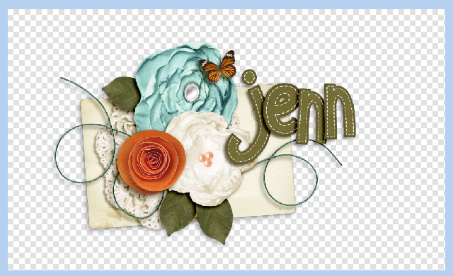
Hi Everyone!  How are you all out there in digiland?!  Hope your week is off to a great start!  I’m Jenn, aka jk703, here to bring you today’s post.  I decided to share a bunch of clever tips that you can use when scrapping, which in turn will help you scrap smart and quick! The wonderful CT also made layouts and shared some of their favorite tips too! Wait till you see this list! It is chock full of super tips! I

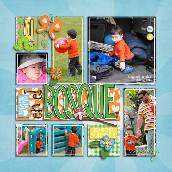
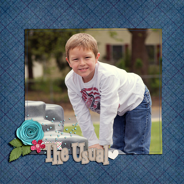
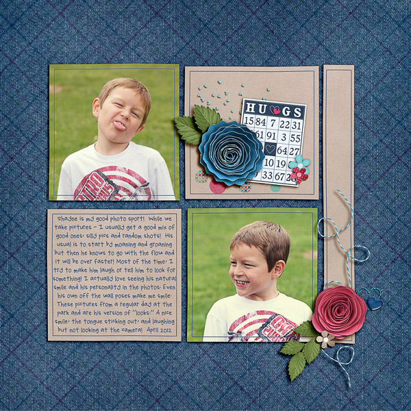
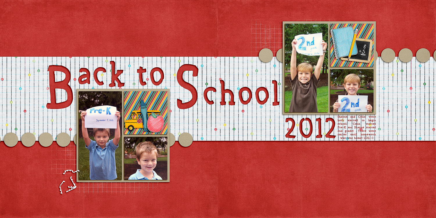
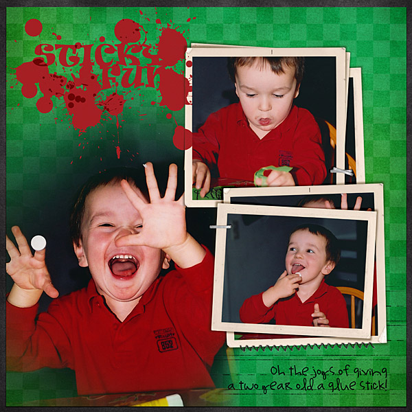
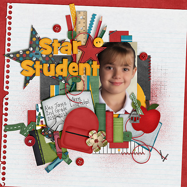
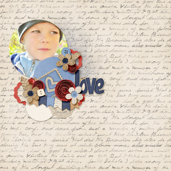
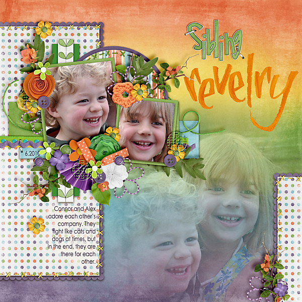
I’ve written about 21 tips and then Kayla (keepscrappin) and Kairyn (KairynLisa) both gave me a tip or two to share too!  First, check out Kayla’s layout, where she used a whole bunch of products – Fill Me In Bundle, Fireworks, Ladybug Hugs, and Apple of My Eye.

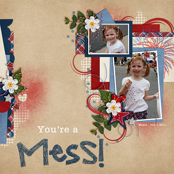
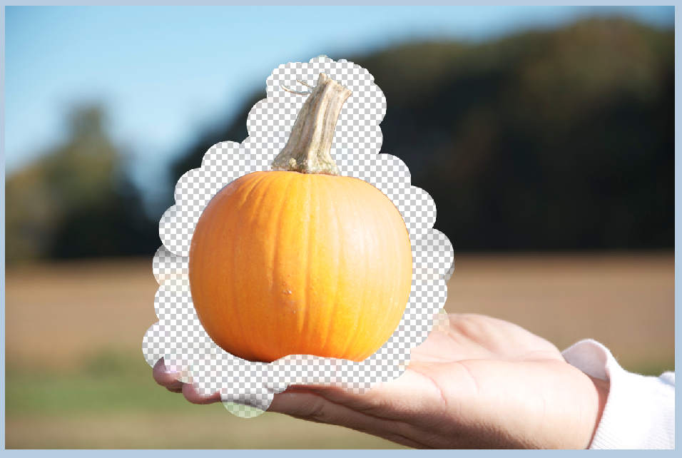
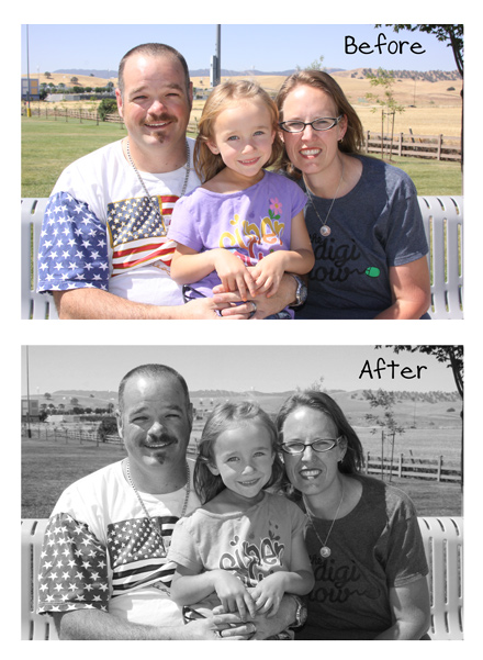
Kayla shared a super easy tip to Defog Photos.  In PSE, choose Enhance from the menu bar, then choose Unsharp Mask. From the Pop Up Menu, the amount slider can be changed to 20%, the radius 60 pixels or so. Click ok. Ta Da!  She also shared how to clip a paper to an alpha to easily expand your stash by re-coloring. In PSE, merge all of the letter layers in your title into to one layer. Next, insert a paper above that title or alpha layer in your Layers Palette. Clip the paper to the Alpha by pressing Control + G while the paper layer is selected! So easy!

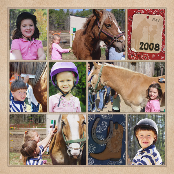
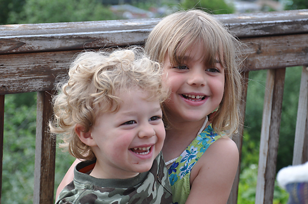
Here is Kairyn’s layout, and she uses a mixture of goodies too – Yeehaw Bundle, In the Pockets Small, and the Fill Me In Marker Alpha. For the tag in the upper right corner, she clipped a mask to it and then used the blending mode “Overlay” at 33% opacity – this is herfavorite way to take something from plain to perfect!

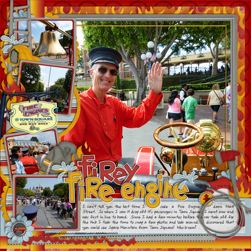
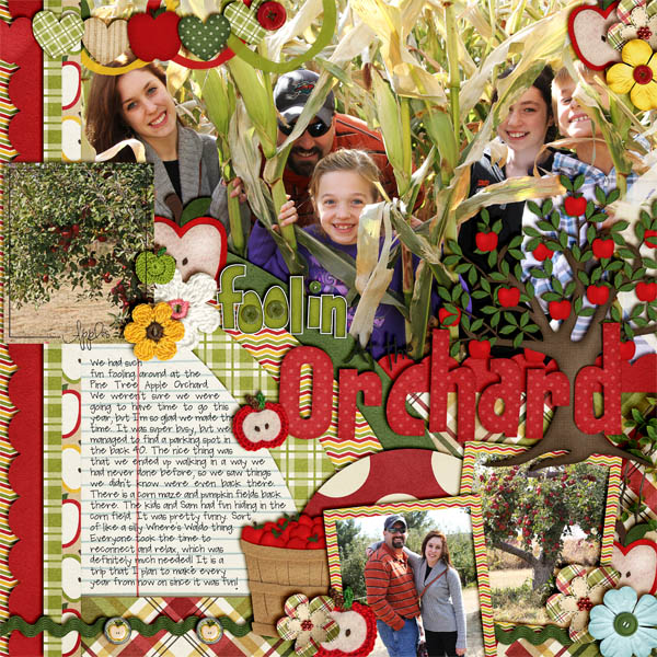
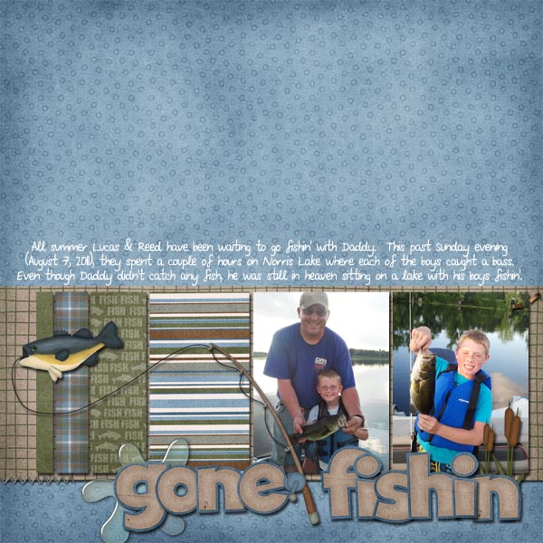
Next up is Jan’s (QuiltyMom) awesome layout – she uses the Heros {Fire} by Chelle and Dream Big Designs.  Here is what Jan shared for our SBC+ tip:

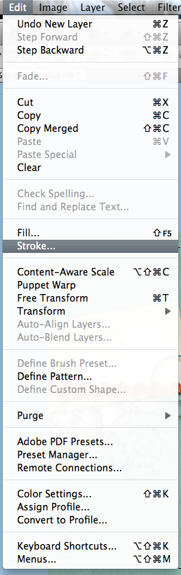
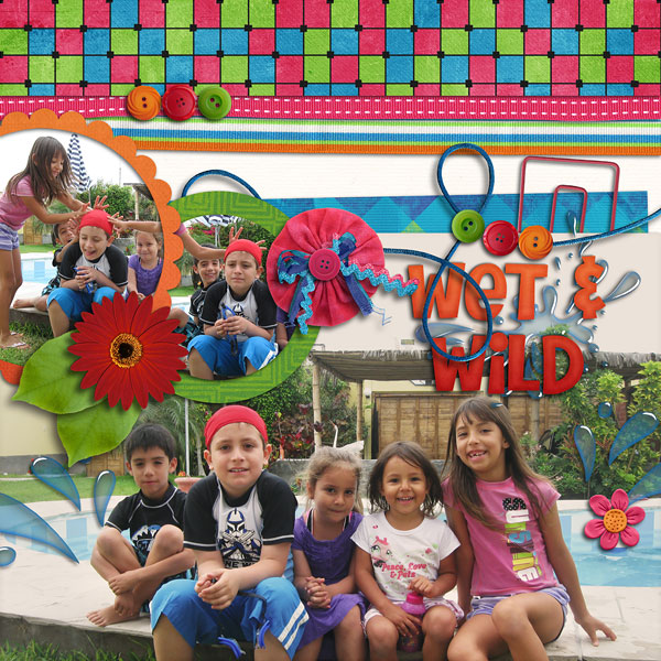
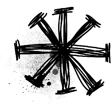
She likes to make her pages full of elements and photos, and many times she wants a certain element on the page to stand out. On this page she wanted to add a strok around the water spray. She thought if she didn’t it would’ve been completely lost on the page.

She has always wanted to have the stroking feature on SBC+, but it has never been put into any of the updates or upgrades. But after talking with other SBC+ users Jan came up with her own way of doing it using the glow feature of the program. There may be another way to do it, but here’s what she figured out.

1. Select element and resize to desired size. Go to > format > glow > select a custom glow.
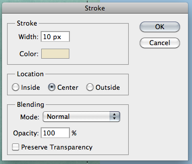
2. The setting you choose will decide the width of the stroking/outline. Set > Softness at 0 (zero) and Expansion anywhere up to 1. I find that settings beyond 1 are too large, but it all depends upon what you are looking for. Select color of outline.

Now, since this is technically a shadow you will need to make it more dense. Once she has the stroking as she wants it, she copies and pastes three additional copies of the stroked element (you will now have four of them on the page), lines them up on top of each other, then flattens. This will make the stroking completely opaque. (The fourth one I keep as a reference in case I choose to make changes or layer the element, shadowed, on top of the stroked one.)

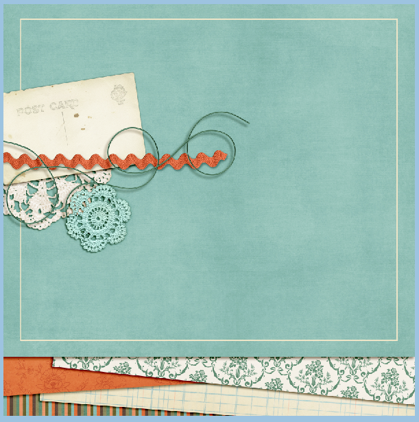
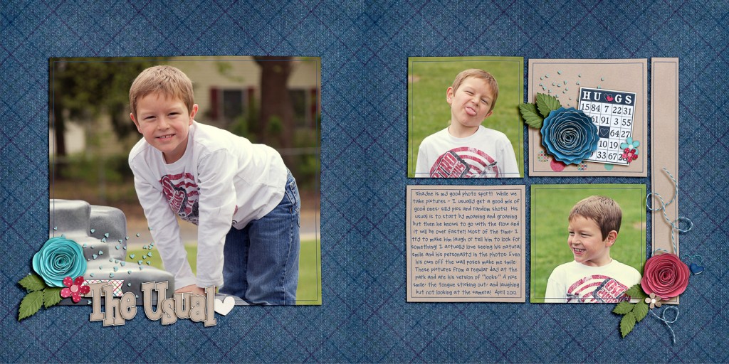
You can also clip a paper to the flattened element if you’d like. Just layer the original element back on top of it when you’re done. Here is her page with the stroked water spray.

Here are the rest of the Tips and Tricks for Photoshop!  I’d love to know your favorites! There are so many things in Photoshop that I love, but I find I always play with Blend Modes, the D, and so many more!

 1. Hold down the Command + Alt key and drag any layer to make an on-the-spot copy!

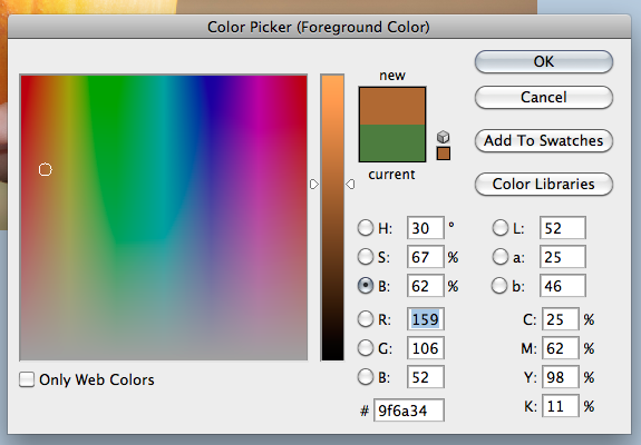
2. Press I (as in Igloo) to activate the Eyedropper Tool. Click on a color and it will become the foreground color. Press the Alt Key and then click on any color in your image. This color will now be the background color.

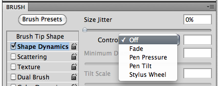
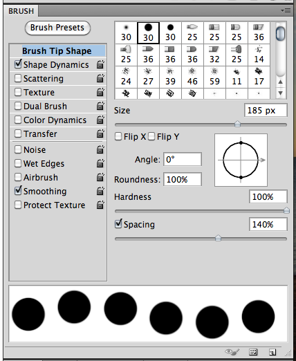
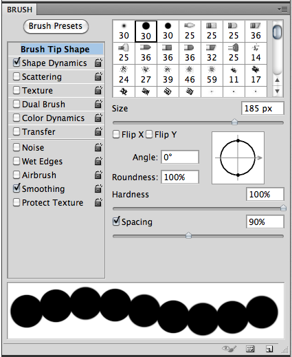
3. When using brushes, you can change the size of the brush by pressing the right bracket ( [ ) to increase the size or the left bracket ( ] ) to decrease the size.

4. When the move Tool is selected, you can use your arrow keys to nudge 1 pixel. By pressing the Shift and then the arrow, your image will now nudge 10 pixels. Super Nudge!

5. When the Move Tool is selected, click on the “Auto-Select” option. Make sure that option drop down is set to Layer. This will allow you to click on your image, and the layer will automatically be selected in the Layers Palette.

6. If you hold down the Command (Control) key, and then click on the thumbnail of a layer, you will create a selection (see the marching ants) based on the layer that you clicked.

7. Pressing “D” resets your foreground colors to black and white. Pressing the “X” will make them switch back and forth.

8. When you have a selection made or a layer chosen, you can fill the layer by pressing the Option + Delete. The fill color is the foreground color.

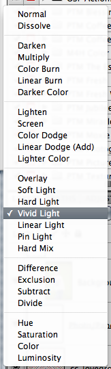
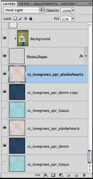
9. When looking at Blend Modes, use the Shift key plus the + or – keys to “scroll” through the different looks.

10. When using Type you can add a Faux Bold, press Command + Shift + B, or a Faux Italic Command + Shift + I. If your font has a bold or italic weight, it will use the font’s bold weight. Otherwise, it will add a faux weight style to your font.

11. Command + Enter = Commit is a great tip for when you don’t want to click on that little check mark in the top. This works for the Type Tool, as well as when you move or transform items.

12. With the Type layer selected, you can scroll through the fonts by clicking within the Font Name setting, and using the arrow keys up and down. You will see that layer’s font change as you scroll through different fonts.

13. Merge lots of layers up by selecting the layers in the Layers Palette, and then press Command + E. This is useful because the layers do not have to be next to each other.

14. Command + 0 will fit your image to your screen. Command + 1 will zoom to view the actual pixels.

15. In the Layers Palette, if you press the Option key and then click and drag a layer style to another layer. This will duplicate your layer style from layer to layer. If you only want to copy one particular style (like Drop Shadow or Outer Glow) from one layer to another, click the name of the effect and Option + drag that effect over to the layer.

16. Press the Shift Key when re-sizing items. It will constrain the proportions, and you will never have skewed or distorted images.

17. When working and you need a little more space, press the Tab key. Your Tools and Palettes will disappear. When you need them again, press the Tab key one more time.

18. When zoomed in and you don’t want to zoom out, press the space bar, and the Hand Tool will appear. You can move the screen and pan around. When you are done, let go of the space bar.

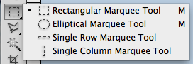
19. When you have the Marquee Tool selected, and you have made a selection on your layer – but in the wrong location! Don’t let go of your mouse, press the space bar, and them move your selection to the correct location.

20. To help you align things, you can create guides. With the rulers showing in your workspace, you simply, click and drag from teh top or left side ruler to where you would like a guide to be.

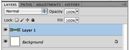
21. Double click the Background Layer to convert it to an editable layer.

Hope you learned something new with all this info!  Have a great week! Thanks for stopping by!
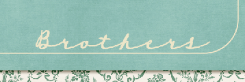
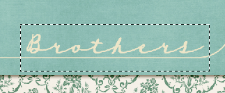
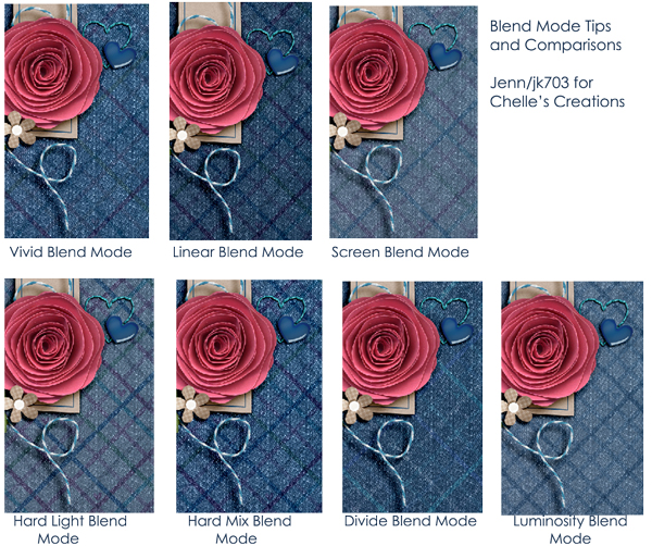
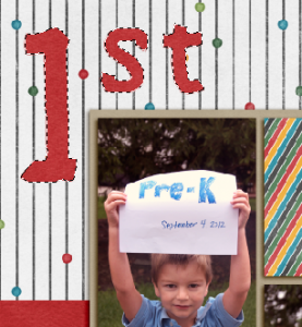
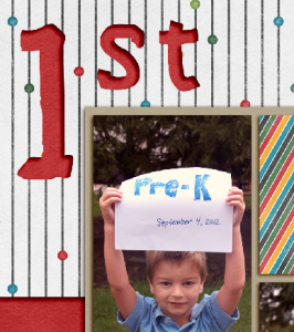
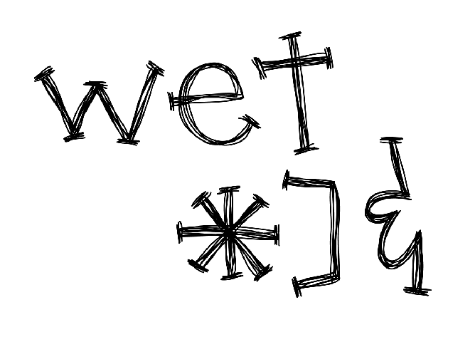
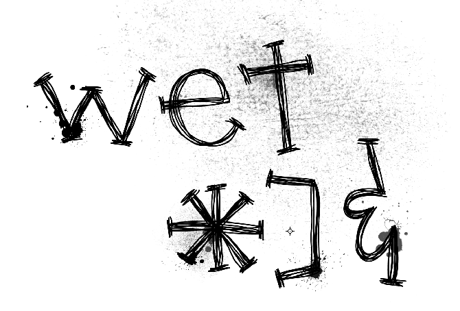
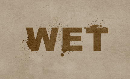
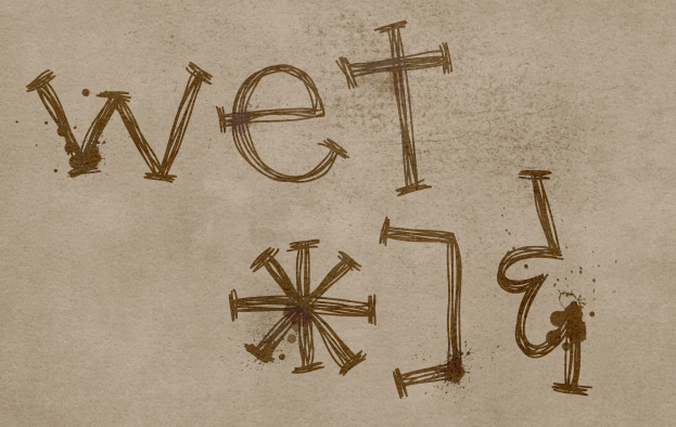
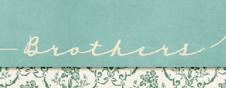
Tips for Cell Phone Photos | Digital Scrapbooking Tips

Hey Everyone – hope you are having a great week!  I’m Jenn, aka jk703, here for some Cell Phone Photo Tips.  Many people nowadays have phones that have a multitude of functions, and one of them is taking pictures. While taking pictures with your phone is a great idea, it made me wonder about the picture quality and if I could use them on my layouts. The short answer – YES!  We can use our cell phone pictures for our layouts, but should watch the sizing/quality of the photo if you will be printing your pages. This will be pretty straight forward, and easy to follow.

Here are my Top 5 Tips of taking photos with your cell phones…

1. Good Light
2. Get Close and Closer
3. Don’t Zoom
4. Take Lots of Pictures, Keep Them All, and Edit Later
5. Stay Still

Go Toward the Light!

Get as much light as you can when taking pictures with your cell phones. The sensors on our phones are smaller than regular cameras so the more light the better. Natural light is better, and most times you want the light in back of you or from the side. If your phone has optional flash, give both a try on and off. Sometimes when using my phone, I find that my editing can help a little with the lighting. I also usually tend to avoid direct sunlight, as the camera cannot focus well. Another feature that some phones come with is Adjustable White Balance. If your phone has this, experiment with it. It allows for changing or modifying the color balance.

Up Close and Personal

I’ve taken pictures and then looked at them, and thought I was a lot closer than the image portrayed. Phone cameras don’t blur backgrounds, and that can be done later on. So, with that in mind, you may want to fill your frame with your subject, and get closer than you normally would or think you should.

No Zoom, Zoom

Right now there is a feature on most phone cameras that allows you to zoom in closer, without you being physically closer. Digital Zoom.  Avoid this option. Basically, your images will lose quality, and become increasingly pixelated if you use this function. If you take your picture, you can zoom in later on when editing. If your camera is newer, or has the Optical Zoom feature, then you can zoom – as Optical Zoom doesn’t enlarge your image by enlarging the pixels.

Mistakes?! Keep Them!

Take lots and lots of pictures and keep them all. You never know when a mistake will be salvagable or fixed with a little editing. Plus, you’re looking at your images on an extra small screen, so wait to check them out on your computer later on. There have been times that I’ve taken pictures and I know it looks horrible on my screen, but when looking at the bigger picture, it is workable. Case in point is one of the photos in my layout below – the Statue of Liberty had a paper blocking the lens. Keep any and all photos until you’ve seen them on your computer. With this in mind, also make sure that your phone isn’t too stuffed with apps, and other things and there is room for your pictures.

The Hard Part – Stay Still!  

Cell phones have slow shutter speeds, mostly. So, try to have a steady hand when taking your photos to prevent blurriness. While you want to have the highest setting for resolution set on your phone, a lot of times, you can improve the shot by just staying still. As much as possible…. this is especially important in low light settings. A quick and handy tip is to rest your hand taking the shot against a non-moving solid item. By this, I mean a wall, tree, table, anything that is solid, and still. Also, when taking a photo, let the camera finish before you move your hand. You wouldn’t want the blurry shot of the ground because you moved your hand too early. The slow shutter speed causes a lag, so let the camera finish it’s work.

Now… I have an iPhone 4, which has a 5 MP camera. Excellent quality for a printed photo is 300 dpi, while 200 dpi is ok, but you would never want to go lower. With my specific phone, I could have  prints made up to 8.5 x 6.5 approx! That is perfect for scrapping. Yes, I might not be able to cover a whole 12×12 page with my cell photo, but that is a pretty large size of space it could cover.

To test out your phone and print qualities before printing layouts, try getting separate orders of phone image prints made and naming your image with the size and dpi. Most places put the image name on the back of your photo when printing. Depending on your phone’s megapixels – here is a approximate reference:

2 MP – 300 dpi size 5 x 4, 200 dpi size 8 x 6

3.2MP – 300 dpi size 6.5 x 5, 200 dpi size 10 x 7.5

5MP – 300 dpi size 8.5 x 6.5, 200 dpi size 12.75 x 9.5

8MP – 300 dpi size 10.5 x 8, 200 dpi size 16 x 12


Now… onto the good parts… Layouts using cell phone photos.  First, is my layout from Vegas last March. My dSLR camera fell and my lens broke on the last day. I subsituted my cell phone to take pictures and was quite surprised with the great pictures I got after I uploaded and did a little editing. The statue of liberty was greyed out some in the corner. For this layout, I used Chelle’s Big City kit.

Jennifer (jmljensen) made this fun outdoor page using her cell pictures! Gone Fishin’ was used for her layout.

 Kassie made this wonderful layout with a cell phone photo – and it turned out beautifully. She scrapped using the  Apple of My Eye kit.

Lastly, Kairyn made this fun layout using a lot of her cell phone photos!  So many things to see! She used the Primarily Mini Kit and Build It for her layout.

 There you have it… some easy to follow tips for cell phone photos! So… go get started and give it a try! Thanks for visiting and we hope you come back again soon!

Creating & Saving Siggys | Digital Scrapbooking Tips

Hello everyone!  Hope you are enjoying September already! Whenever the seasons change, I always see new signatures (aka siggy) popping up in the forums!  It is always a reminder to grab some pre-made ones or get cracking on a new one for myself! So, today I’ve got some tips today on how to scrap a siggy, and save it for the forums. It’s a bit photo heavy, so let’s get to it! For my siggy example, I used Chelle’s wonderful Family Tree – it had just the colors I wanted.

When I usually scrap siggys, I scrap like I regularly do for a cluster on my page. I do this so I am not re-sizing to an extremely tiny size. Another reason to scrap large is so you can see your shadows and how they will look. I know the first time I made a siggy, I made my canvas the size that my signature had to be – I think it was 400 x 250. It was hard to scrap for that size!

OK… Once my cluster is complete, I add my name last. Here is what I would see.

 From the Tools, I’m going to choose the Crop Tool. It is the one that looks like a box.  After this tool is chosen, I crop to just outside my cluster. Make sure not to cut anything off, especially splatters or paint!  

Here is what my cropped signature looks like:

Next, I’m going to save it so I can upload and use it in forum settings. First, click on File > Save for Web and Devices:

Next, a pop up screen will open. Toward the left of this screen there is a lot of information – some important. You can see that my signature is approximately 2014 x 1203 in pixel size, and my image right now is a JPEG, with a high quality. This is way bigger than any forum would allow!  First… here is what you are looking at:

For signatures, you would like to have a transparent background. This is not important, but based more on what you prefer and what you find pleasing. If you have a transparent background, your signature will look just like what you see on the checkered box above. If you prefer JPEG, your image will have a white box where the grey and white checker box pattern is. Purely preference. I decided to choose PNG from the presets menu.

Next, I’m going to change my pixel size. The forums you post in should advise you of the signature size you are allowed in their guidelines – each one is different. For this example, I decided to make my signature 450 x 269. The 269 came about by itself. The lock feature will keep the sizing intact. See the pixel sizes and lock feature here:

Now, you are ready to save your file. Click on File > Save As and save as you wish. Make sure to have the file extension as you want – PNG, JPEG, etc.


Here is my final signature (I changed the size to 400). All I would add would be the teams that I am creative for, as well as my own blog. Hope that helped.

Here are a couple signatures that the CT made. Jennifer (jmljensen) made this awesome and bright siggy!

Ronnie (ronnie_texas) made the prettiest signature:

Have a great week and I’ll see you again at the end of the month!  Thanks for stopping by!