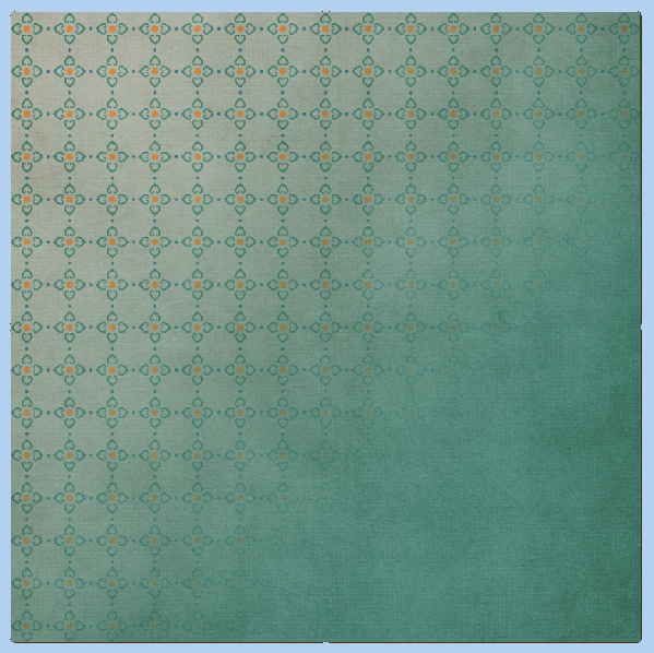
Hi Everyone! It’s Thursday, and we are ready to get back to normal in my house – especially after Christmas. This is Jenn, aka jk703, here to show you a fun way to change up your background papers. Background Spotlights are a way to give a spotlight or a luminosity effect on your background papers. You can highlight a pattern, or even just add a little accent to the background paper. I will show you guys two ways to do this, and there is always room for different steps or ways to get to the same ending. Play with all the blend modes, and even all the other styles – you might like what you accidentally learn!  For my paper, I’ve used Chelle’s Capture Your December kit.
Here is the way using the Gaussian Blur:
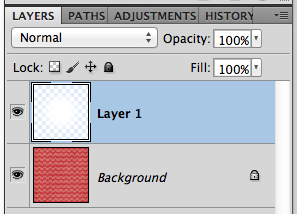
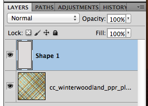
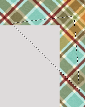
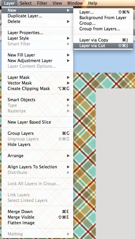
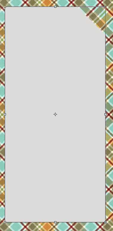
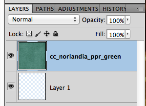
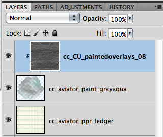
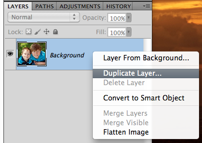
First thing you will want to do is to add a layer above your background layer. Use the box on the bottom of the Layers Palette and it will add a layer below the background paper. You can just move it up.
Next, choose your brush tool. For my example, I have it set to 2000px, soft, white brush. 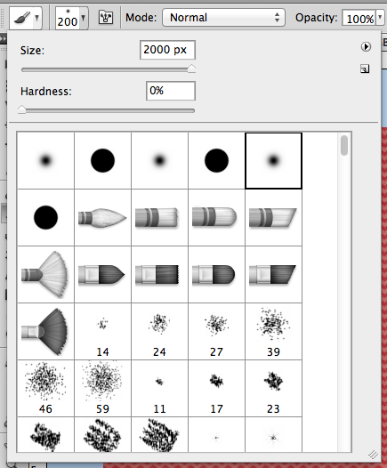
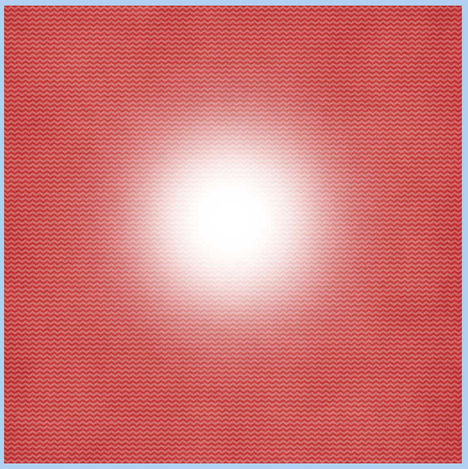
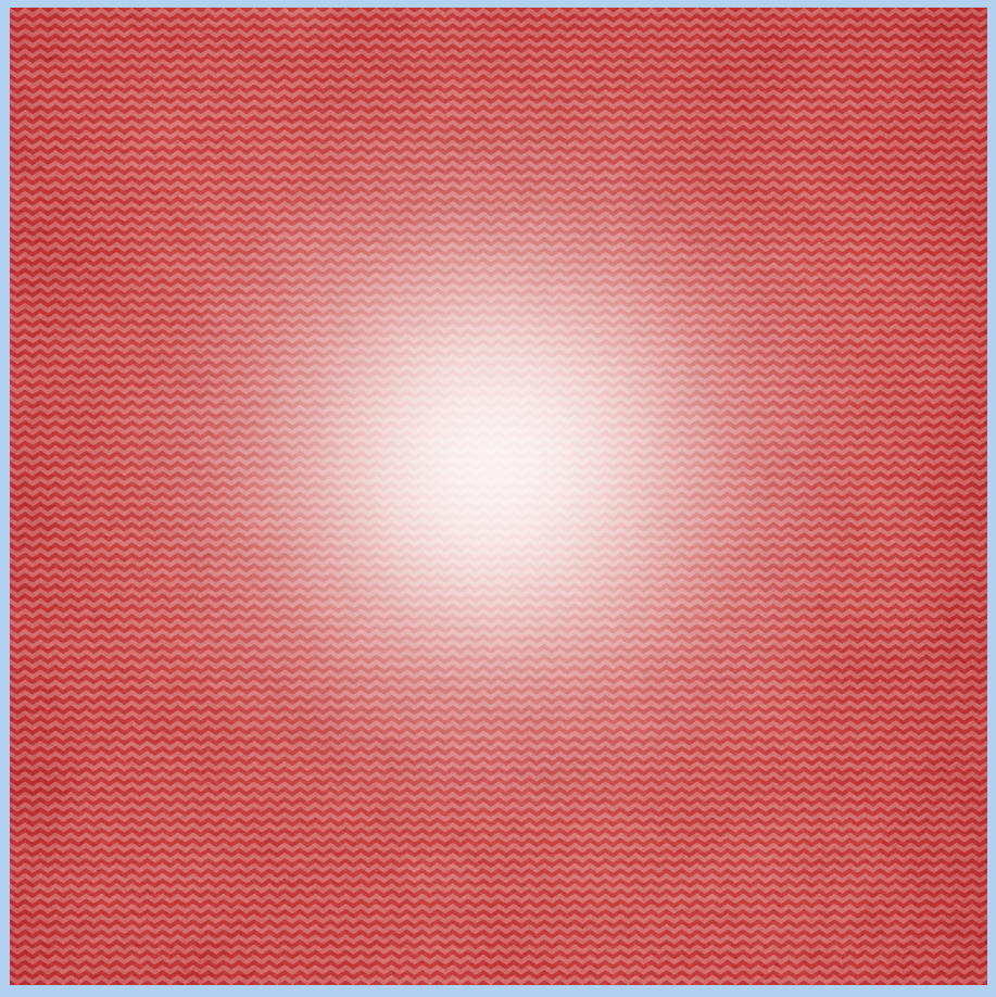
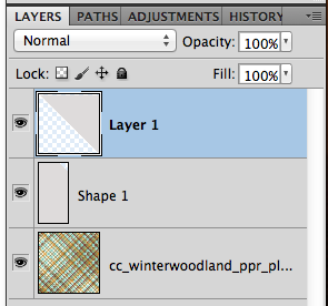
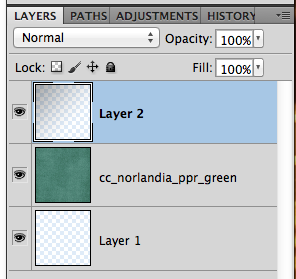
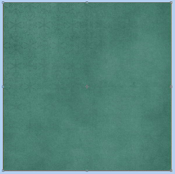
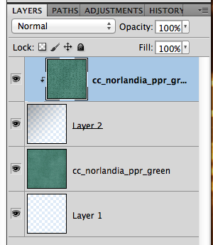
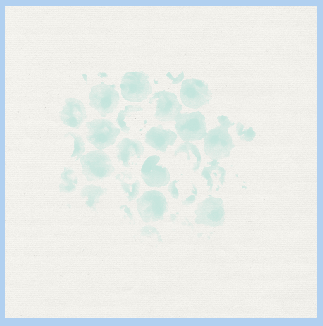
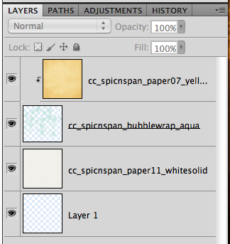
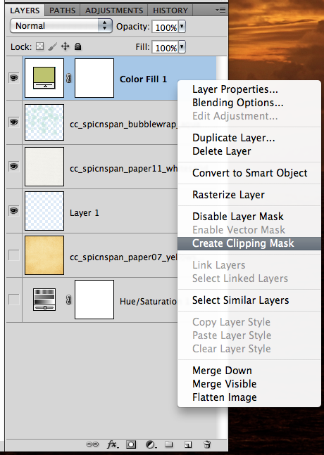
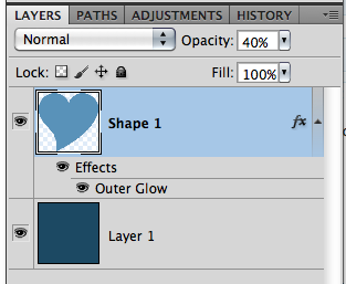
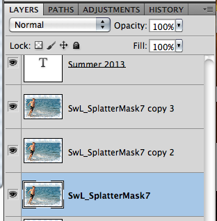
Make sure that your new layer is selected, and then click once or twice in the center. You will get a bright white spot, that feathers out to the outer edges. Below, is what my layers look like at this point.
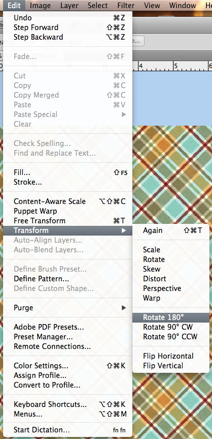
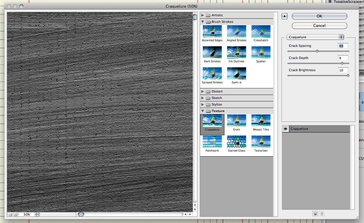
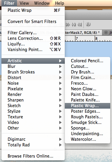
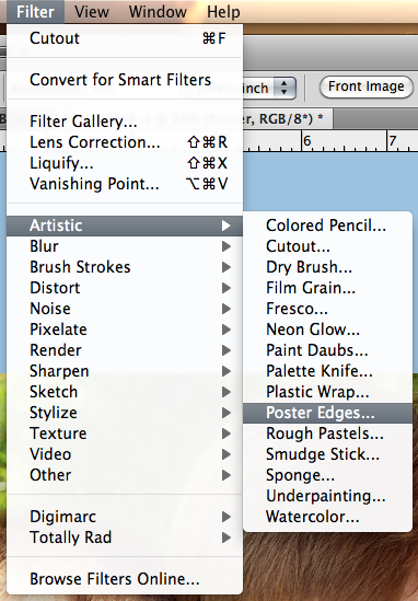
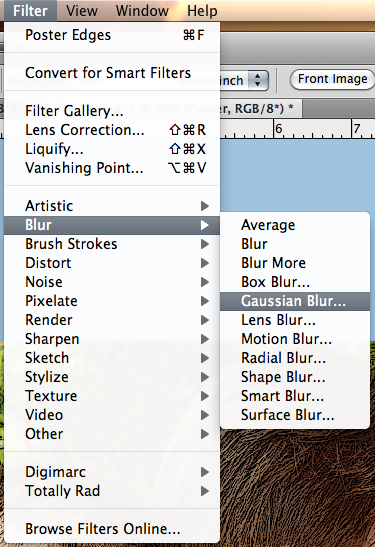
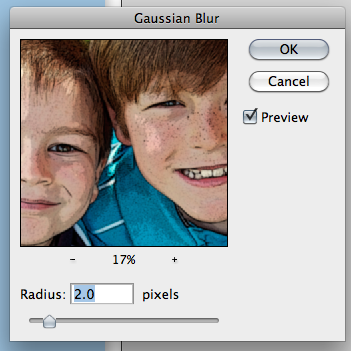
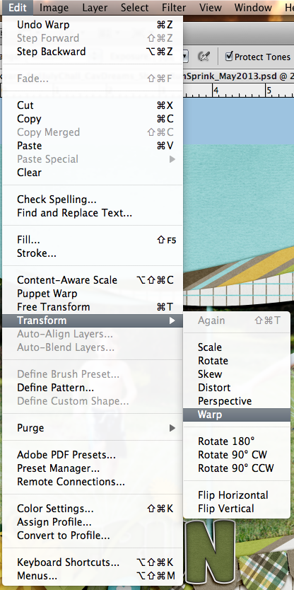
Now, in the Menu Bar, choose Filter > Blur > Gaussian Blur.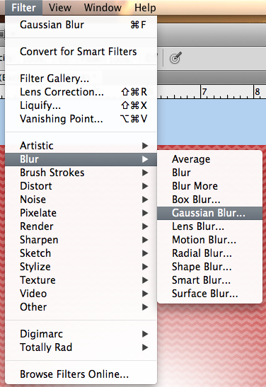
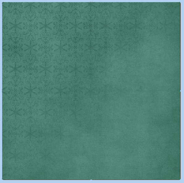
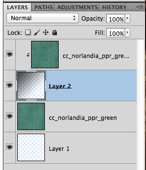
A menu will pop up – and I’ve moved the slider up to 250 – as high as it will go. Click ok, and this will blur the brush circle out just a little more and lighten it at the same time.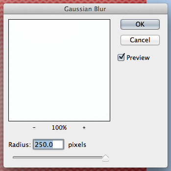
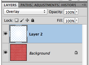
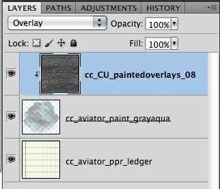
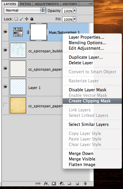
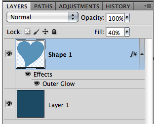
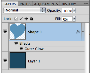
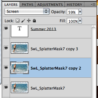
Now, on the Layers Palette, choose the bruch circle layer, and change the blend mode to Overlay.
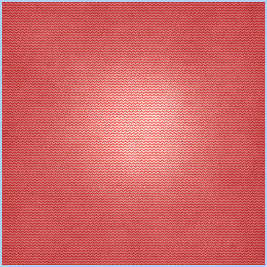
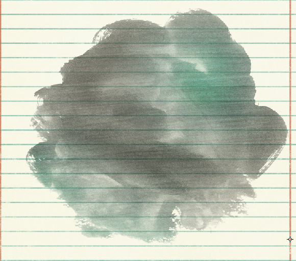
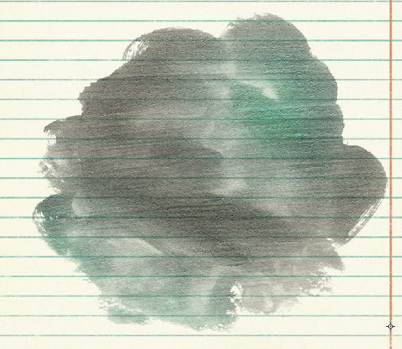
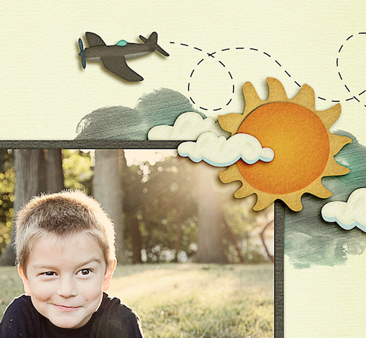
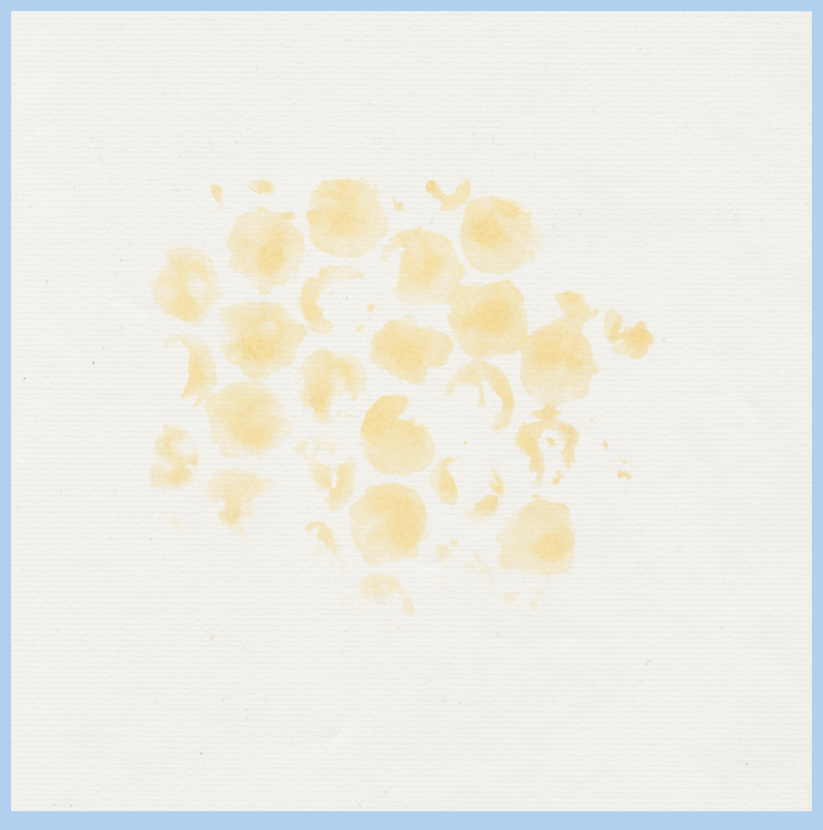
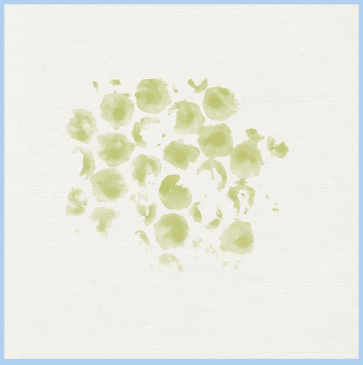
This is what you will end up with. A little light flare or spotlight. Again, try different blend modes, colors, and even different brushes and shapes!
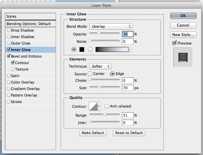
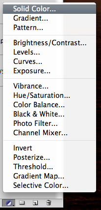
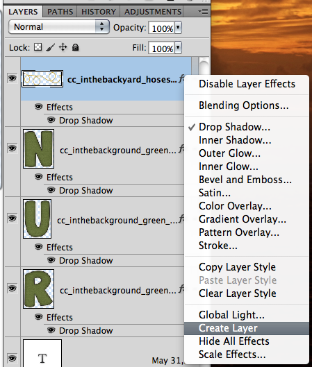
Now, I know there are oodles of ways to do things to get to the same effect in photoshop, so I’ve got another way to do this. This one is a little more difficult. For this version, starting from scratch, you will use the Layer Styles.
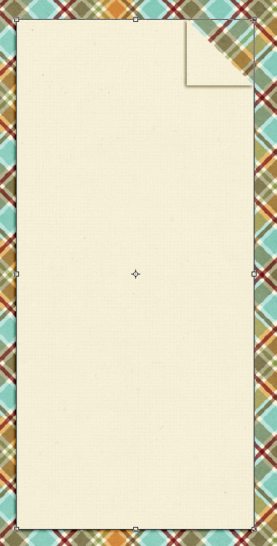
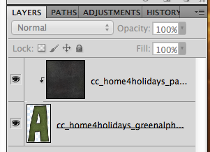
There are two steps that you need to do before starting this one. With your background paper open, and just in case it is your only layer, you need to remove the lock from the layer. Just double click on the layer. A menu will appear to name it – name it if you wish, and click ok.
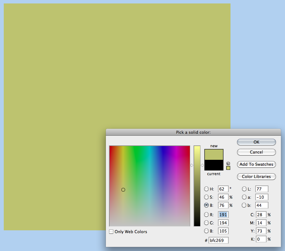
Also, for this one, I’ve changed my foreground and background colors to match my paper. Like this:

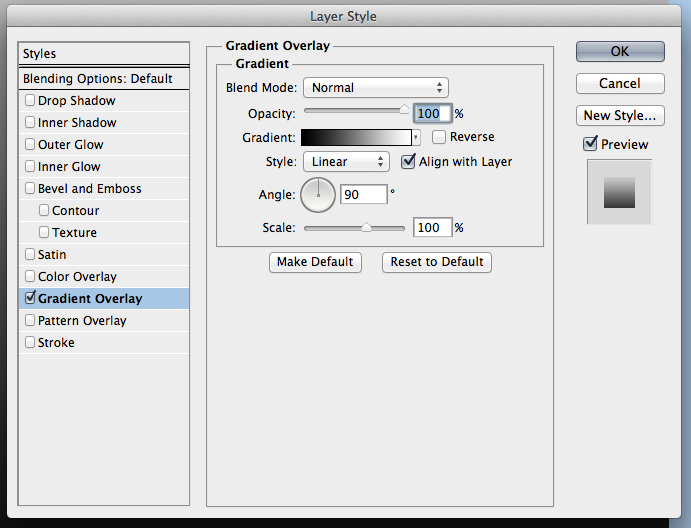
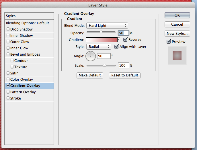
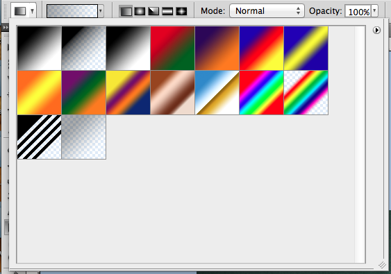
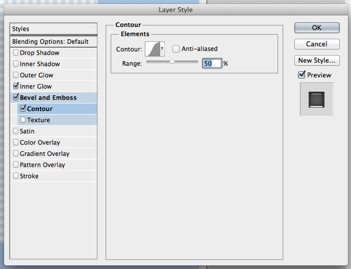
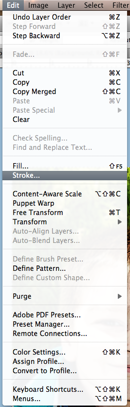
OK. Now, we will double click on the background layer and the Layers Styles menu will come up. Click on the Gradient Overlay. Here are the settings that I believe are default.
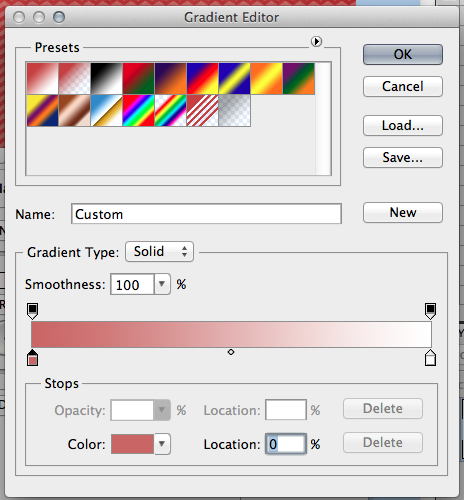
Click on the Gradient that you see, A menu will pop up. By Gradient I mean the White to Black bar. We want to change the color of the Gradient to the color in the Foreground Box that we changed first. This is tricky – click on the bottom left corner slider box, and then click on the Foreground Color. The slider will change.
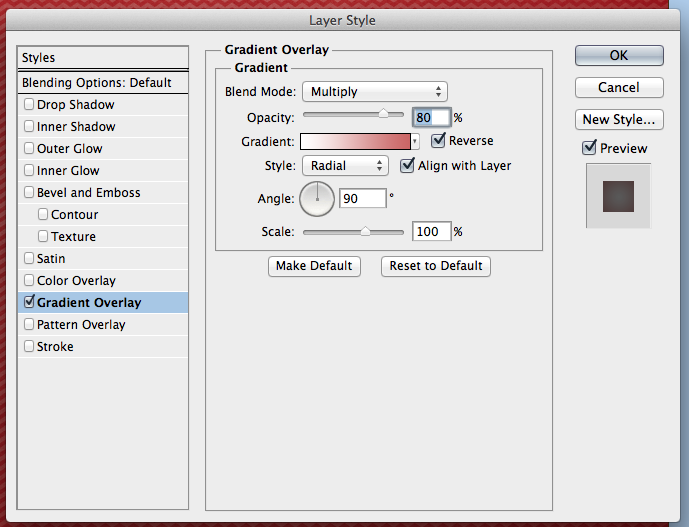
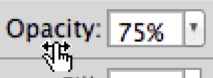
Next, (just in case you close it – double click on the background paper again to get to the styles), you will also change the Blend Mode to Multiply, Opacity to 80%, check off the Reverse box, and change the to “Radial.” Like this:
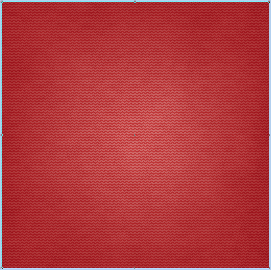
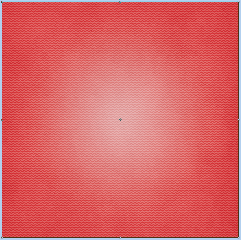
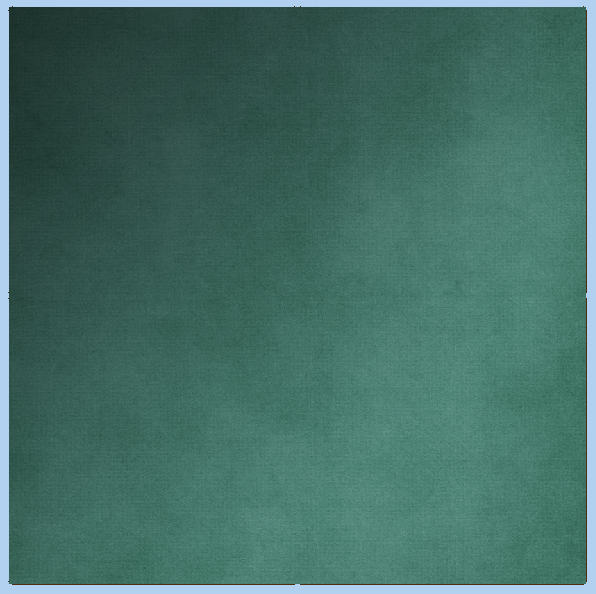
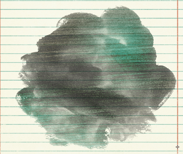
Once you click ok, your paper should look like this – a darker edged spotlight – way more subtle to the previous one. Remember, play with the Opacity, Blend Mode or even the Scale.
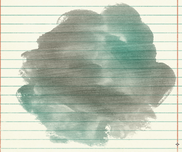
To make it a little more like the spotlight above, and to show how Blend Modes can make a change, here is the setting changed to Hard Light:
And the new paper:
Pretty easy, and fun to try! Here is what the CT came up with:
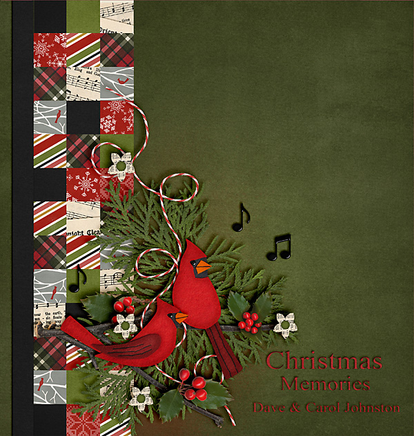
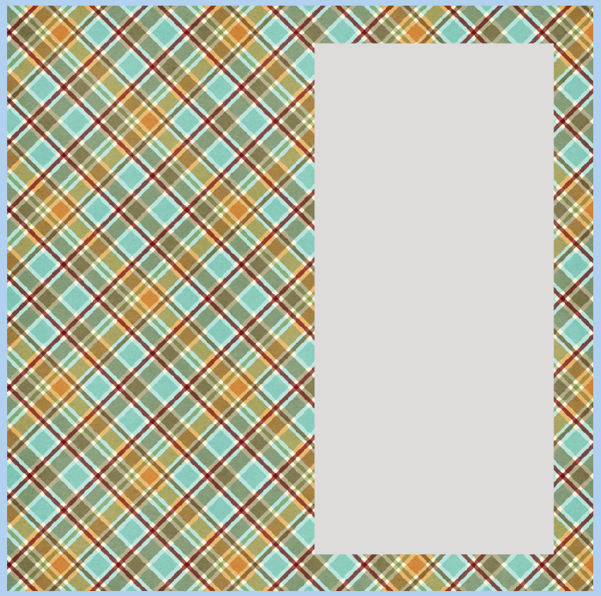
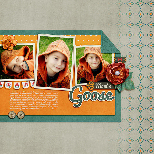
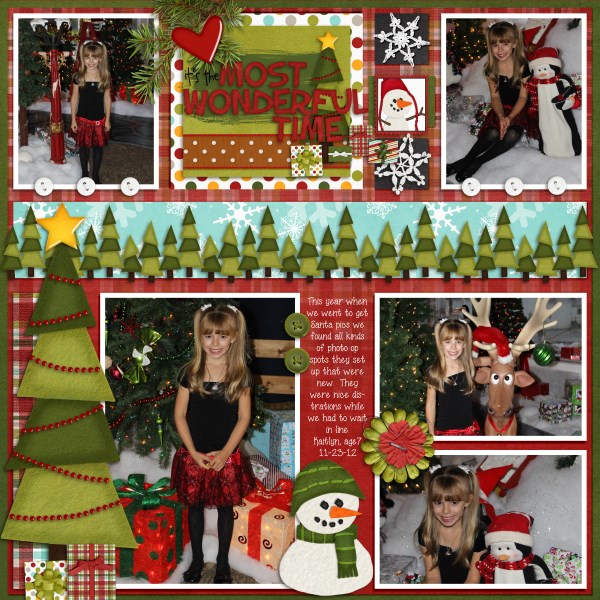
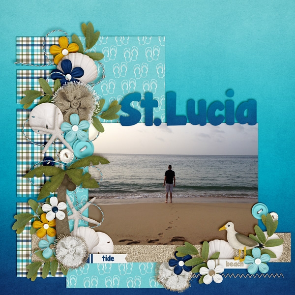
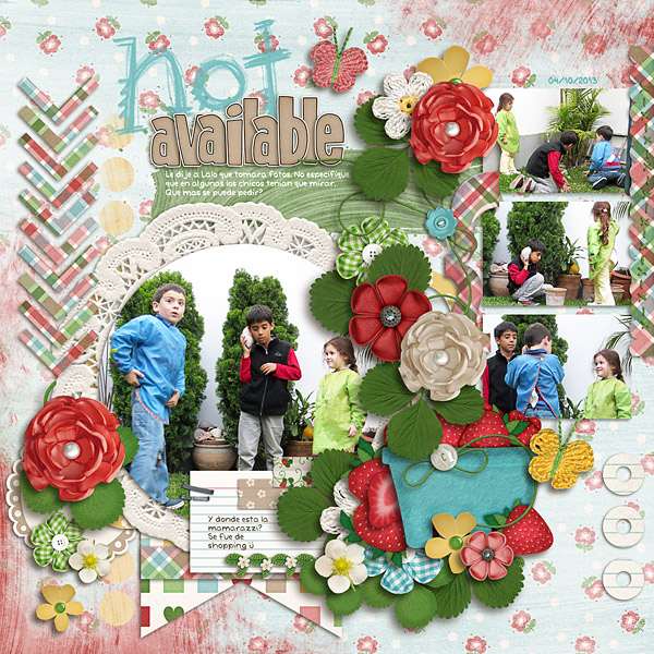
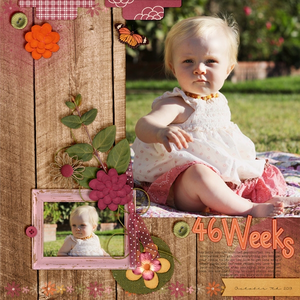
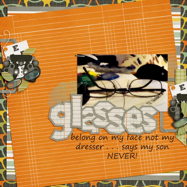
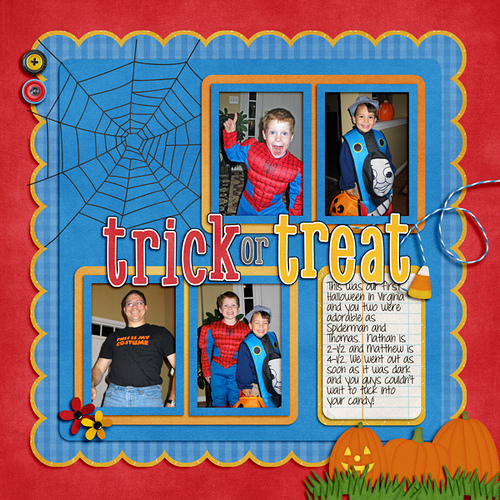
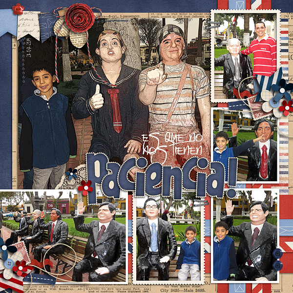
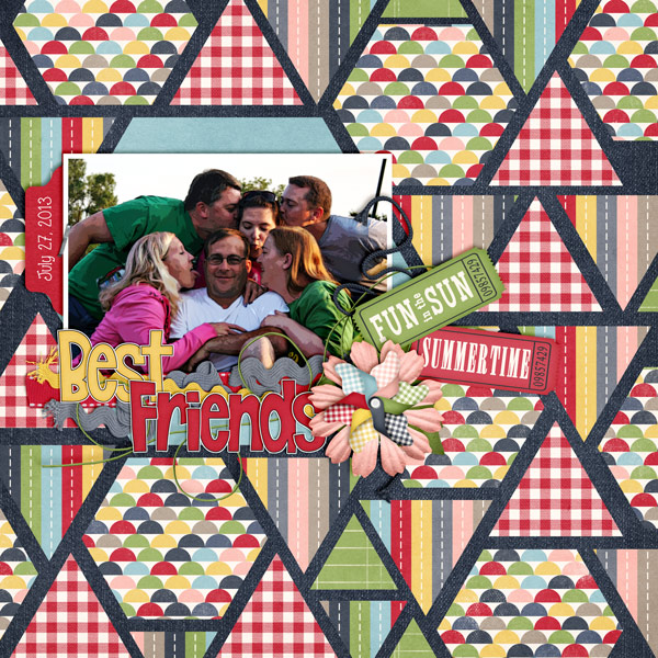
Carol (Iowan) created this wonderful page – I just adore the quilted look! She used We Wish You A Merry Christmas by Chelle’s Creations.
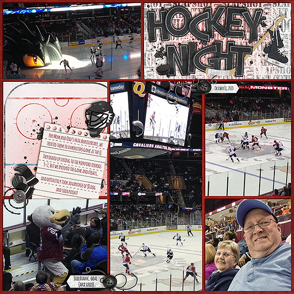
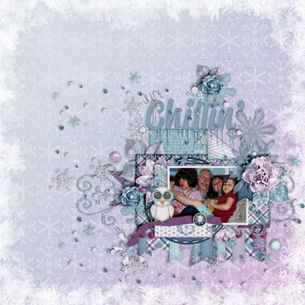
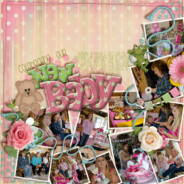
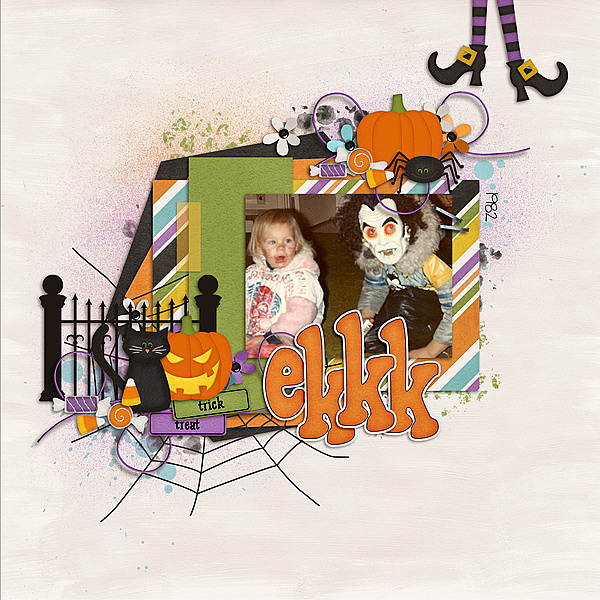
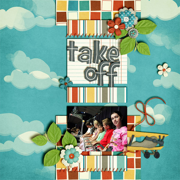
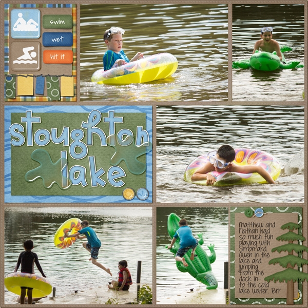
Karen (zippyoh) said that she used the effect behind the title and the journaling paper for her layout. After she applied the gaussian blur, she then changed the blending mode to vivid light behind the title and pin light behind the journaling paper. Her layout uses Penalty Box and the journaling paper is from Toil & Trouble, with a template from Scrapping with Liz. Lastly, she also changed the color of the background paper by layering the red above the black, and lowering the opacity.
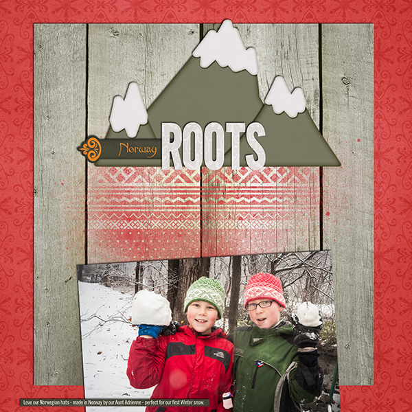
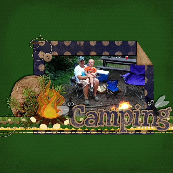
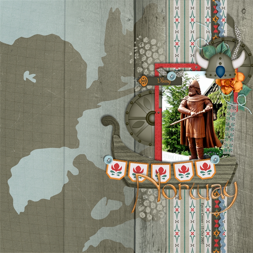
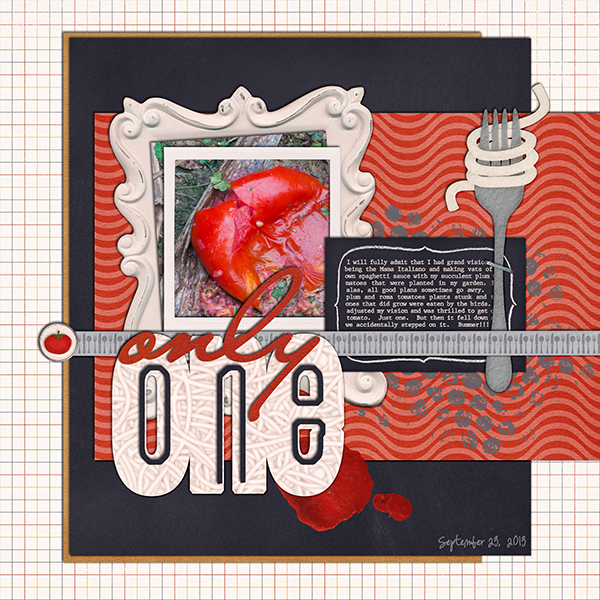
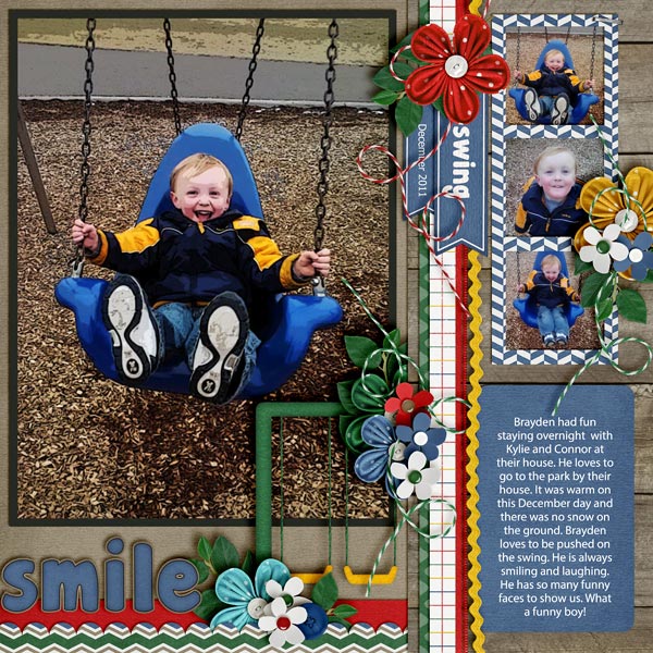
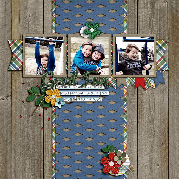
Jenn (jenny) used the effect on the overall wood paper so she could see the pain spritz a bit better….gave a lighter looking wood. She used Norlandia for her page.
There you have it! A great way to change up the background papers! Hope you enjoyed this tutorial today. Have a great week everyone!


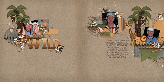
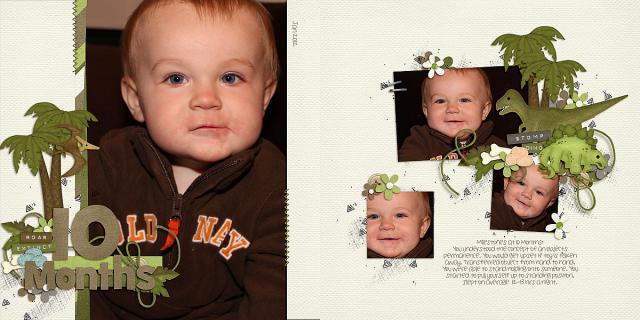
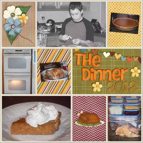
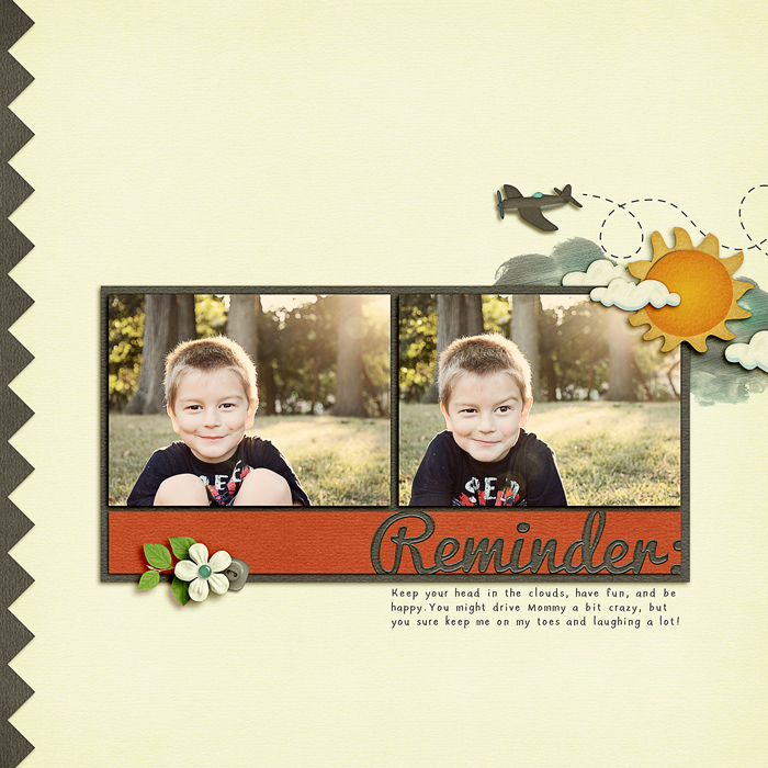
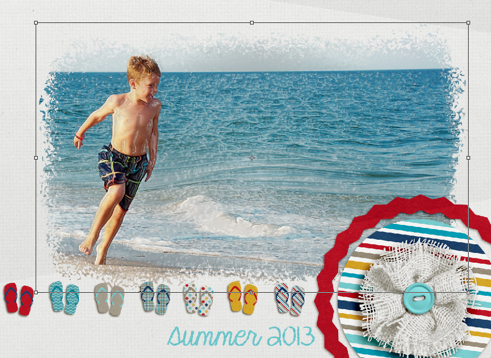
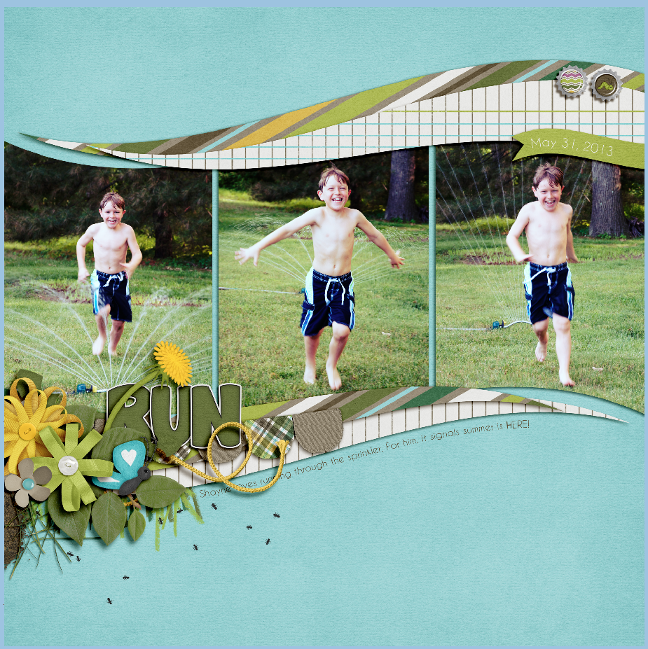
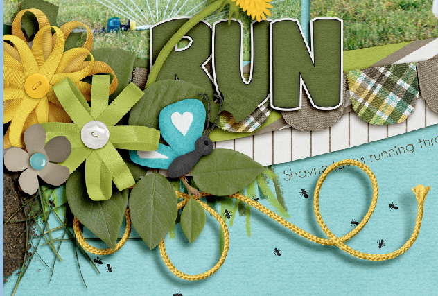
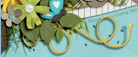
 Here is the layout that I made:
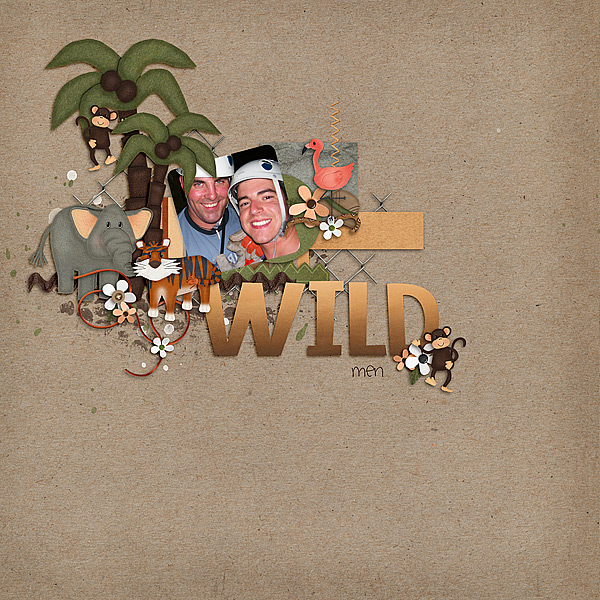
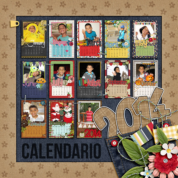
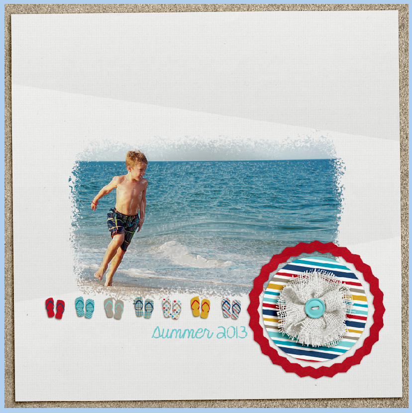
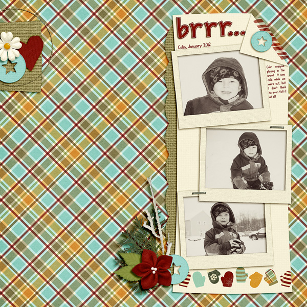


 Hi! I'm Chelle: a 40 something mom of 7. My husband & I live in a rural community in the rocky mountains with our 4 children still at home. In the winters we enjoy sledding & snuggling by the fire. I the cool fall evenings we love relaxing around the campfire & meeting friends at the county fair. Admiring the stars


