Adding Texture

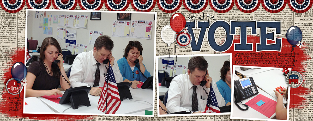
Hi Chelle’s fans! We have a real treat for you today. Three of Chelle’s talented Creative Team members have created digital scrapbooking pages employing varying techniques for adding texture to a large background photo. This can be very useful when the photo you want to use for a background is lower resolution than ideal, or when you just want to add that tactile feeling to a page with lots of textures in the subject.

Jenny’s photo falls into the latter category: she had a photo of her son playing at the beach, and she wanted to add a little emphasis to the background. Here’s her original photo without any textures added. IMG_8656-s Now, here’s that same photo with a sand texture added but erased over his sweet face. Can you see the dimension it adds to the page? She used At the Beach for her page, and she used the sand paper in the kit for the texture.  BrayBeach2014SwLBigPho5_web

Next I have a page from Donna. I think she’s tired of the snow, but she made a gorgeous page with a texturized large photo in the background. Here’s what she said about her page. “The background photo was taken with my iPhone, and it was taken through the windshield of our car, so I knew that when enlarging to this size, the resolution would not be great. I used a snowflake paper from We Wish You a Merry Christmas, and changed the opacity to Overlay at 70%, then merged that to the photo layer. Still wanting more, I added Chelle’s CU Fabric Textures (linen) on top of the photo/snowflake layer and merged the two.”web_djp332_sbm_2ndtempchall_feb2015_a_zpsgg1qx3ug

Finally, Kayla has used one Chelle’s latest kits Makin Tracks for her page. It was a perfect match for her photos. Here’s what she says: “ I wanted the tracks and grunge from the background paper to show on the photo. I placed the photo on top of the paper and scrolled through the blending modes with the photo layer selected.The overlay mode gave me the closest result to what I was looking for but it wasn’t quite enough. I needed the photo a little lighter, so I duplicated the photo layer again.That made it too light, so I adjusted the opacity down on the 2nd photo layer until it looked right. Then, I merged the 2 photo layers and used a layer mask with the linear gradient (foreground to transparent) tool to blend the bottom edge of the photo into the paper. I love how it looks like the photo and paper are all one layer.”

BikerGirl_May12_web


Personally, I LOVE it when friends tell me exactly how they achieved their artistic look on a page. A huge thanks to Donna, Jenny, and Kayla for sharing with us this week.

by_Cheryl

Oodles of Doodles

Sometimes there are items in a designer’s digital scrapbooking kits that I look at and think, “that’s nice, but I don’t think I’ll use it.” That was my thought when I first saw doodles in a kit. I had no idea what to do with them. But, Chelle has a Youtube video here to show you all you need to know to be able to fill the doodles with any color or paper you want making those doodles some of the most versatile elements in any kit. Go ahead and watch – I’ll wait.

Wasn’t that cool? Although the particular kit Chelle used in the video is not currently available, she has lots of other doodles in the market. Let me show you some in use.

Krista used Good Night Teddy kit and {Doodles} to make her page and the teddy bear accent on her page, but you can find the kit and the doodles and a whole lot more in the {Bundle} if you’re looking for a great deal. Isn’t he perfect? It’s an adorable accent to her photo. SweetDreams__1

You don’t have to color in the the doodles. Sometimes, the doodles alone make the perfect accent to a page. Take Jenn’s page, for example. She used a lined ledger-style paper for her background, so the doodles she used from Oh Snap! look like they were hand-drawn on her page. The doodles are all included in this kit, one of the most versatile kits around. gotcha

Lots of Chells’a products have doodles. Ladybug Hugs has a doodled alpha; Tea for Two has a teacup border doodle; and Chelle has lots of CU doodle alphas (don’t let that CU designation scare you – anyone can use them!). So grab a doodle and have a play. I’m sure you’ll love the personal touch it adds to your memory keeping.

by_Cheryl

Good Night Teddy

It seems everyone loves to capture photos of their loved ones sleeping. Chelle has a classic kit of elements and papers to accent your sleepy-time pictures. It’s called Good Night Teddy, and her CT members have been playing with it again. Let’s take a look!

Jenn caught her sweet hubby napping and decided to scrapbook the images. He wasn’t thrilled with her, but she maintains that these are the peaceful moments you want to remember. I tend to agree. She used Good Night Teddy and a couple of the coordinating Journal Cards for her page. everybody naps

Jennifer also used the Journal Cards along with the kit for her first page. I love the photo she used; her son was pretending to sleep and wanted his picture taken. Isn’t that a riot? web_pretendingtosleep_blockbyblock11

Jennifer also used the kit for another page, but this child was truly sleeping. I love the teddy bear and clock she used as accents.  web_sweetdreams_SwL_PuckerUpTemplate2

Here’s a closer look at the kit and the Journal cards in the market. The images are linked to Chelle’s store at Scrap Orchard.

cc_goodnightteddy

cc_goodnightteddy_jc

by_Cheryl

In the Shadows

Quite often in life, it’s the details that matter. That’s true in digital scrapbooking, also. In traditional paper scrapbooking, shadows are added by the light source used for viewing, so in digital pages, shadows need to be added to make a page look as they would on a traditional page. They can be tricky, but the right shadows make a world of difference. Take a look at the following pairs of pages that show a page first without shadows applied and then with. Look closely at each example to see how different thicknesses of elements are shadowed with different depths just as they would be in real life.

First, an example from Donna: she used Big City and a template from Scrapping with Liz. Look at the shadows on the photos compared to the thickness of the shadows on the felt pieces.  web_djp332_cc_NS_bigcity_due3_31_SwL_LotsofBlocksTemplate5_zpsfa2gdsg1web_djp332_cc_shadows_bigcity_due3_31_SwL_LotsofBlocksTemplate5_zpsmmnaq1bb

Next, a page from Carol using Under Construction . The intended thickness of the cluster of elements is really obvious is the second layout, as it should be, and is much more realistic that the un-shadowed version. noshadow_fixitnoshadow_fixit_SHADOWS

Finally, it’s easy to see the stacked effect of the elements on the next page. Wow, what a difference those shadows make! noshadow_birdiesnoshadow_birdies_SHADOWS

If you need help with shadows, the easiest thing to do is add Chelle’s Me & My Shadow Styles to your software. She has taken the guesswork out of shadowing for us, and they are perfect for taking your shadow skills up a notch.

by_Cheryl

Fleur de Violette

We’re taking a look back at a classic kit today: Fleur de Violette. It’s full of spring flowery goodness that will remind you of fond memories you’ve had and is great for enhancing your digital scrapbooking pages of a wide variety of topics. Take a look at what the Creative Team has to show you.

First, Mel had a fantastic photo of her and her two daughters doing a selfie. She applied a tint to the photo to give it an extra effect, and it looks perfect with our featured kit. I love her clusters of flowers on the top right and bottom left.  Smile-MMT-copy

Kayla has a couple of pages to show us, both using templates from Fiddle-Dee-Designs. The first one is a photo of her daughter Aspen taken at Easter, and the second is a close-up of her daughter Megan. Notice how she used the lined paper on each layout? I love that she lined up her journaling on the lines. EasterBlooms_Apr11_web_zps6a2e1c7eFlirtyGirl_Jan13_web

Here’s a closer look at the kit in the market, but let me point out that there’s also a bundle that includes some quickies and other great extras, and there are InstaLife cards and Journal Cards sold separately, great for printing and using in your daily albums or for using in your Project Life phone app. fleurdeviolettete

by_Cheryl

You in front of the camera

Hey, you! Don’t turn around – I’m talking to YOU. Turn that camera around, or hand it to a passerby, and get in the photos. Your family will be so glad you did. So often, the photographer is the least one photographed, and our family members truly wish there were more photos of us when we neglect to get in front of the lens. Sometimes it’s a difficult thing to do emotionally if we are self-conscious about the way we look, but it’s time to put that behind us and step out in front of the lens. I have some great layouts to show you where Chelle and her CT have made pages using photos including their own images. Take a look!

First, Kayla handed her camera to one of her children when they were taking a break at Disney’s California Adventure. Vacations are must-do events for getting in front of the lens, and look how happy she and her husband look. It’s a great photo deserving a full page spread. By the way, she used Chelle’s Put a Ring On It and   the matching alpha.YouAndMe_June14_web

Next, Jan also used a vacation as an opportunity to get a family photo. Maybe she set the timer and did the run-in-ten-seconds-and-look-like-you-were-there-waiting trick or maybe she handed the camera to a passerby, but whatever the technique, she got a great shot of the whole family. She used Surfin’ USA, Surfin’ USA alpha, At the Beach, and Anchors Away for her page.  carmel

Next, I have a few pages from Chelle. She does some scrapping on her phone, and I think she made these first two pages with the Project Life App on her iPhone. Her husband took the selfies with the phone camera, and then she was all set to scrap. It’s super convenient, and she has a video here to show you how to incorporate her cards into the app. temple_donebasketball_done

Her next page was not made with her phone but her regular digital scrapbooking program, and she used Rock the Vote.12_10_29_getouthevote_2post


And finally, here she is with her family playing in the foam. If you look closely, you can see she’s wearing her Scrap Orchard t-shirt. 12_07_24_foam_2post_blurred

I hope the pages I’ve shared have inspired you to get yourself in the photos. Don’t be shy, now!

by_Cheryl

Lucky Me

Top of the Mornin’ to ya, Chelle’s Creations fans! Chelle’s CT members have been playing with her Lucky Me bundle this week, and I have a couple of their digital scrapbooking pages to show you. This bundle is a collection of a greens, golds, and oranges that are perfect for documenting your St. Patrick’s Day celebrations or anything that makes you feel lucky. I’ve been on a roll finding four leaf clovers lately, and Chelle’s kit even has a perfect digital match to my clover leaves.

First, Karen has some pictures of one lucky dog who is a special part of her family. She captured him on a warm, spring day resting while they were out for exercise. I love the stacked papers she used in the background. luckymerascal2012_600_zpslrbnrdt0

Next, Jenn took a group photo of her crew at a St. Patty’s Day parade, and what better way to record the memory of that fun day than have that photo be huge on the page. She used the word art as well as the kit for her page. If you’ll look closely, she has used the clovers I mentioned on the top corner of the “N” in her title. Aren’t they perfect? going green

The bundle in the market is a really good deal. I know you’ll feel lucky to have found it here – like finding your pot of gold at the end of the rainbow. Check it out!

cc_luckyme_bundle

by_Cheryl

Line it Up!

Hello Chelle’s Creations fans! Ever wonder how you can get your journaling to match the lines on a journal card in your favorite digital scrapbooking kit? There are a variety of ways to do it.  Chelle wrote a blog post with instructions here, if you want to take a look. A couple of Chelle’s Creations CT members have some examples to show us with explanations on how they created it in their particular programs.

First, let’s look at Lisa’s page. She used Chelle’s Lovin from the Oven kit and Journal cards. She used Photoshop to create her page and says she used the tools under “character” to adjust spacing between lines and picked an appropriate font size for the lines. Take a look! 3 Assign 1 Print on lined tag 600 x 600

Next, Jan shows us how she achieves the text effect with Storybook Creator Plus. She says, “For my page I did two things: 1) I changed the size of my font to best match the lines of the journaling box; then 2) flattened the text box and unlocked the aspect ratio to fine-tune the resizing to best match the lines. I always make a copy of the live journaled text box and save it hidden on the page, in case I ever want to come back and change my journaling. Another option if you are using lined paper is to insert an empty photo frame onto your page, resize the frame as desired, then fill it with the paper, allowing you to easily enlarge or reduce the size of the paper to fit while keeping its original size and aspect ratio.” She used Out of this World kit, borders, and word art. ootw space

Do you have a different technique? Leave us a comment below and share for all to read. One of the things I LOVE about the scrapbooking community is the willingness to share information. Let’s keep that going here and help each other out. Thanks and happy scrapping!

by_Cheryl

Street Smarts {reloaded} meets Make a Monster

Today we’re looking at a couple of items in Chelle’s Creations’ store that are perfect for recording your memories of sunny days and childhood loves on your digital scrapbooking pages. Street Smarts {reloaded} is the main kit and Chelle’s CT members have combined it with Make a Monster for the perfect embellishments.

First, Kimberly has a photo-less page in which she tells the story of her favorite memory watching a childhood TV show with her brother. She has created a perfect little monster to add to the corner of her page for emphasis. LovinTheStreet_zps9cf9f728

Next, Jan combined these two items to make a page about some scenes from a recent trip to Disney’s California Adventure. She created a couple of furry faces to use as embellishments around her page. ss and mam

Here’s a closer look at the items in the market. The images are linked.

cc_streetsmartscc_makeamonster

by_Cheryl

Mixing Alphas

Hello friends! Are you staying warm this week? I’m sure our friends in the southern hemisphere are, but we in the north are a bit chilly. That means we have lots of indoor time to make digital scrapbooking pages, right? If you are needing inspiration for some hot titles, Chelle’s Creative Team Members have been doing some creative title work with mixing alphas, and they have a couple of pages to show us.

First, Jen used alphas from Down on the Farm, Master Builder & Get Your Grill On to make her awesome double page. She also used About a Boy and Lay It on There #10 template from Chelle’s Creations. I love the playful feel the mixed alphas give this layout. Jen520x260

And Krista also mixed alphas, but choosing just two alphas in contrasting colors gave her main word in the title more presence. She used Chelle’s Jump Zone {alpha}, At the Beach, and CU Burlap Bits.

Source: via kc71595 on Scrap Orchard

by_Cheryl

Source: via kc71595 on Scrap Orchard