


Hi everyone! Hope you have all had a wonderful September! This is Jenn, also known as jk703, here to bring you today’s post. I’m going to give you guys an explanation of what the difference is between Fill and Opacity in Photoshop. I would randomly use one when scrapping, and then I wondered what the difference could be and what using one over the other affected. So, Tips: Fill Vs. Opacity might just teach us something! Let’s get into it.
First, they do act similarly to each other, and both of these selections work with each layer’s transparency. What that means, is that the Fill and Opacity options allows you to see the layer below, and how much of it you can see. The main difference between them occurs when there are styles on the layer that you are using the Fill or Opacity options. Opacity will change and affect all of the layer including layer styles, while the
Fill option only affects the layer content, but not layer styles.
Most of the time when I am scrapping my pages, I use the Opacity slider. Now, I know if there is a layer style, I will choose the Fill slider. Many times, when I am using the Opacity or Fill options, I am also using the Blend Modes. Give all these options a try, and play to see what you like. Some other ways to use the Opacity/Fill on your digi pages can be to:
Make a Plaid Paper – take one striped paper, duplicate it, rotate 90 degrees, and then lower the opacity to your liking.
Make a Paper appear like Vellum – just take a paper, lower the opacity, and then apply a style. Or apply the style, and then lower the fill. It all depends on the look you prefer.
Make a Rub-on – Change a font layers opacity or fill to blend with the background. Make it appear rubbed on by giving it a little texture.
Blend a photo – Using a mask or not, blend your photo into the background paper.
TIP: Use the numbers to change the Opacity while working in Photoshop .With the layer that you want to change the Opacity, just press the number. Zero is equal to 100% and 5 is equal to 50%. Makes it super easy to try, and you can easily see what opacity you like the best.
Now, let me give you some images to show you what I mean. I work better with pictures, so I just assume you do too!  You can do this along with me if you want to try it out. I’ll even use the number tip above.
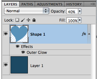
First, make a shape. The background should be one color and your shape another. Apply an outer glow. Here is my heart:

Next, lower the opacity to 40%. Hint – make sure your shape layer is selected, and press the 4. Here is mine, and the layer’s palette.

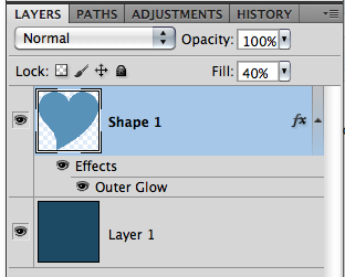
Now, bring the opacity back up to 100% by pressing 0 (zero) on the number pad, and then lower the Fill to 40%. Here is my unfilled heart (boohoo, lol!):

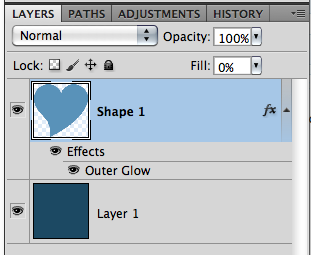
Aha! See… it makes complete sense now, right?! See how the style totally changes when you use the Opacity slider versus the Fill Slider! Cool right. Now, try this… bring the Fill down to 0%. Here is what you will see:

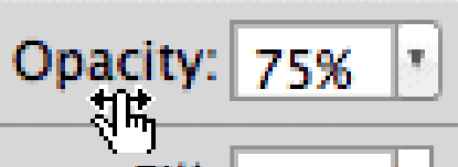
TIP: (COOLEST ONE YET!) You can also change the amount of your Fill, Opacity, Font Size (and all Character settings), Paragraph Settings, Feather, and more with your mouse. Just hover over the word Opacity, and you will see a hand with an arrow with points on either side. Just click right there on the word, and slide your mouse back and forth to the right and left… the number will change as you move. Moving to the right brings the number up, and moving to the left brings the number down. This works for SO many tools. Try it… be amazed! I sure thought it was cool! Here is a pic of the cursor.
So simple, yet so cool… and makes perfect sense now why we have both options, right! Hope that was pretty clear… no pun intended! Here is what the CT did when playing with the Opacity.
Mary (tanni) created this page using See Clearly Now, and See Clearly Now Alpha. She clipped a paper to the leaves, and then lowered the opacity. 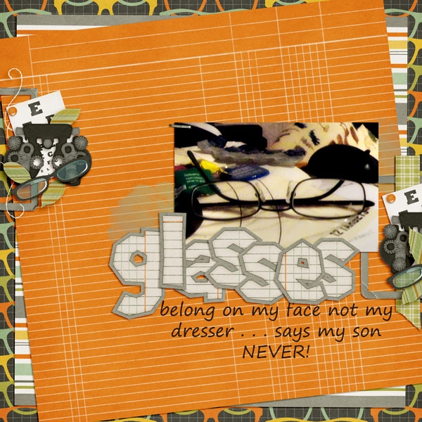
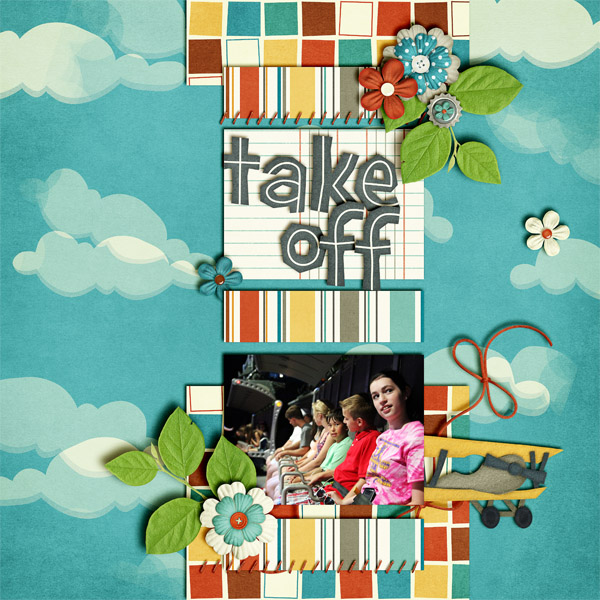
Jenn (jennschultz) created this page, and adjusted the opacity on the background paper to make the clouds appear blended in just a bit more. She used Chelle’s Aviator kit.
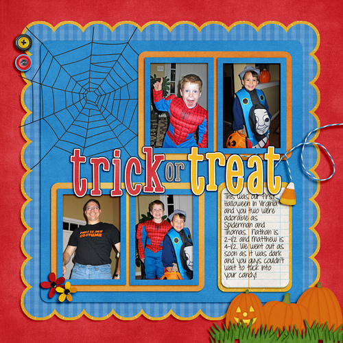
Lastly, Leslie (lab130) created her plaid paper by duplicated it and rotated it 90 degrees. She then lowered the opacity of the top paper by 50% to make a gingham-style paper. Awesome work! She used Chelle’s Choo Choo Kit and her Eeeeek! Bundle.
There you have it. Some great tips, and ideas for your scrapbook layouts! I’d love to know what think of our Opacity or Fill ideas and tips! Thanks for visiting and come back again!


 Hi! I'm Chelle: a 40 something mom of 7. My husband & I live in a rural community in the rocky mountains with our 4 children still at home. In the winters we enjoy sledding & snuggling by the fire. I the cool fall evenings we love relaxing around the campfire & meeting friends at the county fair. Admiring the stars


