1.13 Tutorial: Highlighting Titles with Paint

1.13 Tutorial: Highlighting Titles with Paint

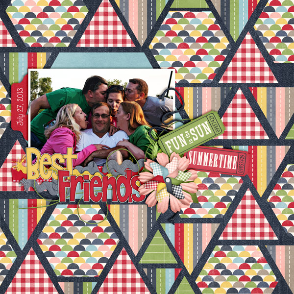
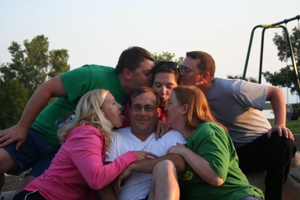
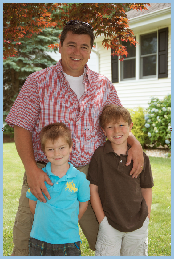
Hi Everyone! I’m Jenn, aka jk703, here to bring you today’s tutorial from a snowy NJ! I think we are forecasted to get about 10-12+ inches, and let me tell you – I’m ready for summer! So, for today’s Tutorial: Highlighting Titles with Paint, I’ve used a summer photo and tried to re-live that wonderful season! :) So, let’s get to that text!

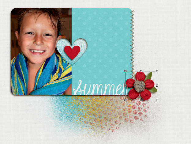
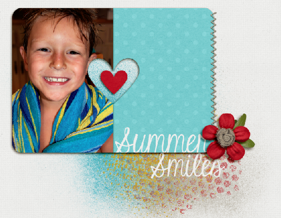
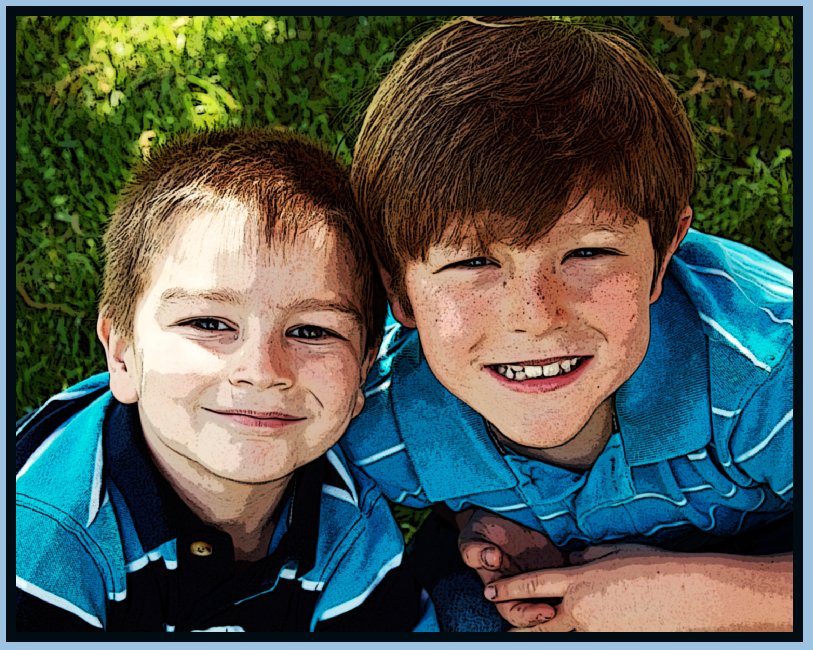
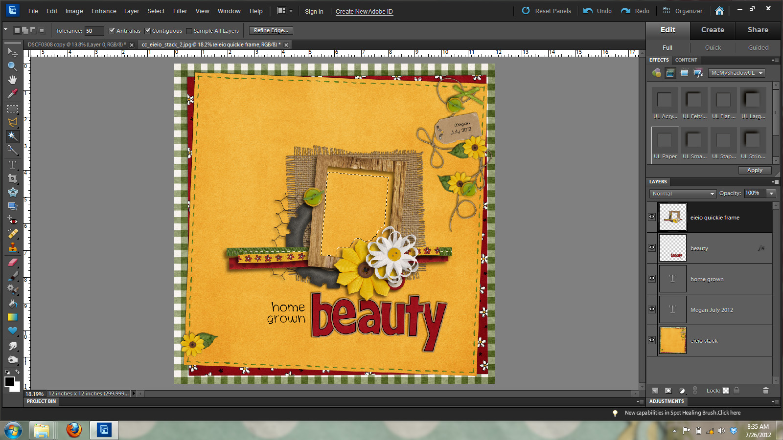
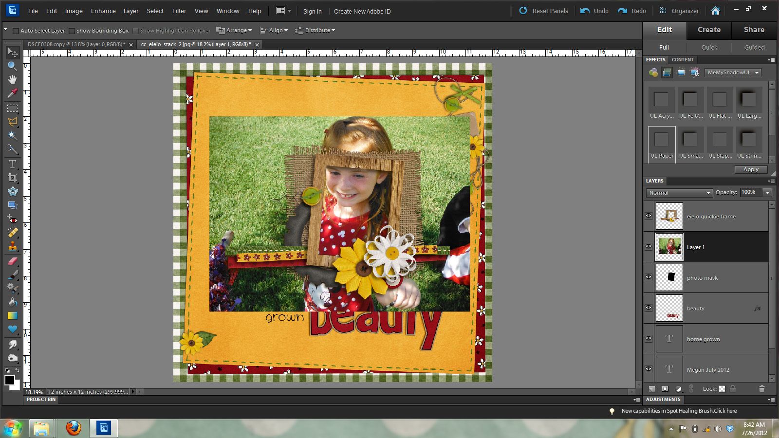
For my layout, I’ve used Chelle’s At The Beach Kit, CU Texturizing Brushes Vol 2, CU Bubble Wrap Brushes, as well as Scrapping with Liz’s In Love Journal Cards. Ok. This is my layout so far. I wanted to add a little oomph for the title but was stumped. So, I decided to use splatters and colors to make the title stand out. You will want to add text to your layout above the background layer.

SplatterText1

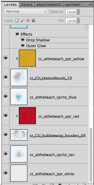
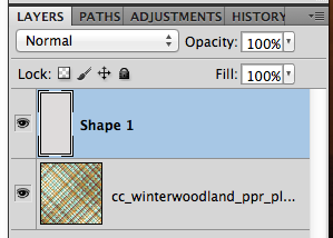
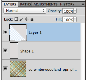
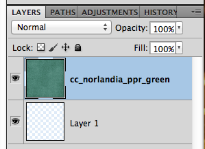
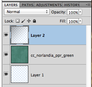
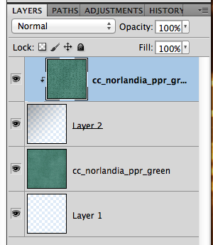
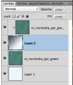
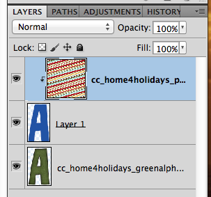
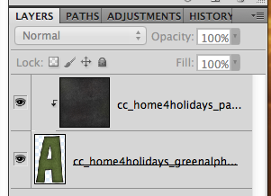
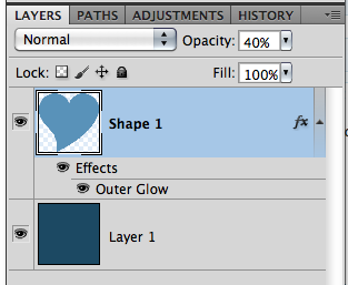
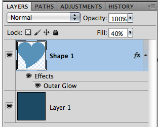
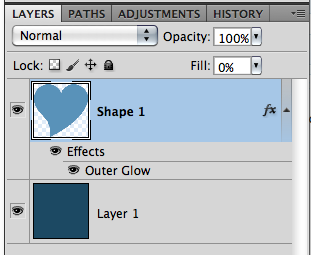
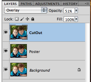
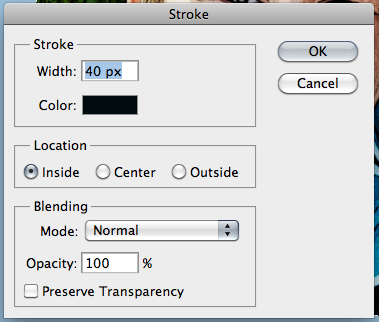
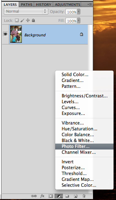
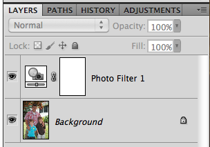
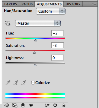
Here is an image of my layers palette, and how I have the layers set up for color, and splatters. It’s a mix of splatters from the kit, and added splatter/texture brushes from Chelle’s CU stash of goodies. My text will be above that yellow paper. :)

SplatterText2

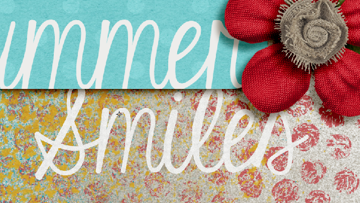
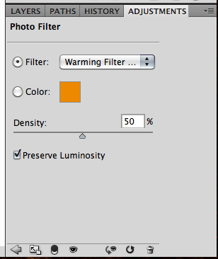
A quick tip…just to give you options for the next part of the tutorial.

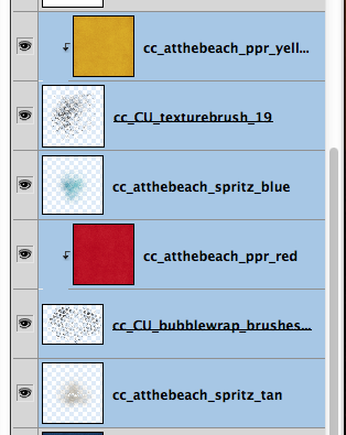
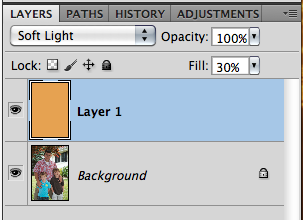
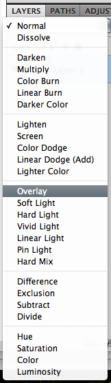
All the splatter layers and papers – You could either combine all your splatter layers to one layer, or keep them separated. You will be deleting from these layers, and it might be a little quicker to combine them. I prefer to leave the layers and delete from each layer, because if I don’t like how it turns out I can easily fix that layer or if I want to keep one color un-deleted, I can. Just my opinion.

SplatterText3

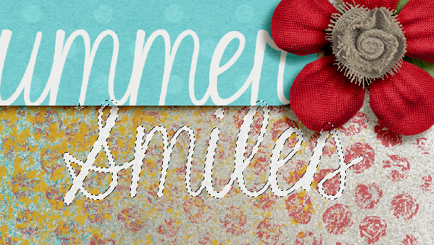
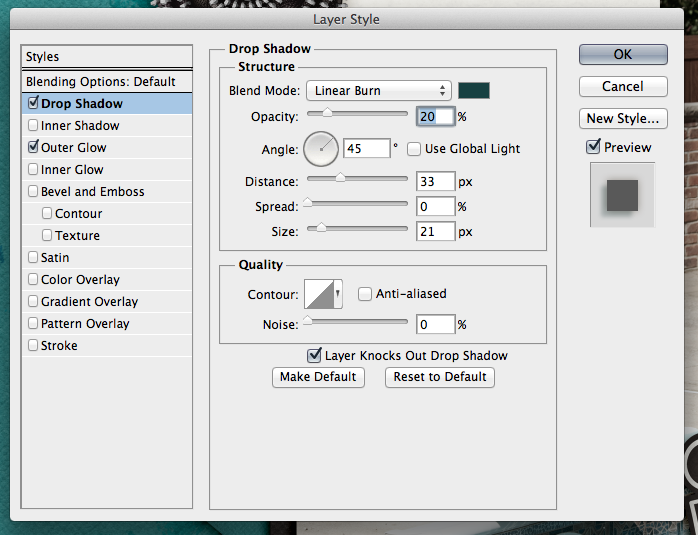
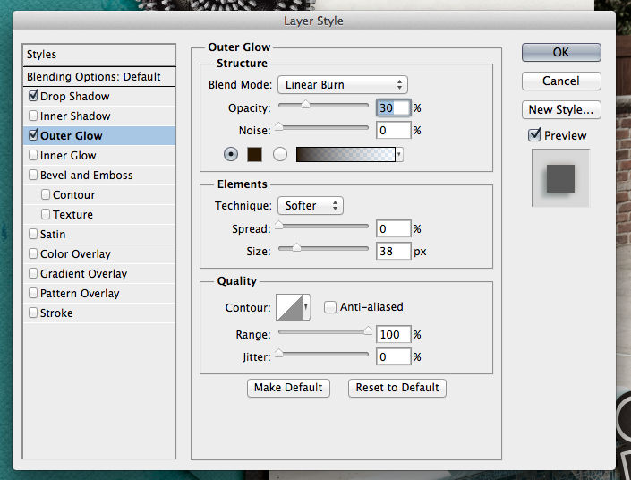
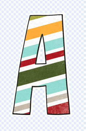
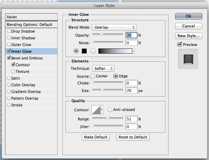
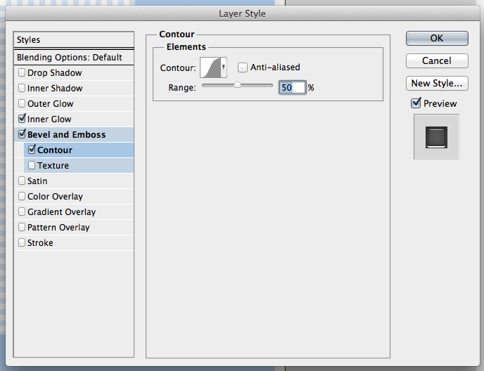
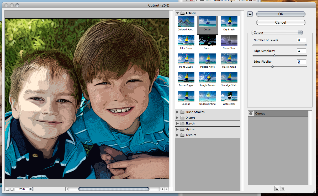
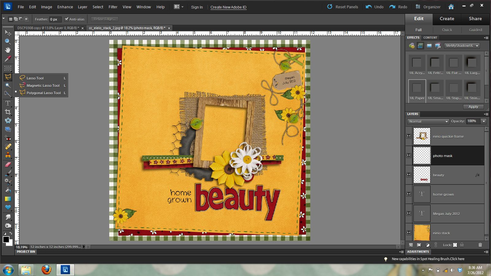
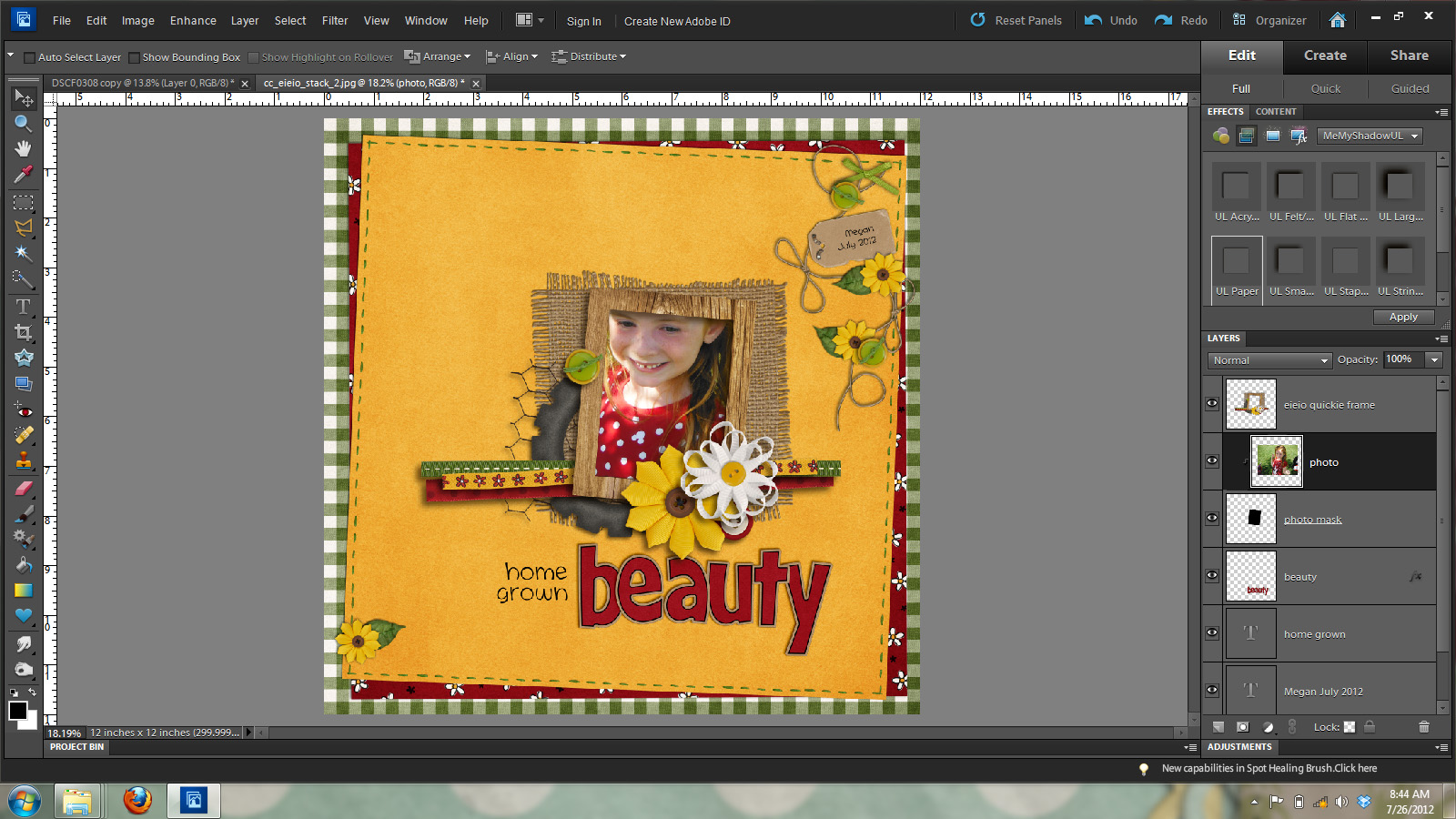
Ok, once you have your text in the location and correct spot in the layers palette, you’re ready to start. Here is my text:

SplatterText3d

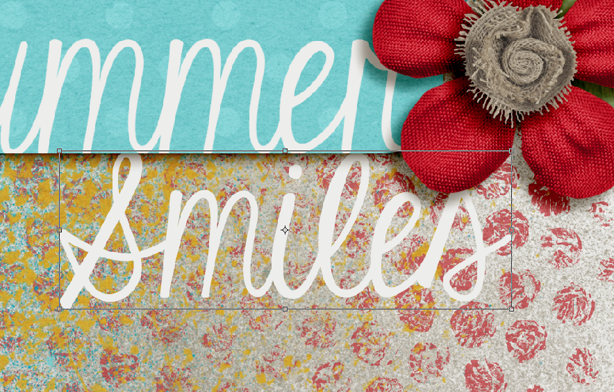
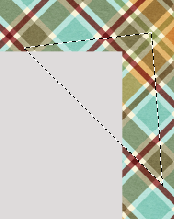
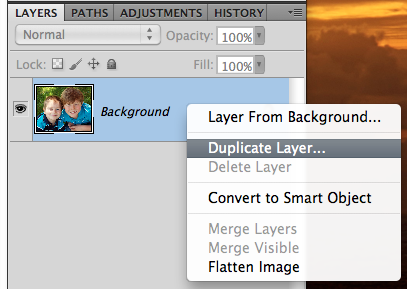
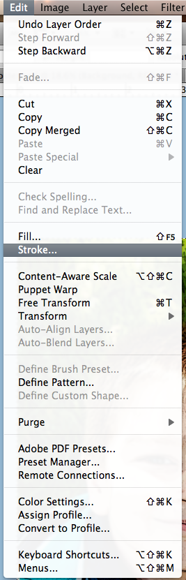
I’ve double clicked on the layer thumbnail in the layers palette for the text. When you do this, you should get marching ants.

SplatterText3c

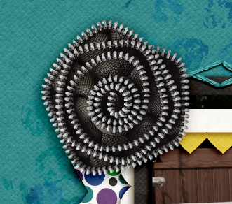
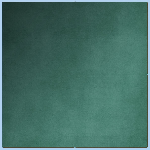
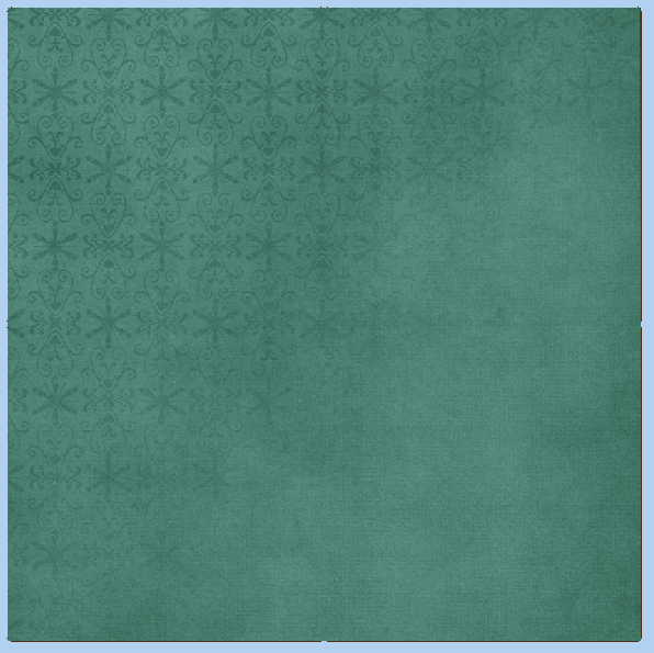
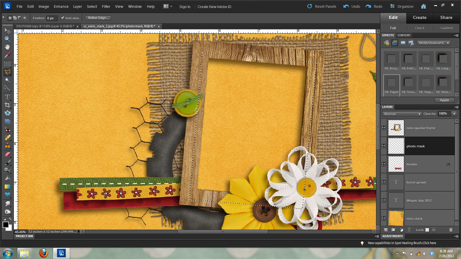
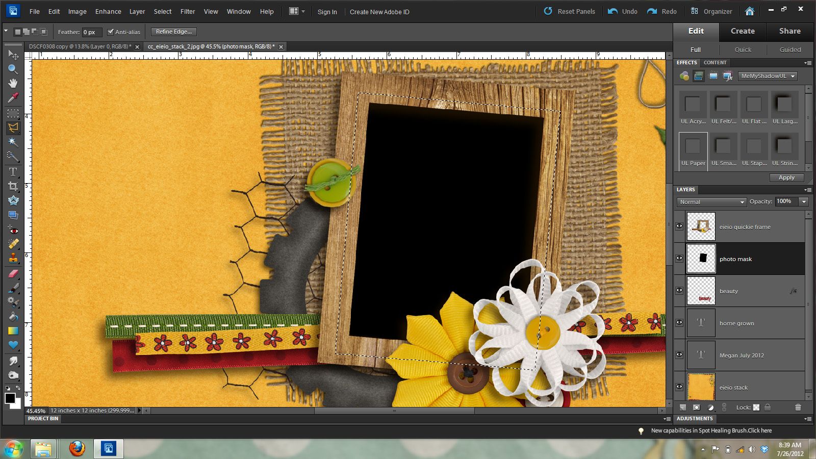
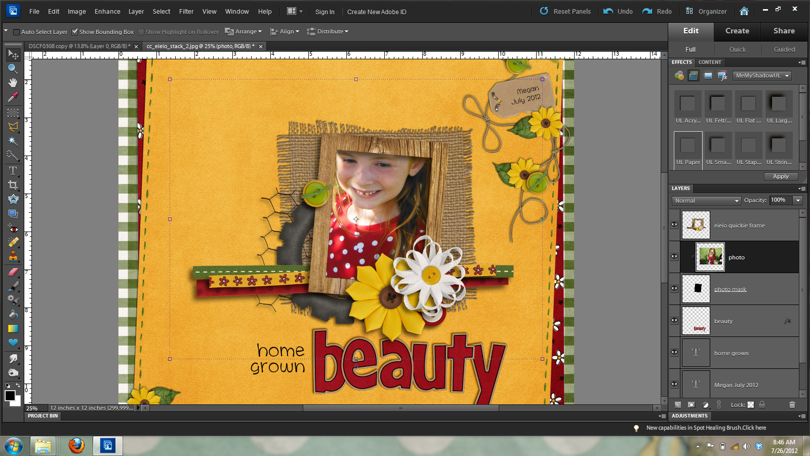
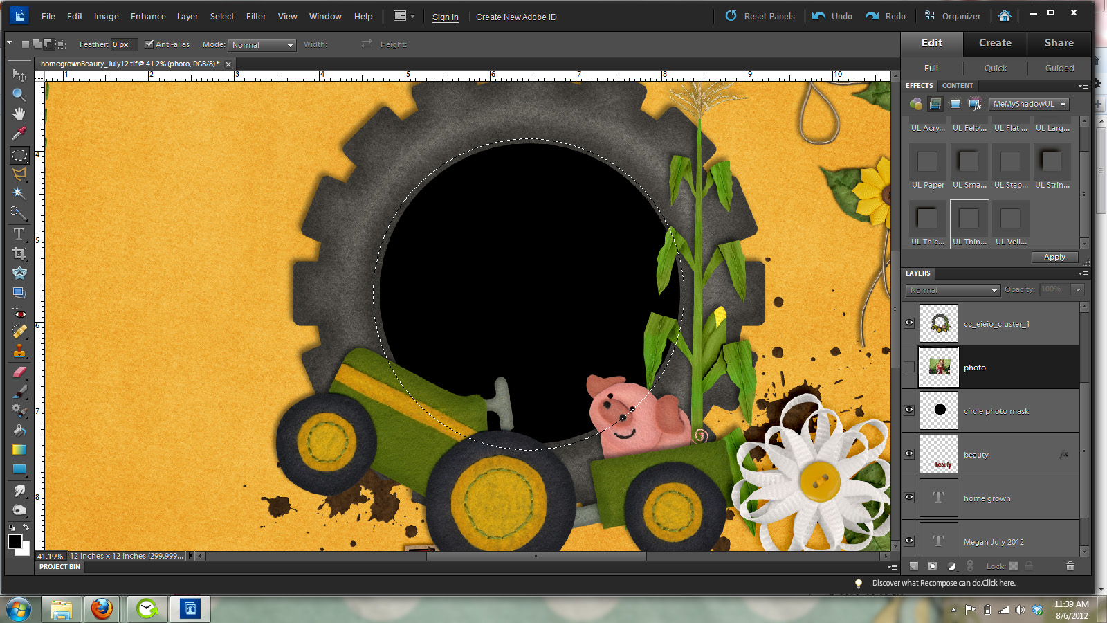
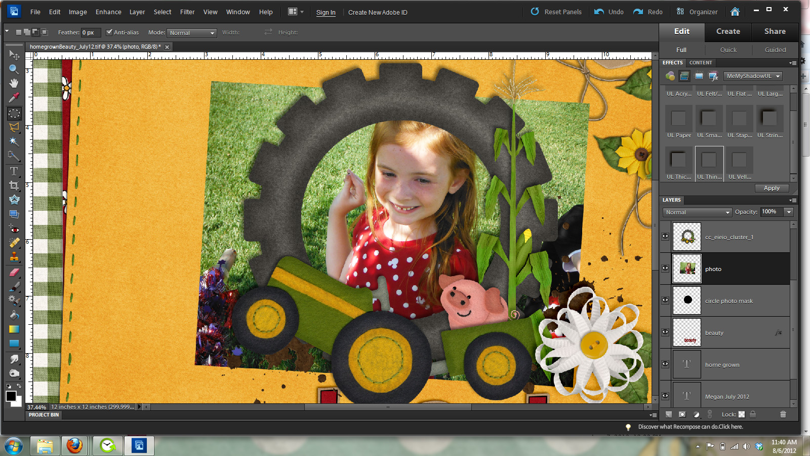
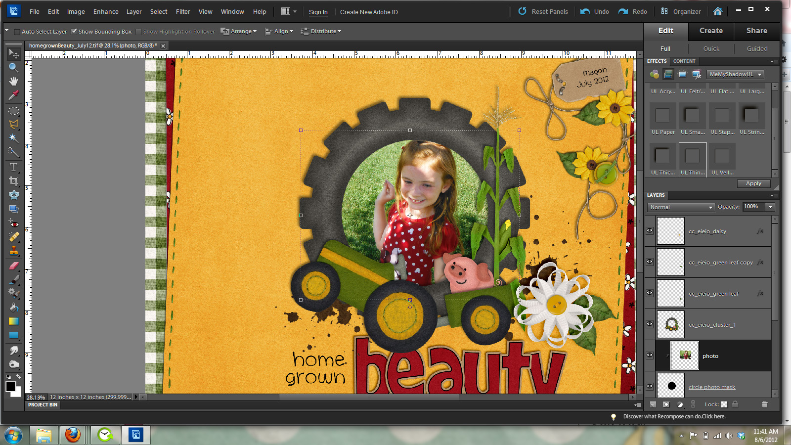
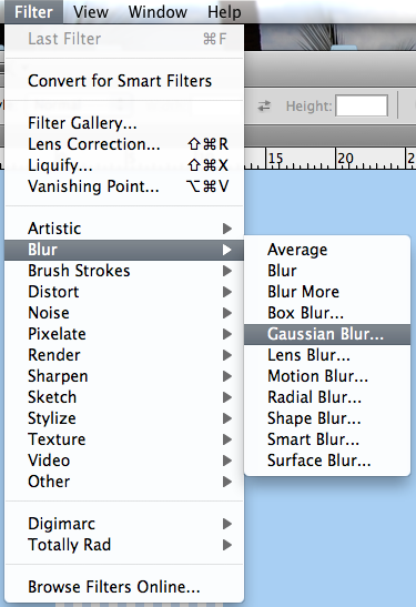
Now, you will click onto every splatter/texture/bubble wrap layer (one at a time, or all depending on the above tip) and press delete. Then turn off your visibility for the text layer. Your paper should show through the splatters. Here is mine (not the best example with white, but you can see different texture).

SplatterText4

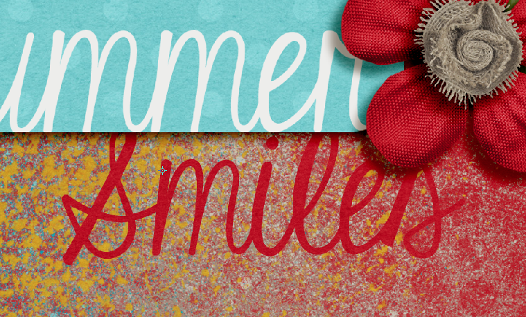
Here is another example using a red background:

SplatterText5

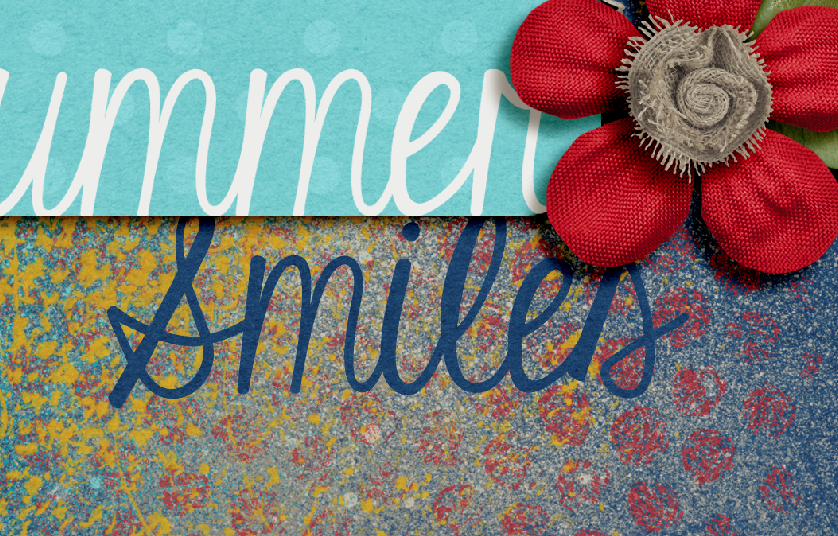
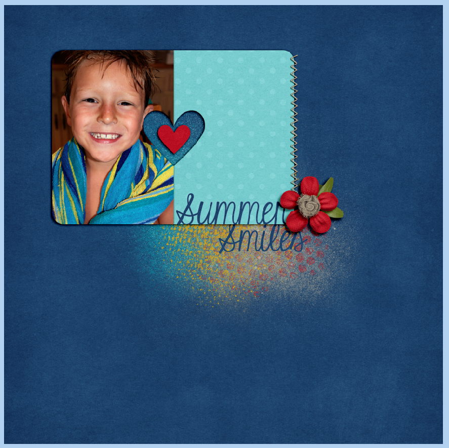
Here is the same example using a blue background:

SplatterText6

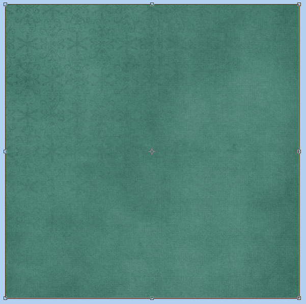
Here is my white background page:

SplatterText7

Here is the blue background page:

SplatterText9a

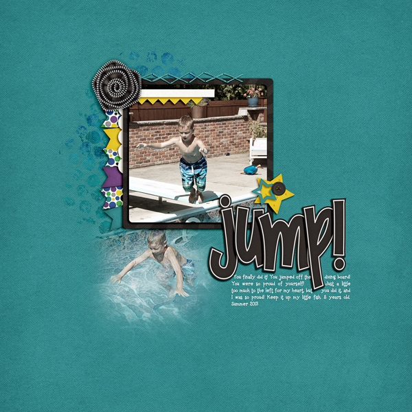
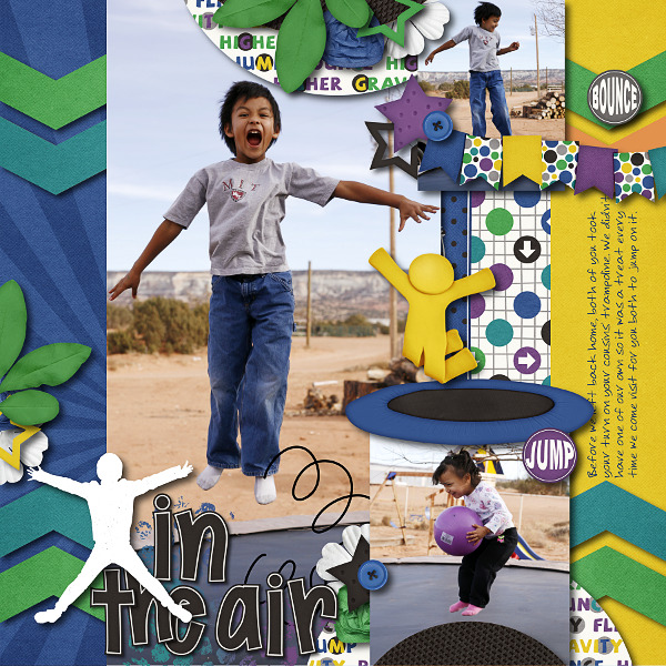
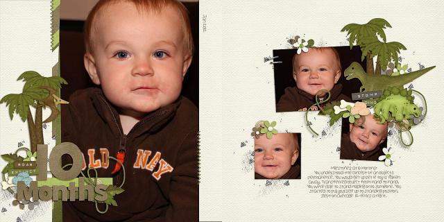
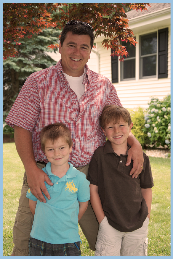
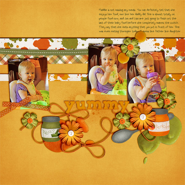
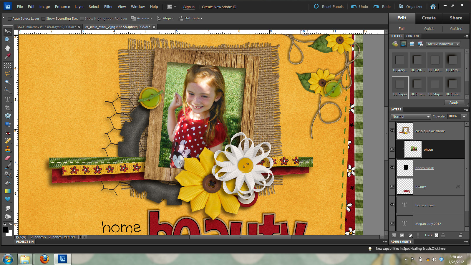
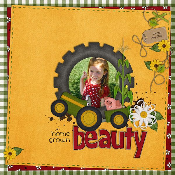
My preference was the white background, and here is my completed page.

SO_CC_AtBeach_SWL_InLoveJnlCrd_KGEyesWdOpn_ShayneSummer2013_WEB


Ok. Let’s see what the CT came up with for this post: Highlighting Titles with Paint! There are some awesome layouts!

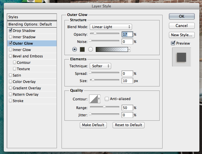
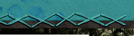
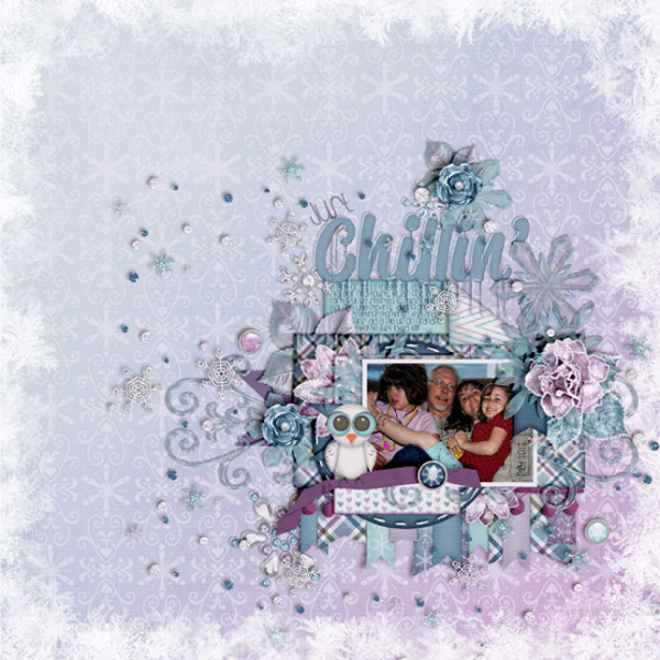
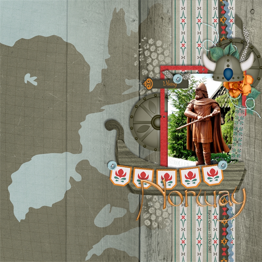
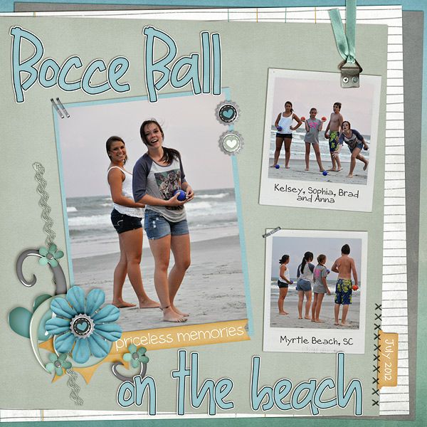
Roxana (roxanamdm) used this tutorial for her page, and then made it her own. Products: Traveler Bundle, CU Spritzes, and CU Bubble Wrap Brushes. She said she kept adding brushes, then added the dark brown paper from the kit on top of the blue. She used the blend mode – luminosity with a  40% opacity. This allowed the background a little darker. She also used the tutorial tomake the stitches in the border too, the template had that brushed border so just clipped a light paper and it worked perfectly.

febtiportut13-web-1

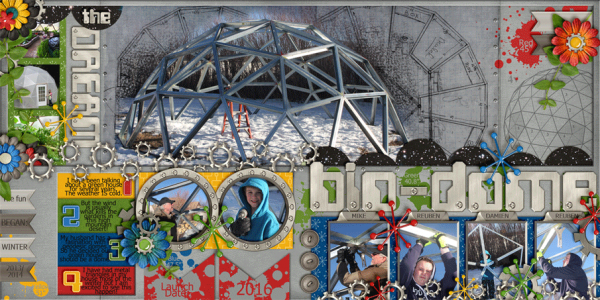
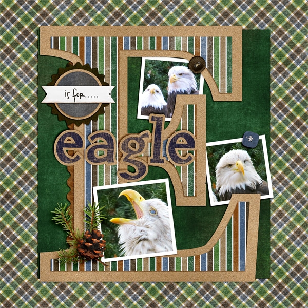
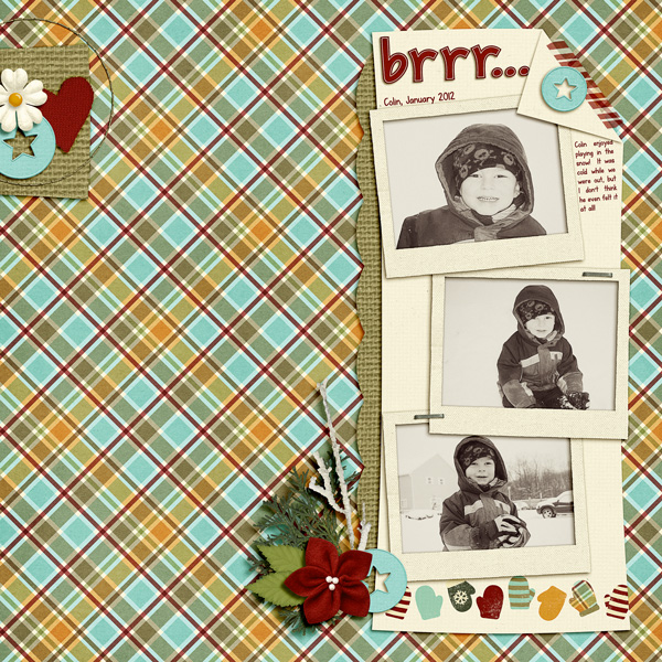
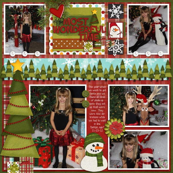
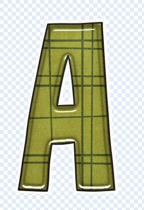
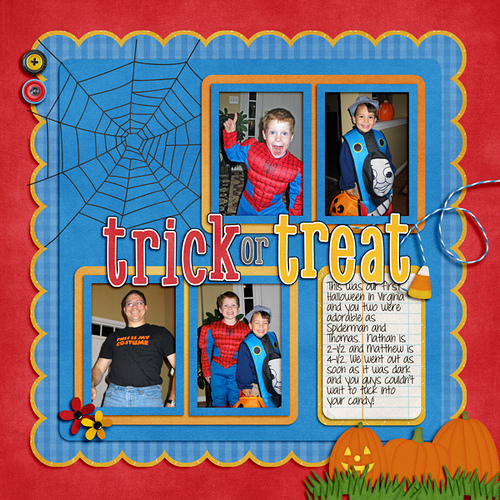
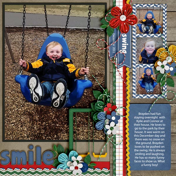
Mel (KSCroppyChick) made her page and highlighted the title by putting the paint splatters behind the title, on the background paper. She used Out Of This World, Basic Black Stitched Alpha, and a Little Green Frog Designs Template.

Explore-Space

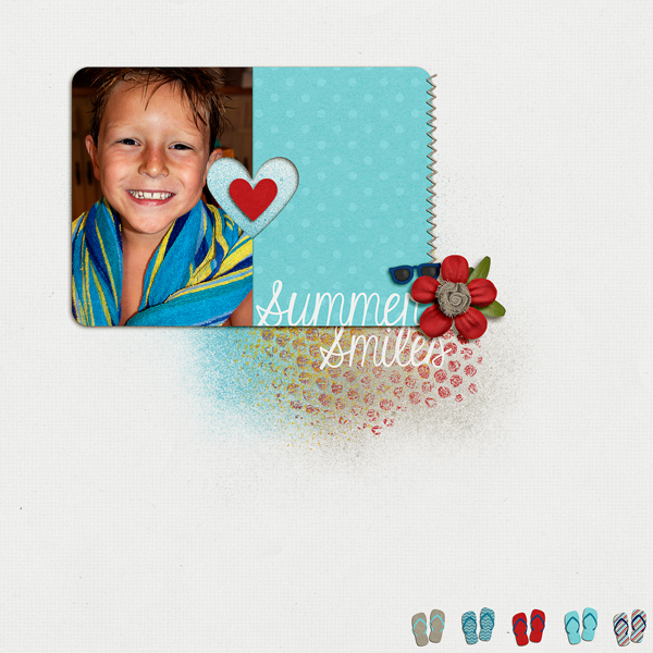
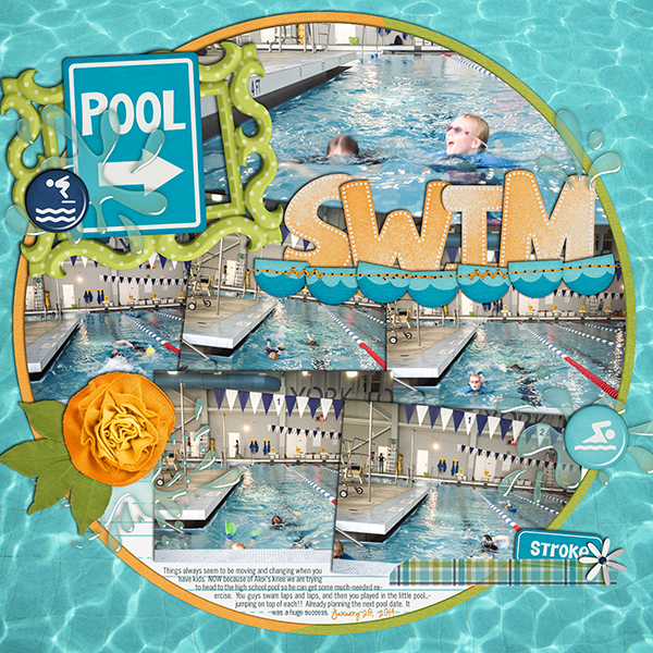
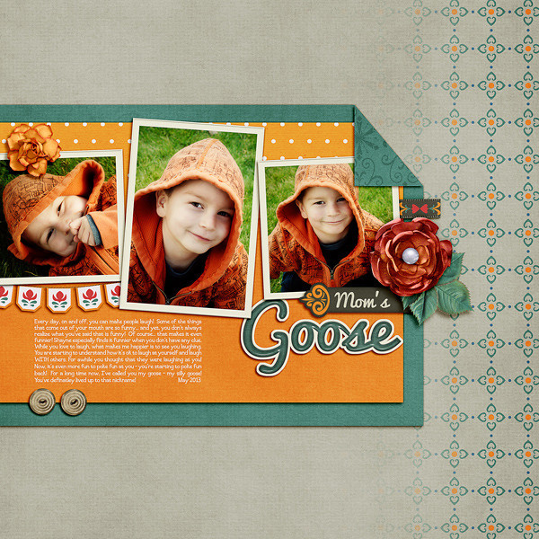
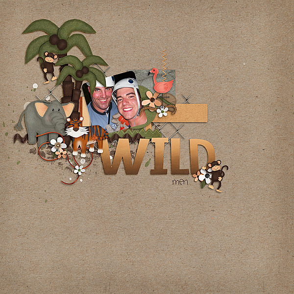
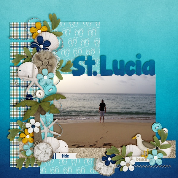
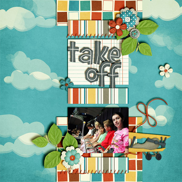
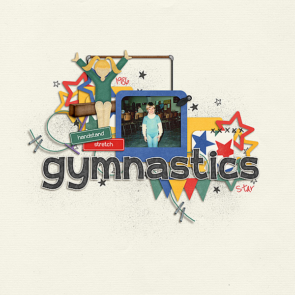
Jenn (jennv) created this summer themed page using Chelle’s In The Pool Kit. She said that she used paint splatters to clip to her title alpha. She was looking to make it stand out a bit more – she wanted it a bit more white-ish!!! Pretty Clever!

12_2014_PoolPlay_600_zps4a443f1b

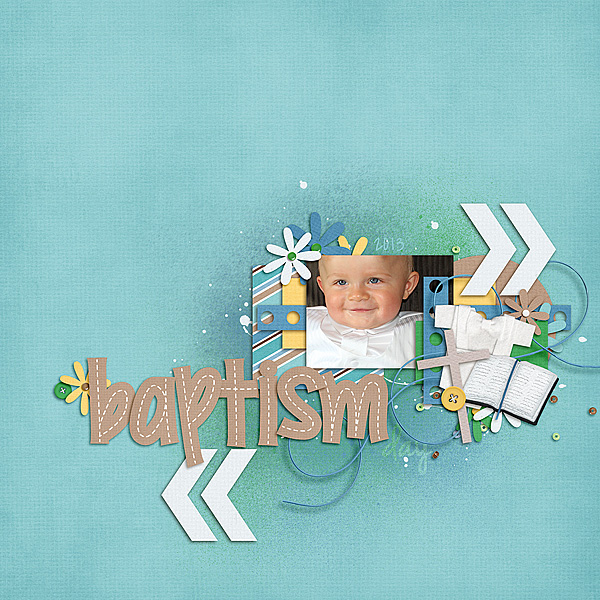
Melissa (prettypeaches) created this adorable page using Chelle’s Choose The Right {Baptism Kit} and a Little Green Frog Designs Template. She wanted a muted look to add to her title and page, and this tutorial was perfect. She even did the date too.

XOXO_zpsd0ef7ece

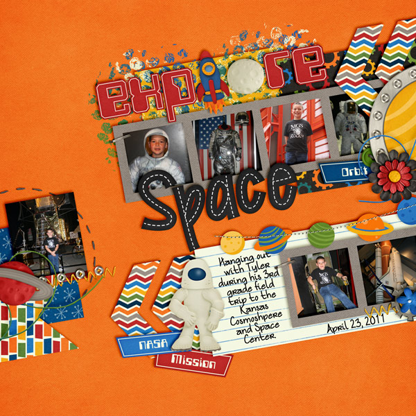
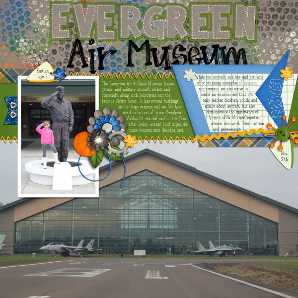
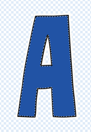
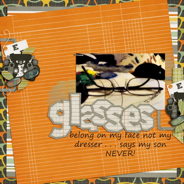
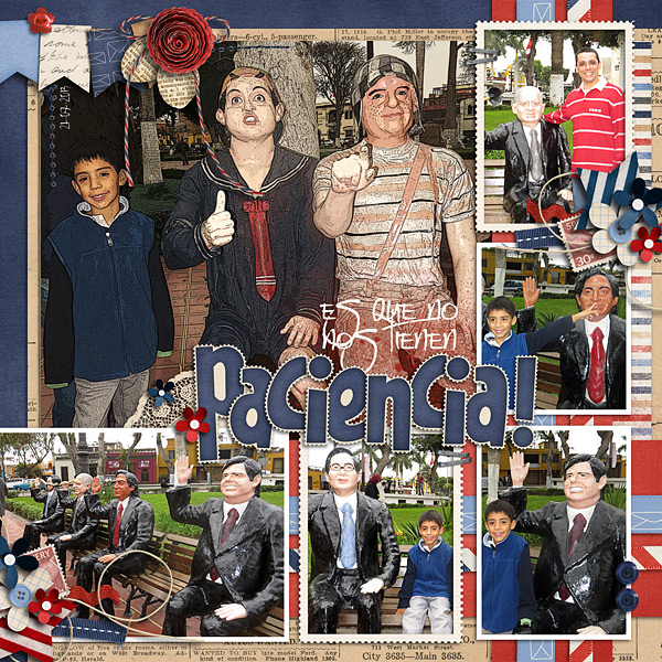
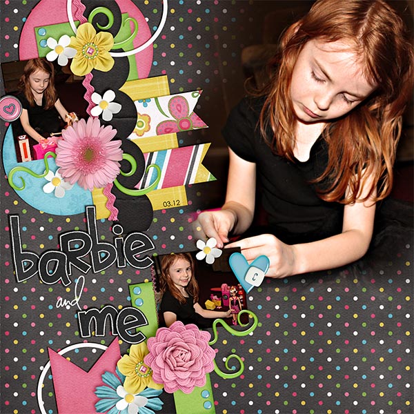
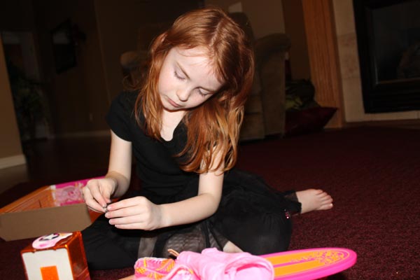
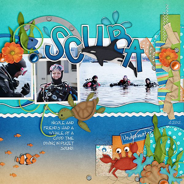
Lisa (kelseyll) created this cool page. She said she used the paint in the Out of this World kit. Then she clustered and merged them together. She then used the CU Dandy alpha to erase out the “Evergreen” lettering, but used the dashed lines to see the letters better. She decided to also make a thin line paper outline in green to further help it stand out.

2-1OutofthisWorld600x600

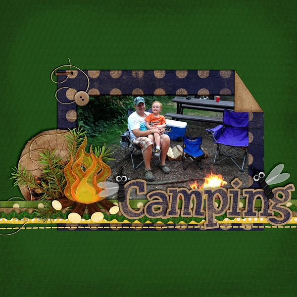
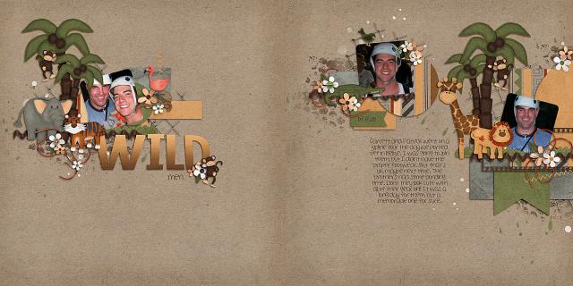
Lastly Leah (Cat Lady) created a double! She used Chelle’s Out of this World kit, Riveted Alpha (Previous Blog Freebie) and a Little Green Frog Designs Template.

39057

Cool pages, ladies! I love what they came up with and how creative they were. Hoping you enjoyed this post, and you will try out the Tutorial: Highlighting Titles with Paint for your next page!

Thanks for visiting!

by_Jenn


1.16 Tips: Shadowing and Preferences

1.16 Tips: Shadowing and Preferences

Hi Everyone, it’s Jenn (jk703) here to share some tips with you today. I’m going to focus on shadowing and preferences – because everyone shadows differently, and everyone has their likes and dislikes. It can depend on the blend modes, distance of your shadows, the size of your shadows, the color of the shadows, and the opacity of the shadows. There are so many different things that can change, so that is why I’ll show you a little of my shadowing and preferences. For today’s example, my page is using Chelle’s newest kit – Jump Zone and it’s coordinating (but so versatile) alphabet – Zone {Alpha}. Here is my page: SO_SWLSwtSmpl_CC_Jmpzn_LDJFrndFnt_CLNSmmr2013_WEB

Now, let’s get a little closer. First up, the banner.

Shadow1

For this particular banner, I have it tucked under paper layers, so it is closer than if it were on top of the photo. For this and the paper layers, I use what I call “Paper Layer + Opposite Edge.”

Here is the shadow information. For the basic Drop Shadow layer, my style uses a Linear Burn, 50% opacity, with a Distance of 13, and a sir of 24. The distance will change how far away the shadow will be from the paper or element. The size will determine how “crisp” your shadow is, or how blurry it is.

Shadow2

For this and most of my paper layers, I add a shadow to the opposite edge. When I look at a paper, it doesn’t sit perfectly on top of another when stacked – there is a slight shadow around the edge so you know they are separate pages. To get this effect, I add an Outer Glow. I use Linear Light, at 17%, color versus a gradient color, and my size is 10 with a softer Technique.

Shadow3

Next up, how I add shadows to stitches. They are really close to the pages, so I shadow these with a heavier “color.” For me, when I look at pages, the closer the item it and how “heavy” at item is will dictate what kind of shadow you need. You may think otherwise, and that’s ok. This is all about you and your preferences. Here are my settings for the stitching:

Shadow4

Shadow5

One last shadow, and then I’ll share what the CT made! Flowers. There are SO many different flowers, realistic, paper, doodles, etc, and there are so many more ways to shadow them. For this particular page, I have a zippered flower. To me, that is a heavier flower/fabric, and metal – which deserves a heavier shadow. Here is my normal “higher” flower shadow with a little added for the opposite edge. Shadow6

It looks too dark to me. Especially on the darker teal paper. So, I adjusted it, and the color of the shadow to make it more to my liking.

Shadow7

Here are the settings that I used for the second flower. I changed the color by clicking on the color box, and then clicking on my background paper. I then chose a color on the darker end of the slider. I also lowered the opacity, and made the size a little smaller than usual. This isn’t my normal settings, so it took some time to make it pleasing to my eye.

Shadow8

For the opposite edge of the flower, I used the Linear Burn Blend Mode at 30%, along with the Technique: Softer at 38 pixels in size.

Shadow9

Play with your shadows, and make them how YOU like them. Use the shadowing and preferences how you like them! Once you like them, get a test print of one page before printing. By doing that, you can make sure that you like how they look when printed. I wasn’t sure when I printed my first album, but it turned out wonderfully. Recently, I printed a Wedding Guest Book as a gift for a cousin, and again, I loved the book so much, and the shadows really made it stand out. People were “petting” the pages.


Here is what the CT shared with me. First, Ophelia (navaja77) uses Gimp for her scrapping!  So she gave me some information to share with you all and a sample page of hers! She used Jump Zone and Zone {Alpha}.

“I used GIMP 2.6 and Drop Shadow Script-fu. For the papers – I typically use X: 15, Y: 15, Blur radius: 25 and 65% opacity.  For this page, I used X: 20, Y: 20, Blur radius: 35 and 65% opacity. For the elements – X: 25, Y:25, Blur radius: 55 and opacity 65%.  This page didn’t have stitches or washi tape but for those I typically use X:4, Y:4, Blur radius: 4 and opacity 40%.  For leaves, to get the realistic feeling, I will increase to 30, 30, 60 and opacity 60%.  My settings place the shadows on the lower right side.  If you prefer lower left side, then change X to negative number (e.g. Papers: -15, 15, 25, 65%). If you shadow like Chelle, ten both X & Y would be negative numbers so you get shadowing at upper left.”

2012-12-02-intheair_sm


Next up, is Donna (dip332) who created this wonderful page. She added shadows using Chelle’s Me & My Shadow, and then tweaked it to her taste. She said “I made the pine and pine cone really stand out by using both an upper and lower large shadows. I also used a chipboard shadow on the word eagle. The buttons are both a flat button setting. The rickrack is a flat ribbon shadow style.” Perfect way to make it stand out – using two shadow settings on one element! Great idea! (She also used Let’s Camp S’more and On The Trail)

36080

Lastly, here we have a honorable page from Leah (Cat Lady). She said “I start with Chelle’s shadows and expand from there. And I love to put shadows on their own layer and expand and move them to cause elements to “lift” off of the page!”  She used Chelle’s Rolling Along kit and Scrapping with Liz’ December Tuesday’s Template.

35881

Hope you enjoyed today’s post – Thanks for visiting!

by Jenn


1.2 Tutorial: Folded Corners

1.2 Tutorial: Folded Corners

Hi Everyone!  Welcome to 2014! I’m Jenn, aka j703, and I’m  excited to start the year fresh and enjoy it! Let’s get to today’s Tutorial: Folded Corners!

Begin your layout with a background paper, and a shape on top. For the tutorial, you will want a straight shape to easily try it out. I’ve chosen a rectangle – you can also try a circle or square. My examples uses Chelle’s Winter Woodlands kit.
FC1

This is what my Layer’s Palette looks like:
FC2

Next, choose the Polygonal Lasso Tool. Click an hold the Lasso tool to get to the other tool options.
FC3

Once you have the Polygonal Lasso Tool selected, and the shape layer selected, click on the corner that you want to “flip.” I’ve created a triangular area that I will flip over, and once I connected all the points, the marching ants create the selection.
FC4

With the selection still marching, click on Layer > New > Layer Via Cut. This will cut the section out and put it on it’s own layer.
FC5

Here is what my Layers Palette looks like now. (If the ants are still marching, just press Command + D)
FC6

Now, with the new layer selected, choose Edit > Transform > Rotate 180*. Your shape should twist and not really be visible.
FC7

Here is what my shape looks like:
FC8

Add Shadows to all layers:
FC9

Add papers to all layers:
FC9a

Here is another example of a irregular shape. It’s a bit more tedious to get the edges/corners to line up. You may also want to warp the shadows a little using Edit > Transform > Warp. Irregular shapes are do-able, but take more time, and effort to get the same look.
FC9bHere is the layout that I made:

SO_CC_WntrWdlnd_KGFallForYou_ColinJan2012_WEB


Here is a layout by Jenny (jenn18) that uses Let’s Camp S’more. I think the fire looks awesome!

35449


Leah (Cat Lady) used Snowlandia for her layout. So pretty!

35506

Not too hard – so give it a shot!  Add a little twist to your page using a folded corner! Have fun and thanks for visiting!

by_Jenn


12.5 Tutorial: Gradient to Blend Papers

12.5 Tutorial: Gradient to Blend Papers

Hi Everyone!!!  How are you?!  I’m hoping you are doing well. This is Jenn, aka jk703, here to share a fun and easy way to stretch your paper stash!  All you have to do it use a gradient to blend papers, and the possibilities are endless! Let’s get right to it! For my example screen shots and layout, I used the Norlandia Kit that recently debuted over Farmer’s Market!

To start, open a new document and add a Paper Layer:

GB1

Once you have your paper imported in, choose the Gradient Tool:

GB2

Now, you will add a new layer ABOVE the 1st Paper Layer. To do this click on the little icon on the bottom of the Layers Palette that looks like a square with a folded corner. Move this layer above the paper layer, in case it isn’t already there. Have this new layer selected.

From choosing the Gradient Tool, you will have a little “plus” cursor. Click on the top left corner of your paper and drag to the opposite corner. Let go when you are about ¾ way to the other side. This is what the paper will look like:

GB3

And the Layers Palette:

GB4

Up at the top menu bar there are some of the Gradient Tool menu options. You can change the type of gradient, where it comes from, reverse it, the color, and even the blend mode. Fun to play with to get different effects on your paper!

GB5

Above the Gradient Layer, bring in a new paper layer. I found that something with a faint pattern or even a coordinating colorful pattern works great. Make sure the colors work well together! Though don’t worry if they don’t – there’s always Control Z! Now, clip the new paper to the Gradient Layer by right clicking on that layer, and choosing Create Clipping Mask.

Here is my first version.

GB6

GB7 To change your blend, you can also click on the Gradient Tool again, and choose the Gradient Layer in the Layers Palette. Click and drag again like you did earlier, and the mask will get darker to allow more paper to show through. Here is a darker mask and the layers that I have now.

GB8

GB9

And another version with a different colored pattern paper:

GB10

Here is my final layout – which, by the way, I changed the gradient and one of the papers above! LOL! :)

i-8W9SW49-L

Here is what the CT made!  Super awesome pages if you ask me! We have some pretty talented scrappers on this team!  Melissa (prettypeaches) created this double layout, but she also said she “cheated!” She said that she just clipped an already created Gradient paper to her alpha to make a new one!  Pretty clever, and awesome if the paper is already included in the kit! Melissa used Zoopendous!

LGFD-LiSlide-2_zps4c2cb059


LGFD-LiSlide-2LS_zps57c3b531

Next, Jan created this stunner. For all of you who use the PSP program, Jan shared this tip: “I made the gradient by going to the >Cut and Fill, >Straight Line and >Blended Edge. I enlarged the blended area to make the gradient fill the page, then chose the >Keep the Unshaded Section for the cut.” Jan used Norlandia and Road Maps No. 4 by Down This Road Designs.

viking

 Lisa (kelseyll) created this fun holiday page – I just love the blocking – check out the blended plaid to solid gradient!  Lisa used Home for the Holidays for this layout.

Home4Holidays2600x600

There you have it – a super easy way to stretch that paper stash!  Thanks for visiting, and I hope to see some Gradient Paper Blends in the gallery! :)

by_Jenn


11.14 Tips: Changing Up an Alpha

Hi Everyone!  I’m Jenn, my user name around Scrap Orchard is jk703. Hope you are having a great week – yay for Thursday! Today, I’m going to share some Tips for Changing Up Alphas. Chelle has awesome alphas in her kits – always a go to when I’m titling my layout – there are usually a couple to choose from in color, pattern or kind!  She makes it super easy to use them. BUT, what happens if you want your alpha just to be a little different from everyone else’s?  Well… you change them a smidge all by yourself!  Here are three tips to Changing Up an Alpha! Oh… I am using the versatile Home for the Holidays for my example images. :)

First, changing the color or pattern.

I have letter selected from the Layers Palette. We are going to make this green letter a striped pattern! (So simple/easy!)

Alpha1

I click on the Magic Wand tool from the Tool Palette, and click on the inner dark green color. If there are any spots that weren’t included, just click near them, and it should then add them to the selection.

Aplha2

You will see marching ants at this point. Add a new layer ABOVE your letter – click on the little square with a folded corner (like a sticky note!) on the bottom of the Layers Palette. Make sure you have this filled layer selected in the Layers Palette after you create it.  Now, press Command > Delete.  Your marching ants will fill in with the background color.

Alpha3

Now, just bring your paper in, position it, and clip it to the filled layer. To clip, just right click on the paper, and choose to Create Clipping Mask.

Alpha4

You can merge the three layers if you like, but otherwise you are done!

Alpha5


OK. Next up is making a simple but fun edge. I have an “A” with a new pattern all ready to go. So, just like above, follow the steps to add a different pattern or colored paper, and we will add a  bevel-ish shiny style. lol! Here is my alpha final.

Alpha6

Here are the three menus, and all the little parts for you to try out. It was easier to post pictures of my screens than try to write it down. This way you can get an exact lookalike!

Inner Glow:

Alpha8a

Bevel and Emboss:

Alpha7

Contour:

Alpha8

Once you change up your settings, your alpha will look similar to mine!  Super easy!

Lastly, by far the easiest way to easily change up your alpha. Just clip a paper to the whole letter. Here is my green A changed to a clack A. All you have to do is right click on the paper, and choose Create Clipping Mask.

Alpha10

Alpha9

Pretty easy?!  Now, your stash of kits, alphas can all be made into new goodies! Here is what the CT did (awesome layouts!)

Melissa (pretty peaches) created a wonderfully cute double – look at that smile/smirk!!  She clipped a paper from Prehistoric to the alpha.

ksd_FP1a_zpsa3e54b8b

Roxana (roxanamdm) created her page using – Summer Lovin. For the Alpha, she clipped a Kraftabulous paper and duplicated each letter, added a thin black stroke to one layer and a white thicker to the other then merged both layers for each letter. She is also showing off (and keeping a copy) of her calendars  – Chelle’s 2014 Calendars 4×6.

calendar2014-web

Jenny (jenn18) created her page using At The Beach, and changed the Alpha by clipping one of the papers to it.

32918

Kimberly (enjoyyourpix) created this page using Taste of Home, In the Pocket {small}, Rainbow Gold alpha (not changed) and Wish You Merry Alpha (color changed).  She said she clipped a hue/saturation layer over the top and made the color more fall-ish

32574

 Jen (supergirljennie) created this cute layout (look at his eyes!) using Kraftabulous, Give Thanks and Marker Alpha. She changed the first part of her title (leaves are) by merging all the individual letters together, and then clipped a solid brown color to the phrase, and then using the blend mode overlay. Jenny also said she overlaid the phrase to the paper and reduced opacity by 20% so it looked more like it was written on the page and less like it was floating.

leaves_zpsd7e77eb0

There you go… some really easy to do ways to Change Up your Alpha!  Make the most of your stash! Have fun, I’d love to see the pages you create in the gallery! Thanks for visiting.

by_Jenn


9.26 Tips: Fill Vs. Opacity

9.26 Tips: Fill Vs. Opacity

Hi everyone!  Hope you have all had a wonderful September! This is Jenn, also known as jk703, here to bring you today’s post. I’m going to give you guys an explanation of what the difference is between Fill and Opacity in Photoshop. I would randomly use one when scrapping, and then I wondered what the difference could be and what using one over the other affected. So, Tips: Fill Vs. Opacity might just teach us something! Let’s get into it.

First, they do act similarly to each other, and both of these selections work with each layer’s transparency. What that means, is that the Fill and Opacity options allows you to see the layer below, and how much of it you can see. The main difference between them occurs when there are styles on the layer that you are using the Fill or Opacity options. Opacity will change and affect all of the layer including layer styles, while the
Fill option only affects the layer content, but not layer styles.

Most of the time when I am scrapping my pages, I use the Opacity slider. Now, I know if there is a layer style, I will choose the Fill slider. Many times, when I am using the Opacity or Fill options, I am also using the Blend Modes. Give all these options a try, and play to see what you like. Some other ways to use the Opacity/Fill on your digi pages can be to:

Make a Plaid Paper – take one striped paper, duplicate it, rotate 90 degrees, and then lower the opacity to your liking.

Make a Paper appear like Vellum – just take a paper, lower the opacity, and then apply a style. Or apply the style, and then lower the fill. It all depends on the look you prefer.

Make a Rub-on – Change a font layers opacity or fill to blend with the background. Make it appear rubbed on by giving it a little texture.

Blend a photo – Using a mask or not, blend your photo into the background paper.

TIP: Use the numbers to change the Opacity while working in Photoshop .With the layer that you want to change the Opacity, just press the number. Zero is equal to 100% and 5 is equal to 50%. Makes it super easy to try, and you can easily see what opacity you like the best.

Now, let me give you some images to show you what I mean. I work better with pictures, so I just assume you do too! :) You can do this along with me if you want to try it out. I’ll even use the number tip above.

First, make a shape. The background should be one color and your shape another. Apply an outer glow. Here is my heart:

Fill1

Next, lower the opacity to 40%. Hint – make sure your shape layer is selected, and press the 4. Here is mine, and the layer’s palette.

Fill2

Fill3


Now, bring the opacity back up to 100% by pressing 0 (zero) on the number pad, and then lower the Fill to 40%. Here is my unfilled heart (boohoo, lol!):

Fill4

Fill5


Aha!  See… it makes complete sense now, right?!  See how the style totally changes when you use the Opacity slider versus the Fill Slider! Cool right. Now, try this… bring the Fill down to 0%. Here is what you will see:

Fill6


Fill7


TIP: (COOLEST ONE YET!) You can also change the amount of your Fill, Opacity, Font Size (and all Character settings), Paragraph Settings, Feather, and more with your mouse. Just hover over the word Opacity, and you will see a hand with an arrow with points on either side. Just click right there on the word, and slide your mouse back and forth to the right and left… the number will change as you move. Moving to the right brings the number up, and moving to the left brings the number down. This works for SO many tools. Try it… be amazed! I sure thought it was cool!  Here is a pic of the cursor.

Fill8

So simple, yet so cool… and makes perfect sense now why we have both options, right!  Hope that was pretty clear… no pun intended! :) Here is what the CT did when playing with the Opacity.

Mary (tanni) created this page using See Clearly Now, and See Clearly Now Alpha. She clipped a paper to the leaves, and then lowered the opacity. 29441

Jenn (jennschultz) created this page, and adjusted the opacity on the background paper to make the clouds appear blended in just a bit more. She used Chelle’s Aviator kit.

takeoff

Lastly, Leslie (lab130) created her plaid paper by duplicated it and rotated it 90 degrees. She then lowered the opacity of the top paper by 50% to make a gingham-style paper. Awesome work! She used Chelle’s Choo Choo Kit and her Eeeeek! Bundle.

9877495843_311f831525


There you have it. Some great tips, and ideas for your scrapbook layouts! I’d love to know what think of our Opacity or Fill ideas and tips! Thanks for visiting and come back again!

by Jenn

8.1 Tutorial: Cartoon Posterizing

Hi Everyone! Happy August 1st!  Can you believe this month has already started!?   It’s Jenn, aka jk703, here for today’s Tutorial. A fun and different technique that you can use on your layouts! Sometimes learning a new technique gets you to play with tools and other options that you didn’t know were available to you in Photoshop or Photoshop Elements. Today, we are going to look at a mix of cartoon posterizing! Like all of the skills that you learn, remember to play with the options and all the sliders. You never know what might happen!

OK. First step is to right click on your image and duplicate it. Remember, use a copy of your image to start with every time, just in case you need to go back to the original!

Cartoon3

With the duplicate layer selected in the Layers Palette, click on Filter > Artistic > Poster Edges.

Cartoon4

A pop up will appear… I have my settings at 7 Thickness, 2 Intensity, and 2 for Posterization. Play with these to see what you like.

Cartoon7

Next, with that same layer selected, choose Filter > Blur > Gaussian Blur.

Cartoon6

Another pop up will appear, and I’ve moved the cursor to 2.0. Next, duplicate your Blurry Poster Layer in the Layers Palette. Choose this layer if not already chosen.

Cartoon8

On the Menu Bar, choose Filter > Artistic > Cutout.

Cartoon9

The pop up menu will show, and you can make adjustments to the settings. I have mine at 8 for the # of Levels, 4 for the Edge SImplicity, and 2 for my Edge Fidelity. Click ok.

Cartoon9a

I’ve decided to change the blend mode, and lower the opacity of this Cutout layer – only because my sons face is super light, and I want it to look a bit better. I have it set to Overlay, and 51% Opacity.

Cartoon9b

Next, use the folded corner box to create a new layer. Move it above the Cutout layer. Double click on the thumbnail of the Cutout Layer to get the marching ants. Then click back to your new layer.

Cartoon9c

With the new layer selected, click on Edit > Stroke.

Cartoon9d

When the pop up appears, I used a black stroke, 40 pixels and it comes from the inside.

Cartoon9e

Example

Cartoon9f

Now, let me show you what the CT made… Roxana changed her main image… and I think it looks awesome!  Such a fun photo to try it out on too – since they are statues! She used Letters From Home and Rock the Vote57-estatuas-web

Jenny created this super cute layout using At The Park and a template by Little Green Frog Designs.

Carton-Park_web

Mel used Summer Lovin’ for her layout and even showed the before and after pics for her image!

Summer Lovin' by Chelle's Creations Template by Megans Creations

Before

IMG_9683

After

IMG_9683-toonish2

There you go. A new idea, and you can play with it to make it a fun one for one of your layouts!  See you later in the month! Thanks for stopping by today!

by Jenn

Tutorial: Adding Warmth to Photos

Tutorial: Adding Warmth to Photos

Happy 4th of July to all those who celebrate! Hi Everyone – it’s Jenn, aka jk703 here with a quick tutorial!  So much is going on, so I won’t keep you for long. Adding warmth to photos are super easy to do… and can really make a cooler photo look nice and warm with a sunny feel. Sometimes shadows, clouds, and skin tone will look a bit blue… so this will help you change it a little. This little tutorial can also be done for many other color changes for photos.

Open your image and re-save it. This was you will have your original available if you need it later. Here is mine of my boys on Father’s Day this year. Not a bad picture, but I like my images a little warmer most of the time.

Warm 1
Next, on the bottom of your Layers Palette, there is a black and white filled circle. Click on that and the Adjustment Layer options will pop up. Choose Photo Filers.

Warm 2
You will automatically be looking at the Adjustment Palette. you can click drop down menu next to “Filter.” There are so many options available to you to enhance your photo. You can also use a specific color by clicking on Color. You will then get an option to change the color by double clicking on the color box.

Warm 3
Warm 4

I’ve chosen the first warming filter, and have moved the opacity to 50%. Then you are done!
Here is my image… and my Layer’s Palette so you can see what yours should resemble.

Warm 6

Warm 5
Another easy way to add warmth (or any color) to your photo is to add a layer above your photo. Click on your background color in the Tools Menu. Use the color picker to get a color that you want to add to your photo. I used an orangey color for mine – similar to the one available in the previous adjustment layer. Press Command + Delete to fill the layer with the background color.

Warm 7

Next, change the blend mode to Soft Light, and play with the opacity of the color layer. You can use any blend mode and opacity combination that you like for your photo. Here is mine – Soft Light and an opacity of 30%.

Warm 8

Here are layouts using these techniques from the CT. Here, Jenn (jennschultz) created this layout using First Foods.

yummy-2

Here is her original picture:

IMG_0176

Next, Kayla (keepscrappin) made this layout using Girlfriend, Toadally, and Toadally Add-On (and a Little Green Frog Template too!)

BarbieNme_Mar12_web_zps3ec1b8ab

And Kayla’s original image:

IMG_3609_before_zps9837b5a1

There you go!  Simple and super fast too! Thanks for stopping by today, be sure to keep checking everyday for Chelle’s freebies for the month of July! Have a great week!

by_Jenn

Filling A Frame | Digital Scrapbooking Tips

Fill a Frame Photoshop Elements 10 Tutorial
by Kayla Chamberlain aka keepscrappin
We’re gonna start with my layout that is almost finished.  I used Chelle’s Creations E-I-E-I-O kit/alpha and E-I-E-O Quickies to make this layout.  Gotta love those quickies. They make for a really quick layout!

I’m going to show you how to add your photo to the pre-made photo cluster.  This method can be used on any square or rectangle frame.

There are many ways to fill a frame in PSE, but today I’m gonna show you what works for me.  My favorite way is to create a fill or photo mask layer for the opening of the frame.  An easy way to do this is by using the magic wand tool to select the area inside the frame opening.  This works great for non-shadowed frames, but the one I’m using already has all of Chelle’s fabulous shadows and I don’t want to have to do all that shadow work again.  When I use the magic wand tool on the frame with shadows, it doesn’t nicely select the area I want to fill.  See the image below to see that the marching ants are inside the frame where the shadows are.

Don’t fret though PSE has another tool that will help me easily select the area I want and still be able to use the shadowed version of the frame.  This tool is called the polygonal lasso tool.  It is the sixth tool down in the tool palette and is grouped with the lasso tool, and magnetic lasso tool, so  you may have to click on those and hold for the fly-out menu so you can get the one pictured below.

The nice thing about filling this frame is that we don’t have to be totally exact on selecting the inside of the frame because we will be putting our photo underneath the clustered frame layer.  We will want to make a new layer under the clustered frame layer.  You can do this by being on the frame layer and then holding down the ctrl key and clicking on the new layer icon at the bottom of the layers palette.

Once you’ve made your new layer under the frame layer, you will use the polygonal lasso tool to click on the upper left corner of the frame and draw a rectangle around the frame.  See the image below for what the marching ants should look like.

While you have the marching ants selecting the area you’d like to fill you will now make your fill layer or photo mask layer on the new layer you just made.  To do this you will hold down the alt key + the backspace key to fill that layer with your foreground color.  Don’t worry about the color of this mask, as it won’t show once we clip our photo to it.  See the image below to see that my black photo mask now fills the open spot in the frame.

Ok – now you can remove the marching ants by pressing ctrl and D.

Now, it’s time for the photo.  Open your photo and do any necessary editing and then add it to your layout on the layer above your photo mask.  See the image below for how the layers should look in the layers palette.

As you can see from the above image my photo is too large for my frame.  So I’m going to clip it to my photo mask layer by going Layer ] create clipping mask.  Or pressing control and g.

In the image below you will see that it looks like my image has been cropped, but really it all still there but is just showing the part that is clipped to the photo mask.  I can move it around, resize it and such so it will show what I want it to show.

I want to resize this photo to show more of my daughter in the frame, so I’m going to check show bounding box in the top options bar.  This will give me a box with handles to resize my photo as shown in the image below.

I want to bring in my photo from the corner handles so it will constrain the proportions of my photo.  If I resized it by clicking on one of the center handles it would distort my photo and make my daughter either look tall and skinny or short and fat and not good at all.  It is really important to always resize from a corner handle and make sure that the proportions are constrained so you don’t get weird looking people on your layouts.  The people on my layouts are weird looking enough without any help from me and photoshop.  LOL

Here’s what my photo looks like in the frame now that I’ve resized it and used the mouse and/or arrow keys to position it to show what I want shown in the frame.

And here’s my final layout zoomed out so you can see my little home grown beauty.

But wait you say!  How do I fill a circle or oval frame?  Well, let’s take a look at that right now.  Here’s my same almost completed layout with a circle frame cluster from the E-I-E-I-O Quickies.

The easiest way I have found to fill a circle frame is by making a circle photo mask layer.  We will do this with the elliptical marquee tool.  It is nestled in the toolbar with the rectangle marquee tool.  See the image below for where it’s located.

Make sure feather is set to zero in the top options bar and draw a circle around the opening of the frame.  Holding the shift key down while you draw out the circle will keep it a perfect circle.  You can also press the spacebar while drawing to move the circle to the position you want.  When you have finished you will have marching ants around the circle like in the image below.

You will now need to make a new layer under the frame layer for your photo mask.  This will be the layer you will clip your photo too so it will fit inside the circle frame.  Click on the new layer icon at the bottom of your layers palette to make this layer and then hold down the alt and backspace keys to fill the layer with the foreground color.  As before the color doesn’t matter because it is just a place holder for where the photo will go.

Now you can get rid of the marching ants by pressing control and D.  We will now bring in our photo to the layer above the circle photo mask you just made like in this image.

As you can see from the above image my photo is too large for my frame. So I’m going to clip it to my photo mask layer by going Layer ] create clipping mask. Or pressing control and g.  Then like before move and resize the image to fit in the frame how you’d like it.  Remember to always resize from a corner handle to NOT distort your image.

And here is my finished layout with a circle frame instead of a rectangle frame.

Here’s some fabulous filled frame layouts from the Chelle’s Creations Creative Team.

From Carol using Something Fishy

From Shannon using Oh Snap Quickies.

I hope you’ve enjoyed this tutorial and I can’t wait to see all your wonderful layouts in the gallery with filled frames.

take care and keepscrappin’

6.28 Tutorial: Dreamy Photo Look in 5 Minutes

Hi Everyone! It’s Jenn, aka jk703 here…. bringing you a fun and really fast tutorial today!  Love the dreamy look to some older photos that you see?  Well, you can quickly add them in five minutes!  Ready?

Here is my original photo of my son, Colin.

Step 1: Open your image and re-save it. This way the original will remain intact for future use.

Step 2: Duplicate the image. (Cmd+J or Ctrl+J or by Dragging the Background Layer to the “New Layer” button on the bottom of the Layer’s Palette.) This is what the New Layer button looks like:  

Step 3: With the Duplicate layer (or Top Layer) selected in the Layers Palette, Click Filter > Blur > Gaussian Blur. A pop up will “pop” (lol). Enter 10-30px. Look at the preview to see the changes that are made. Play with the amount of blur that you like, and just make sure that the outlines of the face are evident. Click OK.

Step 4: With the Duplicate Layer selected, change the blending mode to Overlay. Your photo will take on a softer, dreamier look. This is within the Layers Palette, and near the top left corner.

Step 5: If your image is too RED, click on the little black and white circle on the bottom of the layers palette – the Adjustment Layer. Choose Hue/Saturation and set the Hue to around a positive 2 or 3 and the Saturation around a negative 2 or 3. Make sure Lightness is set to zero. Click ok. The way the photo appears can be played with in the Adjustment Layer – some photos may need more of an adjustment, so play with the numbers so the images is to your liking.

TIP: To get a specific color for the dreaminess, you can add an additional adjustment layer. With the Duplicate layer selected, choose the icon for the Adjustment layer again. Choose Photo Filter. Pick a color from the drop down menu, and choose the Density. You can add a pink, yellow, or blue dreaminess for the photo. Whatever color you are looking for!

Here is Colin… Dreamified! :)

Now, for some CT Inspiration for your enjoyment!  From Melissa, and she said “When I did this, it made my background really dark, so I turned down the opacity by 10% and it made it have a softer look!”

From Kayla. She had to work with the adjustment layer and advised that her photo was really red so she had to adjust the hue to +7 and saturation down to around -15 to get it to look right.

From Carol, who mentioned that she followed a different technique, but inspired by the Dreamy look. She said that she followed the following steps: Duplicate image, Filter > Blur > Gaussian blur, and then she added mask layer, gradient (circle setting) with a stroke from face to edge.

There you have it – Dreamy Looks in 5 Minutes!  Thanks for stopping by to visit,