


Hello, Hello and happy Thursday! How are you all doing? Is this week flying by for you? It is for me, and I’m enjoying the almost 40 degree weather this week… definitely better than the teens, wind chill, and snow! This is Jenn, aka jk703, and I’m here to share a tutorial that you can use on photos and on your digital papers! It’s pretty versatile and fun… oh, and super easy too! Now, this isn’t available in PSE, but my fellow awesome team members figured out a work around that works similarly. We’re trying to cover the bases so everyone has a way to try it out! Yay!

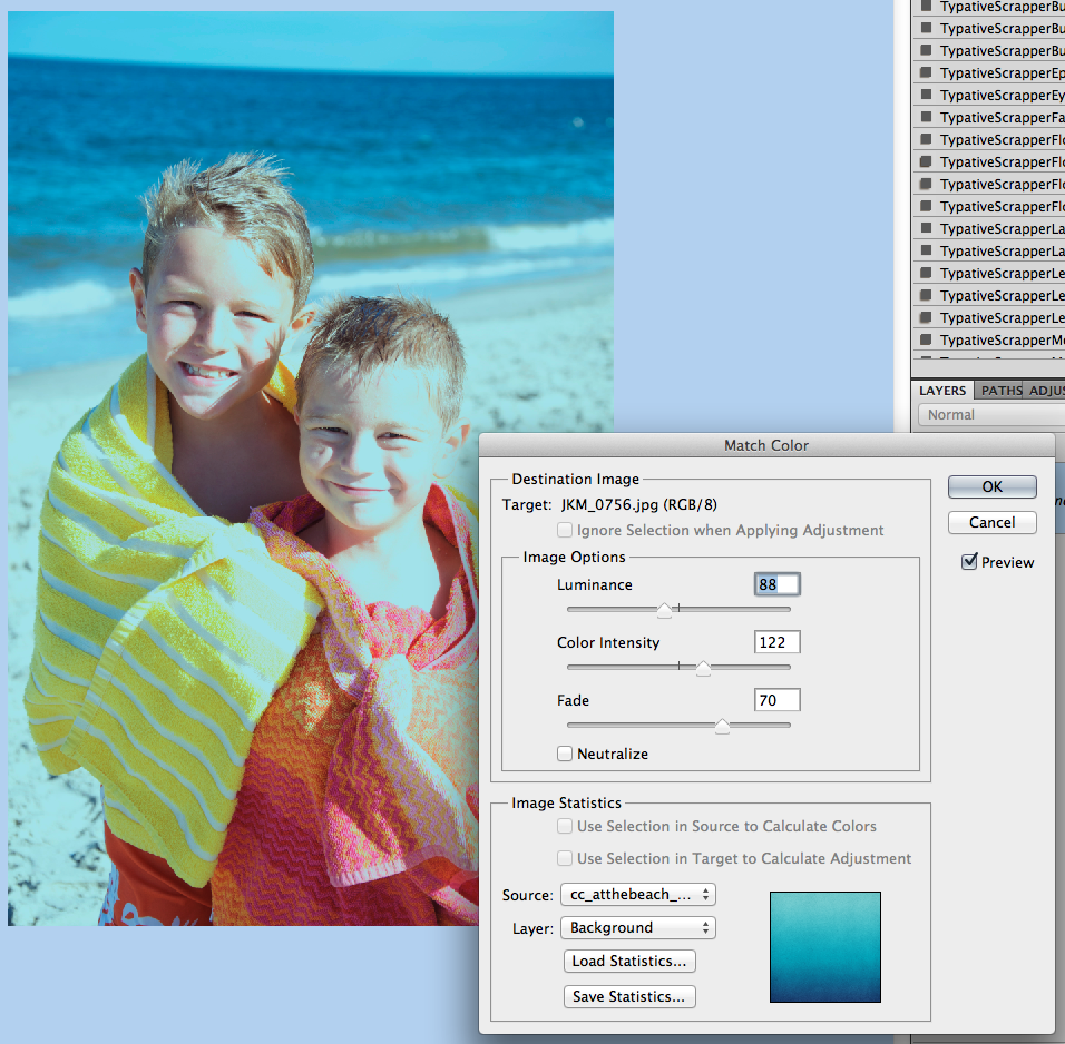
 But, what if I wanted a little cooler to teal tint to the picture. Easy! Ok. You should be “in” the image that you want to color change, and that should be the selected in the Layer’s Palette. Click on Image > Adjustments > Match Color.
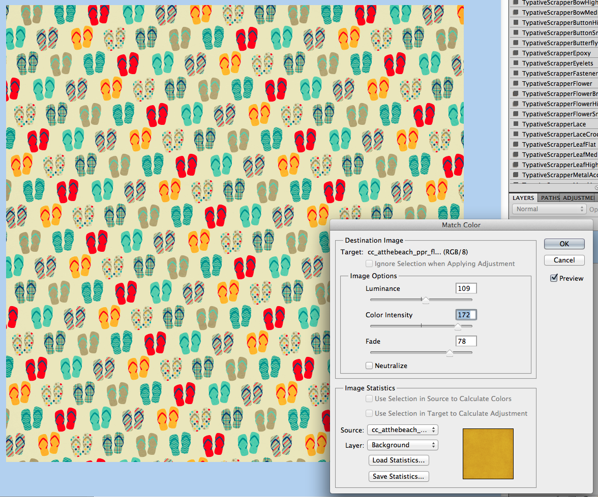
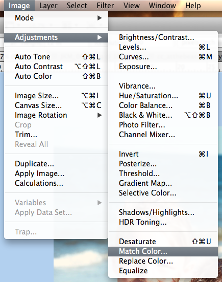 A pop up menu will appear. Towards the bottom, there is a click down to choose the “Source.” The Source is where you will be getting the color from to add to the original picture.
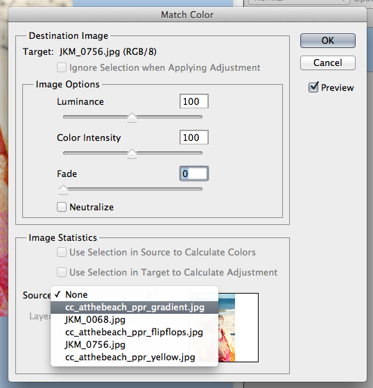
Right now, I chose a gradient paper from the At The Beach Kit. My image will instantly turn a tint of teal. Like this:
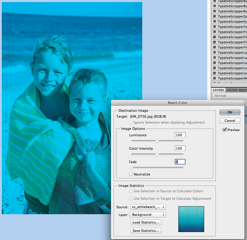
Now, I play with the sliders to change up the color. The sliders are Luminance, Color Intensity and Fade.
Luminance – adjusting to the left makes it darker, while sliding it to the right makes it lighter.
Color Intensity – adjusting to the left makes the color range smaller, while sliding to the right will add to the range and intensify the color.
Fade – sliding will determine how much of an adjustment you will have. To the left is a straight color adjustment, while to the right fades the color adjustment.
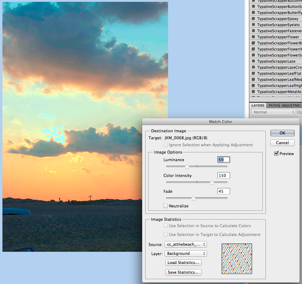
You can see my adjustments and sliders here. Gives it a cool look, and adds to the scenery.
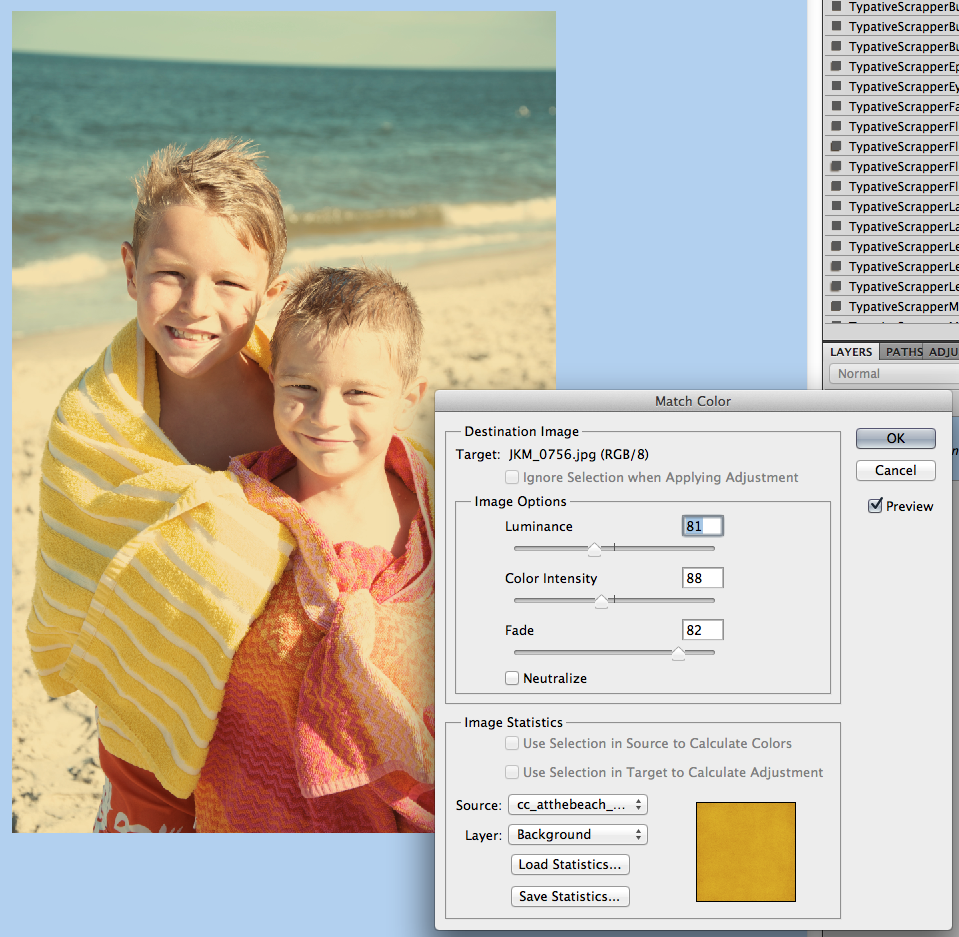
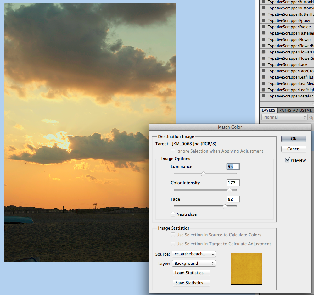
Here is the same image, but with the golden yellow paper, as well as the sliders and settings I settled at. Makes a warmer image and again, it’s still adding to the scenery. See how the same image can work and totally change the photo with each color match!
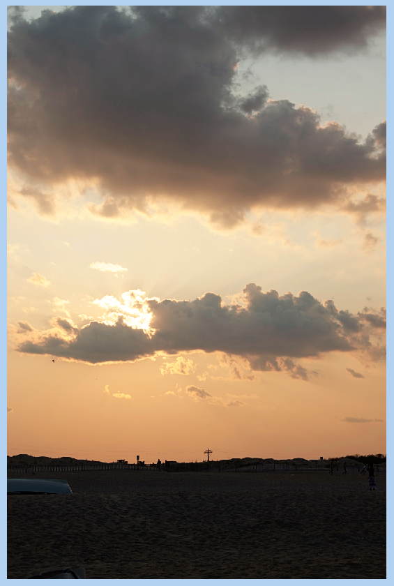
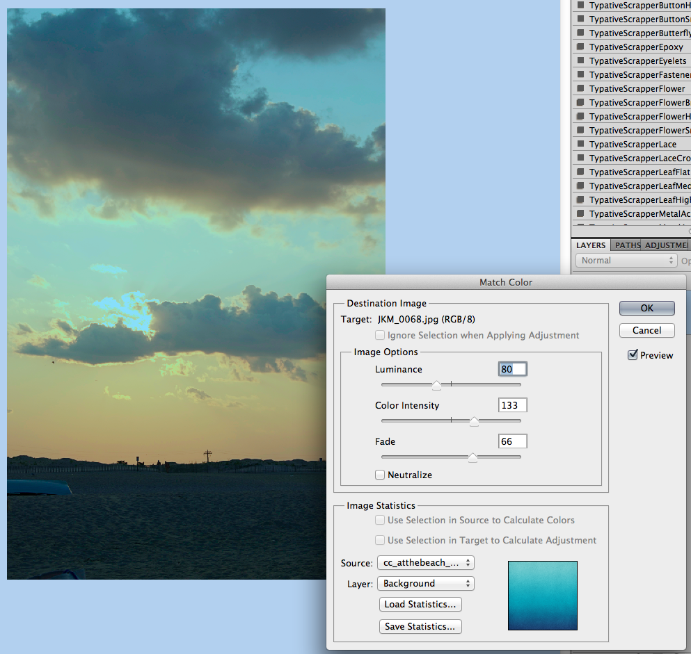
Another example, a sunset:
Image, sliders and outcome with the Teal Paper:
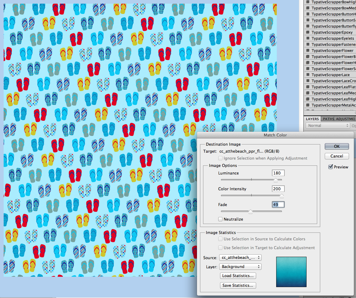
Image, sliders and outcome with the FLIP FLOP paper! Check it out! I really think this cross photo coloring is my favorite! Who would have thought flip flops would do this!
Image, sliders and outcome with the yellow paper:
Now… two other things you can do….
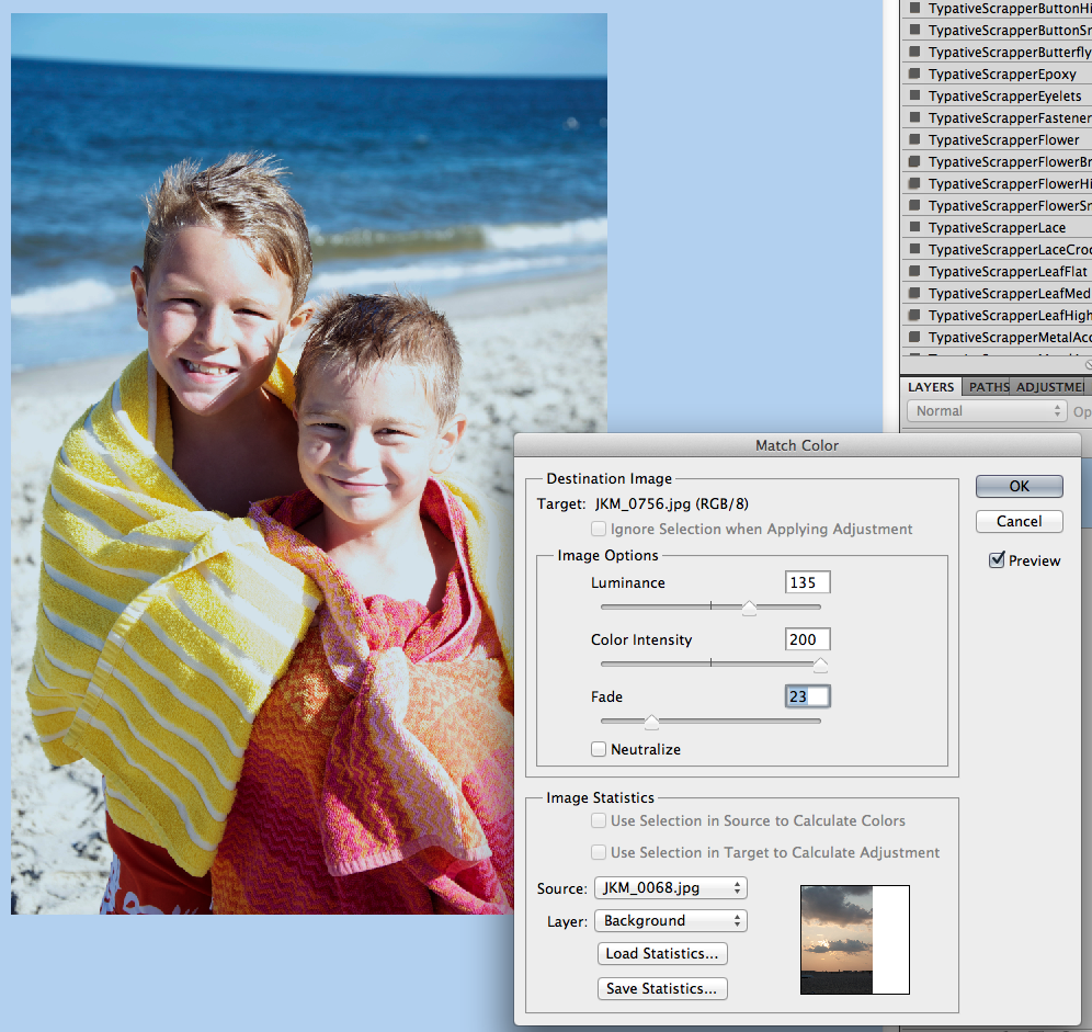
Combine images… here, I’ve combined the boys with the sunset, and moved the sliders some.
Combine papers… here, I’ve combined the flip flop paper with the teal and yellow papers, and how I changed each slider:
Now, here is what the CT came up with! They really helped me out to find an alternative to the Photoshop way! Thanks ladies!
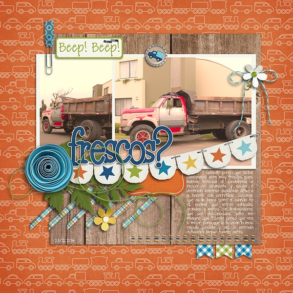
Roxana (roxanamdm) used 2 pictures and the wheels2_orange paper on the BG from About a Boy to match the color, then moved the sliders to 100-88-68.
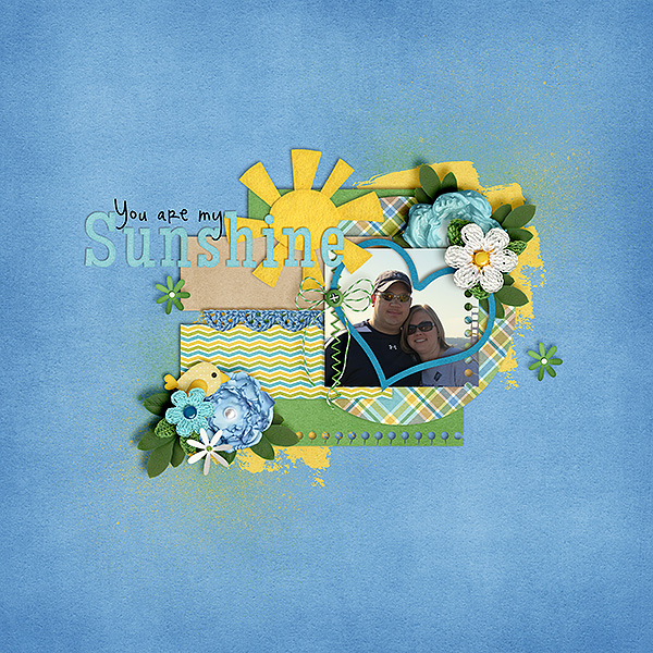
Karen (Zippyoh) said that she uses PSE 11, and for the photo she added the following: Filter > Adjustments > Photo Filter, and from the drop down menu chose the color yellow because of the yellows in my LO. Kit used is Bluebird on My Shoulders and a template from Little Green Frog.
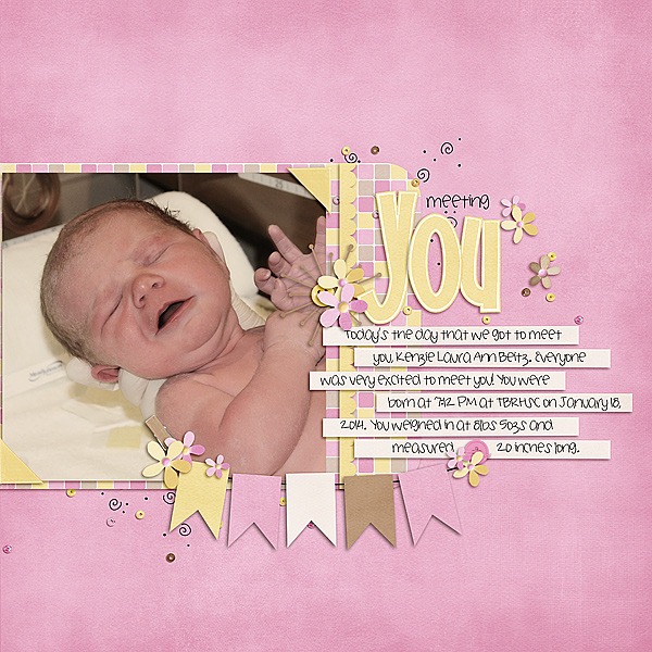
Now, I know we all have different ways of achieving the perfect look for our pages, so Melissa showed us an action that she uses for a similar effect. She used used a free PSE Action called, Coffeeshop Faded Daydreams. Which lightens the photo and adds a yellow and pink colour to the photo It can be located here: http://www.thecoffeeshopblog.com/200…se-action.html She said that the filter gave a softness to the photo and gave uniform-ness to the photos as well to make them match better. I believe she used Beary Cute Baby Girl.

Tammy (craftytam) said that she followed the Filter > Adjustments > Photo Filter to adjusted the blues on her layout. She used Love Grows, CU Tag Ties, About a Boy & a template from Little Green Frog.

That’s it! Lots of great info and such a great way to scrap with whatever kit you like! I’d love to see how you use this tutorial and add a Cross Photo Coloring to your photos – link us up! Hope this was something fun!
Thanks for visiting!


 Hi! I'm Chelle: a 40 something mom of 7. My husband & I live in a rural community in the rocky mountains with our 4 children still at home. In the winters we enjoy sledding & snuggling by the fire. I the cool fall evenings we love relaxing around the campfire & meeting friends at the county fair. Admiring the stars


