5.15 Tips: Starting a Layout

Hi Everyone! It’s Thursday, and for me one day closer to the weekend! This is Jenn, aka jk703, and I’m bringing you a quick post today. I get to showcase layouts from CT members along with some information they have provided for our Tips: Starting a Layout post. When I first started digital scrapbooking, I came from a paper background. I literally stared at PSE and had no clue what to do! It was very daunting. Plus, I hadn’t been aware of templates at that point either! lol!

Here are a few tips for starting a layout that I learned when I started:

  • Know that there isn’t a single way to start a layout. You will figure out over time how you like to start or what inspires you to create. Start with what you are comfortable with – photos, kit, template, even the title or journaling.
  • Remember to work how you like – from the top layer down, bottom layer up, or a random order to your creations. It doesn’t matter if you like to place the background papers, and then go to frames. If it is working for you – that’s a good thing!
  • Relax… you don’t have to conform to a style or template. Scrap how you like. You will like your pages better, and you will scrap faster.  If a template has too many layers, but you love the basic design, delete those extra layers. If a template doesn’t have enough layers, add more. Templates are a starting point. It doesn’t matter if you twist, turn, shrink, flip or duplicate – as long as you like what you are creating!
  • Add more, then delete. If you like something on your page, leave it. You can always remove or hide it later.
  • Proofread your journaling. (I am horrible at this, and must listen to my own words of advice!)
  • Lastly, remember this is a creative process and you are doing it for fun. While it is important for the memories to be recorded, you have to want to do that. When it becomes more “work,” it loses it’s appeal. So, have FUN!

Ok, I’m up first! (gulp!)

For me, my CT work kinda elbows me in the side to scrap. Most of my layouts are for CT duties – as the deadlines, schedule, and expectation gets me to scrap. lol! I scrap for my designers, but my pages have to be useful for me too! My albums are all double pages, and when I scrap a single page, I will eventually add another for my album. If not, I’m saving random pages to print together in a Remember that time when…. album.

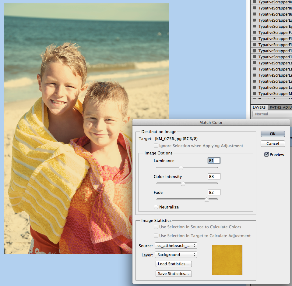
Most times, I start from the bottom paper and work up into my layers. I usually choose two templates, and work them into my double layout – 12×24. I copy all the layers of each template into my “Working Copy,” and save as I go. Once the templates and layout basics figured out, I jump to photo selection. I scrap a certain year, but jump around within that year. This way my pictures work for various kits, and I’m continuously working on my yearly album, If I don’t have the right themed pictures, I look for color. After my pictures are selected, I start with the papers, elements, and all the little extras. I add my shadows after most of my elements are placed. This makes my layout pop to me. I then add journaling, and picking a font usually takes me a LONG time, lol! I have a love of fonts! After the journaling is done, I settle on my title. Every one my pages have at least something written about the picture, and/or at least the date. After all the details are noted, I save both an album copy and a web copy to post around in digiland.

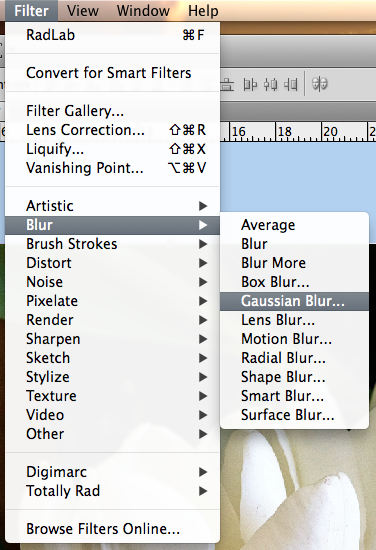
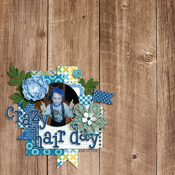
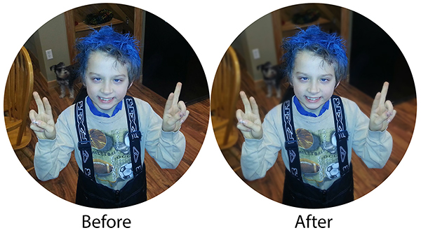
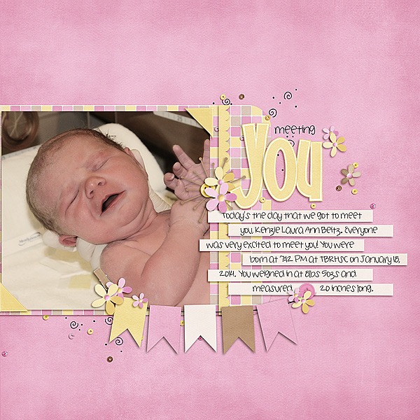
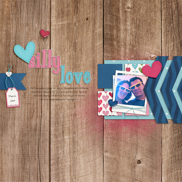
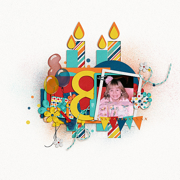
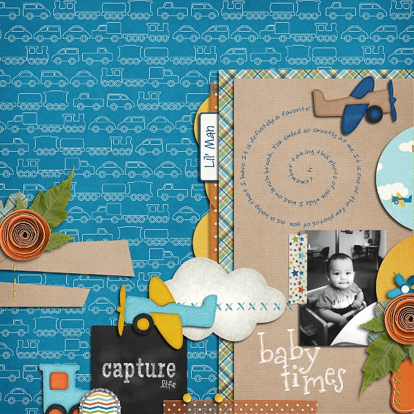
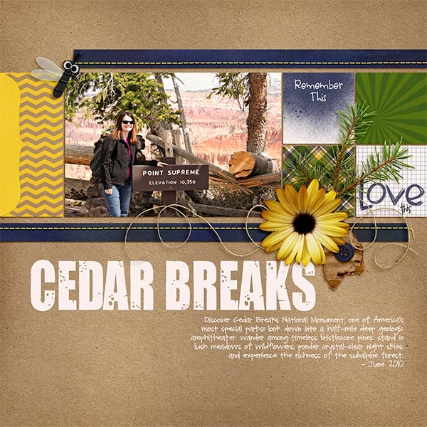
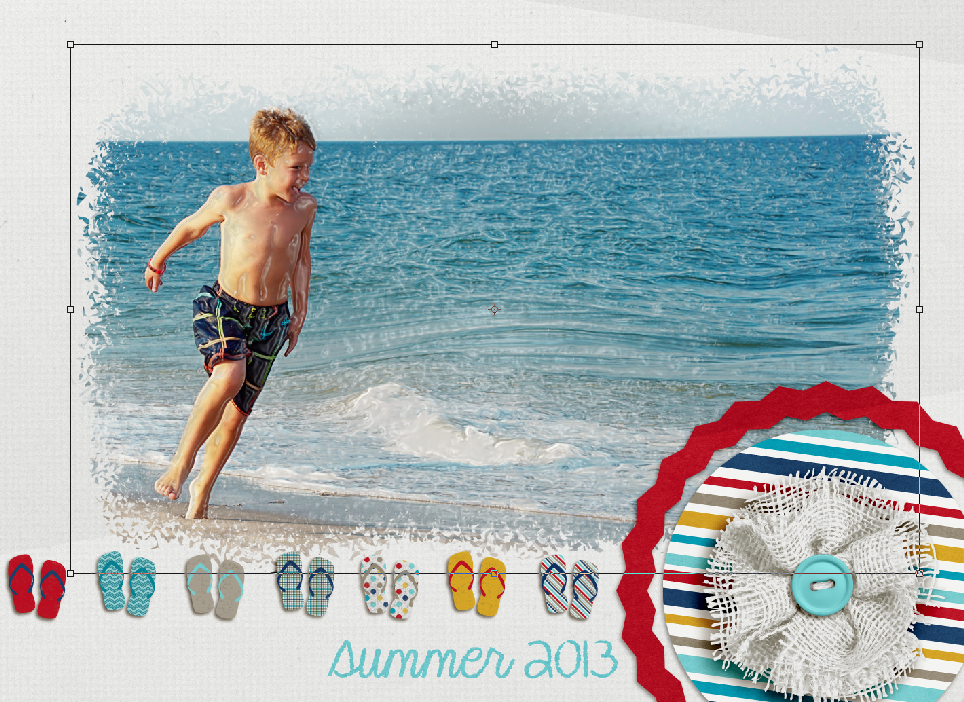
Here is a page I made for this post. I used Chelle’s  Zoo Crew Safari and Jungle kits, as well as a new product that Liz has this week. I have a tendency to use things – just not always as they are intended. :) Once I got my basic layout ready, I choose the photo of the giraffe and edited it. (I use RadLab – which just might be discussed later on this month!) Once the photo was ready, I added the papers, and started building up my cluster.  I added my photo. My layout was coming along nicely, so I added all my shadows and did some tweaking. Next, font selection and journaling. Since this page started out with a journal card template (enlarged), I was basically making up my locations for clusters, journaling and title work. It took me a while to figure out the journaling and title placement for this layout. For a bit, I was just moving things around until it looked right to me. Once done, I ran a “Save” action and saved for my album and for web posting. Here is my layout:

i-n7Z46gk-L


Jenny/supergirljennie

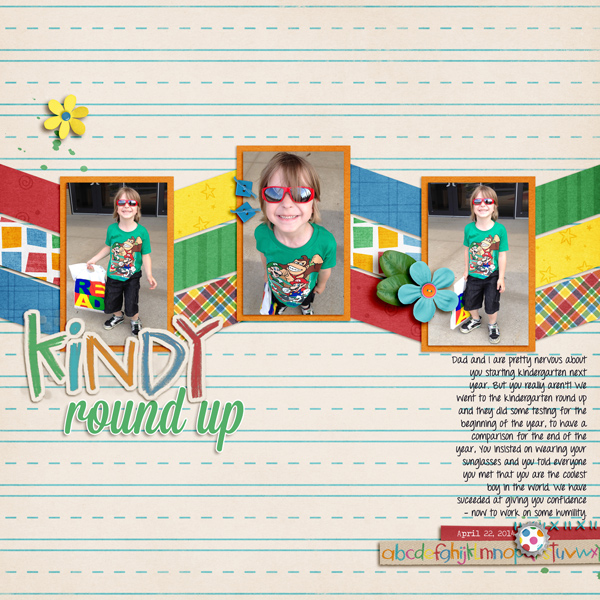
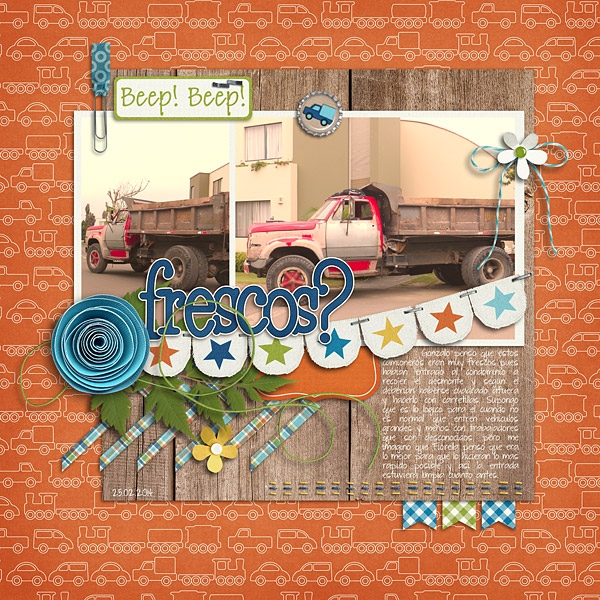
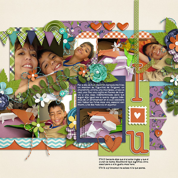
For me, when I scrap for myself and not for CT duties, 90% of the time I start with the photos. I knew I wanted to scrap these photos of my son’s kindergarten round up, and I wanted them in a series. So I went in search of the right template. I chose this one from Scrapping with Liz’s Recyclables 31 because it had the flow I was looking for. Then I selected the perfect bundle – Street Smarts, for the primary color scheme, the lined paper, and how it matched the photo colors. I also really like the crayon alpha (which I turned into a sticker for the title). I add all the papers first, then the elements, then the title. Last comes journaling and the date. Finally I flatten and save as jpg. I always have another look at the journaling on the jpg to check for spelling mistakes and typos before I back it up and post it around digi-land!

kindy-round-up-apr-22_zps256da8b0


Krista/kc71595

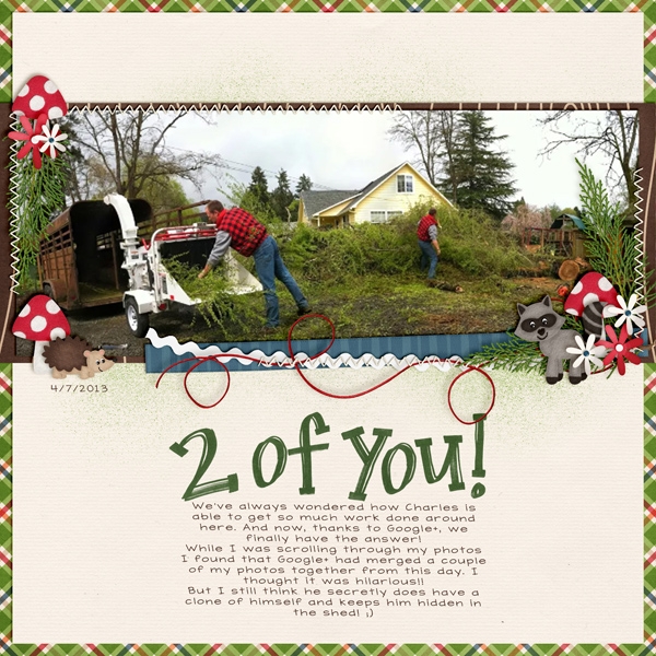
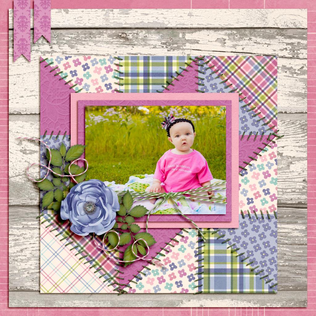
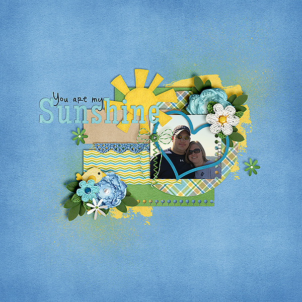
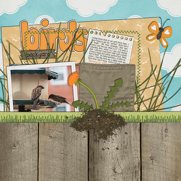
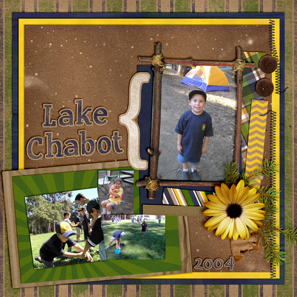
It seems for me I am inspired by any number of things; kits, templates, photos or a story to tell. But, here is an example of a page I did that was first inspired by the photo. The story is in the journaling on the page. I used In The Forest and Marker Alpha.

41484


Cami/camijo

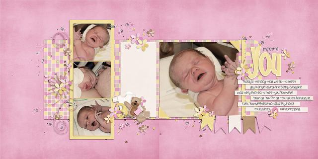
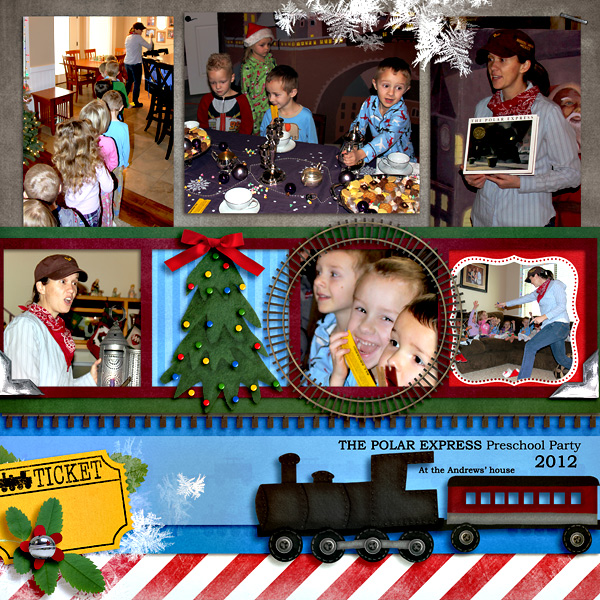
I knew I had alot of photos so I started out with a template that holds more photos. I used Little Green Frogs Simply Block V then I started plugging in pictures.  Then I added the papers, and elements. I used Zoo Crew {jungle} and the WordArt. 

43667


There you have it. Some ideas on how to start your layouts, and a glimpse of how a few of us start ours! Hoping this post will help you when starting a layout! Thanks for stopping by and see you later this month!

by_Jenn


4.10 Tutorial: Adding Depth of Field

4.10 Tutorial: Adding Depth of Field

Hi Everyone! I’m Jenn, or jk703 in the forums. I’m a self taught Photoshop girl, and like to share what I’ve learned with easy tutorials! Hope you enjoy this one!

We are going to manually blur the background of an image to bring the focus onto one subject/object in your photo. Many times when we take pictures, we use the “Auto” settings, and nowadays, many of our photos are taken using cell phones. These pictures are great, and keep taking them! At times though, you might have a busy but crisp background, and that is because when taking the photo you opted or couldn’t change the aperture. To give a bit of depth, and to be able to choose your image’s focus, follow along with the Tutorial: Adding Depth of Field for the simple workaround!

Here is my original image, using my cell phone.

Depth1

First, duplicate your image.

Depth2

Next, with the duplicate layer selected in the Layers Palette, you will go to Filter > Blur > Gaussian.

Depth3

Look at the area that you want to blur, and move the slider until it is blurry enough that you like the look. Don’t worry about the part that you want to stay in focus at this point. Mine is at 6 pixels for now.

Depth4

Next, still with the duplicate layer selected, you will click the square with a circle in it on the bottom of the Layers Palette. This is what I call the Mask Maker. :)

Depth5

Your layer will get a white box next to your image. Click on this white box so you see the corners with double lines. This means the mask is selected.

Depth6

You want to have black in the Foreground Color for painting on the mask. Next, click on the Brush Tool. Use a soft black brush. Mine is set at around 300 pixels, soft, and 40% opacity.

Depth7

Using the brush, paint over the area that you want to bring into focus. You can see my mask here, painted black and almost in the shape of the single tulip.

Depth8

Here is the tulip image. This one is at a 6 pixel blur. Just a little blur for the background and other flower parts.

Depth9

Jumping to an 8.8 pixel blur and the same tulip in focus would make it look extra soft. Almost like the retro photos that had the softness on people’s faces.

Depth9aa

Here is another image of my son, at the park. I wanted to focus on just him, and a bit more blur on the trees and surroundings.

Depth9b

Depth9a

Here is what the CT came up with for this tutorial! :)

Jennifer (jmljensen) created this fun layout of her son – she used Chelle’s Bluebird on My Shoulder and About a Boy (template – Watering Hole freebie template by LGFD).  She already knew what I was going to post, so she was able to give me a before and after of the photo itself!

40769

web_beforeafter_zps8c533405

Jen (supergirljennie) created her layout using Fleur de Violette. She shoots in manual mode, and had the settings at f/2.5, 1/2500sec, 200 ISO. kelseyagain_zps581b5871

Super simple, and a fun technique. It will work great on photos that you have a lot going on in the background. You can easily provide focus on what you would like to stand out. Can’t wait to see what you create using this tutorial. Now, go add some depth of field, lol.

Thanks for visiting!

by_Jenn


3.6 Tutorial: Cross Photo Coloring

3.6 Tutorial: Cross Photo Coloring

Hello, Hello and happy Thursday! How are you all doing? Is this week flying by for you? It is for me, and I’m enjoying the almost 40 degree weather this week… definitely better than the teens, wind chill, and snow! This is Jenn, aka jk703, and I’m here to share a tutorial that you can use on photos and on your digital papers! It’s pretty versatile and fun… oh, and super easy too! Now, this isn’t available in PSE, but my fellow awesome team members figured out a work around that works similarly. We’re trying to cover the bases so everyone has a way to try it out! Yay!

Have you ever had pictures that you wanted to use with a certain kit… but the colors didn’t quite match well enough? I’ve got a solution for you, and it’s super easy! While I am a huge fan of actions and photo editing, (especially RadLab), this is an easy fix to use your photos with whatever kit you’d like – and have them look good together! It’s called Cross Photo Coloring – at least, that’s what I call it. :)
One of the best things about this nifty trick is the whole matchy matchy feel your photos have after doing this technique. Think about it. You’ve been to a party or at a BBQ, you take loads of pictures, and then when you look at them, the lighting isn’t always the same, or the tone doesn’t seem to match. By using the Match photos, and using a base photo or a base paper, you can tie them all together nicely.
First, here is my image. It’s my boys at the beach and my camera settings were off, so the coloring wasn’t how I’d like. But, still a great picture. For my example, I’m using At The Beach kit. (lol!) Before you go further, open a couple pictures and a few sheets of paper in photoshop. To start, all in their own tab – I believe there is a way you can do these same steps using selections and working with the layers, but I have not tested it. Oh… and it’s ok to mix solids, or even patterns. Whatever you prefer. Remember, you could even do this to papers too – the possibilites are endless! Let’s Cross Photo Color IZE it! :)Cross Color 1But, what if I wanted a little cooler to teal tint to the picture. Easy! Ok. You should be “in” the image that you want to color change, and that should be the selected in the Layer’s Palette. Click on Image > Adjustments > Match Color.Cross Color 2A pop up menu will appear. Towards the bottom, there is a click down to choose the “Source.” The Source is where you will be getting the color from to add to the original picture.

Cross Color 3

Right now, I chose a gradient paper from the At The Beach Kit. My image will instantly turn a tint of teal. Like this:

Cross Color 4

Now, I play with the sliders to change up the color. The sliders are Luminance, Color Intensity and Fade.
Luminance – adjusting to the left makes it darker, while sliding it to the right makes it lighter.
Color Intensity – adjusting to the left makes the color range smaller, while sliding to the right will add to the range and intensify the color.
Fade – sliding will determine how much of an adjustment you will have. To the left is a straight color adjustment, while to the right fades the color adjustment.

You can see my adjustments and sliders here. Gives it a cool look, and adds to the scenery.

Cross Color 5

Here is the same image, but with the golden yellow paper, as well as the sliders and settings I settled at. Makes a warmer image and again, it’s still adding to the scenery. See how the same image can work and totally change the photo with each color match!

Cross Color 6

Another example, a sunset:

Cross Color 7

Image, sliders and outcome with the Teal Paper:

Cross Color 8

Image, sliders and outcome with the FLIP FLOP paper! Check it out! I really think this cross photo coloring is my favorite! Who would have thought flip flops would do this! :)

Cross Color 9

Image, sliders and outcome with the yellow paper:

Cross Color 10

Now… two other things you can do….

Combine images… here, I’ve combined the boys with the sunset, and moved the sliders some.

Cross Color 11

Combine papers… here, I’ve combined the flip flop paper with the teal and yellow papers, and how I changed each slider:
Cross Color 12

Cross Color 13

Now, here is what the CT came up with! They really helped me out to find an alternative to the Photoshop way! Thanks ladies!

Roxana (roxanamdm) used 2 pictures and the wheels2_orange paper on the BG from About a Boy to match the color, then moved the sliders to 100-88-68.

tiport10

Karen (Zippyoh) said that she uses PSE 11, and for the photo she added the following: Filter > Adjustments > Photo Filter, and from the drop down menu chose the color yellow because of the yellows in my LO. Kit used is Bluebird on My Shoulders and a template from Little Green Frog.

bluebird600

Now, I know we all have different ways of achieving the perfect look for our pages, so Melissa showed us an action that she uses for a similar effect. She used used a free PSE Action called, Coffeeshop Faded Daydreams. Which lightens the photo and adds a yellow and pink colour to the photo :) It can be located here: http://www.thecoffeeshopblog.com/200…se-action.html She said that the filter gave a softness to the photo and gave uniform-ness to the photos as well to make them match better. I believe she used Beary Cute Baby Girl.

Meeting-You-RS_zps06bb9e96

Meeting-You-Both_zps4266e2f3

Tammy (craftytam) said that she followed the Filter > Adjustments > Photo Filter to adjusted the blues on her layout. She used Love Grows, CU Tag Ties, About a Boy & a template from Little Green Frog.

Silly-Love_zpsb2e970eb

That’s it! Lots of great info and such a great way to scrap with whatever kit you like! I’d love to see how you use this tutorial and add a Cross Photo Coloring to your photos – link us up! Hope this was something fun!

Thanks for visiting!

by_Jenn


2.27: Selective Recoloring Techniques

2.27: Selective Recoloring Techniques

Hi Everyone- it’s Jenn (jk703) here today! I’m back with another tutorial, and this one will be about recoloring. Have you every wanted to match a flower to a different color? An Alpha? Well, using the techniques that I show you today, you will be able to! Here we go – Selective Recoloring Techniques!

I’m working with the Love Grows Kit, and I’ve selected the Banner and a felt flower to work. with specifically.  I’m going to show two methods to recolor the elements to matching colors. There are always many ways to do something in Photoshop, so you may already know these ways, or another way. Any way you recolor and it works for your layout and memories will work! :)

Recolor1

Method 1

Here is what my Layers Palette looks like for reference. To start, I will recolor the flower.
Recolor2

Double click on the flower thumbnail in the Layers Palette, and you should get marching ants around the edges.
Recolor3

Now, we will choose Magic Wand Tool, and choose the Subtract From Selection Preset. You will click on the white in the flower.
Recolor4

When you click on it, it subtracts this section from the selected outline.
Recolor5

Next, on the bottom of the Layers Palette, click on the little black and white circle, choose Hue/Saturation:Recolor6

A screen will pop up, or it may show as a tab in near the Layers Palette. (Mine is a tab.) I’m going to click on the “Colorize” box, and I want to change my flower to green to get a closer match to the heart. Just play with the sliders. If you find other colors are changing also, use the eye dropper with the – sign and click on that area. It should take that specific color out of the equation. Here is what my setting are at after playing with them.

Recolor8

Here is what I ended up with for my flower. If you find that the color is close, but not as you wanted, try changing the Blend Mode on the Adjustment Layer. You might be pleasantly surprised.
Recolor9

Now, I’ve gone and played with those sliders again…. this time I’ll try to match the magenta color.
Recolor10

Here is what I ended up with for my flower. Not too bad, and again, try out changing of the Blend Modes. I find that reds and pinks are harder to recolor than most other colors. Those are trickier to me. If the recolor is not working as well as you like, you could also try to combine methods.
Recolor11

Method 2

For this recolor method, I’m going to change the color of one of the hearts. Specifically, the tan one. In the Menu Bar, click on Image > Adjustments > Replace Color.
Recolor12

A pop up will appear, and you will use the eye dropper tools to select the color of what you wish to replace. If the image in the black box is not all white, just use the + eye dropper and click on other sections of the item that will be recolored. If other items are being included in the recolor, then use the – eye dropper tool to click and remove that color. You want a solid white image – this reflects what will actually be recolored.
Recolor13

Now that you have the shape completed, we will start the color replacement. Use the sliders below, and move them to get to the color you want. Here is what my green heart looks like:
Recolor14

And here is a green flower:
Recolor15

Two, pretty easy, methods for recoloring your stash! Stretch that stash and make it work for you! Here’s what the CT created. Melissa (pretty peaches) said she recolored the tissue paper to blue and the flower to orange. She changed the colour and also had to create another layer and use the filter multiply on it to give it the darker shade. She worked with One Year Older. 

LGFD-IOTCake-1_zpseae7e7be

Roxana (roxanamdm) said she used a red heart stamp, a gel heart and heart stitches from Technolove, which recolored easily with the Replace Color method. She then tried to recolor a pink heart button and felt but they proved to be a bit hard to recolor. She decided that Replace Color and Hue/Saturation technique weren’t working for her, so she clipped an orange paper. Then she changed the blending mode to color burn as well as an adjustment layer at this point.  With a Hue/Saturation layer, she moved the slider until I got the orange I wanted. The blue flower on top from About a boy was not from the tone I was using so recolored it with Replace Color as well. Roxana used Used Berryberry Blue, About A Boy, Techno Love and Mark My Words.

tiportutrecoloringfeb14-web

Jenn (jenny) said she used In the Backyard and recolored the butterfly, alpha, flower and background butterfly paper to orange!!

19_2014_backyardbirds_600_zps8524e38a

See, selective recoloring technique isn’t that difficult! Remember to play and try things out. There is always the Undo button! Hoping you learned a new technique, or another way of recoloring some of you (extensive) digi supplies! 😉 Have a great week everyone! Thanks for visiting! by_Jenn


1.31 Tips: Different Uses for InstaLife or Journal Cards

Hi Everyone! It’s Jenn, aka jk703, here to share a few tips with you today! I know you have all seen the craze – Journal Cards, InstaLife Cards, and any way to stay on top of pocket scrapping!  What do you do if you don’t scrap that way, but you just love the look of the cards?  Well, today I have Tips: Different Uses for InstaLife or Journal Cards! Don’t think you have to stay in that box or rectangle – just look at them a bit differently.

1. Paper Layers.

Use the journal cards as paper layers under your pictures or to mat papers and pictures. They are a great base to any layout. Kimberly (enjoyyourpix) created this intricate page!  She used Let’s Camp S’more and the Let’s Camp S’more Journal Cards. Here is what she said – “Journal cards clipped to paper strips (plaid, striped, and yellow chevron), as well as the journal cards were also used as mats: green sunburst and blue cards. {used 5 cards in all}. I also erased the lines from the bracket journal card-like embellishment in the main kit and just used the bracket. One last item – I took the starlight paper and soft light blended it to the tan paper in the kit.”

02_Wolf_10_chabot_zpsd6c722c7


2. Frames

Many times the InstaLife and Journal Cards have shapes to them. Use can use those shapes to make a frame! Cami (camijo) made her page and had another picture to add. She made a frame using one of the InstaLife cards and removed the inner shape. A cool shaped frame. She used Choo Choo and One Year Older InstaCards.

camijo_train_zps562c229a


3. Create a Siggy/Start a Cluster

Who gets stumped making signatures for the forums? Start it with an InstaLife card and you’ve got a great base so far! Go a few steps further and you’ve created a cluster for your layout. Build it up and try one today! Jan (QuiltyMom) created her signature using Give Thanks and Give Thanks InstaLife Cards.

31826


4. Help Your Title/Word Art

I know I get stumped for a title! many InstaLife and Journal Cards have words on them that relate to their respective Kit. Use that as part of your title, or as Word Art for your page! Adding a little contrast to the page and using different papers and textures can really make them stand out. Here is Ophelia’s (navaja77) layout where she used About a Boy, and Chalked InstaLife Cards.

21854


5. Blocking

I love the look of blocking on my pages and using the InstaLife and Journal cards make this idea super easy! Just drag in, re-size and place. That’s it – so simple! Kayla created this wonderful page using both the Let’s Camp S’more InstaLife Cards, the Kit, and the Journaling Cards!

21641


There is one last thing that you could do with the InstaLife Cards and Journal Cards… journal on them! :) Have fun everyone and be creative! Thanks for visiting!

by_Jenn

8.29 Tutorial: Plastic Wrap Filter

8.29 Tutorial: Plastic Wrap Filter

Hi Everyone!  It’s Jenn (jk703) here for today’s tutorial! How are you all doing – can you believe it’s almost September!! I’m in the Northeast US, and I am NOT ready for summer to be over… or school to start!  Homework is not my favorite! :) I accidentally found a cool filter in Photoshop that I’d love to share with you today – and it is really fun for wet or watery photos! I think with any tutorial I write – it all take s a little practice as well as patience to try new things!  Sometimes, pressing the wrong button will get you results that you will love!


Here is my beginning layout – I’ve used Chelle’s At The Beach kit along with some goodies from Scrapping with Liz. My photo looks a bit pale and washed out. That isn’t my intention… so I’ve decided to give it a little oomph and add a little Plastic look.

PW1

Next, before you get really into it, my sugestion is to make a few (or more) duplicate layers of your photo. This way you can run the filters and if you don’t like it, you can delete, or if you do but want to run it again or change the blend mode, different layers will give you different looks.

Click on Filter >Artistic > Plastic Wrap (pretty easy, right?)

PW2

A large sub menu will pop up, and you will see your image on the left. This shows you the default to the Plastic Wrap – Highlight = 9, Detail = 7 and Smoothness = 9.

PW3

For my image, I’ve tried to zoom in a little to show the details – and my settings are Highlight = 7, Detail = 4 and Smoothness = 8. Play with these!!! :)

PW4

Ok. Remember, I mentioned multiple layering. Here is what I ended up with, all using the Plastic Wrap Filter. Layer 1 is a Normal blend mode, 100% opacity. Layer 2 of my photo is a Screen blend mode, and at 59% opacity. Finally, my last photo layer is Luminosity blend mode with a 80% fill. Right now, since I don’t have any layer styles associated with the layers, Opacity and Fill act like the same thing. If I had layer styles, then that would change things. (I think this might be a tutorial for next month, lol!)

Here are my layers below.

PW5

PW6

PW7

Here is a close up of my image using the above layers, blend modes and Opacity/Fill selections.

PW8

And my final layout…

PW9

That’s it!  Easy, right – but this can be so much fun! :) Here is what some of my fellow CT members came up with using the steps above…

Roxana – she used Gone Fishing by Chelle, as well as a template from Scrapping with Liz.

Kassie – created this summer layout using In The Pool by Chelle, and a template by Rainy Dayz.


What do you think?!  I hope it’s something new, and fun! Thanks for stopping by and have a great day!

by Jenn