Using Digital Stamps

Digital stamps come in all shapes and varieties and can add an extra dimension to your digital scrapbooking pages. The textures add to the 3D effect and help make the page look like it was created the traditional way. Chelle’s Creations has several stamps in the market. The CT have a couple of pages to show you using some of her Commercial Use products. Don’t be afraid to shop in the CU side of the store; the designs there have special licenses for digital designers to be able to use for commercial products, but they can certainly be used for personal projects just as well.

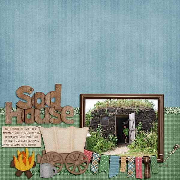
First, Leslie used Chelle’s About A Boy kit along with Mark My Words and Me and My Shadow Styles on her page of cousins.  She has added Chelle’s CU Bubble Wrap Brushes to look like the bubble wrap was stamped onto the background layers giving added texture to her page. Bubble wrap is a great addition to any page since we ALL love to play with it in real life. 15056044347_1067a97c0d_z

Mel created a really colorful page with a Fiddle Dee Dee Designs template and she used Zoo Crew {jungle}, Zoo Crew {safari}, and Zoo Crew {Animal Prints}. With all those bright colors, she decided to use white “paint” to accent the photo frames using CU Hand Carved Stamps {Arrows}, and she used a font for her title that looks stamped. It’s called Stamp Act Jumbled, and it can be found here. It’s a perfect font choice for her page.My-Zoo-copy

I hope this blog post has your stamp of approval. Sorry. I just couldn’t resist!

Enjoy adding stamps to your next project, and I can’t wait to see what you create in the gallery.

by_Cheryl

Movement & Flow

A good idea to keep in mind when designing your digital scrapbooking page is the ease of reading the page. Our memories are important, and the movement of elements on the page can either add to the flow and enhance the reading or it can sabotage it. There are lots of ways to achieve a good flow: the use of arrows and wavy lines can help visual flow. Also, there are several ideas listed on this article about web design, but the same principles apply to a scrapbooking page. Chelle’s CT has a couple of example pages to show you in which they used a strong diagonal line to guide the eye from the lower left to the upper right of their pages.

First, Krista chose to capture her memories about a geocaching experience, and she used Chelle’s On the Trail for her page. There is a great deal of movement in the photos on the page, but the strong diagonal background mat leaves no doubt which way we should read the information. As we move from left to right, we won’t miss the box of journaling telling about their awesome adventure, and even though the words are perpendicular to the flow of the page, it doesn’t stop the movement. At the bottom of the story, our eyes seem to flow naturally to the final two photos on the page.  Geocaching_

Kimberly used Teacher’s Pet to demonstrate movement and flow with her son’s first day of school photos from kindergarten and his senior year. She anchored the layout with the title in the bottom left corner and your eye moves upward to the older photo. The blue crayon also points the way. She used PSE’s check mark shape in the Custom Shape Tool (Shortcut U) to create her own clipping masks. The curved line meets the straight edge of the shape where it points towards her son’s bright future. The first day of school journal card and the Instalife cards tucked into the frame will be in the market on September 4th, 2014. ME and MY Shadows Shadow Styles made this template-less page come together in a snap by using the different options for stitches, large and small flowers, buttons, strings, and heavy embellishments. 2014_08_FirstDaySchool_zps4cf09db3

Are you moving yet? It’s good for the body, soul, and digital scrapbooking page.

by_Cheryl

Skills: Rule of Thirds

Have you ever struggled with where to put your photos on a digital scrapbooking page? I tend to scrap with a lot of templates, so I struggle when I need to make a page from scratch. That’s when the Rule of Thirds is most helpful to me. You’ve probably read about it with regard to photography, but the same principle can apply to design of a good scrapbook page. Basically, you imagine placing a “tic-tac-toe” grid on your page, dividing it into 9 equal sections. Then, place the main focal point of your layout design on one of the crossing points. SusyQScraps wrote a terrific article about this a few few years back, and you can read it here if you want to know more.

Let me show you a page from Krista, one of our Creative Team Members. She used Chelle’s Anchor’s Away and Anchor’s Away {alpha} to make her page. She also took some help from a template freebie from Fiddle-Dee-Dee Designs and shifted the elements a bit to follow the design principle in the Rule of Thirds. The focal point is clearly the large photo in the group of three. It is placed on the imaginary cross point on the bottom right of the tic-tac-toe grid, and my eye is immediately drawn to it. Then, for further emphasis, Krista has placed the title banner directly below the large image, and she has repeated the image in the smaller two photo spots.AreWeThereYet2_

Likewise, Jennifer used the same lower corner spot to place her focal point, but she used a single photo on her page. She used Chelle’s Choose the Right {TREK} for her page. I love the wooden letters in that included alpha.

10441141_10203507184734594_234897355574560773_n

Would you like some help making your page? Fiddle-Dee-Dee Designs has a freebie on the Scrap Orchard blog that follows the Rule of Thirds perfectly. Her focal point is a single photo, and she has placed it in the top right cross of the imaginary grid. Here’s a look at that template; the image in linked to the Scrap Orchard blog where you can grab the template as a free download. fdd_ffFreeBee100_pvw

I hope you’re inspired to make a page using this design principle and preserve some of those precious memories you are making with your family.

by_Cheryl

Shaped Photos and Papers

Time to think outside the box and the circle, digital scrapbooking fans. Today we’re going to take a look at some pages from Chelle’s Creations Creative Team that should inspire you to do just that. A few of Chelle’s Creative Cuties made pages using shapes to help tell the stories on their pages. Sometimes the shapes are used to help convey the message, and other times the shapes help your eye flow from one object to the next around the page. Let’s take a look.

First, let’s look at a page by Heather. She used star shapes on her page to match the theme – a July 4th patriotic celebration. The stars in the papers and elements and photo mats all help to tell the story of the event from which her photos came, paying homage to the Stars and Stripes. I love the title she used from Liberty {Word Art} and of course the Liberty kit itself is THE perfect kit choice.  14842931083_c4e8019425_o

Next, Christine also used star shapes to help tell her story, but hers is all about her son Logan being a star. Since he is the focus of the page, she put his picture into the star shapes on the page. These special shapes are all over her page, as well, in the papers and elements, but there is no doubt who the star of the show is. She used a template by WM[squared] and Chelle’s Good Night Teddy kit. 5osaq0

Next, Krista shows us how to use shape to lead the reader’s eye around the page. The hexagon shapes on her page make perfect spots for photos or papers, and she has used them for both. But the interlocking shapes naturally lead one’s eyes to follow the patterns around the page and not miss any details. She mixed a couple of Chelle’s kits – Family Tree and Zoo Crew {Arctic}. Bella_

Finally, Christine has given us a second page for inspiration on paper shapes. She also used Zoo Crew {Arctic} because the colors were perfect for her photos of Logan’s swim lessons. This time, her featured shapes are triangles. She used a template from Scrapping with Liz and she filled the triangles with various patterned papers from Zoo Crew {Arctic}. The waves created by the triangles point to Logan in the water with his instructor and they give a definite sense of movement to the page that complements the swimming motion.   2ajx1mw

I hope you’re inspired to shape up! See what special shapes you can find in your digital scrapbooking program and try shaping photos or special papers on your pages. I know you’ll love it.

by_Cheryl

Scrap Skills: A Strong Focal Point

Creating a strong focal point on a digital scrapbooking page is extremely important, for without some variation of emphasis, a reader might get lost and miss the purpose of the page. Since we create scrapbook pages to record precious memories, it would be a shame to confuse those for whom we have saved our memories. Debbie Hodge says that emphasis is all about contrast, and it can be achieved in a variety of ways. Take a look at a couple of examples from Chelle’s Creative Team members.

Jennifer used Chelle’s Boho Summer minikit and matching alpha to make a whimsical page using one large, humorous photo. She double framed the photo and created a cluster around it to draw the eye towards the photo. The cluster and single photo contrast with the plain wooden background, and it would be hard to miss Jennifer’s focal point on this page. web_smile

Melissa used Bug Town minikit and alpha to create a double page. She explained, “Since this page has very similar looking photos in each photo spot, I wanted to draw attention to the one I liked best. So I enlarged the photo and really zoomed in. To help keep the focal point on the enlarged photo (since its a 2pager) I cropped the size of all the accompanying photos. And I also kept the all the photos more zoomed out to keep the focus on my main photo.” She also kept the double page layout balanced and added chevrons to help the flow of the layout. Here’s her double page spread followed by the left and right halves separately for ease in viewing. like-clockwork_zps9c1dfe20like-clockworkLS_zps9915b948like-clockworkRS_zps89341476

Remember to keep in mind contrasting elements to bring a strong focal point to your next digital scrapbooking page.

by_Cheryl

Mixing & Matching Alphas

Hello, digital scrapbooking fans and friends of Chelle’s Creations. Today the Creative Team has a few pages to share with you in which they have used 2 different alphas on a page. It’s fun to do, if you’ve never tried it, and the more contrast the better, it seems with some pages. Don’t be afraid to pull two totally different alphas onto your desktop to use on a page. You can pull from the colors in your photos, the textures on the page, or even the shapes of the theme of your page. Let’s take a look at some very inspirational pages.

First, Kimberly used the ever handy curled frames to make a custom layout without the need of a template. She chose different sizes, resized some, and even rotated them to give her page the snapshot-on-a-page look. She used alphas from Liberty and Play the Game for her title. For the word “Your” she used Janda Elegant Handwriting font and applied Chelle’s CU metal styles to make it look like an alpha or piece of word art. 2014_01_LivermoreBasketballGame_zpse38218a6

Next, Leslie used Hippity Hop Hop and the matching alpha for the majority of her page. It was a perfect kit choice since her pictures were from an Easter egg dyeing party. (The words “Dye Job” were made from a retired kit called Spic and Span). I love the blocked look, and the title made from evenly spaced alphas works perfectly in this style. Look how proud her little guy is of his egg! So cute. 14564912585_728170fced_o

Next, Donna has used Hard Hat Required, one of Chelle’s newest kits for her page. Both of the alphas in her title came from the matching alpha set for the kit so they work marvelously together, of course. I love how she used the little construction worker in her title work. I often think Donna is the Queen of using a large photo for a background. Look how well that traffic line flows up through the page. I’m sure it was a frustrating experience, but she’s made a great page from it to record her memory.web2_FFwk1_is2014_djp332_cc_hardhat_LGFD_Opposites-2_zpse3ce9ab1

Finally, Carol has used the Liberty kit and matching alphas on her page. Look how well her retro photo works with this kit! I love the way she sized one of the title words significantly smaller than the other, and the date tag hanging off the side of one of the letters is perfect. Carol, are you one of the cute young ladies in this picture? Adorable!  IconicAmerica1981_zps0bd1c869

I hope you are inspired to mix and match your alphas. It adds texture and dimension to your page and just might be the emphasis you need.

by_Cheryl

Scrap Skills: Using Word Bits

Word bits are some of my favorite elements in today’s digital scrapbooking kits. I love them because I don’t like to journal (I know, fifty lashes with a wet noodle!), and word bits allow me to tell the story without much trouble. Just pop a few bits of predesigned word art onto the page and I’m done! Let me show you a few pages as examples.

Now don’t be shocked, but I’ve decided to show you one of my own pages. I haven’t scrapped much this year due to a crazy work schedule, but I was able to make this page of my son’s high school graduation in just a few minutes by using Chelle’s word art and word bits in her Graduation kit. I love the time savings I get from using the word art, and that little grad-u-ate word bit will add a nice touch to any graduation page. By the way, that frame with the little word bit on it was a freebie made by one of Chelle’s talented team members, and you can still grab it hereJoshGrad

Next, Donna made a double page spread using the Something Fishy bundle and a Yin template. She used the word bits to label the sea animals in her photos on the page, and they look awesome. 43630

Finally, Jenn combined two of Chelle’s kits (Pizza Amore and One Year Older) and a template from Cluster Queen. She made her own word bits to coordinate with her page. Isn’t it fantastic? week13-1

So, whether you make your own word bits or use the ones included in Chelle’s kits, I would encourage you to do so. They add an element of texture and give you a place for some simple but meaningful words.

by_Cheryl

Framing It

I loved using frames in paper scrapping, and I love using them in my digital scrapbooking projects. But, frames don’t have to be “filled” with photos. This week, Chelle’s CT wants to show you how to use frames in different ways, and if you don’t have frames in your favorite kit, Chelle’s Creations has a couple of great photo frame collections that can be used with every kit, no matter the theme. Her newest of these is Curled Frames, but I love the classic Photo Stacks, too. Let’s see the inspiration from the team.

First, Melissa has made a double page spread for us using Zoo Crew Safari {bundle} and the Basic Black Stitched Alpha. She has some of her frames placed wonky on the page to add interest. First, you’ll see the double page, and then I’ve added the singles so you can get a better look.  ff_zpsa8a63cf6 cc_zoocrew_safari_ppr_rings_zpsfe25df51gg_zps9fbebfc0

Next, Heather did a similar thing with her frame using Chelle’s In the Pool. I love how she mixed paper mats and the frame to add texture and dimension to the page. 14167509502_54f69e0951_o

Kimberly chose to use Chelle’s Photo Stacks and Money, Money for her page. She also used the Scribbles 2 alpha to write on top of the money paper. 15870

Finally, Roxana used At the Beach and combined the frames in the kit with some photo frames from Curled Frames. The curled edges really give a tangible look to the page. conchitas-web

Here’s a closer look at the two frame sets used. Why not scrap a page with them now? I’m definitely inspired to do just that.

cc_curledframescc_photostacks


by_Cheryl

Scrap Skills: Shadow Styles

If you’re a new fan to Chelle’s Creations, you might not know that she has some shadow styles in the market that can help you turn your digital scrapbooking page from good to great in one click. The product is called Me & My Shadow and it has 3 common shadow directions for a multitude of different thicknesses of items. But Chelle also has some photo frames that are fairly new to the market, and they include custom shadows that can add variety to your pages. They are Curled Frames and they include warped shadows, exactly like the shadows that would occur when a matted photo is placed on a traditional page. Let’s see what the CT has done with these products.

First, Donna used Chelle’s Choose the Right {Baptism} on a Scrapping with Liz template, and she used Me & My Shadow styles to realistically shadow the flowers, leaves, strings, and papers on her page. I love how the folded paper flower pops off the page with Chelle’s style added. web_djp332_CC_ctr_bapt_SwL_TemplateRevisited22_zpse6da7fa4

Next, Kayla used Hippity Hop Hop kit and matching alpha and the Curled Frames for her Easter photo of her daughter. The warped shadow on the photo gives a variance to the shadow that would most certainly occur if the page were a traditional paper and glue page. EasterBunnyWasHere_Apr11_we_zps48833c6e

Finally, Tammy also used Hippity Hop Hop and the alpha with Me & My Shadow on her page about four generations of her family together at Easter. As with the other pages, the flowers seem to pop off the page, and the tight shadows on the title label are the perfect thickness.4-generations

For a closer look at Me & My Shadow and the Curled Frames check out the products in the market. The images are linked.

cc_memyshadow_previewcc_curledframes

by_Cheryl

Using Banners

It’s a banner day at Chelle’s Creations! The Creative Team members have been using Chelle’s kits to make digital scrapbooking pages with banners on them. Banners can be any shape or size and are the perfect digital embellishment to add to any page. Let’s see what they have to show us.

First, Kayla used One Year Older to make a page about Grandpa Bob’s birthday. She used the banners to create movement from left to right and give a festive feel to her page. HappyBday_July11_web_zps5756c6f4

Next, Tammy used the crocheted heart banners from  Fleur de Violette to create this gorgeous page about the Princess Fantasy Faire. She also has large banner ribbons as mats behind her photos, which are perfect accents. Princess-Fantasy-Faire1_zpsdd0d7722

Donna used Beat the Heat and Gnome Sweet Gnome to create her bright page about the gorgeous birds at the National Aviary in Pittsburgh. She used a banner from a Scrapping with Liz calendar template and filled the pennants on the string with papers from Chelle’s kits. Donna

Next, Jenn used a banner a bit differently. She tucked the banner under the matted photo on her page to accentuate the photo and give more texture and depth to the page. The colors in the banner pieces coordinate perfectly with her little guy’s swimsuit in the photo.  jenn

Helen used Snowlandia to  make this gorgeous page. I love the mitten banner she used as part of the title work at the top. It’s the perfect treatment for it.Helen-snowlandia

Finally, Kassie has used Lady Bug Hugs to make this sweet page about her daughter proudly turning four. Isn’t she precious? The banner really ties the page together and gives a fun feel to it. 4yearsold_zps3e3acd4a

I hope you’re inspired to use banners on your next page, maybe in ways you hadn’t before.

by_Cheryl