Scrap Skills: Using Square Photos

Square photos makes me think of Instagram, the wildly popular social media app based on sharing photos with vintage filters. Chelle is even getting into the Instagram swing, and if you want to follow her, she’ll be adding photos there in 2014. Because of the site’s popularity, many digital scrapbooking fans are using more square photos on their pages, and many are using photo effects similar to the ones in Instagram. Chelle’s Creative Team Members have some layouts to show you how they do it. Some have used Instagram to generate their images, but several have not. Let’s take a look.

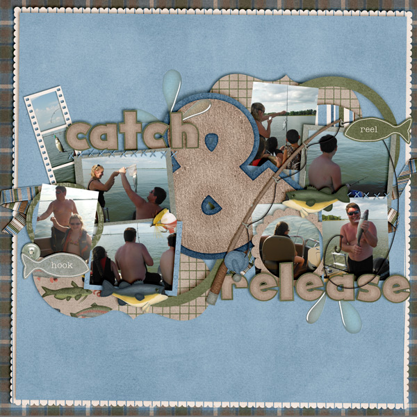
First, Roxana has made a page about her son carving a pumpkin at Halloween, and she has used Chelle’s Carve it Up and Eeeek Word Art. Because the square photos are the same aspect ratio of the page, the maximum space can be used. Look closely how she has filled the left bottom spot and the one above it with one photo. She did this by merging the two layers together first before clipping the photo to them. carvin10

You don’t have to use lots of photos on a page when you use your Instagram pictures. Here’s a page from Helen who used an Instagram image, but it is the only photo on her page, and it is perfect. She used the Nashville filter in the phone app, and she has used Chelle’s Gingerbread kit to make her digital scrapbooking page. I love that frosting circle frame! Helen-gingerbread

Mel has used her Instagram photos documenting her Elf on the Shelf mischief to make an adorable page. Looks like she is having a great time with this little guy. Appropriately, she used Naughty or Nice for her papers and elements. Mischief-Maker

Leah used Chelle’s newest Christmas kit, O Holy Night, with some family photographs to make a page that is not a Christmas theme. The colors in the kit complement the colors in her photographs perfectly, and she has balanced the weight of a few square images with one large image to the right. leahs

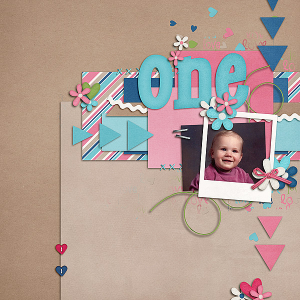
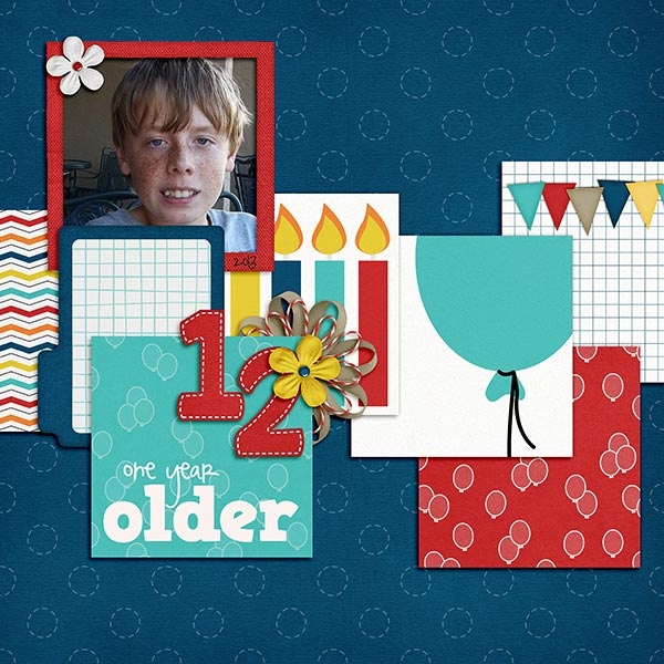
Finally, Jennifer has used square photos on her page about a child’s birthday celebration. She used Chelle’s Play & Grow and One Year Older, and she has made a strong diagonal with the placement of the images. It suites the bold colors of the kit well, and the party looks like it was a lot of fun. 35095

Are you making digital scrapbooking pages with your Instagram photos and Chelle’s kits? Share them with us in her gallery and be sure to use the hashtag #chelle when you do.

by_Cheryl

Scrap Skills: Weaving

Have you noticed how great it looks when someone weaves a string around letters in her name in her forum signature? I think it really helps to hold the image together visually and keeps letters from hanging in space. Take a look at Tammy’s forum siggy here. She has the light string weaving in and out of the letters of her name – perfect for this month. Dec-Siggy2_zps62e42467JPEG

Weaving is easy to do, but making it look realistic can be a bit tricky with shadowing. Never fear! Chelle has a great video tutorial here on her YouTube channel that will walk you through the steps to create the most realistic look possible. It’s only a few minutes long, easy to watch on your next coffee break.

Our Creative Team has been making pages and using Chelle’s weaving techniques to give you some inspiration. First, Tammy made a page using Ho, Ho, Ho, Naughty or Nice, and We Wish You a Merry Christmas, and I think you will recognize some of the same items in her siggy above. Look how well she wrapped the string around the frame on her page. Mrs-Claus1_zps943407d1

Next, Christine has made a gorgeous page with Chelle’s Oh Snap kit. Notice how well the string is woven around the film strip and ribbons on the left of the page. But, look closely at the upper right corner, and you will notice she used the same technique on the string for the date tag. AMomentInTime_zpsd0fcdeee

Kayla used Norlandia and a bonus paper freebie with elements from Snowlandia, too, to make her page, and of course she also used Chelle’s Shadow Styles, Me and My Shadow. She explained in detail exactly how she made the weaving work, “I wove the string around the paper strips and under the photo op tag using a layer mask. I simplified the string and layer mask after I had the parts of the string removed and everything where I wanted it. Then I added a shadow to the string. Next, I went back in on a layer above the string and added the little shadows that would be above the parts of the string where it went under the middle paper and photo op tag with a soft brush to make it look more realistic.”PhotoOp_Jan13_web_zps613893bc

Finally, Karen made a page with the same kits as Kayla, and she wove her string around the title letters on her page. It turned out perfectly, don’t you think? norlandia2

I hope you are inspired to weave some digital string! If not, maybe trying to untangle your Christmas lights this week will motivate you to get back to the digital weaving. It’s much simpler!

by_Cheryl

Digital Pocket Pages

Hi Chelle’s friends and fans! We’re looking at pocket-style digital scrapbooking today, and you are in for a huge treat! Chelle’s CTMs have provided lots of examples to show us the various ways they use her In the Pocket products : In the Pocket {square}, In the Pocket {small}, In the Pocket {strips}, and In the Pocket {pages}.

First, I want to show you a photo of a real pocket page by Kimberly. She used Chelle’s Let’s Camp Smore to create individual cards to fit her pocket page in real life. After printing the cards, she wrote her story on each and slipped them into the pockets of the plastic page. Look closely at the details. 2013-11-12-ChelleHybrid-0015_zps8d54825d

Now look at this page by Jenn, and compare the realistic look of Chelle’s plastic pocket effect in a digital format. Isn’t it amazing? By the way, Jenn used Chelle’s See Clearly Now, Marker Alpha, Chalked Cards, CU Label Shapes, and the wooden A tile is from Game On. 49_2013_GlassestoContacts_600_zps6cb3720e

Next, Donna made a double page layout with 2 of the pocket pages. She likes to show the stitching of the pockets but prefers the look of her photos as they sit atop the plastic layer, which works easily in a digital scrapbooking page. She used On the Water and Gone Fishin.   web_djp32_Inthepocket_blogPost_Nov20

Mel and Tammy love to use the In the Pocket templates, but they prefer to leave the plastic layer off altogether, opting to cluster elements on top and overlapping across the seams. First, here’s Mel’s page using Zoopendous and the Zoopendous Felties. Zoopendous by Chelle's Creations In The Pocket by Chelle's Creations and Tammy used Capture Your December, We Wish You a Merry Christmas, Chalked Cards, Mark My Words, and Me and My Shadow. 23rd-Anniversary-Page2

Kimberly scanned her son’s artwork to put in the pockets of her page, and she used Give Thanks. 0K_B_11_cc_inpocket_squared_04_zps0aa954a6

Jennifer used Naughty or Nice with her pocket page. 33035

Jan used Winter Thrills and Naughty or Nice with In the Pocket {strips}. redsled

And last, but not least, Jenny used In the Backyard and In the Pocket {square}. 33104

Surely, with all that inspiration, you’ll be making your next digital scrapbooking page with one of Chelle’s In the Pocket pages in the very next hour! If you do, pin it to the Scrap Orchard Gallery and tag it with #chelle so I can find it and leave you some love. I can’t wait to see what you make!

by_Cheryl

Using Patterned Papers

Warning: today’s blog post is FULL of fabulous patterns and pages! Chelle’s Creations Creative Team Members LOVE to use lots of patterned papers on their layouts, and they have given us multiple pages to show us how they do it.

First, Carol had some adorable photos of her grandchild with a messy spaghetti face, and Chelle’s Pasta La Feasta was a perfect match. Look how awesome that checkerboard background works with the patterned paper mats on top, and that festive banner is the perfect accent. spaghetti_zpsd256fabf

Next, Leah used Chelle’s Game On kit for her masterpiece. She shows us that it is perfectly acceptable to put journaling right on top of a patterned paper, and she has mixed and matched patterns like a pro. 31050Leah

Jenny also recorded her memories on a patterned paper, but she used the lighter grid paper to do so. This is a great way to jump into the realm of mixing patterns if you aren’t as familiar as Chelle’s CT. By the way, she has used Gnome Sweet Gnome for her creation. 31084Jenny

Jen shows us how to stack multiple patterned papers together in this page using Chelle’s Aviator kit and Bonus papers. Notice how she chose papers with only one or two colors in the patterns for most of the papers, and then she chose a multi-colored plaid to highlight all the colors on the page. aviator_zpsa5eed842Jensg

Brenda’s page is next, and she has used In the Backyard to make this magical page about a fun li’l house. I love that bold hexagon pattern on the background, and the striped and dotted patterns she matted behind the photo work perfectly. Also, notice the subtle blue butterfly pattern everywhere tying the whole page together.lil-house_zpseb632055brenda

Next, Jan has provided two pages for us. I really wish I could have seen the pig races that the first page documents. What a HOOT! She used E-I-E-I-O and has masterfully layered stripes, gingham, and flowered papers on her page. Aren’t those pigs the best?pigracesJan

On her second page, Jan used We Wish You a Merry Christmas to scrap her pictures of her children visiting St. Nick. Look at the cool effect she created by cutting the music-patterned paper into decorative strips.  stnickJan

Can you mix and match patterns? It’s really fun! I would love to see what you create. If you use Chelle’s products for your page, be sure to pin it to the gallery at Scrap Orchard and tag it with #chelle so I can find it. Happy Scrapping, everyone!

by_Cheryl

Using Two Alphas in a Title

Sometimes, all you need to finish off a perfect page is a title that pops. Using two different alphas might seem like a challenge for you, but Chelle’s Creative Team has been making digital scrapbooking pages to show you examples of mixing alphas in a title.

First, Tammy was very gracious and made two gorgeous pages for us. On her first page, she used Chelle’s Choose the Right {Trek} kit and the Chalked {School} alpha for her title. I love the chalkboard with the chalked writing on it, and using it for part of the title is really creative. It looks like Chelle created this kit just for Tammy’s photos; they are a perfect match. Pioneer-Day2010

Tammy’s next page is about a visit to Disneyland. Who doesn’t love a Disney page? Obviously, even the raccoon wanted in on the action, and her use of the multiple alphas on the page is perfect for her story. She has used  In the Forest {alpha} and About a Boy alphas for her title than spans the entire page. Raccoon-at-DL

Next, Brenda has used the Pizza & Pasta Bundle for her photos about the Day of Kids celebration that happens every year in Brazil. Her cute cluster of pizza and vegetables caught my eye, but what really impressed me was the way she used the Serendipity alpha for the word “Day” in her title and filled each letter with papers from the kit.  It looks fantastic mixed with the alpha from the bundle. Day-of-Kids_zps5c8d0efa

Finally, Jan used Chelle’s newest kit Toil & Trouble with the alpha from Midnight Crow, a classic fall kit in Chelle’s store. I love the way Halloween is emphasized in the title by making it large and anchoring the bottom of the page. Using the white alpha from Midnight Crow really helps to make the title pop and gives it much more interest than it would have if only one alpha had been used.10-19ss

Chelle has lots of alphas in her store in addition to the ones in the kits and bundles. Don’t hesitate to combine them for a unique look on your digital scrapbooking projects.

by_Cheryl

Large Text

You know what they say, “Go big or go home!” We’re looking at using large text on a digital scrapbooking page, and I mean large enough to fill a third or more of the page. First, I want to show you a couple of pages using  large numbers. Krista made a page about Zach’s 12th birthday, and she used the giant 12 as part of the title and background. Happy birthday, Zach! The 12 is huge and yet it isn’t overpowering, but it is quite obvious that 12 is an important age to mark.  I love the way she used paper clips to attach the photos to the large numbers. She used Chelle’s newest birthday kit called One Year Older. Krista

Jan also used a large number and the same birthday kit, but instead of placing the number behind her photos, she used vellum for the number 13 and layered the number pieces on top of her page. Her daughter turned 13 on the 13th of July 2013, so the 13 was an obvious choice for emphasis. I really love the vellum effect and the thick shadowing she used to lift it off the page. Happy Birthday, Charlotte!Jan1313

April chose to use large letters on her page instead of numbers. She used Chelle’s Aviator kit to scrap a page about her grandfather’s involvement in World War II. This kit is a perfect match with its vintage feel, and her black and white photos are complemented well with the colors and elements in the kit. She chose to make the title of her page from a very large font and then fill the chunky letters with a photo of the B-29 plane. She has done well capturing the time of such an important memory.April

Mel chose to use a large symbol on her page instead of a letter, number, or word. Using a large ampersand sign is a popular trend in digital scrapbooking right now, and Mel has used it well. It is large and central to her page and helps to make the perfect title. She has used Chelle’s Gone Fishin’ kit to document her memories of a family fishing outing.

Gone Fishin' by Chelle's Creations Template by Megan Turnidge


Now, if you really aren’t comfortable with such a huge piece of text as these ladies have done, you could do what Melissa has done and move into this trend slowly. She has made a page using a photo of her sweet baby at one year old using Chelle’s Love Grows kit, and she made her title word oversized but not so large as previous examples. It’s still a big impact and yet the focus is the photo.
LGFD-IMOWords-1_zps21148f43Can you think of more uses for large text? I would love to see your pages! Post them in the gallery at Scrap Orchard if you use Chelle’s kits, and be sure to tag them with #chelle so I can find them.

by_Cheryl

9.12.13 Using Inner Shadows

9.12.13 Using Inner Shadows

Hi, Leslie here (lab130 in the Scrap Orchard forum).  I want to tell you how I make the Swiss-cheese effect in PSE.  The way I do it is to make it non-destructive because I always want to change my mind!   Too many times I’ve cut a hole in my paper and then decided later that the hole isn’t where I want it to be and have to bring the paper in anew.  Don’t know what I mean by Swiss-cheese effect?  Read on and I’ll tell you!

So, for this page that I’ve started of my nephew’s first birthday, I want the title to be “cut out” of the blue paper and reveal the patterned paper beneath. Here, I’ve used the font “GrilledCheese BTN”. And the kit I’m using is About a Boy by Chelle’s Creations.

image

So, then I’m going to clip a paper to the font layer by selecting the font layer and then dragging in the background paper above it.  Then using Control+G on a PC or Command+G on a Mac, I’ll clip the paper to the font.  It will now look like this:

image
But I want the font to look like it’s cut from the paper, so we’ll need some shadows. I’m going to use the default Inner Shadows style from PSE.

image

These aren’t fabulous selections, and full Photoshop CS users have more choices and editing options, but we can made due in PSE using a little trick.  I’m going to apply the low shadow and make sure my shadow angle agrees with the angle of the blue paper and the rest of the shadows on the page.

Now we’re getting there!  But, notice that the shadows on the letters appear deeper and have a larger distance than does the blue paper at the corner.  It wouldn’t really be that way in real life, right? They should agree, mostly.
image

So we’re going to manipulate the shadow a little.  Anna Forrest has a nice action that helps to edit the interior shadows and gives you some of the full Photoshop capabilities.  But for purposes of this tutorial, I’ll show you the way to manipulate the shadow for FREE!  Go to Layer—>Layer Style—>Scale Effects.  I chose to scale down the shadow 50%, and I think that looks pretty close.  At this point, I have more flexibility to edit the shadow of the corner of the blue paper than the interior shadow, so I’ll play with that until it matches.  That doesn’t look bad, right?

image     image
Except that now, I notice that the text doesn’t line up with the left of the photo above, and I want it to.  But now it’s not a problem!  I simply select the text layer, using Control T or Command T (Mac) to transform it and align it with the photo above.  Because I’ve used shadows and not actually cut the paper, making changes to the design is SO easy!  I can make the text bigger, too.  I just love having that flexibility!

image
Here is my finished page.  I added a little stroke that matched the kit’s off-white color just to define the alpha a little.  I’m pretending I did that with some chalk! haha!
——————————————————————————-
In Story Book Creator or Artisan, you can get a similar effect by putting shapes on top of your paper layer and finally when you’ve got them sized and placed JUST where you want them, after you have the rest of your page laid out, flatten the shapes to the paper and then use the Wand from the Cut and Fill ribbon to cut out the shapes you just flattened to the paper.  This will expose the paper you have beneath.

In Photoshop, you’d use the concept of inner shadows, but you can manipulate the size, distance, opacity and color without having to use the “scale effects” tool that PSE users would be compelled to use.
——————————————————————————–
Here is a page Donna (djp332) did using Prehistoric and a Santa hat from Ho! Ho! Ho! by Chelle’s Creations. She used the shadow technique to cut out the Mickey shape and also to inset her photos into the paper.  Man, the skeleton with a hat on it cracks me up!

image

Jan used Chelle’s newest kit, Aviator and a Fiddle Dee Dee template to make this cute page.  She used the interior shadows co cut out the clouds, exposing the cute plaid paper behind it.  Great idea!

jan-aviatortut

Here’s a final example from Jen (grahamlikethecracker). She used used Love Grows Bundle by Chelle’s Creations and Keepin’ It Real Double Templates by Scrapping with Liz.  She used the technique to make it look like she punched out the letters in her journaling square.  And what a cute baby!!

28966

————————————————————————————-
Well, that’s it for this week!  I hope you learned something new and we’ll be seeing you use this technique in your pages posted to the Gallery!

leslie

Using Journaling Cards | Digital Scrapbooking Skills

Hello! Are you a project life junkie? Do you collect all those crazy little cards for your digital scrapbooking layouts? Well I have a few other ideas for you on how you can use journaling cards in a non project-life way.

1. Pin layouts you like that use journaling cards in a non-traditional manner.
2. Keep your emphasis on the journal cards, even without photos. Try using journal cards in an art journal layout. I think it would be a helpful frame for those of us who are challenged by journaling. Those little cards can really jump start your layout.
3. Layer the cards in a wonky line.

413RZRraUuL._SX342_4. Do you remember those view finders we used to play with as children. It had a circle with little images that you could see using the view finder? Why not use that simple shape and add tons of little journal cards? I love the idea of using bright colors and adding the embellishments etc. If can make a great background image to layer your photos and journaling on, but in a non-traditional way. I’m all for changing things up.

Want to see what I mean? Check out this layout by Anna Backstrom.
945c020a895d3c72ad732e9ffaa53d74

5. Use a series of journal cards under a large picture for emphasis
6. When printing the cards, make sure you use clipping masks to round the corners if that’s the style you prefer.
7. Try and stacking some journaling cards on a layout.  You can let the word art on them peek out around the pictures.
8. Try tucking them behind a picture as a frame.

Now let me show you the ways the Creative Team used them.

April (bilvarmint) used her journaling cards behind her photo and as a chalked journal card as a title. She used Graduation, Chalked {Cards} & Stacked Wonky.

April (billvarmint) She used Graduation, Chalked Cards & Stacked Wonky Templates

Ophelia used the journal cards in a more traditional project life style. The title card is really an interesting way to create texture on her layout. She used Black Belt.

Ophelia (navaja77) She used Black Belt

Jen V (SuperGirlJennie) She used a journal card as a title, but also used one for her hand-written journaling. She used Play and Grow and Chalked {InstaLife Cards.}

Jen V (supergirljennie) She used Play & Grow and Chalked {Journal Cards}

Last, Jenn J (jmljensen) used multiple journal cards to create dimension using different patterns and elements. Jenn used One Year Older & One Year Older {InstaLife Cards.}

Jenn J (jmljensen) She used One Year Older

I hope I’ve given you a few ideas of ways you can use journaling cards.

Hugs!

Using Frames

In paper scrapbooking, frames are difficult to use because of the thickness, but in digital scrapbooking, anything is possible! Most digital scrapbooking kits come with at least a few frames or mats, and you might think you should always use them as you would in real life. But, Chelle’s team has been playing with stacking frames and using them in unexpected ways, and I have a few of their layouts to show you.

Helen made an adorable page using Chelle’s Ladybug Hugs kit, and she used several frames on her page. The black flower-shaped frame is placed on top of one of her photos as you might expect it to be. But she has layered the other photos on top of the green and red frames on her page to add depth and interest to it. I love the clusters of paper strips she placed behind the green frame to add even more dimension. Helen-ladybug-hugs-frames

Ophelia used Chelle’s In the Forest kit for her page. I love the wood paper as the background layered with the tree section piece to form the base of her page. She has stacked her journal paper and her photo on top of the paper frames in the kit at wonky angles, and I love that she used the staples and stitches to attach them. 2011-07-15-hellomrraccoon_sm

Finally, Jen made a page with Chelle’s newest Pizza & Pasta {bundle}. I love that messy face in the photo, and it is highlighted perfectly by her use of the frames in the kit. She chose to stack the paper frames under the photo at wonky angles like Ophelia did, and they pick up on the color of marinara sauce all over her baby’s face. She has also used some frames on the top of the page in that gorgeous cluster of elements and papers. pastalafeasta

Do you have some creative ways to use frames? I’d love to see them! If you make a page with any of Chelle’s products, pin them to the gallery at Scrap Orchard and use the tag #chelle so I can see it. I am always inspired by Chelle’s fans’ pages!

by_Cheryl

8.15.2013 Using Tagxedo

8.15.2013 Using Tagxedo

Hi!  Leslie here and I want to show you a website that can add something different to your pages—make fun groups of words using Wordle or Tagxedo.  For purposes of this tutorial, I’m going to demonstrate Tagxedo and give you some handy tips to use it on your upcoming scrapbook pages.

First things first, go to http://www.tagxedo.com.  You may need to download Silverlight for this to work.  That’s ok, and it works on a Mac and a PC.  Next, select ‘Create’ and then ‘Load’.
image

Here, you can choose to enter in your own text (type it in here, or copy and paste it from another document), or load text from a Webpage.  I typed in, “Nittany puppy cute love Nittany Nittany puppy dog adorable Labrador Nittany Nittany cute love Nittany yellow sweet lovable”. Using the default shape, I now have this:
image
The words ‘Nittany’ and ‘cute’ appear a bit bigger because I repeated those words in the text string.  So, if you want certain words to be bigger, use them more often in what you type in. If you want words to remain grouped together, like ‘super cute’, you need to enter it like this ‘super~cute’.

Ok, so let’s say that I didn’t quite like how that turned out.  I could simply respin it and it will fill the shape another way.  But let’s say I want different colors and a different shape.  Let’s do that.  To adjust color, font, orientation, layout, go to the menu under ‘respins’ on the left.
To change the theme, font, or orientation of the text you may click the ‘redo’ arrow image next to the appropriate menu choice or click the right arrow image to view the theme menu.

So now, I’ve modified the colors, selecting a theme that has the colors I want.  I’ve modified the amount of fonts that the program will use, and I’ve chosen to use only horizontal and vertical text.

image

But I want a different shape.  Let’s select the ‘shape’ menu, under Options.
I’ll choose a dog from the default shapes (you can load your own, too). And now I have this.
image

Cute, right?
Have a play!  You can’t hurt anything.  Try playing with the ‘Word | Layout Options’  to change how many times words appear, color variation, how tight you want the words to be, etc.  If you don’t like what you see, reset it!

To save, select ‘Save | Share’. Save it as a *.png file. I saved it as a 16 megapixel image. I can now bring it into PSE and use it how I want.  I use the magic wand to remove all the white background. To make sure all of the little bits of white inside the letters gets deleted all at once, make sure you have the ‘contiguous’ option unselected. And if I have a color that doesn’t quite match what I want, I can use the color replace tool in PSE/PS to get it just how I want it!

For ideas and inspiration for what you can do with it, check out the Tagxedo Gallery: http://www.tagxedo.com/gallery.html

Here, Erica (stanworth) uses Through the Years  to create this lovely printable as a Christmas gift for her in-laws.

StanworthTree2

Here, Helen (winipeg1) uses In the Forest & In the Backyard Little People to make this cute layout! I love how the words define all of these superlatives about her child.  Every kid should have a page like this!

Helen-in-the-forest-tagxedo

I hope you learned something and might give this a try.  If you do, let us know and link in the blog comments to your gallery post.

Until next time!
leslie