9.12.13 Using Inner Shadows

9.12.13 Using Inner Shadows

Hi, Leslie here (lab130 in the Scrap Orchard forum).  I want to tell you how I make the Swiss-cheese effect in PSE.  The way I do it is to make it non-destructive because I always want to change my mind!   Too many times I’ve cut a hole in my paper and then decided later that the hole isn’t where I want it to be and have to bring the paper in anew.  Don’t know what I mean by Swiss-cheese effect?  Read on and I’ll tell you!

So, for this page that I’ve started of my nephew’s first birthday, I want the title to be “cut out” of the blue paper and reveal the patterned paper beneath. Here, I’ve used the font “GrilledCheese BTN”. And the kit I’m using is About a Boy by Chelle’s Creations.

image

So, then I’m going to clip a paper to the font layer by selecting the font layer and then dragging in the background paper above it.  Then using Control+G on a PC or Command+G on a Mac, I’ll clip the paper to the font.  It will now look like this:

image
But I want the font to look like it’s cut from the paper, so we’ll need some shadows. I’m going to use the default Inner Shadows style from PSE.

image

These aren’t fabulous selections, and full Photoshop CS users have more choices and editing options, but we can made due in PSE using a little trick.  I’m going to apply the low shadow and make sure my shadow angle agrees with the angle of the blue paper and the rest of the shadows on the page.

Now we’re getting there!  But, notice that the shadows on the letters appear deeper and have a larger distance than does the blue paper at the corner.  It wouldn’t really be that way in real life, right? They should agree, mostly.
image

So we’re going to manipulate the shadow a little.  Anna Forrest has a nice action that helps to edit the interior shadows and gives you some of the full Photoshop capabilities.  But for purposes of this tutorial, I’ll show you the way to manipulate the shadow for FREE!  Go to Layer—>Layer Style—>Scale Effects.  I chose to scale down the shadow 50%, and I think that looks pretty close.  At this point, I have more flexibility to edit the shadow of the corner of the blue paper than the interior shadow, so I’ll play with that until it matches.  That doesn’t look bad, right?

image     image
Except that now, I notice that the text doesn’t line up with the left of the photo above, and I want it to.  But now it’s not a problem!  I simply select the text layer, using Control T or Command T (Mac) to transform it and align it with the photo above.  Because I’ve used shadows and not actually cut the paper, making changes to the design is SO easy!  I can make the text bigger, too.  I just love having that flexibility!

image
Here is my finished page.  I added a little stroke that matched the kit’s off-white color just to define the alpha a little.  I’m pretending I did that with some chalk! haha!
——————————————————————————-
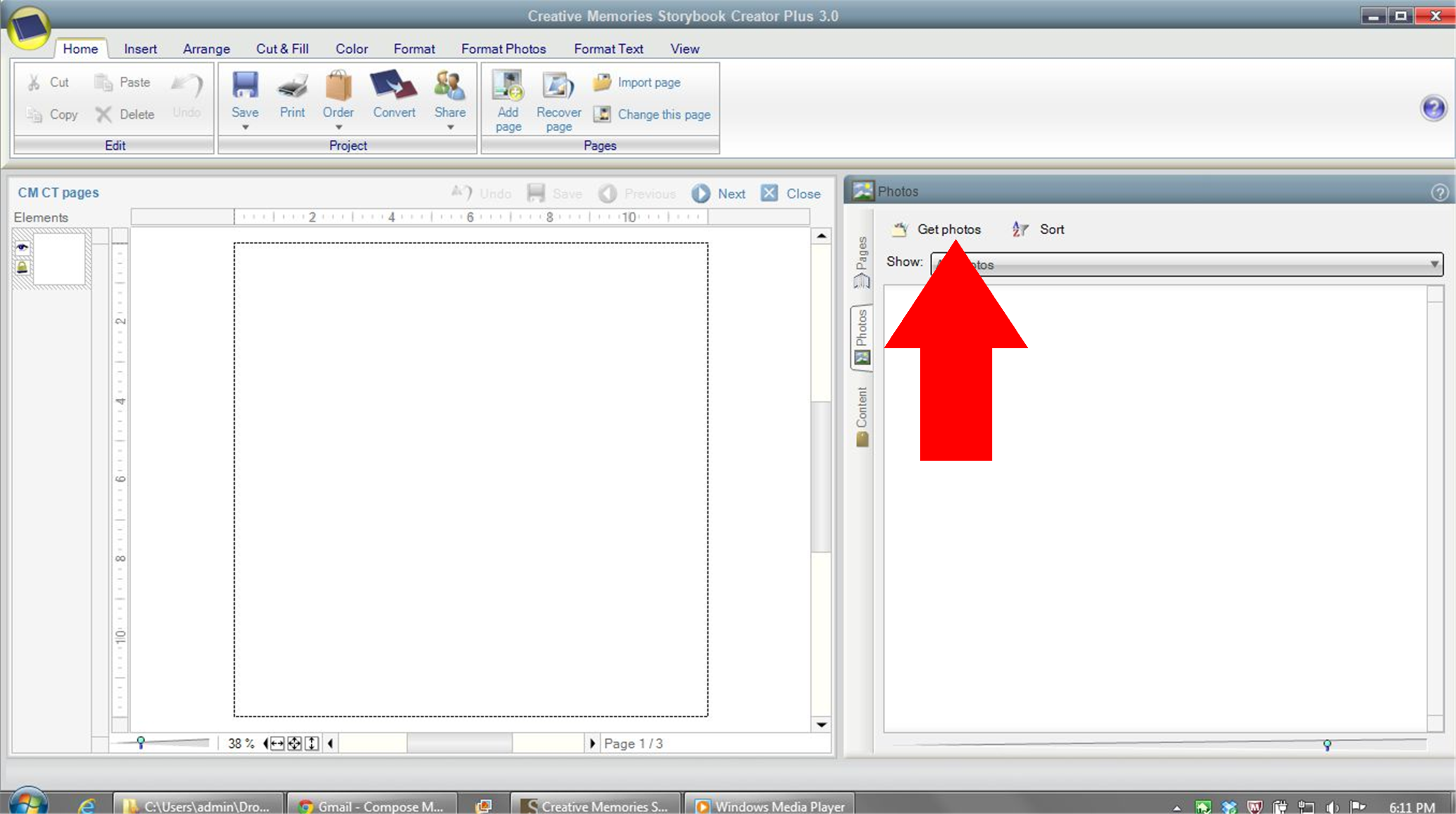
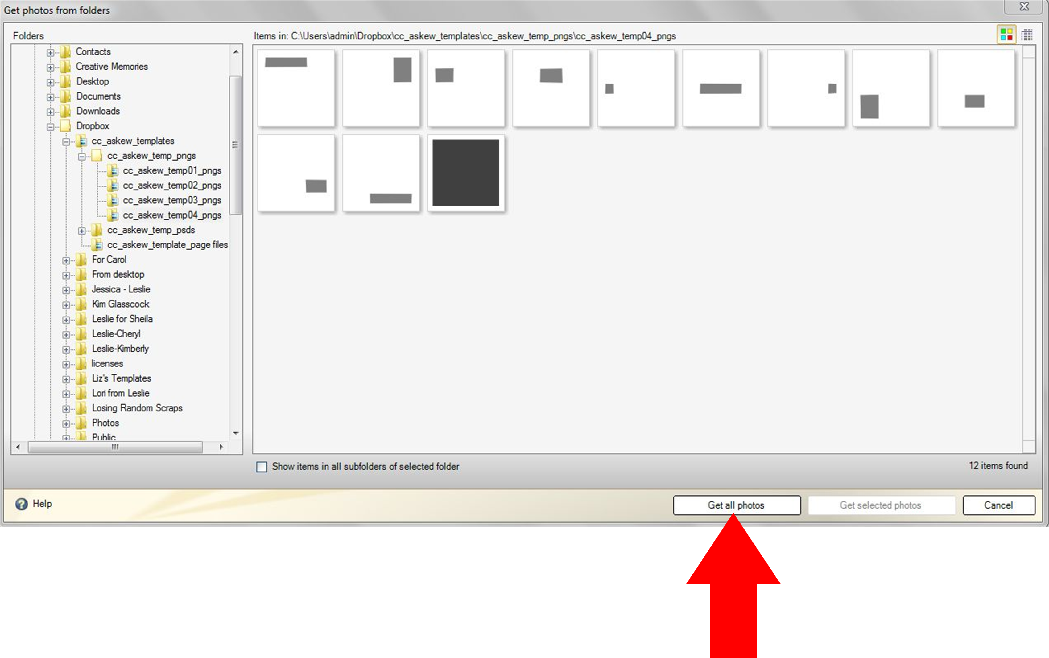
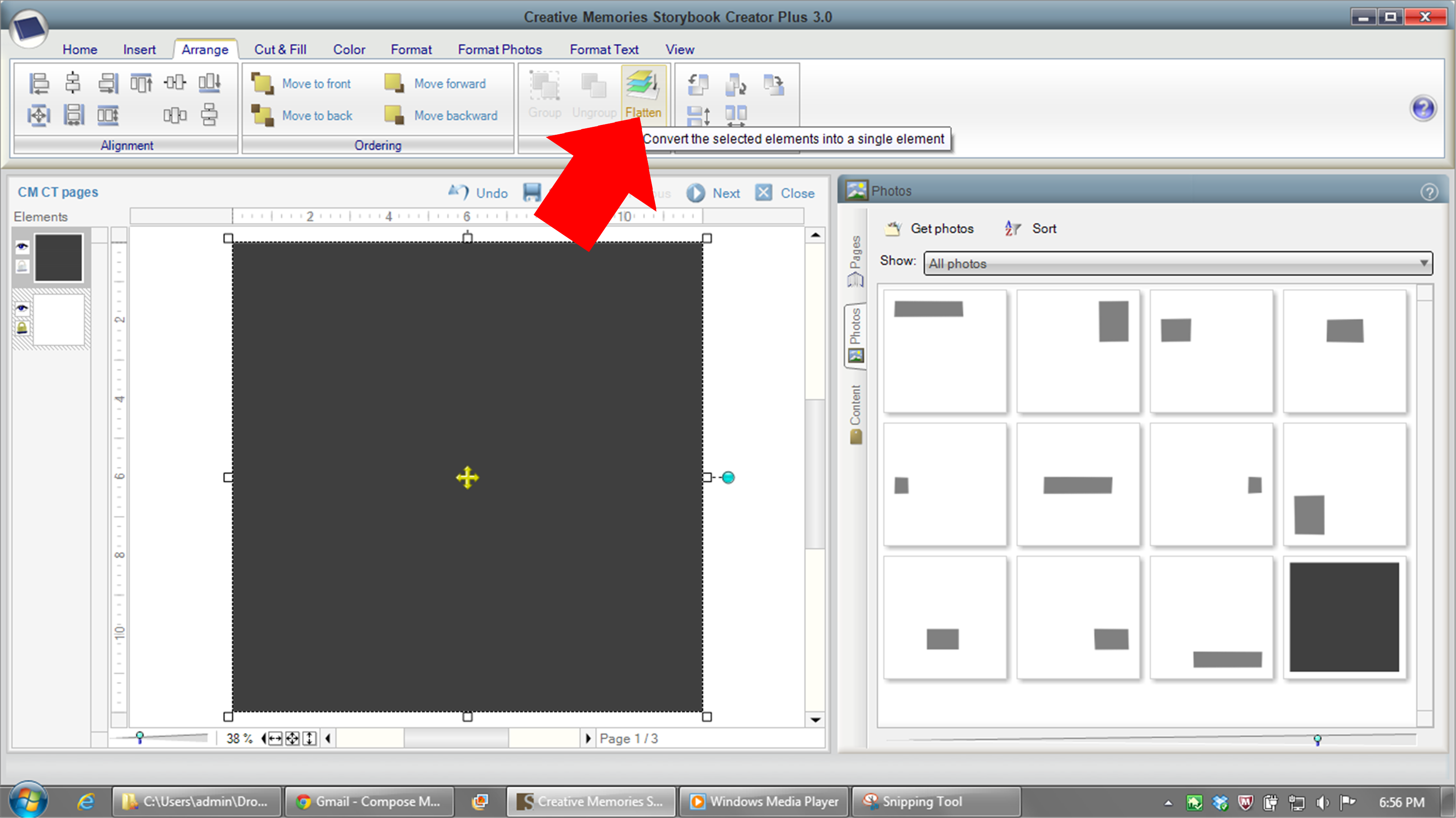
In Story Book Creator or Artisan, you can get a similar effect by putting shapes on top of your paper layer and finally when you’ve got them sized and placed JUST where you want them, after you have the rest of your page laid out, flatten the shapes to the paper and then use the Wand from the Cut and Fill ribbon to cut out the shapes you just flattened to the paper.  This will expose the paper you have beneath.

In Photoshop, you’d use the concept of inner shadows, but you can manipulate the size, distance, opacity and color without having to use the “scale effects” tool that PSE users would be compelled to use.
——————————————————————————–
Here is a page Donna (djp332) did using Prehistoric and a Santa hat from Ho! Ho! Ho! by Chelle’s Creations. She used the shadow technique to cut out the Mickey shape and also to inset her photos into the paper.  Man, the skeleton with a hat on it cracks me up!

image

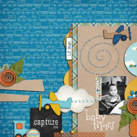
Jan used Chelle’s newest kit, Aviator and a Fiddle Dee Dee template to make this cute page.  She used the interior shadows co cut out the clouds, exposing the cute plaid paper behind it.  Great idea!

jan-aviatortut

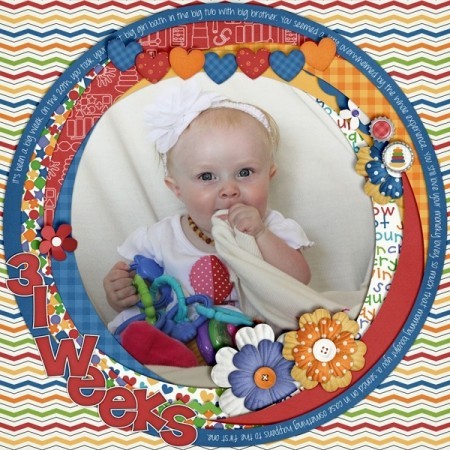
Here’s a final example from Jen (grahamlikethecracker). She used used Love Grows Bundle by Chelle’s Creations and Keepin’ It Real Double Templates by Scrapping with Liz.  She used the technique to make it look like she punched out the letters in her journaling square.  And what a cute baby!!

28966

————————————————————————————-
Well, that’s it for this week!  I hope you learned something new and we’ll be seeing you use this technique in your pages posted to the Gallery!

leslie

8.15.2013 Using Tagxedo

8.15.2013 Using Tagxedo

Hi!  Leslie here and I want to show you a website that can add something different to your pages—make fun groups of words using Wordle or Tagxedo.  For purposes of this tutorial, I’m going to demonstrate Tagxedo and give you some handy tips to use it on your upcoming scrapbook pages.

First things first, go to http://www.tagxedo.com.  You may need to download Silverlight for this to work.  That’s ok, and it works on a Mac and a PC.  Next, select ‘Create’ and then ‘Load’.
image

Here, you can choose to enter in your own text (type it in here, or copy and paste it from another document), or load text from a Webpage.  I typed in, “Nittany puppy cute love Nittany Nittany puppy dog adorable Labrador Nittany Nittany cute love Nittany yellow sweet lovable”. Using the default shape, I now have this:
image
The words ‘Nittany’ and ‘cute’ appear a bit bigger because I repeated those words in the text string.  So, if you want certain words to be bigger, use them more often in what you type in. If you want words to remain grouped together, like ‘super cute’, you need to enter it like this ‘super~cute’.

Ok, so let’s say that I didn’t quite like how that turned out.  I could simply respin it and it will fill the shape another way.  But let’s say I want different colors and a different shape.  Let’s do that.  To adjust color, font, orientation, layout, go to the menu under ‘respins’ on the left.
To change the theme, font, or orientation of the text you may click the ‘redo’ arrow image next to the appropriate menu choice or click the right arrow image to view the theme menu.

So now, I’ve modified the colors, selecting a theme that has the colors I want.  I’ve modified the amount of fonts that the program will use, and I’ve chosen to use only horizontal and vertical text.

image

But I want a different shape.  Let’s select the ‘shape’ menu, under Options.
I’ll choose a dog from the default shapes (you can load your own, too). And now I have this.
image

Cute, right?
Have a play!  You can’t hurt anything.  Try playing with the ‘Word | Layout Options’  to change how many times words appear, color variation, how tight you want the words to be, etc.  If you don’t like what you see, reset it!

To save, select ‘Save | Share’. Save it as a *.png file. I saved it as a 16 megapixel image. I can now bring it into PSE and use it how I want.  I use the magic wand to remove all the white background. To make sure all of the little bits of white inside the letters gets deleted all at once, make sure you have the ‘contiguous’ option unselected. And if I have a color that doesn’t quite match what I want, I can use the color replace tool in PSE/PS to get it just how I want it!

For ideas and inspiration for what you can do with it, check out the Tagxedo Gallery: http://www.tagxedo.com/gallery.html

Here, Erica (stanworth) uses Through the Years  to create this lovely printable as a Christmas gift for her in-laws.

StanworthTree2

Here, Helen (winipeg1) uses In the Forest & In the Backyard Little People to make this cute layout! I love how the words define all of these superlatives about her child.  Every kid should have a page like this!

Helen-in-the-forest-tagxedo

I hope you learned something and might give this a try.  If you do, let us know and link in the blog comments to your gallery post.

Until next time!
leslie

Tips and Tutorials: Template Downloads

Tips and Tutorials: Template Downloads

Hi, everyone.  This is Leslie and I’m going to talk to you about what it is you’re downloading when you buy templates and what you need to keep and what you can discard depending on your scrapping system.  I’ll talk a little about the pros and cons of *.tif files vs *.pngs and some of my fellow CT members will chime in about what system works for them.

When you download a template bundle from a designer, you may see this inside.image
Do you need all those folders taking up space on your hard drive? NO!  Let’s clean up house.
Let’s knock out the first two.  If you’re using Creative Memories Storybook Creator software (SBC) or Panastoria’s Artisan software (Panstoria developed SBC and it is compatible with page format files and is essentially the exact same program only cheaper and will continue to be supported after CM stops supporting SBC),  you’ll want the page files.  You can delete the rest of the files in the downloads folder.  If there happens to be SBC4.0 compatible files, you may choose those; though I wouldn’t, as Artisan doesn’t support those.

OK, next: png files.  If PAGE format files are provided to you as part of the download, and you use SBC or Artistan, you don’t need these. If there are no page files, SBC users can use the png files to make their own template. Refer to my blog post here for how to use them. My workflow has changed a bit since writing that post, but it will get you mostly there. If you’re using another brand of software that is not Adobe or Creative memories, you may be able to use the PNG files in your program to make your own template. If you’re using an Adobe product to scrap (Photoshop Elements (PSE) or Photoshop (PS)), you don’t need these files!  Delete them! But take a look inside to see if there are any cool shapes you want to harvest!

So next are PSD and TIFF files.  Both of these file types work in a layered format within PSE and PS. Which should you keep?  It’s up to you.  Let me talk a little bit about them.

PSD files are the native format for Adobe PS and PSE files. As such, they load quickly and they save quickly. If time and RAM are your limiting factors, you may want to choose the PSD format.

The TIFF format was also developed by Adobe, but isn’t the default file type for PS and PSE files. If saved properly by the template designer, these files can be a little smaller than are PSD files.  So if hard drive space is a limiting factor for you, you may want to consider using TIFF files. Make sure though, that they actually ARE smaller than the PSD files first.  If the designer hasn’t saved them with ZIP compression, they could be bigger.

So what about quality?  Is there a difference in quality between PSD and TIFF files.  Well, there might be.  But I uploaded a page using Chelle’s At the Park kit to Persnickety Prints that had been saved to jpg both from the PSD and the TIFF formats and they printed it for me and looked at it under a microscope and could not discern a difference in the printing quality.  Thanks Persnickety Prints for helping me with my experiment!!

20130717_130733

Me, personally?  I keep TIFF files.  I have thousands of templates because I convert templates to PAGE files for a number of designers and they all add up in space on my hard drive. Thanks to a tip from our Scrap Orchard forums, while working on a project, I’ll save it in PSD format while I’m working on it to get the benefit of that speed, and once it’s done, I’ll save it to TIFF format and delete the original PSD file to get the benefit of storage space.

This is what some of our CT do:
Wanda said:  I am no computer expert, and use the .psd files because I am using Photoshop Elements and they are Photoshop files. One of the complaints about the .psd’s is that you can’t see previews of the files. [editors note: you can with an add-on program] When I am browsing files I can’t see them, but once I am already in Photoshop, I just choose File>Open and navigate to the folder containing the templates I want to use. Then I click each template, and a preview shows up in the bottom of the box…..no problem. I have used .tif files without any problems with either use or printing, but I always go back to the .psd’s and delete everything else. Storage space is not an issue for me, probably because I don’t have a lot of “stuff” and because I don’t save my completed pages as layered files. I flatten them and save them as 8 x 8 (2400 x 2400). I print them either 8 x 8 or 12 x 12 and they look great either way.

Jenn said: I use Photoshop and use .tif files for templates. The .tif files do not take up as much space as the .psd files, which helps with space issues.

Summary:
SBC or Artisan: keep PAGE files or PNG files
Adobe: keep TIF files or PSD files.

So there you go!  Go forth and clean up your files and get some space back.

leslie

Text on and in a shape in PSE

Text on and in a shape in PSE

Hello Scrappers!  Leslie (lab130) here and I have a tutorial for you! Last month Jenn (aka JK703) did a great tutorial that taught PS users how to make text go around or in a shape. This month I want to let PSE users in on the action.   This tutorial uses PSE 11, but PSE 10 can do these things, too; though the selection of shapes it can put text within is more limited.

Ok, so let’s go!  Refer to the image below for reference!

Text-on-Shap-tutorial-PSE-11

Text around a shape
PSE only has the ability to write text inside a few of its default shapes, so I’m going to select a few of the simpler ones.
Get your project ready and go to the shape tool. In PSE 11, it’s in the ‘DRAW’ section of tools to the right of the eye dropper (1) .   Here, I’ve selected a custom shape, which looks a bit like a blob (2). Once you select it, select your crop shape (3).   I have “All Elements Shapes” selected (4).  Did you know you had all those shapes at your disposal? PSE only has the ability to write text inside a few of its default shapes, so I’m going to select a few of the simpler ones.
Draw your shape. When drawing your shapes, if you want to keep the aspect ratio the same as in the example (keep a circle circular, for example), hold down the shift key as you draw.  Don’t simplify your shape yet!  If you have, just undo!
Make sure your shape is selected in the Layers panel. Now, select the Text tool. Take your mouse and over over the edge. Did you see the icon change? It looks like an I-beam with a wavy line going through it.
Text9
If you click on the shape, you can now type around the shape!  If you don’t like where the text starts or stops, or if you want the text on the outside of your shape, go and select the Shape Selection tool (4). Drag your text to the outside of the shape, or drag the little circle that was created at the beginning of your text path to get the text where you want it.  Give it a try!


Text on a shape #2 Text on a shape #1

Text within a Shape
Again, draw a shape, or use the same one you used previously. Again, don’t simplify the shape. Select your text tool and drag the cursor inside the shape.  It should change to an I-beam with a dotted circle around it.

Click in the shape and start typing your text!  (HINT: If you don’t want your text to quite come as close to the edge as it does by default, select your text layer after having committed the text. Then hold down the ALT key while dragging one of the corner grips in.  That will resize the text box from the center and make sure that it stays nice and centered within your shape!).

Text on a shape #3
2011-Spring-Soccer-Matthew


image

image

I hope you find lots of fun and creative uses for text in and on a shape on your scrapbook pages!

leslie

Friday Freebie! Military Memories | Digital Scrapbooking Freebies

One of my favorite kits that Chelle has made has been her Military bundle She has different kits for three branches of the service, including Army, Air Force and Navy.  I was so grateful to have this kit when my husband retired from the United States Air Force last summer.  Wow.  I can hardly believe it has been almost a year already!

I thought I’d share a few pages I’ve made with her kit, featuring predominately Wile Blue Yonder portion, but what’s great about the kit is that there are lots of papers that are common to all.  And at the bottom, I have a special air force-themed element that Chelle made for my by special request last year.  A FLIGHT SUIT!   What I did to personalize the flight suit for my pages, is  I scanned my husband’s patches and scaled them down so they went approximately in the right place.  I’m super pleased with how they turned out!

And also, I have a jet that I made for you.  So scroll down to the bottom to get the flight suit AND the jet!FINI FLIGHT leftprintingFINI FLIGHTrightprintingUSAF fini flightprintingUSAF fini flight3printingUSAF SAFB-300dpiprinting
And here’s your freebie flight suit and jet!  Enjoy!  Don’t forget to share your pages with us by including #cc or #chelle in your ScrapPin gallery post!

cc_militaryfreebie_lbheam

Fonts as Shapes in SBC 4.0

SBC 4.0 offers a couple fun ways to use fonts. Inside the program, you can use any font and fill it with paper by going to the Insert ribbon and then in the text category selecting shape. I love doing this to add some papers and outlines to my fonts. But did you know that you can also make shapes from fonts? Making a font into shapes will allow you to fill your font with photos AND be able to adjust them just the way you want them.  You probably already have some dingbat fonts installed on your computer and SBC4.0 had a few of them pre-installed as shapes to use. I have gone searching for a few additional dingbats that would be GREAT for using as elements or photo holders.

What to do to turn your fonts into shapes:

Make Font into a shape11) Find the fonts you want to make into shapes. Install them to your computer.
2) If you already had SBC 4.0 running, you’ll need to restart the program for the font to be recognized.
3) At the startup screen, select “Manage Content”. In the left hand column, you’ll see “Installed Fonts”.
4) Right click on that and select, “Add a font”. Scroll through your list to find the fonts you want to turn into shapes. Then select “Add” at the bottom.  [At this point, if you just want to use the shape, you can simply insert it by going to the Insert Ribbon and then Shape and find the font shape you want.  If you want to make it a live shape, able to move or scale a photo or paper inside it, read on.] 5) Insert an Empty Frame from the Insert Ribbon and select it.
6) Go to the Format Photos Ribbon and select “Select Mat”. Click on the Cutout button.
7) In the left hand column, select “Installed Fonts”. You should see the font you just installed. Select that
font and scroll in the font preview area for the shape you want and select it.
8) Before you exit out of the “Select Mat” pop-up window, change the “Mat fill” to transparent. This will allow your shape to have no background visible on your page.
9) Fill your shape with paper or a photo.

If you like horses, find a horse font. Birds, find a bird font. Install it, fill it with paper or a photo, and off you go. Find a frames font and fill those with paper and you’ll instantly have fun frames for any SBC+ project. Have fun playing. Here are some links to fonts you can try:

http://www.dafont.com/geobats.font
http://cleversomeday.wordpress.com/2…r-die-cutters/
http://www.fonts2u.com/dj-horses-1.font
http://bestdesignoptions.com/?p=10816

And here are some examples of pages made from our team using this technique:

Here, I (aka lab130) used Chelle’s On The Trail and Geobats  font for my Germany shape.  I’ll use this as the title page for my recent trip to Germany. Germany

Here, Lynett  (aka Lynett_Rock) uses Disney Dings to make some great shapes.  I’m going to have to get this font for myself, I think!   The kit she used is Toadally.
epcotstevensfirstvisit_zps4c0f47da
Here, Jan (aka QuiltyMom) uses her Snoopy Dings to make Snoopy shapes and fill them with paper.  Aren’t they cute?? She used Ticket to Ride and In the Pocket.

snoopy

Try out this technique and post your pages to Scrap Orchard with the hashtag #SBCfonts.  I’d love to see what you do with this!

by_Leslie

12.15 Tutorial:Templates in SBC+

Hi, I’m Leslie and I’m a guest Creative Team member for Chelle’s Creations this month.  I can’t tell you how exciting it’s been to be a part of such a great group of women, getting to know them and Chelle, and getting lots of pages done for my digital scrapbook in the process using great Chelle’s Creations kits!  And for her readers, I have a little freebie cluster at the bottom.
I use Creative Memories’ Storybook Creator Plus (SBC+) for my scrapbooking in addition to Photoshop Elements (PSE).  For those of you with PSE, you have lots and lots of templates out there that you can use that are already in Photoshop format.  SBC+ uses a propitiatory file type, and we have to do a little bit of work to get png and jpg files into our program to use as templates*.
I work behind the scenes making page files for another designer on Scrap Orchard, and as such have made many many page files from pngs.  I hope that my work flow can help others who use SBC+ make their own pages.  These directions will be shown on SBC3.0, but the same workflow works in 4.0, with a few steps made easier, which I’ll explain.  I’ll be using Chelle’s Askew Templates which can be found here Chelle’s Askew Templates
First, I open a project that’s the same size as the Photoshop template, which is usually 12×12.  Whether you do this as part of a Storybook or as a Page Print doesn’t matter.
Then, I go to the right hand side and select “Photos” and then “Get Photos”.

I navigate to where the PNG folder is and get all the photos.

So now, they’re all in the program stored under photos.  Then, I start at the bottom of the stack and work up inserting things into the page. Go to the last photo in the list and double click on it.  That will bring in that photo to the bottom layer.  Then go to Arrange–>Flatten and flatten the image (if the layer is, as shown, filling up the whole screen, you don’t have to flatten it and then you can fill it like you would a photo holder).

Work your way up the layer stack, inserting images into your project and flattening them.
When you’re done bringing in all the photos and flattening them, you can remove those photos from the photos list.

Now, this is where you can feel free to stop, because you have a working template right now.   But I often take it a few steps further in the templates I make.  I prefer to have as many shapes as possible allow me to drop photos or papers right into them and then easily resize the photos and papers.  If the template shapes are rectangles, that’s easy–insert a photo holder, and use the resizing elements to make it in the same place and the same size as the PNG files you’ve brought in.  To get it in the same place in the layer stack, select the photo holder you made and then select the PNG file you inserted earlier.  Now group those two things together (Arrange–>Group) That will bring the photo holder down to the same place as the PNG file.  Then Arrange–>Ungroup.  Now you can delete the PNG file (it will be the bottom of the two and will also be the one that doesn’t have the yellow arrows in it when you select it.  I like to fill my photo holders with colors so they’re not all gray, especially if the intention is to fill them with paper.  SBC4.0 makes this a bit simpler than 3.0–you can just fill it with color right away.  But with SBC3.0, you have to first fill that photo holder with a photo or paper and THEN you can fill that same photo holder with a color.
For wonky shapes, like the ones in Chelle’s template I used as an example, it’s a bit more advanced than the scope of this tutorial can get into.  But what I do do is make custom shapes for each of the askew shapes and before inserting the shapes into my project, I say, “Save this shape as content”.  I now can insert a photo holder and use the Mat function to shape the photo holder like my custom shape.  I do this for all the shapes on the page, and voila, a template you can use again and again!
I hope you’ve learned a little something here and if you have questions, make comments on the blog.  But in the meantime, enjoy this little Christmas freebie I made for you! A little return address label sized for Avery labels 5155. Just add the text as needed for your family in your favorite scrapbooking program and save it to a JPG and then use it in your favorite word processing program formatted for Avery Labels 5155. Just right click on the image and save to your computer. It’s full size right here!