Shadows | Digital Scrapbooking Skills

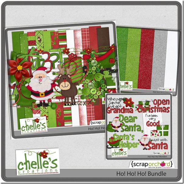
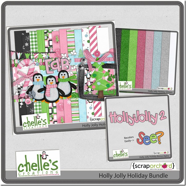
Ever notice how some digital scrapbooking layouts in the  galleries look so real you have to study them to see if they were made from paper supplies or digital? One of the things that can make or break a layout is shadowing. Realistic shadowing is not too difficult, but there are a lot of details to get right. I like to use Chelle’s Creations shadow styles called Me and My Shadow, and her Creative Team likes her shadow styles, too. But, they are going to show us today how to take shadowing just one step further to enhance our layouts.

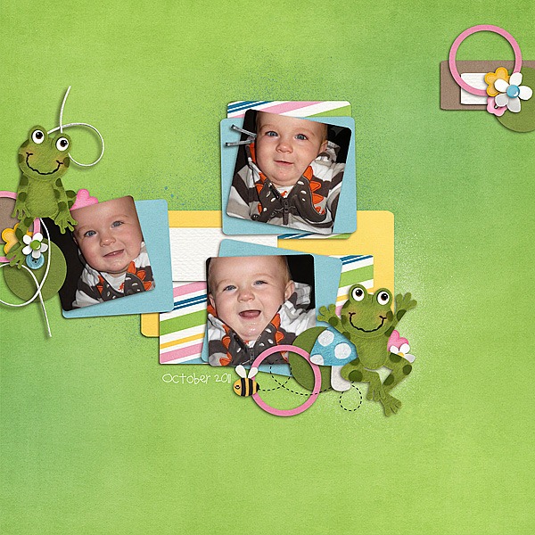
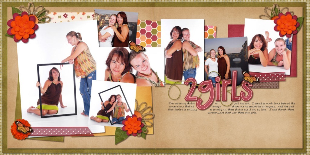
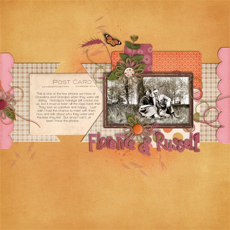
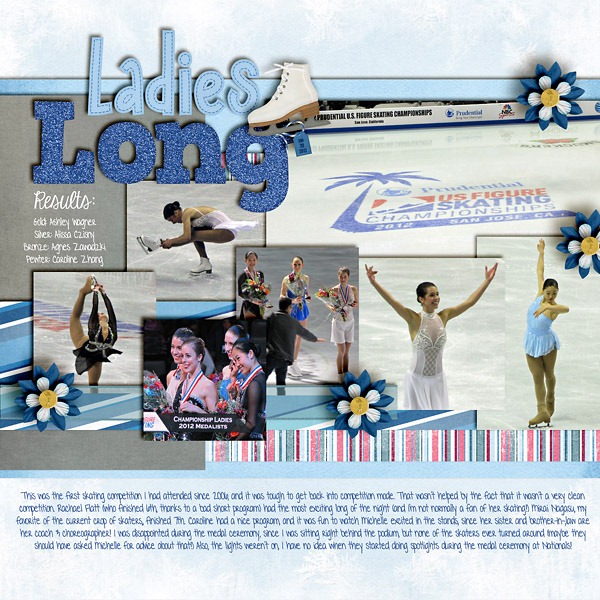
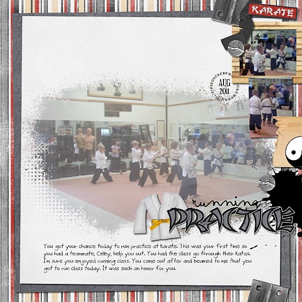
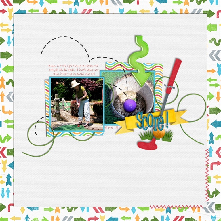
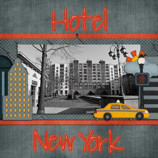
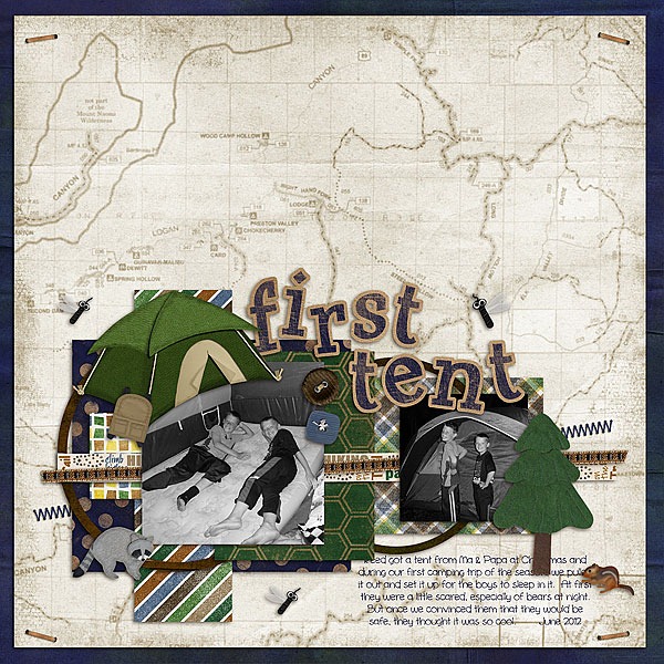
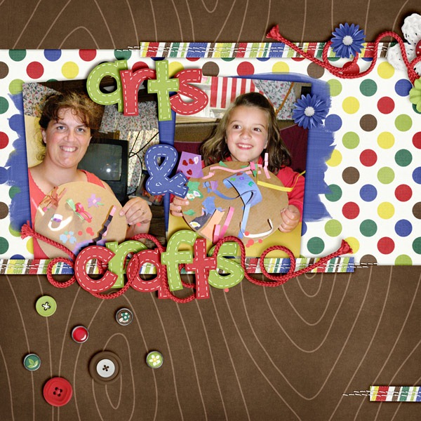
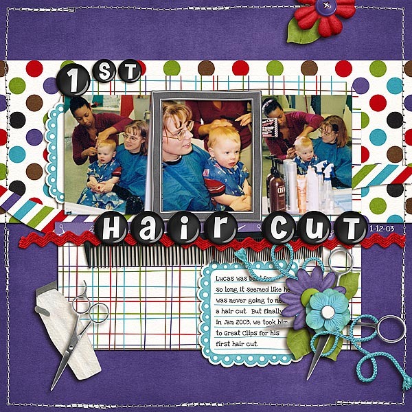
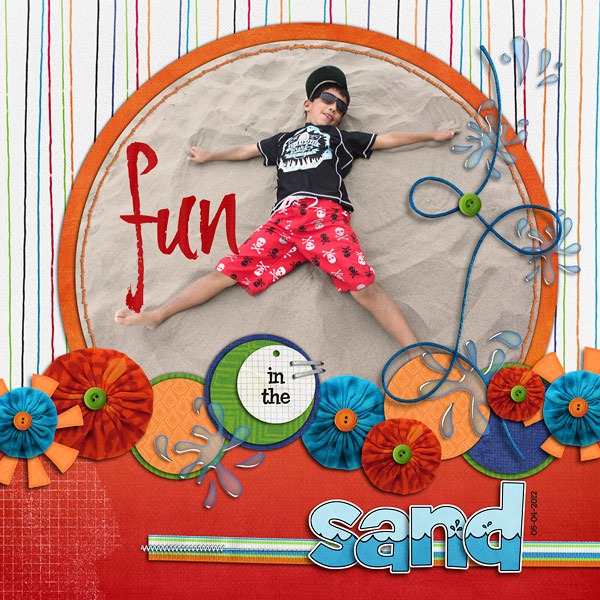
First, let’s look at Erica’s layout. She has a title on her page made from the alpha in the Prehistoric kit, and she merged the letters together before shadowing to make the title have a more solid look. Prehistoric- by Chelle's Creations<br /><br />
Template- by Britt-ish Designs 
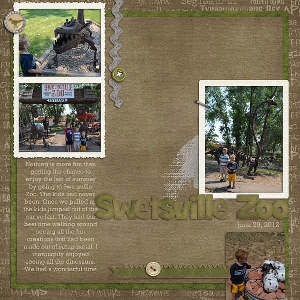
Next, Ronnie made a card with examples of shadowing and an explanation off to the right of each card. Notice how tweaking the shadow on the ribbon helps the card to have a more realistic 3D look. shadows_Samples1 
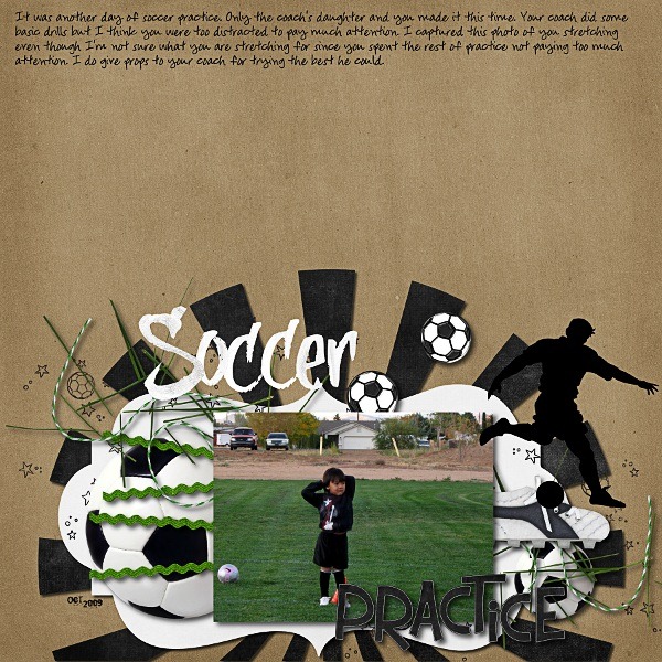
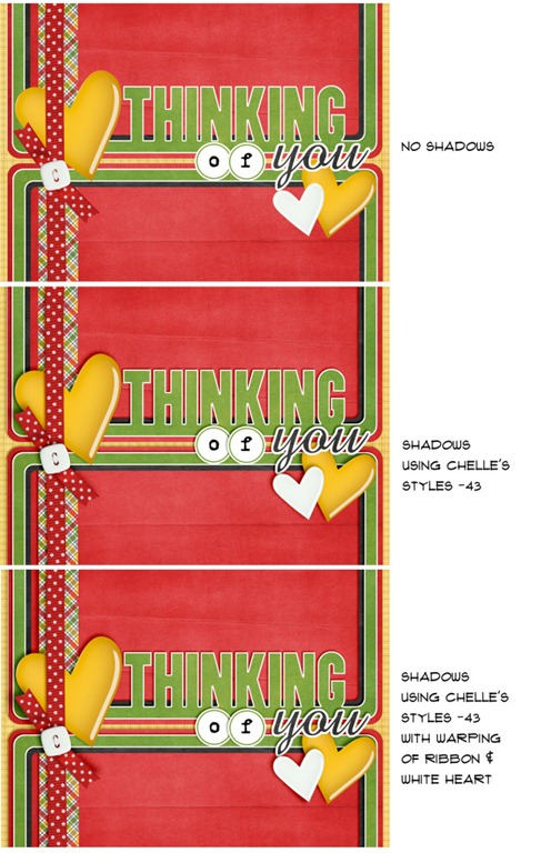
By the way, the angle she mentions (-43) corresponds to the Upper Left shadow style in Me and My Shadow.

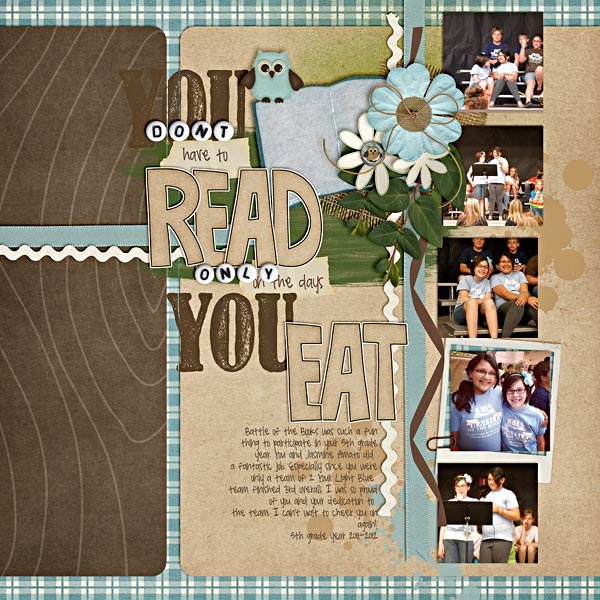
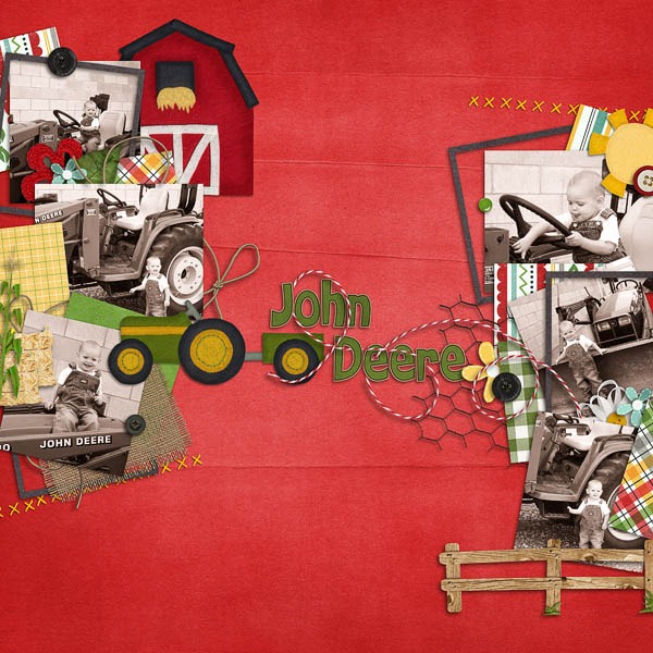
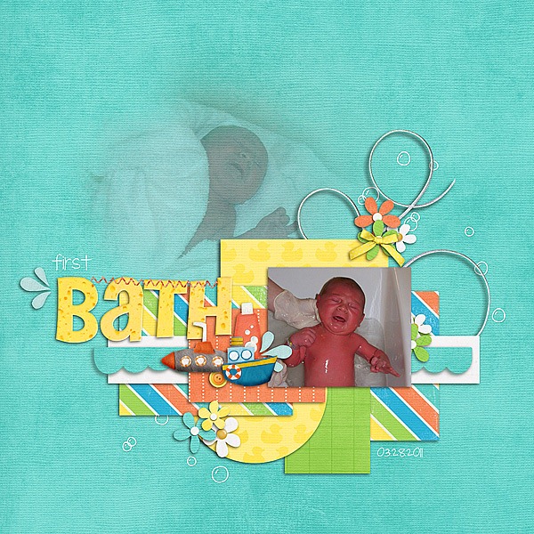
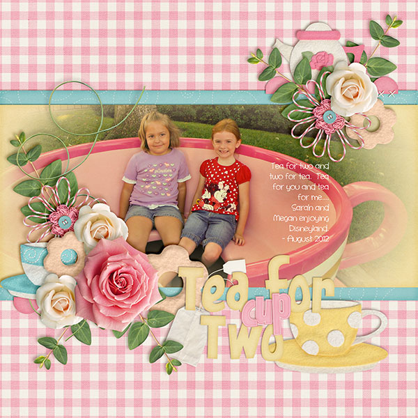
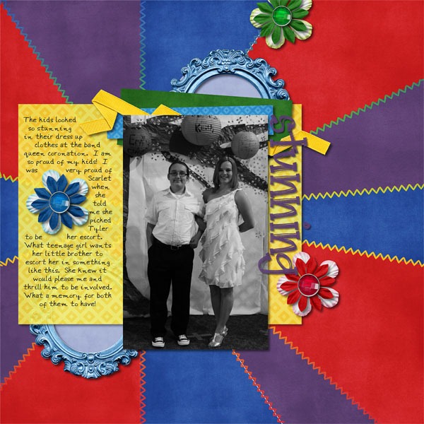
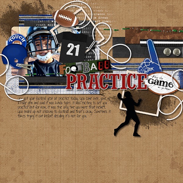
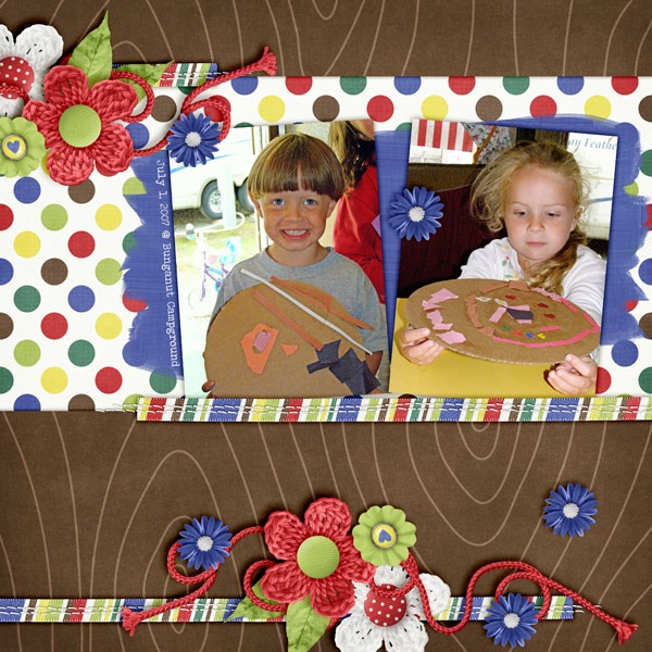
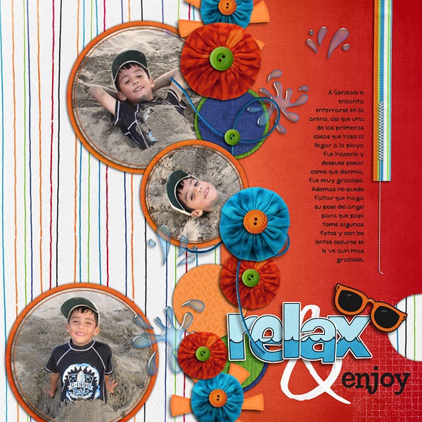
Next, Jenn has a layout and an explanation for what she does with shadows in general. She said, “I use Chelle’s -43 shadows for most of my shadowing needs. Depending on the layout, I sometimes adjust a layer’s shadow or add a shadow on the opposite side for extra definition. I do this by separating the shadow layer (in Photoshop go to Layer->Layer Style->Create Layer). I will then nudge the shadow layer just created up or down depending on how I want it to look.” In her layout below, she nudged the Upper Left (-43) shadow on the fence posts up a little – just so they would look like they were sticking out a bit more. Also on this layout, she added a slight definition shadow on the opposite edge (shadow angle of 120) of her two paper layers and the bed of nails journaling strip.17_2012_BedofNails_600w_zpse346880bJenn

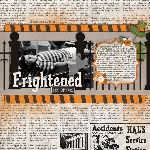
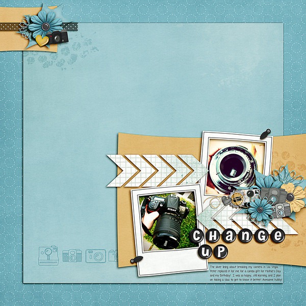
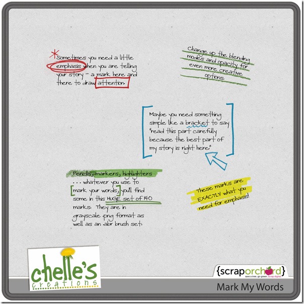
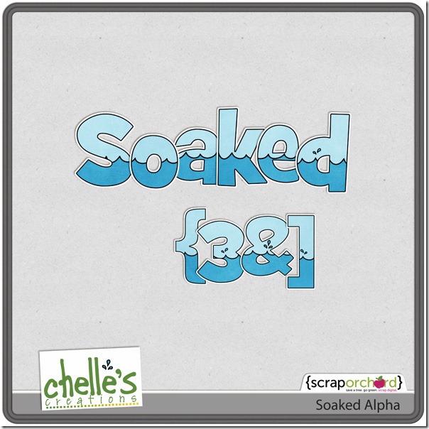
Here’s a closer look at the shadow style in the market. The image is linked. cc_memyshadow_preview

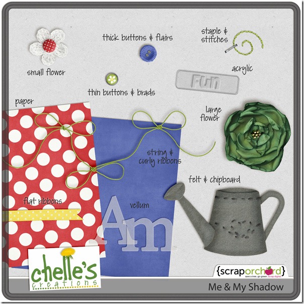
Good luck tweaking your shadows!

Scrap Skills: Using Paint

Hi all! It’s Cheryl again with another Scrap Skills post for you. Today, we are going to look at using paints  or spritzes on our digital scrapbooking pages. Paint splatters can add a significant amount of texture to a page, and they certainly add interest and depth. But, a paint splatter added poorly can ruin a page, just like a paint splatter in real life, right? Once again, Chelle’s video tutorials can save the day. She has a tutorial here entitled Tweaking the Marker Alpha, and it is certainly perfect for her Marker Alpha. She describes how to achieve the effect of the marker “skipping” over the edge of a paper slightly as it would if you were to write with marker on your page. But watch it again, and this time keep in mind how you could apply the same techniques to a paint splatter because the same things happen to both in real life.

Here are some examples of pages created by members of Chelle’s Creative Team to highlight the use of paints and spritzes on a page. Melissa’s page has the paint spritzed behind the photo, so she didn’t need to worry about the effect of the paint crossing a paper boundary. She used the paint to add depth and color to the solid background and to highlight the blue colors on the page. It gives her page much more texture than it would have without the paint. 7-Months-Old-RS_zpsd9655034MelissaNext, Roxana used the paint similarly to Melissa, but in this case, she recolored some of the paints and she used them on a patterned paper background. This keeps the area adjacent to the photo from being too busy and distracting for the photos. She also adjusted the blending mode to allow some of the paper pattern to peek through the paint.22-halldecor-web_zps0d88ab9dRoxanaFinally, Shanell made a page for us, and she really went crazy with the paints. She used both the techniques shown above and the technique in the video tutorial. See if you can find all the paints on her page! But, notice how the green paint smear behind the title has a slight gap in it at the place where it crosses the brown paper edge. Notice also that she erased a thin stripe through the “Y” in the stamped word “You” where it was stamped on the edge of a digital paper. It is this attention to detail that makes her page seem like you could reach through your computer screen and feel its many textures. battle-books-round-3_zpsbbe01f66Shanell

I hope you’ve been inspired to try to add this touch of realism to your layouts. Here’s a closer look at some of the items in the market so you can give this technique a try on your own pages. cc_applemyeye_paintedcc_wetpaintcc_marker_alpha_preview

Scrap Skills: Weaving | Digital Scrapbooking Skills

Maybe you’ll remember back in June, I wrote a post here about weaving elements on a digital scrapbooking page. Have you had a chance to try it? Do you need to see Chelle’s excellent videos again? There is one about linking charms here and one teaching you how to weave a string through grommets on a banner piece here. They are short, easy to watch during a coffee break, and very helpful for making a woven element look 3-D and realistic.

Maybe you just need a bit more inspiration? Chelle’s fabulously talented team members have been playing with these techniques again. First, Lynett made a double page and chose to weave a string around the alpha on her title. The string really helps to anchor her title to the photos, doesn’t it?2girlsLynett Just like Lynett, Erica also took a string and wove it around the title elements. Notice how this helps your eye go across the page following those adorable photos. Look at how well they each did the technique with the string going over and under the letters and shadowing the alphas that are covered just a bit.Mint Tea Template- by Little Green Designs
Lady Bug Hugs and E-I-E-I-O- by Chelle's CreationsNext, Jan wove strings all over her page. Take notice of that gorgeous black and white photo, but look also how the strings woven around the flower on the left and the two strings woven together on the right help to give a very realistic texture to the page. fr2Jan Next, Heather followed more of the Linking Charms video technique as she wove a string through the ice skate and tag in her mixed element title. It is very similar to the way Chelle described hanging a charm on the tassel in her video; very subtle, but oh so effective. mkfhof_ladieslp600cHeatherFinally, Jenn made a page using Chelle’s Oh Snap! kit, and she wove the honey ribbon hanger in and out of the negative strip element. Her shadowing is perfect on the ribbon, and her page truly looks 3-dimensional in every aspect. 7_2012_snap_600JennI hope this post has inspired you to hone your weaving skills to give your pages an enhanced, realistic feel. If you try this technique using Chelle’s kits, post your pages to Chelle’s Gallery at Scrap Orchard and let us know. We would love to see your pages and leave you some love!

Scrap Skills: Blending Photos | Digital Scrapbooking Skills

One of the things that attracted me to digital scrapbooking was the ability to use photos in unique ways on a page. Blending photos is definitely something that can’t be done with traditional paper and scissors, but the effects can be so very striking.  Chelle pointed me to this GSO post of blended photos that inspired her here . The pages there are amazing, and when I first looked at them, I thought, “I’ll never be able to do that,” so I searched through Chelle’s YouTube channel for a video on blending. She has lots of terrific tutorials there, including one on blending photos into the background of a page here. She does such a good job explaining it, I can’t wait to try it!

Chelle’s very creative team members have made some example pages for you to see. Melissa has an adorable little boy, and she made a page about his first bath given to him by the nurse and his daddy while she was recovering in the hospital. A special event like this deserves special attention, and she gave it the emphasis it deserved by blending the photo of him wrapped in a towel into the background while the focus picture is out front and matted. First-Bath-RSMelissa Next, Roxana made a gorgeous travel page, and instead of blending a person’s photo into the background, she used a scenery photo for a stunning effect. Roxana’s pages always make me want to travel to where she has been, and this one is no exception. That sunset looks spectacular in the center. 29-sunset-webRoxana Next, Ophelia has used Chelle’s Black Belt kit to scrap a page about her child leading the karate class in their practice session. Blending the class photo is such a unique way to show the whole room on the page. 2011-08-03-runningpractice_smOphelia Finally, Kayla used Chelle’s newest kit Tea for Two to make a gorgeous page with a photo she took on a recent family vacation to Disneyland. She chose to use the blended photo as the only photo on her page, and it looks awesome.  By the way, the Tea for Two Bundle is still on sale for a short time more, and right now, the gingham papers are free with purchase of the bundle.

Each of these layout artists has used a different blending mode for her photo and a different type of photo, but each page looks amazing. I hope you are inspired as I am to give this technique a try. If you haven’t stopped to watch Chelle’s video, stop to watch it now. You won’t  be sorry!

Scrap Skills: Using Arrows

I love arrows on digital scrapbooking pages. In fact, I have been known to purchase a KIT just because it contained several cute arrows. They are great for directing attention to what I really think is important, especially if it is a small detail that might otherwise get overlooked. I also like to use them to direct the flow of attention because a scrapbook page doesn’t necessarily need to be read left to right, top to bottom, as we do for books, and arrows can add interest and emphasis and a unique artistic element. For example, consider the following layout by Jan. She used a background paper full of arrows that give a general feel of movement to the page, and then she added a large arrow to point to the photo of the ball in the hole in her game of mini golf – all from Chelle’s Putt-Putt kit. I also love the dashed lines she used to create a bouncing ball path. scoreJanJenn used a different kind of “arrow” on her page. Like Jan, she used arrows to keep the pictures as the focus, but she created her own arrows from chevrons using the shape tool in her program and then clipped a paper and splatter from the kit to the shapes. By the way, she used the Oh Snap! kit and the Button Alpha on her page. i-7sCm6pF-LJenn

Chelle’s newest release Mark My Words has several arrows in it as brushes and PNG elements that can be added to a page for emphasis. Shannon used several of the arrows from this to add emphasis to her page. Notice how well the arrows help to draw the eye all around the page to read the important information, and they add visual interest and a playful feeling to her page.17-SL-LBH-MMWShannnon Here’s a closer look at Mark My Words in the Market (image is linked). cc_markmywords I hope you are inspired by these layouts as I am to try some of the techniques the ladies have used. If you haven’t used arrows in a while, maybe this is just what you need to jumpstart your page.

Using Glitter | Digital Scrapbooking Skills

Have you ever wondered what to do with the glitter elements or papers in a digital scrapbooking kit? Maybe you tend to shy away from them, but I would encourage you to use them once in a while to give a little sparkle to your layouts. Chelle’s Creations has glitter in various forms; for example, the Pearly Whites kit has glitter frames and brads in various colors, and the Ho! Ho! Ho! Bundle and the Holly Jolly Bundle each have a pack of glitter papers. The elements that are already glittered can simply be added to a page, and the papers can be simply added, as well. But, Chelle’s very talented team members have made some pages to show you some simple ways to add glitter where there wasn’t glitter already in the kit.

First, Roxana used the Mane Event kit to make a page about a trip to the salon, which was a perfect kit for her photos. She used the black glitter paper from Holly  Jolly Holiday Glitters to clip to the banner elements from CU Banners V3, and she also clipped the glitter to a paint splatter. Using the black glitter in multiple places on the page draws attention to their dark hair and helps to keep a reader’s attention on the “mane” point of her page.29-haircuts_webRoxana Next, Melissa used the glitter splats in the Holly Jolly kit on her page, and she clipped a glitter paper to her title alpha. It is the perfect compliment to the vintage black and white photo she used. Ready-for-SnowMelissa Finally, Ophelia used the red glitter paper to clip to the stars scatter on her basketball page.2012-01-03-1stdayofpractice_smO

Let’s take a look at a couple of bundles in the market that have glitter papers and elements.

cc_hohoho_bundle_preview_2postcc_hollyjollyholiday_bundle_preview_2post

I’m planning to use this technique of clipping glitter papers to elements when I scrapbook my pictures of the nighttime view from the top of Rockefeller Center. Even though I visited New York City in the summer, I will use glitter papers from these winter kit bundles because I think my pages will benefit from the sparkle. Think outside the box: do you have some pages that need sparkle? Clip some glitter papers to some elements; I think you’ll like what you see.

Using Black and White Photos | Digital Scrapbooking Skills

Have you ever converted your photos to black and white to add them to your digital scrapbooking project? It’s a great way to add interest to a page. Converting to black and white can change a casual photo to a more formal look, or it can give a romantic look to a photo, or it might help give a cohesive look to several photos you are using on a page. Chelle’s Creative Team members have made some examples to inspire you.

First, Patty took a photo of her hotel in New York, and printing it in black and white gave it an Ansel Adams quality with the strong parallel lines in the building.  Patty_BigCity Next, Lynett had a special photo of her daughter at the band queen coronation. Her daughter chose her brother to be her escort, and of course, the photo of her two children at such a special occasion deserved special treatment. The black and white contrast gave the photo the formal look it deserved. I think it is a very special young lady who would choose her brother to escort her, and I applaud her for that loving gesture. Lynett_stunning Next, Jennifer had a much less formal event to scrap, but her use of colorless photos is also a great choice because the visual emphasis is on the subjects of the photos – those two cute boys with their first tent. The map patterned paper is a great addition to the page, as well, as it coordinates so well with both the photos and the papers. Jennifer_web_first-tent Finally, Roxana’s page shows how using gray scale in photos is a terrific idea for profile shots. Look how the focus of the page is on her son’s cute face in the series of three photos across the page. The use of the colorless pictures also coordinates with the kit she chose. Roxanna8-handymanny2-web

Next time you have a special photo, a picture of a city scene, a profile shot, or just some photos that deserve a little something extra, try converting them to black and white before you scrap them. It’s a fun way to add interest to a page, and it might help jumpstart a project you’ve been hesitant to begin.

6.27 Scrap Skills: Weaving elements

Hi friends! Cheryl here. I hope you’ve been following the digital scrapbooking tutorial videos Chelle makes from time to time. You can find them all on her YouTube channel, and they are all very helpful. I have learned everything from basic to advanced techniques from her. In fact, today, I would like to focus on two of her videos regarding weaving elements.

The first one called Linking Charms was released when her Graduation kit hit the market. The kit includes a sheet of year medallions that can be cut apart and attached to the tassels in the kit to personalize any graduation page you might be creating. Her video describes precisely how to accomplish that and make your shadows look realistic. It’s the best I’ve seen at describing how to do this. Chelle’s shadowing techniques are outstanding.

The second video I want to highlight is Weaving String Through Eyelets. If you’ve ever seen scrapbook pages in the galleries with string weaving in and out of banner shapes, looking very three dimensional, and wondered how they did that, then this is the video for you. But, even if you know how to do this already, I would encourage you to watch Chelle’s video because you might be surprised by what you could learn. For example, in this video, Chelle has a screen shot of her eyelets she created from simple, flat donut shapes with all her favorite effects layered with it. It isn’t the focus of the video, but it had some very helpful information for me!

Chelle’s creative team members often use this weaving technique on their pages. Cara had a gorgeous photo of a sunset at the lake she wanted to highlight on a page. She used a string element to weave in and out of the letters in the title. The effect of the weaving really adds to the title and is more interesting than merely having the string placed underneath the letters.Carathe-lakeOphelia also used this technique on her page. She wove the string in and around the frames on her page, and again, it adds more interest than simple layering. Ophelia2010-08-07-footballpractice_sm Finally, Kairyn made a double page layout and used this same weaving idea, but I want to show you each side of the layout individually to aid in viewing. On the left side (the first one you see), she used the red cord to weave around her title alpha, and on the right side, the same element is woven around the flowers. That curly cord is practically begging to be woven like she did, don’t you think? It’s a subtle detail, but it makes a large impact in the realism of each page. Kairyn2007-07-01ArtFun-L2007-07-01ArtFun-R

Did you know you can subscribe to Chelle’s YouTube channel? When you are looking at one of her vidoes on YouTube, there is a tab above the video that says, “Subscribe.” Click on that, and you can be the first to know when she adds a new tutorial.

6.13 Scrap Skills: Borders

Do you ever have a creative “block” when you want to make a new digital scrapbook page? One way to overcome is to start with a basic design element such as a border. A good border brings a strong visual anchor to your page and can give you a place to “attach” your photos. Chelle’s friends have been making pages with bold borders to show you some examples.

First, Jennifer made a page about a child’s first haircut, and she used the elements in the kit Mane Event to build her border. She layered a ribbon with rickrack and a comb horizontally across the page and then placed part of the title alpha on top. All her photos, elements, and journal spots are anchored to this border. This gives a calming, solid line that draws your eye to the “mane” event. web_first-hair-cutJennifer Next, Lynett also made a horizontal border of flowers and string and other embellishments from the Gnome Sweet Gnome kit. She made it lighter in appearance than Jennifer’s by giving the elements some space and allowing some of the background papers to show through. This type of border gives a more playful and dynamic feel and it compliments her layout perfectly while giving it a visual bottom to hold the reader’s attention toward the photo and journaling above. funtimesborderexampleLynett

Finally, Roxana made two pages with borders as major design elements. The first page has a strong horizontal border made with circular elements – flowers, paper circles, and buttons – and her large photo is also circular and anchored to the border. This gives the page movement much like the movement of waves crashing onto the beach.  22-angel-left-webRoxana Roxana’s second page has a similar border, but this time it is vertical on the page. While still being made with circular elements, this linear approach mimics the vertical lines on the background paper and the vertically striped ribbon stitched to the right side giving the page a downward flow toward the title “relax & enjoy.” The title here actually forms a secondary border that is horizontal and less structured than the vertical one. Notice how this vertical arrangement suggests movement toward the more calm horizontal resting place with the appropriate title. 23-enterrado-right-webRoxana Did you notice Chelle’s new Soaked alpha Roxana used on both her pages? Here’s a closer look at it in the market. cc_soaked

I hope I have given you some inspiration to begin your next page. You can make a border from almost anything in any kit you use, just as these ladies have, and you will be well on your way to making a visually interesting page to scrap your memories.

5.30 Using 2 Alphas in a Title

Sometimes choosing the right title on a page in a digital scrapbooking project takes me as much time as making the entire rest of the layout. I know that a good title will grab the reader’s attention and make him want to linger on my page a little longer, so I struggle with finding the perfect words. And, then when I finally have the perfect phrase for a heading, I place it on the page only to discover that it lost some of its appeal somehow. I have learned from the experts on Chelle’s Creations creative team that I can “highlight” a major word in the title by using a second alpha, and my title will go from getting the job done to being worthy of a Gallery Standout  with just that little bit of help. Check out these examples:

Mary made a page with Chelle’s latest freebie kit iOnline. She used a combination of a small block alpha with a larger felt alpha making the main word much larger in the felt alpha. She chose a neutral color for one alpha and a bold, bright color for the main word alpha. Doing so created a visual line across the top, almost like a border, and it is obvious what subject the writing will address. I hope you will read her story – it’s an awesome look back at her first use of the internet.internetbyuappMary


Ophelia also used 2 alphas on her page. She has used the black alpha from the Kick it! kit, the kit she chose for her entire page, and then she has augmented this with the Wet Paint Alpha. The white letters stand out on the page, and it’s the first thing I noticed when I saw her page. No doubt about the subject of this page, right?  2009-10-23-soccerpractice_smOphelia

Often, digital scrapbooking kits include alphas, but rarely have I seen one with two alphas included, so choosing a coordinating alpha can be a bit tricky. Thankfully, Chelle has created several multipurpose alphas that are staples in my stash. The Wet Paint Alpha is one of those, but she also has the Marker Alpha and the Darling Stitched-a-bet alphas. Look around in Chelle’s Gallery at Scrap Orchard and you will see many more examples of using two or more alphas to make a good title look great.