Scrap Skills: Double Pages

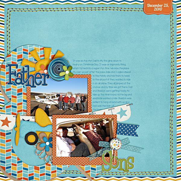
Have you ever noticed how some people make digital scrapbooking pages routinely as double page spreads while others stick to single page layouts? Most people have a preference, it seems, for one way or the other. I must admit, I am a single page scrapper, but I like the challenge of creating a double page layout once in a while. Chelle’s talented team members have made some fabulous examples of double page layouts to show us how great it can be.

Melissa is a talented scrapper who makes double pages effortlessly, it seems. I’ve seen many of her doubles, and I’ve noticed that she always has a nice flow from the left side to the right. Take a look at this example: Four-Months_zps20806b80 She has a horizontal line of elements and photos flowing from the dinosaurs on the left all the way across to the pterodactyl on the upper right corner of the right page. She also has the title on one side and the journaling balancing out the other side. I love how she framed one of the cute photos of her sweet baby with a circle frame. It really bring attention to his fabulously bright expressive eyes.

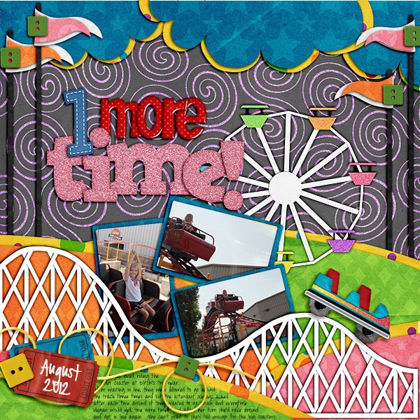
Jenn also has a terrific double page for us. When I can get beyond my extreme jealousy for the fact that her putt-putt golf pictures were taken on a cruise ship, I can see that she has used the banner to literally tie the two pages together. I am naturally drawn to follow the flow of the photos, from the top left down and then across the page following the title and banner to the right side to more great photos. I love the clusters of golf tees and the ribbon on the right, and her photos make me want to find that ship and schedule a trip. It looks like it was tons of fun! puttputtfull

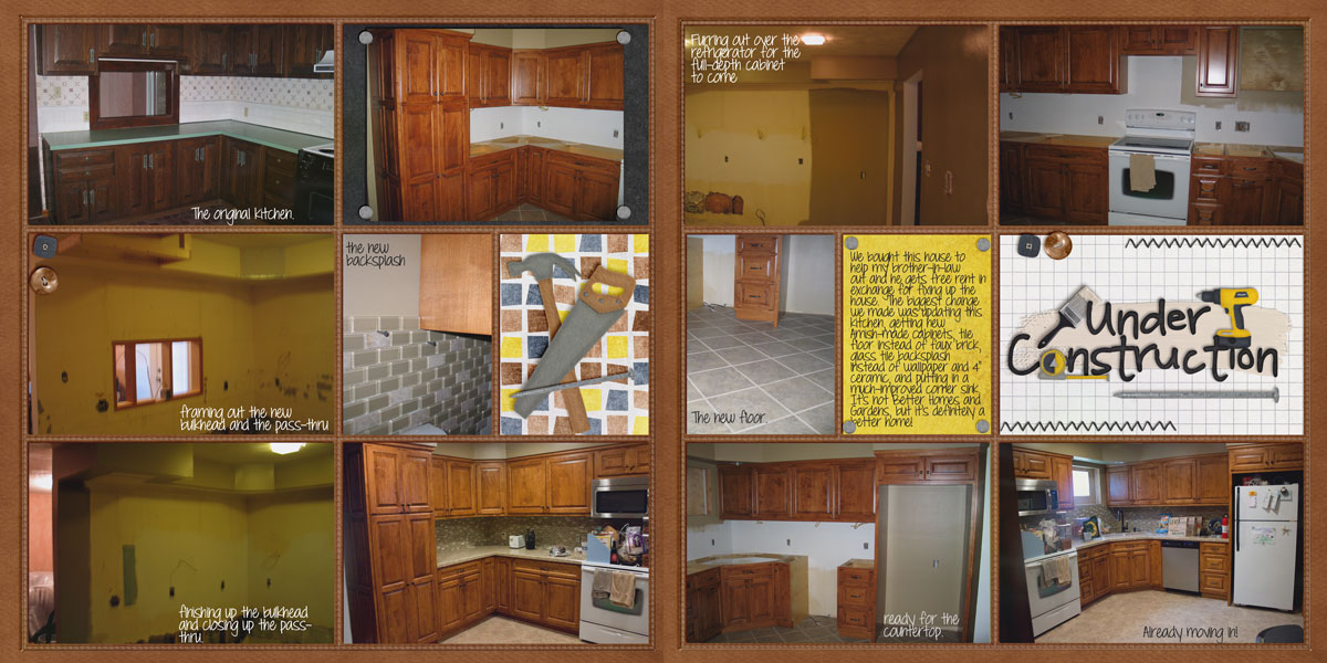
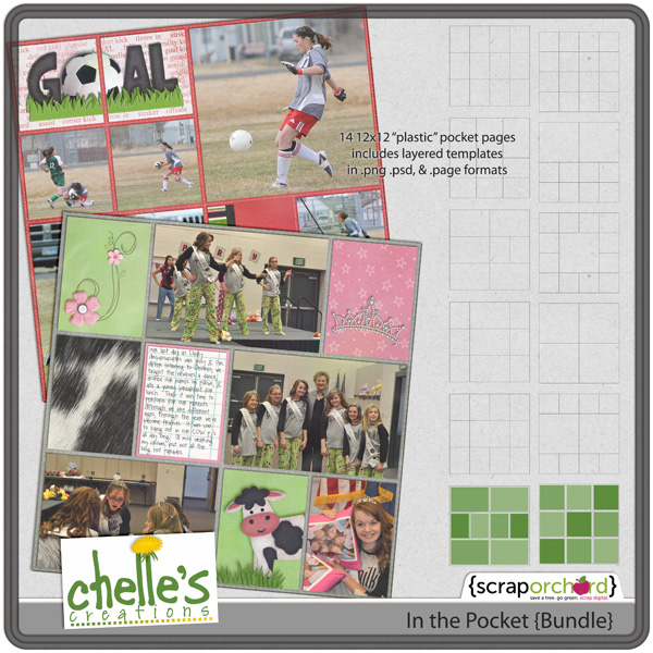
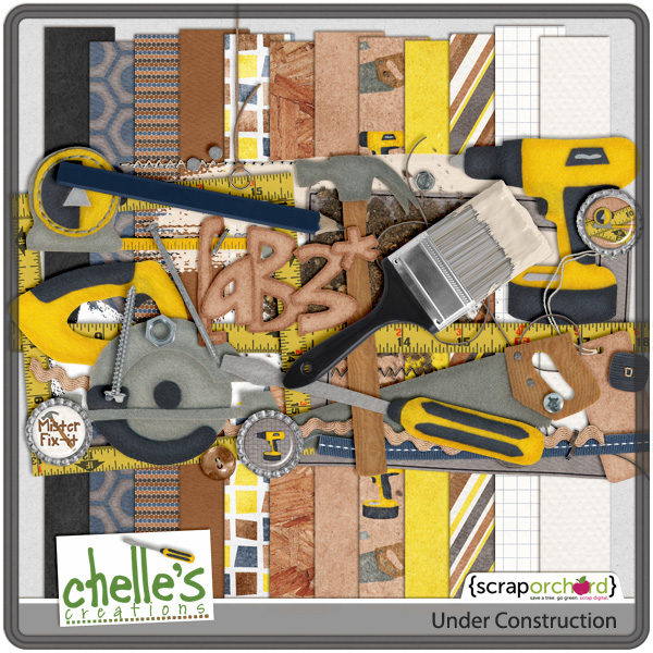
Finally, Leslie has a double page spread of her recent renovation project. I’m sure she could make several more pages to tell the complete story of her kitchen remodel. She used Chelle’s Under Construction kit and her In the Pocket Pages to make this well-designed layout.

kitchen-reno1

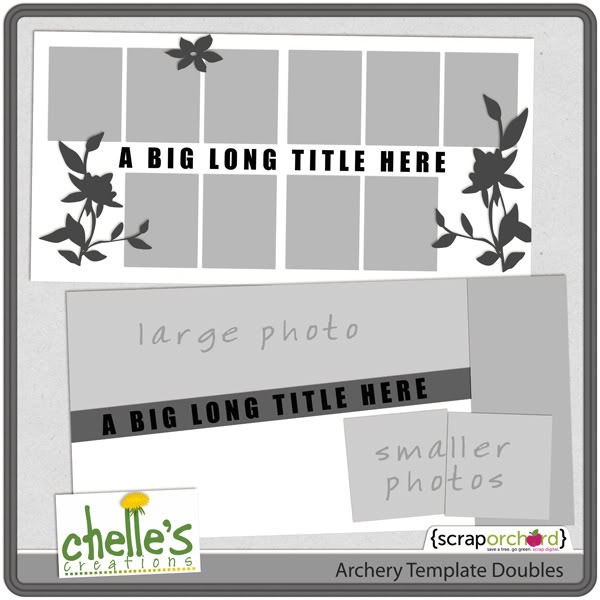
Here’s a closer look at some of the goodies they used to make these fabulous pages. cc_prehistoric_preview_2postcc_holeinone_kitcc_inpocket_bundle-01 cc_underconstruction_preview_2post

by_Cheryl

Scrap Skills: Blending Photos

One thing I really love about digital scrapbooking is the ability to blend photos. It’s an awesome effect appropriate for many different applications. There are some great tutorials online, if you need some help. One of my favorite tutorials is Chelle’s video on YouTube here. She describes how to make a photo that might not be perfect work perfectly on a layout using blending techniques. Take time to check it out, if you haven’t seen it lately.

Chelle’s Creative Team members have offered some layouts to inspire us. Ronnie likes to use blended photos for sports layouts. She demonstrates a terrific way to include multiple images on a page without including the distracting backgrounds, and she shows us it is a great way to show action in the layout. I love how she has one extracted image of her son in the true color while the other images are blended into the background paper. Basketball_thegame_600web

Kairyn, on the other hand, has used a portrait-type image for blending. Again, using the soft edge of a mask or creating one by using the erasing tools, helps to remove any distracting background information while putting the focus on her daughter’s lovely smile. The blended photo is the first one to which my eye is drawn, and it is an excellent focal point to the page. 2011-05-26Summertime-L

Finally, Shanell had a group photo of her daughters in which the background was also very important, and yet she blended it and successfully gave it the attention it deserves. By using the same photo in the small frame as the one that is blended into the background, she has given emphasis to the subject with a creative repetition. Her page draws me in so much it makes me want to visit this military graveyard. pima-air-and-space-museum

I hope you have a chance to review Chelle’s video, and I hope you’ve been inspired to play with the blending modes of your scrapbooking program. See if you can replicate one of the ideas here on an action photo layout, or a portrait layout, or even a layout with scenery you want to emphasize. If you make a layout with Chelle’s products, please share it with us in her gallery at Scrap Orchard. I would love to see it!

by_Cheryl

Using a Large & | Digital Scrapbooking Skills

I love browsing the web for the latest trends, don’t you? Lately, my mojo has taken a vacation, and I was looking for inspiration for digital scrapbooking tips and trends. I saw lots of uses of a giant ampersand on different marketing sites and scrapbooking sites, and Chelle’s talented creative team members have created some fantastic pages using a large “&.” I am really very inspired by them, and I know you will be, also.

Just look at Jan’s page. She has a page about those adorable towel animals the room steward left in her cabin on a recent cruise. Her steward also took care to tuck in her children’s stuffed animals and give them the star treatment every day. Her photos tell the story, and I love how she used the ampersand to join the two main words in her title! It makes me long to go on another cruise. By the way, she used Oh Snap! for her page.towels_zpseb2da153

Here’s a layout from Leslie. She had photos of her son Matthew & their dog Nittany and wanted to scrap this page. For her “AND” she filled the letter with color coordinating blue shades using the words, “Puppy Love,” which really made the contrast work. Her use of size in the font also pulled my eyes toward the “&” to see what she had done. Choosing to use Winter Thrills with colors that worked with her photo and the font from Gone Fishin ties in Nittany’s fur, really adds to the charm of this wonderful memory

Matt-and-Nit

Next, Jenn used the same idea using a large ampersand joining two words in her title. The two words are significant because the page is all about the money in the Great Piggy Bank Adventure. I’m sure this fun game is challenging her children to learn to save their nickels and dimes and invest them wisely. Appropriately, Jenn has used Money, Money and the Marker Alpha for this cute page.

nickelsanddimes

Shanell added this layout about her husband flying her and the kids down to a family Christmas party in 2010. It was a last-minute and they told everyone to meet at the airport if they wanted a ride in an airplane. It took me a minute to find her “&”, but then I saw them, the fun random chevron paper behind the “Fathers. Her composition with the clusters and double row of stitches adds to the fun and excitement of a great day. She used About A Boy.Shanell (happinessis) She used About A Boy

Liz created a page about her and her hubby and how they belong together. Love the “pink” list for her and “green” list for him. Love how that large “&” hooks the lists together. So simple, so elegant. I had to ask her what the font name was that she used. (Lavendaria) She used Chelle’s Love Grows Kit.

Liz.&layout.

Finally, Lynett has two boys in her photo, and what better way to title a page than with their names joined by the large ampersand. They are certainly the main characters of the story, and it looks like they were having a blast checking out the shark tank. The shark in the photo and Chelle’s cute felt shark both look like they have their aim set for Tyler & Harrison. I hope they got out of the aquarium unscathed! Lynett used a lot of Chelle’s great kits for her page including Photo Stacks, Something Fishy and the Something Fishy Felties.   sharktank_zpsff8fa6d2

I hope you are inspired as I am . This was just the thing to jump start my scrapping for the week!

by_Cheryl

Black & White Photos | Digital Scrapbooking Skills

Color photography is the commonplace standard, but there are many times when a black and white photograph can really add to a digital scrapbooking layout. Of course, you should always use black and white if it’s all you have, and if your story includes vintage photos, you should use them as they are. The photos themselves help to convey the era of time because they are black and white. But, sometimes it’s helpful to convert color photos to black and white to enhance them or to make the photo have more visual impact on the page.

Carol had some gorgeous pictures of her granddaughter in her ballet tutu. The contrast between light and dark show off her adorable poses so well in a colorless photo, and the impact of her light body in front of the dark background would be lost somewhat if the photos were color. Using black and white photos to show high contrast is a great trick for adding a big impact to a page. By the way, she used Chelle’s Tutu Cute Bundle for all those cute pink and grey elements and papers. CarolJ_blackampWhtPhoto_zps4b4949b0

Kassie was not happy with the quality of her photos but wanted to scrap the memory, so she converted them to black and white, and it really enhanced her images. This is a great trick to use when editing photos that are less than ideal in color. She used Chelle’s Big City kit and Tiny Tabbed Alpha for her page, and it all works perfectly together. nyc-1k

Finally, let’s look at Jenn’s page. She had photos from a Disney trip, and her family had their pictures taken in front of Cinderella’s castle. Lots of colors on clothing or busy patterns on apparel can be distracting on a page, so Jenn changed the photos to black and white. The effect is that the focus is on the people in the photos instead of the clothing – exactly what she wanted! By the way, she used Chelle’s new CU Watercolor Brushes and the classic kit Happily Ever After  with some greenery added from Girl Power and Blessings. castleportraits

Do you have some pictures that need help? Maybe they have bold, distracting colors on them? Change the color profile to black and white. Or, maybe you have the perfect digital scrapbooking kit in mind that you want to use, but the pictures you have don’t match it. Convert the pictures! It’s a great trick to help in lots of situations.

by_Cheryl

Using Large Photos | Digital Scrapbooking Skills

If I had to name one feature of digital scrapbooking that impressed me more than any other and caused me to change from a traditional scrapper to strictly digital, it would surely be the fact that I could use a very large photo on a page. Traditionally, my prints were sized at 4” x 6,” but digitally, I could make a photo as large as the whole page! A large photo makes a large impact, and isn’t that what we want so often? Chelle’s team members have been making pages with large photos to show you some inspirational examples.

Kayla showcased a photo of her children, all wearing Santa hats at a party. The smiles on their faces are reason enough to make this photo as large as half the page. I love how she repeated each child’s image individually down the left side of the page. She used  We Wish You A Merry Christmas Bundle, Lovin’ from the Oven {bundle}, and Me & My Shadow. WeveBeenGood_Dec11_web

Kassie also made a Christmas page (she used Naughty & Nice) and she used a blend mode on her large photo. A photo with Santa only happens at most once a year, so it deserves prominence on the page, but her children are so cute, they would deserve that anyway. Kassie also repeated the image on the frame in a smaller spot. I love the way she has the elf sitting on top of it. Santa_Claus_is_coming_to_Town

In keeping with the Christmas theme, Shanell made a page about a recent trip to Williams, Arizona, to ride the Polar Express to the Grand Canyon. I am totally jealous. It even snowed on them while they were there! What a magical experience it must have been and definitely deserving a large photo page. By the way, she used Chelle’s Choo! Choo! Bundle, CU Evergreens, and the Winter Thrills snowflakes.. polar-express1

Finally, to show you a perfect example of when to use a large photo that is NOT a Christmas page is Melissa. Every newborn deserves to have at least one scrapbook page in which his sweet baby face photo takes up at least half the page. Melissa’s new baby is adorable, and I LOVE the page she made with his picture. Her clusters of baby elements from Beary Cute Baby Boy were the perfect addition to highlight the theme of the page without distracting from his face. He looks so peaceful there, I want to reach out and stroke his baby soft cheeks. Meeting-You

I’m sure you have a photo or two from the last month that deserves its own page. If you are usually a multi photo scrapper, challenge yourself to try this approach for just one page, and share it with us in Chelle’s Gallery. I would love to see what you do!

by_Cheryl

Weaving | Digital Scrapbooking Skills

How many times have you heard the saying, “the devil is in the details?” I must have heard it a dozen times, and yet it’s the details that make a digital scrapbooking page seem three dimensional. If a page has a banner on it but the string running through each eyelet of the banner isn’t shadowed , then the page loses its realism. When it comes to weaving a string through eyelet, the devil doesn’t have to be in this detail. Chelle has a great video tutorial here on her YouTube channel that gives step-by-step help on getting this detail right. It’s a short video, easy to watch on a coffee break and helpful to refer back to each time you need until you have the technique down. Chelle’s team members have made some pages to give you some inspiration.

First, I’ll show you a page with a string woven all around the page, in and around various paper strips on the page. Melissa made this lovely creation with Chelle’s On the Water kit. You can easily see how the string wrapping around the tabs of paper gives the page a three dimensional edge that would be missing if the string was simply on top or below the papers. And, I just have to add that the photo of her baby smiling from behind his pacifier made me chuckle. What a cutie!!On-the-Boat-RS

Next, we’ll look at the pages Shanell made. She made a double page spread, but I am going to show the two halves separately to highlight what she did on each page. First, let’s look at the right half. She has two strings weaving in and around the letters in her title. The strings look like they are holding the letters together on the page, and the shadowing of the strings is perfect. annie-at-christmas-2Next, if you look closely at the left side of the page below, you’ll notice that Shanell has a date tag hanging from a flower cluster on the top left corner of the page. She has woven the string through the hole in the tag to make it look realistic. This is a great way to add that important information to the page and at the same time add some dimension and texture. annie-at-christmas-1

Finally, Roxana took a slightly different approach to weaving. Instead of weaving string, she has woven paper strips cut in a wavy pattern. The same methods of erasing and shadowing apply as shown in the video, but the shape is just a bit larger than the eyelet and string in the example. By the way, she has used Traveler Bundle on her page. travel10

I hope you are inspired to try a bit of weaving. It might be the difference between liking your next page and loving it.

by_Cheryl

Repetition | Digital Scrapbooking Skills

One of the major principles of design is repetition. Many times in art or literature, repetition is used to bring attention to a particular detail or to emphasize something of importance. In a work of art, a vertical line might be repeated to give a piece height, or a shape might be used multiple times to evoke a certain feeling from the viewer. The same is true in the design of a scrapbook page. Steph at the Daily Digi wrote a great article with Debbie Hodge about this design principle here . She has many examples of ways to use repetition on a page effectively, from repeating a color or a shape to repeating themed elements. Chelle’s team members have given us a couple of examples to illustrate.

First, Leslie has made a page repeating the color of elements and repeating the use of one element in particular, the staple. First, the monochromatic look of her page gives the reader a true sense of the environment of the cave. The tour through Mammoth Cave is an incredible one, but there are very few colors to see when only using a flashlight. The overwhelming presence of dirt and rock in the cave is captured expertly by using the tans and browns in the On the Trail kit and by using a sepia tone for all the photos. The use of staples added to attach the photos to the page leads your eye from one photo to the next and draws the reader into the page. LBeahm-OnTheTrail-250

Jenn also made a page to demonstrate repetition. She chose to repeat a shape, namely a circle, in a vertical line down the side of her page. With the sharp lines of the blocks on her page and the vertical nature of the list, the circular elements of brads and flower centers bring a nice contrast to the page, and they add to the emphasis that this is indeed a list to be read from top to bottom. She has also used careful placement of the red elements from the kit Naughty or Nice to guide readers. Red is such a strong color, it is always helpful in repetitions, and by having the title in red and then several red elements down the red strip, the eye is drawn down the page to read the list in order. By the way, her list has several items I would love to have, if any of my family happens to be reading this post. HINT HINT 39_2012_forme_600Jennv

If you haven’t stopped to read that post I mentioned earlier, you can get to it here, also. It has lots of helpful examples for using repetition in a scrapbook page and is definitely worth the read.

11.27 Using 2 Alphas in a Title | Digital Scrapbooking Skills

One thing I LOVE about digital scrapbooking is being able to easily add interest to a title by using multiple alphas. With traditional scrapbooking, it was so difficult and expensive to add multiple sticker letters to a page, that often my titles were short and boring. But, with digital scrapbooking it doesn’t cost any more to add 2 or more alphas to a title, and the impact is so great that I find myself doing it more often than not. I can mix kits I already own and use the alphas over and over without using them up, like I did with my favorite stickers, making any digital kit a great bargain. Take this page by Karen, for example: one-more-timeKarenShe has used 3 different alphas in the title, and the three different shapes, textures, and colors to the letters (and number) give emphasis to each word. It also fits the fun energy of the overall theme of the page about riding a roller coaster in the amusement park. She used Ticket to Ride for the page and she used the Rainbow Collection for the alphas.

Next, Ronnie used Chelle’s Chillin’ and Grillin’ kit for most of the page and 2 words in the title, but she supplemented her title with the Button Alpha, which is a neutral colored alpha and works with any color scheme. The Button Alpha highlights the word “family,” which is always a good word to emphasize on a page, and making the word “Fun” much larger than the others certainly tells you about the page’s purpose. In fact, everything about this page says “Fun” from the angle of the photo collage to the bright colors of paper strips behind the photos. Chelle Creations - Button Alpha<br /><br />
Chelle Creations - Chill n Grill<br /><br />
Chelle Creations - Ladybug Hug<br /><br />
Chelle Creations - Rainbow Neutral<br /><br />
Scrapping with Liz - Fairly Simple Templates<br /><br />

So, what if you are a “one kit” scrapper and the thought of mixing alphas from other kits makes your palms sweat? Chelle’s CU alphas are a great resource to help you. My friend Leslie has made a page specifically to show you a great way to break into the multi-alpha trend. She created a page with Chelle’s We Wish You A Merry Christmas {Bundle} which includes the red alpha she used in the title (it’s actually part of the Add-On which can be purchased separately from the bundle). Then, she used one of Chelle’s CU Dynamic Alpha Doodles and clipped a black paper to it to coordinate with the dark sweaters in the photo and the black music notes on the papers. Using a multipurpose alpha like this one with paper from your kit makes it easy to add that extra interest to your title without having to search through several kits to try to find a coordinating pattern.Christmas-2006-Nana-PapaLeslie

I hope I’ve inspired you to break into the multi-alpha trend. See you next week!

Scrapping is Cheaper than Therapy | Digital Scrapbooking Skills

We’ve all had those days: days when nothing goes right, our emotions are raw, and we wish things were different somehow. That’s the perfect time to turn on the computer and get out the digital scrapbooking supplies and make a page. After all, it’s cheaper than therapy, right? Sometimes, getting your feelings down on a page is very therapeutic. Take for example Leslie’s page. She recently moved across the country and has had an incredible workload because of her situation. Understandably, she is tired and frustrated. Rather than yell at her kids or sulk, she made a page using the dark paper and graph paper in Play the Game, CU Bubble Wrap Brushes, flowers from Eeeeek!, and she wrote about how she was feeling. It was the perfect therapy for the moment. LBeahm-scrappingtherapy

I like to do introspective pages on occasion, and I like to use quotes from literature or poetry to express my feelings. Somehow, I find that someone else has already written what I want to express at the moment. Kairyn also likes to use quotes, and recently she was thinking about family members who are far away, so she used a favorite quote to express her feelings.08BookCoverPage By the way, she used Chelle’s Family Tree kit to make her lovely page.

Jan decided to share a poster she made for us. I think it would be the perfect accessory to my home office wall. She used Chelle’s Fill Me In {Marker} alpha and the iOnline kit that was shared with her Facebook fans a few months ago. therapy2

You can download it here

Have you scrapped for therapy lately? It can be very helpful to relieving stress.

Tweaking Templates | Digital Scrapbooking Skills

Hi Chelle’s fans! Do you use templates for making digital scrapbooking pages? I don’t think I can scrap without them. I have become quite accustomed to the time saving of using templates, but sometimes I can’t find the perfect template, and I need to tweak a template to make it perfect for a particular layout. Some of Chelle’s team members have done that and have some example layouts to show you what they do when they want to make a template “new.”

Roxana chose to use one of Chelle’s Archery templates given as a prize for a challenge during the NSD events in May, shown in this image here.cc_archery_doubletemps She took the double template and cut it down to a single 12×12 template and did a bit of arranging of the photos and flipped a layer or two. It made a terrific single page with her adorable large photo taking center stage. I love how she added her journal notes on top of the photo. Here’s her page: 23-draculaagain-web_roxana Kayla has an example to show how you can combine 2 templates to make a brand new one. She used templates from Bracket Love and Boo-tiful Blends, which are her own creations, by the way.  She combined the two templates by moving 2 of the photo spots in Bracket Love down and to the corner and replaced the 3rd photo spot with the photo blending mask from the Boo-tiful Blends template. MummyKnowsBest_Oct11_webKayla I love that large photo in a blended photo spot, and her perfect clusters are made from the Eeeeek Bundle and Kraftabulous. Her title is very fitting for her story, and it’s made from Chelle’s Wet Paint Alpha.

Tweaking templates is a great way to stretch your stash. Try experimenting with a template or two and see what gorgeousness you can make. If you use any of her products, post your layouts to Chelle’s Gallery at Scrap Orchard. I would love to see them!