Tweaking Templates

I don’t know about you, but I almost NEVER start a digital scrapbooking page without a template. Even if I make significant changes to it, I still prefer starting with a template, and tweaking templates is a great way to stretch your stash. That’s what we’re looking at today: tweaking templates. A few of Chelle’s CTMs have made layouts with templates and purposely modified them.

Christine started with one of the Scrapping with Liz Long Blocks Templates. She flipped it and removed a lot of the elements. She also moved the title from the top to the bottom of the page and used Chelle’s Home for the Holidays kit. I love how she chose to put one photo across the series of long block photo spots in the template. Christine

Next, Krista combined two kits of Chelle’s, At the Park and At the Beach, for a perfect page about their visit to Devil’s Punchbowl on their first day of Spring Break. She started with a template from Fuss Free: Stitched Together by Fiddle Dee Dee Designs  and changed it up quite a bit. I really love how she has placed the sun peeking from behind the strip of plaid paper.DevilsPunchbowl_Krista

Finally, Karen made a birthday page using One Year Older, the perfect kit choice. She started with a template from Scrapping with Liz Inspired by Jenn Templates, rotated it, and then switched out a journal spot for a third photo on her page. I love her clusters of presents and tissue paper. oneyearolder600x600Karen

I hope you’re inspired to tweak those templates and stretch your stash! Here’s a closer look at the kits the ladies have used.

cc_atthebeachcc_attheparkcc_home4holidays_kit_previewcc_oneyearolder

by_Cheryl

3.27 Tutorial: Easy Pencil Sketched Photos

3.27 Tutorial: Easy Pencil Sketched Photos

Hello Hello! Welcome to today’s tutorial! This is Jenn, aka jk703, and I can’t wait to share a fun and really easy tutorial for you today. You are going to love the Tutorial: Easy Pencil Sketched Photos! It is fun, and has a cool effect, plus I think it can give you a way to change up your layouts. Add a bit of different – :)  I hope you like it!

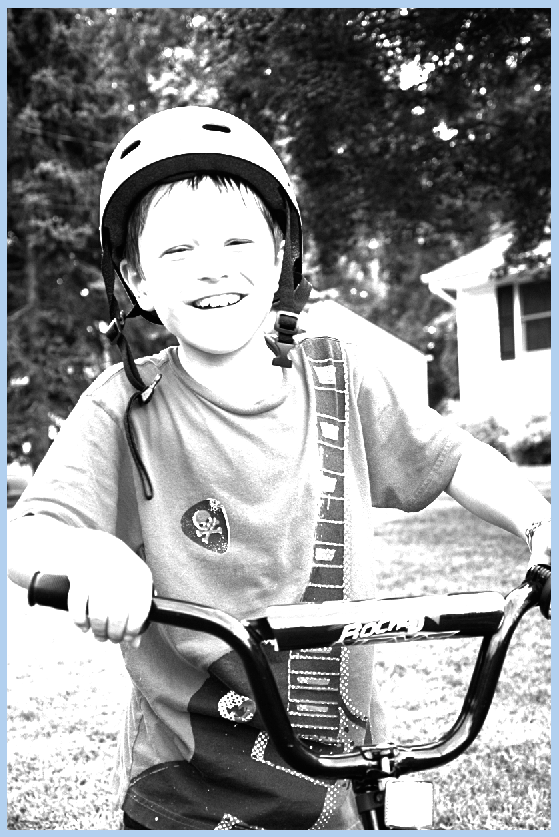
Here is my son, and right before he was done riding his bike, I was able to snap this picture. He is laughing at me for some reason, but I don’t know what it is, lol! I pry told him to get back on the bike and put his helmet back on for a picture. All I know is that he has an infectious smile, and the natural smiles are my favorite. This is the original picture that I will show the tutorial for Easy Pencil Sketched Photos. (This should work for both PS and PSE users – Krista provided instructions on how PSE differs. I will include that in parentheses).

PencilOriginal

First, make a duplicate of your photo, right click to duplicate or Command + J. This way the original is still available and not written over with layers and other changes.
Pencil1

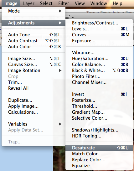
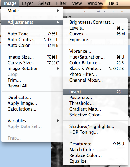
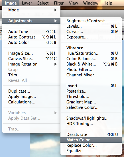
Next, choose your duplicate layer in the Layers Palette. Then click on Image > Adjustments > Desaturate. This will cause your image to turn to a black and white version. (For PSE Users – Krista said that she went to Enhance>Adjust Color>Adjust Hue & Saturation. She then brought the saturation slider all the way to the left.)
Pencil2

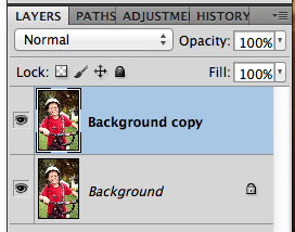
Duplicate the desaturated layer.
Pencil3

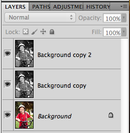
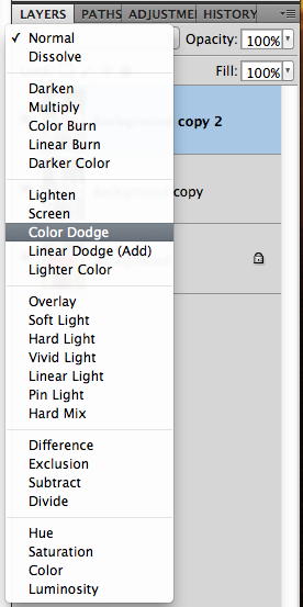
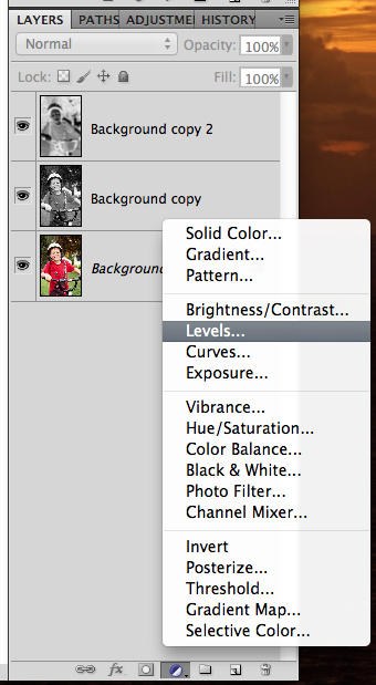
Choose the top layer in the Layers Palette. Next, change it’s Blend Mode to Color Dodge.
Pencil4

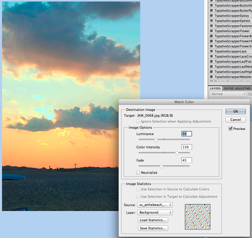
Your image will have an almost over white black and white image. Like this:
4a

The top layer is still selected at this point. Next, click Image > Adjustments > Invert. (For PSE it’s Filter>Adjustment>Invert.)

Pencil5
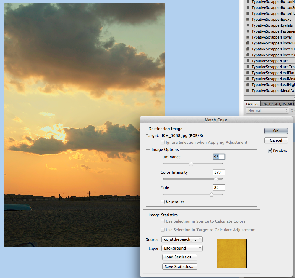
Your image will turn ALL white right after inverting it. It’s normal. :)
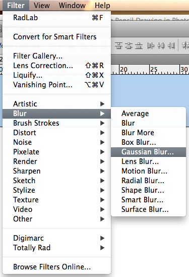
Ok. Next, click on Filter > Blur > Guassian Blur.
Pencil5a

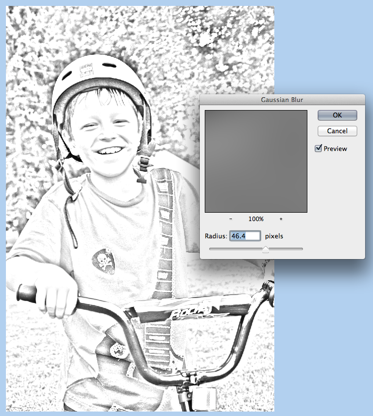
You will move the slider to a lower number, probably between 20-60, depending on your photo. Mine is around 46.
Pencil6

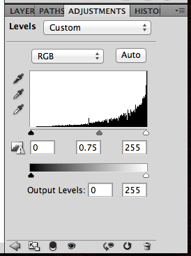
The image lost a lot of it’s detail when we added the blur. We will get some back. Create an Adjustment Layer for Levels. I used the half white/half black circle on the bottom of the Layers Palette to do this step.
Pencil6a

Now, choose the middle triangle under the chart. Slide it to the right. It will change the image, so watch and slide at the same time. It will bring some of the detail back
Pencil7

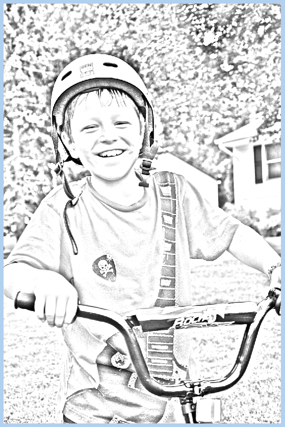
Here is what my image looks like at this point.

Pencil7a

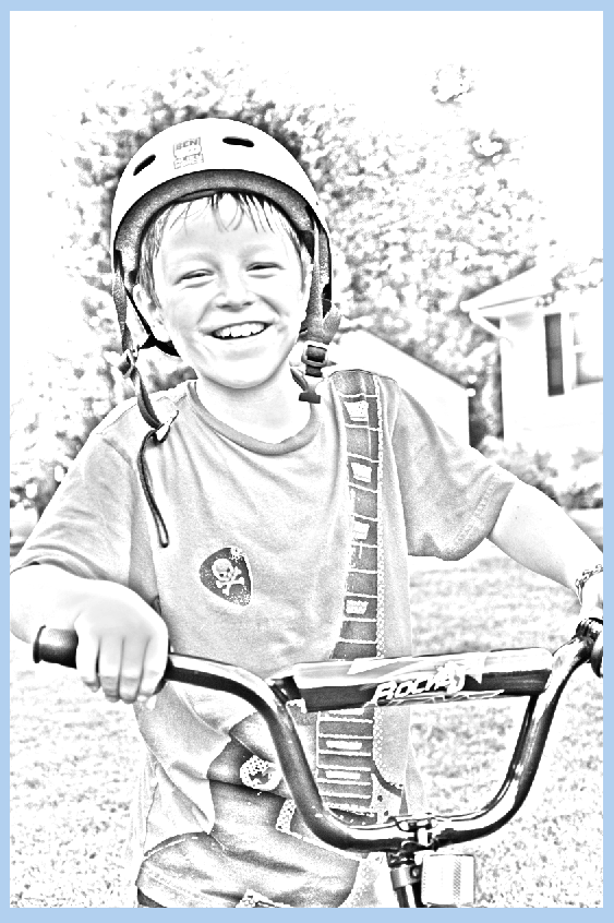
I feel that the surrounding area takes away from him, so I’m going to bring a little more focus to the image. Select the layer just under the Levels Adjustment. Press D to change your foreground and background colors to the default setting.

Now, choose the Brush Tool, and use a Soft Round Brush, and you will paint with the foreground color, black. Mine is at a size of 715, and I originally had the opacity at 20%. As I worked with the brush, I lowered it to 5%. Play with this and your image. If you have erased too much, just switch up your brush color to white, and you can fix where you erased too much of the image. (For PSE Users, Krista said that for some reason she had to use the white to erase the background. When she used black it made the background black).
Pencil8

Here is what I ended up with. You can merge the layers and save them. Then you can use it for your layouts – framed images, polaroid versions, or blend it into the background. Have fun!
Pencil8a

Pretty straight forward! It turns out great for such a simple technique. Here is what the CT created.

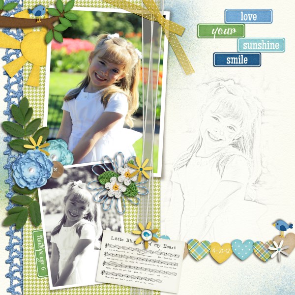
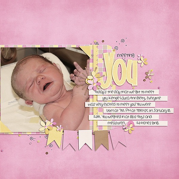
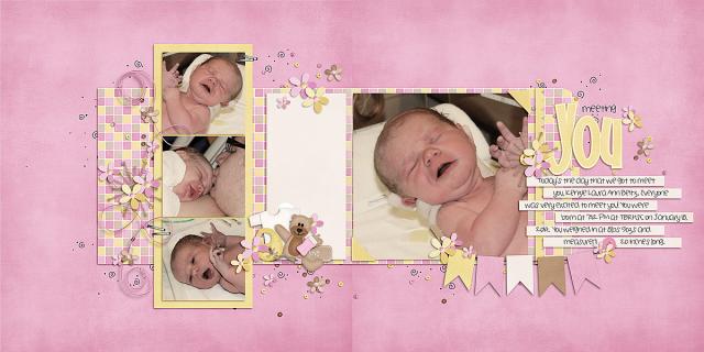
Lisa (kelseyll) created this soft and lovely layout. She used Bluebird On My Shoulder and the Curled Frames.

3-21BluebirdonmyShoulder600x600-1


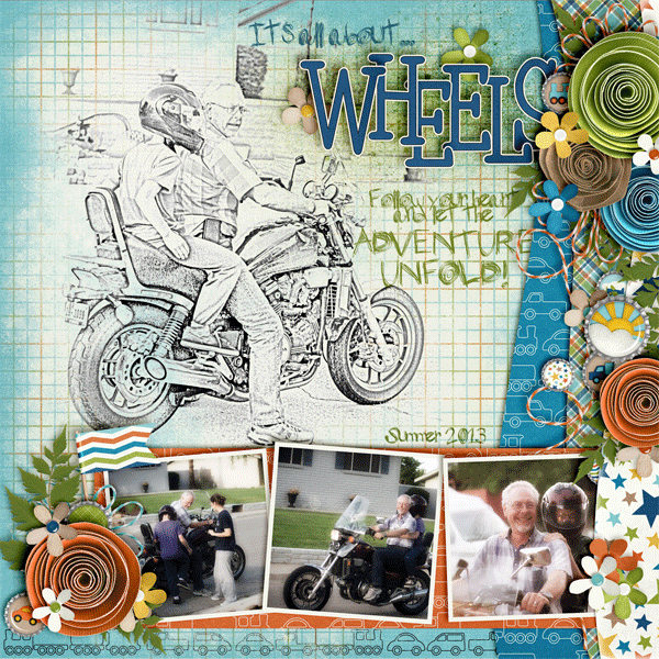
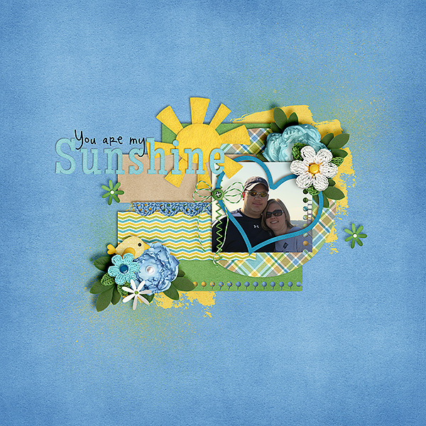
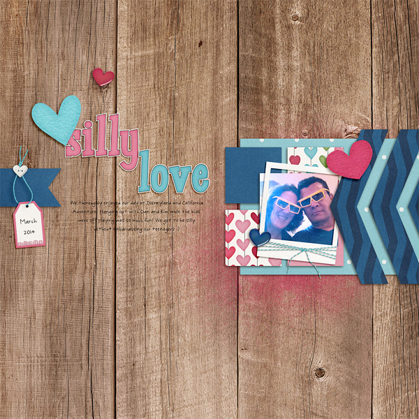
Leah (Cat Lady) made this awesome layout – I think the sketched image is so fun and works so perfectly with that alpha. She used About a Boy and a Fiddle Dee Dee Template.

40937


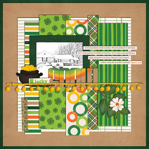
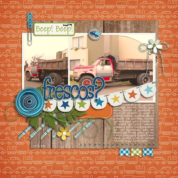
Jenn (jenny) made this fun layout and had the house sketched! She used Lucky Me.

34_2014_luckysnow_600_zpsd8c0cb18

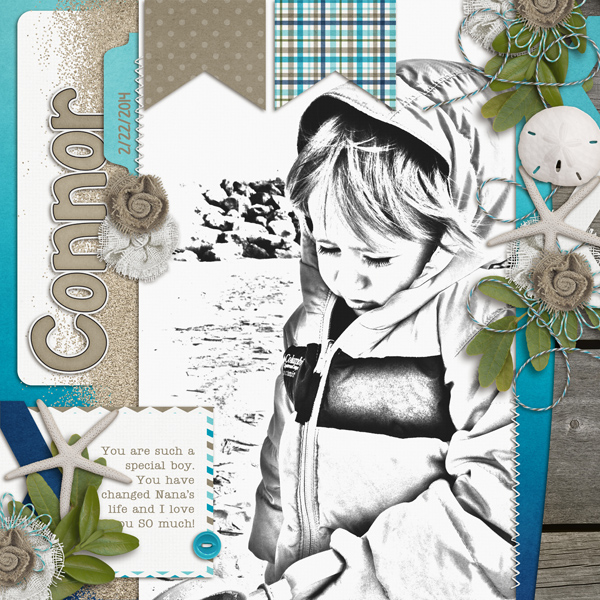
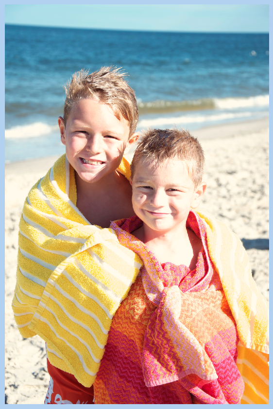
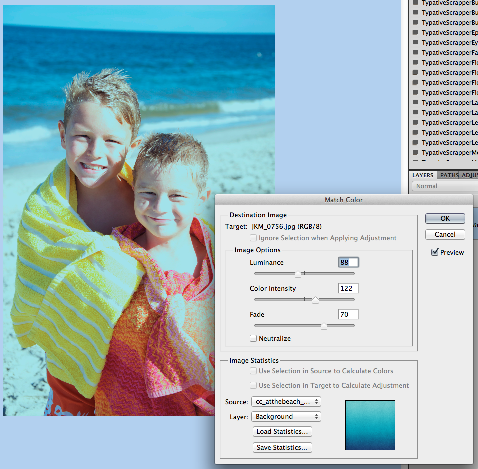
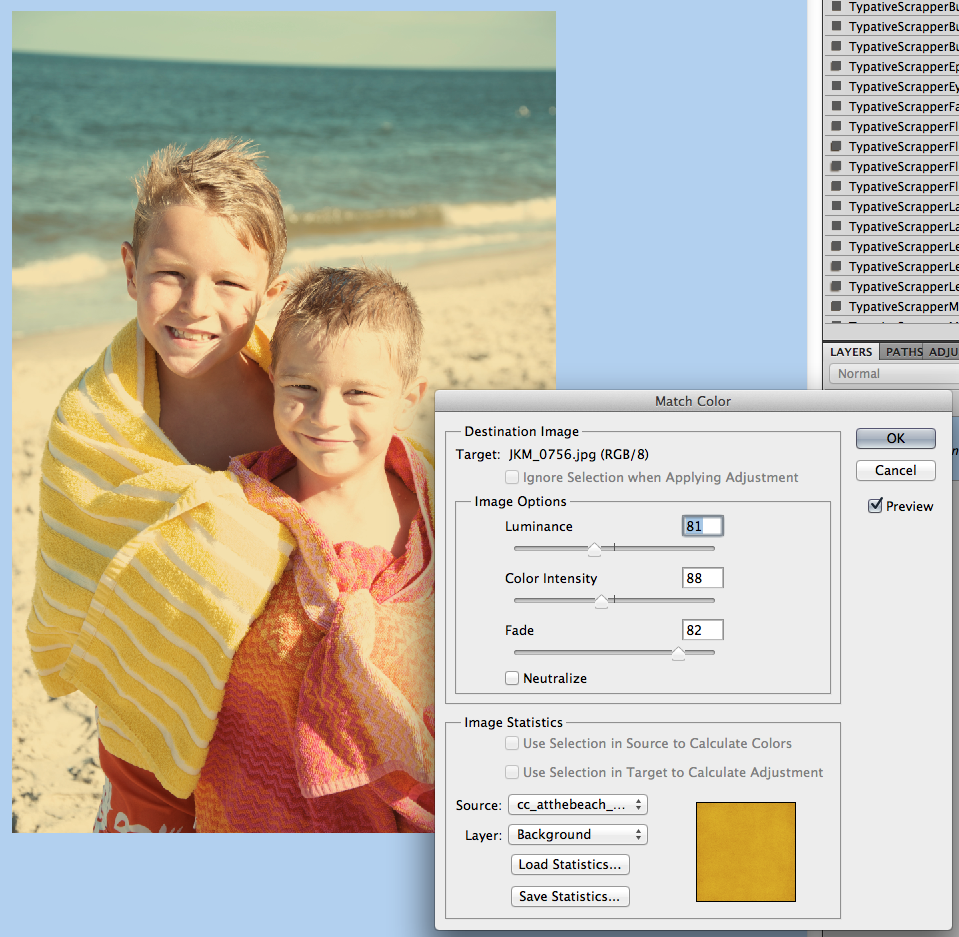
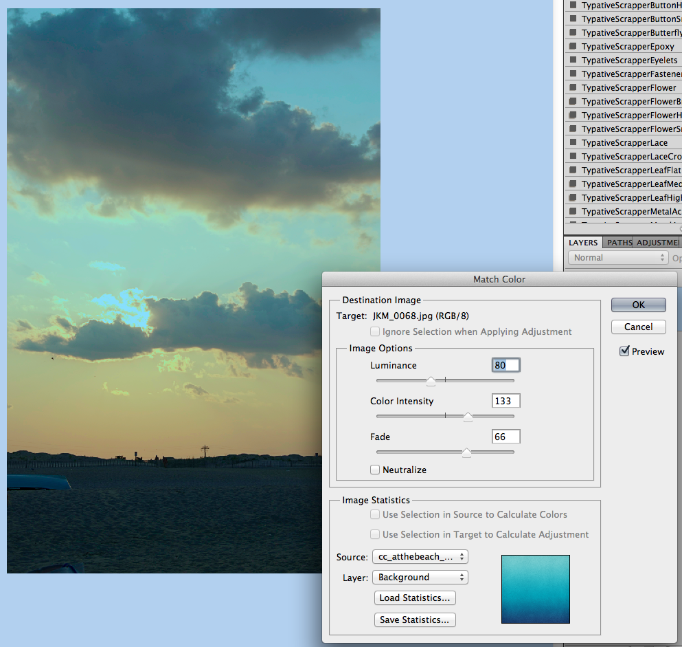
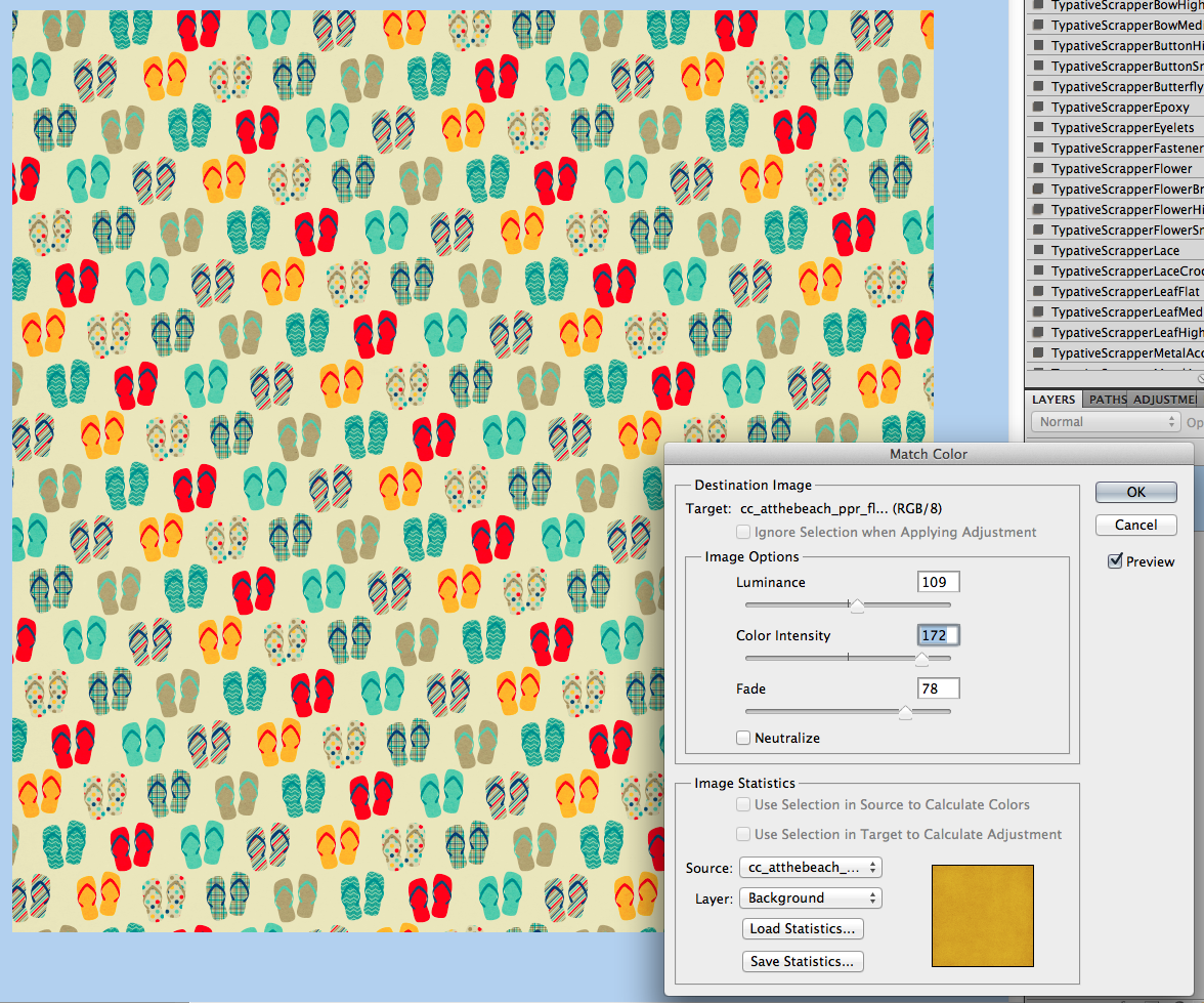
Krista (kc71595) made this layout and the sketched image fits perfectly! She used At The Beach and a Little Green Frog Template.

Connor_

Simply too easy for you not to try it out! Have fun and we’d love to see your pages using this Tutorial: Easy PencilSketched Photos in the ScrapPin Galley! Thanks for stopping by!

by_Jenn


Scrap Skills: Using a Large & or Letter

I LOVE using large characters on a digital scrapbooking page, don’t you? Chelle’s Creative Team members have been making pages with such features to inspire us. Let’s take a look!

First, Kimberly used a font on her computer for her “&”. She sized the font up to around 200, simplified the layer, and then adjusted size with the aspect ratio turned OFF to make the letter a little more customized. She also recolored the sunburst paper using a hue/saturation adjustment layer. She used Chelle’s At the Park kit for her page. 2013_08_Cheer-Jump_zps77e56e29

Next, Jan used a large “&” in her title. She used Chelle’s Lovin’ from the Oven and the matching {stripes & plaids} for her page about a delicious treat at a very magical place. I love the way she made the “&” stand out by making it larger than the other letters in the title. sweetampyummy

Heather used a large “C” for emphasis on her page since the page was about making cupcakes with her daughter. I love the fun feel of her page and the way the elements seem to pop off the page.heatherC

Finally, Jenn wasted no time in making a page about her son’s pi day birthday this year. You know, it was ONLY last week – way to go Jenn! She used Chelle’s One Year Older to make her page, and she used her son’s age as the large numbers on the page. I absolutely adore the way the numbers look like tissue paper stapled and stitched to the page.  32_2014_12BDAY_600_zpsc3554584

Feeling inspired? If you make a page with Chelle’s kits and this technique, be sure to post it to the gallery at Scrap Orchard and tag your page with #chelle. I would love to see it and leave you some love.

by_Cheryl

3.6 Tutorial: Cross Photo Coloring

3.6 Tutorial: Cross Photo Coloring

Hello, Hello and happy Thursday! How are you all doing? Is this week flying by for you? It is for me, and I’m enjoying the almost 40 degree weather this week… definitely better than the teens, wind chill, and snow! This is Jenn, aka jk703, and I’m here to share a tutorial that you can use on photos and on your digital papers! It’s pretty versatile and fun… oh, and super easy too! Now, this isn’t available in PSE, but my fellow awesome team members figured out a work around that works similarly. We’re trying to cover the bases so everyone has a way to try it out! Yay!

Have you ever had pictures that you wanted to use with a certain kit… but the colors didn’t quite match well enough? I’ve got a solution for you, and it’s super easy! While I am a huge fan of actions and photo editing, (especially RadLab), this is an easy fix to use your photos with whatever kit you’d like – and have them look good together! It’s called Cross Photo Coloring – at least, that’s what I call it. :)
One of the best things about this nifty trick is the whole matchy matchy feel your photos have after doing this technique. Think about it. You’ve been to a party or at a BBQ, you take loads of pictures, and then when you look at them, the lighting isn’t always the same, or the tone doesn’t seem to match. By using the Match photos, and using a base photo or a base paper, you can tie them all together nicely.
First, here is my image. It’s my boys at the beach and my camera settings were off, so the coloring wasn’t how I’d like. But, still a great picture. For my example, I’m using At The Beach kit. (lol!) Before you go further, open a couple pictures and a few sheets of paper in photoshop. To start, all in their own tab – I believe there is a way you can do these same steps using selections and working with the layers, but I have not tested it. Oh… and it’s ok to mix solids, or even patterns. Whatever you prefer. Remember, you could even do this to papers too – the possibilites are endless! Let’s Cross Photo Color IZE it! :)Cross Color 1But, what if I wanted a little cooler to teal tint to the picture. Easy! Ok. You should be “in” the image that you want to color change, and that should be the selected in the Layer’s Palette. Click on Image > Adjustments > Match Color.Cross Color 2A pop up menu will appear. Towards the bottom, there is a click down to choose the “Source.” The Source is where you will be getting the color from to add to the original picture.

Cross Color 3

Right now, I chose a gradient paper from the At The Beach Kit. My image will instantly turn a tint of teal. Like this:

Cross Color 4

Now, I play with the sliders to change up the color. The sliders are Luminance, Color Intensity and Fade.
Luminance – adjusting to the left makes it darker, while sliding it to the right makes it lighter.
Color Intensity – adjusting to the left makes the color range smaller, while sliding to the right will add to the range and intensify the color.
Fade – sliding will determine how much of an adjustment you will have. To the left is a straight color adjustment, while to the right fades the color adjustment.

You can see my adjustments and sliders here. Gives it a cool look, and adds to the scenery.

Cross Color 5

Here is the same image, but with the golden yellow paper, as well as the sliders and settings I settled at. Makes a warmer image and again, it’s still adding to the scenery. See how the same image can work and totally change the photo with each color match!

Cross Color 6

Another example, a sunset:

Cross Color 7

Image, sliders and outcome with the Teal Paper:

Cross Color 8

Image, sliders and outcome with the FLIP FLOP paper! Check it out! I really think this cross photo coloring is my favorite! Who would have thought flip flops would do this! :)

Cross Color 9

Image, sliders and outcome with the yellow paper:

Cross Color 10

Now… two other things you can do….

Combine images… here, I’ve combined the boys with the sunset, and moved the sliders some.

Cross Color 11

Combine papers… here, I’ve combined the flip flop paper with the teal and yellow papers, and how I changed each slider:
Cross Color 12

Cross Color 13

Now, here is what the CT came up with! They really helped me out to find an alternative to the Photoshop way! Thanks ladies!

Roxana (roxanamdm) used 2 pictures and the wheels2_orange paper on the BG from About a Boy to match the color, then moved the sliders to 100-88-68.

tiport10

Karen (Zippyoh) said that she uses PSE 11, and for the photo she added the following: Filter > Adjustments > Photo Filter, and from the drop down menu chose the color yellow because of the yellows in my LO. Kit used is Bluebird on My Shoulders and a template from Little Green Frog.

bluebird600

Now, I know we all have different ways of achieving the perfect look for our pages, so Melissa showed us an action that she uses for a similar effect. She used used a free PSE Action called, Coffeeshop Faded Daydreams. Which lightens the photo and adds a yellow and pink colour to the photo :) It can be located here: http://www.thecoffeeshopblog.com/200…se-action.html She said that the filter gave a softness to the photo and gave uniform-ness to the photos as well to make them match better. I believe she used Beary Cute Baby Girl.

Meeting-You-RS_zps06bb9e96

Meeting-You-Both_zps4266e2f3

Tammy (craftytam) said that she followed the Filter > Adjustments > Photo Filter to adjusted the blues on her layout. She used Love Grows, CU Tag Ties, About a Boy & a template from Little Green Frog.

Silly-Love_zpsb2e970eb

That’s it! Lots of great info and such a great way to scrap with whatever kit you like! I’d love to see how you use this tutorial and add a Cross Photo Coloring to your photos – link us up! Hope this was something fun!

Thanks for visiting!

by_Jenn


In Stitches

I’ve been thinking about the various ways to use stitches on a digital scrapbooking page. Chelle’s Creations Creative Team members have played with her stitches and have some great pages to share with us.

Check out what Jenny did with stitching. She used Chelle’s Gone Fishin’ Kit, and she used the included stitches to anchor her papers to the page and frame the main section. I love the way she mixed straight and zigzag stitching, too. 39922

Did you know Chelle has some stitched creations in the market separate from kits? Leah used Chelle’s Stitch Me Up Grids with lots of Chelle’s other products. Added to the Oh Snap kit were some banners, and flowers, and she used the Stitch Me up Grids as a backdrop for all the goodies on the page. 40051

Finally, Jan made some custom stitching for her page using Chelle’s stitches included in the Yeehaw Bundle. She took the small length of tan stitches and made them into one long seam, then made it into double rows of stitching to frame her page. It’s a creative way to mimic the stitching on jeans, so it’s an adorable addition to the denim paper background. Way to go, Jan!billyhill

Stitches are included in most kits, but if you want to add that extra sewn emphasis, you could also use Chelle’s Stitch Me Up Grids like Leah did or the Stitch Me Up Frames, also in the market. Do you have a creative way to use Chelle’s stitches? Upload you page to the gallery at Scrap Orchard and tag your page with #chelle. I would love to see what you’ve done.

by_Cheryl

Ideas & Resources: Printed Guest Book

Ideas & Resources: Printed Guest Book

Hi Everyone! I’m here on one of my off weeks – this is Jenn, jk703! I used to be super duper crafty, but after kids, I lost interest in the glue and all the clean up! That’s when I became obsessed with digital scrapbooking! Recently, I did something that I’ve never done before! So, today, I’m going to share my story – Ideas & Resources: Printed Guest Book!

I’ve been scrapping for a few years now, and have printed my digital pages.  I was thrown for a loop when I was asked IF I could create a special gift for my husband’s cousin. A Guest Book for her wedding. Hmmm….I needed to create a masterpiece! Well, I took on that challenge and it was a bit of a stumble for me to start.  I scrap 12×12, but the book was going to be 8.5 x 11. I was limited on the pages, and what pictures would be included. What really through me for a loop was that I was scrapping for someone else, and I was completely worried she wouldn’t like our gift! But, after working hard, getting feedback, I loved the book! I’ve only included a few of the pages here, but I wasn’t disappointed in the least! I even mentioned and shared my Album with Liz of Scrapping with Liz, so maybe in the future there might be templates available. Check this out!

I’ve tried to share the photos with allowing for some privacy, so I added the information to the pages. Hope you understand. This was a Lay Flat printed book from My Publisher. First page uses Love Grows.

GuestBook1


I lightened this picture up a little, just to show the detail. I added initials inside the little heart stamp. Just to add a little personal touch. Kit: Love Grows.

GuestBook2

This page was a bit tough for me to create, only since I wanted to have the writing lines on each side, as well as keeping the couple intact. I was trying to mix up the formats of the pages, and it worked perfectly in the end. Kit for this page is Traveler.

GuestBook3

This next page uses In The Backyard. Working with the photos and colors, this one really was a fun page.


GuestBook4

Here is a detail shot of the dandelion seeds that are on the lined side of the page. Faint, but I didn’t want to distract form the message being left.

GuestBook5


Trying to make the book continuous, yet different for every page depended on the coloring of the photos and what layout I finally settled on. I did’t want every page to be creme or pale colors, so I tried to mix up the colors. Kit Used: Toil and Trouble.

GuestBook6

Close up of how the printing for the lay Flat book worked. I was worried, but they turned out awesome!

GuestBook7

Another page with some details, but mainly the photos take center stage. Kit Used: Apple Of My Eye.

GuestBook8

Close Up of the flower and burlap.

GuestBook9


There you have it… Ideas & Resources: Printed Guest Book. I loved the book so much, that I wanted to keep a copy for myself! I was so excited when they were delivered!

Oh… She LOVED the book, and so many people commented on it at her wedding. To me, and to her family! It was a special, one of a kind item that she can treasure.

by_Jenn


Using Paint Splats

Here’s a fun thing to do on your digital scrapbooking pages: use paint splats! Lots of kits and collections come with paint splats and splatters. Chelle’s Creations even has some CU paint splats in the market. Last week, Jenn wrote a blog post about using paint to highlight a title, and today Chelle’s creative team has been playing with different ways to use them on pages.

Jenny used the Apple of My Eye bundle to make her page. She used the paint splats as part of a large cluster of elements highlighting her adorable photos. (I absolutely LOVE that buttoned alpha in the bundle). Apple-Orchard-2013---1_web

Jenn was feeling creative and headed to the bay to take photos on a really cold day. I like that idea! She used At the Beach, and she used the paint splat as a base for her journal tag. 14_2014_cold_600_zps8cf29e6d

Finally, Jennifer used Berry Berry Sweet to make a birthday page, and she used Chelle’s CU Paint Splats to show you how to add them to a page. They are very versatile being easily recolored to match any kit. 39456

Digital paint – so much less messy than the real stuff, and yet it still feels like playing with paint when I add it to my page! Have you tried it? I think you’ll agree with me, if you do.

by_Cheryl

Scrap Skills: Arrows

I love to see arrows on a digital scrapbooking page. They let me know what is important on the page or the direction my eye should follow. Chelle’s Creations team members have some pages to show you different ways to get the effect of arrows on a page.

First, Jenn used Norlandia and the Norlandia {alphas} by Ziggle Designs and Chelle’s Creations to make her page. The arrows are large chevrons that are part of the Little Green Frog Designs template, and they are placed behind the photos. They create a great flow for the page.   maelstromJenn

Jenny also used a Little Green Frog Designs template and Chelle’s In the Backyard kit for her page. Again, the flow is obvious, and the page is fun to read.37385Jenny

Tammy used Chelle’s newest kit Out of this World for her page. She has chevrons on her page, like the others, but she also has a large curved arrow framing an adorable young Buzz, and there’s another carefully placed arrow pointing to the hero in the top photo launching to infinity and beyond, I’m sure.Buzz-LightcheerTammy

Melissa has made a page with Love Grows, and it’s the perfect kit choice for her sweet little baby girl’s photo. She has used triangle paper pieces to form an arrow pointing to that sweet baby face. sMelissa2ab69382

Finally, Donna has used lots of arrows for her double page layout. On a recent trip along the Blue Ridge Parkway, she took photos of signs she encountered and photos of the views those signs described. On her page, she has used arrows to point from each sign to its respective view. It’s the perfect way to use arrows to help journal. By the way, she used Chelle’s Great Outdoors Bundle and the arrows are from Vrooom! 5183Donna

I hope you’ll consider adding some arrows to your next page. You can use chevrons or triangles instead of actual arrows, or you could even use drawn arrows like the ones in Chelle’s Creations Mark My Words.

by_Cheryl

Double Page Layouts

Several members of Chelle’s Creative Team love to make double pages for digital scrapbooking layouts. I asked them what they liked about it, and several of them, including Chelle, said they like to use lots of photos on the pages and have both sides of the spread be “matchy matchy.” Helen said, “I like that I can scrap lots of photos without having to make them smaller to fit on a single layout or have to ‘ditch’ some off the layout all together.” Besides being cohesive in theme, Melissa also said she prefers to use only a few photos on her pages, so having a double allows her to use more photos and not have a crowded look.

Personally, I like using double page spreads for vacation books when I have lots of great scenery photos that I want to print in large size. Jan must agree with me because she made a double page with some photos from her trip to Yosemite. The views of El Capitan and Half Dome certainly warrant large photo spaces. She used a template by Little Green Frog Designs and Chelle’s kits Let’s Camp S’more and On the Trail. tunnel

Next, Jenny made a double page from photos of a zoo trip. She also used a double template by Little Green Frog Designs, and she used Chelle’s Prehistoric with her Bedrock Alpha. Because she used 2 pages to tell her story, she was able to enlarge her son’s photo on the left side of the page and still have room for photos of the animals at the zoo. MN-Zoo-Dinosaurs-2012_web

Tammy was able to use no less than 9 photos on her layout because she used a double spread, and she was able to show off her little cuties at the beach while still having lots of room for her story and cute elements from Chelle’s At the Beach kit. I love the sand castle in that kit, and it looks great as an anchor to the photos on the left side of the page.First-Beach-Trip_zps7e8ca073

Heather also loves to show lots of photos on the page at time, and family play time at the bay was the perfect reason to do so. She chose to have the title extend across the middle of the page, which works well since several printing companies now offer lay-flat pages with no gutter. She used At the Pool and a template by Little Green Frog Designs. 11991558595_d68fa6caa6_z

Like Jenny, Donna used a double page spread for her zoo pictures so she could include lots of animal photos. She has used a template by Scrapping with Liz and Chelle’s Bluebird on My Shoulder for the main kit and a few elements from Zoopendous and Forrest Friends. Donnas

Finally, Kimberly has a great tip to share with us regarding the making of a double page spread. She started with a template from Fiddle-Dee-Dee Designs and used Chelle’s Anchors Aweigh kit. She also mixed  the use the styles on the template with Chelle’s  Me & My Shadow styles for added elements for a huge time saver. She doesn’t like to see seams on the background papers, and since the papers are generally only large enough for a single page, the combining of papers is necessary for a double. But, Kimberly uses three papers on the background layering the third paper on top in the middle of the spread. Then she blends the outside edges with the eraser tool into the 2 papers behind. That way, no seams show and the background appears to be one long 24 inch paper. 2003_USSHornetfdd_ffLM2_tp5amp6_zps757c3a9a

I hope you’re inspired to double a page now. I know I am!

by_Cheryl

Using Glitter and Glitter Styles

Chelle recently released some new glitter styles and her creative team members have been playing with these and other glitter elements on their digital scrapbooking pages. Take a look!

Jenn used a template by Fiddle Dee Dee Designs (Center of Attention) combined with Chelle’s kit Love Grows and her CU Iridescent Glitter Styles to create her page. She used the glitter styles to add sparkle to a bracket paper shape included in the template and to several hearts used for embellishment around the page. It’s the perfect touch for a page about a favorite princess. dream

Next, Lisa shows us that the glitter styles look fantastic with a snowy page. She used glitter to embellish this magical snow scene she created using Chelle’s Snowlandia kit which is full of sparkly elements. I love the sparkling frames around the photos to draw attention to the focus of the page. She also has a small strip of glitter paper peeking out in the layers at the bottom of the page.1-2SnowlandiaGlitter600x600

If you don’t want to use the glitter styles, or if your program doesn’t allow use of them, you can still add the sparkle. Several of Chelle’s kits come with elements that are glittered for you already. Helen has used one of them for her page. She used Pearly Whites for her creation. This kit includes a glitter frame in three colors, so it makes it quite easy to add a touch of shine to your project. Helen-pearly-white

Finally, Kimberly show us how to add lots of shine and sparkle to a page. In addition to applying the CU Iridescent Glitter Styles to several of the paper mats, Kimberly used a gem from Girlfriend and utilized the same glitter style and CU Metal Style to create different looking centers to the flowers. She also added the purple glitter style to the white stitched border from the kit Mane Event. One great feature of the two styles is that they work nicely with the Me and My Shadow styles. It doesn’t matter which style you apply first. Now take a close look at the silver metal flower in the bottom left cluster on the page. Kimberly used a doodled flower from Girlfriend and added the CU Metal Style to it to totally change the look and add another element of sparkle to her page. 2013_01-evening-of-the-artsLGFD-WWood-SO-PSD_zpsec01f5bb

That’s a lot of bling, right? I’m inspired to dress up my next page as I’m sure you are.

by_Cheryl