5.30 Tutorial: Easy Blend


Hey Everyone!  It’s Jenn, aka jk703 here for a tutorial for you!  Yay!  I love learning new things about my software, as well as showing people a couple of new techniques!  Today, I’m going to do a quick but easy blending technique.

First, open a blank document, a plainish background paper to practice on and a copy of a photo.  When I am working on something, I save it with the title Working Copy, this way I know what I am working on, and can title it will all my used products at a final save.  Plus, by using a copy of a photo, I know the original is always available to me as a backup!

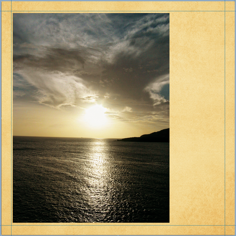
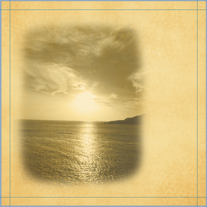
I’ve used Chelle’s Spic n’ Span, along with some added items from the Rainbow Collection for my example, and a template from Scrapping with Liz. The picture from a cruise vacation my family went on in 2007. It is a favorite sunset – and I love taking pictures of nature and landscapes. Here is my photo on top of a paper.

Remember, place your background paper, and then the photo on top.  When placing your photo, place it where you would like the main part of the image to remain.

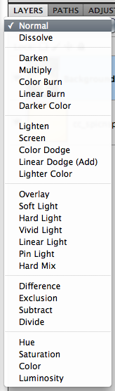
Next, within the Layers Palette, and the photo selected, you can scroll through the different Blend Modes that are available to you in PS or PSE.

To “see” what all the blend modes look like with your picture is to do this:  Choose the layer that will be blended in the Layers palette.  Now, press the Shift key, and use your + and – keys to “scroll” through the different blend modes. How easy and cool is that?!

Next, there are two ways to go about blending. Either erasing first or erasing second. For this example, I am erasing first – but you can choose to flip flop the next few steps.

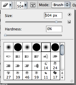
Choosing the Eraser Tool from the Tool Menus, you will choose a large  soft brush. You can change your opacity and flow to dictate how much you will erase, and how drastic it will be with each brush stroke. I lower mine to about 25% when first erasing.  But, with digital scrapbooking, there is always the Undo button, so I am usually not too worried about mistake brush strokes.

Erase away at the edges. Remove the blunt corners, and slowly make the shape that you want to show off from your photo. This may take multiple steps and different opacities while erasing.

Here is what I have so far:

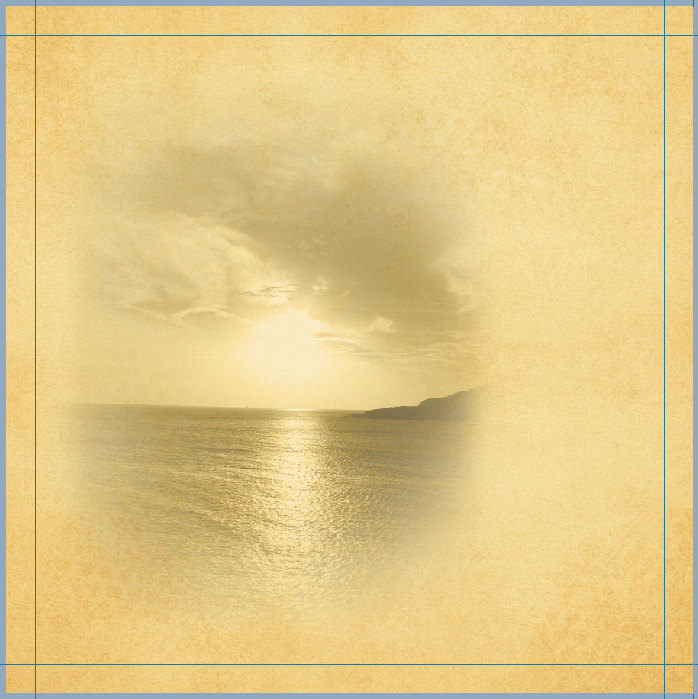
I still think the erasing needs work, and the opacity seems harsh to me. So, I will keep erasing and working on my blend at this point.  After some more brush work, and playing with the blend modes, here is my photo blend.

I really liked the Luminosity blend mode and I also liked the Linear Burn, and Multiply.  Look at them all though – each picture will have a different effect determined by the background paper you choose as well as the picture itself.  Here is the Luminosity blend mode:

At this point, I will duplicate my photo and background paper onto my layout. To do that, all you have to do is highlight both layers in the Layers Palette, and right click. Choose Duplicate Layers, and copy them to the layout that you are working on!

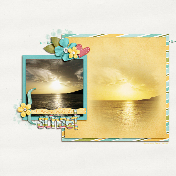
Another fun idea is to combine the blends. Try duplicating the blended photo, and change each layer’s blend mode. You might be surprised what your blended photos look like when mixed with different blend modes!

I ended up layering it, and showing off the original with the blend. I also switched my blend mode. I love this photo and love how the blend really pops with the original photo next to it!

Hoping that was an easy blend tutorial for you!  Thanks for visiting and we hope to see you here again!

Perfect Pairs: Family Tree & Traveler | Digital Scrapbooking Kit Combinations

6/4 Still Aunt Sari…. but I forgot to add 3 of the LO’s from the Creative Team for this blog post.  It was my 45th birthday and I’m planning on using that as my excuse. So, trying again….. Jenn J is up first. I love the string and gear clusters and all the colors of fabric. The background paper makes me think of “Sunday” suits my Mom used to make for my Dad in the late 70s. Looks just like polyester gabardine. Adore the label and the ledger paper.

Kariyn just knocked my socks off. I really need to get on her vacation schedule. The imigrey is beautiful and well, they tell the whole story of that Sunset. Love the Sunset Tag and placement of the butterfly.

_____________

Hi Aunt Sari here. I can’t imagine a better match than these 2 designs by Chelle.  Every one of us eventually came from another city, shire, parrish, state, province, or country. My family tree goes back to England. On my Father’s side of the family, my 4th great grandparents (Chelle’s 5th) 12 of the 16 ancestors came from England. 2 came from Denmark,and 2 from Scotland. On my Mother’s side, 10 of the 16 4th great grandparents were born in England, Leaving 6 born in the USA.

Family History is such a strong part of my life. Chelle’s too. A few years ago for Christmas, Chelle and her Mom purchased histories from the DUP, Daughters Of Utah Pioneers. There’s also a SUP, Sons of Utah Pioneers. Chelle combined and abridged them and made each of her Aunts & Uncle’s a copy of the those merged histories. I love to read them and learn something different each time I do. I’ve also typed histories from some of the ancestor’s. I’ve a scanned copy of Great Grandma Cummings application to the Daughters of the Utah Pioneers. What organizations have your ancestor’s been a part of that you could scrap?

We’ve been blessed to have pictures of 24 of the 32 great-grandparents of my 4th & Chelle’s 5th generation and some from my 5th & Chelle’s 6th great grandparents, we have 5 of 64. I can’t imagine the bravery it took to leave their home and country and migrate to America.

  • 3rd Great Grandma Thornley crossed the plains by walking and ended up with severe frostbite and couldn’t really walk any longer, so her daughter took care of her.
  • Some traveled by steam ships up the Mississippi and then walked across the plains.
  • Some traveled by steam engine trains. The train moved so slowly, the men would get off the train and pick up sagebrush to feed the steam engine. They could easily keep up with the train.
  • 4th Great Grandpa Larsen worked on a ship. His wife died and neighbor’s joined our church and migrated to America. They hadn’t heard from Lars and assumed he had died at sea. It was many years before he and 3rd Great Grandma Christina saw each other.
  • 5th Great Grandpa Cummings was the flag-bearer in the the Mormon Battallion and his son rode for the Pony Express.
  • 4th Great Grandmother Jessop said if she could just get to Utah all would be well. She died just 2 days after arriving in Utah.
  • Some worked in milk barns in England, one was a pugilist, one did tours of Africa, some lost jobs because they chose to join our church.
  • 4th Great Grandfather Thompson migrated to work as a silversmith in Providence, Rhode Island.
  • Almost all of them faced potential Indian troubles when they arrived in Cache Valley, Utah; and lived in Fort’s in their town until it became safe enough to build small log homes.

I think often of those pioneers and Memorial Day has a soft place in my heart because of them. I hope this post will inspire you to scrap those family history stories before they are forgotten.

Here are some layouts on Traveler from the Creative Team. Carol did a super pictorial of her trip. I love the gear & clock borders. Isn’t that street sign yummy? The cathedral is really impressive and the flowers provide a “pop” of color on the page.

Jenn J. provided this example. I love the use of the striped paper, the clusters and how the gears appear next to the “tower.” She did a great job of allowing the paper to separate the sides of the layout.

Ronnie provided this example. How can you not love the clock stamps in the background and the use of the strings. Doesn’t the bracket look good and as if it’s embedded in the book? Very imaginative!

Karen S is my queen for the day! Her LO includes both Family Tree and Traveler. I love the ledger paper with the shading. At the bottom instead of “holes” I almost see “pearl brads.” Maybe I’m fanciful — or more likely–my glasses are dirty! Love the flowers and clusters. Great Job Karen!

Now on to some favorite layouts for Family Tree. They are all so different and I think you could easily add traveler to them. Love how different the styles and compositions are. First is Ophelia. Isn’t the transition from the larger picture down to the lower picture just priceless. The strings, the brackets… Oh my!

Next is Heather. She speaks of her ancestry and how they got started at her father’s Shiva. She also watched NBC’s “Who Do You Think You Are?” That’s one of my favorite shows also. It’s interesting the paths our families take to get us where we are today.

Finally a LO from Roxana. I like the way she used the different elements and inserted so many pictures of her family. I adore the Rose cluster with bling!  Great pics of her hubby and son. That little guy looks like he is having so much fun during the picture taking! Super Job!

Last, here are Chelle’s products that are used in the layouts. See for yourself how well these 2 kits can merge together and bring those memories together.

5.30 Using 2 Alphas in a Title

Sometimes choosing the right title on a page in a digital scrapbooking project takes me as much time as making the entire rest of the layout. I know that a good title will grab the reader’s attention and make him want to linger on my page a little longer, so I struggle with finding the perfect words. And, then when I finally have the perfect phrase for a heading, I place it on the page only to discover that it lost some of its appeal somehow. I have learned from the experts on Chelle’s Creations creative team that I can “highlight” a major word in the title by using a second alpha, and my title will go from getting the job done to being worthy of a Gallery Standout  with just that little bit of help. Check out these examples:

Mary made a page with Chelle’s latest freebie kit iOnline. She used a combination of a small block alpha with a larger felt alpha making the main word much larger in the felt alpha. She chose a neutral color for one alpha and a bold, bright color for the main word alpha. Doing so created a visual line across the top, almost like a border, and it is obvious what subject the writing will address. I hope you will read her story – it’s an awesome look back at her first use of the internet.internetbyuappMary


Ophelia also used 2 alphas on her page. She has used the black alpha from the Kick it! kit, the kit she chose for her entire page, and then she has augmented this with the Wet Paint Alpha. The white letters stand out on the page, and it’s the first thing I noticed when I saw her page. No doubt about the subject of this page, right?  2009-10-23-soccerpractice_smOphelia

Often, digital scrapbooking kits include alphas, but rarely have I seen one with two alphas included, so choosing a coordinating alpha can be a bit tricky. Thankfully, Chelle has created several multipurpose alphas that are staples in my stash. The Wet Paint Alpha is one of those, but she also has the Marker Alpha and the Darling Stitched-a-bet alphas. Look around in Chelle’s Gallery at Scrap Orchard and you will see many more examples of using two or more alphas to make a good title look great.

5.28 Sneak Peek & A Chance to Win!

Hello everyone! Happy Memorial Day to all my American friends. I’m here today to give you sneak peek at what Chelle has coming out this week.

Be sure to check back on Thursday for the full reveal.
You can enter to win this kit in any or all of these ways:
1. Comment on this blog post.
2. Like this Facebook post. Or post about the sneak on your own wall and link it to this blog post.
3. Tweet about the contest.
Remember, since the winner is chosen using a random number generator, be sure to come back and post when you’ve done #2 & #3 each in their own comment.
Deadline: 11:59 PM EST Wednesday.