7.10 Tips: Web Saving – Pop, Sharpen and Save

7.10 Tips: Web Saving – Pop, Sharpen and Save

Can you believe the title of the post? 7.10 Tips: Web Saving – Pop, Sharpen and Save! That date – it’s July already! The year and summer for that matter are flying by fast! It’s Jenn, aka jk703, here to give you a little tutorial for saving your scrapbook pages for gallery uploading. Many things can be done differently, and this is just based on how I complete this process. Once you get the hang of it, you could even record an action, and make it even faster!

Saving has a few steps for me. Saving the .psd as I work, the the final psd, then the print copy and finally the WEB copy. I name them as to what they represent – Working Copy for layouts in progress, PSD copies with kit, font and file info when complete, Print copies have ALBUM Left or Right at the end, and Web copies have WEB on the end. This way, I’ve covered my bases. When saving your files for print, make sure you choose the Quality of 10 (at least) so your pages come out as beautiful as they really are!  Web saving is a little different as you need to lower the dpi as well as the size of the image.

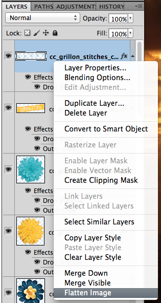
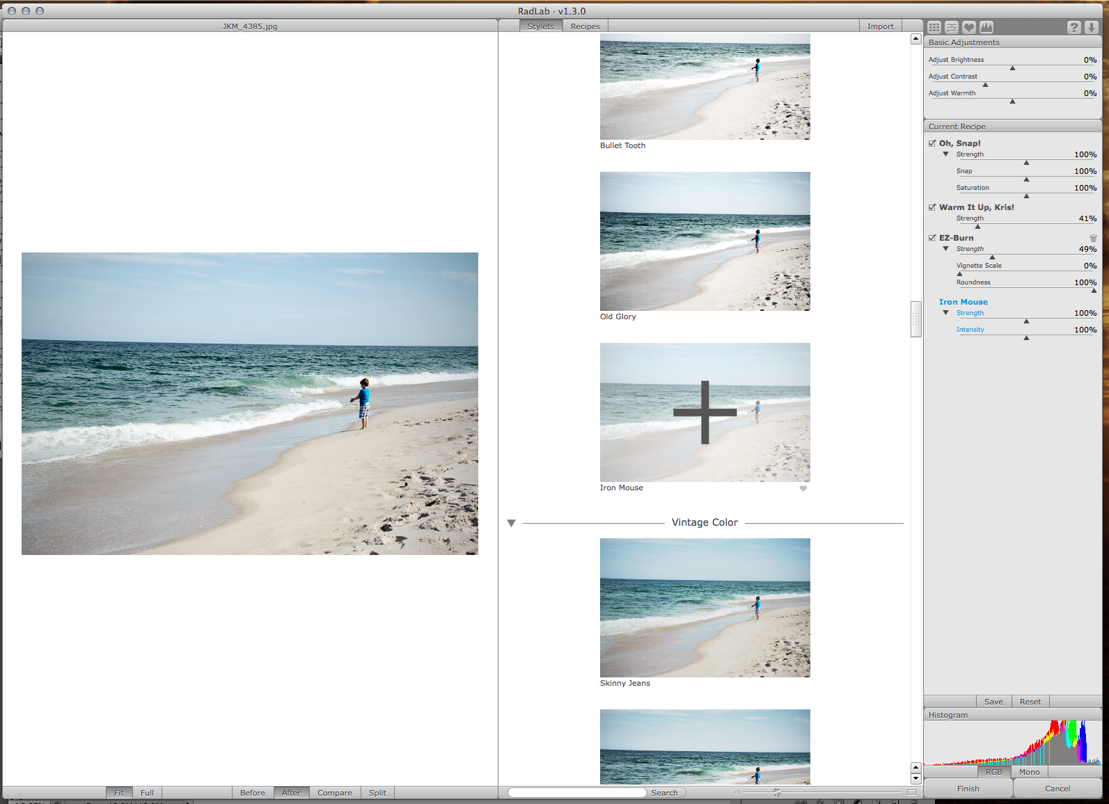
So, you’ve finished your layout and are wondering what to do next to save for the web. First things first, we need to flatten the image, and merge all those pesky layers. Click on the top most layer in the layer palette, and choose Flatten Image.
WEB1

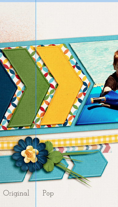
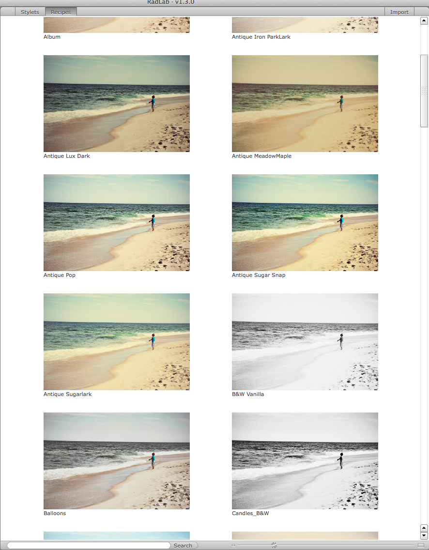
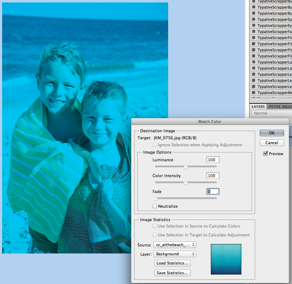
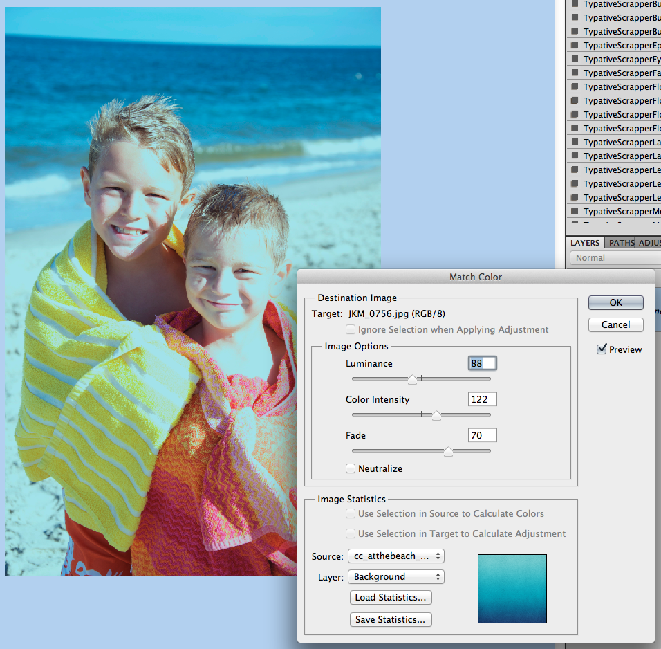
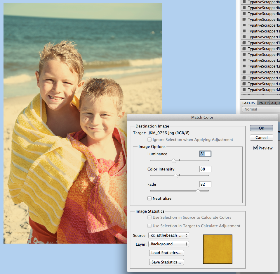
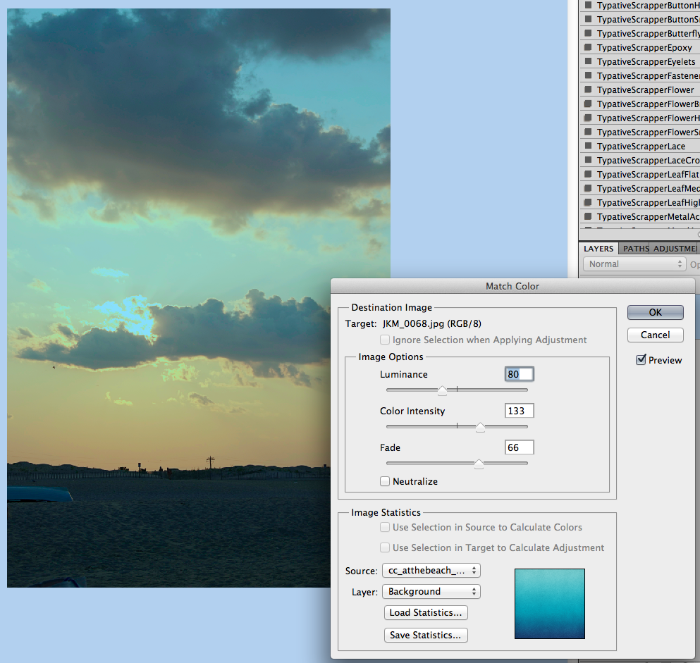
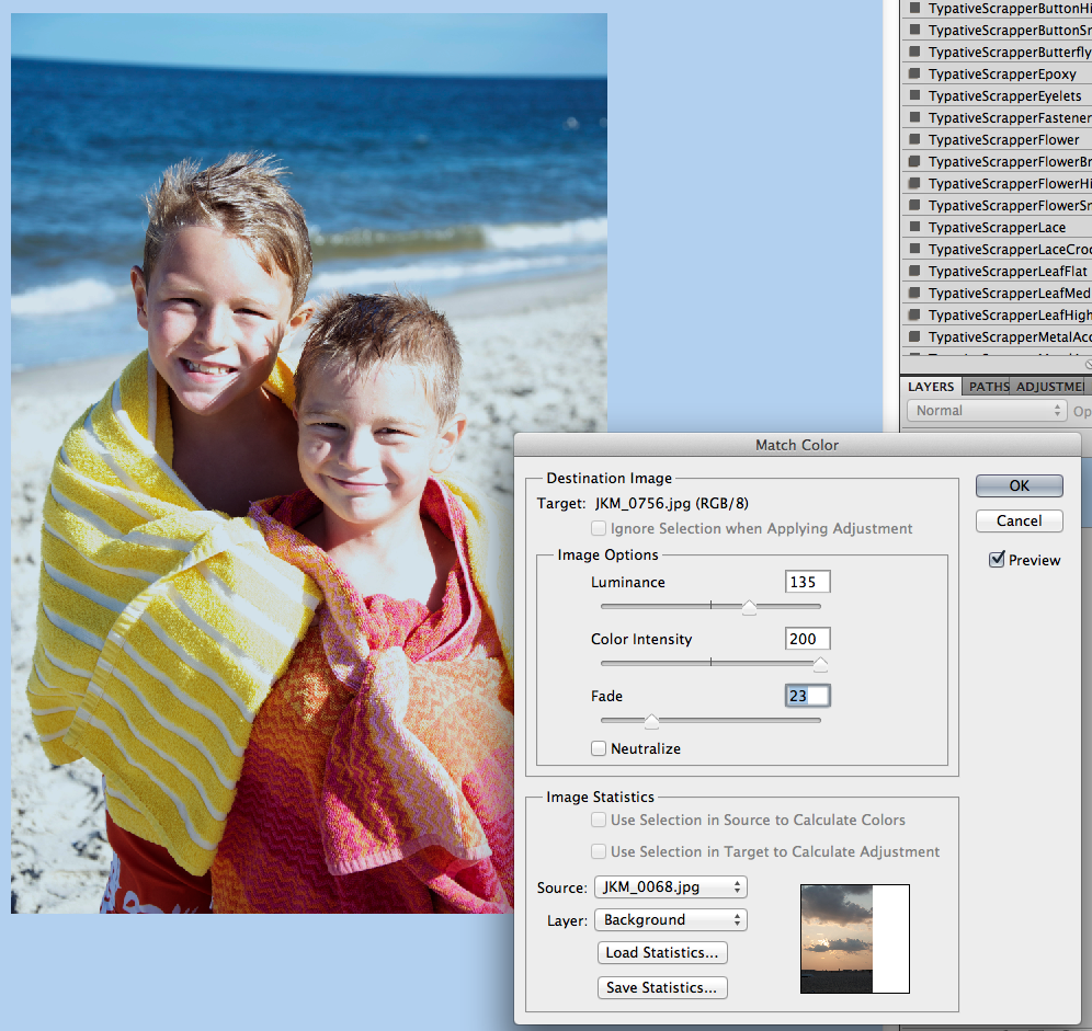
Next, you will make a duplicate of the Background. Right click on the Background layer, and choose Duplicate Layer. For my example, I’ve renamed the duplicate layer “Pop.” I’ve also gone ahead and changed the Blend Mode to Overlay, and lowered the opacity to 20%. Usually my opacity is anywhere between 20 and 80%, depending on the layout and coloring.

WEB2

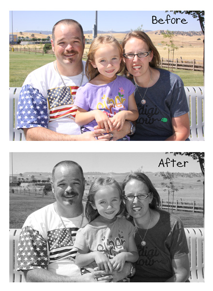
This pop layer give a little pop to your layout colors for uploading to the web. I find that my images don’t seem as bright or sharp when I upload, so I add those two things. Here is the slight difference you can see at 20% for the pop layer. You can see that the white pops a little more than the left side, the green has a little more color, and the flower has a slightly deeper blue.

WEB3

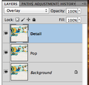
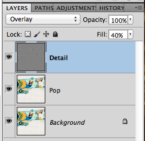
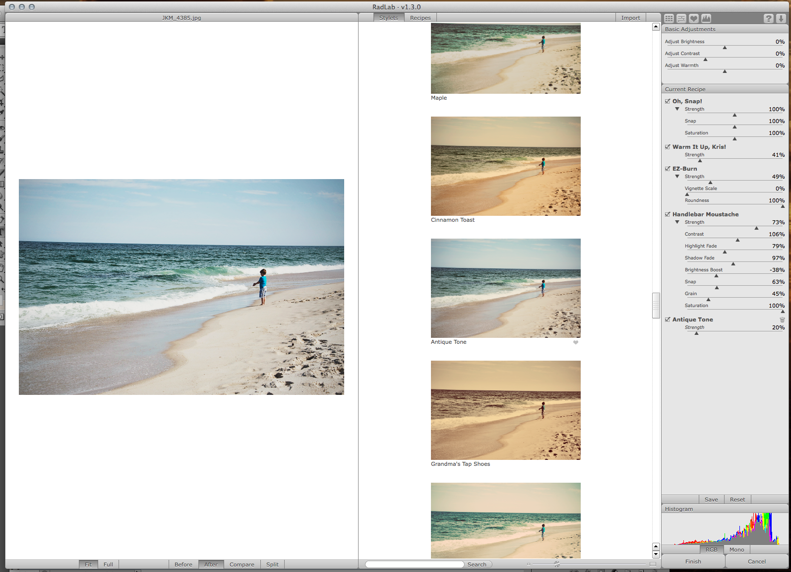
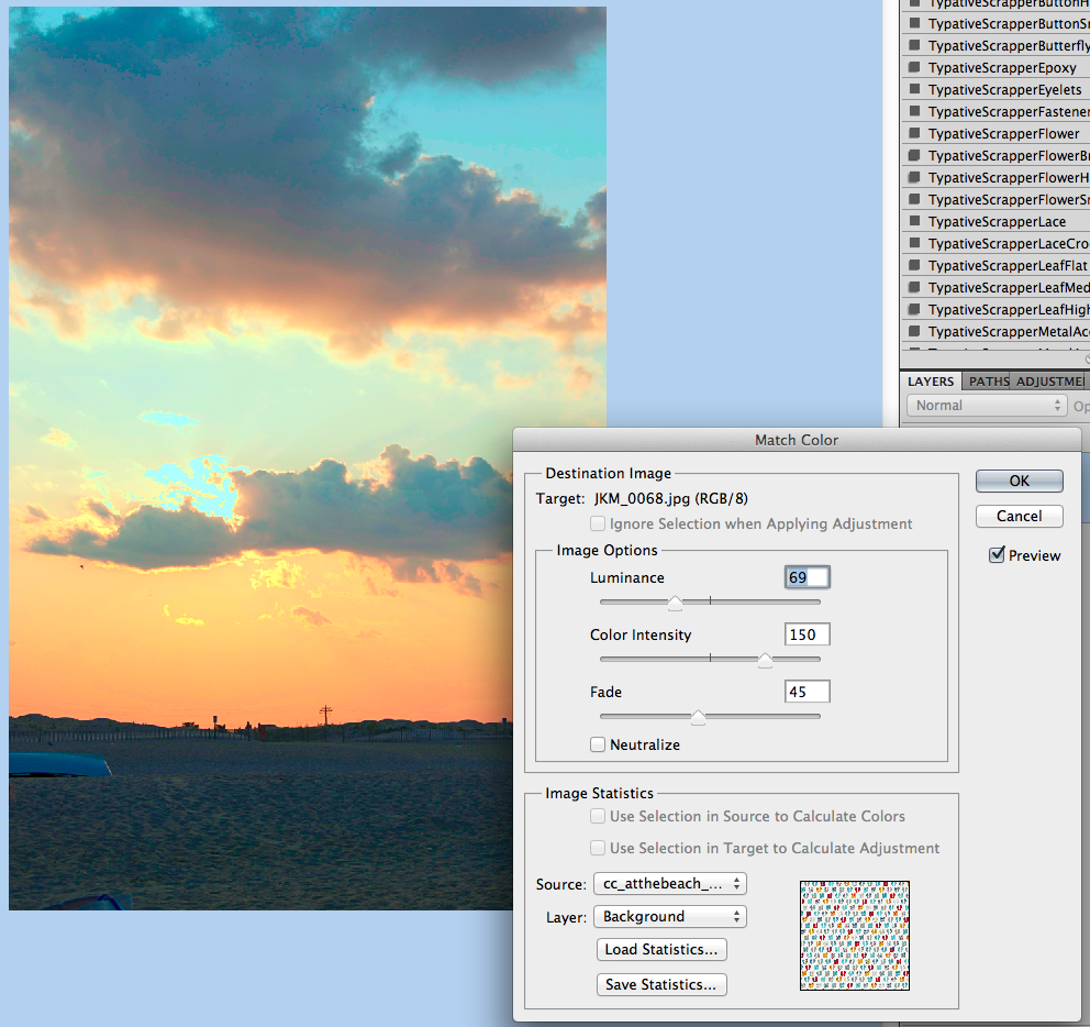
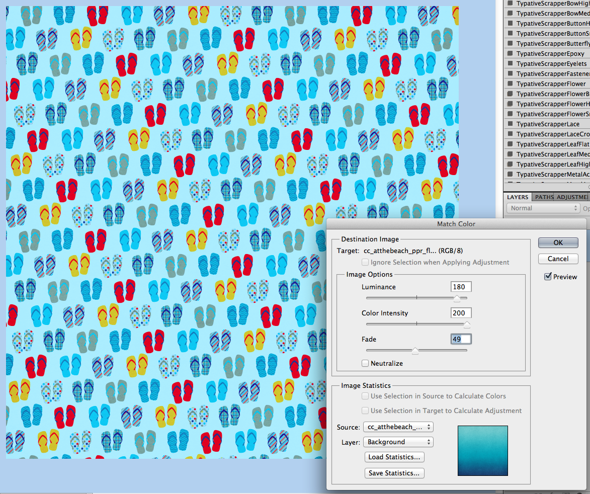
Next, we need to add a little sharpness. You are going to duplicate your Background Layer and move it to the top of the layers palette. I’ve renamed my layer “detail” for this example. Change the blend mode to Overlay. Here are my layers.

WEB4

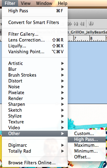
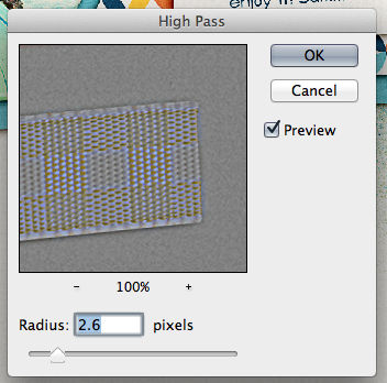
With the “Detail” layer selected, choose Filter > Other > High Pass.

WEB5

A pop up menu will appear. I move the slider to approx 2-4 pixels. It depends on the coloring to determine the amount. For this one, it is set at 2.6. I prefer to have the preview clicked so I can see the details on my larger image.

WEB6

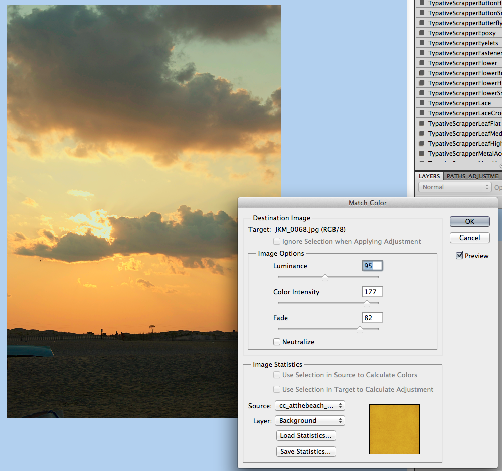
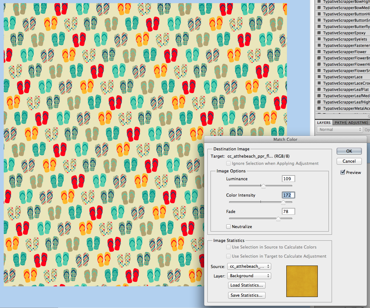
Here is what my layers look like at this point. For the Detail layer, I’ve lowered the opacity to 40%. Watch your page as you move the slider to determine what you like best, and how much detail you want. Sometimes, it can look over exposed, so be sure to look at the whole layout.

WEB7

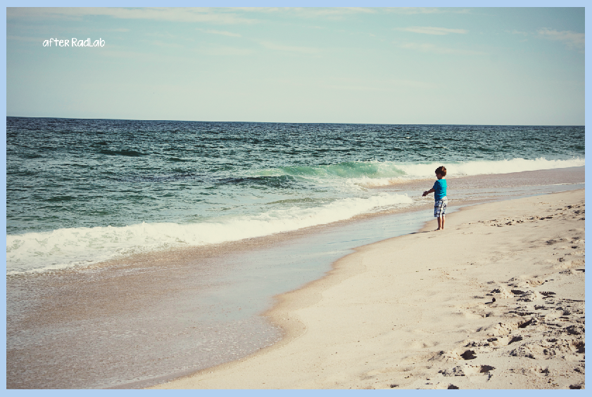
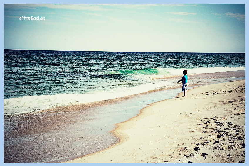
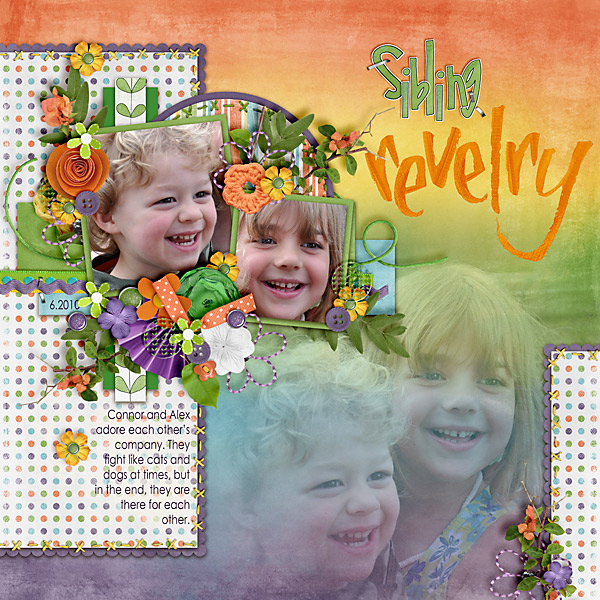
Here are two images that show the difference in detail when using this method. You can see the leaves have a little more detail showing, as well as the papers, and textures. It really makes the page look fantastic. WEB9 WEB8

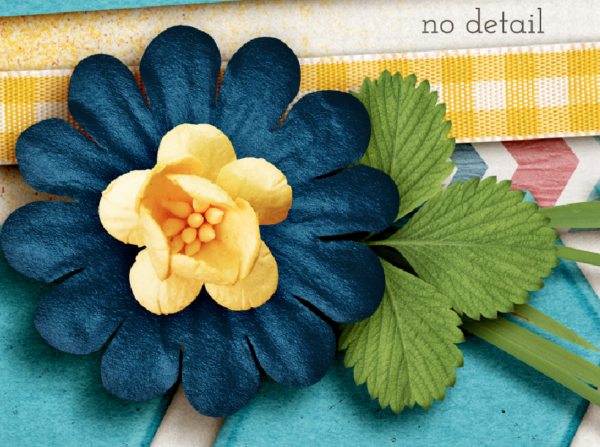
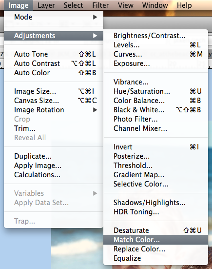
You can also do two other methods for sharpening. They would both be on the original background layer, and you would not need a duplicate/overlay blend mode layer. A straight Filter > Sharpen > Unsharp Mask with Amount approx. 20-150 and radius  approx .01-2. Or you can also choose Filter > Sharpen > Smart Sharpen with the Amount approx 15% – 60% and a radius of .5-2. At this point, you can merge your layers, and then save the file for printing. Be sure to play with the blend modes and opacity to see what you like. What I do is my preference. As you scrap, you will find what pleases your eye. :)

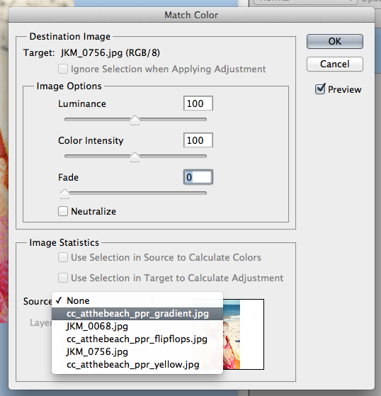
There are two ways you can do the next step. Here is what I think most people do, though I don’t complete this step.

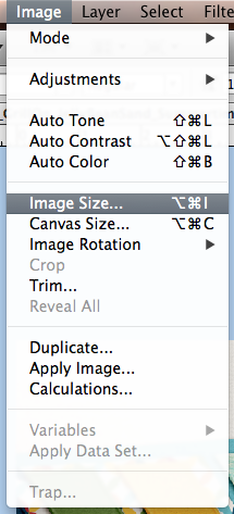
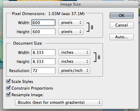
First, click on Image > Image Size.

WEB10a

A menu will pop up and you will want to change the size to 600 x 600, and the dpi to 72.

WEB11a

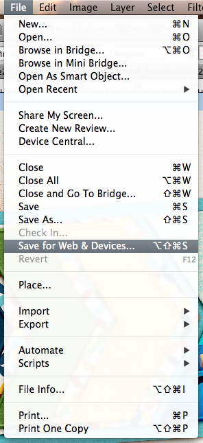
Once you complete this, you are ready to save for the web.  Click on File > Save for Web and Devices.

WEB10

A large pop up will appear. It will be of your layout with a before/after view, and ability to change some settings. You will want to check that the image size is 600 x 600, and we will get the highest quality that we can in the next step.

WEB12

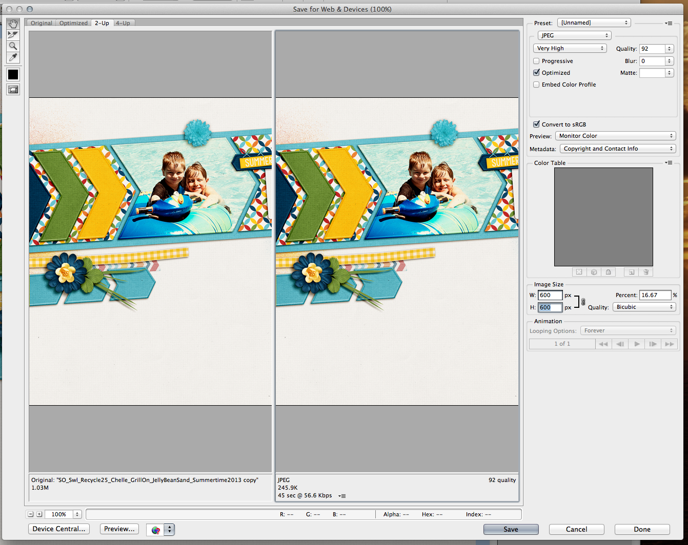
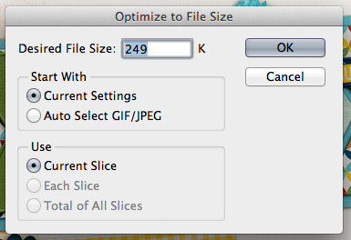
On the screen print below, in the top right corner is a small down arrow and lines next to it. click on this icon. A small pop up will appear, and you want to type in 198 or 249 – whatever the gallery limit is where you upload your images. I use a smaller number than the actual limit so that I don’t go over, and won’t have to repeat these steps. :) After this step, you will click Save, and save your WEB version layout.

WEB13

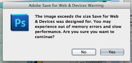
Going back a couple of steps, you might miss a step and hit a snag. If you accidentally get this pop up, don’t worry! Click ok, and let the image load. (This is actually my usual step. I don’t usually re-size before I click on the Save for Web and Devices. )

WEB11b

The same large pop up will appear and, you can adjust your image size here – right in the middle to right side of the pop up. Change it from 3600 to 600 for both areas.

WEB11c

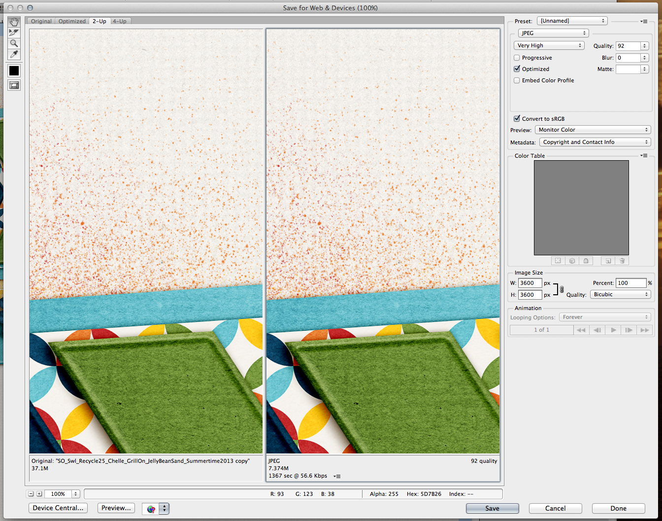
 When you click save, just make sure to at least put WEB so you know this is the WEB version of your layout.

WEB14

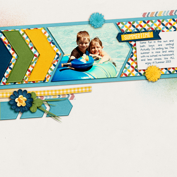
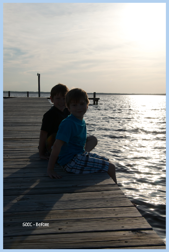
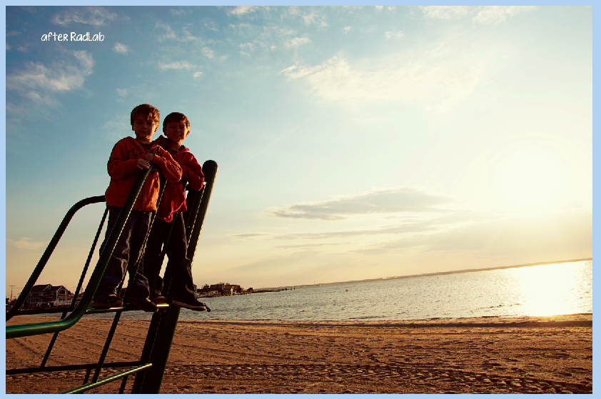
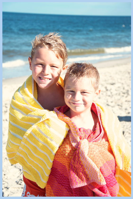
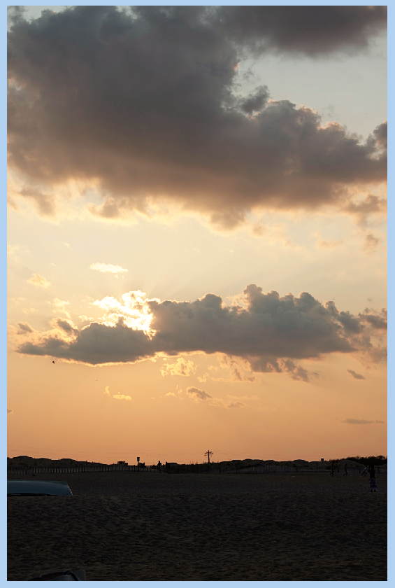
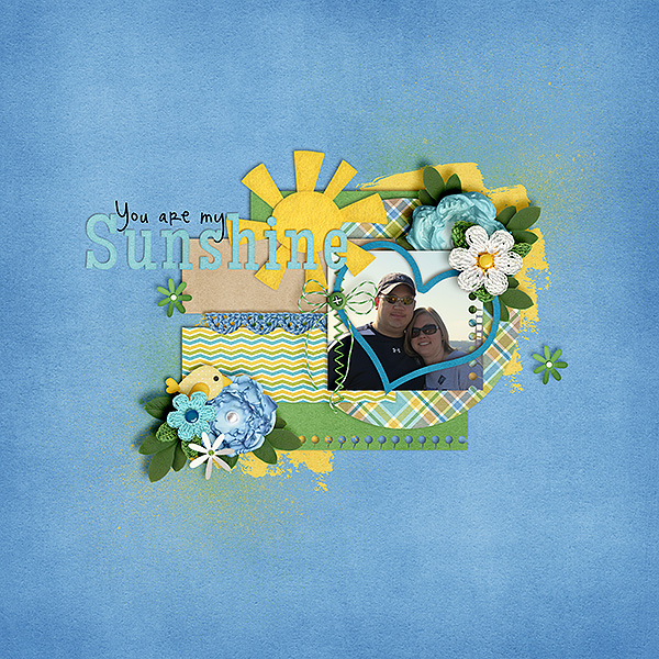
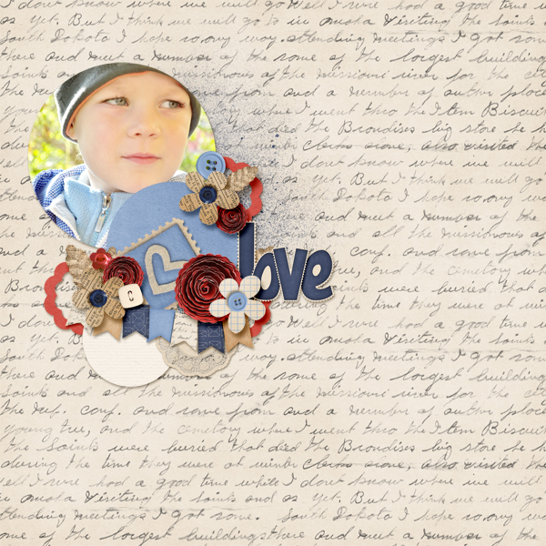
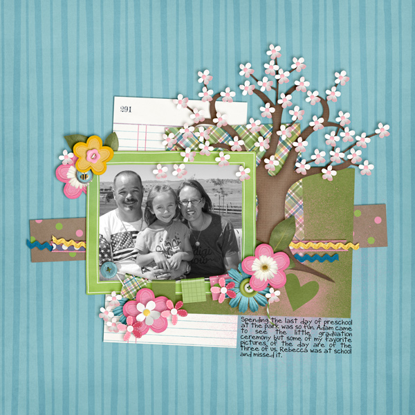
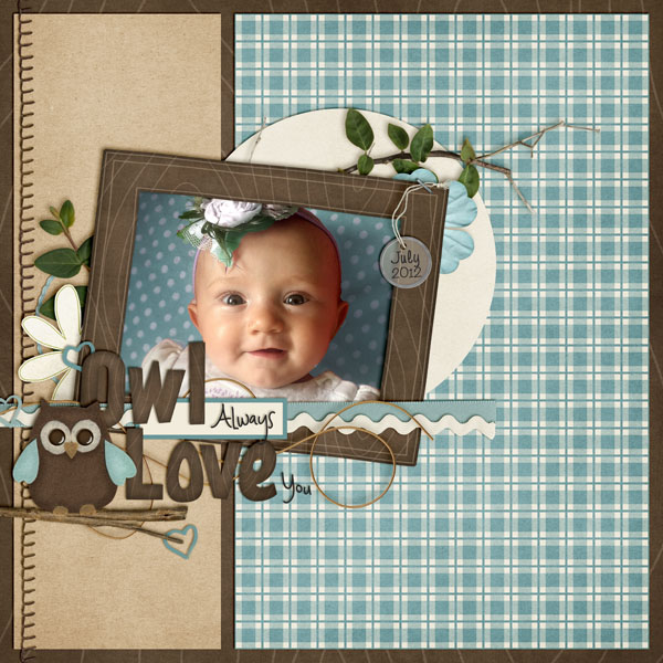
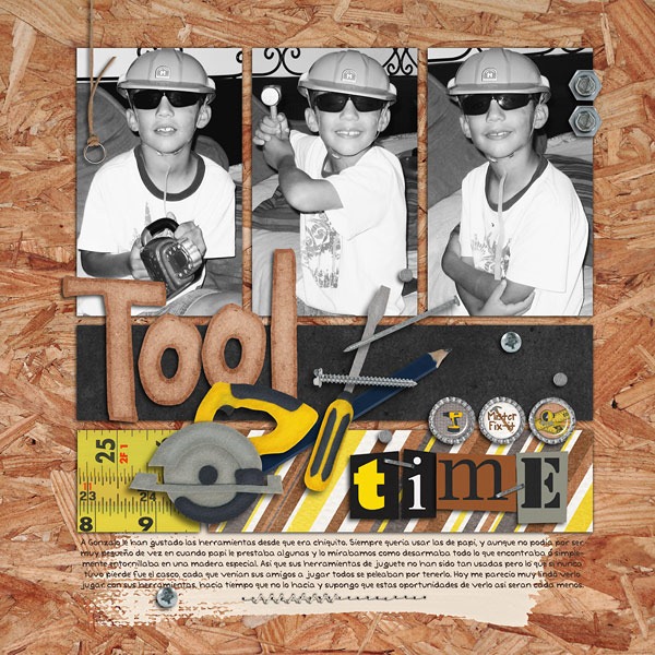
Here is my web sized layout – after. My layout uses Chelle’s Grill On kit, Scrapping with Liz Recyclables 25, and the font is Jelly Bean Sandwich. Fun kit and super versatile!

SO_Swl_Recycle25_Chelle_GrillOn_JellyBeanSand_Summertime2013_WEB


Lisa (kelseyll) also shared some wonderful information from her scrapping experience:

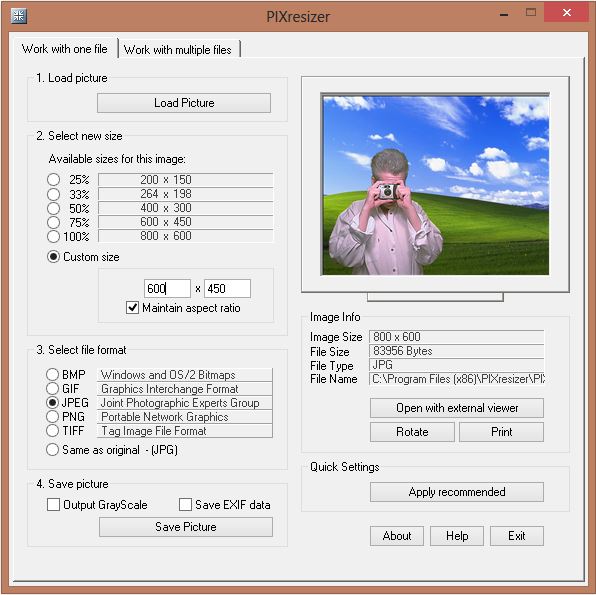
I didn’t start out digitally scrapping in PS so all the “save for web” tutorials I saw didn’t work with my program. When I first starting uploading to galleries and doing CT work I discovered PIXresizer, which is super easy to use. Even though I have PS now, I still use it! After downloading, unzipping and installing you are ready to go. I like that you can do an individual file OR a whole folder of images at once –  and it is really fast. You can quickly change what final dimension you need and even change what format it will be saved as. I simply upload my 12×12 (3600×3600) layout by clicking “Load Picture”. I change the custom size to 600×600 and hit “Save Picture” and select where I want it saved. If I need multiple preview sizes for my designs for advertising I just go back and change the custom size and “Save Picture” again. For my photography, I can click the other tab at the top, “Work with multiple files” and navigate to a folder from a photoshoot and resize the entire folder in seconds. I honestly can’t compare it to other “save for web” actions, or scripts because I’ve never veered from PIXresizer and being a SAHM now, I couldn’t beat free!


Here is a screen shot of the software she uses:

PIXresizer

That’s everything for saving your layout for the Web. Hope you got some great tips and pointers here from my post today – 7.10Tips: Web Saving – Pop, Sharpen and Save.

Have a great week and thanks for stopping by!

by_Jenn

5.29: RadLab – Simple Photo Editing

5.29: RadLab – Simple Photo Editing

Hi Everyone! This is Jenn (jk703) back for my end of the month visit! I’m super excited about my post for today! First, I can’t believe the title of the post is 5.29: RadLab – Simple Photo Editing – because that mean’s it really is almost June! How did half a year go by so quickly! Then to top it off, I get to chat with you about RadLab! This is a super duper easy editing function for Photoshop and Photoshop Elements. So… let’s jump in!

Ok. So, some of you have never heard of RadLab. To me, it is an easy way to edit my photos. Going a step further, I would add that it is similar photo editing as if I were using actions, BUT there is one major difference. RadLab allows you to run over 75 actions in one moment, and each and every option is customizable. What?! Yes!!! It’s super fast, and luckily for me, works on the basis of actually seeing the outcome before making the editing decision. RadLab has preset “recipes” that you can click on to instantly edit your photo. Then, there is the option for you to create your own recipes, and save them to use again for later. Or, better yet, you can share your recipes with other RadLab users! Pretty cool, right?! The folks at Totally Rad even give away free ones on their FB page and at the website!

At the end of this post, I will link up for the free trial version, the all out buy version, Totally Rad tutorials, Totally Rad Freebie Recipes, and FREE Recipes from me! Yay! Give the page a minute to load, you won’t want to miss the photo details. :)

Now, time to see this super duper plug-in in action. I’ve chosen some pictures of my boys recently at the Jersey Shore. I’m excited for the summer and excited to spend my weekends at the beach hanging out with friends and family! Here is my first picture – a dark but sun filled bayside picture.

Note: Click on an image if you would like to see it bigger or some of the details.

RL1

Now, I’ve set up my RadLab with a keyboard shortcut since I use it so often. Mine is Command+1. You could set yours up for anything you want. You can also find the plug in under Filter > RadLab. (Easy, right?! LOL!)

RL2

Once clicked, a BIG screen will appear. It looks like this – well, without the typed words. :)

RL3 copy

You can change the preview to fit your picture, show both before and after, or even just the end result. I’ve scrolled through the pre-loaded recipes, and picked multiple for this image. I’ve adjusted each individual recipe for my image and I’m going to click Finish. If I wanted, I could save my special recipe by clicking on Save.

RL4

Here is my finished image – I love it. Every image has so many possibilities – color casts, black and white, sharpening – so many!

RL5

Here are some more photos, edits and the RadLab screens.

RL6

RL7

If you edit a photo, and forgot to save the recipe, you can still do so. Just re-open RadLab, and it will show your last settings, and a whole new after with double the edits. If you want to add more editing, but not what you had before, just click reset. If you do want to save the recipe, just click on the save button (right side, toward the bottom, near reset( and name your recipe.

RL8

One more image and it’s editing screens. Added a little Snap, Warmth, Burn, and another called iron Mouse.

RL10

Went back in and changed it up a little. Added the Handlebar Moustache, and the Antique Tone. I removed the Iron Mouse. Love the outcome, and that I can see it before I click finish!

RL11

Nice work for just a few minutes of time! And on top of that, easily personalized.

RL12

One other cool thing is that you can edit and edit and edit. Remember to open a copy of your image, and this way you will always have the original to play and re-edit! Here is the same photo with Oh Snap!, Grainy, and Cool as a Cucumber added.

RL14

Now, remember that you can save your recipes. I usually am not creative with my names, but try to include a little of what I started with – hence – Antique Iron Park Lark – with is probably a combination of Antique Tone (my fave!), Iron Mouse, Park(?) and Meadowlark. Here is a peek at my saved recipes.

RL13

I hope you want to give it a whirl – it’s free for a trial run! Check out Rad Lab – can’t hurt to try it. But be warned, you WILL want to purchase it. But, soon enough there will be a sale! Promise!

Here are some helpful links:

Videos and Totally Rad tutorials: http://www.gettotallyrad.com/support/tutorials/

Test it out here…. clickable

tr_aff_200x200px_1


Buy it here… clickable

tr_aff_200x200px_3


Free Recipes from Totally Rad AND Free Recipes from me! Afternoon Beach, Caribbean, and Antique Sugar Snap. Just click HERE

If you try it, you will love it! I can’t wait to see your photo edits! Thanks for visiting me today!

by_Jenn


3.6 Tutorial: Cross Photo Coloring

3.6 Tutorial: Cross Photo Coloring

Hello, Hello and happy Thursday! How are you all doing? Is this week flying by for you? It is for me, and I’m enjoying the almost 40 degree weather this week… definitely better than the teens, wind chill, and snow! This is Jenn, aka jk703, and I’m here to share a tutorial that you can use on photos and on your digital papers! It’s pretty versatile and fun… oh, and super easy too! Now, this isn’t available in PSE, but my fellow awesome team members figured out a work around that works similarly. We’re trying to cover the bases so everyone has a way to try it out! Yay!

Have you ever had pictures that you wanted to use with a certain kit… but the colors didn’t quite match well enough? I’ve got a solution for you, and it’s super easy! While I am a huge fan of actions and photo editing, (especially RadLab), this is an easy fix to use your photos with whatever kit you’d like – and have them look good together! It’s called Cross Photo Coloring – at least, that’s what I call it. :)
One of the best things about this nifty trick is the whole matchy matchy feel your photos have after doing this technique. Think about it. You’ve been to a party or at a BBQ, you take loads of pictures, and then when you look at them, the lighting isn’t always the same, or the tone doesn’t seem to match. By using the Match photos, and using a base photo or a base paper, you can tie them all together nicely.
First, here is my image. It’s my boys at the beach and my camera settings were off, so the coloring wasn’t how I’d like. But, still a great picture. For my example, I’m using At The Beach kit. (lol!) Before you go further, open a couple pictures and a few sheets of paper in photoshop. To start, all in their own tab – I believe there is a way you can do these same steps using selections and working with the layers, but I have not tested it. Oh… and it’s ok to mix solids, or even patterns. Whatever you prefer. Remember, you could even do this to papers too – the possibilites are endless! Let’s Cross Photo Color IZE it! :)Cross Color 1But, what if I wanted a little cooler to teal tint to the picture. Easy! Ok. You should be “in” the image that you want to color change, and that should be the selected in the Layer’s Palette. Click on Image > Adjustments > Match Color.Cross Color 2A pop up menu will appear. Towards the bottom, there is a click down to choose the “Source.” The Source is where you will be getting the color from to add to the original picture.

Cross Color 3

Right now, I chose a gradient paper from the At The Beach Kit. My image will instantly turn a tint of teal. Like this:

Cross Color 4

Now, I play with the sliders to change up the color. The sliders are Luminance, Color Intensity and Fade.
Luminance – adjusting to the left makes it darker, while sliding it to the right makes it lighter.
Color Intensity – adjusting to the left makes the color range smaller, while sliding to the right will add to the range and intensify the color.
Fade – sliding will determine how much of an adjustment you will have. To the left is a straight color adjustment, while to the right fades the color adjustment.

You can see my adjustments and sliders here. Gives it a cool look, and adds to the scenery.

Cross Color 5

Here is the same image, but with the golden yellow paper, as well as the sliders and settings I settled at. Makes a warmer image and again, it’s still adding to the scenery. See how the same image can work and totally change the photo with each color match!

Cross Color 6

Another example, a sunset:

Cross Color 7

Image, sliders and outcome with the Teal Paper:

Cross Color 8

Image, sliders and outcome with the FLIP FLOP paper! Check it out! I really think this cross photo coloring is my favorite! Who would have thought flip flops would do this! :)

Cross Color 9

Image, sliders and outcome with the yellow paper:

Cross Color 10

Now… two other things you can do….

Combine images… here, I’ve combined the boys with the sunset, and moved the sliders some.

Cross Color 11

Combine papers… here, I’ve combined the flip flop paper with the teal and yellow papers, and how I changed each slider:
Cross Color 12

Cross Color 13

Now, here is what the CT came up with! They really helped me out to find an alternative to the Photoshop way! Thanks ladies!

Roxana (roxanamdm) used 2 pictures and the wheels2_orange paper on the BG from About a Boy to match the color, then moved the sliders to 100-88-68.

tiport10

Karen (Zippyoh) said that she uses PSE 11, and for the photo she added the following: Filter > Adjustments > Photo Filter, and from the drop down menu chose the color yellow because of the yellows in my LO. Kit used is Bluebird on My Shoulders and a template from Little Green Frog.

bluebird600

Now, I know we all have different ways of achieving the perfect look for our pages, so Melissa showed us an action that she uses for a similar effect. She used used a free PSE Action called, Coffeeshop Faded Daydreams. Which lightens the photo and adds a yellow and pink colour to the photo :) It can be located here: http://www.thecoffeeshopblog.com/200…se-action.html She said that the filter gave a softness to the photo and gave uniform-ness to the photos as well to make them match better. I believe she used Beary Cute Baby Girl.

Meeting-You-RS_zps06bb9e96

Meeting-You-Both_zps4266e2f3

Tammy (craftytam) said that she followed the Filter > Adjustments > Photo Filter to adjusted the blues on her layout. She used Love Grows, CU Tag Ties, About a Boy & a template from Little Green Frog.

Silly-Love_zpsb2e970eb

That’s it! Lots of great info and such a great way to scrap with whatever kit you like! I’d love to see how you use this tutorial and add a Cross Photo Coloring to your photos – link us up! Hope this was something fun!

Thanks for visiting!

by_Jenn


To Really Remember Don’t Take Pictures of It ?!?!?! | Digital Scrapbooking Inspiration

Hey Scrappers!

I recently read this article by lifehacker about memory & taking photos.  As a memory keeper the title really bothered me.  The nutshell version is that they had students tour a museum where they were told to take photos of some items and just look at other items, then given a test on their memory of the items.  The students remembered details of things they’d NOT photographed better than what they had.  But the REAL gem in this article/study was near the end.  Research suggests that reviewing your photos DOES improve memory.  However, they argued that we take many, many photos that we never review again.  That is certainly true.  I often take photos for a completely different reason that to remember something.  Just last night I took a photo of my newly repaired Nikon just to share my excitement on Instagram that I’m finally able to work again.  If you look at my photo stream, amid the photos of Disney & carving jack-o-lanterns & my daughter opening her mission call; there are tons of photos I took for a reason other than memory keeping.

But I DO take photos for memory keeping.  And I KNOW it improves my memory.  The older I get the more it’s true that the ONLY things I remember are the things in the scrapbook.  Or at least the things I remember best.  LOL!  So to really remember something, you should photograph it, journal about it, scrap it, and enjoy those layouts again and again.

The past month I’ve felt like I had one of my legs in a cast…or maybe both legs at some point.  The graphics card (and thereby the whole logic board) on my Mac went out while we were on vacation (it was a working vacation for me…without being able to work!) and had to be replaced.  Then on the last day of our vacation, my Nikon accidentally crashed to the cement floor.  I limped along through the month.  I got my computer back late last weekend and my camera arrived fresh from Nikon last night.  And I’m  feeling like my cast has just been removed.  I’m able to walk, but still a bit wobbly.  I can’t WAIT to dive into kit designing.  In just a few minutes when I hit submit, I’m pulling out the clay and creating the ideas that have been swimming in mind for the past weeks.  (I need the Nikon to photograph the clay.)  SIGH!  So glad to be back.

In the meantime, I’ve pulled out a couple of items that were previous participation prizes:

NEW!

AND

It coordinates with the O Holy Night Collection which was released in December. Check your stash, it was also a participation prize for our December Scrap Twister game.

Here’s a couple of favorite layouts from our CT

So I’ll see you next week with a hot-off-the-presses new kit!

Retouching Photos | Digital Scrapbooking Tutorials

Retouching Photos | Digital Scrapbooking Tutorials

Hi Everyone!  It’s Jenn, aka jk703 Here for today’s post. Can you believe it’s almost November and DSD weekend!?  This year is going by so fast. We are going to chat about retouching photos and I will provide some quick and easy tips to retouch your photos – fast and easily. First and foremost, when you retouch photos or work with any images, you should re-save the image as a new file so that the original will remain intact. The Layers Palette in Photoshop and Photoshop Elements is very important because you can work with your edits on each layer, without damaging your original photo. Just to be safe, re-save with a new name.  Here are some great and easy tips.

1. Content Aware is an awesomely cool feature in CS6. It will allow you to remove unwanted items in your photos – which could be Wires, poles, other people, scratches, or other marks. This tool takes time to play with and you will end up with different results every time. Give it a try. It is found under Edit > Fill.

2.  Smooth skin using the High Pass Filter. This is a backwards retouching technique. Most times the High Pass Filter will make your images crisp, and add some definition. For retouching photos, we will use it to soften skin and make it appear smoother. Make a duplicate copy of your image, and change the blend mode to Overlay. Run the High Pass Filter by Clicking on Filter > Other > High Pass. Next, click on Image > Adjustments > Invert. Your image will appear to have a fuzzy cloud over it. Click on the Mask button (grey square with a white circle inside) and add a mask to your duplicate layer. With the Mask selected, take a soft round brush and brush black on the areas of your image that you want to be sharp. The other areas will remain soft and smooth. Play with the Opacity to change the softness. Quick and easy smooth skin! (This can also be used for Teeth Whitening, too!)

3. Fix spots and other marks, scratches, or items on faces and people by using the Spot Healing Tool. This looks like a BandAid with a dotted circle behind it or you can press the shortcut: J. When using this too, you will want to sample All Layers and I usually use the Content Aware as my Type. You can also change the blend modes for this feature – replace, lighten, Darken, etc. All you have to do is press the Option button, and sample the skin that you want to work with, and then click and brush the area that you want to heal. This is especially great for the Under the Eye Bags that we get from scrapping all night long!  For those pesky bags, make sure you have the Lighten blend option and play with the opacity.

4. Adjustment Layers and Curves can be used to tone down certain colors or add contrast to your photos. There is a small half black and half white circle on the bottom of your Layers Palette. This is the Adjustment Layer button. Click this and there are a HUGE amount of options for working with your photos. The Color Balance adjustment option allows you to change certain colors in your image, as well as Shadows, Midtones, and Highlights. You can also add a Curves Adjustment Layer to make changes to the contrast and processing. Be sure to click on the menu options you can try where it says Default.

5. Remove Red Eye with the Red Eye Tool lets you choose the darkness and size of the pupil. Get up and close to the eyes so you can be sure to cover the whole area that needs fixing. You can also

6. If all of your hard work is not working with your photo, and your editing and retouching hasn’t helped, try changing your photo from a color image to a black and white image. Black and white images are very forgiving and easy to do! First, make an Adjustment Layer, and choose Channel Mixer. Within that menu, click and check off Monotone. Your image will instantly become black and white. Next make another Adjustment Layer, and choose Brightness/Contrast. Play with the sliders until you are happy with the black and white conversion.

There are so many more ways to retouch your photos, but I think that working with these will get you off to a good start. Here are what the CT did with their photos and layouts. Dagi had a darker photo, and used an Adjustment Layer > Curves to lighten her image and improve the dark contrast. Here is her layout, and she used Letters From Home.

Carol sharpened the photo by using the unsharp mask, and then she used the clone tool to get rid of a scratch mark on his chin. She also  lightened the area around the little girl’s eyes, whitened the whites of the eyes, and added some catchlights.

Before:

 After

And her layout, using Bugcatcher in combination with other items:

Lastly, Krisi worked with a photo by using content aware to remove the pole sticking out of Rachel’s head. She also used an Adjustment Layer – Black & White – Maximum Black to change the photo to Black and White. I love how it turned out. Here are her images:

Here is her layout, using the Through The Years Quick Pages:

 I hopt that you’ve learned something useful for retouching your photos today!  Thank you for coming by the blog and visiting!  Hope to have you back again!

Tips for Cell Phone Photos | Digital Scrapbooking Tips

Hey Everyone – hope you are having a great week!  I’m Jenn, aka jk703, here for some Cell Phone Photo Tips.  Many people nowadays have phones that have a multitude of functions, and one of them is taking pictures. While taking pictures with your phone is a great idea, it made me wonder about the picture quality and if I could use them on my layouts. The short answer – YES!  We can use our cell phone pictures for our layouts, but should watch the sizing/quality of the photo if you will be printing your pages. This will be pretty straight forward, and easy to follow.

Here are my Top 5 Tips of taking photos with your cell phones…

1. Good Light
2. Get Close and Closer
3. Don’t Zoom
4. Take Lots of Pictures, Keep Them All, and Edit Later
5. Stay Still

Go Toward the Light!

Get as much light as you can when taking pictures with your cell phones. The sensors on our phones are smaller than regular cameras so the more light the better. Natural light is better, and most times you want the light in back of you or from the side. If your phone has optional flash, give both a try on and off. Sometimes when using my phone, I find that my editing can help a little with the lighting. I also usually tend to avoid direct sunlight, as the camera cannot focus well. Another feature that some phones come with is Adjustable White Balance. If your phone has this, experiment with it. It allows for changing or modifying the color balance.

Up Close and Personal

I’ve taken pictures and then looked at them, and thought I was a lot closer than the image portrayed. Phone cameras don’t blur backgrounds, and that can be done later on. So, with that in mind, you may want to fill your frame with your subject, and get closer than you normally would or think you should.

No Zoom, Zoom

Right now there is a feature on most phone cameras that allows you to zoom in closer, without you being physically closer. Digital Zoom.  Avoid this option. Basically, your images will lose quality, and become increasingly pixelated if you use this function. If you take your picture, you can zoom in later on when editing. If your camera is newer, or has the Optical Zoom feature, then you can zoom – as Optical Zoom doesn’t enlarge your image by enlarging the pixels.

Mistakes?! Keep Them!

Take lots and lots of pictures and keep them all. You never know when a mistake will be salvagable or fixed with a little editing. Plus, you’re looking at your images on an extra small screen, so wait to check them out on your computer later on. There have been times that I’ve taken pictures and I know it looks horrible on my screen, but when looking at the bigger picture, it is workable. Case in point is one of the photos in my layout below – the Statue of Liberty had a paper blocking the lens. Keep any and all photos until you’ve seen them on your computer. With this in mind, also make sure that your phone isn’t too stuffed with apps, and other things and there is room for your pictures.

The Hard Part – Stay Still!  

Cell phones have slow shutter speeds, mostly. So, try to have a steady hand when taking your photos to prevent blurriness. While you want to have the highest setting for resolution set on your phone, a lot of times, you can improve the shot by just staying still. As much as possible…. this is especially important in low light settings. A quick and handy tip is to rest your hand taking the shot against a non-moving solid item. By this, I mean a wall, tree, table, anything that is solid, and still. Also, when taking a photo, let the camera finish before you move your hand. You wouldn’t want the blurry shot of the ground because you moved your hand too early. The slow shutter speed causes a lag, so let the camera finish it’s work.

Now… I have an iPhone 4, which has a 5 MP camera. Excellent quality for a printed photo is 300 dpi, while 200 dpi is ok, but you would never want to go lower. With my specific phone, I could have  prints made up to 8.5 x 6.5 approx! That is perfect for scrapping. Yes, I might not be able to cover a whole 12×12 page with my cell photo, but that is a pretty large size of space it could cover.

To test out your phone and print qualities before printing layouts, try getting separate orders of phone image prints made and naming your image with the size and dpi. Most places put the image name on the back of your photo when printing. Depending on your phone’s megapixels – here is a approximate reference:

2 MP – 300 dpi size 5 x 4, 200 dpi size 8 x 6

3.2MP – 300 dpi size 6.5 x 5, 200 dpi size 10 x 7.5

5MP – 300 dpi size 8.5 x 6.5, 200 dpi size 12.75 x 9.5

8MP – 300 dpi size 10.5 x 8, 200 dpi size 16 x 12


Now… onto the good parts… Layouts using cell phone photos.  First, is my layout from Vegas last March. My dSLR camera fell and my lens broke on the last day. I subsituted my cell phone to take pictures and was quite surprised with the great pictures I got after I uploaded and did a little editing. The statue of liberty was greyed out some in the corner. For this layout, I used Chelle’s Big City kit.

Jennifer (jmljensen) made this fun outdoor page using her cell pictures! Gone Fishin’ was used for her layout.

 Kassie made this wonderful layout with a cell phone photo – and it turned out beautifully. She scrapped using the  Apple of My Eye kit.

Lastly, Kairyn made this fun layout using a lot of her cell phone photos!  So many things to see! She used the Primarily Mini Kit and Build It for her layout.

 There you have it… some easy to follow tips for cell phone photos! So… go get started and give it a try! Thanks for visiting and we hope you come back again soon!

Using Black and White Photos | Digital Scrapbooking Skills

Have you ever converted your photos to black and white to add them to your digital scrapbooking project? It’s a great way to add interest to a page. Converting to black and white can change a casual photo to a more formal look, or it can give a romantic look to a photo, or it might help give a cohesive look to several photos you are using on a page. Chelle’s Creative Team members have made some examples to inspire you.

First, Patty took a photo of her hotel in New York, and printing it in black and white gave it an Ansel Adams quality with the strong parallel lines in the building.  Patty_BigCity Next, Lynett had a special photo of her daughter at the band queen coronation. Her daughter chose her brother to be her escort, and of course, the photo of her two children at such a special occasion deserved special treatment. The black and white contrast gave the photo the formal look it deserved. I think it is a very special young lady who would choose her brother to escort her, and I applaud her for that loving gesture. Lynett_stunning Next, Jennifer had a much less formal event to scrap, but her use of colorless photos is also a great choice because the visual emphasis is on the subjects of the photos – those two cute boys with their first tent. The map patterned paper is a great addition to the page, as well, as it coordinates so well with both the photos and the papers. Jennifer_web_first-tent Finally, Roxana’s page shows how using gray scale in photos is a terrific idea for profile shots. Look how the focus of the page is on her son’s cute face in the series of three photos across the page. The use of the colorless pictures also coordinates with the kit she chose. Roxanna8-handymanny2-web

Next time you have a special photo, a picture of a city scene, a profile shot, or just some photos that deserve a little something extra, try converting them to black and white before you scrap them. It’s a fun way to add interest to a page, and it might help jumpstart a project you’ve been hesitant to begin.

Rule of Thirds for Photography | DIgital Scrapbooking Photo Tips

What is the Rule of Thirds?  The basic principle behind the rule of thirds is to imagine breaking an image down into thirds (both horizontally and vertically) so that you have 9 parts.

As you’re getting ready to take a photo, you would have imagined this grid in your mind through your viewfinder, or in the LCD display that you use to frame your shot.  Some cameras have settings to turn on this grid.  The ‘rule of thirds’ now identifies four important parts of the image that you should consider placing points of interest in as you frame your image–the four places the lines cross.
The theory is that if you place points of interest in the intersections or along the lines that your photo becomes more balanced and will enable a viewer of the image to interact with it more naturally. Studies have shown that when viewing images that people’s eyes usually go to one of the intersection points most naturally rather than the center of the shot – using the rule of thirds works with this natural way of viewing an image rather than working against it.
Read more: http://www.digital-photography-school.com/rule-of-thirds#ixzz1nqSrgSmf

BUT…I’m not always that good at framing my photos.  Sometimes my subject is moving.  Or I need to quickly capture a photo.  The Rule of Thirds can also be used when cropping your photos to scrap them.  The concept is the same.  Crop the photo so that the point of interest of your photo falls along one of the lines or at the cross-points.
I’ve made a .png “photo cropping guide” for you to use until you get accustomed to doing this.

Place the cropping guide on a layer above your photo.  Resize and move it around until the point of interest is in the cross-hairs OR along one of the lines.  Select the area OUTSIDE the cropping guide, select the inverse, and crop.

Here’s some samples from the CT:
From Roxana using Make a Splash.  See how her son is along the right hand 1/3 line?

From Carol using On the Water.  Check out how the space needle is right along the left hand 1/3 line.

Try using the rule of thirds next time you pick up your camera.  And the next time you are scrapping, be sure to crop your photos using this rule.  We’d love to see your layouts!  Link us up in the comments!

Improving your on camera flash

I thought when I built my house that having one wall that was mostly windows would add lots of light…and it does…in the middle of the afternoon. But I want to take photos throughout the day, so I end up using my flash…A LOT.  I know there are all those fabulous natural light photos, and I have some of those.  I know there are tricks for adding more light to your photo situation (like a fixed 50mm lens & upping the ISO).  I use both of those tricks as well, but the reality is, with a busy 2 year old, sometimes I need a flash.

Last week I was perusing my blog reader when I ran across this article on improving your on camera flash.  My favorite part of Sarah’s suggestion was that it doesn’t involve any fancy or expensive equipment…just a simple piece of white paper and a little piece of tape.  In a nutshell, Sarah recommends you roll a piece of paper into a tube and place that over your camera flash.  The diffused light will give you a much more “normal” looking photo.  Here’s Sarah’s tube rolled up:

She shows a with/without comparison in her tutorial.  We decided to give it a try.

Here’s Fonetta’s “with” photo using Techno Love Bundle, In Harmony, & Love My Fans Alpha:

Here’s her “without” photo:

Here’s Ronnie’s “with” photo using Tutu Cute:

And here’s her “without” photo:

Jami reminded us that sometimes even when outside we need to use the flash.  Here’s her “with flash” photo using Let’s Camp S’more:

And here’s her “no flash” photo:

Our consensus is DO IT!  It’s not very difficult, not expensive, and we loved the results.