Fill a Frame Photoshop Elements 10 Tutorial
by Kayla Chamberlain aka keepscrappin
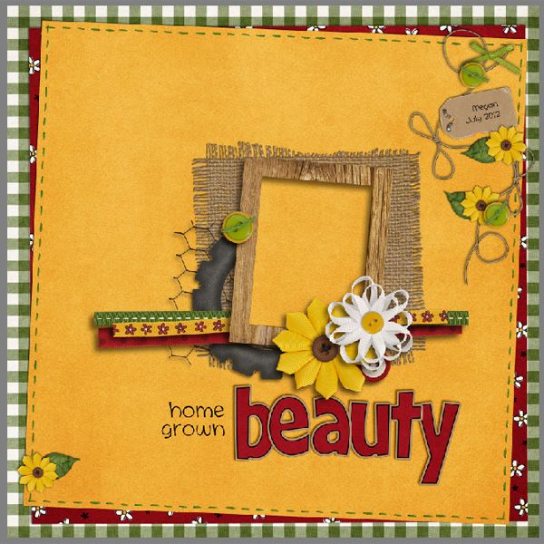
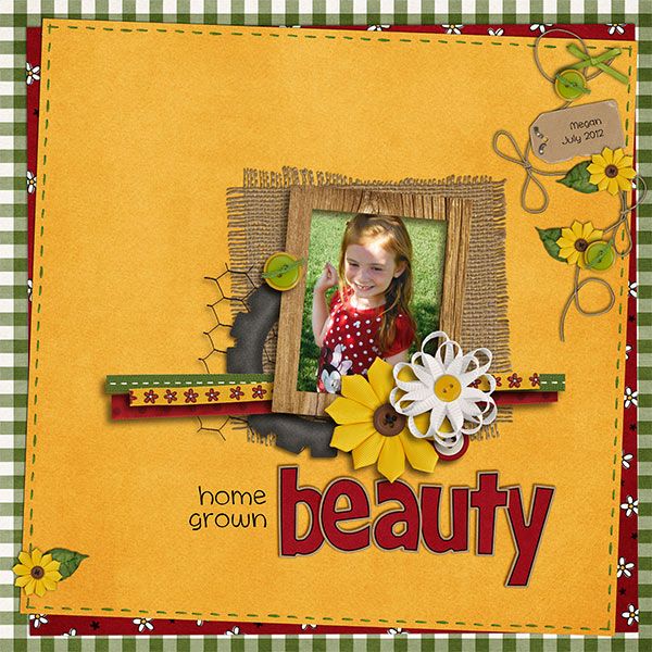
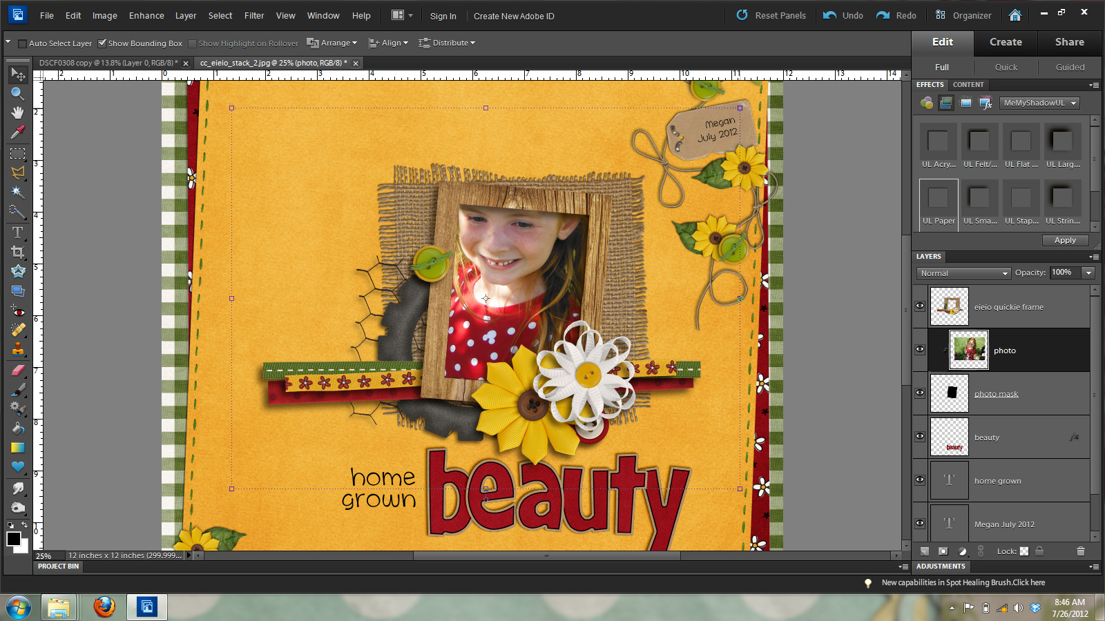
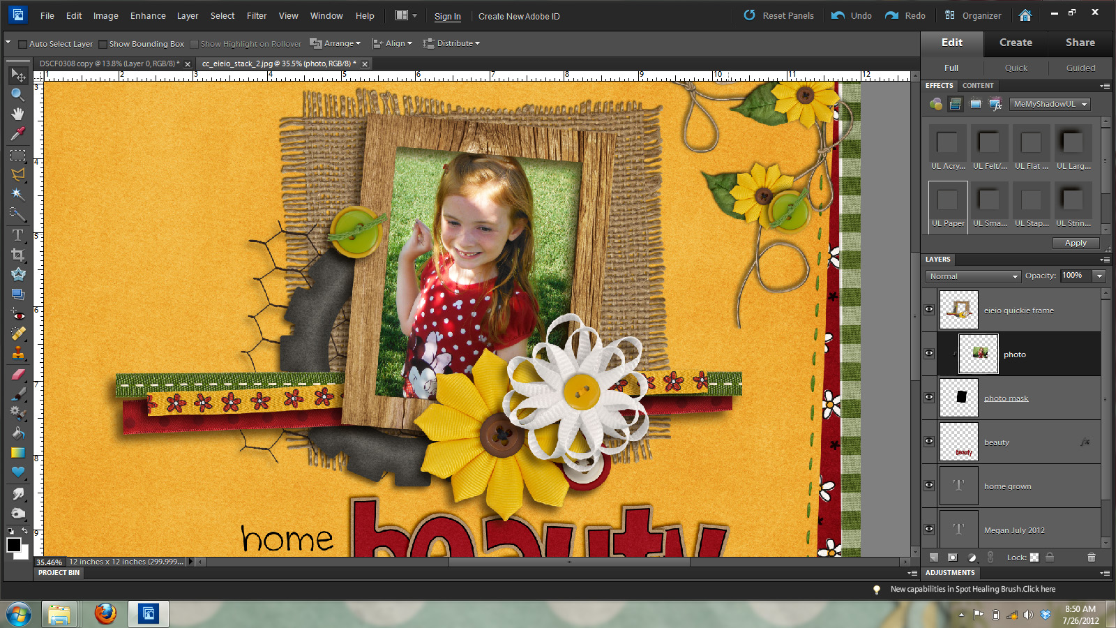
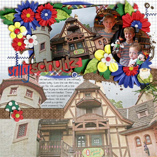
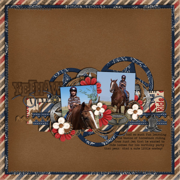
We’re gonna start with my layout that is almost finished. I used Chelle’s Creations E-I-E-I-O kit/alpha and E-I-E-O Quickies to make this layout. Gotta love those quickies. They make for a really quick layout!
I’m going to show you how to add your photo to the pre-made photo cluster. This method can be used on any square or rectangle frame.
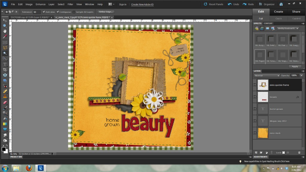
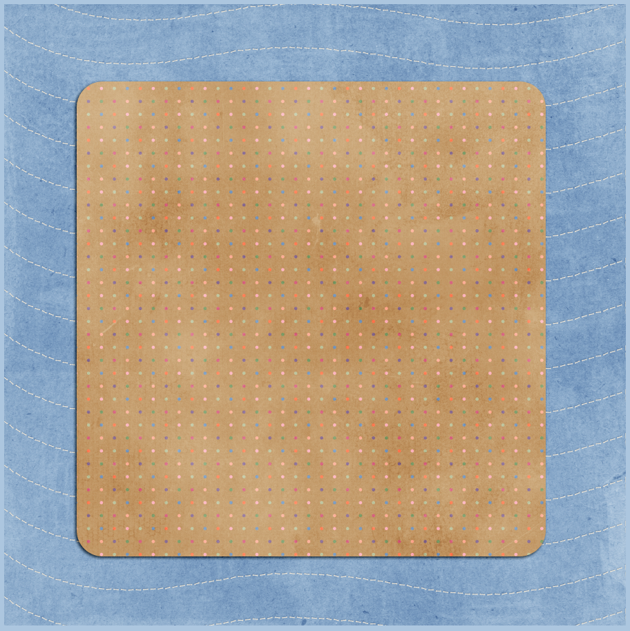
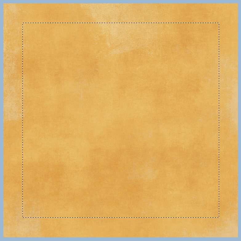
There are many ways to fill a frame in PSE, but today I’m gonna show you what works for me. My favorite way is to create a fill or photo mask layer for the opening of the frame. An easy way to do this is by using the magic wand tool to select the area inside the frame opening. This works great for non-shadowed frames, but the one I’m using already has all of Chelle’s fabulous shadows and I don’t want to have to do all that shadow work again. When I use the magic wand tool on the frame with shadows, it doesn’t nicely select the area I want to fill. See the image below to see that the marching ants are inside the frame where the shadows are.
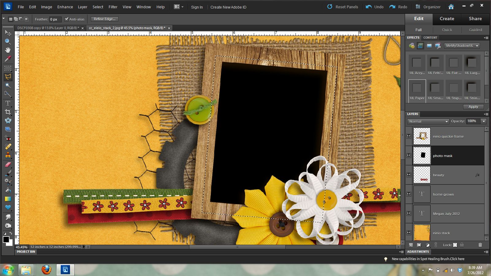
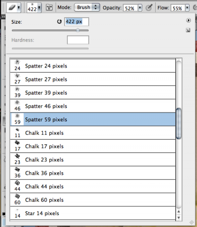
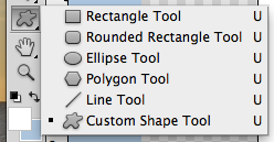
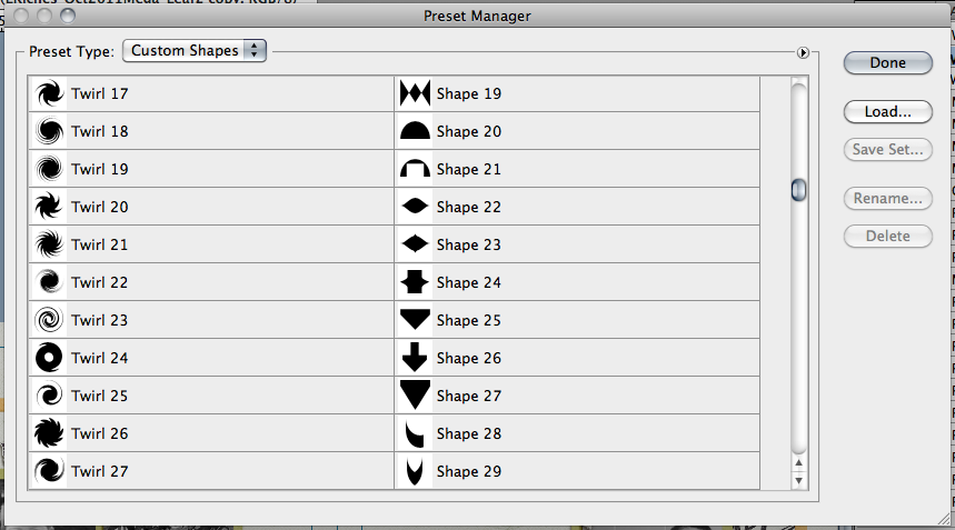
Don’t fret though PSE has another tool that will help me easily select the area I want and still be able to use the shadowed version of the frame. This tool is called the polygonal lasso tool. It is the sixth tool down in the tool palette and is grouped with the lasso tool, and magnetic lasso tool, so you may have to click on those and hold for the fly-out menu so you can get the one pictured below.
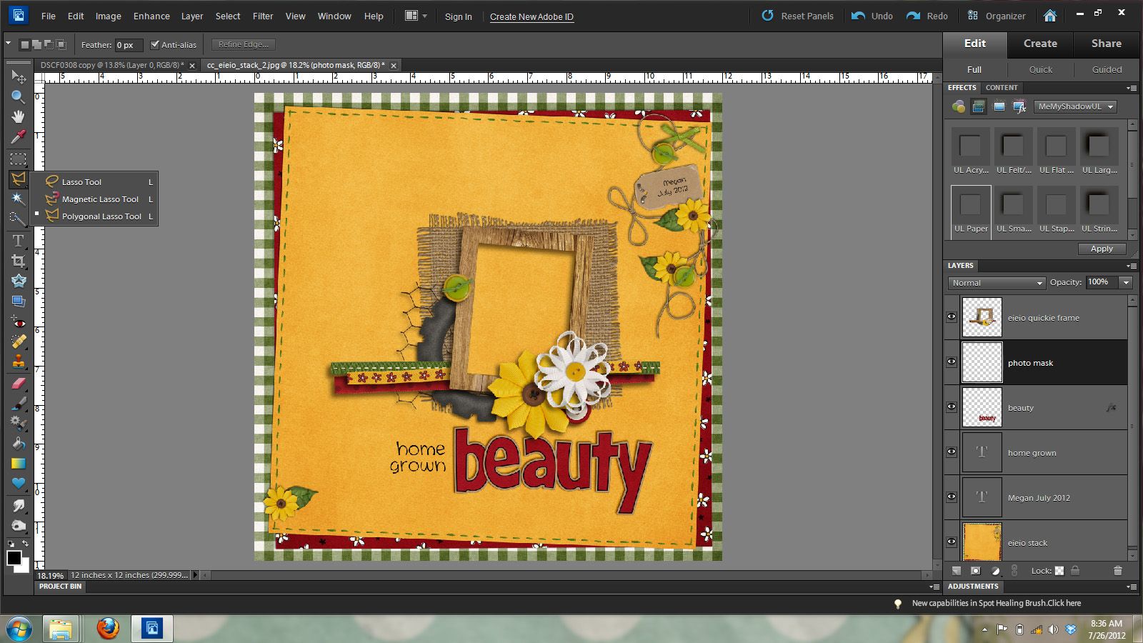
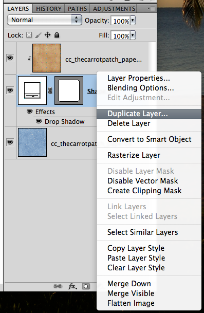
The nice thing about filling this frame is that we don’t have to be totally exact on selecting the inside of the frame because we will be putting our photo underneath the clustered frame layer. We will want to make a new layer under the clustered frame layer. You can do this by being on the frame layer and then holding down the ctrl key and clicking on the new layer icon at the bottom of the layers palette.
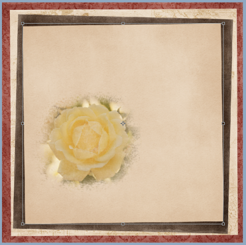
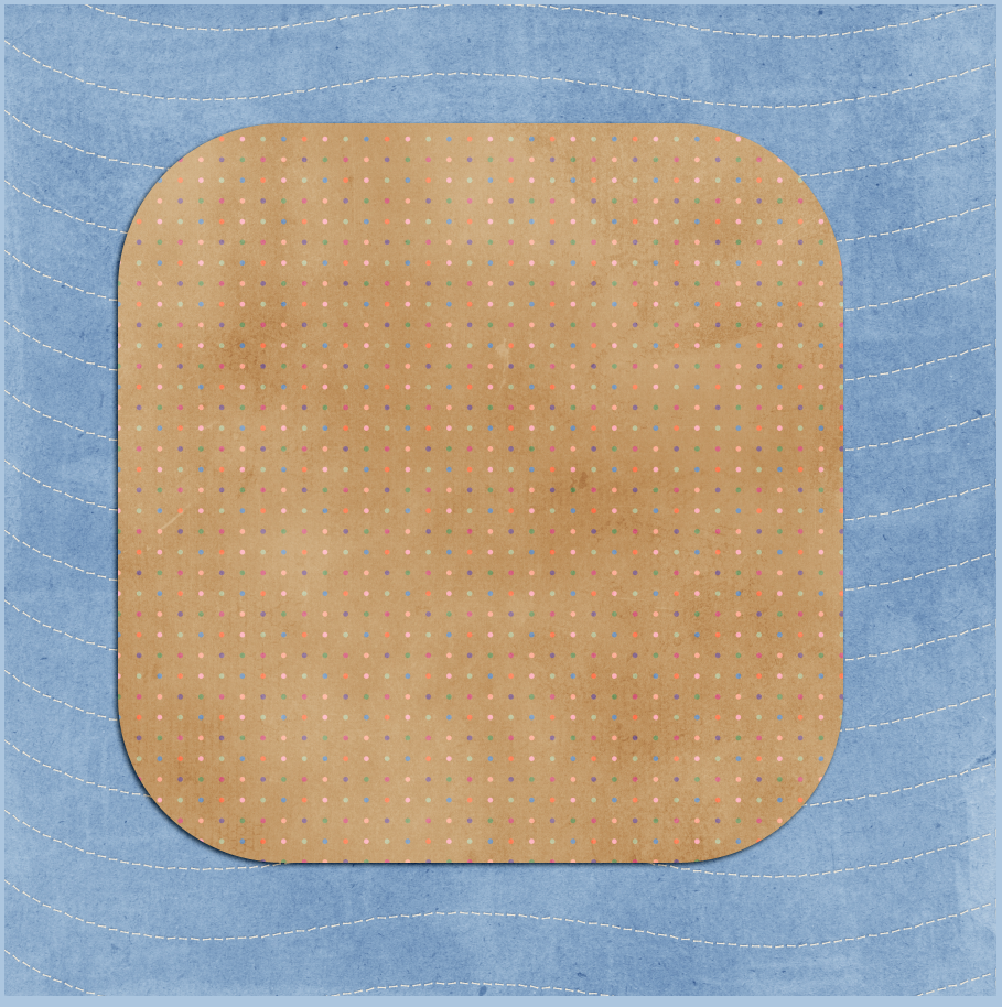
Once you’ve made your new layer under the frame layer, you will use the polygonal lasso tool to click on the upper left corner of the frame and draw a rectangle around the frame. See the image below for what the marching ants should look like.
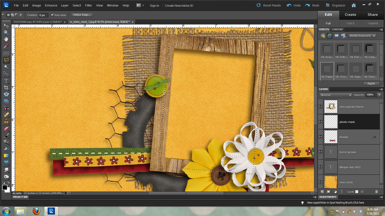
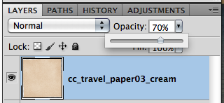
While you have the marching ants selecting the area you’d like to fill you will now make your fill layer or photo mask layer on the new layer you just made. To do this you will hold down the alt key + the backspace key to fill that layer with your foreground color. Don’t worry about the color of this mask, as it won’t show once we clip our photo to it. See the image below to see that my black photo mask now fills the open spot in the frame.
Ok – now you can remove the marching ants by pressing ctrl and D.
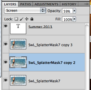
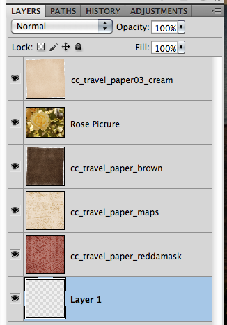
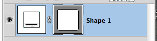
Now, it’s time for the photo. Open your photo and do any necessary editing and then add it to your layout on the layer above your photo mask. See the image below for how the layers should look in the layers palette.
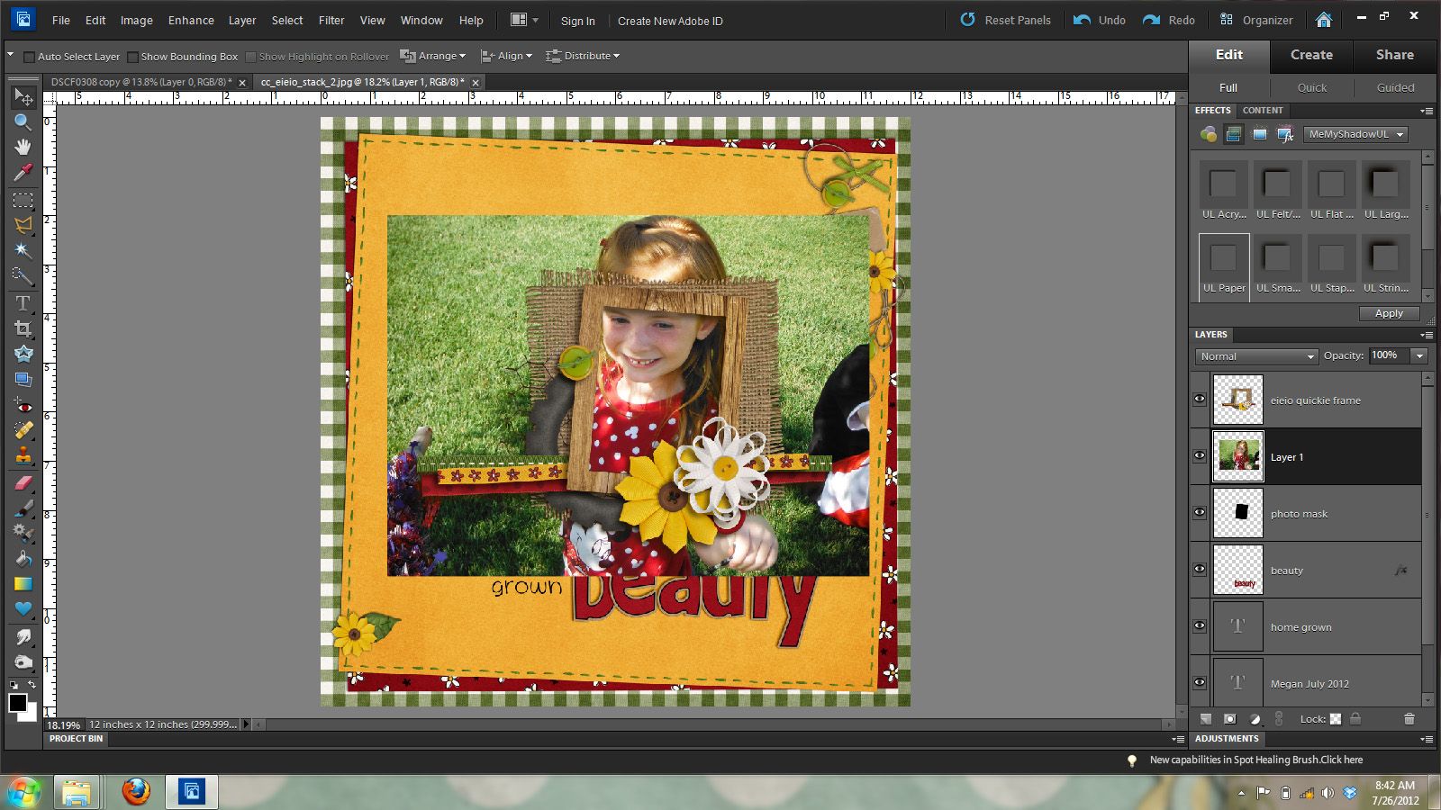
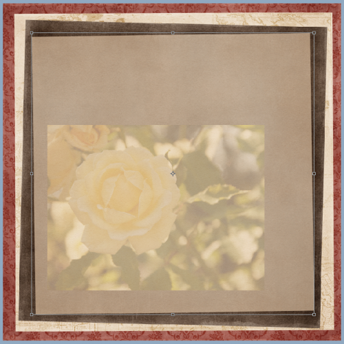
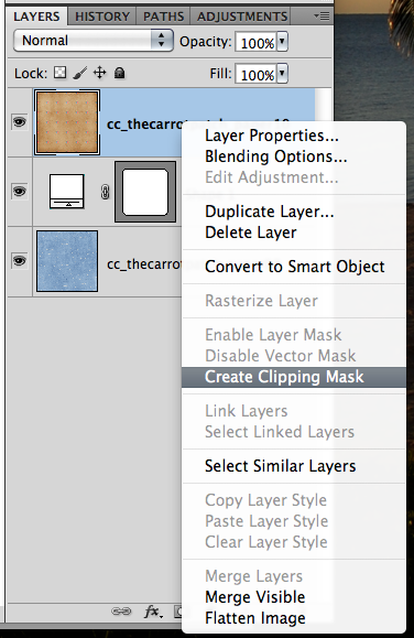
As you can see from the above image my photo is too large for my frame. So I’m going to clip it to my photo mask layer by going Layer ] create clipping mask. Or pressing control and g.
In the image below you will see that it looks like my image has been cropped, but really it all still there but is just showing the part that is clipped to the photo mask. I can move it around, resize it and such so it will show what I want it to show.
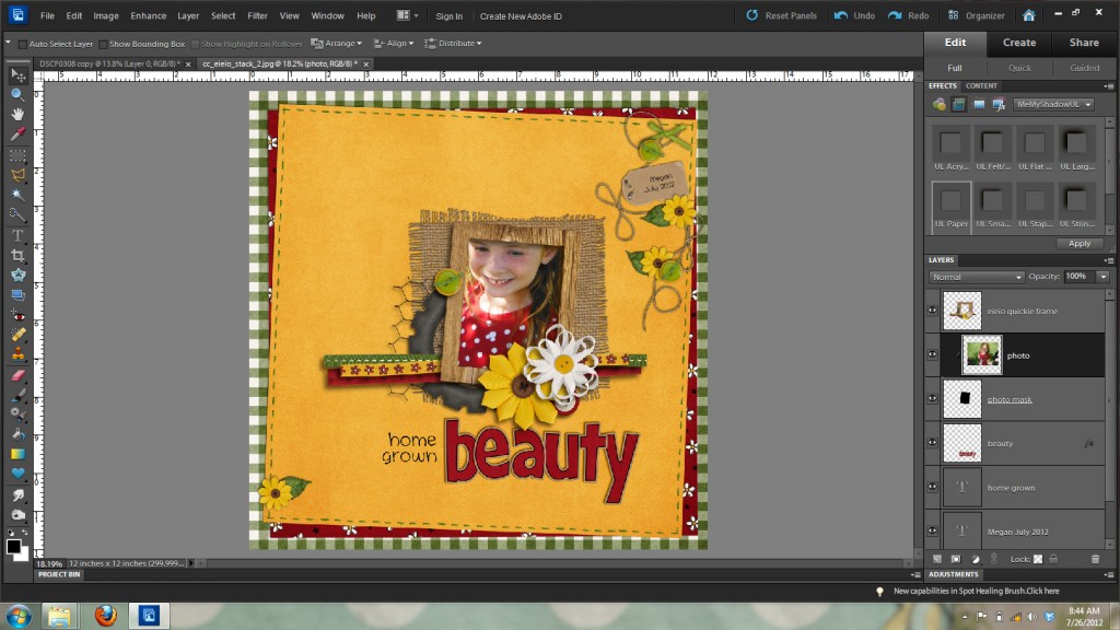
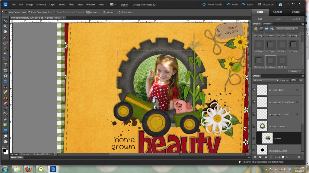
I want to resize this photo to show more of my daughter in the frame, so I’m going to check show bounding box in the top options bar. This will give me a box with handles to resize my photo as shown in the image below.
I want to bring in my photo from the corner handles so it will constrain the proportions of my photo. If I resized it by clicking on one of the center handles it would distort my photo and make my daughter either look tall and skinny or short and fat and not good at all. It is really important to always resize from a corner handle and make sure that the proportions are constrained so you don’t get weird looking people on your layouts. The people on my layouts are weird looking enough without any help from me and photoshop. LOL
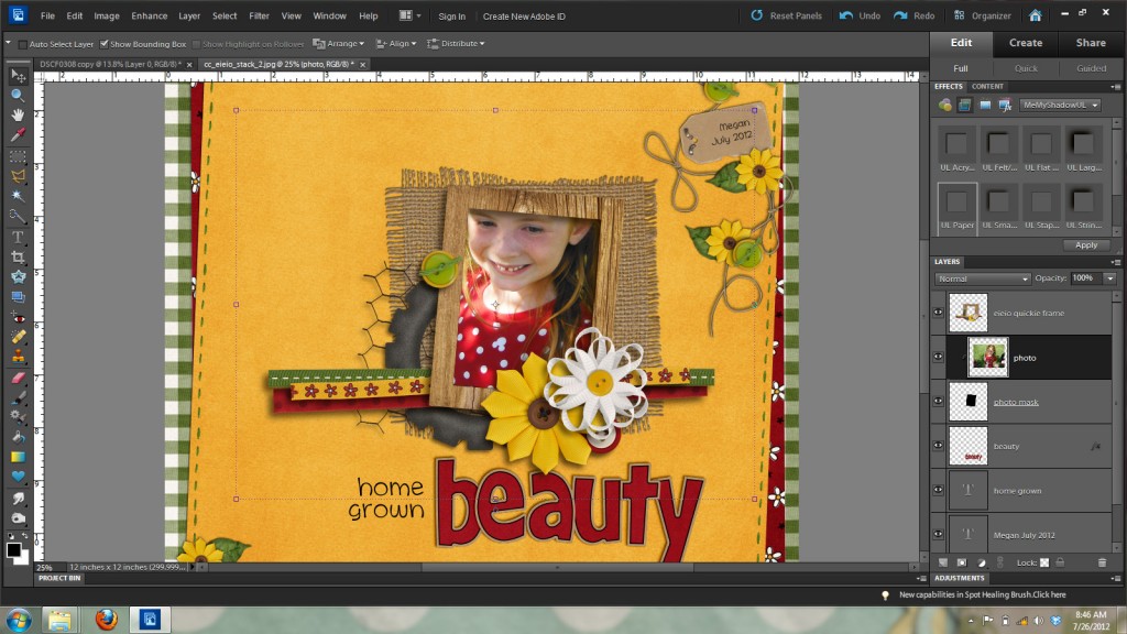
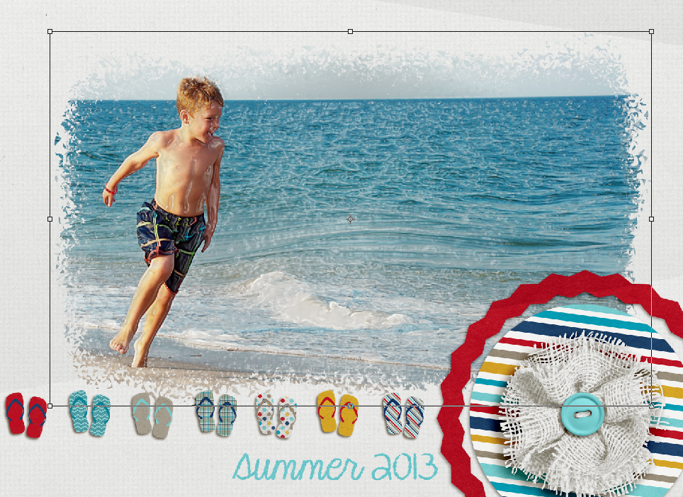
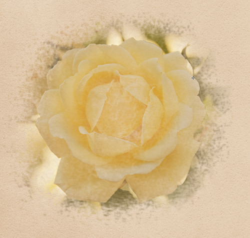
Here’s what my photo looks like in the frame now that I’ve resized it and used the mouse and/or arrow keys to position it to show what I want shown in the frame.

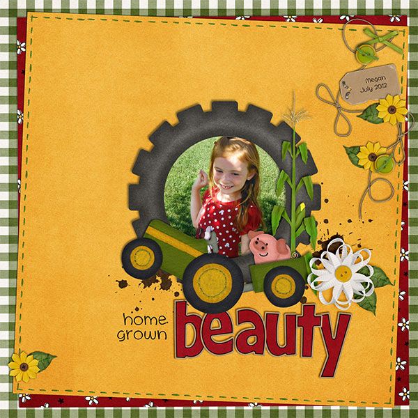
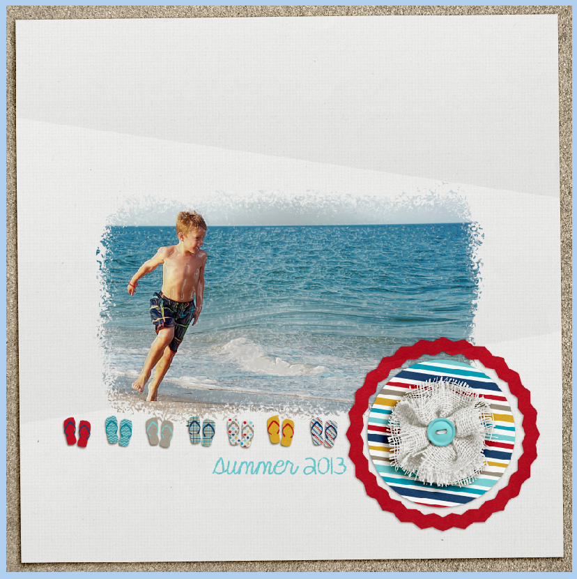
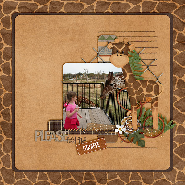
And here’s my final layout zoomed out so you can see my little home grown beauty.
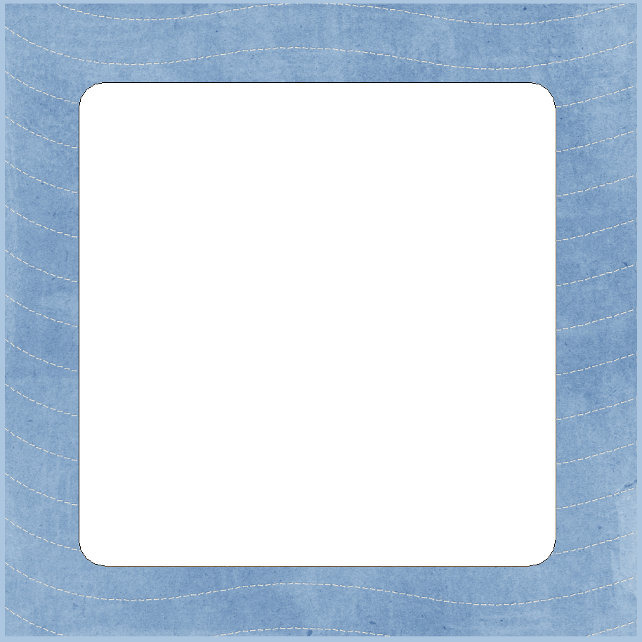
But wait you say! How do I fill a circle or oval frame? Well, let’s take a look at that right now. Here’s my same almost completed layout with a circle frame cluster from the E-I-E-I-O Quickies.
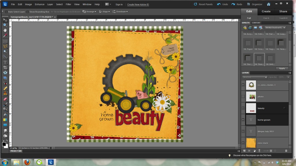
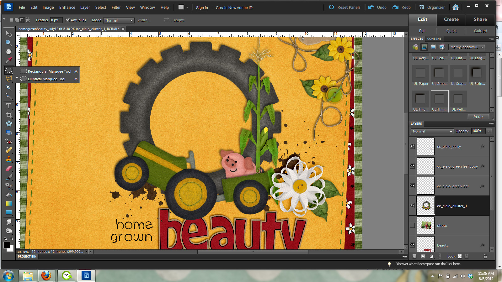
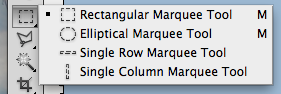
The easiest way I have found to fill a circle frame is by making a circle photo mask layer. We will do this with the elliptical marquee tool. It is nestled in the toolbar with the rectangle marquee tool. See the image below for where it’s located.
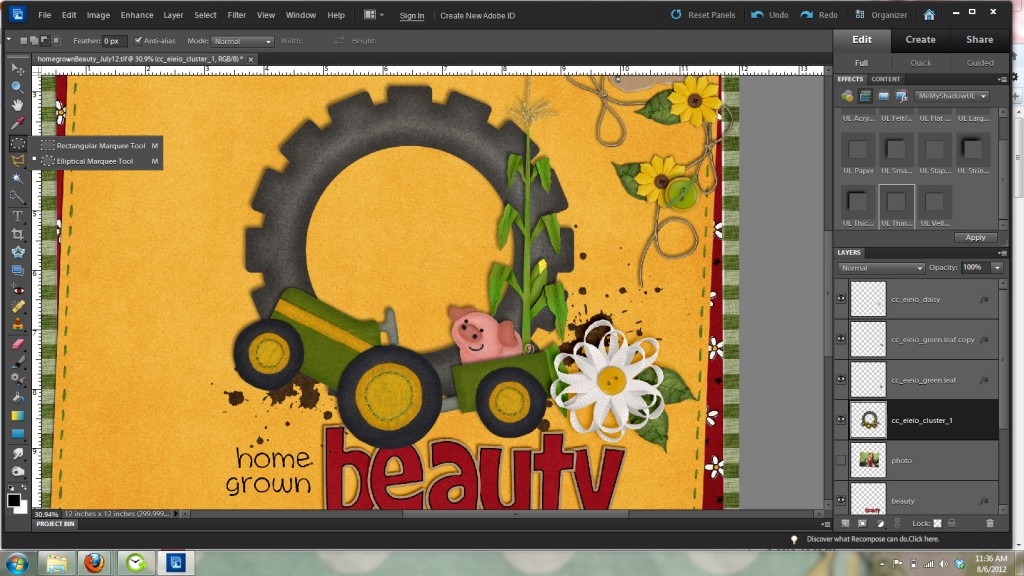
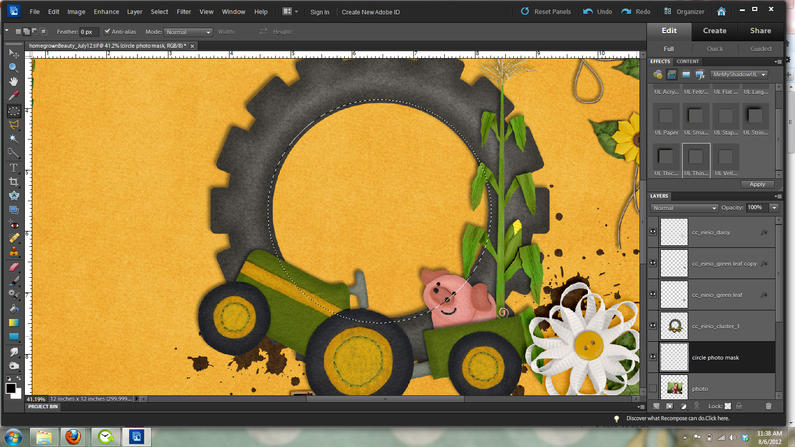
Make sure feather is set to zero in the top options bar and draw a circle around the opening of the frame. Holding the shift key down while you draw out the circle will keep it a perfect circle. You can also press the spacebar while drawing to move the circle to the position you want. When you have finished you will have marching ants around the circle like in the image below.

You will now need to make a new layer under the frame layer for your photo mask. This will be the layer you will clip your photo too so it will fit inside the circle frame. Click on the new layer icon at the bottom of your layers palette to make this layer and then hold down the alt and backspace keys to fill the layer with the foreground color. As before the color doesn’t matter because it is just a place holder for where the photo will go.
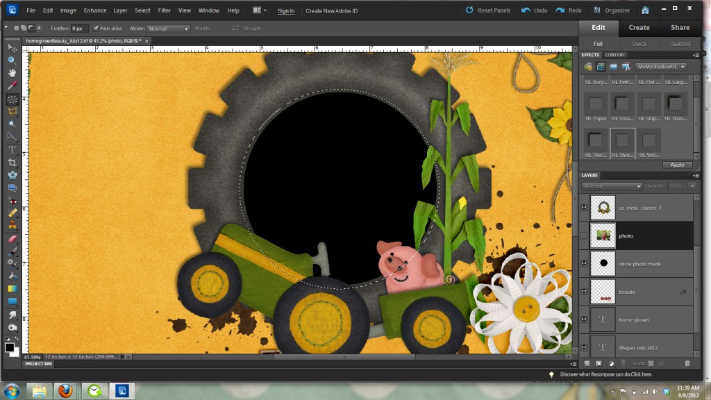
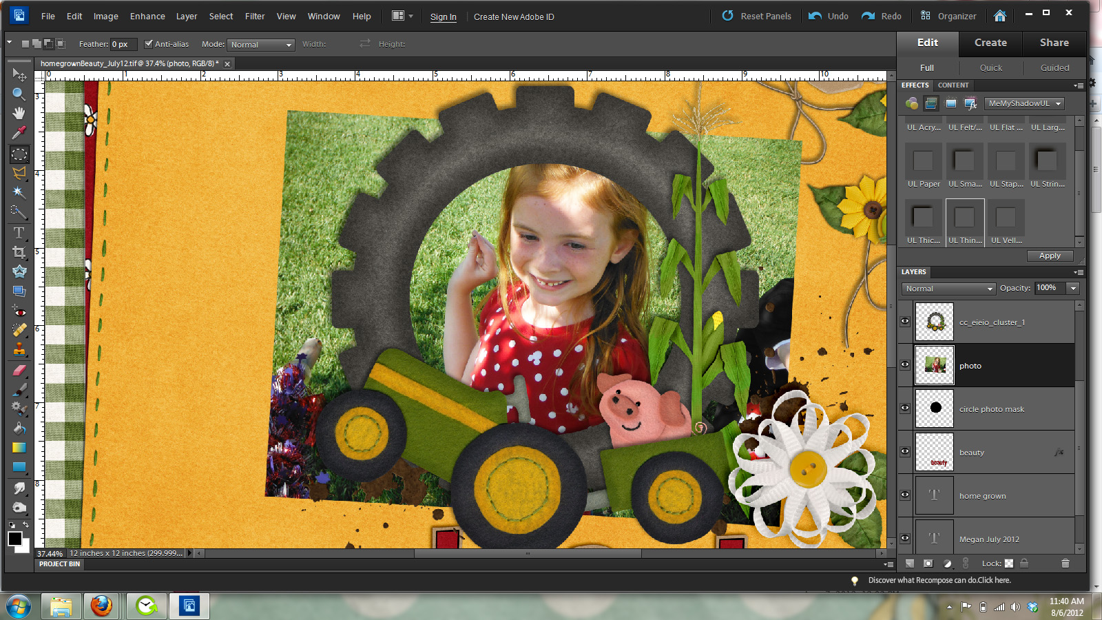
Now you can get rid of the marching ants by pressing control and D. We will now bring in our photo to the layer above the circle photo mask you just made like in this image.

As you can see from the above image my photo is too large for my frame. So I’m going to clip it to my photo mask layer by going Layer ] create clipping mask. Or pressing control and g. Then like before move and resize the image to fit in the frame how you’d like it. Remember to always resize from a corner handle to NOT distort your image.
And here is my finished layout with a circle frame instead of a rectangle frame.
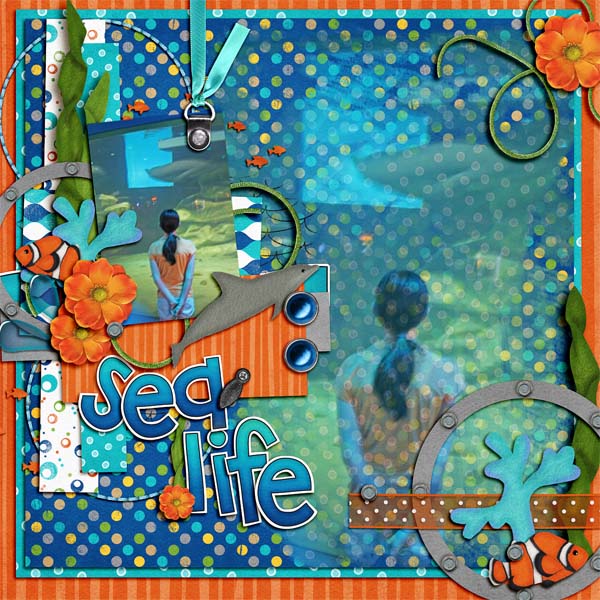
Here’s some fabulous filled frame layouts from the Chelle’s Creations Creative Team.
From Carol using Something Fishy
From Shannon using Oh Snap Quickies.
I hope you’ve enjoyed this tutorial and I can’t wait to see all your wonderful layouts in the gallery with filled frames.
take care and keepscrappin’


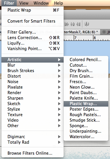
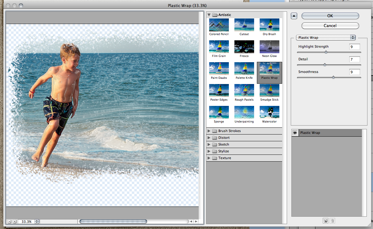
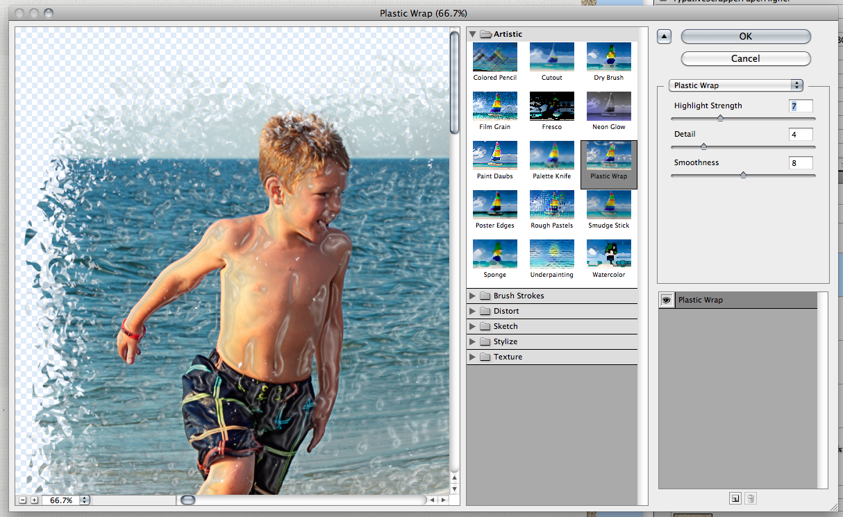
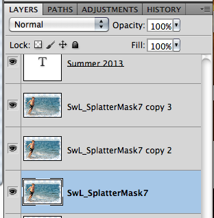
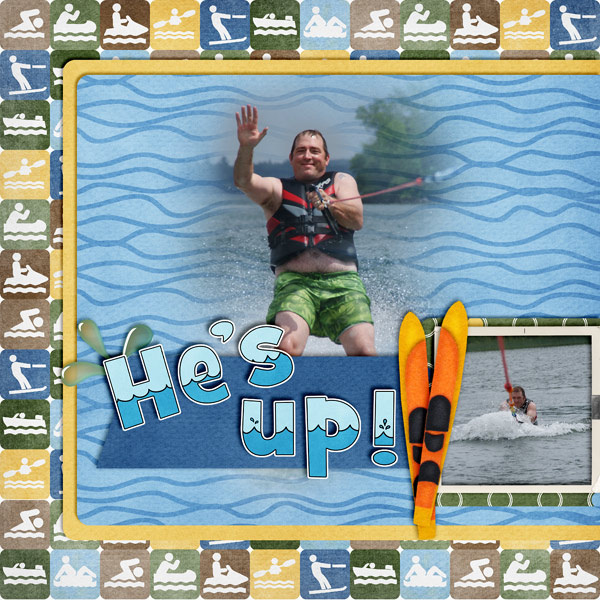
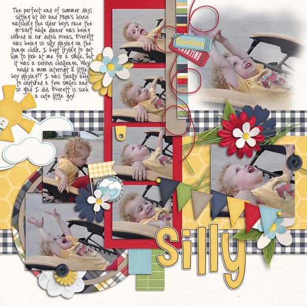
 I accidentally found a cool filter in Photoshop that I’d love to share with you today – and it is really fun for wet or watery photos! I think with any tutorial I write – it all take s a little practice as well as patience to try new things! Sometimes, pressing the wrong button will get you results that you will love!


 Hi! I'm Chelle: a 40 something mom of 7. My husband & I live in a rural community in the rocky mountains with our 4 children still at home. In the winters we enjoy sledding & snuggling by the fire. I the cool fall evenings we love relaxing around the campfire & meeting friends at the county fair. Admiring the stars


