3.15 Tutorial: Rounded Edge

3.15 Tutorial: Rounded Edge


Hi Everyone! Hope you are all doing great!  It’s Jenn, aka jk703, here for an easy tutorial – but something you might not know how to do!  Hope this is easy for you to follow, and maybe something new for you!

Many of my layouts are square… right angles, and lots of them!  What about softening the edges, and making some of your layers rounded?!  I love this little idea, and use it all the time, especially because it is sooo easy!  So, start your layout, and let’s go!

Step 1:  When you are ready to make your rounded edge layer, choose the Rounded Rectangle Tool from the Tools Palette. My tools pop out to the right when I click and hold, which allows me to choose one of the other sub tools in the menu.

Step 2:  Next, you will see your cursor change to a symbol similar to a plus sign. On the tools menu options, there is a section for the Radius.  You can have anything up to 13 inches. I’ve used .50 inches for this example.

Step 3:  Now, you will click on your layout, and hold the mouse button down.  Drag the button, and you will see your shape forming with a dashed line.  Make the shape the size that you would like. When you let go of the mouse button, the shape will be filled in with the foreground color.

Step 4: After the color is filled, you can then clip your paper to the shape!
Step 5:  Add your shadows and you’ve made rounded edges!
But what happens if you use a different radius?  The amount of roundness will change, making it a larger number will cause the shape to be rounder.  Having a lower radius, will cause the shape to be less round on the corners.
Here is a different example, rounder with a radius of 2 inches:
A really simple way to add something different to your layouts!  Here is my final page, and I used Chelle’s Carrot Patch and Stamped Alpha:
One from Mel.
From Jan:
From Melissa:
Thanks for stopping by and visiting!
Jenn (jk703)

(Leading) Making Journaling FIt on Lines | Digital Scrapbooking Tutorials

Have you taken a look at the tutorials here?  This is an oldie but goodie.

I LOVE the “undo” part of digi-scrapping…and typing my journaling so there are no errors, but I also like the look of “hand-written” journaling on all those fun journal elements…especially the ones with lines.

There is a simple tool in photoshop & photoshop elements for quickly and easily lining up your journaling on those lines. It’s called adjusting the leading.
Here’s how to do it:
Step 1: Make a text box. With the text tool, click down in the upper left corner of the journaling element, then drag down to the bottom right corner without letting up on the mouse button. When you are in the bottom corner THEN let go. You should see your new text box highlighted (the marching border)

Step 2: Paste your text in the box. I suggest you write your story in a program with spell-check, then paste it into Photoshop/Photoshop Elements. You may need to edit it to fit. Move the text so that the TOP line of your journaling is sitting nicely on the top line of your journaling element.

Now we’ll be adjusting the leading. THIS is the little box where we adjust it. (In Photoshop it’s under Window>Character.)

Step 3: Highlight all of your text (Ctrl-A) Then using the drop-down box try some of the preset numbers. Here I tried 18 (too small) then 24 (too large)

Step 4: Be a little goldilocks and figure out the exact amount to make your text line up with your journaling element lines. Mine turned out to be 19.2

That’s all there is to it. Now you can have “hand written” journaling “on the lines” on all your layouts. It also works great on lined papers…like those in back to school kits.

Here’s a couple of freebie journaling elements to practice on:

Here’s a few samples from the CT:

From Karen using Gone Fishing:

From Carol using Chilling & Grilling:


2.16 Tutorial: Custom Shape Tool


Hi Everyone!  It’s Jenn, aka jk703 here to share a fun tutorial that I use all the time.  Custom shapes are a fun tool in Photoshop.  They can help make fun layers, photo mats, and even custom text paths. I tend to use them mostly for all of those reasons, lol! You can apply special effects and cool styles to create even more shapes and fun things for your scrapbook layouts! The pre-drawn images that you will find already loaded in the software have lots of stars, circles, arrows, and decorative shapes. But, the best part is the fact that you can actually create your own shapes and save them too!  Today, I’m going to focus on actually making a shaped paper mat (or photo mat).

Here is a quick tutorial to add a custom shape layer to your layout.  For my example, I’ve used the newest kit from Chelle’s Creations, The Mane Event Bundle, as well as a splatter from Chelle’s Spic n Span kit and my picture uses Worn Pieces by Happy Scrap Girl.  My fonts are The Chuck Wearer by Heather Hess and LDJ Thankful.
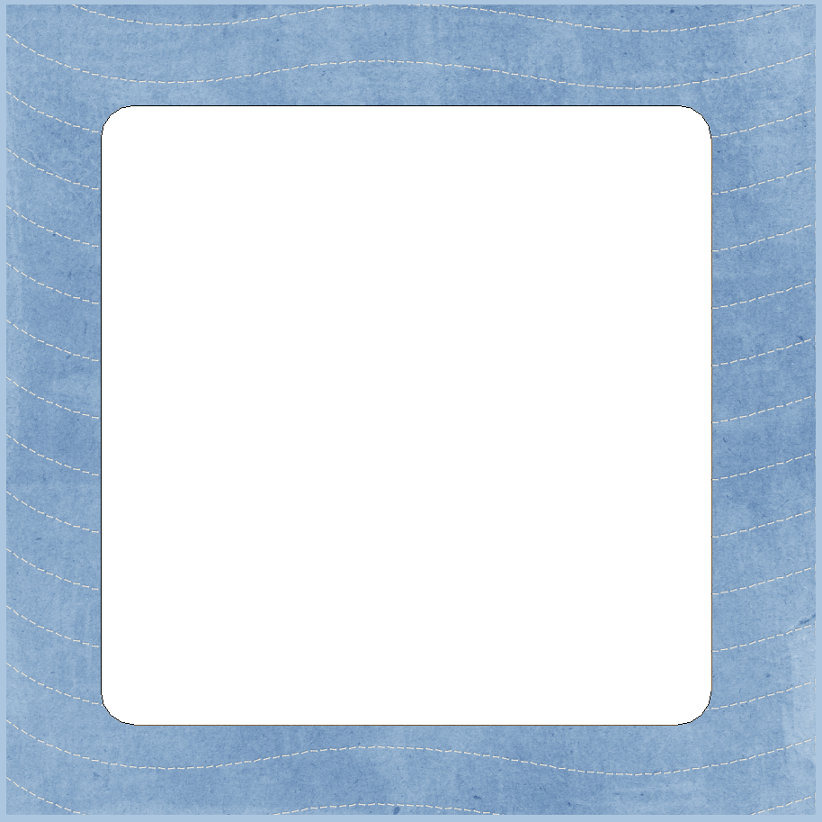
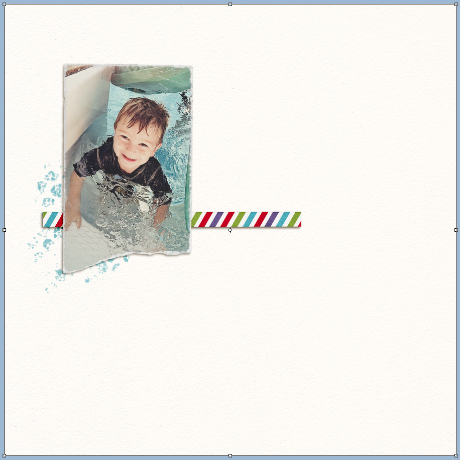
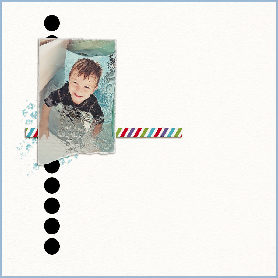
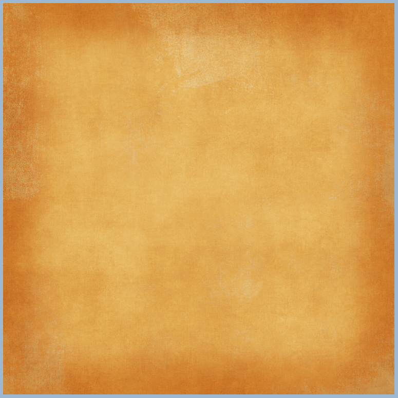
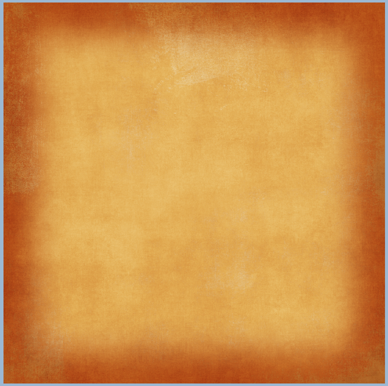
Here is my layout with my son, Colin. I’ve started the layers, but I want to add a couple of shapes to clip my papers to behind the photo.
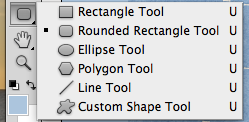
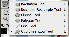
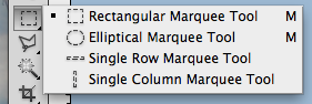
Choose the Custom Shape Tool in the Tool Menu, by clicking on it or by pressing the “U.”  Tip – to rotate between the different shape tools, press the “U” again along with the Shift key.
From the top menu bar, click on the small arrow next to the star, and a whole menu will appear with shapes that you can choose from.  Pick your shape.
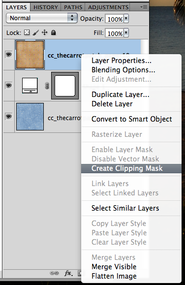
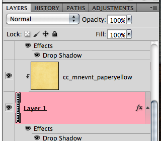
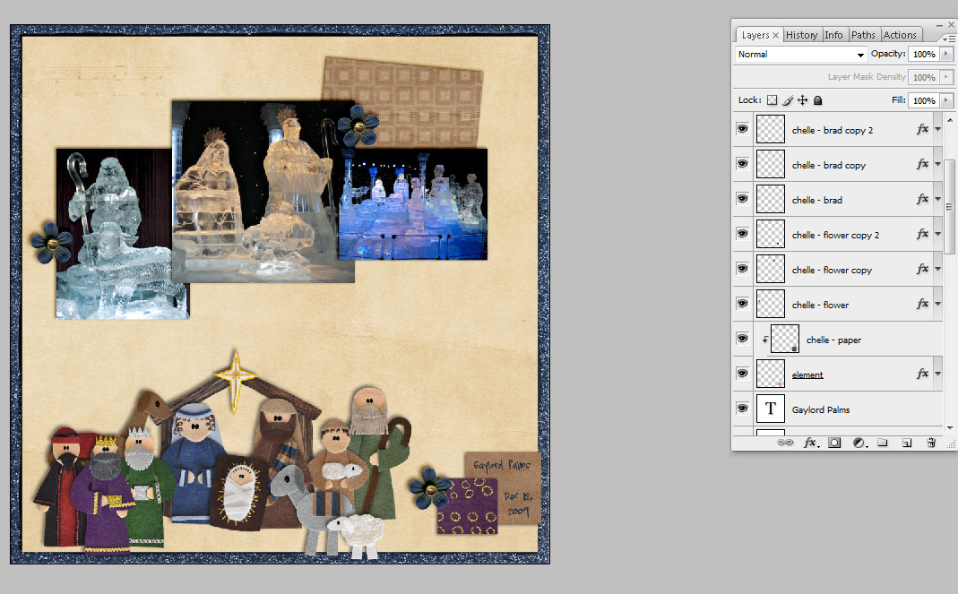
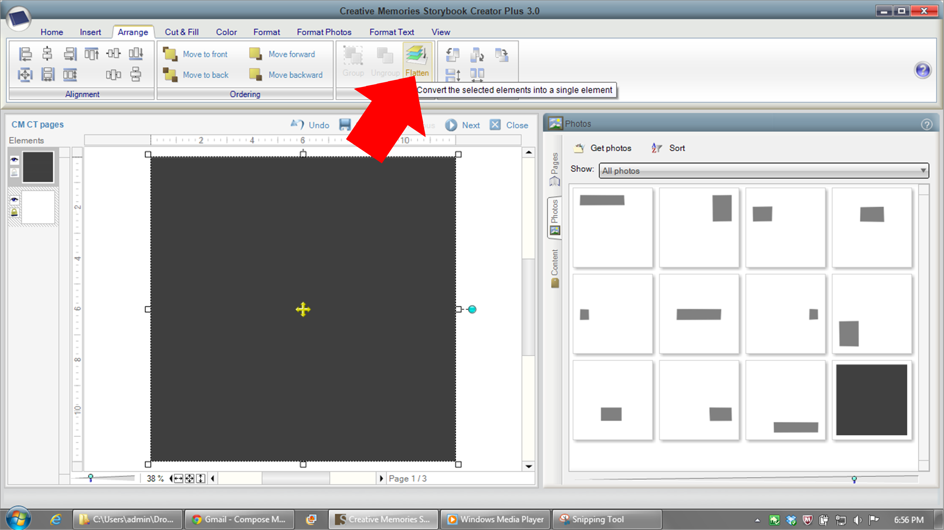
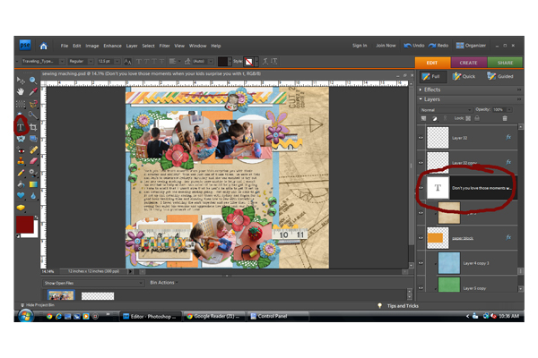
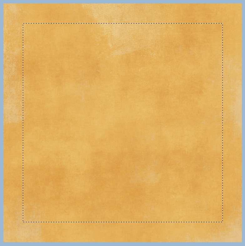
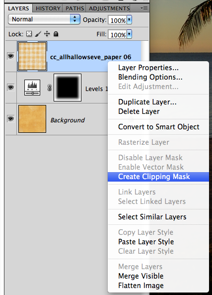
In your Layers Palette, we are going to add a blank layer. Note that the new layer inserts above the layer you have selected in the Layers Palette. Now, look towards the bottom there is a small square with a corned folded over. Click that once.
Now, with that new layer selected and your custom shape tool active, click on your layout and drag your shape to the size that you want.  When you let go of the mouse button, the shape will fill with the foreground color.
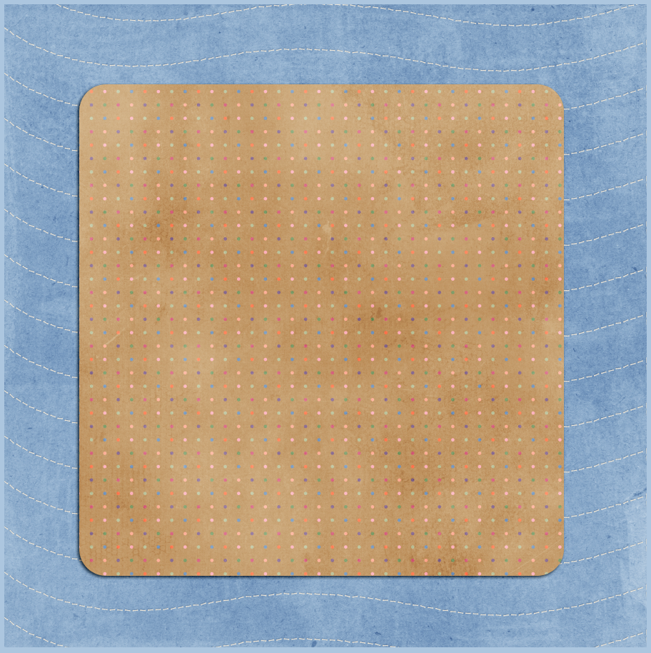
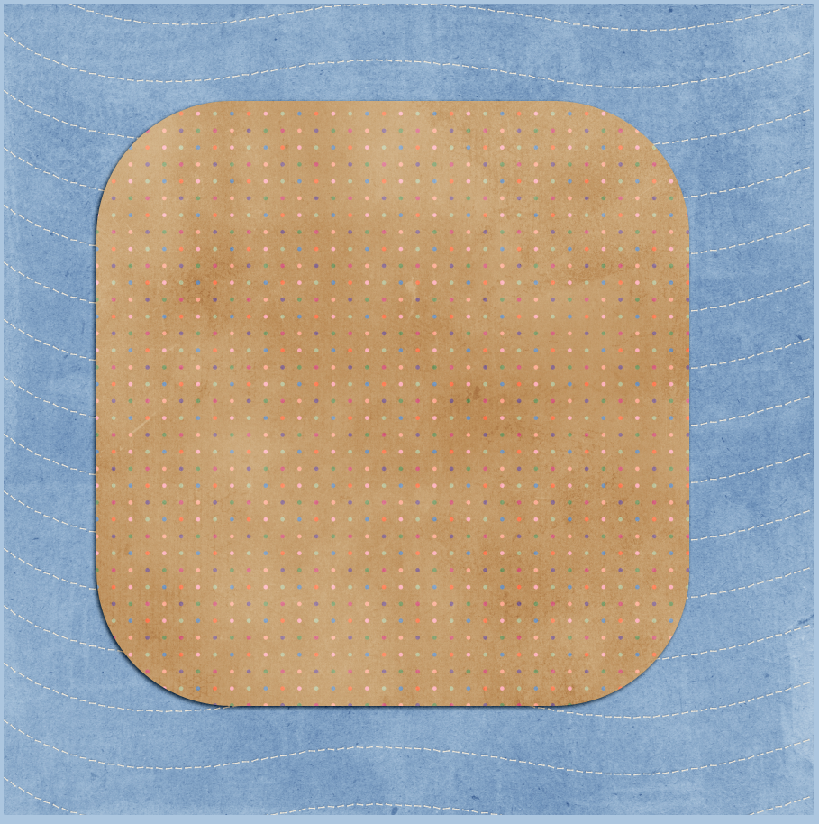
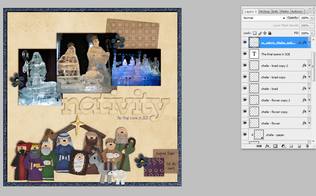
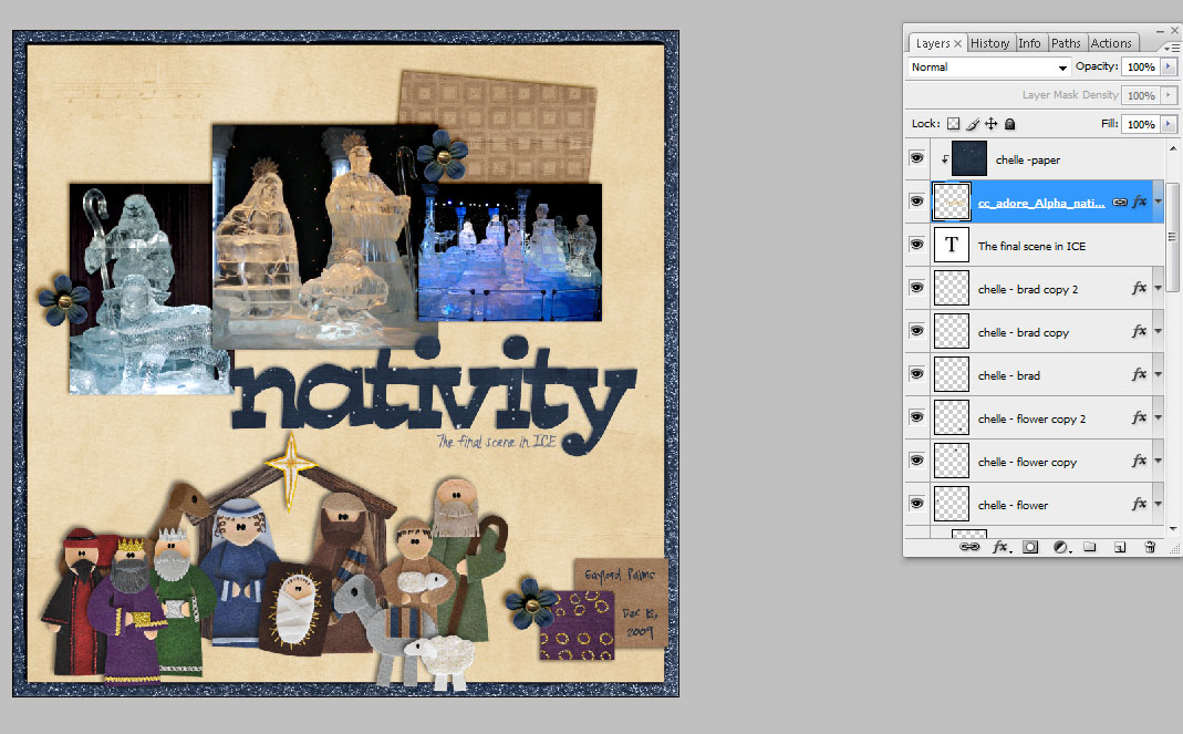
Next, I clipped my paper to the shape, and added my shadow to the shape layer. Here is my Layers Palette and how it looks on my layout.
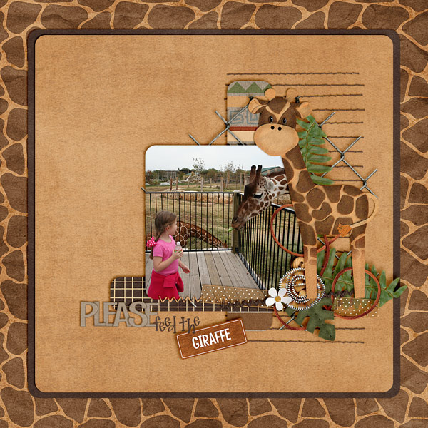
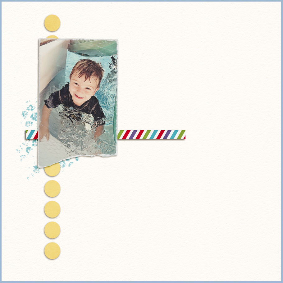
After that circle shape, I decided to add one more star-ish shape mat. To finish off my layout, I also decided to use a shape to make a text path for my journaling – so it would fit exactly under my star shape.  Here is my final layout.
Here is some more inspiration when using the shape tool:
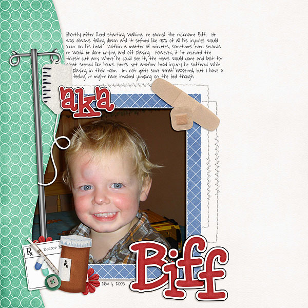
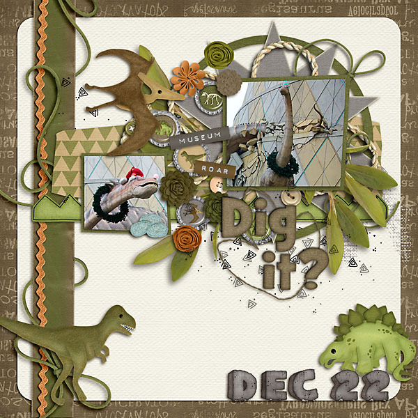
By Shannell
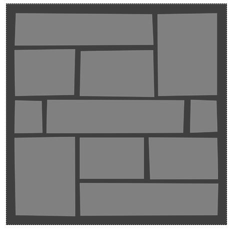
She used shapes to make the paper mats on her page.  She also mentioned that if she didn’t start with a template, she turns to the shape tool – which helps her get started on her layout.
By Roxana
Roxana used her shape tool to highlight her title and journaling. The yellow bracket shape really pops off the red.
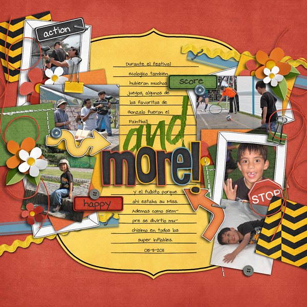
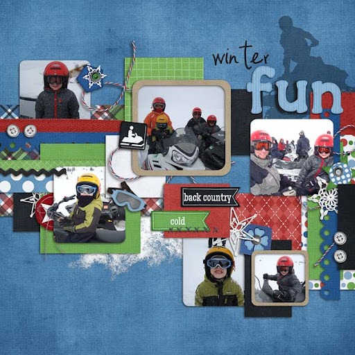
By Jennifer
She used the custom shape tool (sign #4) which looks like a highway road sign to create the border. I made it extra large and clipped a paper to it. Awesome curve add so much to the design of the layout!
Hope that you enjoyed this tutorial!
Thanks for visiting and come again soon!

2.08 Tutorial: Using Strings

Hello friends! Have you ever wondered what to do with the strings that Chelle includes in her gorgeous digital scrapbooking kits? She has some lovely strings in various shapes and sizes. Take a look at the cute blue and white strings in her Pearly Whites kit. Melissa used one of these to wrap around her photo and the toothbrush embellishment on this gorgeous page about her little one’s new tooth. Two-Tiny-Teeth-LSMelissa Heather also used a string in a cluster of embellishments, but rather than having it in the focal area of the page, she chose to use it as a subtle part of a flower cluster in the top right corner to draw your eye to the pumpkin scarecrow picture on her layout. Take a look: wwohp_hagrid600Heather In case you’re wondering, she used two kits to make her page: Shades of Autumn and Midnight Crow.

Next, take a peak at Erica’s layout using Chelle’s new Winter Thrills kit: EricaKeystone- Snowmobiling 2-11 (2) She used several strings on her page to help your eyes move across the page from one photo to the next. They’re tucked under frames across the page, and the end of a string is even tucked under a button giving it the illusion of being sewn to the page.

Finally, Fran made use of several strings all over her layout. They’re very effective in showing the layers of her border, and the ribbon and rope behind the photo draw your eye to her focal point photo. She used the Prehistoric kit, Bedrock Alpha, and some Ric Rac Flowers I have to say, I love the Christmas decorations on those dinos!

Take a look at the kits you own, or maybe take this as a cue to shop, and let these layouts inspire you to use your strings to enhance your pages. If you use Chelle’s kits, be sure to post your layouts in her gallery at Scrap Orchard so we can all be inspired!

1.25 Tip: Clipping Paper to Alphas

Hi, it’s Heather. Today I thought I’d show you an easy way to get more use out of the alphas in your stash. Just clip papers to them!

First, lets start with a layout that is complete, other than the alpha


I was using Chelle’s O Come Let Us Adore Him, so I went to use the alpha in the kit, but then there was no contrast between the background paper and the alpha.


So, I took a darker color paper in the kit, and clipped it to the alphas. Instantly, the title looks much better!!


Here’s my finished layout


12.15 Tutorial:Templates in SBC+

Hi, I’m Leslie and I’m a guest Creative Team member for Chelle’s Creations this month.  I can’t tell you how exciting it’s been to be a part of such a great group of women, getting to know them and Chelle, and getting lots of pages done for my digital scrapbook in the process using great Chelle’s Creations kits!  And for her readers, I have a little freebie cluster at the bottom.
I use Creative Memories’ Storybook Creator Plus (SBC+) for my scrapbooking in addition to Photoshop Elements (PSE).  For those of you with PSE, you have lots and lots of templates out there that you can use that are already in Photoshop format.  SBC+ uses a propitiatory file type, and we have to do a little bit of work to get png and jpg files into our program to use as templates*.
I work behind the scenes making page files for another designer on Scrap Orchard, and as such have made many many page files from pngs.  I hope that my work flow can help others who use SBC+ make their own pages.  These directions will be shown on SBC3.0, but the same workflow works in 4.0, with a few steps made easier, which I’ll explain.  I’ll be using Chelle’s Askew Templates which can be found here Chelle’s Askew Templates
First, I open a project that’s the same size as the Photoshop template, which is usually 12×12.  Whether you do this as part of a Storybook or as a Page Print doesn’t matter.
Then, I go to the right hand side and select “Photos” and then “Get Photos”.

I navigate to where the PNG folder is and get all the photos.

So now, they’re all in the program stored under photos.  Then, I start at the bottom of the stack and work up inserting things into the page. Go to the last photo in the list and double click on it.  That will bring in that photo to the bottom layer.  Then go to Arrange–>Flatten and flatten the image (if the layer is, as shown, filling up the whole screen, you don’t have to flatten it and then you can fill it like you would a photo holder).

Work your way up the layer stack, inserting images into your project and flattening them.
When you’re done bringing in all the photos and flattening them, you can remove those photos from the photos list.

Now, this is where you can feel free to stop, because you have a working template right now.   But I often take it a few steps further in the templates I make.  I prefer to have as many shapes as possible allow me to drop photos or papers right into them and then easily resize the photos and papers.  If the template shapes are rectangles, that’s easy–insert a photo holder, and use the resizing elements to make it in the same place and the same size as the PNG files you’ve brought in.  To get it in the same place in the layer stack, select the photo holder you made and then select the PNG file you inserted earlier.  Now group those two things together (Arrange–>Group) That will bring the photo holder down to the same place as the PNG file.  Then Arrange–>Ungroup.  Now you can delete the PNG file (it will be the bottom of the two and will also be the one that doesn’t have the yellow arrows in it when you select it.  I like to fill my photo holders with colors so they’re not all gray, especially if the intention is to fill them with paper.  SBC4.0 makes this a bit simpler than 3.0–you can just fill it with color right away.  But with SBC3.0, you have to first fill that photo holder with a photo or paper and THEN you can fill that same photo holder with a color.
For wonky shapes, like the ones in Chelle’s template I used as an example, it’s a bit more advanced than the scope of this tutorial can get into.  But what I do do is make custom shapes for each of the askew shapes and before inserting the shapes into my project, I say, “Save this shape as content”.  I now can insert a photo holder and use the Mat function to shape the photo holder like my custom shape.  I do this for all the shapes on the page, and voila, a template you can use again and again!
I hope you’ve learned a little something here and if you have questions, make comments on the blog.  But in the meantime, enjoy this little Christmas freebie I made for you! A little return address label sized for Avery labels 5155. Just add the text as needed for your family in your favorite scrapbooking program and save it to a JPG and then use it in your favorite word processing program formatted for Avery Labels 5155. Just right click on the image and save to your computer. It’s full size right here!


11.10 Tutorial: Justifying Text

Hi, Karen here with my first blog post for Chelle’s Creations.   It is Thursday which means we are one day closer to the weekend and it is Tutorial Thursday!  Today we are going to talk about a trick I learned just a few weeks ago myself, making your text fill the entire text box.
I am using PSE 7, but my sources say it is the same for PSE3 through CS5.  First let’s review the obvious ways to justify your text.  Here is a page I made using Chelle’s Creations Sew Crafty and when I typed the text this is how it came out:

See how all the text is even on the left side or left justified?  Here is how you change that.  First you want to make sure you have your text layer selected in the layers palette and that you are using the text tool.
Then while your cursor is anywhere in the text box click ctrl-a to select all of your text.  When all of your text is highlighted look for a drop down menu at the top of your screen with a bunch of line on it, this will justify your text in three different ways.  You can pick justify left, center, or justify right.  Simply select which option you want on the drop down menu.

For some pages those 3 options might give you just the look you were going for, but none of them look quite right for this page.  I wanted something that looked a little blockier (is that a even a word?) to go with the blocked background paper.
To get the text to look blockier or to fill the entire rectangle of your text box the first steps are the same.  Make sure you are on the text layer in the layers palette and you have the text tool selected.  Then select all of your text using ctrl-a with your cursor in the text box.
Now hit ctrl-shift-j and watch the magic! 
See how the text goes from one side of the box to the other?

I just love the look of the text filling the block from one side to the other, it works well with the rest of the layout. Remember, while your text is selected hit ctrl-shift-j.

I hope you enjoyed this addition of Tutorial Thursday!

10.13 Tutorial: Mixed Edges

Hi Everyone!  It’s Jenn, aka jk703 here for today’s post.  It’s Thursday here, and almost Friday!  That just makes me one day closer to the weekend and a much happier person!  Today, I thought I would share a fun and new to me technique that I just recently learned.  We all love our digital scrapbooking papers, and Chelle sure has some awesome ones!  Here is a way to mix up the papers and get a cool effect for your backgrounds.

For today’s tutorial, I’ve used papers from Chelle’s All Hallow’s Eve kit.

Step 1:  Open up a new document and then one of the background papers.

Step 2:  Using the Rectangular Marquee tool, select the area that you would like to have show a different background paper. This should leave a border on your paper with marching ants.  Here is the tool and my chosen selection.

Step 3:  Click on Select > Inverse from the Menu Bar.  This will inverse the marching ants to the edge instead of the inner part of the background paper.

Step 4:  Next choose Select > Modify > Feather.  We are going to soften the edges on the selection.  A menu will pop up, and you can choose any value you like, but I found that it works nicely when between 100 and 250.  For my example, I chose 150.

Step 5:  Next, you will clicl on the half black/white circle on the bottom of the Layers Palette. Choose Levels (or from the Menu Bar you can choose Image > Adjustments > Levels.)  When the adjustments menu appears, you will slide the middle GREY triangle toward the right.  You will see the paper change all on the selection.

Here is what my plain background paper looks like after playing with the adjustment level.

Here is another version with the slider closer to the right (towards the white triangle).

Step 7:  Now, to incorporate more background papers, you can layer them and clip them to the adjustment layer. After you have opened another background paper, make sure the layer is above the adjustment layer.  Next, right click and choose Create Clipping Mask.

Step 8: Clip the paper, and then you can play with the opacity of the top background paper.  Here I’ve lowered mine to about 47%. And the final background.

Looks cool, right!  I can’t wait to incorporate this in my next layout! I was so excited to share this, that I didn’t get to scrap it, lol! Thanks for visiting today!  I hope this was a fun and interesting new technique. We hope you come back soon!


9.23 Tip: Creative Ways to Use Stacks

9.23 Tip: Creative Ways to Use Stacks

Wondering what to do with Digital Scrapbook Stacks? (Besides adding your pics/title/journaling…they look great just as they are) Strech your stash and create those trendy off-set style layouts speedy quick with stacks:

CREATIVE WAYS TO USE STACKS

Want to know when I create new video tutorials? Subscribe to my You-tube channel. (click on the link and look under the title for a box marked SUBSCRIBE)
CLICK HERE to view in YouTube. (& to Subscribe to my Digital Scrapbook & Design Videos)

9.16 Tutoriial: EZ Black and White Photos

Hey Everyone!  It’s Friday!  Yay!  It’s Jenn, aka jk703, here to bring you today’s post.  I hope that you are ready for the weekend!  Today, I decided to make my post about a quick How-To for Black and White Photos.  The weekend will be a perfect time to try out this technique. It’s not too difficult and can really make your otherwise dull black and white photos pop!

Black and White, otherwise B&W, can be a way to create a striking photo and bring a lot of contrast to your digital scrapbooking layouts.  Here is my starting photo – a pretty flower I snapped while on vacation this summer. It is a very bright photo and I love the perspective.

Let’s say that I am making a layout also with bright colors in the papers and elements, but I really want to use this photo.  Instead of a too busy or too colorful page, I want to create a focal point on my layout.  To make the photo pop, I am going to make the photo B&W.

First, remember to save your image before completing your edits so you will always have the original photo if you ever needed it. Next, with the photo selected,  in the Menu Bar, click on Layer. Scroll down to New Layer Adjustment, and choose Channel Mixer.

The Adjustment Palette will pop up (mine is within my Layers Palette, just another tab).  You will see a few slidebars, and a small box that is for  Monochrome.  Click this box and make sure there is a check mark ticked.

Your photo will turn to an instant Black and White.  But wait… there’s more… Again, in the Menu Bar, click on Layer > New Adjustment Layer . Brighness/Contrast.  Here are the options available to you in this particular adjustment.

When you look at the Layers Palette, you will now see another new adjustment layer. By tweaking the contrast, your photo can become a little more sharper and really jump off the page.  Here is my after picture below.  See how the center of the flower is a little more focused and the edges of the shadows are just a tad deeper.

Here is my final Black and White Photo.

There you have it – an easy way to make a photo black and white!  Plus, the know-how to tweak the brightness and contrast to your own liking!  Enjoy your pictures and make them pop off the page!

Have a great weekend, and thank you for stopping by.  Come back soon!