Save For Web

Save For Web

Hi Everyone! This is Jenn, jk703, here back for another blog post today! I’m here to share how I easily share my layouts after they are completed by using photoshop to Save for Web. Photoshop makes it pretty easy, and I’ve been doing this version for a few years now.

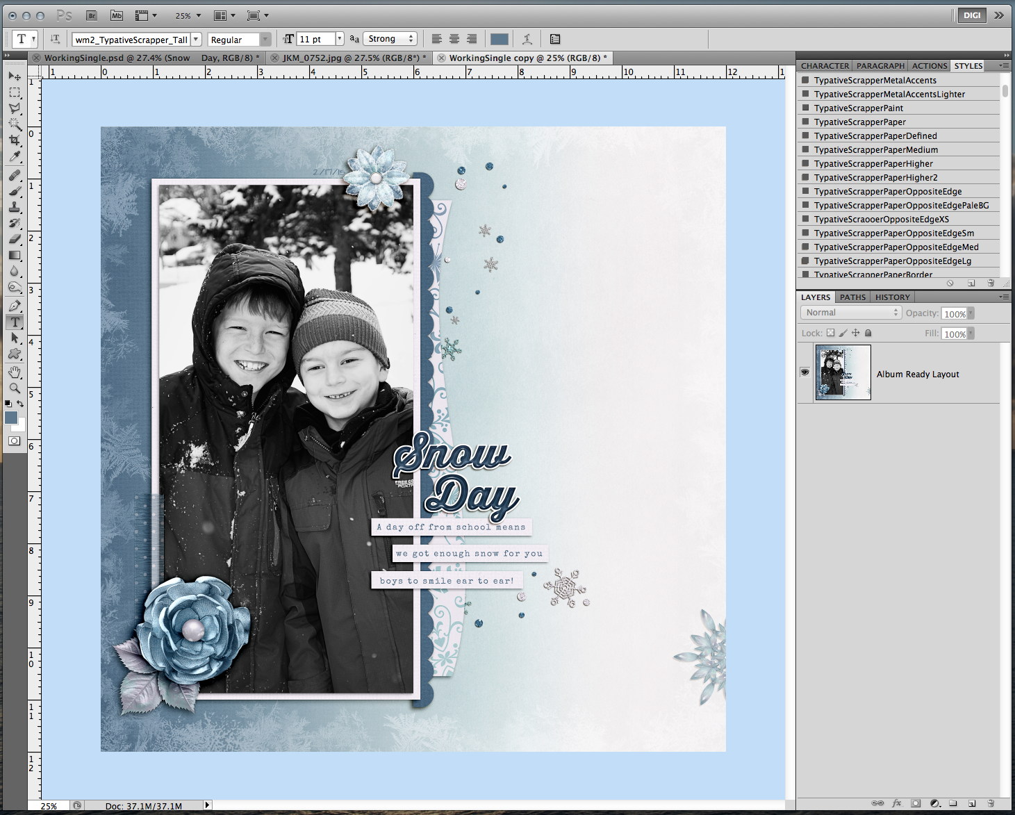
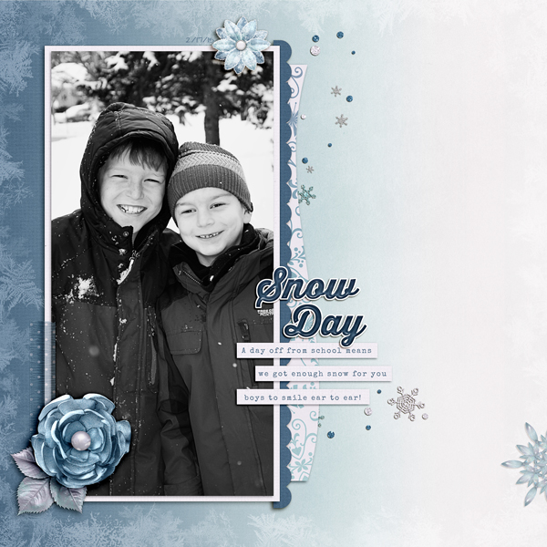
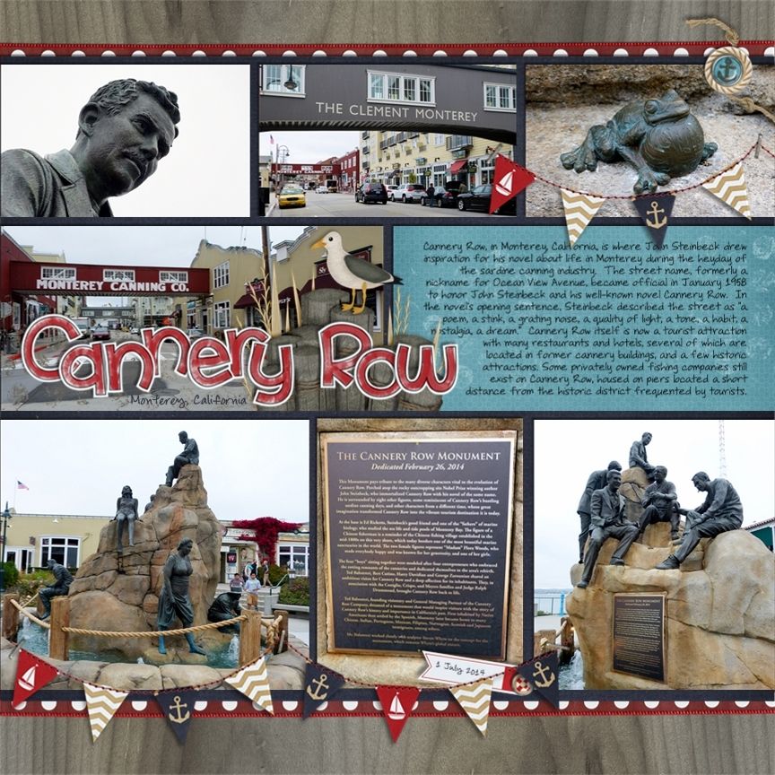
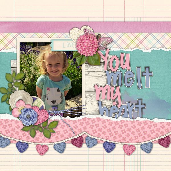
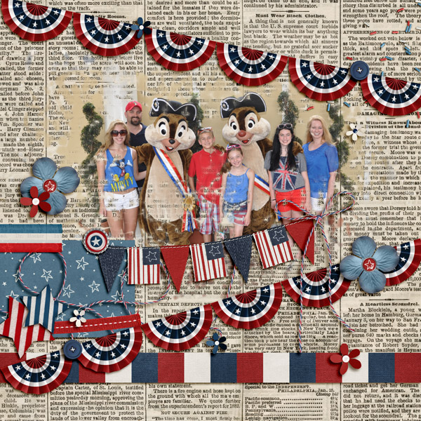
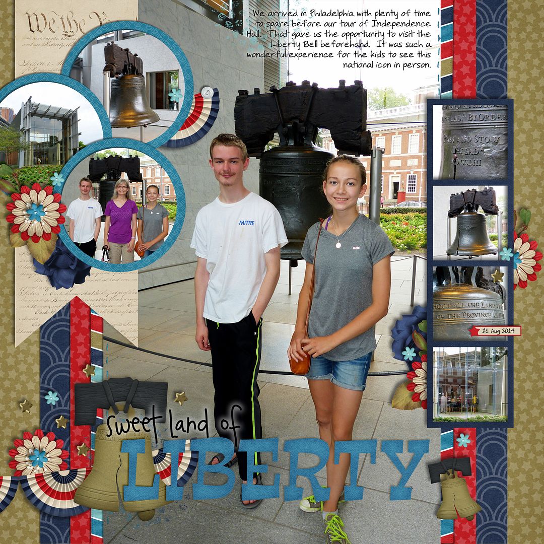
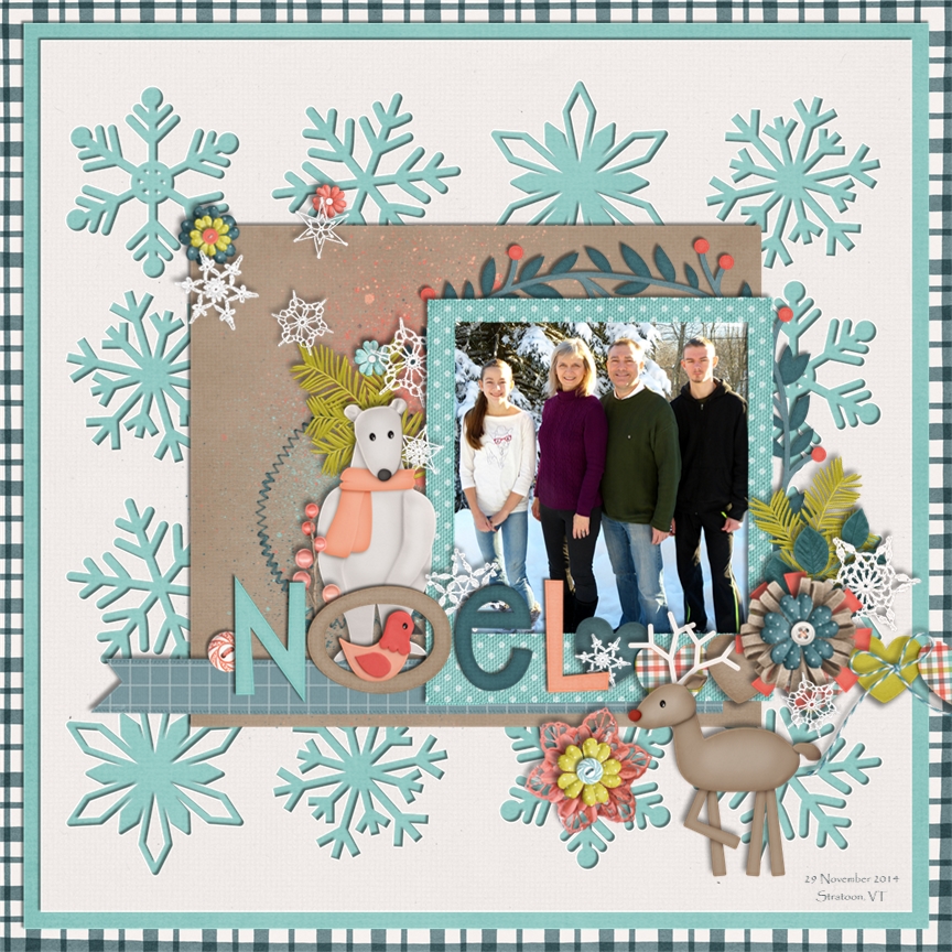
For my example and layout, I’ve used the collab, Snowlandia by Chelle’s Creations and Ziggle Designs. My font is Special Elite, and my title was a free version of Thirsty Script. I’m also using a template that has been modified from Scrapping with Liz.

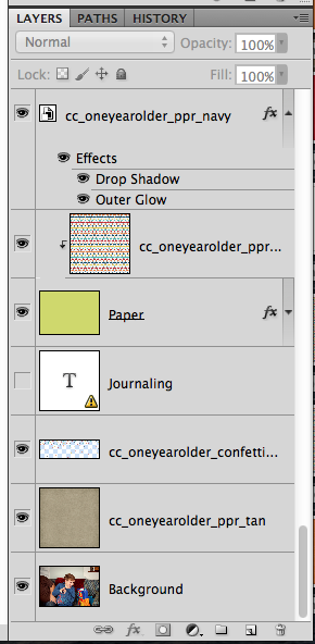
I’ve finished my layout, and I’ve saved the layout for my Album. Now, I’m going to save for web version. Here is what my working space looks like in Photoshop.

Save1

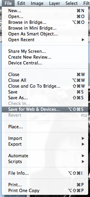
Next, under the File menu, you will choose the Save for Web and Devices option.

Save2

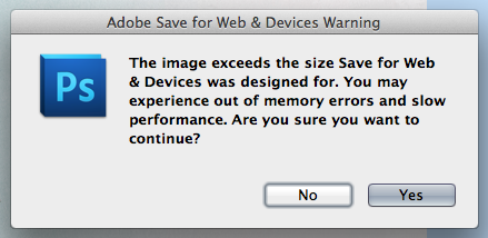
When I complete a layout and save it for my Albums, it is full size. I leave it as is, and after I choose the Save for Web and Devices option, I get a warning pop up. The warning does advise that it may run slow, and have errors. BUT, this error has only ever occurred 1 time when I completed this step, and since I have the album copy saved, I never worried about it. I’m also a bit lazy, and just go for the save for web and save myself a few steps. Here is what the error looks like:

Save3

ALTERNATE WAY: If that warning scares you, then before you choose the Save for Web option, you can resize your layout by choosing Image > Image Size. Then when the pop up appears, change your layout to 6 inches by 6 inches or 1800 pixels x 1800 pixels. Then the warning will not occur. All other steps remain the same.

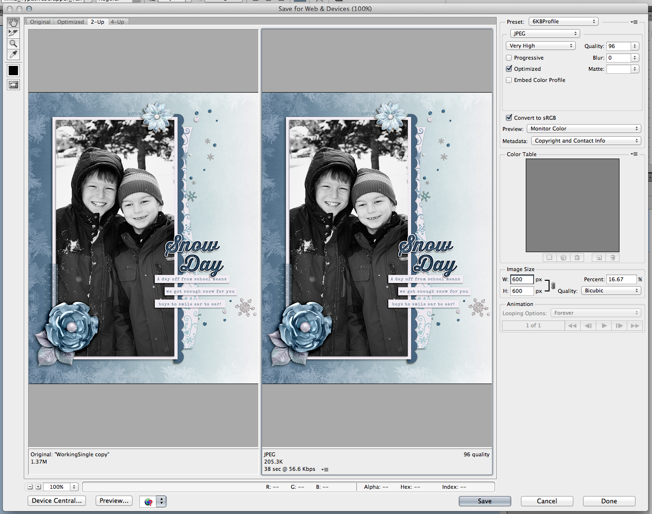
So, once you have chosen Save for Web, a large pop up screen will appear. It will look like this.

Save4

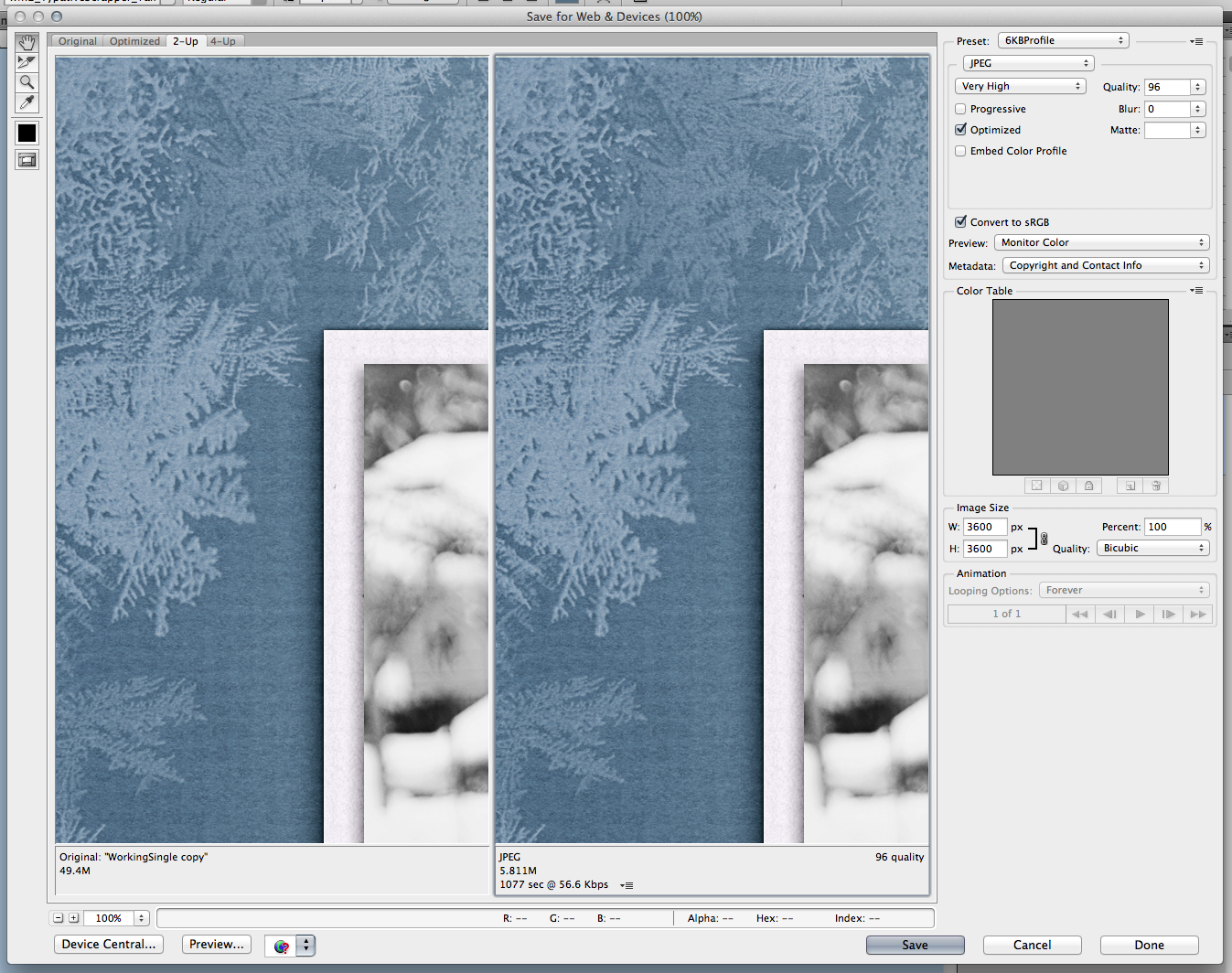
On the right side, about halfway down, there is a Image Size option box. You will enter the size to be whatever size you require. Most galleries are 600 x 600, some are 700 x 700, 800 x 800 and even 900 x 900. Enter in that size, and keep the constraints locked. Once you hit enter, your image will shrink down.

Save5

Save6Next, on the image, in the top you have choices for how you want to save. For the web, mine is set to JPEG, and it is also set to Very High, and Optimized. Save7b

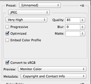
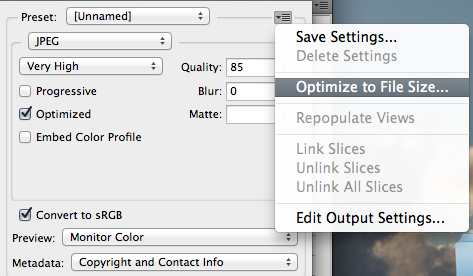
After you have JPEG selected, you will click on that SUPER SMALL itty bitty arrow that is to the right of “Unnamed.” A menu will appear, and you will choose Optimize to File Size.

Save7a

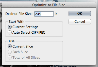
Once, you click on that, you will then enter the number that you want the file to be – size wise. 😛 I’ve put mine to 249, just so it doesn’t cause issues if a gallery has a 250kb limit.

Save8

Click OK, and then click Save on the bottom of the Save for Web screen. Save your layout, and then you’re ready to upload to most galleries. Here is the layout that I was working on – perfectly sized, and ready to go for the Web:

SO_CCZig_Snowlandia_Swl_S&SB_ThirstyBold_SnwDyFeb2015

Thanks for visiting today! Have a great week!

by_Jenn

02.26 Video Tutorial: Isolated – Selective Coloring

Have you ever noticed photos where just a certain object in the photo was in color and the rest was black and white? Do you know how to get that same result with the photos you take? Chelle of Chelle’s Creations has created a video tutorial to explain just that. Let’s take a moment to watch and learn.

Helen (winipeg1) has used what she learned from the video to created this simply adorable layout. It almost seems as if Chelle designed the kit around the color of her bow because they go together so well. Helen used the Put a Ring on it kit to create her gorgeous layout.

Unfortunately, the kit used in this video tutorial is retired but take a look around Chelle’s Creations store to see if something else catches your eye. I hope you this video tutorial has given you a new way to showcase some of the photos you have. I hope to see some layouts featuring this technique in the galleries. Happy scrapping until I’m back next month with another fun and exciting tutorial to share with you.

Washi Tape Shadowing Techniques

Washi Tape Shadowing Techniques

Washi tape is super fun, and a great little embellishment to have in your stash! This is Jenn, aka jk703, here to bring you Washi Tape Shadowing Techniques today. There are a lot of way to shadow, and we all have our little quirks, so hopefully one of these might work for you and your layouts!

Shadowing washi tape is a little tricky, but it doesn’t have to be. Washi tape is a fun element, to tack items down, use as a journaling/date location, and even as a border with multiple pieces across a whole edge on a layout. Once you use it, you will be “stuck” wanting to use it over and over again! :) 
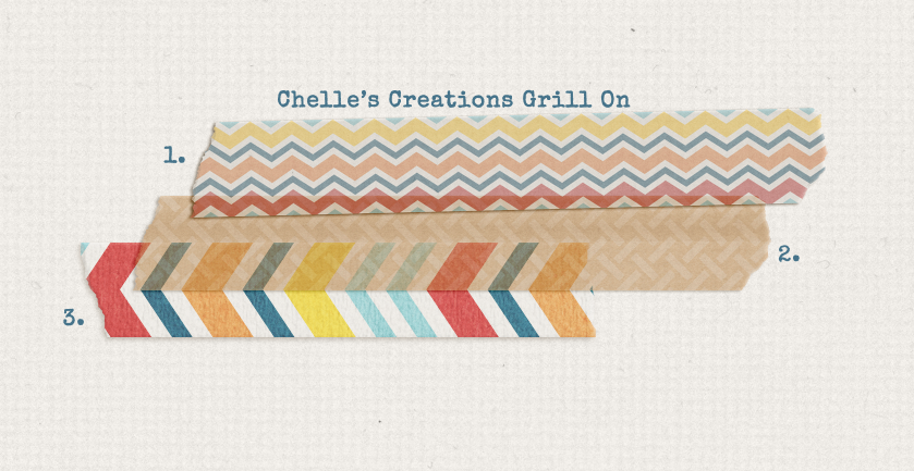
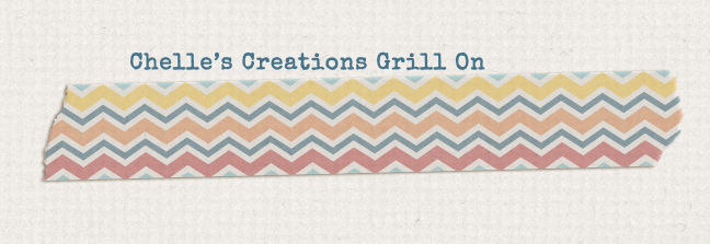
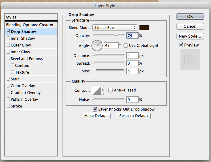
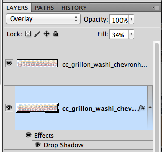
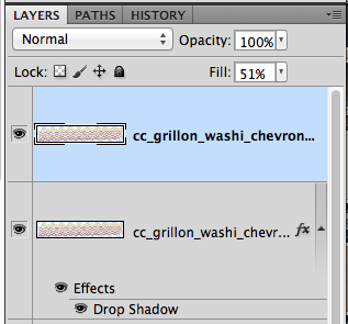
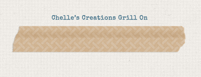
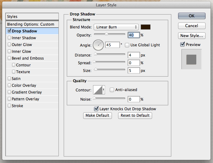
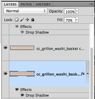
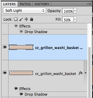
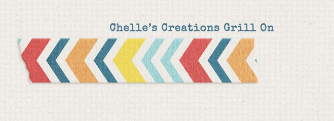
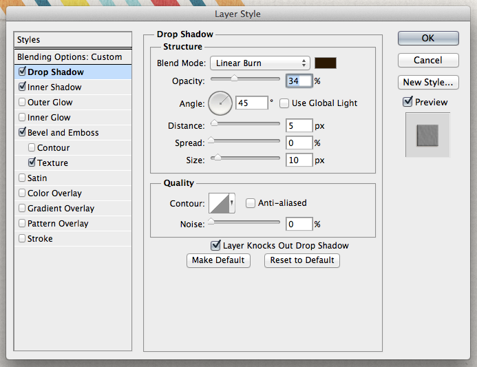
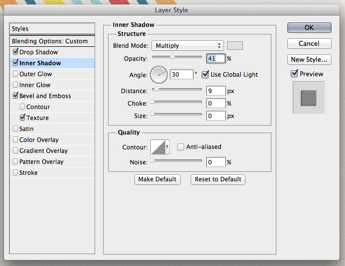
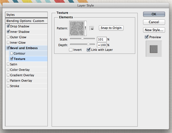
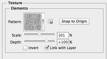
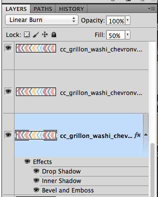
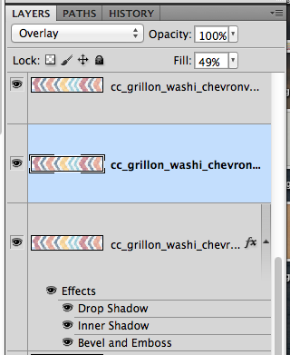
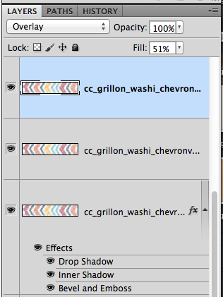
Here are a few ways we can shadow washi tapes.
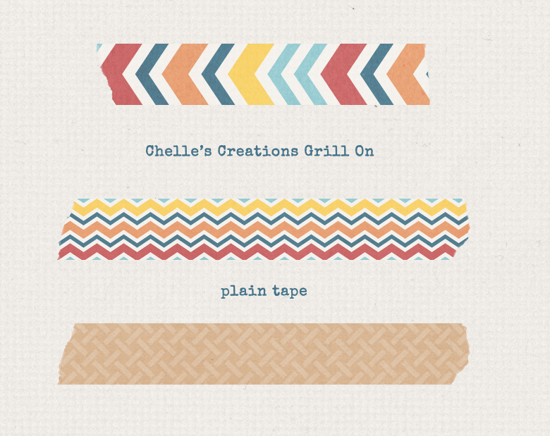
Here are the tapes that I have used for my examples. They are a part of Grill On. Plain Tape

Tape1

Tape with Shadows – layered for you to see how they might look stacked.
Tape2

#1 Easy Peasy

Tap3

You start out with a piece of washi tape. First, you will want to make another (duplicate) copy of the original tape – right click, and choose duplicate. For this shadowing technique, I’ve added a shadow (mine are 45* – down and to the left) to the lower of the two copies. I have a distance of 4 and a size of 5. I lowered the opacity to 74, and used the Linear Burn Blend Mode. Tape3a

The bottom layer tape has a blend mode of Overlay, and a Fill of 34%.

Tape3b

The top layer of tape has a Normal Blend Mode, and is at 51% opacity.
Tape3c

See, that wasn’t so hard! Next up, we will try something else – adding a little depth over paper. Oooooohhhhh…. 😛


#2 A Little Burn Won’t Hurt
Here is what my finished tape looks like stand alone. I’ve made it appear as if part of the tape has a higher lift on the top portion. This will be layered onto another piece of paper. If you look above, you will see this on top of another tape layer too. It will appear as if the edge of the underlying paper has put an edge into the tape.
Tape4

For this shadowing process, you will want to have two duplicate copies of the tape layer. With the bottom one selected, I’ve set my shadows to Linear Burn, 40% opacity, Distance of 4 and a size of 5.
Tape4a

My bottom layer has a Normal Blend Mode, and a Fill of 70%
Tape4b

The top layer of tape has a Soft Light Blend Mode, with a fill of 50%.
Tape4c

Next, with the bottom layer of the tape selected in the Layers Pallette, you will choose the Polygonal Lasso Tool. You will use this tool around to make a box around the tape portion that is OVERLAPPING something – a piece of paper, or a photo, whatever the tape is overlapping. Once your box is made, you will get marching ants.
Tape4d

Now, click on the Burn Tool. It’s the one that sort of looks like the fingers/hand are making a circle.

Tape4e

Now, my settings are at 65 size, Exposure 30%, and Protect Tones is checked.
Tape4f

At this point you should still have marching ants on the bottom layer of tape. With the Burn tool, brush over the bottom edge of the marching ants – where your tape overlaps another paper/photo, etc. You should get a slight darkness added to this layer of tape. Almost like a crease.

No too bad, and looks especially good when using on top of paper layers. Makes it just a little more realistic with a darker bump where the overlap occurs.

#3 Textured Tape
This is a fun shadowing technique for washi tape. It adds a little dimension where you might not have realized you wanted it, lol!
Tape5

Make 3 copies of the tape for this shadowing technique. My piece of tape above has a Drop Shadow using Linear Burn, 34% opacity, Distance of 5 and a Size of 10.
Tape5a

THEN, it also has a Inner Shadow using a Multiply Blend Mode at 41%, and a Distance of 9.
Tape5b

THEN on top of that, I have a Bevel and Emboss – Texture added! My Scale is 101%, and my Depth is 100%.
Tape5c

See that little triangle pointing down on the right of the pattern box? Click that, and choose a pattern that you like. I’ve chose Wax Crayon on Sketch Pad.
Tape5d

Bottom layer of tape is set to Linear Burn, with 50% opacity.
Tape5e

Middle layer of tape is set to Overlay, and 49% opacity.
Tape5f

Top layer of tape is also set to Overlay, and has a 51% opacity.Tape5gThere you go – a textured, fun, washi tape.

Jenn (jennschultz) created this fun page using tape from See Clearly Now. She tacks down her picture and the eye chart with it. :)

new glasses

Hope you learned something new with Washi Tape Shadowing Techniques. There are so many ways to shadow things in PS/PSE. Make sure you like what you have, and play with the blend modes. They can make or break the coloring. Have fun! Thanks for stopping by today! See you next time.

by_Jenn

02.12 Video Tutorial: 5 Ways to Use Bubble Wrap

Who’s ready for some warmer weather? I know that I’m not looking forward to this coming week here in Florida. We are predicted to hit a record low for this time of year. Enough about weather let’s get on with what everyone is here to read all about. Chelle’s Creations has created a video tutorial that shows you five different ways to use her CU Bubble Wrap Brushes. Let’s take a minute to watch her video.

As always, Chelle’s creative team has used a technique or two they picked up from the video and applied it to their own page.

Jan (QuiltyMom) used the brushes to help make her title not get lost in the photo. She also created some texture with the brushes on her blue paper with her journaling. The Anchor’s Away kit by Chelle is perfect for this layout and Jan paired it with a template by Scrapping with Liz.

To add a pop of color to the white background Lisa (kelseyll) clipped a paper and a paint splat the brushes. It really helps your pictures stand out. Lisa used Bug Town by Chelle for her cute layout.

Melissa used Down on the Farm by Chelle to create this adorable layout. She wanted her page to have more of a grungy look. She clipped a paper to the brush to achieve the look she was wanted.

There are a lot of uses for the CU Bubble Wrap Brushes for the every day scrapper. Just because they are labeled CU doesn’t mean you can’t use them on your own personal pages. Head over to Chelle’s Creations store to check them out and while your there see what others goodies you might find.

Stop The Crop!

Hi Everyone! It’s Jenn, jk703, here. Did I get your attention!? By me telling you to Stop the Crop isn’t referring to actually stopping your scrapping, but toward the cropping of your photos! :) We all scrap and the reason could be for many reasons – photos, creative outlet, recording our memories and sharing the stories. Sometimes, you can use the photo to give more information, or just as a backdrop for your journaling. Maybe you don’t have any space to journal, as you filled up your page with all photos!There may be times the story could also be in the surroundings in your photo.

Journaling on photos isn’t hard, but there are a few tips that might help you.

  • Make sure the font is legible on the photo. My thought is that you wouldn’t want to use a fancy script that will be hard to read on busy background photo.
  • Check the color, and change it to see what reads easier over the photo. Try changing the Blend Modes on the Type Layer.
  • Work with the space and shape of your photos. If your program allows, try using the Type Tool, and the Shape Tool to create Text Paths for your journaling.
  • When journaling on the photo, try to determine the best spot to journal. Sometimes you can journal on one spot, but then another it gets to hard to read. Choose wisely.
  • Lastly, to keep the surroundings visible, but to allow for journaling on a busy background, add a paper piece of vellum. You can then still see the image slightly, but your journaling will be easier to read.

Here are some examples that the CT created. Jenn created this YUMMY layout – using Pizza and Pasta Journal Cards, Pizza Amore and the alpha from Pasta La Feasta.  She added some journaling to the photo, used a typewriter font, and used a lighter font on her picture.

pizza

Lisa created this fun layout. She used Roller Coasters and Cotton Candy. Lisa also said that she made two layers of the text, one in white and one in black underneath, and she offset by 1 pixel down and 1 pixel to the left to give a shadowed appearance to make it easier to read.

2-5Assign1TextonPhoto600x600


Jan made a great layout about her trip to California! She used Get Your Grill On, with Gimmie Doubles Vol. 1 by Cluster Queen Creations. She added her journaling right on to her photos, and tried to place it in a location to make it easier to read.

loulous

Here is my page – I used Chelle’s At The Beach, and Scrapping with Liz’s 2016 Calendar Templates 2. I had originally had my journaling as a long column, but since there was a lot of dark and light pockets on the sand, I moved it only to the water and sky. Much more legible.

i-WcfWX9J-L

There you go. Stop the Crop and journal on your photos! Have a great week, and thanks for stopping by!

by_Jenn

01.29 Video Tutorial: Torn Paper Edge

Are you looking for a way to add a more realistic touch to your layouts? Chelle’s Creations video tutorial is going to share how to give papers in your layouts a torn edge look. Chelle Creations has created a bundle to make it even easier.

Here are a few inspiration pages from Chelle’s creative team.

Krista (kc71595) combined the CU Torn: Whites with Anchors Away and Liberty to create her lovely page. She also chose a template by Scrapping with Liz. I love how the torn paper adds a little texture to the page.

That smile would definitely melt my heart. Helen (winipeg1) used Fleur de Violoette to create this adorable page.

Do you want to easily be able to create the torn paper look on your own pages? Check out Chelle’s Creations CU Torn Bundle featured in the video. While there check out other great products that Chelle has to get your pages going.

Backwards Photo Blend

Backwards Photo Blend

Hi Everyone! This is Jenn (jk703) here, hoping you are all doing well on this wintry (for me) Thursday! We’ve got a smidge of snow on the ground, and it is so cold out! I’m home with a sick child, and it is nice not having to go out and about today! Today I’m going to show you how to make a blend, but backwards, lol! It’s super easy, and looks great!

For the Backwards Photo Blend tutorial, I’ve used Chelle’s One Year Older Kit, and some new products from Scrapping with Liz. They were a perfect match and I love how my layout turned out! Here is my layout so far… a little bit of fun, and a lot of open space. I love open space layouts, but I’m not always the best at them. Sometimes, I feel like I spend more time trying to work on a clean layout versus a bit of clustering. So, let’s fill that BIG open space with a picture.

Erase1

Next, I’ve pulled in a picture and for this image, it is above the paper. Just so I can see where I want the image, I’ve changed the blend mode for the time being. This way I can move the photo and see how it might look for the blend. This step is just for placement. After doing your photo moving, you will then put the image behind the background paper layer. (Remember, to change your image back to the Normal Blend Mode.)

Erase2

Here is my Layer’s Palette. Photo on the borrow, background paper and then all the papers and embellishments. These are not the originals, just “copies” of the kit pulled into Photoshop. You also want to have a duplicate image of your photo. Not the original. The reason for this is that this method of blending/masking could damage your original photo or papers.

Erase3

Next, I’ve selected the Eraser Tool.

Erase4

For my selections on the Eraser Tool, here is the sub menu. I’ve selected a large soft brush eraser, and a flow of 25%. I usually start low, and if I need more erased, I go over again, or adjust the flow higher.

Erase5

With my kraft background paper selected in the Layers Palette, I slowly click on where my son’s head is, to erase the paper. I click in a couple more spots, and after erasing, here is what my Backwards Photo Blend looks like. It is intended for him to look excited at the pictures of him, lol!

Erase6

Next, I add a title and my journaling and I’m good to go. Space filled, a bit a cluster, title and journaling. All done!

SO_CC_1YrOldr_SWLRcyc36&EdgrTmps_SpecialElite_ShayneCloud9Dec2014_WEB

Jenn (jennschultz) created a page using Chelle’s Rock the Vote and the Summertime mini kit! Perfect combination! She made a layout for a visit with Chip & Dale, and the backwards photo blend was done on the family picture!

chipanddaleleft

A super easy way to try out the Backwards Photo Blend – I hope you liked it! Can’t wait to see your creations using the technique! Have fun, and thanks for visiting!

by_Jenn

01.15 Video Tutorial: Text on a Busy Background

Welcome to the new year and another video tutorial by Chelle of Chelle’s Creations. Today she is going to give you a few pointers to ensure that you journaling doesn’t get lost on busy background papers or photos.

A couple of Chelle’s talented creative team members provided layouts using the techniques they learned while watching the video.

Lisa (kelseyll) used the outer glow method by casting a blue hue around all the text. Since the date was on a really busy part of her layout she also added a slight shadow to help it to be seen. For this cute layout Lisa used the parts of Loom Love (Sampler, Solids, and Alpha).

The outer glow method doesn’t work just on text, but it also works on word art as Jan (QuiltyMom) demonstrates with her layout. To make the black letters stand out and not fade into the black of the Liberty bell the outer glow creates the perfect contrast. She also used the outer glow method on her journaling to ensure the words didn’t blend in with the photo. For this fabulous layout Jan combined Liberty and Liberty (word art) with a template by Cluster Queen Creations.

This video features Chelle’s Creations Falling 4 U kit. Visit Chelle’s Creations store here to see this kit and her other fabulous creations.

You don’t want your journaling to get lost on the page. You placed it there to remind yourself and tell others about the experiences you had. The next time you are finding it hard to read what you wrote try one of Chelle’s tricks.

Flower Layering and Tips

Flower Layering and Tips

Hi everyone! Happy New Year! I’m excited to show you my post today. This is Jenn, jk703, here today to share some fun ideas and some awesome pages using Chelle’s Creations supplies. This is so easy, and I had so much fun. And I’m sure you can relate – I made my layout for the post, and it became my newest most favorite layout. Actually, many of my favorite layouts are using Chelle’s supplies. They make me and my pages happy!

Today, we are going to play with flowers – specifically Flower Layering and Tips. For my example images, I’ve used Chelle’s At the Beach kit, and the At the Park Kit. So versatile, and they work well together!

Let’s get to it! Flowers are *usually* included in kits, and there are always so many and in so many colors. I want to use them all sometimes, but that doesn’t always look right for me or my style. So, this is an alternative. Layer them up, change, twist and flip them to make them work for you.

Here is the start of my flower. A pretty bright red, with a shadow style and it looks nice!

Flowers1


Next, I’ve added the same flower but one that has a pattern on it, right on top. Then I used my Move Tool and twisted it a little bit. Still looks a bit unfinished, right?

Flowers2


Next, I added one of Chelle’s super awesome little paper flowers to the middle, and your shadow styles – and you get this little gem. Viola! A perfectly pretty layered flower. Isn’t it pretty? I just love it! (Yes, I’m a bit dorky, lol – sorry!).


Flowers3


What about other kinds of flowers that you see in her kits? They all work with this method. Here is a burlap flower with a buttoning the center. It looks nice, and that blue looks great on the white. How can we add to it? We layer it up!


Flowers4


Adding that same plaid flower layer from above, just squeeze it in between the white burlap and the button. Just give it a little oomph, more than just a button.

Flowers5


You could even layer up burlap flowers of different colors, and change out the button to a decorated bottle cap. Just remember to make the 2nd flower a bit smaller than the one in back, and add a shadow style.


Flowers6


Or, mix it up by adding the 2 burlap flower layers, the fabric flower layer and the button. Making layered flowers like this has infinite possibilities. You can stretch your stash another 100 flowers.

Flowers7


After I was done layering up and trying out all kinds of flowers, the ones above were my favorite mix. I made a layout and I LOVE it! For this layout, I also used one of Scrapping with Liz’s templates – New Year’s Templates. – which I modified a lot. Here’s my page:

SO_CC_AtBeachPark_SwlNewYrsTemps_MissKinder_SmirkJul2014_WEB


Flower Layering and Tips: 

Play and try out flowers you don’t think will work together. It might surprise you. I didn’t think the two burlap flowers above would look good, but with a little shrinkage and a twist, it came out pretty sharp looking.

Try bold patterns or shapes with classic colors. You might like the combination.

Give each layer a shadow style so that each layer of flower has some depth and definition. Shadow Styles make it look a bit more realistic. If you had flowers on your table and put them on top of one another, you would not have flat flowers. Neither should your layouts. :)

Try clustering your layered flowers. My layout above combines the flowers I made and then adds another little paper flower. It’s a boy page, but the colors and types of flowers means that it doesn’t come off as a girly page. The burlap flowers give a sturdy solid feeling.

For flowers, I work in groups of odd numbers – 1, 3, 5. Above, my layout uses 3 in a cluster, and then 1 above the photo. With you eye, you may go from the white top flower, down over the photo to the flower cluster, and then over to read the title. (At least, that is how my “eye” flows over the page, lol!)

The layered flowers adds visual interest to the layout, as well as depth and different texture. You that toward your advantage and allow those flowers to convey feelings. My page above is bright, fun, on the boyish side, and solid. I think my flowers convey that – they aren’t soft, dainty or pastel.

Try different centers for your flowers – Brads, Buttons, Beads, Coins, or any other embellishments that might fit. Even a metal asterisk from an alpha might work.


I had some lovely layouts submitted for Flower Layering and Tips post from my co-CT members. Here are their pages. What is funny is that they both picked Cozy Christmas for their pages! It must be because it’s so cold out, and everyone would love to be cozy and warm.

Jenn (jennshultz) created this  layout. She mixes up her flower layers with different types of flowers and lots of great colors – as well as adding shadow styles to give each flower it’s own depth. She also used the Cozy Christmas alpha that matches the kit. brrr-1


Jan (QuiltyMom) made the next chilly layouts with lots of snowflakes and flowers. Jan worked with the template by Down This Road Designs and worked the ideas into her flowers. She layered some flowers on snowflakes, and then layered more flowers on top – very clever. She alternated colors and added shadow styles. She also used CU Snowflakes for her layout. noel

There you go. Flower Layering and Tips to start off your layouts. Give it a try and I’d totally love to see what you create! Thanks for stopping by today and have fun scrapping!

by_Jenn


Scrap a Layout in 5 minutes ON YOUR PHONE | Digital Scrapbook Tutorial

Hey Friends,

I just scrapped a layout in 5 minutes…ON MY PHONE!  I love the speed and simplicity of Project Life -style layouts, but I want the beauty of “touchable” digital layouts.  That’s one of my favorite things about digi is that it doesn’t look flat.  Layouts have depth and dimension.  So do my new journaling cards:  3D’s: Digi, Depth, & Dimension!  I’ve cooked up a few using some of my recent favorite kits.  Check out my Tip of the Week Video below to see how to scrap on your phone using these cute cards!

Good Night Teddy


Movie Night


Down on the Farm


Down on the Farm & Down on the Farm {Sounds}


SCRAP on your PHONE?!?!?!?

Scrap super quick and on the go.  Using a couple of apps (3 to be exact) using Chelle’s Creations journal cards…Let me show you how:

if you mail client doesn’t play nice, you can download any of my video tutorials from my You Tube Channel.