8.28 Tips: Big Photos

Hi everyone! Can you believe it’s the end of the summer here in the US? I can’t – I’m in denial! This is Jenn (jk703) here, and I am in complete denial that the summer is ending!  LOL! We’ve gotten our teacher assignments, and classroom schedules, and I keep telling myself “It’s Summer!” Uh oh!

Anyway, summer is BIG for me! BIG as is lots of freedom, time, fun, and even more pictures! I bet you have great summer pictues too! I know that once I get a great photo, I like to make it the focus of my scrapbook pages! So…. how to you do that? By making the photo the center of the page! Here are a few tips for you!

1. Let the photo shine….

Really. It’s ok. Trust Me. Many templates out there are one photo, two photo. or multiple small photos. You don’t have to follow the template! I know, it’s hard not to, but you can switch it up! try using a photo as the “background paper” and moving the clusters to one side or corner! Play with your templates! Remember they are not set in stone, you can change them how you choose.

2. Make it Big and Layer It Up!

Many of my pictures are layered and “matted” up. I like the look of a big picture with matted edges. All you have to do is stroke the edge of the photo with a few pixels and you are set! It doesn’t have to take up 10×12 of a 12×23 layout to shine. Just make it the focus!

3. Add a Title!

You have a great picture, now what? Nothing but add a title! Really! If you love the picture that you have, make it work for your page – just add a title and even some journaling, and you are set. Done. East Peasy!

Here are some inspirational pages from Chelle’s CT to show off some BIG picture pages:

Here is Jenny’s page using Hard Hat Required! Look at that BIG photo -perfect with just the clusters in the corners!

 Memorial-Weekend-w-Vandebergs-1_web


Look at this Super Moon pic by Donna! You can’t help but admire it! She used Out of the is World by Chelle!

Donna

Last, but not least, Lisa, made this wonderful page about life size games, specifically, Chess!  I think I have to dig out my pictures lie this too and scrap lift her! She used Game On by Chelle! Kelsey

Big pictures are a good thing. Don’t be afraid to use them!

Have a great week, and thanks for visiting!

by_Jenn

8.18 Video Tutorial: Sticker-ize Elements

As a kid I loved to place stickers everywhere. Did you know you can get your elements to have a sticker look to them. Chelle’s Creations has this video tutorial to show you just how easy it is. Chelle uses elements from her kit Play & Grow for this video.

Here is some creative team inspiration using what they learned from the video.

Jen (supergirljennie) adds the sticker look to different elements from the See Clearly Now kit. I love how she combines a font with the See Clearly Now {alpha} to create the title on the page. She used a template by Scrapping with Liz.

This technique does not have to be used with just elements. Melissa (prettypeaches) sticker-ized the Hard Hat Required {alpha} on her layout. I love the split design of the Little Green Frog template she used. Isn’t that cluster on the bottom of the page too cute? She used the Hard Hat Required kit for this adorable page.

Love the kit Chelle used in her video? You can pick Grow & Play up in here store.

I can’t wait to see what you decided to sticker-ize!

8.14 Tips: Digital Shadow Tips and Tricks

8.14 Tips: Digital Shadow Tips and Tricks

Hi Everyone!! It’s Jenn (jk703) here to bring you today’s post and offer some tips with your digital shadows! Chelle offers a wonderful style set of shadows called Me & My Shadows by Chelle’s Creations. Here is the description (I can’t describe it any better, lol!) right from the product page:

“A digital scrapbook product by Chelle’s Creations.  Take your shadowing up a notch with Me & My Shadow Styles by Chelle’s Creations.  Speed up your scrapping with these layer styles.  Quickly add shadows to multiple layers.  Me & My Shadow Styles works with PSE & PS and progams that use .asl style files.  Includes common shadow directions:  Shadow to the LowerRight = 120 (photoshop standard),  Shadow to the LowerLeft = 45 , Shadow to the UpperLeft = -43.”

You can complete your layout, add all of your shadows with simple click, click, click. But, if you are like me, you can’t leave well enough alone! Sometimes, I just have to adjust my shadows by moving them a smidge, changing the depth, or even the color. Here are a few tips when working on shadows. Just remember, you have to like your shadows, and everyone has their own taste. While I might offer some tips, I am no expert. :) These are just tips and tricks to using shadows, and how to make them your own, and to change them up to make them your own! Most of these tips will work with PS and PSE, some may not work with PSE.

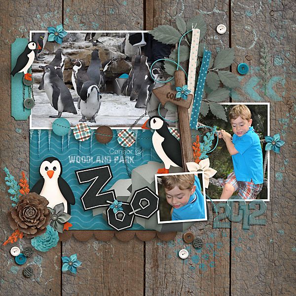
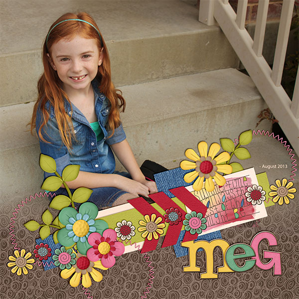
All of the close up examples use Chelle’s Creations Zoo Crew (Arctic). 

1. Lighting

First things first. Light is a big thing. Look where the light is coming from on elements when you place them. You will want to shadow and match the lighting on the element with a twist, turn, or flip. Here are two buttons, both use the Thin Button Brad setting. Can you see how the one on the left is twisted so the light part is to the upper right? That is because I usually shadow to the lower left. The button on the right is shadowed the same direction, but the lighting on the button is on the bottom left. It looks funny. So, try to match your lighting to your elements.

ShadowTips1

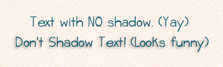
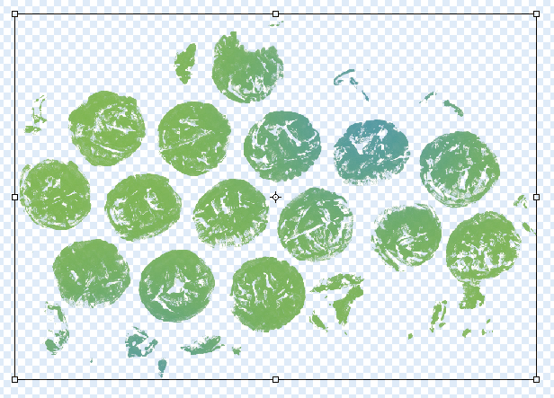
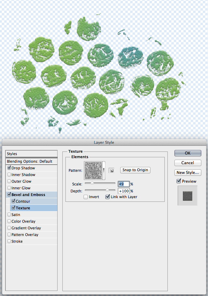
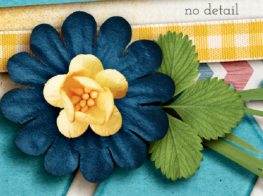
2. Not ALL Items Must Be Shadowed

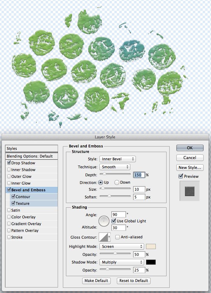
So, what happens if you add a shadow to text. Well… it looks funny. LOL! Text usually doesn’t have a shadow that I’ve ever seen when I write on a piece of paper, so I don’t add shadows to my digital scrapbook pages.  Other items that may not need shadowing are paint and splatters. Here’s an example:

Screen Shot 2014-08-13 at 10.25.53 PM

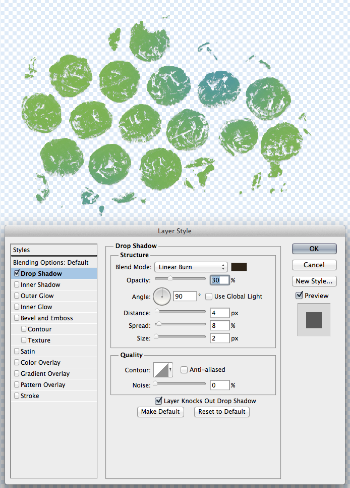
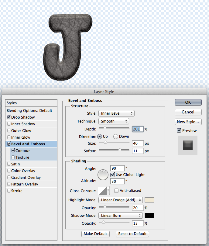
3. Global Light & Blend Modes

This is a personal choice, but one that I think is important when you start to play with individual shadows. Leave the Global Light Unchecked. Why? When I start fiddling with shadows, and if the Global Light is checked, some of my other shadows may change to match the Global Light. Global Light’s purpose is to have all your effects agree and work together. I don’t want my shadows to all work together. If I am fiddling with them, I want them to stay how I left them, not change in between or after I’ve made changes to other elements.

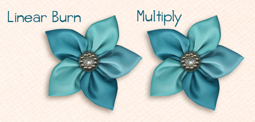
Blend Modes are important for the way the shadow looks and how it interacts with the layer below the shadow. Most times Multiply is the Default Blend Mode for shadows. I happen to use Linear Burn for my shadowing. I also look at the background paper to determine if my shadow color needs tweaking. I’ll make this super simple. Multiply is a bit more “solid” when casting a shadow. Linear Burn takes the color information of the embellishment that getting the shadow, and transfers that to the shadow coloring, If there is a lighter spot in the embellishment, the shadow will be lighter also in that spot. It is a very slight difference, but over time, I preferred the Linear Burn. Here is an example:

Screen Shot 2014-08-13 at 10.51.21 PM

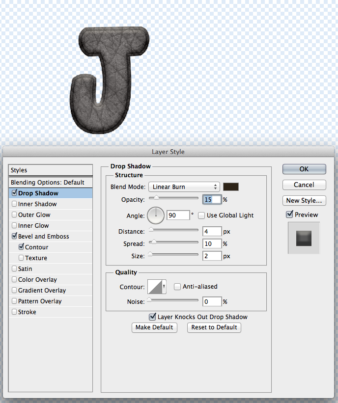
4. Shadow the OPPOSITE Edge

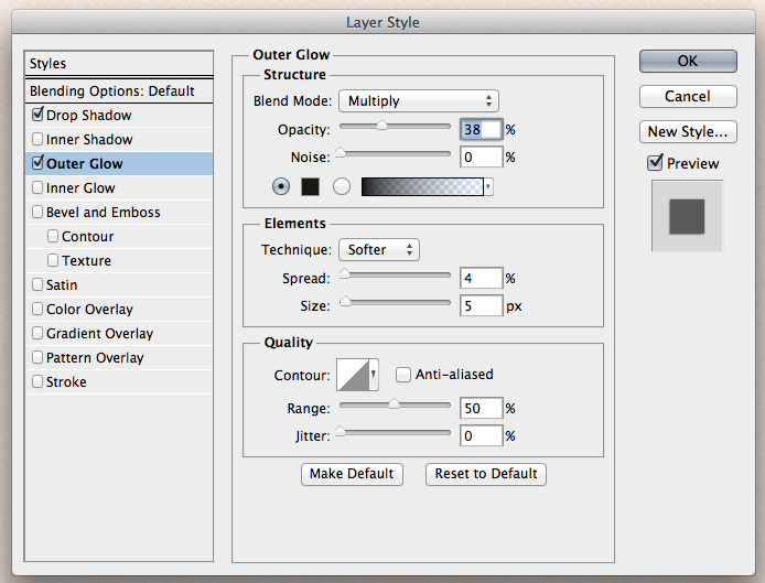
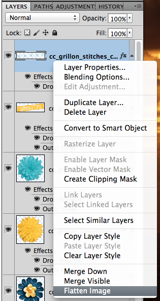
Nothing has a shadow on one side, and sits perfectly flat with no shadow on the opposite side. This can be done a few different ways, but the way that I do this uses the Outer Glow. Here are two pieces of paper, and the setting that I added to the opposite edge. To get to the shadow settings, click on the little “fx” on the layer you want to adjust the shadows. I feel this just adds a little something to certain elements and papers. I use this a lot for stacked papers, and stacked elements. You can use the Multiply or the Linear Burn for this option, as I think it is not as noticeable as regular shadows. Here are my examples.

Screen Shot 2014-08-13 at 11.14.08 PM

Screen Shot 2014-08-13 at 11.14.36 PM

5. Tweaking

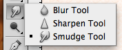
Tweaking shadows are something that I don’t do often – I’m just too lazy. While I wanted to learn and was so excited to learn, I found that I didn’t want to give that extra time to all my shadows. If I do tweak shadows, its for a flower here or there, a crumpled paper or frame, but mostly I use this for ribbons and string. When I tweak, I use either the Warp Tool or the Smudge Tool.  The Smudge Tool feels a bit more controlled than the Warp Tool.

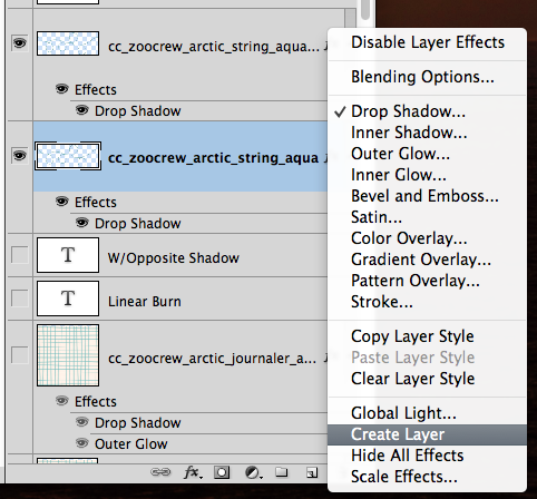
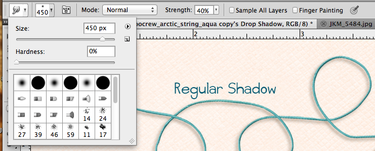
In the Layers Palette, select the layer that you want to Smudge the Shadow. Right click on the “fx” symbol, and choose Create Layer. This puts your shadow on it’s own layer, and allows you greater control of tweaking.

Screen Shot 2014-08-13 at 11.25.44 PM

Once you have your layers separated, select the shadow layer, and then choose the Smudge Tool. Here are my Smudge Tool Settings too. I use a larger brush to start with, and then change the size smaller when I need to get into corners or smaller areas. Usually around 450 to start, and then 100 when I end. I also leave the strength at about 40%, and have a hardness of 0%. Even with Control Z, it’s easier to add then to remove. :)

Screen Shot 2014-08-13 at 11.26.34 PM

Screen Shot 2014-08-13 at 11.32.24 PM

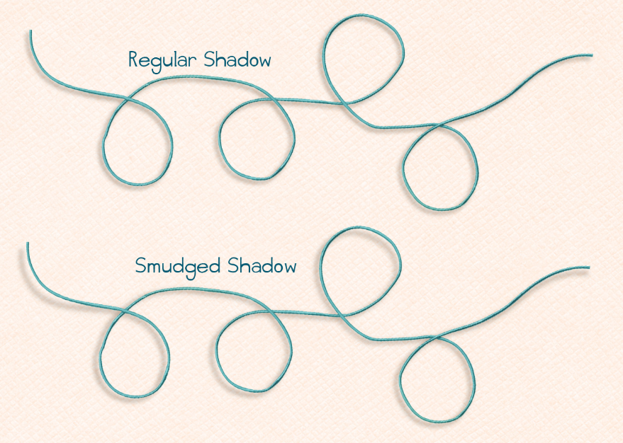
Here are my strings and how they appear after smudging. Look at the end pieces, and then near where any of the curved circles of the string is. Can you see the difference?

Screen Shot 2014-08-13 at 11.33.23 PM

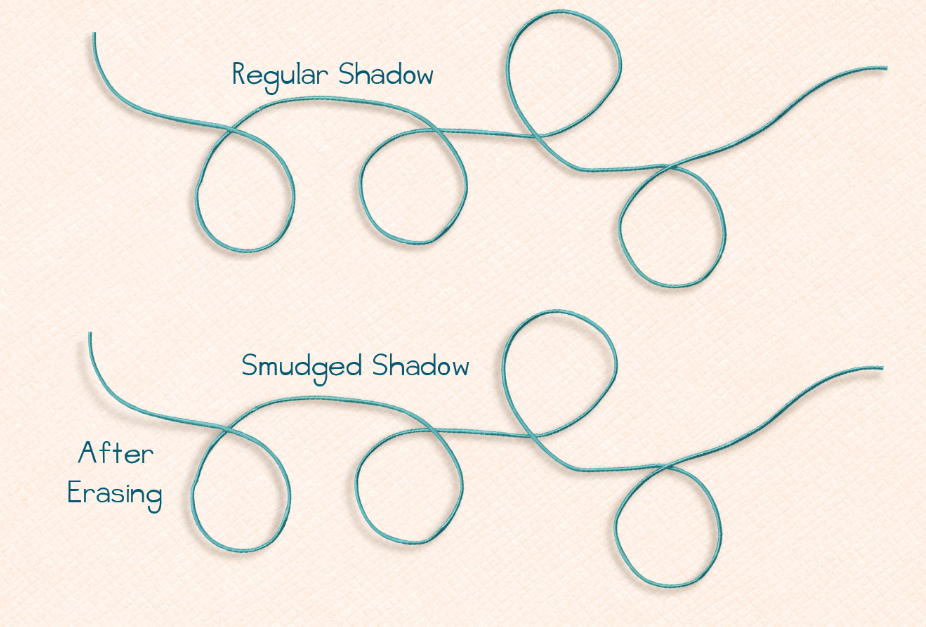
 I have one more tidbit to make them look a little more realistic. Especially, since string and other embellishments do not all sit at the same exact depth. Once you smudge a section and it looks as if it is farther away from the background, you might want to change the darkness of the shadow. Further shadows will have less definition and a lighter color than those closer to the background. Erasing part of the shadow will do the trick! Choose the Eraser Tool, and make the settings around 150 pixels in size, 40% opacity, and 40% flow.  On the shadow layer, click to erase the sections away that are “lifted.” Click and remove, over and over again. Here is how mine turns out. What do you think?

Screen Shot 2014-08-13 at 11.50.44 PM

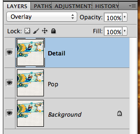
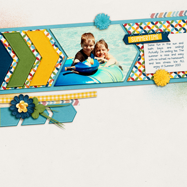
Jan (Quiltymom) also shared some information for the SBC+ users out there.  Her layouts uses In the Pool and Splash Alpha, and a Cluster Queen Creations Template. She shared the following info to help with your shadowing.

jan-14aug14tut

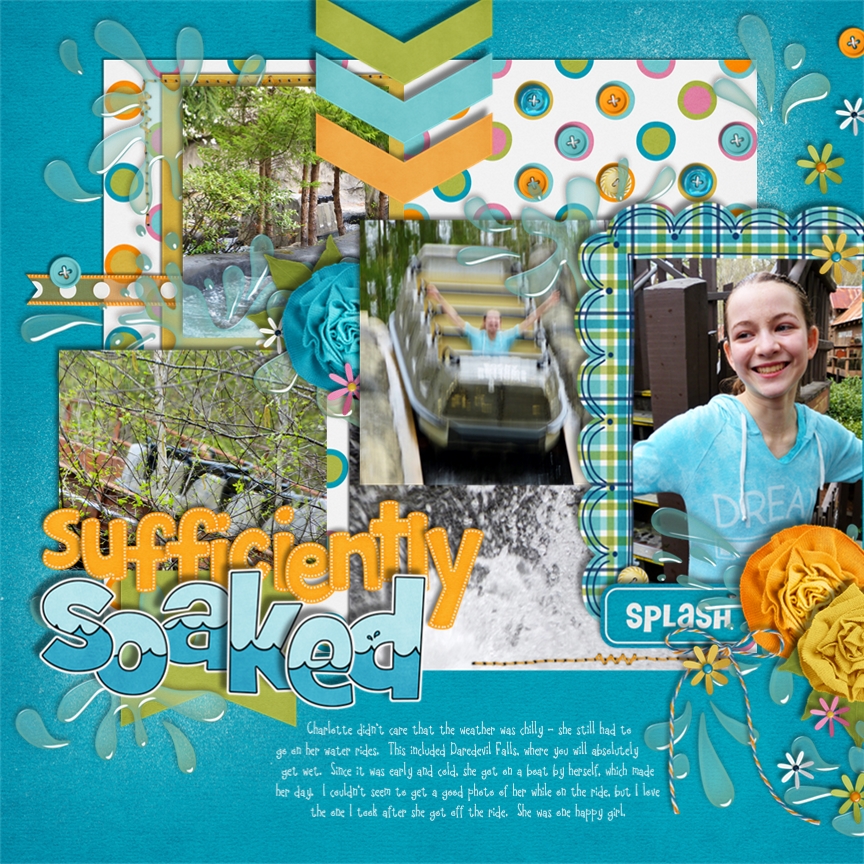
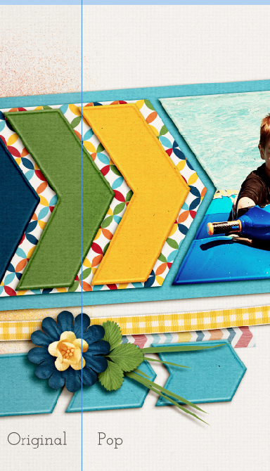
What I love about using SBC+ (StoryBook Creator Plus/Panistorian Aritsan) is how user friendly it is. Since most of the work has been already done for you, all you need to do is use a preset, or modify it if you choose. Shadow work is so simple and fun to customize. The closest to what Chelle uses is what I call the upper left preset. I always start my pages using the presets, but I’ll come back to customize certain elements to make them pop a bit more. I always make sure to use a variety of shadows to keep the page looking more realistic without being either flat or having everything float off the page. Also, for the most part I’ll leave the shadow color at black, only changing it to make the shadow less harsh.

It is also difficult to get a good shadow on transparent elements, such as the water splashes, so I cheat and use Chelle’s pre-shadowed elements from her kit! Yay for them!

I use the upper left presets for my pages for both the heavy and light shadows (Direction -135, Expansion 0). Here are the changes the settings I made for this page:
“soaked”: Depth 3, Softness 2
Large flowers: Depth 3, Softness 3
Buttons: Depth: 1.2, Softness 0.09

For the stitching I used the preset choice in the middle: Direction 0, Depth 0, Softness .07, Expansion 0. I want it to have some definition so it is not flat on the page without having it float.


There you go! Hoping you learned something today with our Digital Shadow Tips and Tricks post! Have a great week!

Thanks for stopping by!

by_Jenn

8.4 Video Tutorial: Stretch Your Stash – Blending Papers

Have you been looking in a kit for a paper to use and can’t find just what you were looking for? Chelle’s Creations created this video tutorial to give ideas on how to get that perfect paper by blending two papers together. For this video she uses her kit About A Boy, but this technique can be used with any two papers.

Now let’s check out how Chelle’s Creations ladies used what they learned from this video.

Carol (Iowan) created a fabulous muddy looking background paper. She used the small elephant print paper from Zoo Crew {Animal Prints} with a blending mode of darken at 100% opacity and the Zoo Crew {Jungle} paper woodgrain to create this cool looking background. In addition, she used Zoo Crew {Arctic} and the Zoo Crew {Arctic Alpha}.

Next up Melissa (pretty peaches), used Chelle’s Creations kit coming coming out this week called Good Night Teddy. She placed the white starry paper over the light blue paper. She then changed the opacity of the starry paper to 15% to give it the nice soft look.

I would have been a nervous wreck having this guy hanging outside my house. Jan (QuiltyMom) on the other hand was even quick enough to get these great photos of him. She used a combination of Chelle’s kit to create this fun layout: On the Trail, Zoo Crew {Safari}, and Zoo Crew {Jungle}. Jan blended a patterned paper from On the Trail with the textured brown paper from Zoo Crew {Safari} to give the background paper a creased look.

This video tutorial features the About A Boy kit.

Have fun trying out the technique on your next layout!

7.24 Tutorial: Heat Embossing

7.24 Tutorial: Heat Embossing

Hi Everyone! This is Jenn, aka jk703 here for today’s Tutorial: Heat Embossing. Hope you are all doing great! I’m on vacation and hanging out in the lovely state of Vermont with family and friends! I’m so happy!

Have you ever paper scrapped and stamped? If so, this is a super easy technique that we are replicating – heat embossing. Heat embossing is usually an inked stamp on paper, embossing powder sprinkled all over that stamp so it adheres. Then you would use a heat tool to heat the powder, and it melts to become a smooth, yet dimensional image.

Here’s how we can get that same look digitally! For my example, I used Chelle’s Zoo Crew Safari and Jungle Kit. For the other item examples, Jump Zone and At The Beach. Unfortunately, this tutorial isn’t easily copied in Photoshop Elements BUT I’m testing out a style that you guys could download In the future!

Here is the bubble Wrap straight as it looks from the kit. We will be adding a lot of styles and settings to make the embossed look.
1emb

First, I add a little shadow to the bubbles. Normally, when I’ve used a heat tool with embossing powder, it raises the image, and then it will leave a slight shadow. Here are my settings:
2emb

The next part that I will change my settings for is the Bevel and Emboss. I’ve chosen the Inner Style Bevel. Here is an explanation of the different choices:
Outer Bevel: Applies the bevel to the outside of the shape
Inner Bevel: Applies the bevel to the inside of the shape
Emboss: Applies the bevel to both the outside, and the inside of the shape
Pillow Emboss: Applies the bevel to both the outside and inside of the shape, but in opposite directions
Stroke Emboss: Only works when you also have a stroke effect applied to your layer, and applies the bevel only to the stroke

I also have chosen a Smooth Technique. An explanation of these techniques:
Smooth: Smooth, rounded edge bevel
Chisel Hard: Hard, chiseled edge bevel
Chisel Soft: Rough, chiseled edge bevel

The others are dependent on what you are doing. Depth, would be how large of a bevel and emboss you would like. The direction would let you decide if you want it to come toward you, or away from you, more like raised or pressed from the paper. Size allows you to determine how much of the effect is seen – subtle or more dramatic. Soften slider determines how soft the edges are.

My depth of 150%, Up Direction, Size of 10 pixels, softened to 5 pixels.

Below the Structure Box is the Shading Box. The Angle and Altitude work with your lighting and shadows. The Global Light check will match it to other settings that you have in the file. The Gloss Contour can create fun and interesting effects. A linear contour creates more natural looking effects, while choosing something like the sine wave contour can create reflective effects. Anti Alias means it will smooth out any jaggies in the gloss. The Highlight Color may usually be white, but you can change it up depending on the light source that will highlight the item. Similar for shadows and the Shadow Mode.

My settings for this are 90 degree Angle, with a 30 degree Altitude, and Global Light is checked off. The Gloss Contour is the diagonal line – aka Linear. The Highlight Mode is Screen, with 50% Opacity, and a color of #f1e9d4. The Shadow Mode is Multiply at 25% Opacity and the color #000000.

3emb

Under the Contour sub menu of Bevel and Emboss, you can choose what count our you like. It is easier for you to play with this setting than it is for me to actually give you a good description. Give each a try.
4emb

Here is the Half Round Contour.
5emb

Next up is Texture. Adding a little texture allows you to mimic what the embossing powder does when heated and then when it dries. It does not dry smooth always, may have slight bumps and give the appearance of rises and ridges. Here are my settings with the Bubble Texture.
6embBubble

Here is another one, called Rust Flakes.
7embRustFlakes

That is pretty much it. You play with the settings and when you like on, save it. You can just click then and it will be done! This technique can also be applied to other elements and things. Alphas even look good with a little Bevel and Contour.

8emb

9emb

Here is the footprint from At The Beach – with a paper clipped to it. Then I copied the settings on the paint above, and this is what it looked like.
10emb

Here is a star element from Jump Zone.
11emb


Some other tips:
Bevel and Emboss effects can be applied to text layers as well as shape layers.
Many times, the shape of the Bevel is determined by the Contour you choose, and the Smooth Technique that you choose.
When you’re applying a Texture to a Bevel and Emboss, you can Link with Layer checkbox, which lets you move the Texture and layer in complete together.

Kayla (keepscrappin) found this work around for Photoshop Elements – Thank you Kayla!  Since PSE doesn’t have all the options you had, she did a simple inner bevel on the alpha and the floral border. She then modified the bevel down to 10 pixels, simplified the layer and then added the drop shadows. Kayla used Boho Summer and modified a LGFD template.

Meg_Aug13_web_zpseba3db81

Look at that smiling face! I love the blend of background paper into the photo – it is perfect! I think it does give it the raised effect,  but not totally sure if it looks embossed with a heat tool. What you do all think?

I hope you give it a try and remember to play with the settings! Have a great week! Thanks for visiting!

by_Jenn

7.21 Video Tutorial: Photo Collages

Photo collages are the perfect way to scrap when you have a lot of photos of one event. They let you get a page complete in a short amount of time and allow you the flexibility to embellish a little or a lot. Chelle has a video tutorial sharing how easy it is to create a layout with her college templates (Collage Templates {square} and Collage Templates {long}).

Now let’s get inspired by the work of Chelle’s talented group of ladies.

Carol (Iowan) created this stunning 4th of July layout. I really like the way she made the title of the page large and really stand out. For this layout she used the mini kit, Liberty, and the the Liberty {word art}.

Using the Game On kit, Roxana (roxanamdm) created this fun layout. I love the way she uses the word bits on the different pictures.

I start to drool every time I look at Jenn’s (jennschultz) page. She does a fantastic job combining the different pattern papers on her page. For her page she used Lovin’ from the Oven.

This tutorial and sample pages feature these products:

Try out scrapping with the collage templates today to get a page done in a flash.

7.10 Tips: Web Saving – Pop, Sharpen and Save

7.10 Tips: Web Saving – Pop, Sharpen and Save

Can you believe the title of the post? 7.10 Tips: Web Saving – Pop, Sharpen and Save! That date – it’s July already! The year and summer for that matter are flying by fast! It’s Jenn, aka jk703, here to give you a little tutorial for saving your scrapbook pages for gallery uploading. Many things can be done differently, and this is just based on how I complete this process. Once you get the hang of it, you could even record an action, and make it even faster!

Saving has a few steps for me. Saving the .psd as I work, the the final psd, then the print copy and finally the WEB copy. I name them as to what they represent – Working Copy for layouts in progress, PSD copies with kit, font and file info when complete, Print copies have ALBUM Left or Right at the end, and Web copies have WEB on the end. This way, I’ve covered my bases. When saving your files for print, make sure you choose the Quality of 10 (at least) so your pages come out as beautiful as they really are!  Web saving is a little different as you need to lower the dpi as well as the size of the image.

So, you’ve finished your layout and are wondering what to do next to save for the web. First things first, we need to flatten the image, and merge all those pesky layers. Click on the top most layer in the layer palette, and choose Flatten Image.
WEB1

Next, you will make a duplicate of the Background. Right click on the Background layer, and choose Duplicate Layer. For my example, I’ve renamed the duplicate layer “Pop.” I’ve also gone ahead and changed the Blend Mode to Overlay, and lowered the opacity to 20%. Usually my opacity is anywhere between 20 and 80%, depending on the layout and coloring.

WEB2

This pop layer give a little pop to your layout colors for uploading to the web. I find that my images don’t seem as bright or sharp when I upload, so I add those two things. Here is the slight difference you can see at 20% for the pop layer. You can see that the white pops a little more than the left side, the green has a little more color, and the flower has a slightly deeper blue.

WEB3

Next, we need to add a little sharpness. You are going to duplicate your Background Layer and move it to the top of the layers palette. I’ve renamed my layer “detail” for this example. Change the blend mode to Overlay. Here are my layers.

WEB4

With the “Detail” layer selected, choose Filter > Other > High Pass.

WEB5

A pop up menu will appear. I move the slider to approx 2-4 pixels. It depends on the coloring to determine the amount. For this one, it is set at 2.6. I prefer to have the preview clicked so I can see the details on my larger image.

WEB6

Here is what my layers look like at this point. For the Detail layer, I’ve lowered the opacity to 40%. Watch your page as you move the slider to determine what you like best, and how much detail you want. Sometimes, it can look over exposed, so be sure to look at the whole layout.

WEB7

Here are two images that show the difference in detail when using this method. You can see the leaves have a little more detail showing, as well as the papers, and textures. It really makes the page look fantastic. WEB9 WEB8

You can also do two other methods for sharpening. They would both be on the original background layer, and you would not need a duplicate/overlay blend mode layer. A straight Filter > Sharpen > Unsharp Mask with Amount approx. 20-150 and radius  approx .01-2. Or you can also choose Filter > Sharpen > Smart Sharpen with the Amount approx 15% – 60% and a radius of .5-2. At this point, you can merge your layers, and then save the file for printing. Be sure to play with the blend modes and opacity to see what you like. What I do is my preference. As you scrap, you will find what pleases your eye. :)

There are two ways you can do the next step. Here is what I think most people do, though I don’t complete this step.

First, click on Image > Image Size.

WEB10a

A menu will pop up and you will want to change the size to 600 x 600, and the dpi to 72.

WEB11a

Once you complete this, you are ready to save for the web.  Click on File > Save for Web and Devices.

WEB10

A large pop up will appear. It will be of your layout with a before/after view, and ability to change some settings. You will want to check that the image size is 600 x 600, and we will get the highest quality that we can in the next step.

WEB12

On the screen print below, in the top right corner is a small down arrow and lines next to it. click on this icon. A small pop up will appear, and you want to type in 198 or 249 – whatever the gallery limit is where you upload your images. I use a smaller number than the actual limit so that I don’t go over, and won’t have to repeat these steps. :) After this step, you will click Save, and save your WEB version layout.

WEB13

Going back a couple of steps, you might miss a step and hit a snag. If you accidentally get this pop up, don’t worry! Click ok, and let the image load. (This is actually my usual step. I don’t usually re-size before I click on the Save for Web and Devices. )

WEB11b

The same large pop up will appear and, you can adjust your image size here – right in the middle to right side of the pop up. Change it from 3600 to 600 for both areas.

WEB11c

 When you click save, just make sure to at least put WEB so you know this is the WEB version of your layout.

WEB14

Here is my web sized layout – after. My layout uses Chelle’s Grill On kit, Scrapping with Liz Recyclables 25, and the font is Jelly Bean Sandwich. Fun kit and super versatile!

SO_Swl_Recycle25_Chelle_GrillOn_JellyBeanSand_Summertime2013_WEB


Lisa (kelseyll) also shared some wonderful information from her scrapping experience:

I didn’t start out digitally scrapping in PS so all the “save for web” tutorials I saw didn’t work with my program. When I first starting uploading to galleries and doing CT work I discovered PIXresizer, which is super easy to use. Even though I have PS now, I still use it! After downloading, unzipping and installing you are ready to go. I like that you can do an individual file OR a whole folder of images at once –  and it is really fast. You can quickly change what final dimension you need and even change what format it will be saved as. I simply upload my 12×12 (3600×3600) layout by clicking “Load Picture”. I change the custom size to 600×600 and hit “Save Picture” and select where I want it saved. If I need multiple preview sizes for my designs for advertising I just go back and change the custom size and “Save Picture” again. For my photography, I can click the other tab at the top, “Work with multiple files” and navigate to a folder from a photoshoot and resize the entire folder in seconds. I honestly can’t compare it to other “save for web” actions, or scripts because I’ve never veered from PIXresizer and being a SAHM now, I couldn’t beat free!


Here is a screen shot of the software she uses:

PIXresizer

That’s everything for saving your layout for the Web. Hope you got some great tips and pointers here from my post today – 7.10Tips: Web Saving – Pop, Sharpen and Save.

Have a great week and thanks for stopping by!

by_Jenn

7.7 Video Tutorial: Using Watercolor Brushes

The watercolor look is an awesome effect to dress up any type of layout you create. Today I’m going to share a video tutorial in which Chelle show you several different ways to use her CU Watercolor Brushes on a layout. You don’t need to be a designer to get a lot of use out of these fun brushes.

Ready to see a couple of examples to get your creative juices flowing?

First up Donna (djp332) used the brushes to add a festive look to her Easter page. The multi-color brush spots remind me of dyed Easter eggs. Donna had the same thought because she had tried this page multiple times before creating this gorgeous page. She used Hippity Hop Hop, the Hippity Hop Hop Alpha and a template by Connie Prince to create this page.

Next up I (Sagediva2) created a page. After seeing how Chelle cut out letters in the brushes I knew the page I wanted to create. I love how the brushes remind me splattered sauce. I used Pasta La Feasta for this page. If you like this kit check out the coordinating Pizza Amore kit and word art.

This tutorial features the CU Watercolor Brushes.

The kits used in sample layouts in the video are:

While your in Chelle’s Creations store be sure to check out the other watercolor items she has.

5.26 Video Tutorial: Digitizing Autographs

If you are like me you have a book filled with your favorite characters autographs and would love to be able to use them on your scrapbook pages. Today’s video tutorial by Chelle’s Creations shows you have to accomplish this task.

You can watch the video here:

A couple of Chelle’s creative ladies used what they learned to create pages of their own. As you will see the items you use don’t have to be just autographs.

Donna (djp332) created two fabulous layouts after visiting memorials on a recent vacation. Instead of autographs she has a National Parks Passport that she has stamped at each park or memorial she visits. She used the same process to digitize the stamps from her passport. The first layout combines Gone Fishin’, CU Torn Bundle and the alpha from History Lessons. She also used a template from Butterflies and Bluebelles.

The second layout combines Gone Fishin’, History Lessons and CU Sketched Alpha Doodles with a Scrapping with Liz template.

Melissa (prettypeaches) created this adorable page using Love Grows. She plans on creating a custom book with the autographs she collected.

This video features the Happily Ever After kit.

Also check out the Happily Ever After Wordart.

Have fun turning handwritten item into digital masterpieces.

5.15 Tips: Starting a Layout

Hi Everyone! It’s Thursday, and for me one day closer to the weekend! This is Jenn, aka jk703, and I’m bringing you a quick post today. I get to showcase layouts from CT members along with some information they have provided for our Tips: Starting a Layout post. When I first started digital scrapbooking, I came from a paper background. I literally stared at PSE and had no clue what to do! It was very daunting. Plus, I hadn’t been aware of templates at that point either! lol!

Here are a few tips for starting a layout that I learned when I started:

  • Know that there isn’t a single way to start a layout. You will figure out over time how you like to start or what inspires you to create. Start with what you are comfortable with – photos, kit, template, even the title or journaling.
  • Remember to work how you like – from the top layer down, bottom layer up, or a random order to your creations. It doesn’t matter if you like to place the background papers, and then go to frames. If it is working for you – that’s a good thing!
  • Relax… you don’t have to conform to a style or template. Scrap how you like. You will like your pages better, and you will scrap faster.  If a template has too many layers, but you love the basic design, delete those extra layers. If a template doesn’t have enough layers, add more. Templates are a starting point. It doesn’t matter if you twist, turn, shrink, flip or duplicate – as long as you like what you are creating!
  • Add more, then delete. If you like something on your page, leave it. You can always remove or hide it later.
  • Proofread your journaling. (I am horrible at this, and must listen to my own words of advice!)
  • Lastly, remember this is a creative process and you are doing it for fun. While it is important for the memories to be recorded, you have to want to do that. When it becomes more “work,” it loses it’s appeal. So, have FUN!

Ok, I’m up first! (gulp!)

For me, my CT work kinda elbows me in the side to scrap. Most of my layouts are for CT duties – as the deadlines, schedule, and expectation gets me to scrap. lol! I scrap for my designers, but my pages have to be useful for me too! My albums are all double pages, and when I scrap a single page, I will eventually add another for my album. If not, I’m saving random pages to print together in a Remember that time when…. album.

Most times, I start from the bottom paper and work up into my layers. I usually choose two templates, and work them into my double layout – 12×24. I copy all the layers of each template into my “Working Copy,” and save as I go. Once the templates and layout basics figured out, I jump to photo selection. I scrap a certain year, but jump around within that year. This way my pictures work for various kits, and I’m continuously working on my yearly album, If I don’t have the right themed pictures, I look for color. After my pictures are selected, I start with the papers, elements, and all the little extras. I add my shadows after most of my elements are placed. This makes my layout pop to me. I then add journaling, and picking a font usually takes me a LONG time, lol! I have a love of fonts! After the journaling is done, I settle on my title. Every one my pages have at least something written about the picture, and/or at least the date. After all the details are noted, I save both an album copy and a web copy to post around in digiland.

Here is a page I made for this post. I used Chelle’s  Zoo Crew Safari and Jungle kits, as well as a new product that Liz has this week. I have a tendency to use things – just not always as they are intended. :) Once I got my basic layout ready, I choose the photo of the giraffe and edited it. (I use RadLab – which just might be discussed later on this month!) Once the photo was ready, I added the papers, and started building up my cluster.  I added my photo. My layout was coming along nicely, so I added all my shadows and did some tweaking. Next, font selection and journaling. Since this page started out with a journal card template (enlarged), I was basically making up my locations for clusters, journaling and title work. It took me a while to figure out the journaling and title placement for this layout. For a bit, I was just moving things around until it looked right to me. Once done, I ran a “Save” action and saved for my album and for web posting. Here is my layout:

i-n7Z46gk-L


Jenny/supergirljennie

For me, when I scrap for myself and not for CT duties, 90% of the time I start with the photos. I knew I wanted to scrap these photos of my son’s kindergarten round up, and I wanted them in a series. So I went in search of the right template. I chose this one from Scrapping with Liz’s Recyclables 31 because it had the flow I was looking for. Then I selected the perfect bundle – Street Smarts, for the primary color scheme, the lined paper, and how it matched the photo colors. I also really like the crayon alpha (which I turned into a sticker for the title). I add all the papers first, then the elements, then the title. Last comes journaling and the date. Finally I flatten and save as jpg. I always have another look at the journaling on the jpg to check for spelling mistakes and typos before I back it up and post it around digi-land!

kindy-round-up-apr-22_zps256da8b0


Krista/kc71595

It seems for me I am inspired by any number of things; kits, templates, photos or a story to tell. But, here is an example of a page I did that was first inspired by the photo. The story is in the journaling on the page. I used In The Forest and Marker Alpha.

41484


Cami/camijo

I knew I had alot of photos so I started out with a template that holds more photos. I used Little Green Frogs Simply Block V then I started plugging in pictures.  Then I added the papers, and elements. I used Zoo Crew {jungle} and the WordArt. 

43667


There you have it. Some ideas on how to start your layouts, and a glimpse of how a few of us start ours! Hoping this post will help you when starting a layout! Thanks for stopping by and see you later this month!

by_Jenn