1.16 Tips: Shadowing and Preferences

1.16 Tips: Shadowing and Preferences

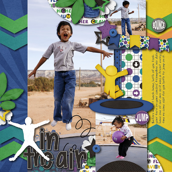
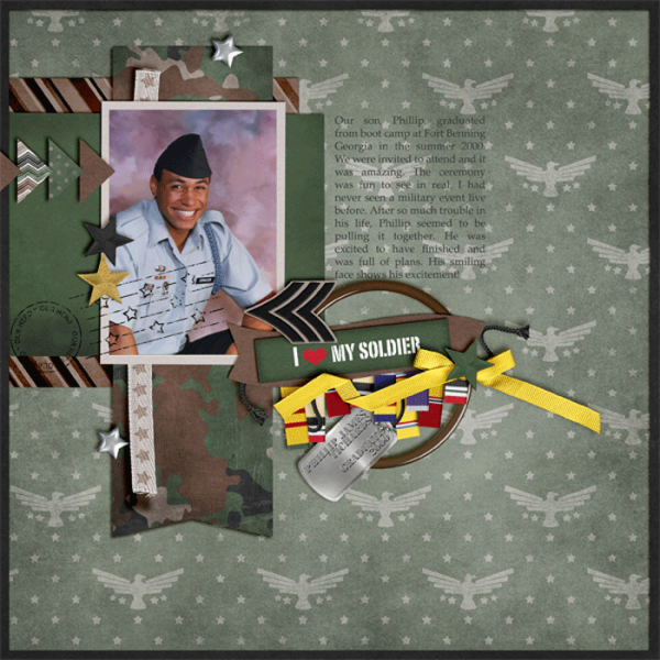
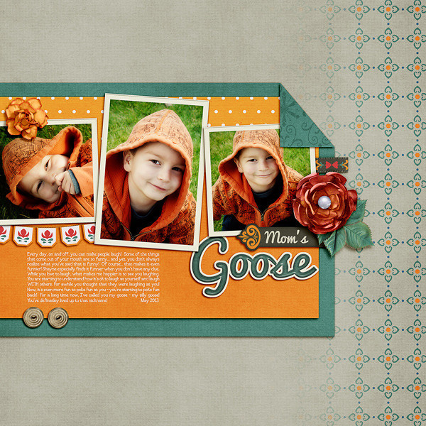
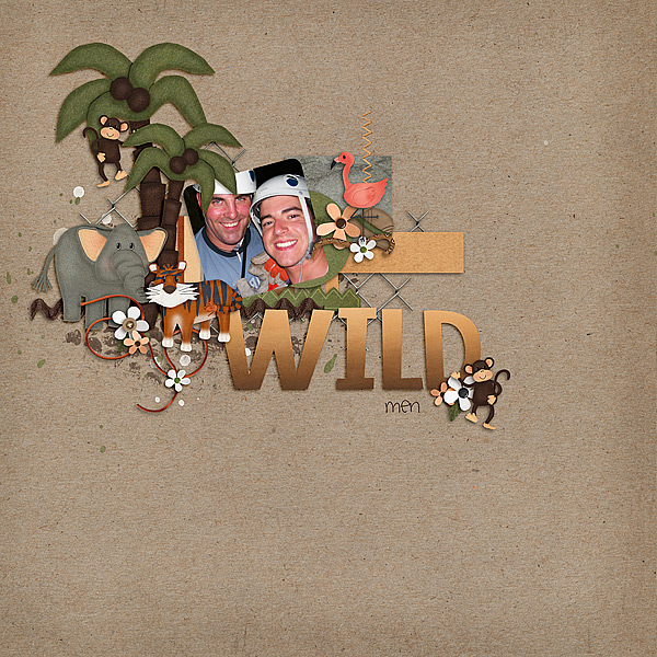
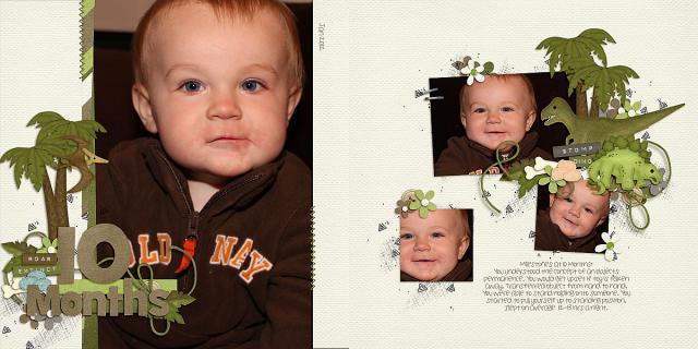
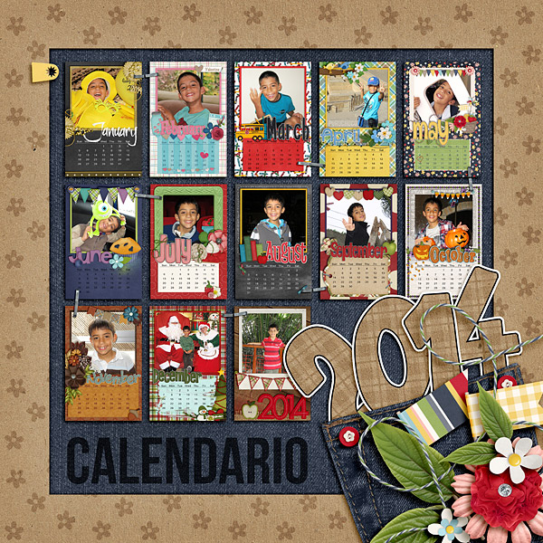
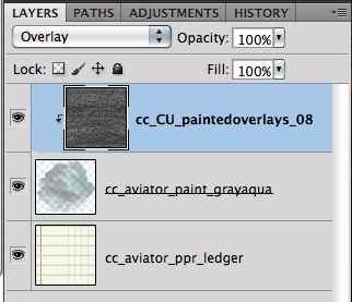
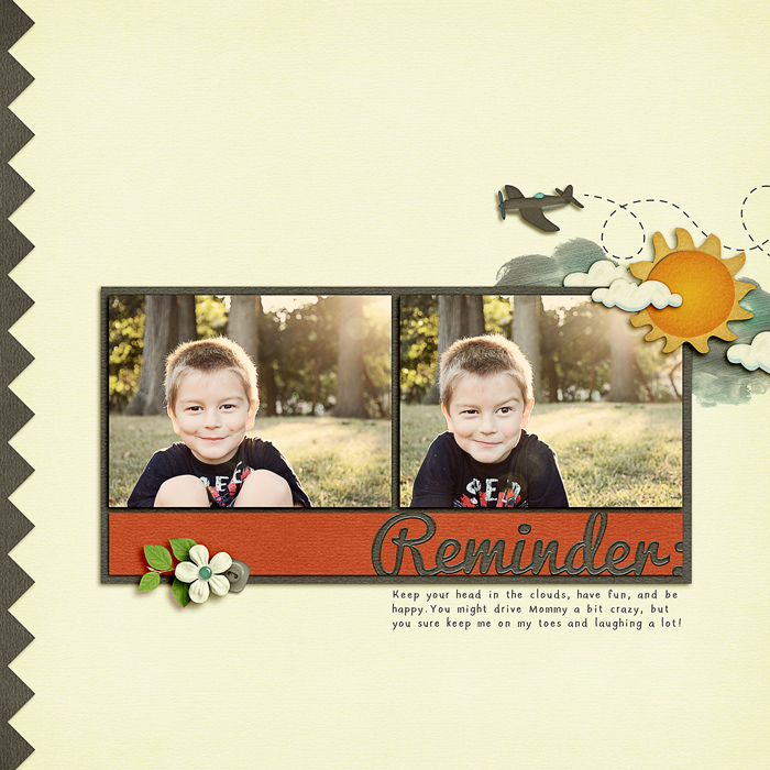
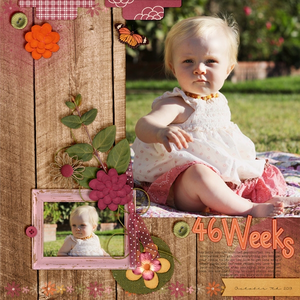
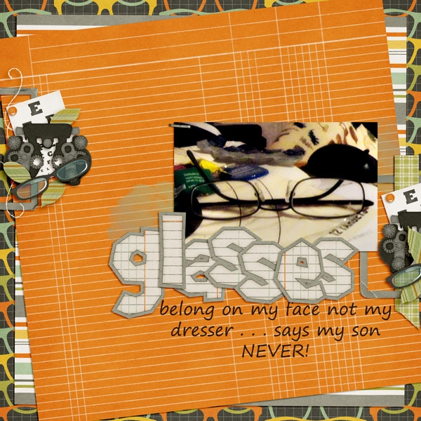
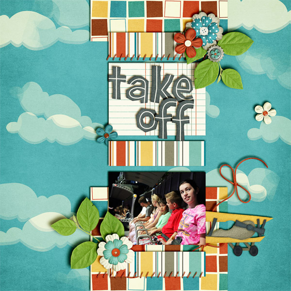
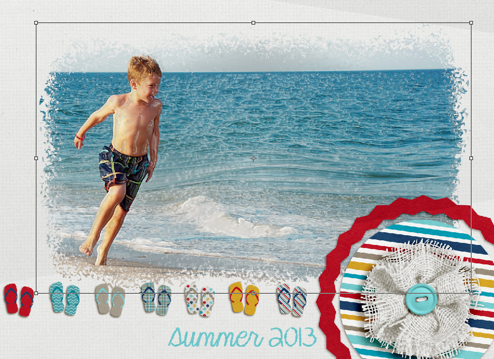
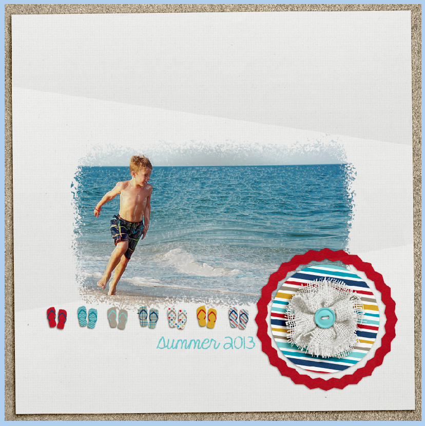
Hi Everyone, it’s Jenn (jk703) here to share some tips with you today. I’m going to focus on shadowing and preferences – because everyone shadows differently, and everyone has their likes and dislikes. It can depend on the blend modes, distance of your shadows, the size of your shadows, the color of the shadows, and the opacity of the shadows. There are so many different things that can change, so that is why I’ll show you a little of my shadowing and preferences. For today’s example, my page is using Chelle’s newest kit – Jump Zone and it’s coordinating (but so versatile) alphabet – Zone {Alpha}. Here is my page: SO_SWLSwtSmpl_CC_Jmpzn_LDJFrndFnt_CLNSmmr2013_WEB

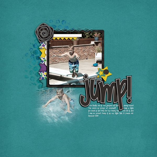
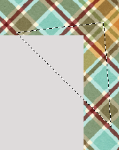
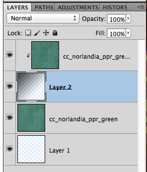
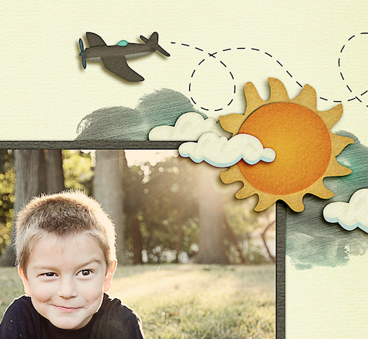
Now, let’s get a little closer. First up, the banner.

Shadow1

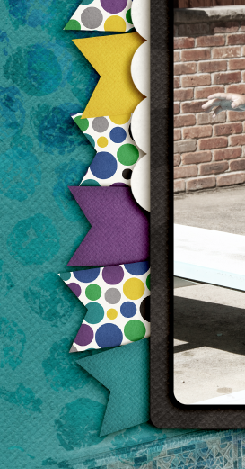
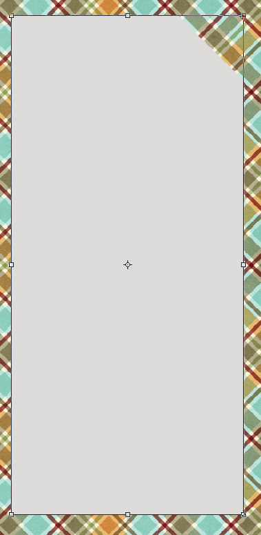
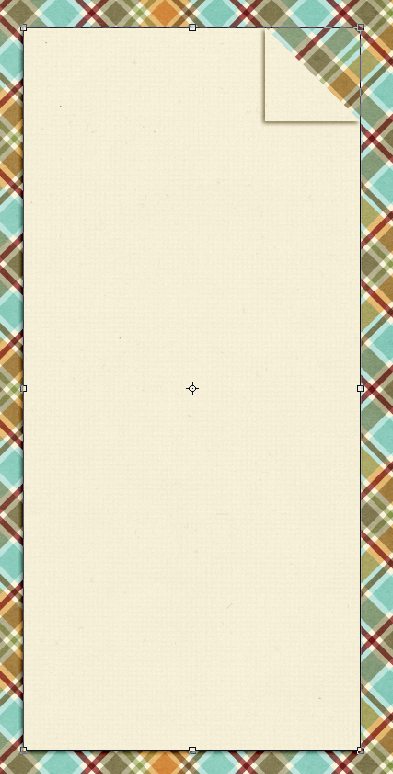
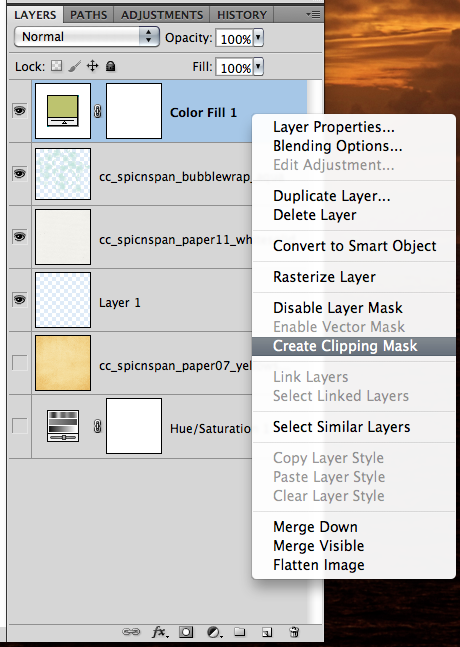
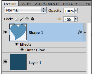
For this particular banner, I have it tucked under paper layers, so it is closer than if it were on top of the photo. For this and the paper layers, I use what I call “Paper Layer + Opposite Edge.”

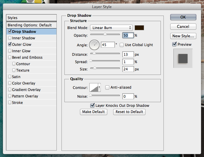
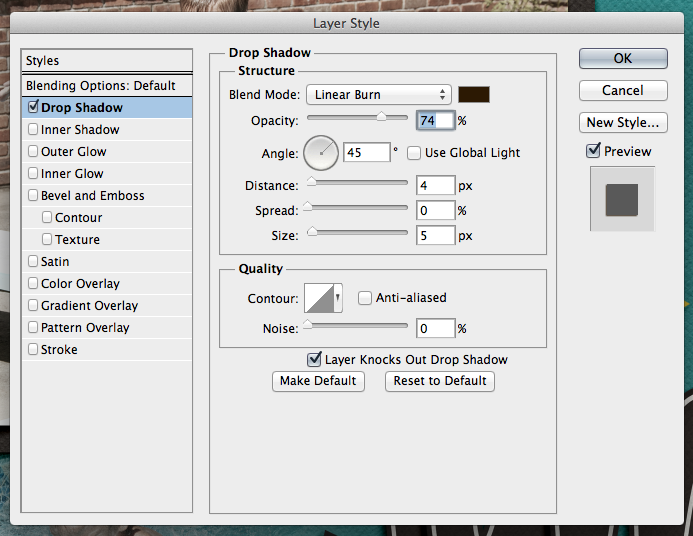
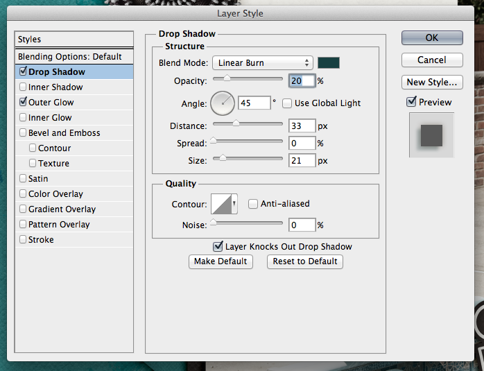
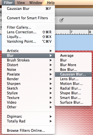
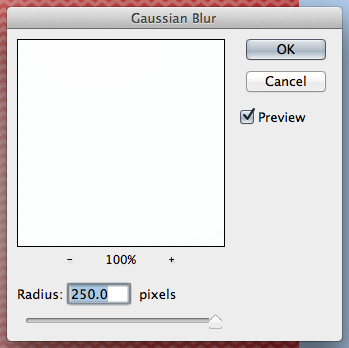
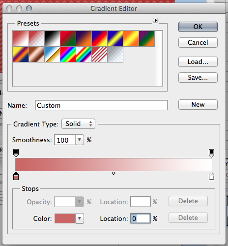
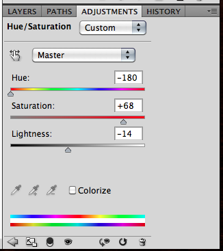
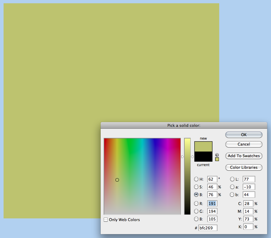
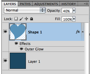
Here is the shadow information. For the basic Drop Shadow layer, my style uses a Linear Burn, 50% opacity, with a Distance of 13, and a sir of 24. The distance will change how far away the shadow will be from the paper or element. The size will determine how “crisp” your shadow is, or how blurry it is.

Shadow2

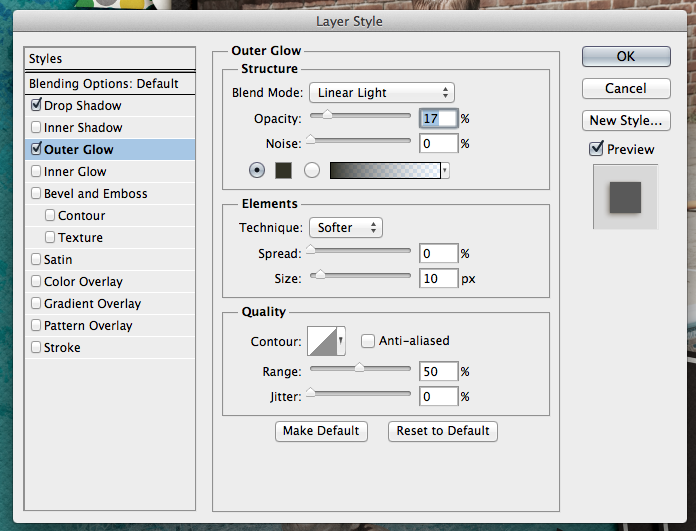
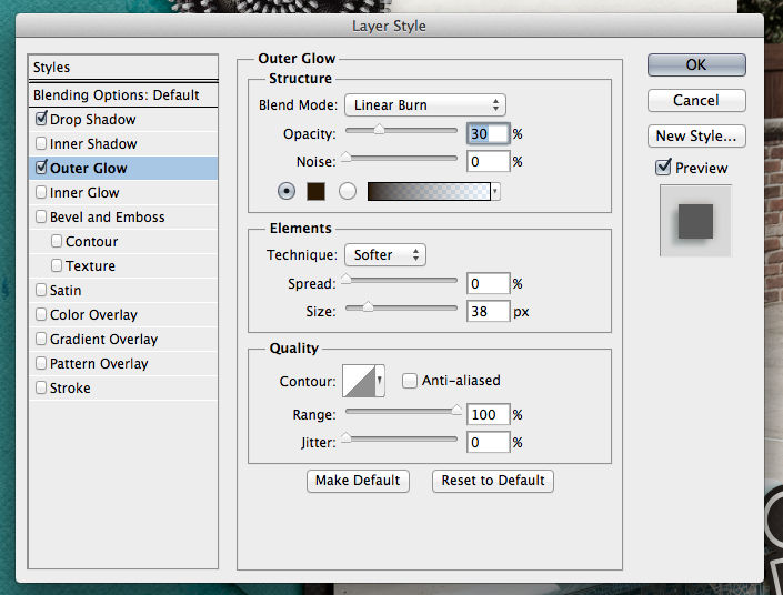
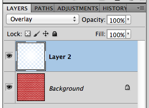
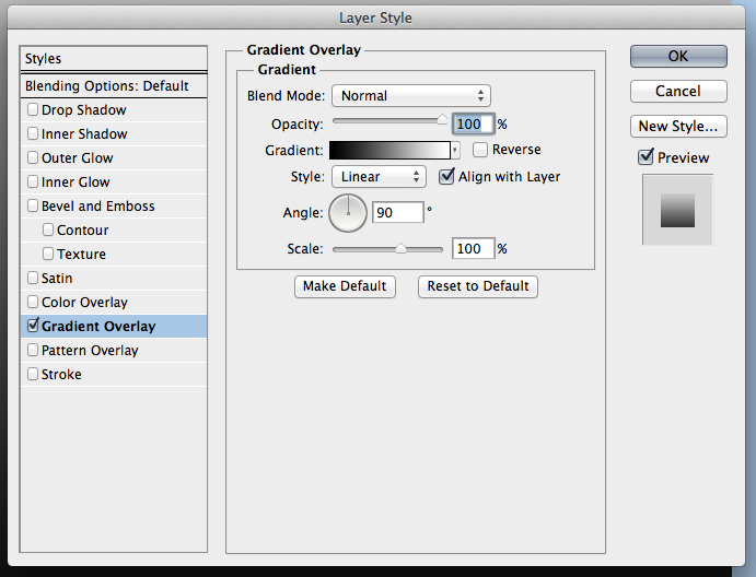
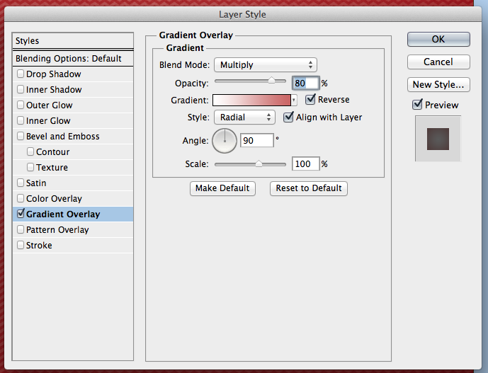
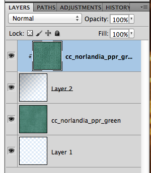
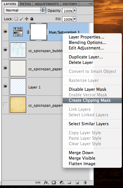
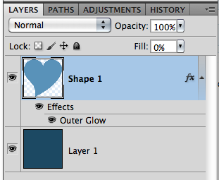
For this and most of my paper layers, I add a shadow to the opposite edge. When I look at a paper, it doesn’t sit perfectly on top of another when stacked – there is a slight shadow around the edge so you know they are separate pages. To get this effect, I add an Outer Glow. I use Linear Light, at 17%, color versus a gradient color, and my size is 10 with a softer Technique.

Shadow3

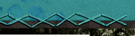
Next up, how I add shadows to stitches. They are really close to the pages, so I shadow these with a heavier “color.” For me, when I look at pages, the closer the item it and how “heavy” at item is will dictate what kind of shadow you need. You may think otherwise, and that’s ok. This is all about you and your preferences. Here are my settings for the stitching:

Shadow4

Shadow5

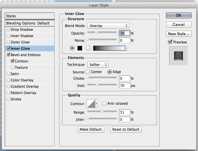
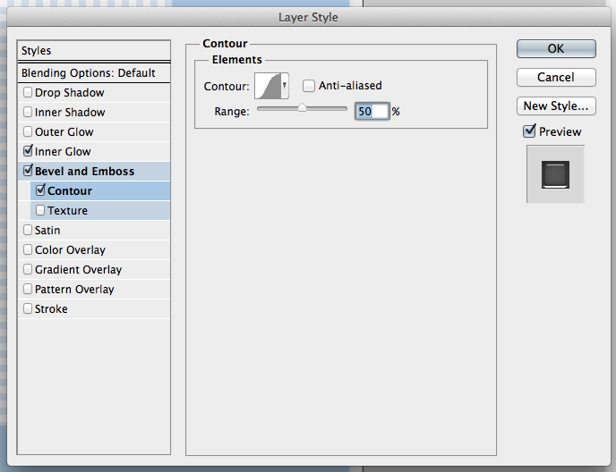
One last shadow, and then I’ll share what the CT made! Flowers. There are SO many different flowers, realistic, paper, doodles, etc, and there are so many more ways to shadow them. For this particular page, I have a zippered flower. To me, that is a heavier flower/fabric, and metal – which deserves a heavier shadow. Here is my normal “higher” flower shadow with a little added for the opposite edge. Shadow6

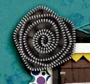
It looks too dark to me. Especially on the darker teal paper. So, I adjusted it, and the color of the shadow to make it more to my liking.

Shadow7

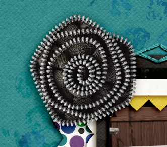
Here are the settings that I used for the second flower. I changed the color by clicking on the color box, and then clicking on my background paper. I then chose a color on the darker end of the slider. I also lowered the opacity, and made the size a little smaller than usual. This isn’t my normal settings, so it took some time to make it pleasing to my eye.

Shadow8

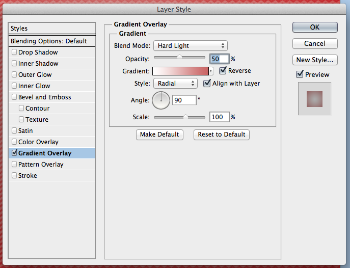
For the opposite edge of the flower, I used the Linear Burn Blend Mode at 30%, along with the Technique: Softer at 38 pixels in size.

Shadow9

Play with your shadows, and make them how YOU like them. Use the shadowing and preferences how you like them! Once you like them, get a test print of one page before printing. By doing that, you can make sure that you like how they look when printed. I wasn’t sure when I printed my first album, but it turned out wonderfully. Recently, I printed a Wedding Guest Book as a gift for a cousin, and again, I loved the book so much, and the shadows really made it stand out. People were “petting” the pages.


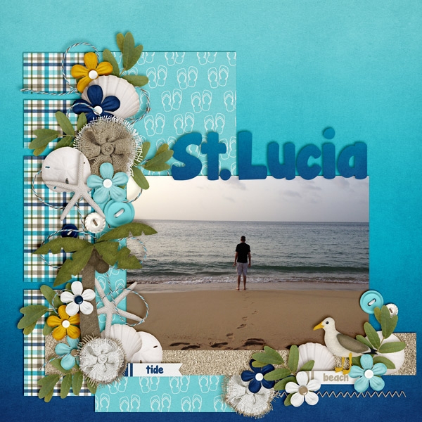
Here is what the CT shared with me. First, Ophelia (navaja77) uses Gimp for her scrapping!  So she gave me some information to share with you all and a sample page of hers! She used Jump Zone and Zone {Alpha}.

“I used GIMP 2.6 and Drop Shadow Script-fu. For the papers – I typically use X: 15, Y: 15, Blur radius: 25 and 65% opacity.  For this page, I used X: 20, Y: 20, Blur radius: 35 and 65% opacity. For the elements – X: 25, Y:25, Blur radius: 55 and opacity 65%.  This page didn’t have stitches or washi tape but for those I typically use X:4, Y:4, Blur radius: 4 and opacity 40%.  For leaves, to get the realistic feeling, I will increase to 30, 30, 60 and opacity 60%.  My settings place the shadows on the lower right side.  If you prefer lower left side, then change X to negative number (e.g. Papers: -15, 15, 25, 65%). If you shadow like Chelle, ten both X & Y would be negative numbers so you get shadowing at upper left.”

2012-12-02-intheair_sm


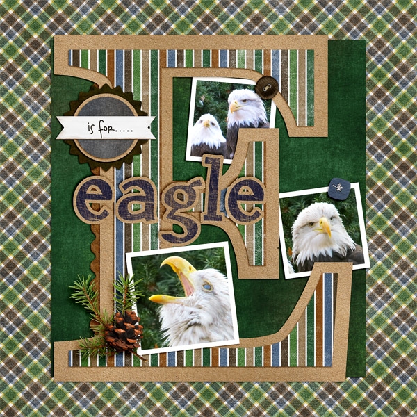
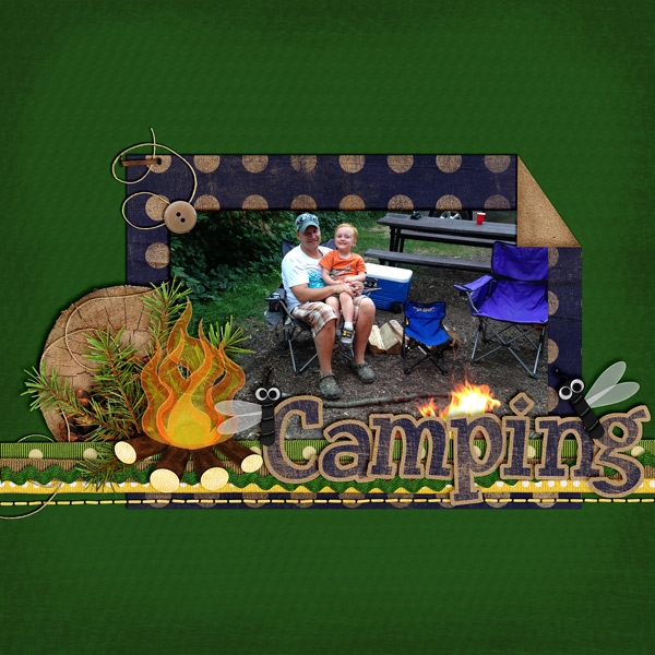
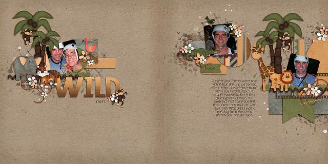
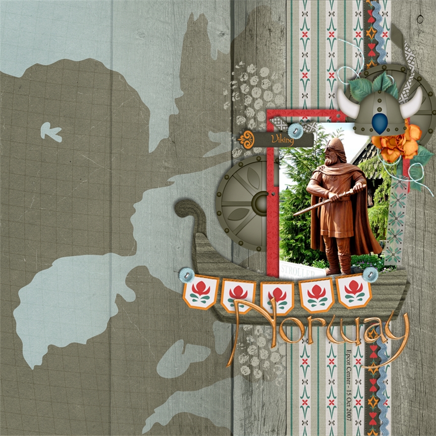
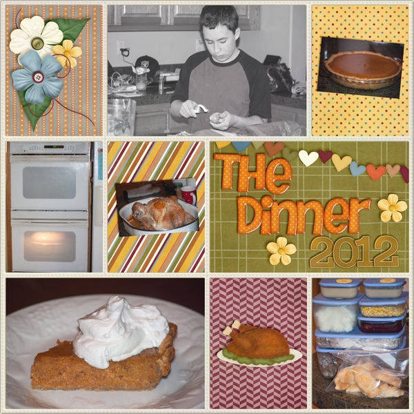
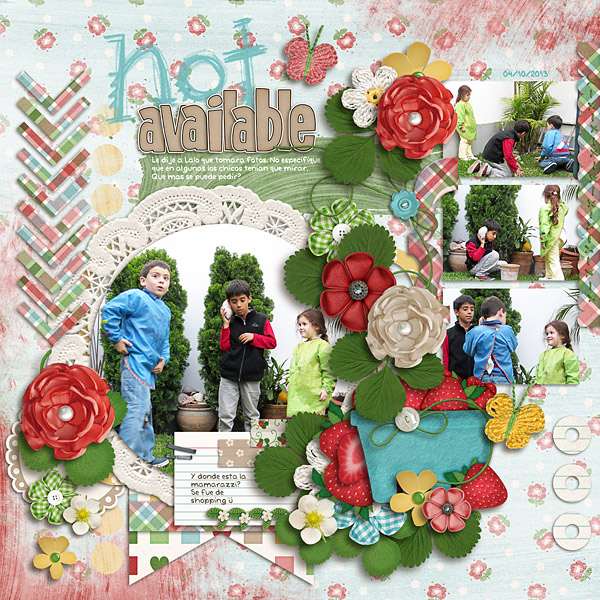
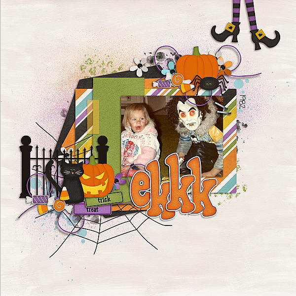
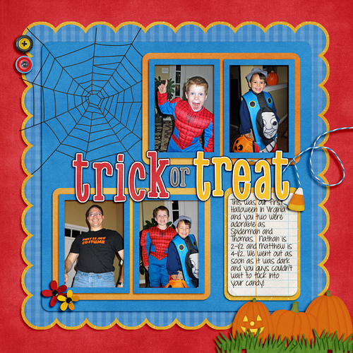
Next up, is Donna (dip332) who created this wonderful page. She added shadows using Chelle’s Me & My Shadow, and then tweaked it to her taste. She said “I made the pine and pine cone really stand out by using both an upper and lower large shadows. I also used a chipboard shadow on the word eagle. The buttons are both a flat button setting. The rickrack is a flat ribbon shadow style.” Perfect way to make it stand out – using two shadow settings on one element! Great idea! (She also used Let’s Camp S’more and On The Trail)

36080

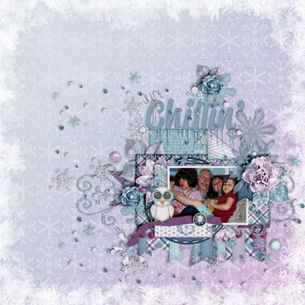
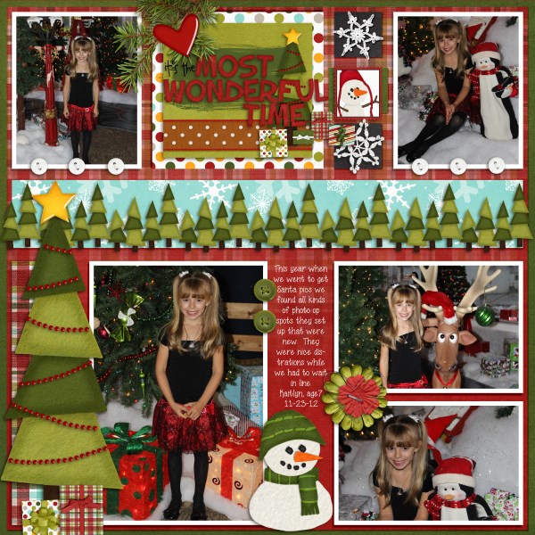
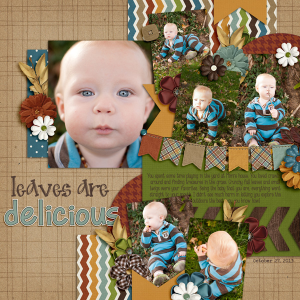
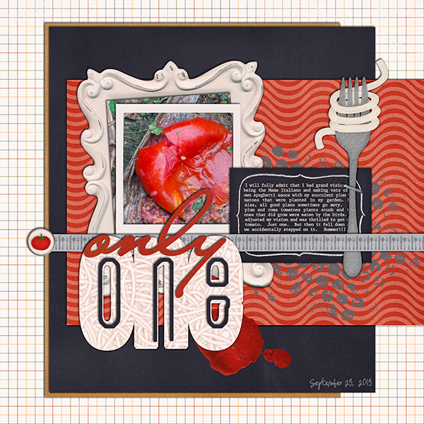
Lastly, here we have a honorable page from Leah (Cat Lady). She said “I start with Chelle’s shadows and expand from there. And I love to put shadows on their own layer and expand and move them to cause elements to “lift” off of the page!”  She used Chelle’s Rolling Along kit and Scrapping with Liz’ December Tuesday’s Template.

35881

Hope you enjoyed today’s post – Thanks for visiting!

by Jenn


1.2 Tutorial: Folded Corners

1.2 Tutorial: Folded Corners

Hi Everyone!  Welcome to 2014! I’m Jenn, aka j703, and I’m  excited to start the year fresh and enjoy it! Let’s get to today’s Tutorial: Folded Corners!

Begin your layout with a background paper, and a shape on top. For the tutorial, you will want a straight shape to easily try it out. I’ve chosen a rectangle – you can also try a circle or square. My examples uses Chelle’s Winter Woodlands kit.
FC1

This is what my Layer’s Palette looks like:
FC2

Next, choose the Polygonal Lasso Tool. Click an hold the Lasso tool to get to the other tool options.
FC3

Once you have the Polygonal Lasso Tool selected, and the shape layer selected, click on the corner that you want to “flip.” I’ve created a triangular area that I will flip over, and once I connected all the points, the marching ants create the selection.
FC4

With the selection still marching, click on Layer > New > Layer Via Cut. This will cut the section out and put it on it’s own layer.
FC5

Here is what my Layers Palette looks like now. (If the ants are still marching, just press Command + D)
FC6

Now, with the new layer selected, choose Edit > Transform > Rotate 180*. Your shape should twist and not really be visible.
FC7

Here is what my shape looks like:
FC8

Add Shadows to all layers:
FC9

Add papers to all layers:
FC9a

Here is another example of a irregular shape. It’s a bit more tedious to get the edges/corners to line up. You may also want to warp the shadows a little using Edit > Transform > Warp. Irregular shapes are do-able, but take more time, and effort to get the same look.
FC9bHere is the layout that I made:

SO_CC_WntrWdlnd_KGFallForYou_ColinJan2012_WEB


Here is a layout by Jenny (jenn18) that uses Let’s Camp S’more. I think the fire looks awesome!

35449


Leah (Cat Lady) used Snowlandia for her layout. So pretty!

35506

Not too hard – so give it a shot!  Add a little twist to your page using a folded corner! Have fun and thanks for visiting!

by_Jenn


12.26 Tutorial: Background Spotlights

Hi Everyone!  It’s Thursday, and we are ready to get back to normal in my house – especially after Christmas. This is Jenn, aka jk703, here to show you a fun way to change up your background papers. Background Spotlights are a way to give a spotlight or a luminosity effect on your background papers. You can highlight a pattern, or even just add a little accent to the background paper. I will show you guys two ways to do this, and there is always room for different steps or ways to get to the same ending. Play with all the blend modes, and even all the other styles – you might like what you accidentally learn! :) 
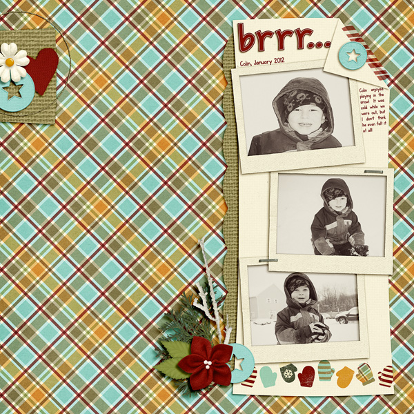
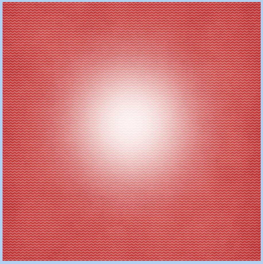
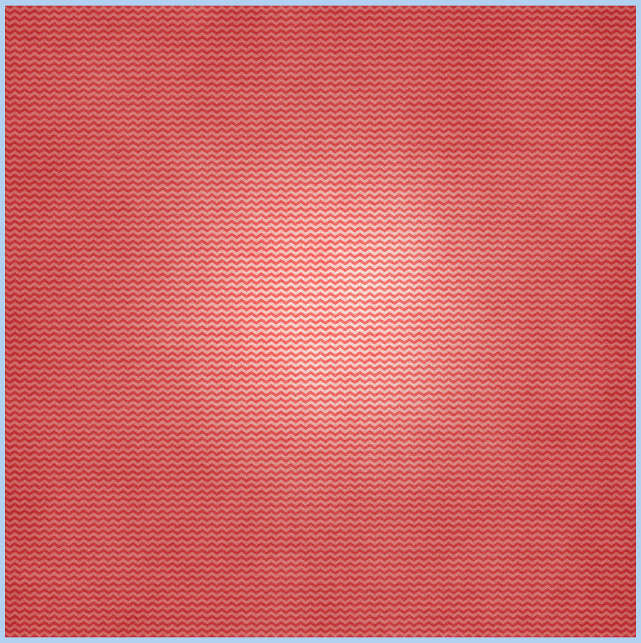
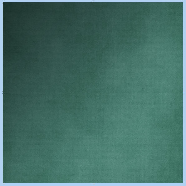
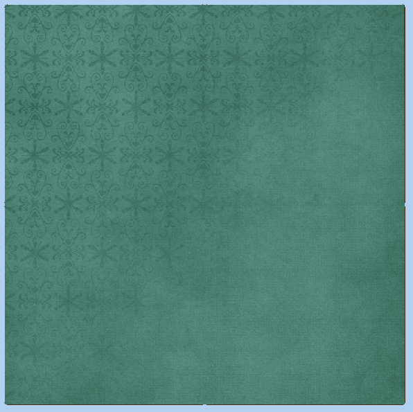
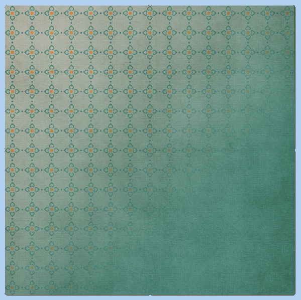
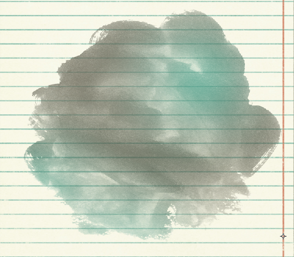
For my paper, I’ve used Chelle’s
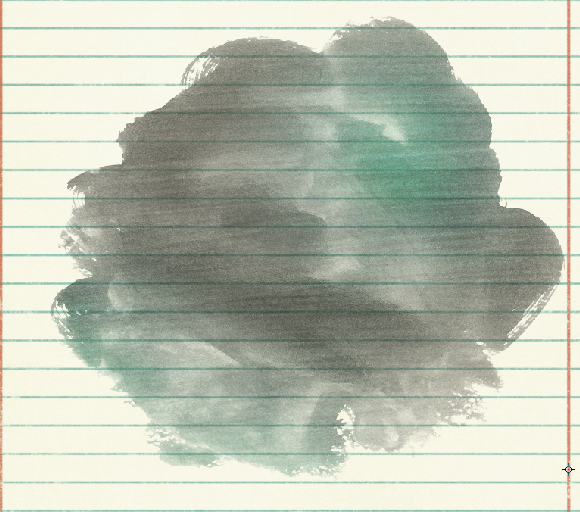
 Capture Your December kit.

Here is the way using the Gaussian Blur:

First thing you will want to do is to add a layer above your background layer. Use the box on the bottom of the Layers Palette and it will add a layer below the background paper. You can just move it up.

Next, choose your brush tool. For my example, I have it set to 2000px, soft, white brush.  SL1

Make sure that your new layer is selected, and then click once or twice in the center. You will get a bright white spot, that feathers out to the outer edges. Below, is what my layers look like at this point.

SL2

SL3

 Now, in the Menu Bar, choose Filter > Blur > Gaussian Blur.SL4


A menu will pop up – and I’ve moved the slider up to 250 – as high as it will go. :)  Click ok, and this will blur the brush circle out just a little more and lighten it at the same time.SL5

SL6

Now, on the Layers Palette, choose the bruch circle layer, and change the blend mode to Overlay.

SL7

This is what you will end up with. A little light flare or spotlight. Again, try different blend modes, colors, and even different brushes and shapes!

SL8

Now, I know there are oodles of ways to do things to get to the same effect in photoshop, so I’ve got another way to do this. This one is a little more difficult. For this version, starting from scratch, you will use the Layer Styles.

There are two steps that you need to do before starting this one. With your background paper open, and just in case it is your only layer, you need to remove the lock from the layer. Just double click on the layer. A menu will appear to name it – name it if you wish, and click ok.

Also, for this one, I’ve changed my foreground and background colors to match my paper. Like this:

GSP1

OK. Now, we will double click on the background layer and the Layers Styles menu will come up. Click on the Gradient Overlay. Here are the settings that I believe are default.

GSP2

Click on the Gradient that you see, A menu will pop up. By Gradient I mean the White to Black bar. We want to change the color of the Gradient to the color in the Foreground Box that we changed first. This is tricky – click on the bottom left corner slider box, and then click on the Foreground Color. The slider will change.

GSP3

Next, (just in case you close it – double click on the background paper again to get to the styles), you will also change the Blend Mode to Multiply, Opacity to 80%, check off the Reverse box, and change the to “Radial.” Like this:

GSP4

Once you click ok, your paper should look like this – a darker edged spotlight – way more subtle to the previous one. Remember, play with the Opacity, Blend Mode or even the Scale.

GSP5

To make it a little more like the spotlight above, and to show how Blend Modes can make a change, here is the setting changed to Hard Light:

GSP6

And the new paper:

GSp7

Pretty easy, and fun to try!  Here is what the CT came up with:

Carol (Iowan) created this wonderful page – I just adore the quilted look!  She used We Wish You A Merry Christmas by Chelle’s Creations. 

cover-with-highlight-copy_zps5bb7a584

Karen (zippyoh) said that she used the effect behind the title and the journaling paper for her layout. After she applied the gaussian blur, she then changed the blending mode to vivid light behind the title and pin light behind the journaling paper. Her layout uses Penalty Box and the journaling paper is from Toil & Trouble, with a template from Scrapping with Liz. Lastly, she also changed the color of the background paper by layering the red above the black, and lowering the opacity.

hockeynight2013_zps3fc07b6a.jpg~original

Jenn (jenny) used the effect on the overall wood paper so she could see the pain spritz a bit better….gave a lighter looking wood. She used Norlandia for her page.

65_2013_Norwayroots_600_zps6ef7c43e

There you have it! A great way to change up the background papers! Hope you enjoyed this tutorial today. Have a great week everyone!

by_Jenn

12.5 Tutorial: Gradient to Blend Papers

12.5 Tutorial: Gradient to Blend Papers

Hi Everyone!!!  How are you?!  I’m hoping you are doing well. This is Jenn, aka jk703, here to share a fun and easy way to stretch your paper stash!  All you have to do it use a gradient to blend papers, and the possibilities are endless! Let’s get right to it! For my example screen shots and layout, I used the Norlandia Kit that recently debuted over Farmer’s Market!

To start, open a new document and add a Paper Layer:

GB1

Once you have your paper imported in, choose the Gradient Tool:

GB2

Now, you will add a new layer ABOVE the 1st Paper Layer. To do this click on the little icon on the bottom of the Layers Palette that looks like a square with a folded corner. Move this layer above the paper layer, in case it isn’t already there. Have this new layer selected.

From choosing the Gradient Tool, you will have a little “plus” cursor. Click on the top left corner of your paper and drag to the opposite corner. Let go when you are about ¾ way to the other side. This is what the paper will look like:

GB3

And the Layers Palette:

GB4

Up at the top menu bar there are some of the Gradient Tool menu options. You can change the type of gradient, where it comes from, reverse it, the color, and even the blend mode. Fun to play with to get different effects on your paper!

GB5

Above the Gradient Layer, bring in a new paper layer. I found that something with a faint pattern or even a coordinating colorful pattern works great. Make sure the colors work well together! Though don’t worry if they don’t – there’s always Control Z! Now, clip the new paper to the Gradient Layer by right clicking on that layer, and choosing Create Clipping Mask.

Here is my first version.

GB6

GB7 To change your blend, you can also click on the Gradient Tool again, and choose the Gradient Layer in the Layers Palette. Click and drag again like you did earlier, and the mask will get darker to allow more paper to show through. Here is a darker mask and the layers that I have now.

GB8

GB9

And another version with a different colored pattern paper:

GB10

Here is my final layout – which, by the way, I changed the gradient and one of the papers above! LOL! :)

i-8W9SW49-L

Here is what the CT made!  Super awesome pages if you ask me! We have some pretty talented scrappers on this team!  Melissa (prettypeaches) created this double layout, but she also said she “cheated!” She said that she just clipped an already created Gradient paper to her alpha to make a new one!  Pretty clever, and awesome if the paper is already included in the kit! Melissa used Zoopendous!

LGFD-LiSlide-2_zps4c2cb059


LGFD-LiSlide-2LS_zps57c3b531

Next, Jan created this stunner. For all of you who use the PSP program, Jan shared this tip: “I made the gradient by going to the >Cut and Fill, >Straight Line and >Blended Edge. I enlarged the blended area to make the gradient fill the page, then chose the >Keep the Unshaded Section for the cut.” Jan used Norlandia and Road Maps No. 4 by Down This Road Designs.

viking

 Lisa (kelseyll) created this fun holiday page – I just love the blocking – check out the blended plaid to solid gradient!  Lisa used Home for the Holidays for this layout.

Home4Holidays2600x600

There you have it – a super easy way to stretch that paper stash!  Thanks for visiting, and I hope to see some Gradient Paper Blends in the gallery! :)

by_Jenn


11.14 Tips: Changing Up an Alpha

Hi Everyone!  I’m Jenn, my user name around Scrap Orchard is jk703. Hope you are having a great week – yay for Thursday! Today, I’m going to share some Tips for Changing Up Alphas. Chelle has awesome alphas in her kits – always a go to when I’m titling my layout – there are usually a couple to choose from in color, pattern or kind!  She makes it super easy to use them. BUT, what happens if you want your alpha just to be a little different from everyone else’s?  Well… you change them a smidge all by yourself!  Here are three tips to Changing Up an Alpha! Oh… I am using the versatile Home for the Holidays for my example images. :)

First, changing the color or pattern.

I have letter selected from the Layers Palette. We are going to make this green letter a striped pattern! (So simple/easy!)

Alpha1

I click on the Magic Wand tool from the Tool Palette, and click on the inner dark green color. If there are any spots that weren’t included, just click near them, and it should then add them to the selection.

Aplha2

You will see marching ants at this point. Add a new layer ABOVE your letter – click on the little square with a folded corner (like a sticky note!) on the bottom of the Layers Palette. Make sure you have this filled layer selected in the Layers Palette after you create it.  Now, press Command > Delete.  Your marching ants will fill in with the background color.

Alpha3

Now, just bring your paper in, position it, and clip it to the filled layer. To clip, just right click on the paper, and choose to Create Clipping Mask.

Alpha4

You can merge the three layers if you like, but otherwise you are done!

Alpha5


OK. Next up is making a simple but fun edge. I have an “A” with a new pattern all ready to go. So, just like above, follow the steps to add a different pattern or colored paper, and we will add a  bevel-ish shiny style. lol! Here is my alpha final.

Alpha6

Here are the three menus, and all the little parts for you to try out. It was easier to post pictures of my screens than try to write it down. This way you can get an exact lookalike!

Inner Glow:

Alpha8a

Bevel and Emboss:

Alpha7

Contour:

Alpha8

Once you change up your settings, your alpha will look similar to mine!  Super easy!

Lastly, by far the easiest way to easily change up your alpha. Just clip a paper to the whole letter. Here is my green A changed to a clack A. All you have to do is right click on the paper, and choose Create Clipping Mask.

Alpha10

Alpha9

Pretty easy?!  Now, your stash of kits, alphas can all be made into new goodies! Here is what the CT did (awesome layouts!)

Melissa (pretty peaches) created a wonderfully cute double – look at that smile/smirk!!  She clipped a paper from Prehistoric to the alpha.

ksd_FP1a_zpsa3e54b8b

Roxana (roxanamdm) created her page using – Summer Lovin. For the Alpha, she clipped a Kraftabulous paper and duplicated each letter, added a thin black stroke to one layer and a white thicker to the other then merged both layers for each letter. She is also showing off (and keeping a copy) of her calendars  – Chelle’s 2014 Calendars 4×6.

calendar2014-web

Jenny (jenn18) created her page using At The Beach, and changed the Alpha by clipping one of the papers to it.

32918

Kimberly (enjoyyourpix) created this page using Taste of Home, In the Pocket {small}, Rainbow Gold alpha (not changed) and Wish You Merry Alpha (color changed).  She said she clipped a hue/saturation layer over the top and made the color more fall-ish

32574

 Jen (supergirljennie) created this cute layout (look at his eyes!) using Kraftabulous, Give Thanks and Marker Alpha. She changed the first part of her title (leaves are) by merging all the individual letters together, and then clipped a solid brown color to the phrase, and then using the blend mode overlay. Jenny also said she overlaid the phrase to the paper and reduced opacity by 20% so it looked more like it was written on the page and less like it was floating.

leaves_zpsd7e77eb0

There you go… some really easy to do ways to Change Up your Alpha!  Make the most of your stash! Have fun, I’d love to see the pages you create in the gallery! Thanks for visiting.

by_Jenn


10.24 Tutorial: Adding Texture

10.24 Tutorial: Adding Texture

Hi everyone! *waving* Can you believe it’s almost the end of October!? I think I say this every time a month’s end is close! It’s Jenn (jk703) here to share a fun and I think unique way for adding texture on our pages. I often try to change up the textures on papers, elements, frames, and even fonts. Adding a style, using a blend mode and trying out new Filters in Photoshop are my favorite ways to do this. Often times, I use watercolors to add a little “see-through” color to my pages…but there are times when I wish they could be a little more substantial, and act as another element. Today, I’m going to give you a few tips about Adding Texture and I’m focusing on Chelle’s Painted Overlays.

For my example images and layout, I used Chelle’s Aviator Kit, the Painted Overlays and a template from Scrapping with Liz. I’ve taken a light colored paper, and one of the few watercolor paints and opened them in Photoshop. My watercolor is above my paper, like so:

Texture1

Next, I decide on which of the fun painted overlays I want to use, and I bring it in my layout. I place it above the watercolor paint. I also right click on the painted overlay, and choose Make Clipping Mack. This way, the overlay is clipped to the paint. Your paint will look funny right now, but we will fix it!

Texture2

Next, adding texture is as easy as changing the blend mode. Here are a few that I liked.

Overlay:

Overlay

Vivid Light:VividLight

Luminosity

Luminosity

I have decided to leave the Painted Overlay on the Overlay blend mode, lol! :) Now… let’s make that texture stand out just a little bit.Texture9Click on Filter > Texture > Craquelure:Texture6

A big menu screen with lots of options will pop up, and the side with the preview will look black. (At least mine did!). Play around with the settings on the right – Crack Spacing, Crack Depth, and Crack Brightness to see what happens to the painted overlay. It will all change and look different. I decided on 49 for Crack Spacing, 9 for Crack Depth, and 10 for Crack Brightness.

Texture7

Click OK when you decide what you like. Here is what my paint looks like – it adds just a little texture:

Texture8

Here is my Layers Palette and what settings I have my layer on just in case your version looks different! I have the Overlay Blend mode at 100%, then I applied the Craquelure Filter and ta-daa!

Texture9

Here is the final page that I created – and yes, I changed out the graph/lined paper to a plain paper because my layout just called for a clean look.

SO_CC_Aviator_SwlSimpleCalTopp_Pacifico_LDTeachHand_ReminderColin2013_WEB

Here is a detail of the clouds that I made using the textured watercolor paint. I just couldn’t chop my son out… that devilish look just makes me shake my head and laugh at the same time! But, take a look at the clouds below, a little texture can change the way you look at some elements! Cool, right!

Texture Detail

Roxana (Roxanamdm) created this fun page using the Painted Overlays, Berry Berry Sweet Kit, and the Marker Alpha.  She said to add texture to the paints, she used mostly Divide, Soft light and Overlay blending modes plus played with the % opacity. She also did the same for the background, so the colors werent too strong.

nomamarazzi-web

Helen (winipeg1) made this adorable page. She used Summer Lovin’ and Chelle’s Painted Overlays.  For her paint, she used the transparency tool and then duplicated the layer, and flipped it to put it along the bottom also. You can also see she added a paint effect to the paper with her journaling.

Helen-painted-overlay

There you go! Now, go try adding texture to your watercolors or paint spots, even your backgrounds and frames!  We’d love to see what you create, so let us know if you tried a tutorial, and link us up in the comments! Have fun, and thanks for visiting. Have a great week!

by_Jenn

10.10 Tutorial: Changing Paint Colors

10.10 Tutorial: Changing Paint Colors

Hello everyone! I’m Jenn, aka jk703 here to bring you a tutorial today! We are going to look at paint and splatters, and how to change their colors!  I’ll give you three ways to do it, though there are so many more ways, these are simple and really quick!  Perfect way to match the paint you want to use to the colors of the kits!

For my examples, I’m using the bubble wrap paint from Chelle’s Spic and Span kit – one of my personal favorites for the colors! :) You can use this for splatters, smears, paint, and many other items. Here is the pale teal bubble wrap, I’m going to change that paint color:PntChg1


Now, the easiest way to change the color is to place a paper above the bubble wrap layer. Right click on the bubble wrap layer, and choose Create Clipping Mask. Then your bubble wrap will take on the color of the paper you clipped to it. Super, super easy.

PntChg2

PntChg3

Next, you can use an Adjustment Layer – specifically the Hue/Saturation. With your bubble wrap layer chosen in the Layers Palette, click on the little circle half white and half black (or I call the Black and White Cookie) and choose Hue/Saturation. A menu will appear and you can move the sliders and play with the coloring. Don’t worry if it appears as if the whole layer is changing color.

PntChg4

PntChg5

Once you find the color you want – I chose pink – click back to your Layers Palette. Right click on the Adjustment Layer, and choose Create Clipping Mask. The adjustment will then only be on the bubble wrap. Super easy, right?!

Screen shot 2013-10-09 at 9.18.53 PM

Here is how my pink turned out:

PntChg6

Here is one more way to change the color. With the bubble wrap chosen in the Layers Palette, choose the cookie (black and white circle on the bottom) and choose Solid Color.

PntChg7

Your bubble wrap will go black – it’s ok! :) Next, choose the color, with the color picker that you want your bubble wrap to be. The whole area will then turn to that color. Click ok.

PntChg8

Click back to your Layer’s Palette. With the solid color adjustment layer chosen, right click and choose Create Clipping Mask. Your bubble wrap will now be that chosen color.

PntChg9

PntChg10

Pretty simple and very fast!  Makes for a great paint, splatter or bubble wrap that will match any kit or paper. Here is what the CT made – some super super awesome pages!

Jen made this gorgeous page of her daughter – so cute!  She used  Indian Summer, Indian Summer Plaids, and Apple of My Eye {painted}  for her layout. She started with clipping papers and then added a blend more for a little extra paint look.

30338

Next, Leah used Chelle’s Tea for Two for her layout – look at all those photos! :) She used the Hue Slider for re-coloring.

30344

Melissa used re-colored bubble wrap from Spic n Span, re-colored the splats from Apple of my Eye, re-coloured the spritz paint from About a Boy, and the kit Eeeeek! Melissa clipped papers to the paints for re-coloring.

LGFD-AllHallows-4jj_zps830374bb

Lastly, Jenn used Pasta La Festa and Pizza Amore and the Hue Slider to change the Bubble Wrap. (I’m hungry now!)

32_2013_onlyone_600_zpsb950067f

There you go!  Changing paint colors is super easy and fast!  Hope you learned something new!  Have a great week!

by Jenn

9.26 Tips: Fill Vs. Opacity

9.26 Tips: Fill Vs. Opacity

Hi everyone!  Hope you have all had a wonderful September! This is Jenn, also known as jk703, here to bring you today’s post. I’m going to give you guys an explanation of what the difference is between Fill and Opacity in Photoshop. I would randomly use one when scrapping, and then I wondered what the difference could be and what using one over the other affected. So, Tips: Fill Vs. Opacity might just teach us something! Let’s get into it.

First, they do act similarly to each other, and both of these selections work with each layer’s transparency. What that means, is that the Fill and Opacity options allows you to see the layer below, and how much of it you can see. The main difference between them occurs when there are styles on the layer that you are using the Fill or Opacity options. Opacity will change and affect all of the layer including layer styles, while the
Fill option only affects the layer content, but not layer styles.

Most of the time when I am scrapping my pages, I use the Opacity slider. Now, I know if there is a layer style, I will choose the Fill slider. Many times, when I am using the Opacity or Fill options, I am also using the Blend Modes. Give all these options a try, and play to see what you like. Some other ways to use the Opacity/Fill on your digi pages can be to:

Make a Plaid Paper – take one striped paper, duplicate it, rotate 90 degrees, and then lower the opacity to your liking.

Make a Paper appear like Vellum – just take a paper, lower the opacity, and then apply a style. Or apply the style, and then lower the fill. It all depends on the look you prefer.

Make a Rub-on – Change a font layers opacity or fill to blend with the background. Make it appear rubbed on by giving it a little texture.

Blend a photo – Using a mask or not, blend your photo into the background paper.

TIP: Use the numbers to change the Opacity while working in Photoshop .With the layer that you want to change the Opacity, just press the number. Zero is equal to 100% and 5 is equal to 50%. Makes it super easy to try, and you can easily see what opacity you like the best.

Now, let me give you some images to show you what I mean. I work better with pictures, so I just assume you do too! :) You can do this along with me if you want to try it out. I’ll even use the number tip above.

First, make a shape. The background should be one color and your shape another. Apply an outer glow. Here is my heart:

Fill1

Next, lower the opacity to 40%. Hint – make sure your shape layer is selected, and press the 4. Here is mine, and the layer’s palette.

Fill2

Fill3


Now, bring the opacity back up to 100% by pressing 0 (zero) on the number pad, and then lower the Fill to 40%. Here is my unfilled heart (boohoo, lol!):

Fill4

Fill5


Aha!  See… it makes complete sense now, right?!  See how the style totally changes when you use the Opacity slider versus the Fill Slider! Cool right. Now, try this… bring the Fill down to 0%. Here is what you will see:

Fill6


Fill7


TIP: (COOLEST ONE YET!) You can also change the amount of your Fill, Opacity, Font Size (and all Character settings), Paragraph Settings, Feather, and more with your mouse. Just hover over the word Opacity, and you will see a hand with an arrow with points on either side. Just click right there on the word, and slide your mouse back and forth to the right and left… the number will change as you move. Moving to the right brings the number up, and moving to the left brings the number down. This works for SO many tools. Try it… be amazed! I sure thought it was cool!  Here is a pic of the cursor.

Fill8

So simple, yet so cool… and makes perfect sense now why we have both options, right!  Hope that was pretty clear… no pun intended! :) Here is what the CT did when playing with the Opacity.

Mary (tanni) created this page using See Clearly Now, and See Clearly Now Alpha. She clipped a paper to the leaves, and then lowered the opacity. 29441

Jenn (jennschultz) created this page, and adjusted the opacity on the background paper to make the clouds appear blended in just a bit more. She used Chelle’s Aviator kit.

takeoff

Lastly, Leslie (lab130) created her plaid paper by duplicated it and rotated it 90 degrees. She then lowered the opacity of the top paper by 50% to make a gingham-style paper. Awesome work! She used Chelle’s Choo Choo Kit and her Eeeeek! Bundle.

9877495843_311f831525


There you have it. Some great tips, and ideas for your scrapbook layouts! I’d love to know what think of our Opacity or Fill ideas and tips! Thanks for visiting and come back again!

by Jenn

9.12.13 Using Inner Shadows

9.12.13 Using Inner Shadows

Hi, Leslie here (lab130 in the Scrap Orchard forum).  I want to tell you how I make the Swiss-cheese effect in PSE.  The way I do it is to make it non-destructive because I always want to change my mind!   Too many times I’ve cut a hole in my paper and then decided later that the hole isn’t where I want it to be and have to bring the paper in anew.  Don’t know what I mean by Swiss-cheese effect?  Read on and I’ll tell you!

So, for this page that I’ve started of my nephew’s first birthday, I want the title to be “cut out” of the blue paper and reveal the patterned paper beneath. Here, I’ve used the font “GrilledCheese BTN”. And the kit I’m using is About a Boy by Chelle’s Creations.

image

So, then I’m going to clip a paper to the font layer by selecting the font layer and then dragging in the background paper above it.  Then using Control+G on a PC or Command+G on a Mac, I’ll clip the paper to the font.  It will now look like this:

image
But I want the font to look like it’s cut from the paper, so we’ll need some shadows. I’m going to use the default Inner Shadows style from PSE.

image

These aren’t fabulous selections, and full Photoshop CS users have more choices and editing options, but we can made due in PSE using a little trick.  I’m going to apply the low shadow and make sure my shadow angle agrees with the angle of the blue paper and the rest of the shadows on the page.

Now we’re getting there!  But, notice that the shadows on the letters appear deeper and have a larger distance than does the blue paper at the corner.  It wouldn’t really be that way in real life, right? They should agree, mostly.
image

So we’re going to manipulate the shadow a little.  Anna Forrest has a nice action that helps to edit the interior shadows and gives you some of the full Photoshop capabilities.  But for purposes of this tutorial, I’ll show you the way to manipulate the shadow for FREE!  Go to Layer—>Layer Style—>Scale Effects.  I chose to scale down the shadow 50%, and I think that looks pretty close.  At this point, I have more flexibility to edit the shadow of the corner of the blue paper than the interior shadow, so I’ll play with that until it matches.  That doesn’t look bad, right?

image     image
Except that now, I notice that the text doesn’t line up with the left of the photo above, and I want it to.  But now it’s not a problem!  I simply select the text layer, using Control T or Command T (Mac) to transform it and align it with the photo above.  Because I’ve used shadows and not actually cut the paper, making changes to the design is SO easy!  I can make the text bigger, too.  I just love having that flexibility!

image
Here is my finished page.  I added a little stroke that matched the kit’s off-white color just to define the alpha a little.  I’m pretending I did that with some chalk! haha!
——————————————————————————-
In Story Book Creator or Artisan, you can get a similar effect by putting shapes on top of your paper layer and finally when you’ve got them sized and placed JUST where you want them, after you have the rest of your page laid out, flatten the shapes to the paper and then use the Wand from the Cut and Fill ribbon to cut out the shapes you just flattened to the paper.  This will expose the paper you have beneath.

In Photoshop, you’d use the concept of inner shadows, but you can manipulate the size, distance, opacity and color without having to use the “scale effects” tool that PSE users would be compelled to use.
——————————————————————————–
Here is a page Donna (djp332) did using Prehistoric and a Santa hat from Ho! Ho! Ho! by Chelle’s Creations. She used the shadow technique to cut out the Mickey shape and also to inset her photos into the paper.  Man, the skeleton with a hat on it cracks me up!

image

Jan used Chelle’s newest kit, Aviator and a Fiddle Dee Dee template to make this cute page.  She used the interior shadows co cut out the clouds, exposing the cute plaid paper behind it.  Great idea!

jan-aviatortut

Here’s a final example from Jen (grahamlikethecracker). She used used Love Grows Bundle by Chelle’s Creations and Keepin’ It Real Double Templates by Scrapping with Liz.  She used the technique to make it look like she punched out the letters in her journaling square.  And what a cute baby!!

28966

————————————————————————————-
Well, that’s it for this week!  I hope you learned something new and we’ll be seeing you use this technique in your pages posted to the Gallery!

leslie

8.29 Tutorial: Plastic Wrap Filter

8.29 Tutorial: Plastic Wrap Filter

Hi Everyone!  It’s Jenn (jk703) here for today’s tutorial! How are you all doing – can you believe it’s almost September!! I’m in the Northeast US, and I am NOT ready for summer to be over… or school to start!  Homework is not my favorite! :) I accidentally found a cool filter in Photoshop that I’d love to share with you today – and it is really fun for wet or watery photos! I think with any tutorial I write – it all take s a little practice as well as patience to try new things!  Sometimes, pressing the wrong button will get you results that you will love!


Here is my beginning layout – I’ve used Chelle’s At The Beach kit along with some goodies from Scrapping with Liz. My photo looks a bit pale and washed out. That isn’t my intention… so I’ve decided to give it a little oomph and add a little Plastic look.

PW1

Next, before you get really into it, my sugestion is to make a few (or more) duplicate layers of your photo. This way you can run the filters and if you don’t like it, you can delete, or if you do but want to run it again or change the blend mode, different layers will give you different looks.

Click on Filter >Artistic > Plastic Wrap (pretty easy, right?)

PW2

A large sub menu will pop up, and you will see your image on the left. This shows you the default to the Plastic Wrap – Highlight = 9, Detail = 7 and Smoothness = 9.

PW3

For my image, I’ve tried to zoom in a little to show the details – and my settings are Highlight = 7, Detail = 4 and Smoothness = 8. Play with these!!! :)

PW4

Ok. Remember, I mentioned multiple layering. Here is what I ended up with, all using the Plastic Wrap Filter. Layer 1 is a Normal blend mode, 100% opacity. Layer 2 of my photo is a Screen blend mode, and at 59% opacity. Finally, my last photo layer is Luminosity blend mode with a 80% fill. Right now, since I don’t have any layer styles associated with the layers, Opacity and Fill act like the same thing. If I had layer styles, then that would change things. (I think this might be a tutorial for next month, lol!)

Here are my layers below.

PW5

PW6

PW7

Here is a close up of my image using the above layers, blend modes and Opacity/Fill selections.

PW8

And my final layout…

PW9

That’s it!  Easy, right – but this can be so much fun! :) Here is what some of my fellow CT members came up with using the steps above…

Roxana – she used Gone Fishing by Chelle, as well as a template from Scrapping with Liz.

Kassie – created this summer layout using In The Pool by Chelle, and a template by Rainy Dayz.


What do you think?!  I hope it’s something new, and fun! Thanks for stopping by and have a great day!

by Jenn