5.12 Video Tutorial: Recoloring Alphas

Hello Kristin here to show you another fabulous video tutorial from Chelle’s Creations. We all love ways to use things we have in our stash in new and different ways. Chelle is going to show you how to recolor the Anchors Away {alpha}.

Here is the video to watch.

Now check out how Chelle’s Creations’ ladies uses the videos to recolor alphas they have in their stash.

First, Jennifer (jmlijensen) used the Anchors Away mini with the Anchors Away {alpha} to create this cute page. I love the painted smear behind her photo and cluster.

Next, Karen (zippyoh) used Lucky Me, Rainbow Golds and the lime alpha, that she recolored, from Lucky Me {alpha}. She also used a template from Scrapping with Liz to create with colorful character encounter layout.

This tutorial features the Anchors Away {alpha}.

Next time you can’t find an alpha to match you can try this recoloring method.

4.28 Video Tutorial: Coloring in Doodles

Good morning! Kristin here with you to share another one of Chelle’s amazing video tutorials. This time she is going to show you have to color in doodles.

Learn how by watching this video.

Now that you know how; let’s look at some inspiration to get those creative juices flowing.

Karen (zippyoh) colored in the adorable frogs and lilypad from the Toadally Doodles for this sweet layout. The colored in frogs are a nice touch to add to the Toadally kit she used along with a template from Little Green Frog.

The dark green flower doodle is super cute on this page my Melissa (prettypeaches). She combined Hippity Hop Hop and Leafy Treetops along with the Toadally Doodles to create this fun Easter page.

You can use the same technique to fill in alpha doodles. Donna (djp332) filled in the Delightful Alpha Doodle with the plaid paper and the outer section with white paper. It give the title a fun pop. She also used At the Beach and a template by Scrapping with Liz.

This video features the Toadally Doodles and papers from the Toadally Add-on kit.

Grab some doodles and see what kind of creations you can make.

See you next month with two more video tutorials!

4.24 Tutorial: Using Curves

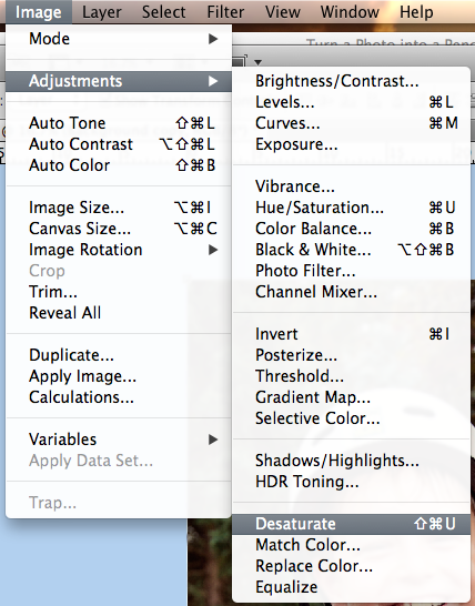
Hi Everyone! It’s Jenn, jk703, here again for our bi-monthly date! :) Today, we are going to have a little  fun with my Tutorial: Using Curves! Curves are a great way to transform your photos and do it non-destructively. Each adjustment is on it’s own layer and doesn’t affect the original photo. Curves allow you to control tones, colors, contrast, and so much more. Here are some detailed images that will help with understanding what curves can do for you. :) All you have to do it copy the curves that you see in my layer/adjustment box, and you should have a similar effect. Some of the pictures don’t look great with the adjustments, but I’m trying to get across more of what each can do. Hope that helps!

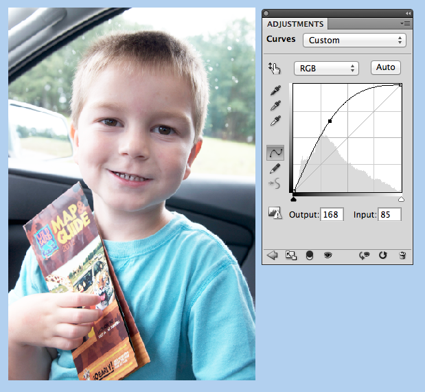
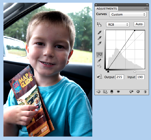
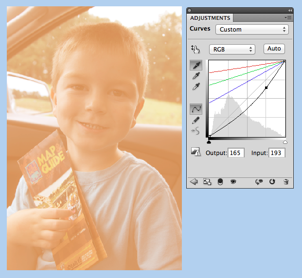
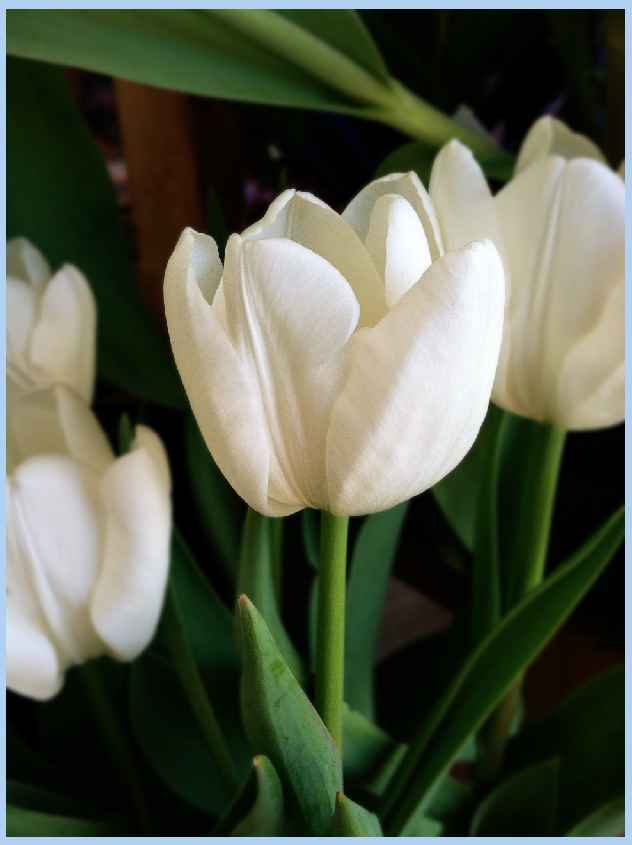
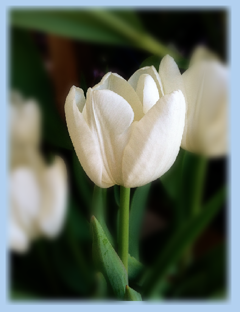
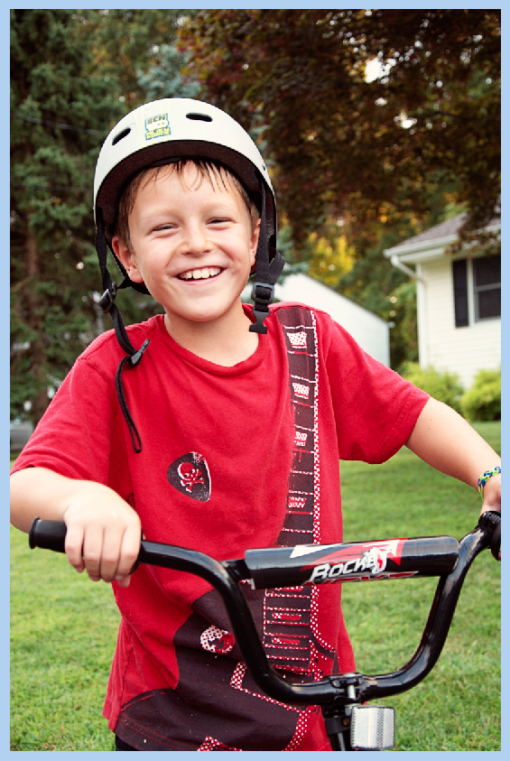
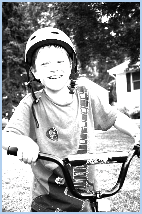
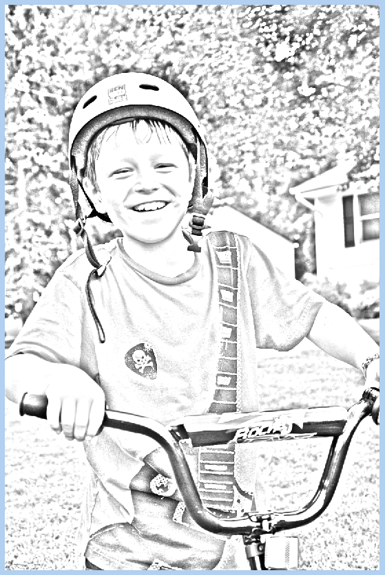
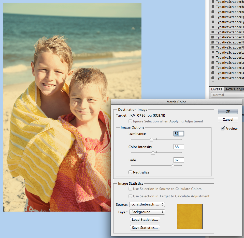
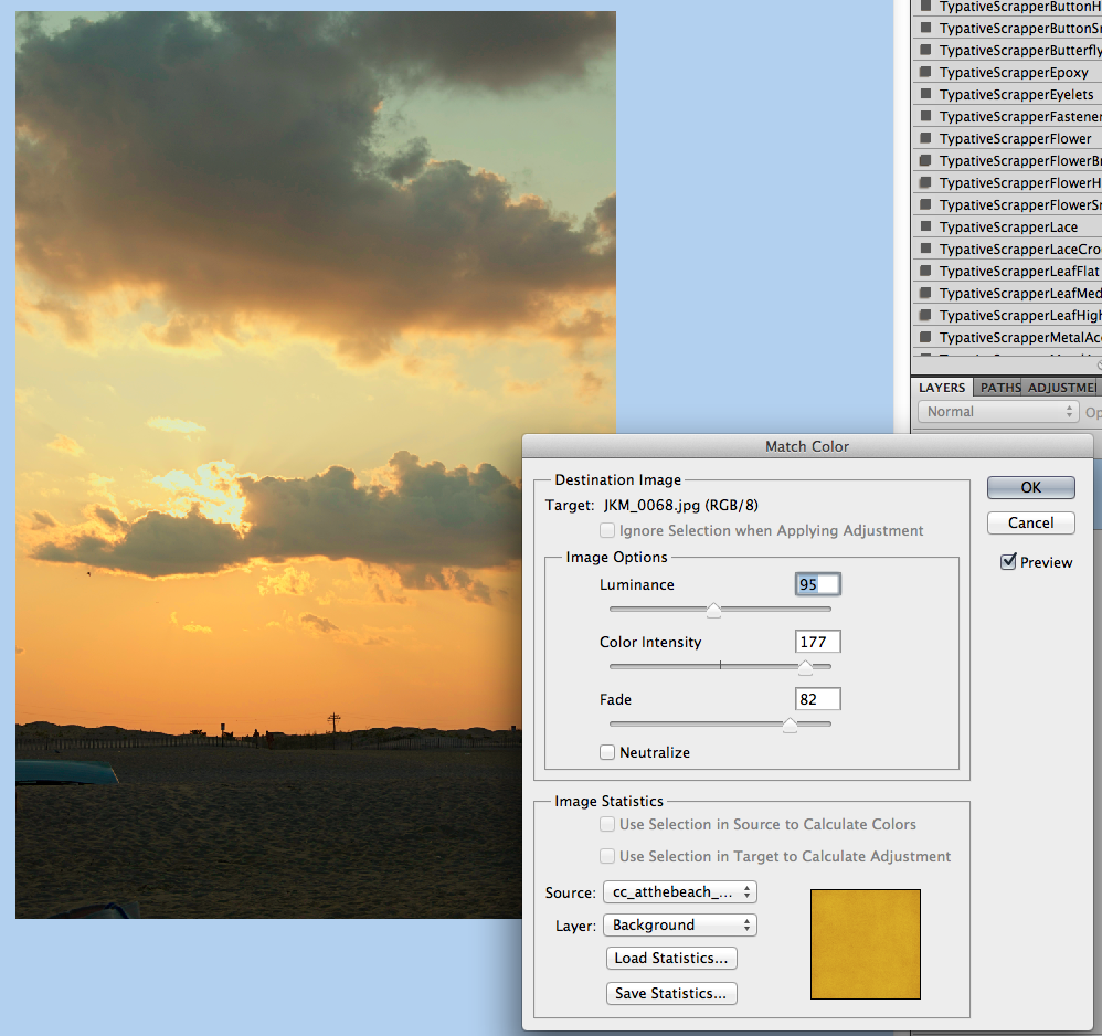
First, here is my original picture.

Curves

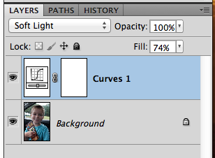
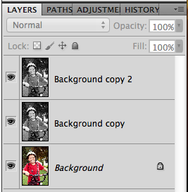
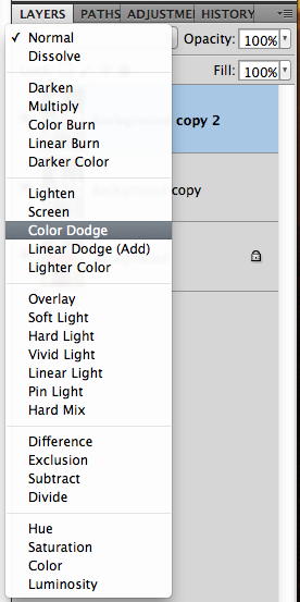
Now, before you actually start. After each and every one of these adjustments, you can tweak everything, and even change the blend modes so they work for your photo. All you have to do is click over to the Layers Palette, choose the adjustment layer and change the opacity and the blend mode. 

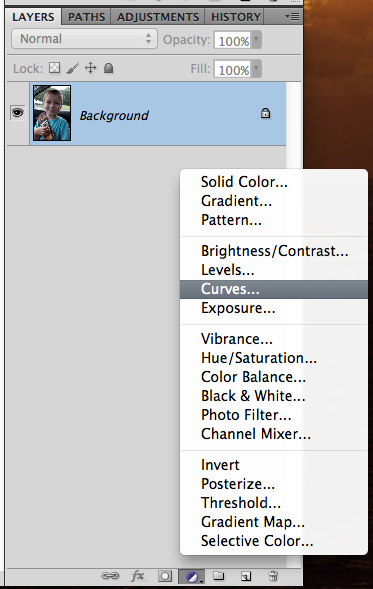
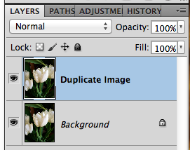
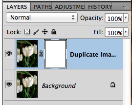
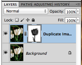
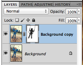
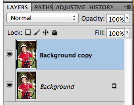
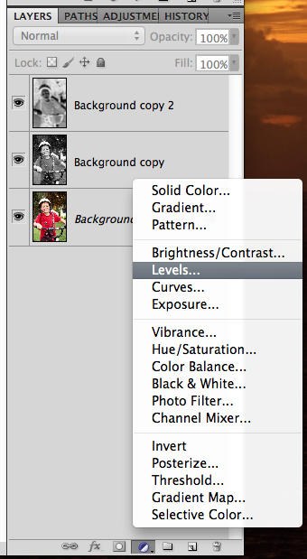
Next, to easily add an adjustment layer, click on the Black and White Cookie on the bottom of the Layers Palette. It’s the small circle that is half black and grey. Choose Curves.

I use Photoshop CS5, and know it works in that software. Melissa (prettypeaches) said that for Photoshop Elements, you have to follow a different route.

PSE Users: For PSE people to adjust curves: Go to Enhance → Adjust Color → Adjust Color Curves.

Curves1

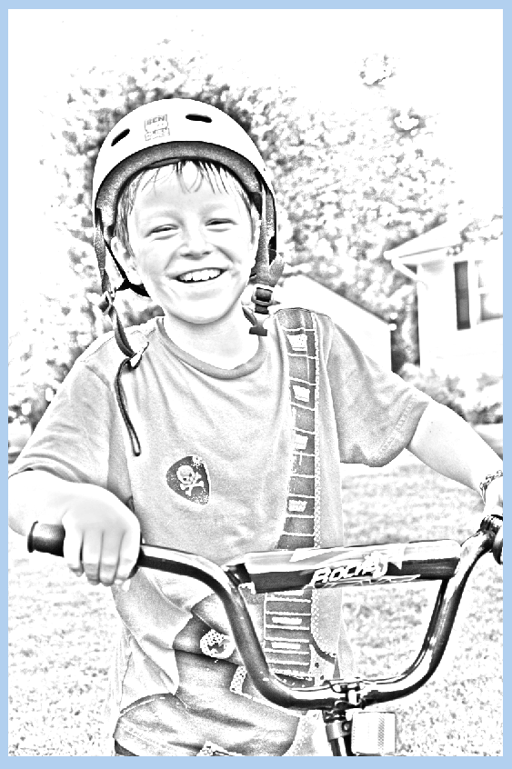
Click and drag the curve upwards to lighten the photo.

Curves2


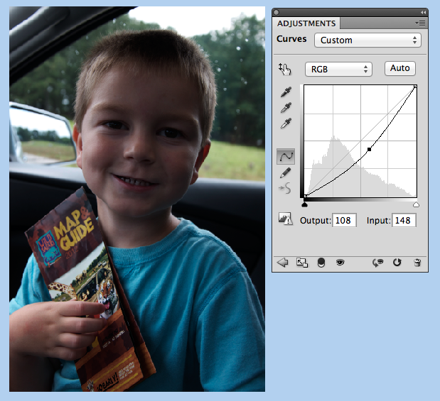
Click and drag the curve down to darken the photo.


Curves3

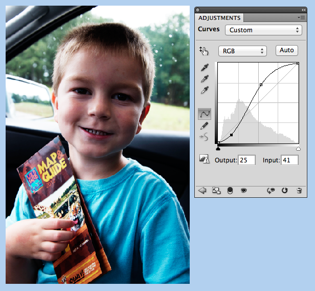
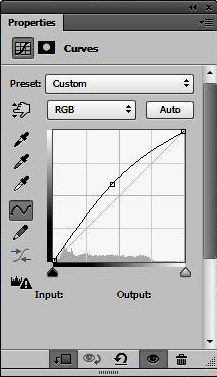
Click and drag the curve to make an S shape and you will be adjusting the contrast of the photo.

Curves4

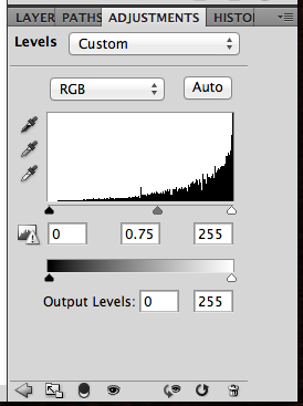
You can change the black and white points on the image, just by sliding the little triangles on the bottom of the graph.

Curves6

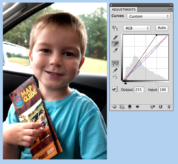
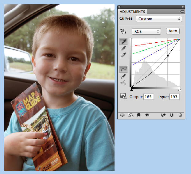
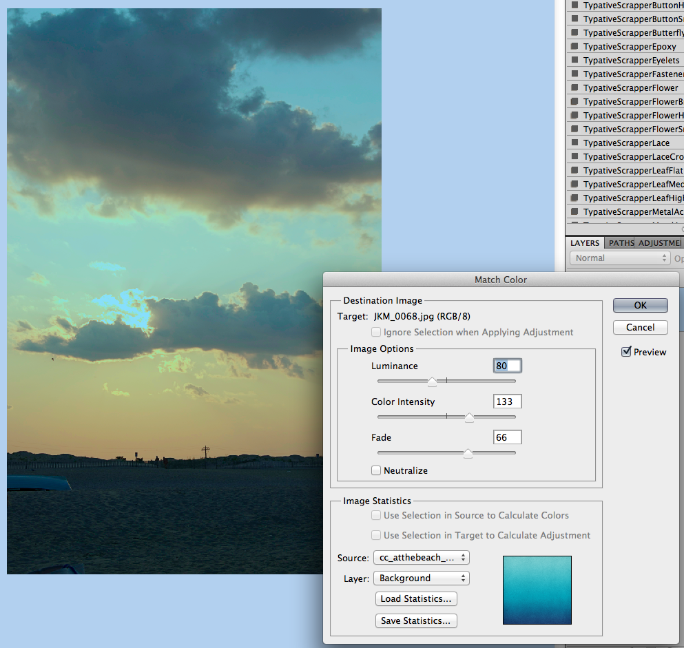
By clicking on the middle eyedropper, and clicking on a spot that should be grey in the photo, you can change the color cast. I clicked on part of the door, and it warmed my image up nicely. (When proofing this, I didn’t realize that I had created a second layer adjustment – see the black and white points? – they are the settings from the previous example.)

Curves7

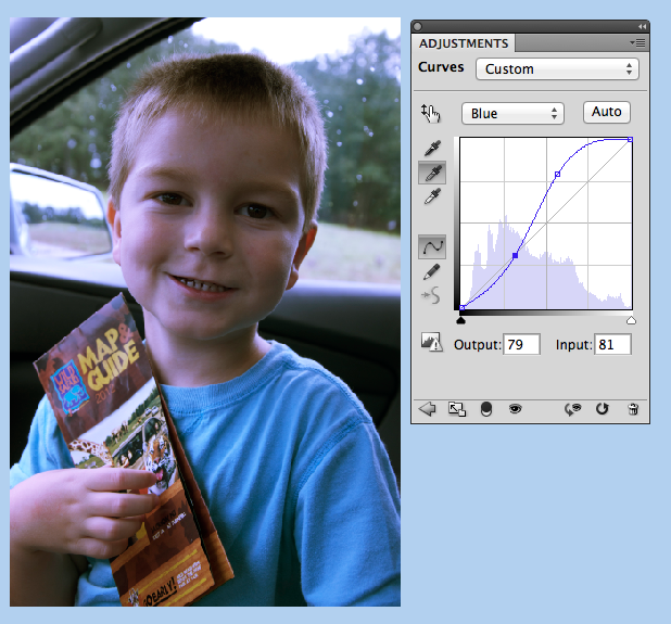
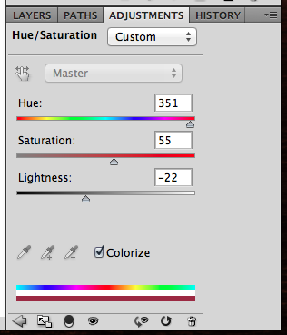
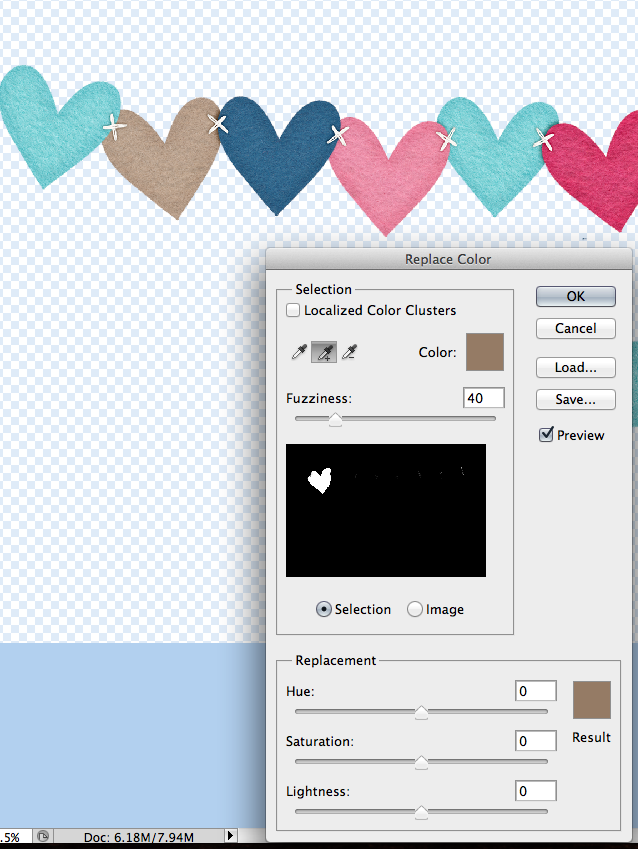
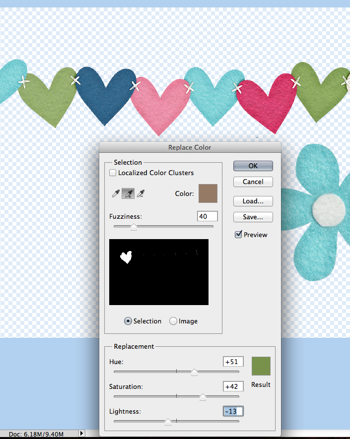
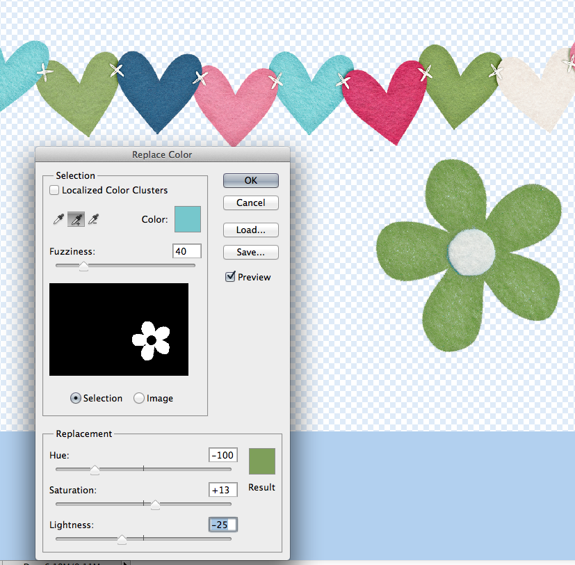
You can also use Curves to change a specific color. Click on RGB, and choose one of the colors: Red, Green, Blue. Then just adjust to your liking.

Curves8

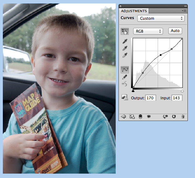
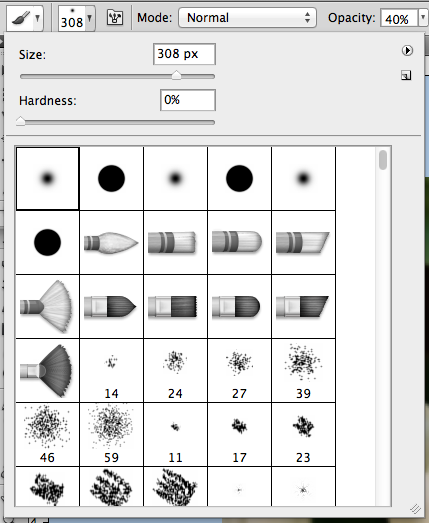
You can make changes by using the image as well. Click on the hand icon, and then click on your picture to change the curves.

Curves9

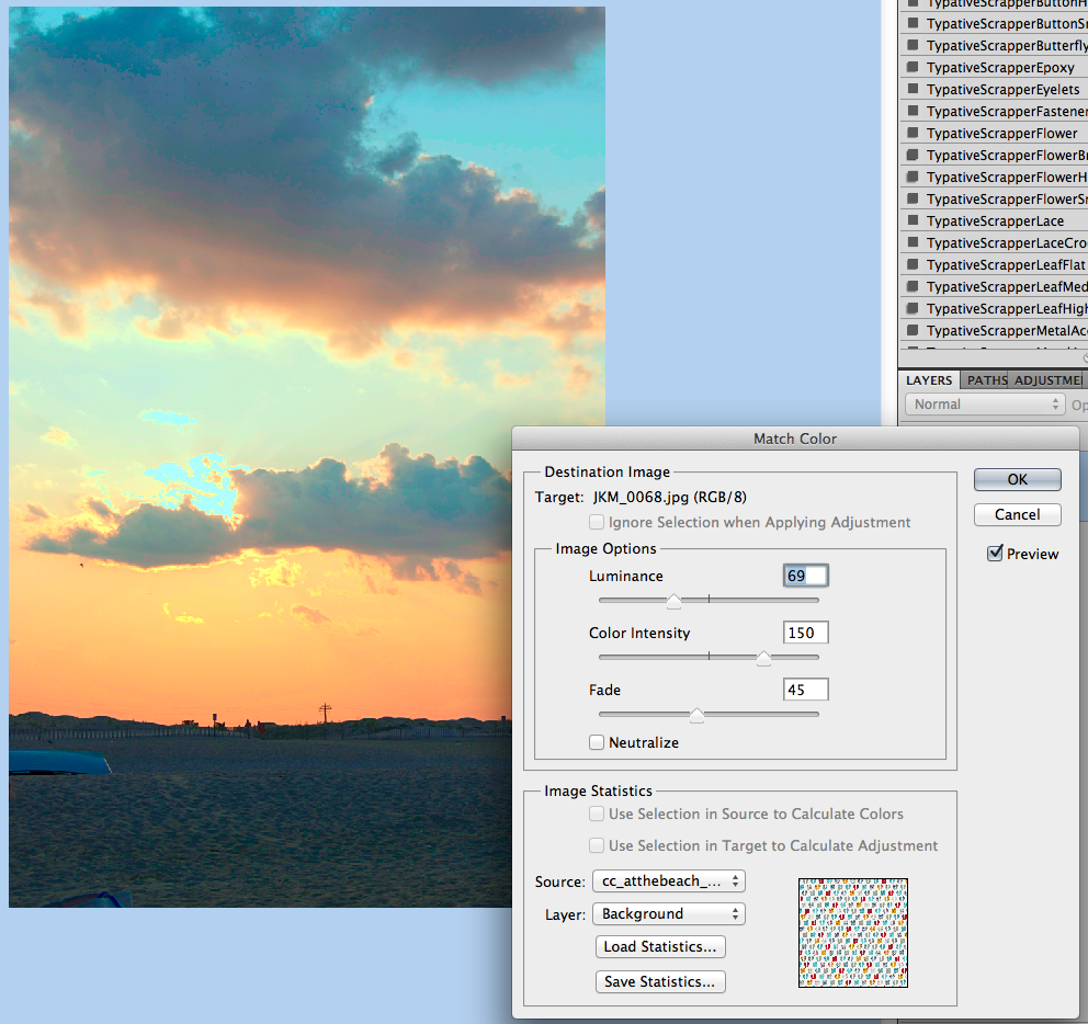
You can also add color casts by using the eyedroppers. I used the top one, and chose an orangish color. It turned my image bright orange, lol! But, don’t worry – remember you can fix the adjustment layer!

Curves9b

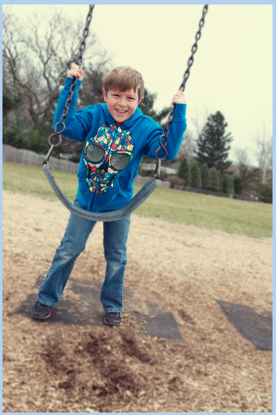
Here’s how. I have an orange picture! Now what!?

Curves9c

All you have to do is click to the Adjustment Layer, and use the Opacity and Blend Modes. This step can be done for each and every example above, but this specific one shows just how much this step can change the curves adjustment.

Curves9d

The final look for the color cast adjustment.

Curves9e


Here are some tips when using curves:

  • Use Curves because they are non-destructive to the original photo.
  • If you click on the finger, you can make your adjustments right on/in the photo and not use the chart.
  • Once you finish an adjustment, you can double click on it and make additional adjustments.
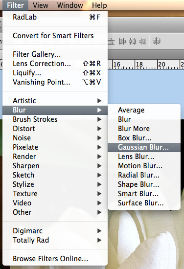
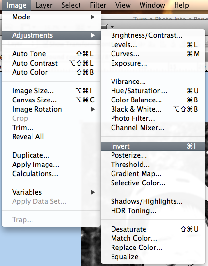
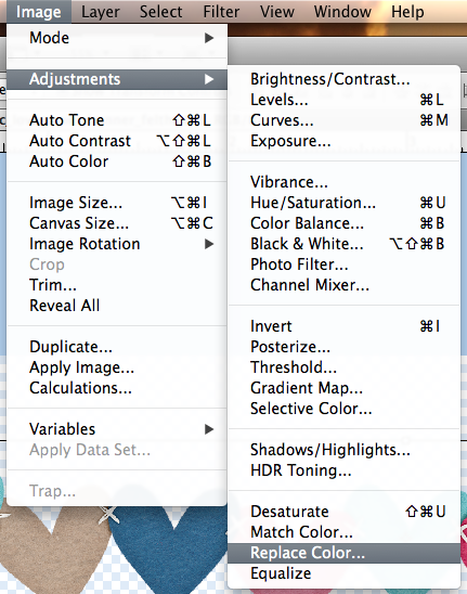
  • Curves can be found in two other ways – Image > Adjustments > Curves, or Layer > New Adjustment Layer > Curves.
  • Once you click on a spot in the chart, you can use your arrow keys (up, down, left, right) for specific and very precise adjustments.
  • You can have as many adjustment layers as you want. Create a layer for each change that you made.

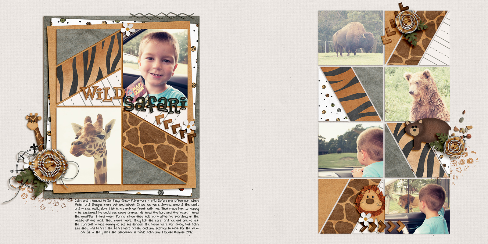
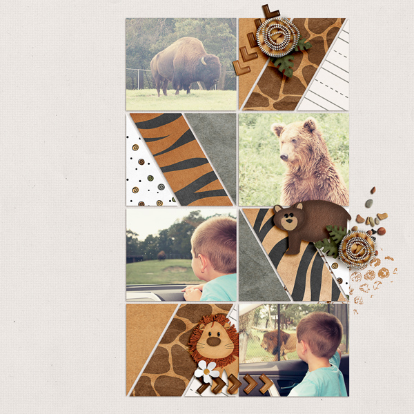
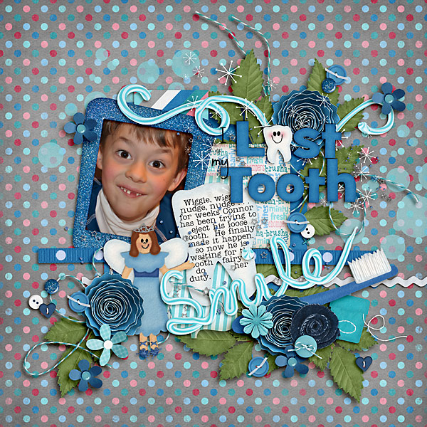
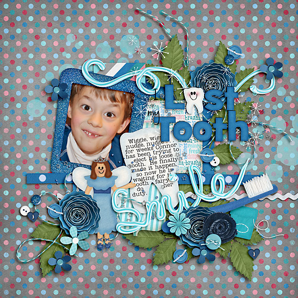
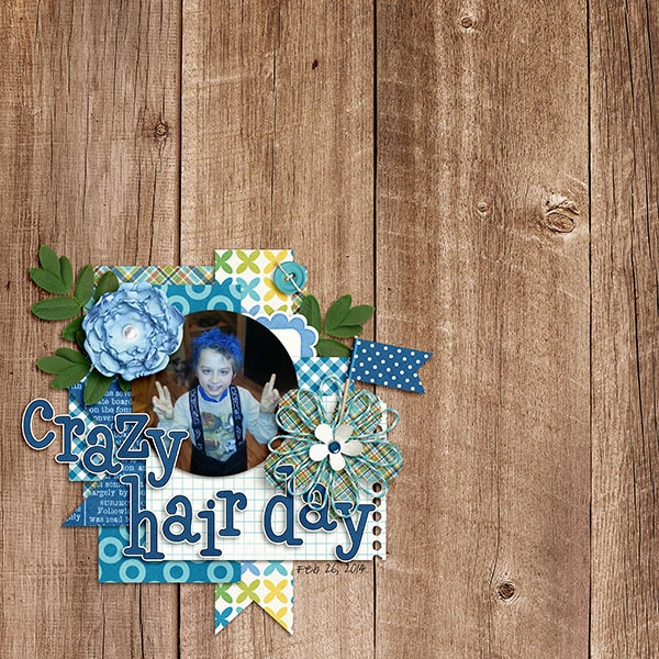
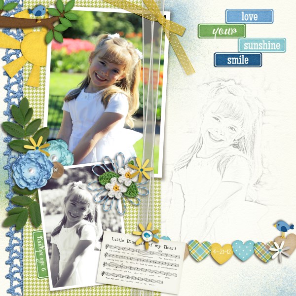
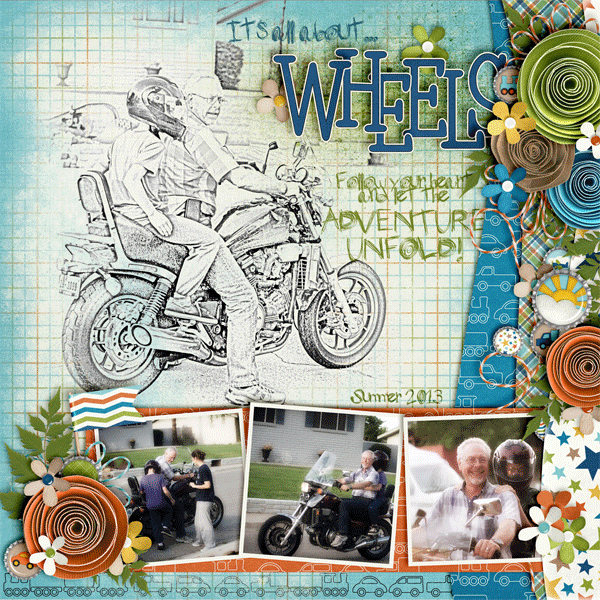
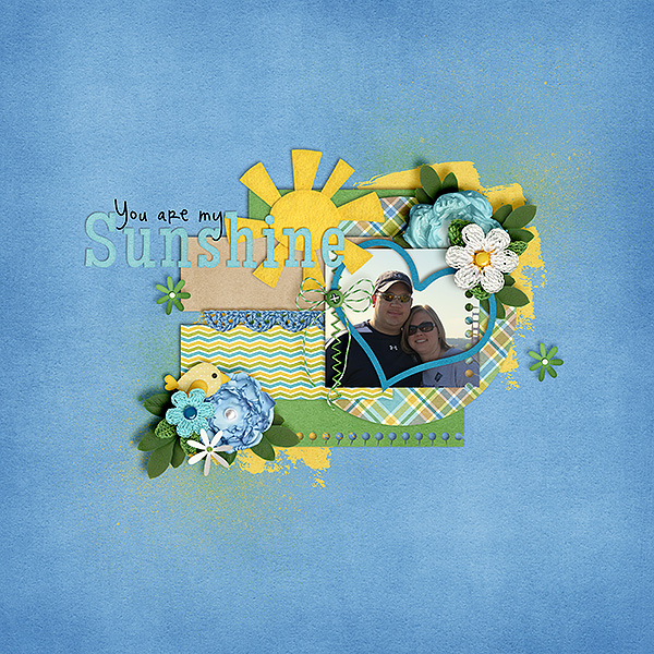
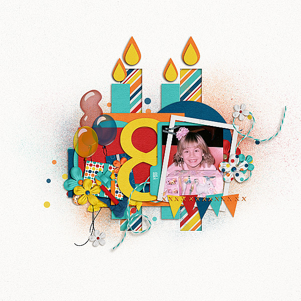
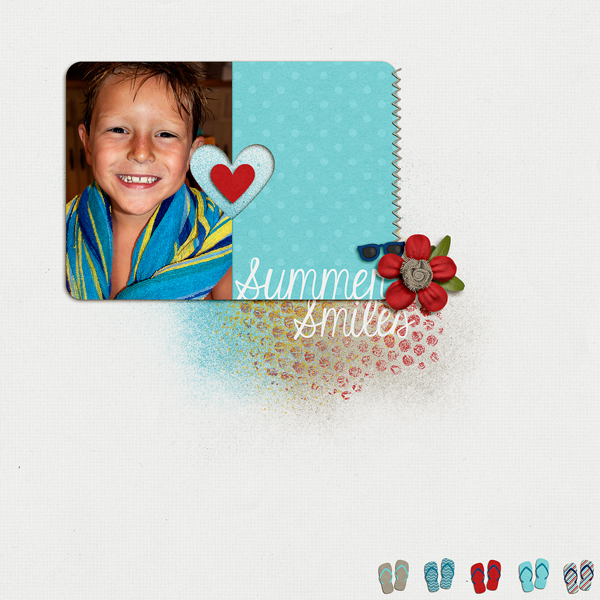
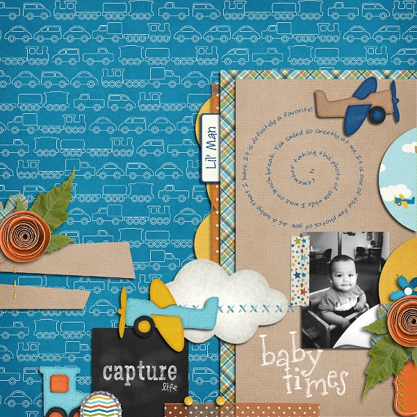
Here are my layouts. I used the same picture, just had multiple adjustment layers. (Lighter, Contrast, Color). Kits used: Toil and Trouble, Zoopendous, and On The Trail.

SO_CC_ToilTrb_OnTrl_Zoopnd_Swl_Triangle_KGSmTwnSthnGrl_ColinSafariAug2012_WEBDbl

SO_CC_ToilTrb_OnTrl_Zoopnd_Swl_Triangle_KGSmTwnSthnGrl_ColinSafariAug2012_WEBLft

SO_CC_ToilTrb_OnTrl_Zoopnd_Swl_Triangle_KGSmTwnSthnGrl_ColinSafariAug2012_WEBRght


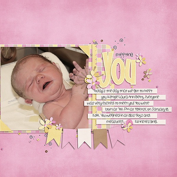
Lisa (kelseyll) gave this wonderful example, and had this to say:

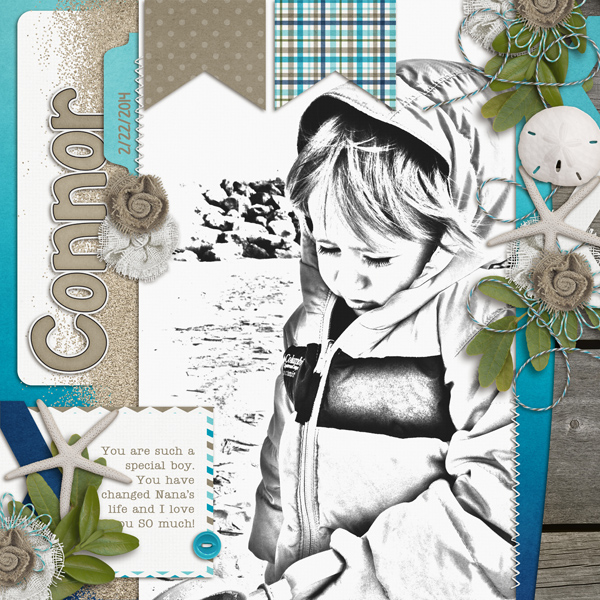
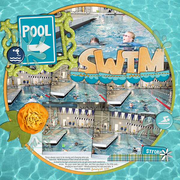
“I added 2 curves layers. For the first layer I clicked on the eye dropper that adjusts white and clicked on her sandal and changed the blending mode to soft light. That helped brighten up the colors in my picture. Then I added another curves layer and dragged the curve up a bit to lighten the photo. This one I left on “normal” for blending mode. The original picture had a muted tone and was a bit dark for the kit colors so using curves was a quick and simple fix to warm up her skin color and to get my tones to be more in line with the kit I chose which was Fleur de Violette.”  Lisa uses Photoshop CS5.

4-15CurvesAssignmentexample600x401
Here’s my final layout:

4-15FleurdeViolette600x600


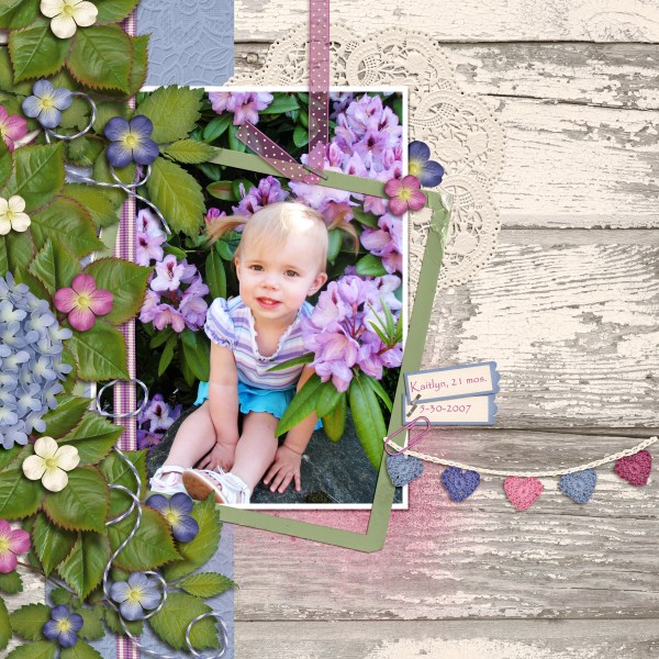
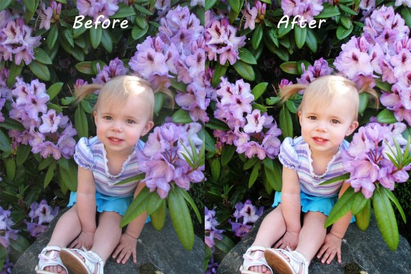
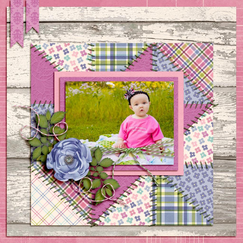
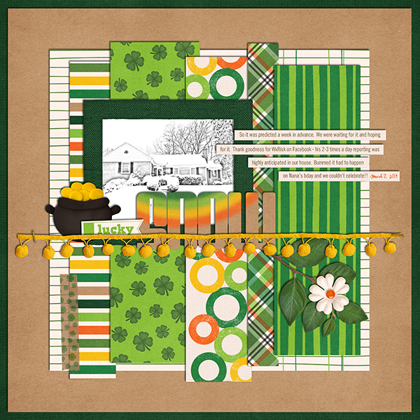
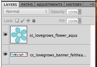
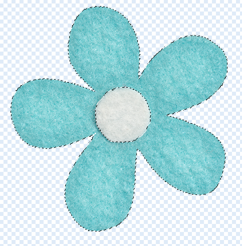
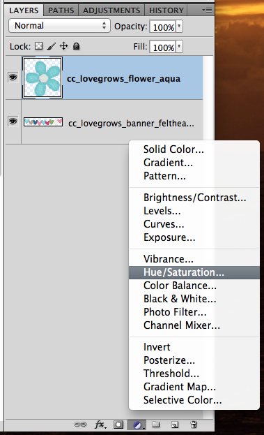
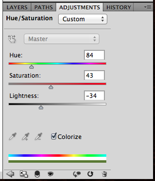
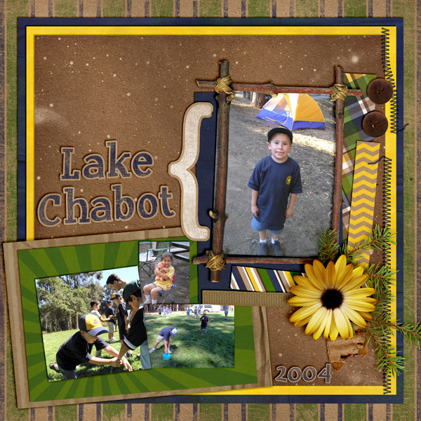
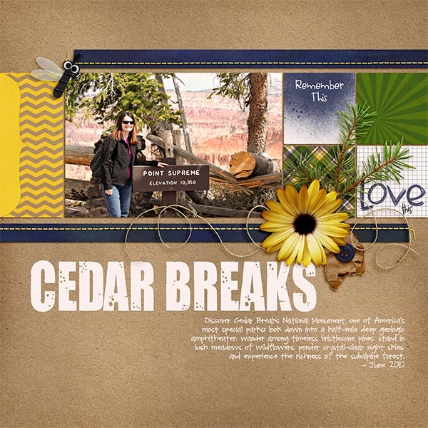
Carol (iowan) made this lovely layout, and here is the before and after.  She used Pearly Whites and Love Grows.

No Curve

Lost-tooth-Connor-2014-no-curve_zps7caee651


Actual Curve Setting

curves_zpsfac4d3c2

Curve

Lost-tooth-Connor-2014-withcurve_zps79ec9325


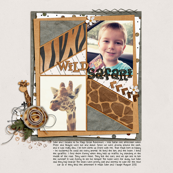
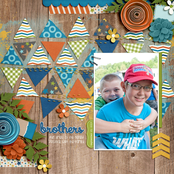
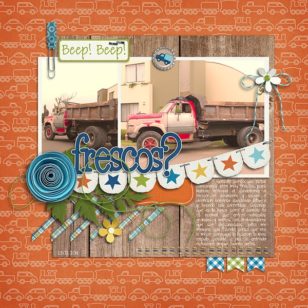
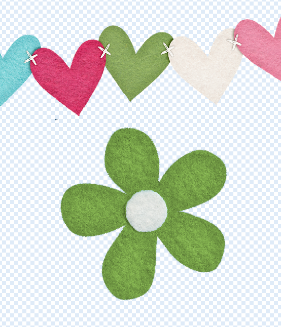
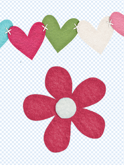
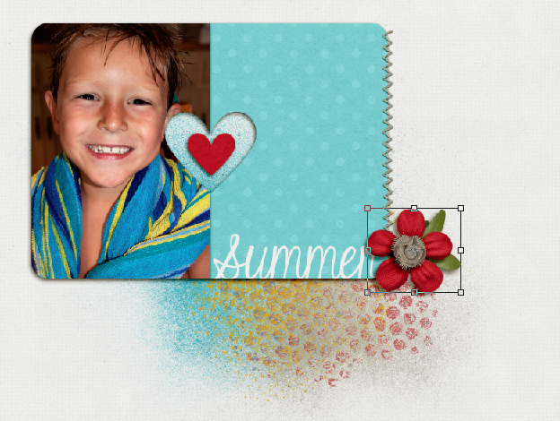
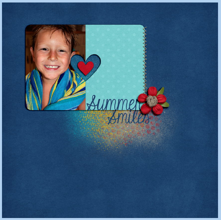
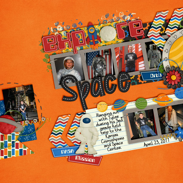
Jen (supergirljennie) used used About a Boy, CU Felt Flowers 2, and Fiddle Dee Dee’s What’s Your Angle 2 to make her page. Looks fantastic!

collage_zps3cfcd630

brothers_zps59ddcab1

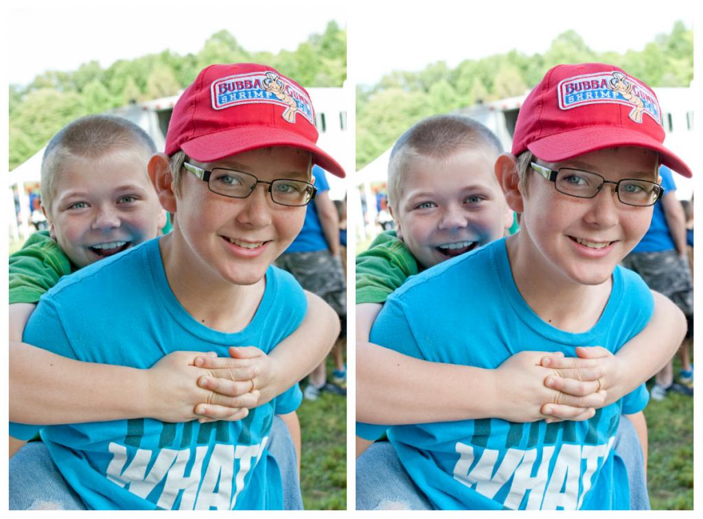
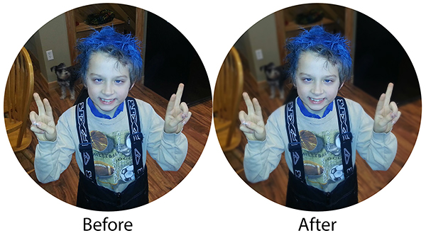
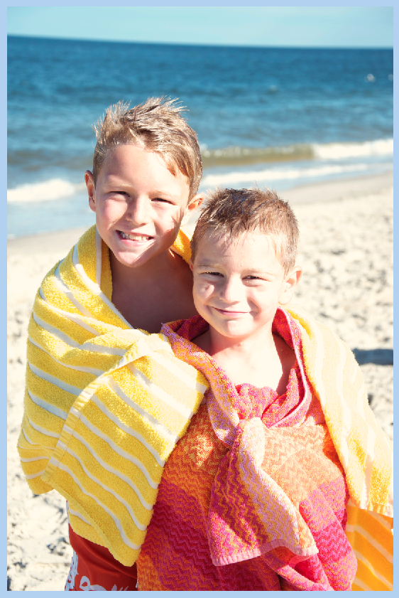
Melissa (prettypeaches) created a before and after set. She said ” I went to enhance, adjusted colour, then adjusted colour curves. I used the default settings, and I first increased the contrast and saved. I then darken the highlights and saved. I liked the effect the contrast gave to the background, but it made my lil guy bright, so by darken the highlights it made his face more natural looking again.” She used Hippity Hop Hop & Leafy Treetop.

Before photo and layout:

Before

Before cc_hippityhophop_ppr_white_zps2a48a173

After photo and layout:

After

After cc_hippityhophop_ppr_whitee_zps1b6126ee

Give it a whirl! I hope this tutorial about using curves was a little helpful. You might be surprised how easy playing with curves is to make your picture pop! Have fun and thanks for visiting!

by_Jenn


4.24 Tutorial: Using Curves

4.14 Video Tutorial: Using Alpha Stamps

Do you love learning new things? Of course we all do! Did you know that Chelle has a growing library of video tutorials on YouTube? If not, have no fear! Each month we will pick a couple to share and show you how Chelle’s talented group of ladies uses what they learned in their very own layouts.

This video demonstrates how to create your own titles with the adorable hand-doodled alpha, Scribbles 2.
Digital Scrapbook Tutorial – Using Alpha Stamps – Scribbles 2

Here is some inspiration on how to use this super cute alpha.

I love the way Helen (winipeg1) used various colors to create her title. She used Carrot Patch to create this darling layout.

Jenny (jenn18) left the alpha black on her layout. Just look at that cutie! She used Capture Your December and a template by Little Green Frog Designs.

This bright sunny layout by Krista (kc71595) just screams spring. She did a fantastic job of mixing the Scribbles aplha with a font to create her title. For this layout she used Bluebird on My Shoulder and a template by Fiddle Dee Dee.

The video features the Scribbles 2 Alpha and Letters from Home Quickies.

Next time your stuck on how to title your page try this simple solution using the Scribbles 2 alpha.

See you next time!

4.10 Tutorial: Adding Depth of Field

4.10 Tutorial: Adding Depth of Field

Hi Everyone! I’m Jenn, or jk703 in the forums. I’m a self taught Photoshop girl, and like to share what I’ve learned with easy tutorials! Hope you enjoy this one!

We are going to manually blur the background of an image to bring the focus onto one subject/object in your photo. Many times when we take pictures, we use the “Auto” settings, and nowadays, many of our photos are taken using cell phones. These pictures are great, and keep taking them! At times though, you might have a busy but crisp background, and that is because when taking the photo you opted or couldn’t change the aperture. To give a bit of depth, and to be able to choose your image’s focus, follow along with the Tutorial: Adding Depth of Field for the simple workaround!

Here is my original image, using my cell phone.

Depth1

First, duplicate your image.

Depth2

Next, with the duplicate layer selected in the Layers Palette, you will go to Filter > Blur > Gaussian.

Depth3

Look at the area that you want to blur, and move the slider until it is blurry enough that you like the look. Don’t worry about the part that you want to stay in focus at this point. Mine is at 6 pixels for now.

Depth4

Next, still with the duplicate layer selected, you will click the square with a circle in it on the bottom of the Layers Palette. This is what I call the Mask Maker. :)

Depth5

Your layer will get a white box next to your image. Click on this white box so you see the corners with double lines. This means the mask is selected.

Depth6

You want to have black in the Foreground Color for painting on the mask. Next, click on the Brush Tool. Use a soft black brush. Mine is set at around 300 pixels, soft, and 40% opacity.

Depth7

Using the brush, paint over the area that you want to bring into focus. You can see my mask here, painted black and almost in the shape of the single tulip.

Depth8

Here is the tulip image. This one is at a 6 pixel blur. Just a little blur for the background and other flower parts.

Depth9

Jumping to an 8.8 pixel blur and the same tulip in focus would make it look extra soft. Almost like the retro photos that had the softness on people’s faces.

Depth9aa

Here is another image of my son, at the park. I wanted to focus on just him, and a bit more blur on the trees and surroundings.

Depth9b

Depth9a

Here is what the CT came up with for this tutorial! :)

Jennifer (jmljensen) created this fun layout of her son – she used Chelle’s Bluebird on My Shoulder and About a Boy (template – Watering Hole freebie template by LGFD).  She already knew what I was going to post, so she was able to give me a before and after of the photo itself!

40769

web_beforeafter_zps8c533405

Jen (supergirljennie) created her layout using Fleur de Violette. She shoots in manual mode, and had the settings at f/2.5, 1/2500sec, 200 ISO. kelseyagain_zps581b5871

Super simple, and a fun technique. It will work great on photos that you have a lot going on in the background. You can easily provide focus on what you would like to stand out. Can’t wait to see what you create using this tutorial. Now, go add some depth of field, lol.

Thanks for visiting!

by_Jenn


3.27 Tutorial: Easy Pencil Sketched Photos

3.27 Tutorial: Easy Pencil Sketched Photos

Hello Hello! Welcome to today’s tutorial! This is Jenn, aka jk703, and I can’t wait to share a fun and really easy tutorial for you today. You are going to love the Tutorial: Easy Pencil Sketched Photos! It is fun, and has a cool effect, plus I think it can give you a way to change up your layouts. Add a bit of different – :)  I hope you like it!

Here is my son, and right before he was done riding his bike, I was able to snap this picture. He is laughing at me for some reason, but I don’t know what it is, lol! I pry told him to get back on the bike and put his helmet back on for a picture. All I know is that he has an infectious smile, and the natural smiles are my favorite. This is the original picture that I will show the tutorial for Easy Pencil Sketched Photos. (This should work for both PS and PSE users – Krista provided instructions on how PSE differs. I will include that in parentheses).

PencilOriginal

First, make a duplicate of your photo, right click to duplicate or Command + J. This way the original is still available and not written over with layers and other changes.
Pencil1

Next, choose your duplicate layer in the Layers Palette. Then click on Image > Adjustments > Desaturate. This will cause your image to turn to a black and white version. (For PSE Users – Krista said that she went to Enhance>Adjust Color>Adjust Hue & Saturation. She then brought the saturation slider all the way to the left.)
Pencil2

Duplicate the desaturated layer.
Pencil3

Choose the top layer in the Layers Palette. Next, change it’s Blend Mode to Color Dodge.
Pencil4

Your image will have an almost over white black and white image. Like this:
4a

The top layer is still selected at this point. Next, click Image > Adjustments > Invert. (For PSE it’s Filter>Adjustment>Invert.)

Pencil5
Your image will turn ALL white right after inverting it. It’s normal. :)
Ok. Next, click on Filter > Blur > Guassian Blur.
Pencil5a

You will move the slider to a lower number, probably between 20-60, depending on your photo. Mine is around 46.
Pencil6

The image lost a lot of it’s detail when we added the blur. We will get some back. Create an Adjustment Layer for Levels. I used the half white/half black circle on the bottom of the Layers Palette to do this step.
Pencil6a

Now, choose the middle triangle under the chart. Slide it to the right. It will change the image, so watch and slide at the same time. It will bring some of the detail back
Pencil7

Here is what my image looks like at this point.

Pencil7a

I feel that the surrounding area takes away from him, so I’m going to bring a little more focus to the image. Select the layer just under the Levels Adjustment. Press D to change your foreground and background colors to the default setting.

Now, choose the Brush Tool, and use a Soft Round Brush, and you will paint with the foreground color, black. Mine is at a size of 715, and I originally had the opacity at 20%. As I worked with the brush, I lowered it to 5%. Play with this and your image. If you have erased too much, just switch up your brush color to white, and you can fix where you erased too much of the image. (For PSE Users, Krista said that for some reason she had to use the white to erase the background. When she used black it made the background black).
Pencil8

Here is what I ended up with. You can merge the layers and save them. Then you can use it for your layouts – framed images, polaroid versions, or blend it into the background. Have fun!
Pencil8a

Pretty straight forward! It turns out great for such a simple technique. Here is what the CT created.

Lisa (kelseyll) created this soft and lovely layout. She used Bluebird On My Shoulder and the Curled Frames.

3-21BluebirdonmyShoulder600x600-1


Leah (Cat Lady) made this awesome layout – I think the sketched image is so fun and works so perfectly with that alpha. She used About a Boy and a Fiddle Dee Dee Template.

40937


Jenn (jenny) made this fun layout and had the house sketched! She used Lucky Me.

34_2014_luckysnow_600_zpsd8c0cb18

Krista (kc71595) made this layout and the sketched image fits perfectly! She used At The Beach and a Little Green Frog Template.

Connor_

Simply too easy for you not to try it out! Have fun and we’d love to see your pages using this Tutorial: Easy PencilSketched Photos in the ScrapPin Galley! Thanks for stopping by!

by_Jenn


3.6 Tutorial: Cross Photo Coloring

3.6 Tutorial: Cross Photo Coloring

Hello, Hello and happy Thursday! How are you all doing? Is this week flying by for you? It is for me, and I’m enjoying the almost 40 degree weather this week… definitely better than the teens, wind chill, and snow! This is Jenn, aka jk703, and I’m here to share a tutorial that you can use on photos and on your digital papers! It’s pretty versatile and fun… oh, and super easy too! Now, this isn’t available in PSE, but my fellow awesome team members figured out a work around that works similarly. We’re trying to cover the bases so everyone has a way to try it out! Yay!

Have you ever had pictures that you wanted to use with a certain kit… but the colors didn’t quite match well enough? I’ve got a solution for you, and it’s super easy! While I am a huge fan of actions and photo editing, (especially RadLab), this is an easy fix to use your photos with whatever kit you’d like – and have them look good together! It’s called Cross Photo Coloring – at least, that’s what I call it. :)
One of the best things about this nifty trick is the whole matchy matchy feel your photos have after doing this technique. Think about it. You’ve been to a party or at a BBQ, you take loads of pictures, and then when you look at them, the lighting isn’t always the same, or the tone doesn’t seem to match. By using the Match photos, and using a base photo or a base paper, you can tie them all together nicely.
First, here is my image. It’s my boys at the beach and my camera settings were off, so the coloring wasn’t how I’d like. But, still a great picture. For my example, I’m using At The Beach kit. (lol!) Before you go further, open a couple pictures and a few sheets of paper in photoshop. To start, all in their own tab – I believe there is a way you can do these same steps using selections and working with the layers, but I have not tested it. Oh… and it’s ok to mix solids, or even patterns. Whatever you prefer. Remember, you could even do this to papers too – the possibilites are endless! Let’s Cross Photo Color IZE it! :)Cross Color 1But, what if I wanted a little cooler to teal tint to the picture. Easy! Ok. You should be “in” the image that you want to color change, and that should be the selected in the Layer’s Palette. Click on Image > Adjustments > Match Color.Cross Color 2A pop up menu will appear. Towards the bottom, there is a click down to choose the “Source.” The Source is where you will be getting the color from to add to the original picture.

Cross Color 3

Right now, I chose a gradient paper from the At The Beach Kit. My image will instantly turn a tint of teal. Like this:

Cross Color 4

Now, I play with the sliders to change up the color. The sliders are Luminance, Color Intensity and Fade.
Luminance – adjusting to the left makes it darker, while sliding it to the right makes it lighter.
Color Intensity – adjusting to the left makes the color range smaller, while sliding to the right will add to the range and intensify the color.
Fade – sliding will determine how much of an adjustment you will have. To the left is a straight color adjustment, while to the right fades the color adjustment.

You can see my adjustments and sliders here. Gives it a cool look, and adds to the scenery.

Cross Color 5

Here is the same image, but with the golden yellow paper, as well as the sliders and settings I settled at. Makes a warmer image and again, it’s still adding to the scenery. See how the same image can work and totally change the photo with each color match!

Cross Color 6

Another example, a sunset:

Cross Color 7

Image, sliders and outcome with the Teal Paper:

Cross Color 8

Image, sliders and outcome with the FLIP FLOP paper! Check it out! I really think this cross photo coloring is my favorite! Who would have thought flip flops would do this! :)

Cross Color 9

Image, sliders and outcome with the yellow paper:

Cross Color 10

Now… two other things you can do….

Combine images… here, I’ve combined the boys with the sunset, and moved the sliders some.

Cross Color 11

Combine papers… here, I’ve combined the flip flop paper with the teal and yellow papers, and how I changed each slider:
Cross Color 12

Cross Color 13

Now, here is what the CT came up with! They really helped me out to find an alternative to the Photoshop way! Thanks ladies!

Roxana (roxanamdm) used 2 pictures and the wheels2_orange paper on the BG from About a Boy to match the color, then moved the sliders to 100-88-68.

tiport10

Karen (Zippyoh) said that she uses PSE 11, and for the photo she added the following: Filter > Adjustments > Photo Filter, and from the drop down menu chose the color yellow because of the yellows in my LO. Kit used is Bluebird on My Shoulders and a template from Little Green Frog.

bluebird600

Now, I know we all have different ways of achieving the perfect look for our pages, so Melissa showed us an action that she uses for a similar effect. She used used a free PSE Action called, Coffeeshop Faded Daydreams. Which lightens the photo and adds a yellow and pink colour to the photo :) It can be located here: http://www.thecoffeeshopblog.com/200…se-action.html She said that the filter gave a softness to the photo and gave uniform-ness to the photos as well to make them match better. I believe she used Beary Cute Baby Girl.

Meeting-You-RS_zps06bb9e96

Meeting-You-Both_zps4266e2f3

Tammy (craftytam) said that she followed the Filter > Adjustments > Photo Filter to adjusted the blues on her layout. She used Love Grows, CU Tag Ties, About a Boy & a template from Little Green Frog.

Silly-Love_zpsb2e970eb

That’s it! Lots of great info and such a great way to scrap with whatever kit you like! I’d love to see how you use this tutorial and add a Cross Photo Coloring to your photos – link us up! Hope this was something fun!

Thanks for visiting!

by_Jenn


2.27: Selective Recoloring Techniques

2.27: Selective Recoloring Techniques

Hi Everyone- it’s Jenn (jk703) here today! I’m back with another tutorial, and this one will be about recoloring. Have you every wanted to match a flower to a different color? An Alpha? Well, using the techniques that I show you today, you will be able to! Here we go – Selective Recoloring Techniques!

I’m working with the Love Grows Kit, and I’ve selected the Banner and a felt flower to work. with specifically.  I’m going to show two methods to recolor the elements to matching colors. There are always many ways to do something in Photoshop, so you may already know these ways, or another way. Any way you recolor and it works for your layout and memories will work! :)

Recolor1

Method 1

Here is what my Layers Palette looks like for reference. To start, I will recolor the flower.
Recolor2

Double click on the flower thumbnail in the Layers Palette, and you should get marching ants around the edges.
Recolor3

Now, we will choose Magic Wand Tool, and choose the Subtract From Selection Preset. You will click on the white in the flower.
Recolor4

When you click on it, it subtracts this section from the selected outline.
Recolor5

Next, on the bottom of the Layers Palette, click on the little black and white circle, choose Hue/Saturation:Recolor6

A screen will pop up, or it may show as a tab in near the Layers Palette. (Mine is a tab.) I’m going to click on the “Colorize” box, and I want to change my flower to green to get a closer match to the heart. Just play with the sliders. If you find other colors are changing also, use the eye dropper with the – sign and click on that area. It should take that specific color out of the equation. Here is what my setting are at after playing with them.

Recolor8

Here is what I ended up with for my flower. If you find that the color is close, but not as you wanted, try changing the Blend Mode on the Adjustment Layer. You might be pleasantly surprised.
Recolor9

Now, I’ve gone and played with those sliders again…. this time I’ll try to match the magenta color.
Recolor10

Here is what I ended up with for my flower. Not too bad, and again, try out changing of the Blend Modes. I find that reds and pinks are harder to recolor than most other colors. Those are trickier to me. If the recolor is not working as well as you like, you could also try to combine methods.
Recolor11

Method 2

For this recolor method, I’m going to change the color of one of the hearts. Specifically, the tan one. In the Menu Bar, click on Image > Adjustments > Replace Color.
Recolor12

A pop up will appear, and you will use the eye dropper tools to select the color of what you wish to replace. If the image in the black box is not all white, just use the + eye dropper and click on other sections of the item that will be recolored. If other items are being included in the recolor, then use the – eye dropper tool to click and remove that color. You want a solid white image – this reflects what will actually be recolored.
Recolor13

Now that you have the shape completed, we will start the color replacement. Use the sliders below, and move them to get to the color you want. Here is what my green heart looks like:
Recolor14

And here is a green flower:
Recolor15

Two, pretty easy, methods for recoloring your stash! Stretch that stash and make it work for you! Here’s what the CT created. Melissa (pretty peaches) said she recolored the tissue paper to blue and the flower to orange. She changed the colour and also had to create another layer and use the filter multiply on it to give it the darker shade. She worked with One Year Older. 

LGFD-IOTCake-1_zpseae7e7be

Roxana (roxanamdm) said she used a red heart stamp, a gel heart and heart stitches from Technolove, which recolored easily with the Replace Color method. She then tried to recolor a pink heart button and felt but they proved to be a bit hard to recolor. She decided that Replace Color and Hue/Saturation technique weren’t working for her, so she clipped an orange paper. Then she changed the blending mode to color burn as well as an adjustment layer at this point.  With a Hue/Saturation layer, she moved the slider until I got the orange I wanted. The blue flower on top from About a boy was not from the tone I was using so recolored it with Replace Color as well. Roxana used Used Berryberry Blue, About A Boy, Techno Love and Mark My Words.

tiportutrecoloringfeb14-web

Jenn (jenny) said she used In the Backyard and recolored the butterfly, alpha, flower and background butterfly paper to orange!!

19_2014_backyardbirds_600_zps8524e38a

See, selective recoloring technique isn’t that difficult! Remember to play and try things out. There is always the Undo button! Hoping you learned a new technique, or another way of recoloring some of you (extensive) digi supplies! 😉 Have a great week everyone! Thanks for visiting! by_Jenn


1.13 Tutorial: Highlighting Titles with Paint

1.13 Tutorial: Highlighting Titles with Paint

Hi Everyone! I’m Jenn, aka jk703, here to bring you today’s tutorial from a snowy NJ! I think we are forecasted to get about 10-12+ inches, and let me tell you – I’m ready for summer! So, for today’s Tutorial: Highlighting Titles with Paint, I’ve used a summer photo and tried to re-live that wonderful season! :) So, let’s get to that text!

For my layout, I’ve used Chelle’s At The Beach Kit, CU Texturizing Brushes Vol 2, CU Bubble Wrap Brushes, as well as Scrapping with Liz’s In Love Journal Cards. Ok. This is my layout so far. I wanted to add a little oomph for the title but was stumped. So, I decided to use splatters and colors to make the title stand out. You will want to add text to your layout above the background layer.

SplatterText1

Here is an image of my layers palette, and how I have the layers set up for color, and splatters. It’s a mix of splatters from the kit, and added splatter/texture brushes from Chelle’s CU stash of goodies. My text will be above that yellow paper. :)

SplatterText2

A quick tip…just to give you options for the next part of the tutorial.

All the splatter layers and papers – You could either combine all your splatter layers to one layer, or keep them separated. You will be deleting from these layers, and it might be a little quicker to combine them. I prefer to leave the layers and delete from each layer, because if I don’t like how it turns out I can easily fix that layer or if I want to keep one color un-deleted, I can. Just my opinion.

SplatterText3

Ok, once you have your text in the location and correct spot in the layers palette, you’re ready to start. Here is my text:

SplatterText3d

I’ve double clicked on the layer thumbnail in the layers palette for the text. When you do this, you should get marching ants.

SplatterText3c

Now, you will click onto every splatter/texture/bubble wrap layer (one at a time, or all depending on the above tip) and press delete. Then turn off your visibility for the text layer. Your paper should show through the splatters. Here is mine (not the best example with white, but you can see different texture).

SplatterText4

Here is another example using a red background:

SplatterText5

Here is the same example using a blue background:

SplatterText6

Here is my white background page:

SplatterText7

Here is the blue background page:

SplatterText9a

My preference was the white background, and here is my completed page.

SO_CC_AtBeach_SWL_InLoveJnlCrd_KGEyesWdOpn_ShayneSummer2013_WEB


Ok. Let’s see what the CT came up with for this post: Highlighting Titles with Paint! There are some awesome layouts!

Roxana (roxanamdm) used this tutorial for her page, and then made it her own. Products: Traveler Bundle, CU Spritzes, and CU Bubble Wrap Brushes. She said she kept adding brushes, then added the dark brown paper from the kit on top of the blue. She used the blend mode – luminosity with a  40% opacity. This allowed the background a little darker. She also used the tutorial tomake the stitches in the border too, the template had that brushed border so just clipped a light paper and it worked perfectly.

febtiportut13-web-1

Mel (KSCroppyChick) made her page and highlighted the title by putting the paint splatters behind the title, on the background paper. She used Out Of This World, Basic Black Stitched Alpha, and a Little Green Frog Designs Template.

Explore-Space

Jenn (jennv) created this summer themed page using Chelle’s In The Pool Kit. She said that she used paint splatters to clip to her title alpha. She was looking to make it stand out a bit more – she wanted it a bit more white-ish!!! Pretty Clever!

12_2014_PoolPlay_600_zps4a443f1b

Melissa (prettypeaches) created this adorable page using Chelle’s Choose The Right {Baptism Kit} and a Little Green Frog Designs Template. She wanted a muted look to add to her title and page, and this tutorial was perfect. She even did the date too.

XOXO_zpsd0ef7ece

Lisa (kelseyll) created this cool page. She said she used the paint in the Out of this World kit. Then she clustered and merged them together. She then used the CU Dandy alpha to erase out the “Evergreen” lettering, but used the dashed lines to see the letters better. She decided to also make a thin line paper outline in green to further help it stand out.

2-1OutofthisWorld600x600

Lastly Leah (Cat Lady) created a double! She used Chelle’s Out of this World kit, Riveted Alpha (Previous Blog Freebie) and a Little Green Frog Designs Template.

39057

Cool pages, ladies! I love what they came up with and how creative they were. Hoping you enjoyed this post, and you will try out the Tutorial: Highlighting Titles with Paint for your next page!

Thanks for visiting!

by_Jenn


1.31 Tips: Different Uses for InstaLife or Journal Cards

Hi Everyone! It’s Jenn, aka jk703, here to share a few tips with you today! I know you have all seen the craze – Journal Cards, InstaLife Cards, and any way to stay on top of pocket scrapping!  What do you do if you don’t scrap that way, but you just love the look of the cards?  Well, today I have Tips: Different Uses for InstaLife or Journal Cards! Don’t think you have to stay in that box or rectangle – just look at them a bit differently.

1. Paper Layers.

Use the journal cards as paper layers under your pictures or to mat papers and pictures. They are a great base to any layout. Kimberly (enjoyyourpix) created this intricate page!  She used Let’s Camp S’more and the Let’s Camp S’more Journal Cards. Here is what she said – “Journal cards clipped to paper strips (plaid, striped, and yellow chevron), as well as the journal cards were also used as mats: green sunburst and blue cards. {used 5 cards in all}. I also erased the lines from the bracket journal card-like embellishment in the main kit and just used the bracket. One last item – I took the starlight paper and soft light blended it to the tan paper in the kit.”

02_Wolf_10_chabot_zpsd6c722c7


2. Frames

Many times the InstaLife and Journal Cards have shapes to them. Use can use those shapes to make a frame! Cami (camijo) made her page and had another picture to add. She made a frame using one of the InstaLife cards and removed the inner shape. A cool shaped frame. She used Choo Choo and One Year Older InstaCards.

camijo_train_zps562c229a


3. Create a Siggy/Start a Cluster

Who gets stumped making signatures for the forums? Start it with an InstaLife card and you’ve got a great base so far! Go a few steps further and you’ve created a cluster for your layout. Build it up and try one today! Jan (QuiltyMom) created her signature using Give Thanks and Give Thanks InstaLife Cards.

31826


4. Help Your Title/Word Art

I know I get stumped for a title! many InstaLife and Journal Cards have words on them that relate to their respective Kit. Use that as part of your title, or as Word Art for your page! Adding a little contrast to the page and using different papers and textures can really make them stand out. Here is Ophelia’s (navaja77) layout where she used About a Boy, and Chalked InstaLife Cards.

21854


5. Blocking

I love the look of blocking on my pages and using the InstaLife and Journal cards make this idea super easy! Just drag in, re-size and place. That’s it – so simple! Kayla created this wonderful page using both the Let’s Camp S’more InstaLife Cards, the Kit, and the Journaling Cards!

21641


There is one last thing that you could do with the InstaLife Cards and Journal Cards… journal on them! :) Have fun everyone and be creative! Thanks for visiting!

by_Jenn